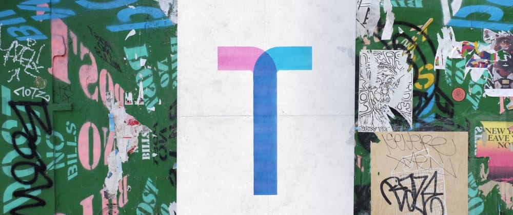
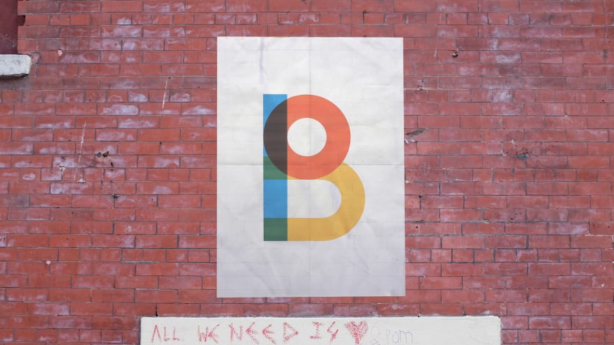
I’ve been preparing for my Talk.CSS talk about mix-blend-mode this week. Meanwhile, if you happen to have come across this cute little community called SingaporeCSS, and are even in our facebook group, you’d notice that the banner, though dates back to Jan 2018, uses an interesting display font.

The font was made to commemorate Gilbert Baker, who designed the rainbow flag.

It is a color font and you may download both the color version and the normal version from the Type With Pride website.

Aside from being incredibly beautiful, you cannot miss the blending effect on the intersections of the strokes. And hey, remember the topic for my talk? This CSS property mix-blend-mode is exactly about how colors blend. And so now it becomes the font of my slides.
Figuring out the blending mode
One side effect from preparing for a talk on mix-blend-mode is that you cannot stop but wonder what’s the blending mode (or not any) used on each of the intersection of colors you see. And mid-way through slides preparation I felt this increasing temptation to figure out what’s on my chosen font. I mean, what if someone asks that question?
I’m not very well trained in looking at colors. And I cannot tell how the colors are blended just by naked eyes. I guess since I’m learning something about the blending modes, why not try my luck to figure it out?
Now, the reverse-engineering requires some understanding of CSS Colors and Blending, which I’ll summarize just enough for this process:
- 12 out of 16 of the blending modes are Separable Blending Modes computed in the sRGB color space. Separable means the R, G, and B channels of the resultant color are computed separately. The 4 others are Non-Separable and are computed in the HSL representation.
- The computation uses the fractional values of each color, i.e., “0xFF” or 255 means 1, “0x80” or 128 means 0.5.
You may check the specs for the the complete list of CSS specified blending modes.
There is no guarantee that I can find my match in the separable blending modes, and maybe not even any CSS specified blending modes. The designers of the font may pick any colors at all for the intersections of the strokes. Who knows 🤷🏻♀️
Still, I dumped the typographer’s favorite quote on to a white background and started doing this:
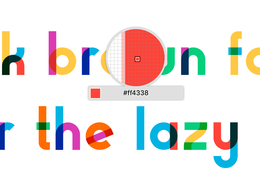
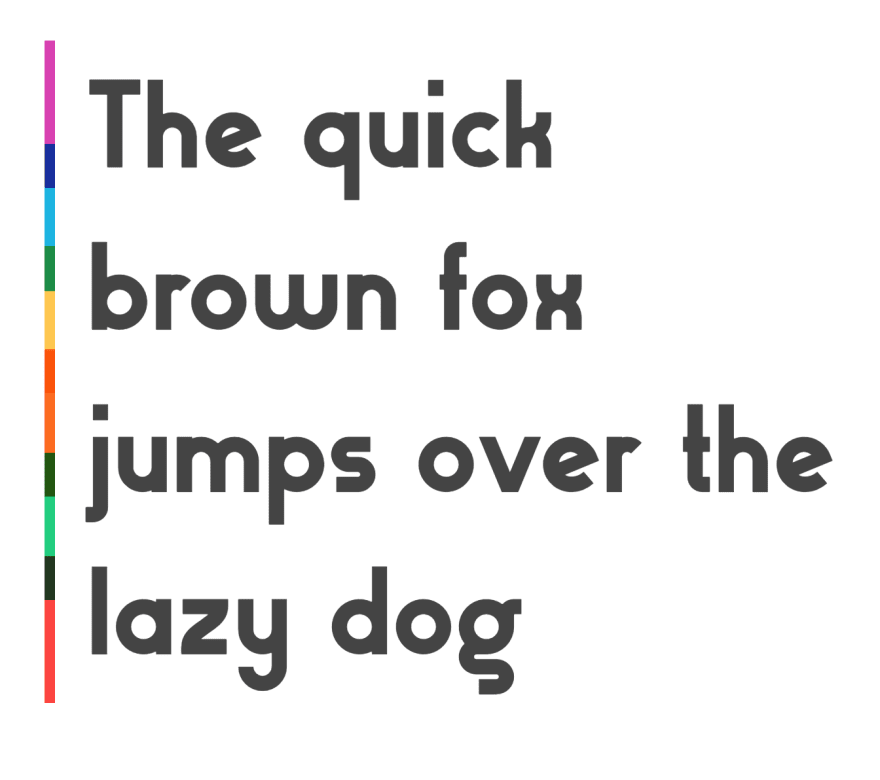
And here are the colors
--orange: rgb(255, 107, 0); /* #ff6b00 */
--red: rgb(255, 67, 56); /* #ff4338 */
--green: rgb(5, 206, 124); /* #05ce7c */
--blue: rgb(0, 179, 227); /* #00b3e3 */
--magenta: rgb(218, 58, 179); /* #da3ab3 */
--yellow: rgb(255, 200, 67); /* #ffc843 */
Basically, I’ve decided to try every blending function and see which one matches. And I’d like to first check if there are any easy eliminations.
Normal, for example, says there’s no blending at all.
Darken and lighten pick the darker or the lighter channel values, respectively. So the result should have numbers matching either one of the channels of the constituent colors, but there is none except for zeroes.
The first one that has a non-trivial blending computation is multiply, which is essentially multiplying the colors by channels. Elementary school math taught us that zero times any number gives you zero. So I tried my luck on a few combinations that involve two colors with zeros:
Reading from the color pickers:
- green x orange:
#055600, orrgb(5, 86, 0) - blue x red:
#002f32, orrgb(0, 47, 50) - blue x magenta:
#00299f, orrgb(0, 41, 159)
Then I did the math, rounded to the nearest integer:
- green x orange
R: (5 / 255) * (255 / 255) = 5 / 255
G: (206 / 255) * (107 / 255) = 86 / 255
B: (227 / 255) * (0 / 255) = 0 / 255
And I get… rgb(5, 86, 0) which is exactly the intersection! I tried a few combinations, and they all matched. 😱 Did I just got hit by shit luck?
Now, as a Chinese term goes, 胆大心细 which means you should be bold but careful, is a virtue for mathematicians. I should verify that it is indeed multiply, and not anything else.
A few more can be eliminated by naked eyes, as well as easily verifiable with simple math. If you are keen, I have this color palette on CodePen as well:
It is not screen, because screening any color with 0 gives you back the color.
It is not color-dodge, because B?(x, 1) does not yield 1.
It is not color-burn, because B?(1, x) does not yield 1.
… and I eventually ended up realizing that there aren’t that many intersections after all. All of them are multiply, for real. QED. Although, that’s not to guarantee anything for future reference... The designers may change their mind 🤷🏻♀️
Multiply and darken
While darken was easily eliminated by logic, I noticed how multiply and darken look very similar in this situation. The side by side comparison on that CodePen may give you an idea, and let me paste a screenshot again:

With single colors, since both darken and multiply yield a weaker value in each color channel, they may very well produce very similar resultant colors. Where they differ drastically is when applied to photos, or any graphics with more complex contours and textures. Because multiply is a linear operation, it preserves the texture of both the graphics. But darken simply picks the smaller value on each channel and hence there is no guarantee the texture of any side can be preserved.

A detour
There was a detour in this process. I was originally playing with Chrome and the numbers never matched with my computation. They were close, but the resultant values were always off by a few integers. And when playing with mix-blend-mode: screen they were often even off by two digits 😲
I nearly thought I did not understand mix blend mode at all. Turns out there’s a bug in Chrome that may be related. Never be too sure of yourself, never be too sure the mistake is at your side neither 😬. Firefox, on the other hand, happily spat out my results with a few exceptions that were at most off by rounding on the unit’s digit. It looks like Firefox is rounding up, where I’m doing the traditional math rounding.
A block quote border blended
I thought I’d do something to match my slides’ theme with the font’s design. Since I now have known the secret of their colors, why not use that knowledge for free man.
I wanted to create a blended border for my block quote elements, where I’ll use the colors to cover the border, make them intersect each other with the matching blending mode for the intersections.
I decided to go with multiple background images, and use background-blend-mode: multiply.
Initially I was thinking along the line of stacking an array of background linear gradient images with some overlap.
blockquote {
  background-image: linear-gradient(
      to bottom,
      var(--magenta) 0,
      var(--magenta) 100%
    ), linear-gradient(to bottom, var(--blue) 0, var(--blue) 100%),
    linear-gradient(to bottom, var(--yellow) 0, var(--yellow) 100%),
    linear-gradient(to bottom, var(--orange) 0, var(--orange) 100%),
    linear-gradient(to bottom, var(--green) 0, var(--green) 100%),
    linear-gradient(to bottom, var(--red) 0, var(--red) 100%);
  background-size: 8px calc(100% / 4.5); /* to create the overlap */
  background-repeat: no-repeat;
  background-position-y: 0, calc(100% / 5), calc(200% / 5), calc(300% / 5), calc(
      400% / 5
    ), calc(500% / 5);
  background-blend-mode: multiply;
}
They worked. But they turned out to look rather uninteresting..
This is personal, but I added a tweak on the gradient directions that made me really happy. The final result looks like this:

You may check out the implementation in this CodePen. Note that the color part works only on browsers that support color font.
Till next time 🤞
If you happen to be in Singapore this month, and are designer or front end dev interested in one another, maybe come to Talk.CSS #38 to hear me talk about this CSS property called mix blend mode. Or if you are inspired by this little work and have created something interesting, please show and tell us 👀
Fingers crossed for CodePen to be back in shape though.


Top comments (12)
Looks like a great font for presentations too. I would really like to try it, especially the animated version. Unfortunately I have to use PowerPoint which as far as I know doesn't support anything like this. Or am I wrong?
Yes it's such a nice display font right! I don't have PowerPoint installed on my machine, but I believe if you install the font you can use it like other fonts? The font can be found here.
Thanks, have just tried it. Unfortunately it only displays the monochrome version. Same with Libre Office and Gimp. It does look awesome in the browser however.
Maybe you can answer a completely different question: The font has a fixed mapping between strokes and colors, the "o" for example is always yellow. In some of the pictures from your post, this seems to be different. The same character appears in different colors. Why is that?
I think that's how they designed color font to be. You may check out Color Font to learn more about it :]
Sorry if I am asking stupid questions. I understand that in a color font, each character has fixed colors. But in one of your sample pictures displaying the text "the quick brown fox...", the same letters appear with different colorings. This is what I don't understand.
Oops sorry. Let me try to understand your question more precisely -- are you referring to the 'o' stroke, for example, it appears in 'b', 'd', and 'q', as well as 'o' itself?
The 'o' in 'brown' is yellow, the one in 'fox' is green and the ones in 'over' and 'dog' are red. That's what puzzles me.
I see. In fact, all the letter 'o's are yellow. The stroke 'o' in other letters such as 'd', 'p', 'q', 'g' have different colors -- this I believe is designers' decisions. Unless you are seeing otherwise?
Hi, it's me again :) - no, my issue is not the o-shaped strokes in different letters. Please check the letters 'o' in the words 'brown', 'fox', 'over' and 'dog' in the 3rd image of your article. At least on my screen they have completely different colors!
Hi, it's me again :) - no, my issue is not the o-shaped strokes in different letters. Please check the letters 'o' in the words 'brown', 'fox', 'over' and 'dog' in the 3rd image of your article. At least on my screen they have completely different colors!
Hmm I see. Sorry I was missing your point 😅
Actually, that image is from typewithpride's website banner. They probably put a different version or one that is not exactly the same with what they release with the font files.
For the actual glyph you will see, should follow what actually shows up in the font book.
If you are the only one giving the presentation you can use webslides, Ive used it alot. When people want the slides I just export them to PDF and send them (does not include the animation tho). With webslides you can use html/css/js and more