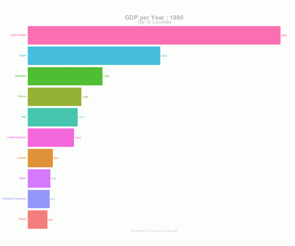
Recently, Animated Bar Plots have started going Viral on Social Media leaving a lot of Data Enthusiasts wondering how are these Animated Bar Plots made. The objective of this post is to explain how to build such an Animated Bar Plot using R – R with the power of versatile packages.
Final Output:
The output of this project is going to look like this:
Packages
The packages that are required to build animated plots in R are:
- ggplot2
- gganimate
While those above two are the essential packages, We have also used the entire tidyverse, janitor and scales in this project for Data Manipulation, Cleaning and Formatting.
Data
The original dataset used for this project is downloaded from WorldBank Data. The same csv file can be found in the project folder.
About Data:
This data contains GDP value of most of the countries for several years (especially from 2000 to 2017).
Data Preprocessing:
We will use the following code to prepare our data in the desired format. Actually, we’re cleaning up the column names, typecasting the numbers into numeric format and converting the data from Wide Format to Long format using tidyr’s gather() function. The tidy data is saved into a new csv file gdp_tidy.csv for further usage.
library(tidyverse)
library(janitor)

gdp <- read_csv("./data/GDP_Data.csv")

#select required columns

gdp <- gdp %>% select(3:15)

#filter only country rows

gdp <- gdp[1:217,]

gdp_tidy <- gdp %>%
  mutate_at(vars(contains("YR")),as.numeric) %>%
  gather(year,value,3:13) %>%
  janitor::clean_names() %>%
  mutate(year = as.numeric(stringr::str_sub(year,1,4)))

write_csv(gdp_tidy,"./data/gdp_tidy.csv")
Animated Plot
An Animated Plot building process involves two primary sections:
- Building the entire set of actual static plots using ggplot2
- Animating the static plots with desired parameters using gganimate
The final step after these two primary steps is to render the animation in the desired file format, like GIF or MP4 (Video).
Loading Required Libraries
library(tidyverse)
library(gganimate)
Data Manipulation:
In this step, We’re going to filter our dataset to retain only the top 10 countries for every given year. We’ll also create a few more columns that will help us display labels in the plot.
gdp_tidy <- read_csv("./data/gdp_tidy.csv")


gdp_formatted <- gdp_tidy %>%
  group_by(year) %>%
  # The * 1 makes it possible to have non-integer ranks while sliding
  mutate(rank = rank(-value),
         Value_rel = value/value[rank==1],
         Value_lbl = paste0(" ",round(value/1e9))) %>%
  group_by(country_name) %>%
  filter(rank <=10) %>%
  ungroup()
Building Static Plots
Now that our data is ready to plotted, We’ll build all the required static plots. As you might have seen in the animation at the top of this post, We’re going to see how the Top 10 Countries based on GDP has changed over the years in the given dataset. For that we need to build individual plots for each year.
staticplot = ggplot(gdp_formatted, aes(rank, group = country_name,
                fill = as.factor(country_name), color = as.factor(country_name))) +
  geom_tile(aes(y = value/2,
                height = value,
                width = 0.9), alpha = 0.8, color = NA) +
  geom_text(aes(y = 0, label = paste(country_name, " ")), vjust = 0.2, hjust = 1) +
  geom_text(aes(y=value,label = Value_lbl, hjust=0)) +
  coord_flip(clip = "off", expand = FALSE) +
  scale_y_continuous(labels = scales::comma) +
  scale_x_reverse() +
  guides(color = FALSE, fill = FALSE) +
  theme(axis.line=element_blank(),
        axis.text.x=element_blank(),
        axis.text.y=element_blank(),
        axis.ticks=element_blank(),
        axis.title.x=element_blank(),
         axis.title.y=element_blank(),
        legend.position="none",
        panel.background=element_blank(),
        panel.border=element_blank(),
        panel.grid.major=element_blank(),
        panel.grid.minor=element_blank(),
        panel.grid.major.x = element_line( size=.1, color="grey" ),
        panel.grid.minor.x = element_line( size=.1, color="grey" ),
        plot.title=element_text(size=25, hjust=0.5, face="bold", colour="grey", vjust=-1),
        plot.subtitle=element_text(size=18, hjust=0.5, face="italic", color="grey"),
        plot.caption =element_text(size=8, hjust=0.5, face="italic", color="grey"),
        plot.background=element_blank(),
       plot.margin = margin(2,2, 2, 4, "cm"))
We will not get into the details of how to static plots are built as that’s pretty much similar to how any normal plot is built using ggplot2. As you can see in the above code, There are a few key aspects with the theme() function that are done to make it go well with the animation, like – Only Vertical Grid Lines are drawn and Legends, Axes Title and few more components are removed from the plot.
Animation
The key function here is transition_states() which stitches the individual static plots together by year. view_follow() is used to give a view as if the background lines (gridlines) are moving as the animation is progressing.
anim = staticplot + transition_states(year, transition_length = 4, state_length = 1) +
  view_follow(fixed_x = TRUE)  +
  labs(title = 'GDP per Year : {closest_state}',
       subtitle  =  "Top 10 Countries",
       caption  = "GDP in Billions USD | Data Source: World Bank Data")
Rendering
With the animation being built (ready) and saved in the object anim , It’s time for us to render the animation using animate() function. The renderer used in the animate() differs based on the type of output file required.
For GIF File Format:
# For GIF

animate(anim, 200, fps = 20,  width = 1200, height = 1000,
        renderer = gifski_renderer("gganim.gif"))
For Video (MP4) File Format:
# For MP4

animate(anim, 200, fps = 20,  width = 1200, height = 1000,
        renderer = ffmpeg_renderer()) -> for_mp4

anim_save("animation.mp4", animation = for_mp4 )
Gives this AnimationSummary
Summary
Thus, We’ve successfully built the Animated Bar Plot to visualize how the Top Countries have moved over a few years period, based on its GDP value. This code can be easily modified to fit in your purpose once the data preprocessing and data manipulation steps take care of reshaping your input data into the desired format. R is an amazing tool for Data Visualization of any form and to learn more check out this. This entire project is available on my github, feel free to fork and use it for your use-case.
