- Enter the Material Design for Bootstrap UI Kit
- Your First Material Design for Bootstrap Page
- Copying HTML and CSS
- Creating an Advanced Layout
- Add Navigation
- Add a Carousel
- Adding Page Content
- Add a Footer
- More Information About Material Design for Bootstrap
- Frequently Asked Questions (FAQs) on Material Design for Bootstrap
This article was sponsored by Material Design for Bootstrap. Thank you for supporting the partners who make SitePoint possible.

As a SitePoint reader, you’re undoubtedly interested in creating bleeding-edge, sophisticated websites and applications. You may not write everything from scratch, but you want a deep understanding of the code. You need nothing more than a text editor to build your next award-winning masterpiece.
Unfortunately, working life isn’t always so simple. You could be taking your first steps toward becoming a web development ninja. Your boss may want something completed within hours rather than days. Your client could be at the lower end of the budgetary spectrum. You need something practical developed quickly and painlessly within a few hours.
Many would consider a CMS such as WordPress. It’s a good option but it can be overkill and take too much time. Novice coders may be daunted by hosting requirements, PHP setups, MySQL database creation and the WordPress ecosystem. Even if your initial installation goes smoothly, you need to locate, install, configure and use appropriate themes and plugins.
Enter the Material Design for Bootstrap UI Kit
Fortunately, there’s an easier alternative. Material Design for Bootstrap (mdbootstrap.com) provides a set of slick, responsive page templates, layouts, components and widgets to rapidly build web pages. There’s no complication or fuss: you just copy and paste code into one or more HTML files. It’ll help if you have a basic understanding of client-side web development, but even those with a rudimentary knowledge of HTML can build an attractive page within minutes.
The free edition has more than 400 components to choose from. The commercial PRO edition contains more than 2,000 components with additional templates, tutorials, tools, and support. Both editions come in jQuery, Angular 4, or React flavors so you can select the most appropriate framework. (If in doubt, stick with jQuery, which has a shallower learning curve and legacy browser support.). If necessary, your resulting page templates can be imported into WordPress so your client can add and update content.
Here’s the final product we’ll be building in this tutorial:
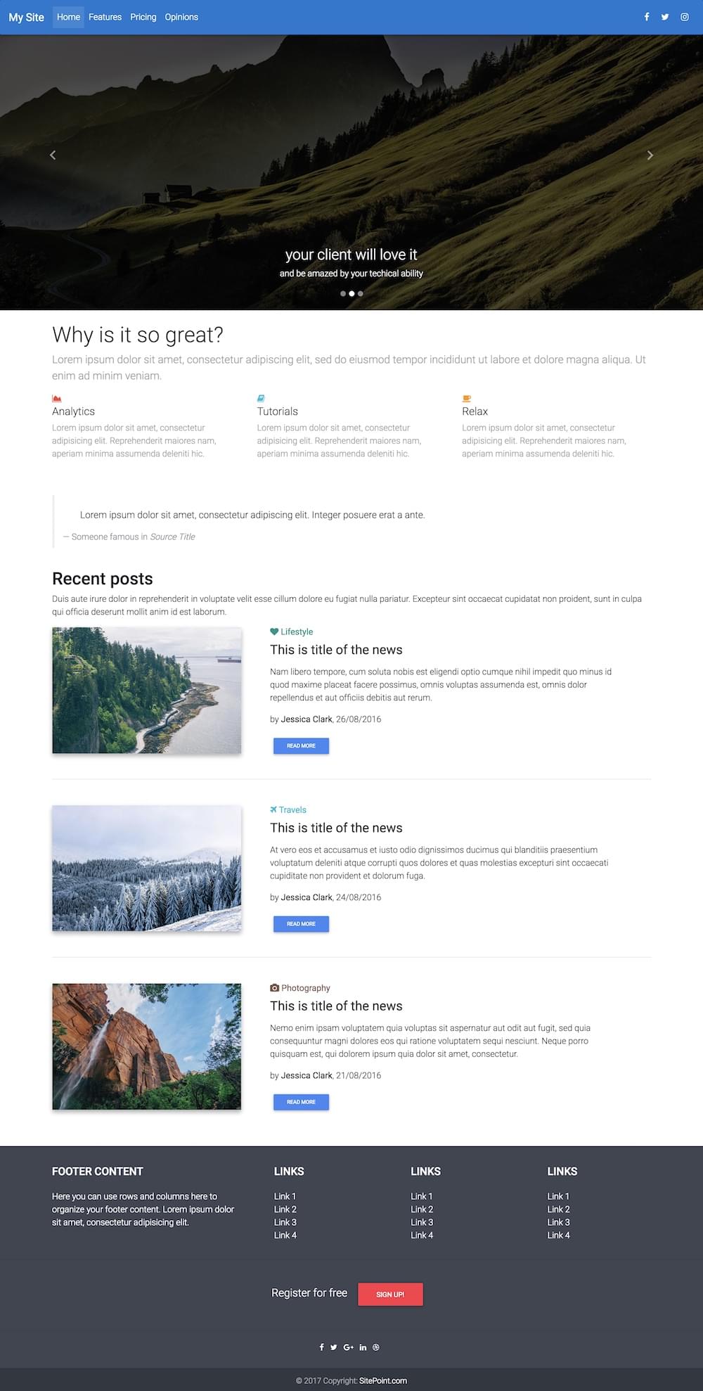
You can check out a live preview of our finished product here.
To create this, we’ll be incorporating a range of elements from Material Design for Bootstrap:
- navigation
- a carousel
- a feature overview section
- blockquote styling from the typography library
- a recent posts section
- a footer
Install Material Design for Bootstrap by downloading and extracting the ZIP file to an appropriate location on your PC. You can use any folder, since most pages will open in a browser directly from your file system. That said, I’d recommend you place them in a web server folder — especially if you intend to use JavaScript-powered components. If you don’t have a server installed, a quick option is http-server for Node.js (which exposes the current folder as a web root) or an all-in-one package such as XAMPP. Alternatively, you may be able to upload the files to your web host and edit there using a compatible editor such as codeanywhere.
Your First Material Design for Bootstrap Page
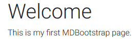
Open index.html in your web browser and you’ll see a home page with a welcome message:
Now open index.html in your text editor or IDE of choice (perhaps the fabulous and free VS Code or Atom). Delete the lines of HTML between:
<!-- Start your project here-->
and
<!-- /Start your project here-->
Then replace them with this:
<div class="container-fluid">

  <h1>Welcome</h1>
  <p>This is my first MDBootstrap page.</p>

</div>
The code defines a container which provides a margin and responds to the browser width. It contains a title and paragraph:
Copying HTML and CSS
You’re now ready to insert your own components. Head over to mdbootstrap.com and click the menu icon at the top left of the page. A long list of categorized components can be selected.
Most components require you to insert HTML into your page. Some also require additional CSS styles which should be copied and pasted into the (initially empty) css/style.css file. A link to this stylesheet is already provided in the HTML <head>:
<link href="css/style.css" rel="stylesheet">
Creating an Advanced Layout
Now we’ll start building the more advanced layout that we previewed at the start of the tutorial.
Make sure you revert back to an empty page by removing the code between:
<!-- Start your project here-->
and
<!-- /Start your project here-->
Add Navigation
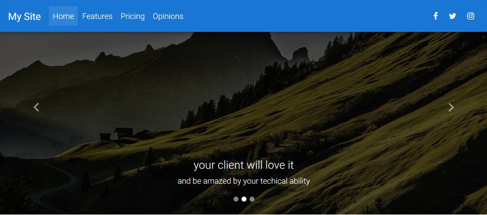
The MDBootstrap Layout / Navigation provides a variety of options which collapse to hamburger menus when space is limited. The Regular Fixed Navbar HTML can be copied into the page immediately after <!-- Start your project here-->.
I’ve added a couple of tweaks:
bg-pinkin thenavclass has been changed tobg-blue, and- the
Navbartitle has been changed toMy Site.
<!--Main Navigation-->
<header>
  <nav class="navbar fixed-top navbar-expand-lg navbar-dark bg-blue scrolling-navbar">
    <a class="navbar-brand" href="#"><strong>My Site</strong></a>
    <button class="navbar-toggler" type="button" data-toggle="collapse" data-target="#navbarSupportedContent" aria-controls="navbarSupportedContent" aria-expanded="false" aria-label="Toggle navigation">
        <span class="navbar-toggler-icon"></span>
    </button>
    <div class="collapse navbar-collapse" id="navbarSupportedContent">
      <ul class="navbar-nav mr-auto">
        <li class="nav-item active">
          <a class="nav-link" href="#">Home <span class="sr-only">(current)</span></a>
        </li>
        <li class="nav-item">
          <a class="nav-link" href="#">Features</a>
        </li>
        <li class="nav-item">
          <a class="nav-link" href="#">Pricing</a>
        </li>
        <li class="nav-item">
          <a class="nav-link" href="#">Opinions</a>
        </li>
      </ul>
      <ul class="navbar-nav nav-flex-icons">
          <li class="nav-item">
            <a class="nav-link"><i class="fa fa-facebook"></i></a>
          </li>
          <li class="nav-item">
            <a class="nav-link"><i class="fa fa-twitter"></i></a>
          </li>
          <li class="nav-item">
            <a class="nav-link"><i class="fa fa-instagram"></i></a>
          </li>
      </ul>
    </div>
  </nav>
</header>
<!--Main Navigation-->
The result:

Add a Carousel
I’m not a big fan of carousels, but clients usually love them. The MDBootstrap JavaScript / Carousel provides numerous options, but we’ll use the Basic Example by pasting the HTML immediately after the navigation menu:
<!--Carousel Wrapper-->
<div id="carousel-example-2" class="carousel slide carousel-fade" data-ride="carousel">
  <!--Indicators-->
  <ol class="carousel-indicators">
    <li data-target="#carousel-example-2" data-slide-to="0" class="active"></li>
    <li data-target="#carousel-example-2" data-slide-to="1"></li>
    <li data-target="#carousel-example-2" data-slide-to="2"></li>
  </ol>
  <!--/.Indicators-->
  <!--Slides-->
  <div class="carousel-inner" role="listbox">
    <div class="carousel-item active">
      <div class="view hm-black-light">
        <img class="d-block w-100" src="https://mdbootstrap.com/img/Photos/Slides/img%20(68).jpg" alt="First slide">
        <div class="mask"></div>
      </div>
      <div class="carousel-caption">
        <h3 class="h3-responsive">Yeah, so carousels are a bit "meh"</h3>
        <p>But...</p>
      </div>
    </div>
    <div class="carousel-item">
      <!--Mask color-->
      <div class="view hm-black-strong">
        <img class="d-block w-100" src="https://mdbootstrap.com/img/Photos/Slides/img%20(6).jpg" alt="Second slide">
        <div class="mask"></div>
      </div>
      <div class="carousel-caption">
        <h3 class="h3-responsive">your client will love it</h3>
        <p>and be amazed by your techical ability</p>
      </div>
    </div>
    <div class="carousel-item">
      <!--Mask color-->
      <div class="view hm-black-slight">
        <img class="d-block w-100" src="https://mdbootstrap.com/img/Photos/Slides/img%20(9).jpg" alt="Third slide">
        <div class="mask"></div>
      </div>
      <div class="carousel-caption">
        <h3 class="h3-responsive">Be prepared</h3>
        <p>to have money thrown at you!</p>
      </div>
    </div>
  </div>
  <!--/.Slides-->
  <!--Controls-->
  <a class="carousel-control-prev" href="#carousel-example-2" role="button" data-slide="prev">
    <span class="carousel-control-prev-icon" aria-hidden="true"></span>
    <span class="sr-only">Previous</span>
  </a>
  <a class="carousel-control-next" href="#carousel-example-2" role="button" data-slide="next">
    <span class="carousel-control-next-icon" aria-hidden="true"></span>
    <span class="sr-only">Next</span>
  </a>
  <!--/.Controls-->
</div>
<!--/.Carousel Wrapper-->
It’s a lot of code, but don’t be afraid to change the image src attributes, h3 titles and p paragraph text. You can also add or remove <div class="carousel-item"> blocks as necessary.
Save and refresh your page in the browser:
Adding Page Content
Our page now requires content. It’s best to place content components within a container so there’s a margin to the browser viewport:
<div class="container-fluid">
  <!-- page content here -->
</div>
Add a Feature Section to the Page Content
MDBootstrap’s Sections / Features is a good starting point because it describes the essential aspects of a product or service. Copy the Features v.1 code within the container <div> added above:
<!--Section: Features v.1-->
<section class="section feature-box">

  <!--Section heading-->
  <h1 class="section-heading pt-4">Why is it so great?</h1>
  <!--Section description-->
  <p class="section-description lead grey-text">Lorem ipsum dolor sit amet, consectetur adipiscing elit, sed do eiusmod tempor incididunt ut labore et dolore magna aliqua. Ut enim ad minim veniam.</p>

  <!--Grid row-->
  <div class="row features-big">

    <!--Grid column-->
    <div class="col-md-4 mb-r">
      <i class="fa fa-area-chart red-text"></i>
      <h5 class="feature-title">Analytics</h5>
      <p class="grey-text">Lorem ipsum dolor sit amet, consectetur adipisicing elit. Reprehenderit maiores nam, aperiam minima assumenda deleniti hic.</p>
    </div>
    <!--Grid column-->

    <!--Grid column-->
    <div class="col-md-4 mb-r">
      <i class="fa fa-book cyan-text"></i>
      <h5 class="feature-title">Tutorials</h5>
      <p class="grey-text">Lorem ipsum dolor sit amet, consectetur adipisicing elit. Reprehenderit maiores nam, aperiam minima assumenda deleniti hic.</p>
    </div>
    <!--Grid column-->

    <!--Grid column-->
    <div class="col-md-4 mb-r">
      <i class="fa fa-coffee orange-text"></i>
      <h5 class="feature-title">Relax</h5>
      <p class="grey-text">Lorem ipsum dolor sit amet, consectetur adipisicing elit. Reprehenderit maiores nam, aperiam minima assumenda deleniti hic.</p>
    </div>
    <!--Grid column-->

  </div>
  <!--Grid row-->

</section>
<!--Section: Features v.1-->
The result:

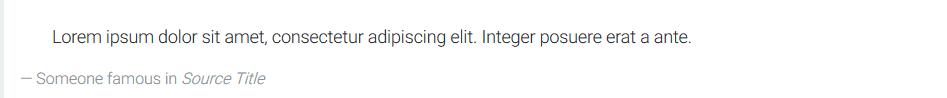
Add a Blockquote to Page Content
The MDBootstrap’s Content / Typography explains a range of text components including titles, paragraphs, and lists. We can use a blockquote section to add an inspirational quote to our page. The code should be placed immediately after feature section and remain within the container <div>:
<blockquote class="blockquote">
  <p class="mb-0">Lorem ipsum dolor sit amet, consectetur adipiscing elit. Integer posuere erat a ante.</p>
  <footer class="blockquote-footer">Someone famous in <cite title="Source Title">Source Title</cite></footer>
</blockquote>
Again, you can change the text to whatever you like then save and refresh:
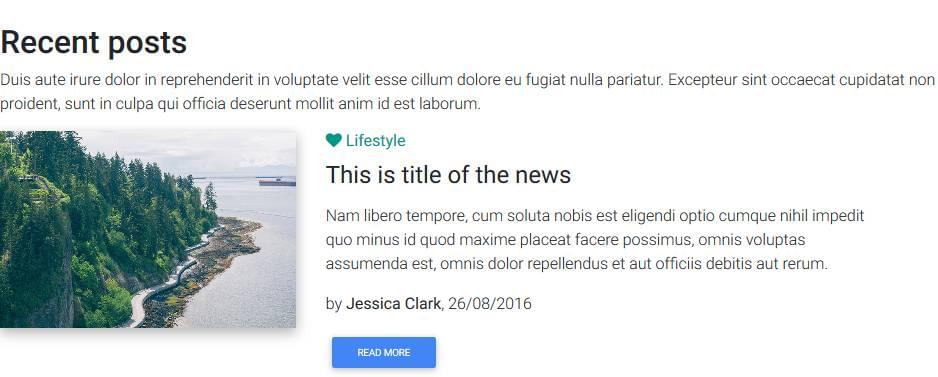
Add a Recent Posts Section to Page Content
MDBootstrap provides a variety of Blog listing sections. A reasonable choice for our example page is Blog Listing v.3. Copy the code immediately after the blockquote within the container <div>:
<!--Section: Blog v.3-->
<section class="section extra-margins pb-3 text-center text-lg-left">

  <!--Section heading-->
  <h2 class="section-heading h2 pt-4">Recent posts</h2>
  <!--Section description-->
  <p class="section-description">Duis aute irure dolor in reprehenderit in voluptate velit esse cillum dolore eu fugiat nulla pariatur. Excepteur sint occaecat cupidatat non proident, sunt in culpa qui officia deserunt mollit anim id est laborum.</p>

  <!--Grid row-->
  <div class="row">

    <!--Grid column-->
    <div class="col-lg-4 mb-4">
      <!--Featured image-->
      <div class="view overlay hm-white-slight z-depth-1-half">
        <img src="https://mdbootstrap.com/img/Photos/Others/img (38).jpg" class="img-fluid" alt="First sample image">
        <a>
          <div class="mask"></div>
        </a>
      </div>
    </div>
    <!--Grid column-->

    <!--Grid column-->
    <div class="col-lg-7 ml-xl-4 mb-4">
      <!--Excerpt-->
      <a href="" class="teal-text"><h6 class="pb-1"><i class="fa fa-heart"></i><strong> Lifestyle </strong></h6></a>
      <h4 class="mb-3"><strong>This is title of the news</strong></h4>
      <p>Nam libero tempore, cum soluta nobis est eligendi optio cumque nihil impedit quo minus id quod maxime placeat facere possimus, omnis voluptas assumenda est, omnis dolor repellendus et aut officiis debitis aut rerum.</p>
      <p>by <a><strong>Jessica Clark</strong></a>, 26/08/2016</p>
      <a class="btn btn-primary btn-sm">Read more</a>
    </div>
    <!--Grid column-->

  </div>
  <!--Grid row-->

  <hr class="mb-5">

  <!--Grid row-->
  <div class="row mt-3">

    <!--Grid column-->
    <div class="col-lg-4 mb-4">
      <!--Featured image-->
      <div class="view overlay hm-white-slight z-depth-1-half">
        <img src="https://mdbootstrap.com/img/Photos/Others/forest-sm.jpg" class="img-fluid" alt="Second sample image">
        <a>
          <div class="mask"></div>
        </a>
      </div>
    </div>
    <!--Grid column-->

    <!--Grid column-->
    <div class="col-lg-7 ml-xl-4 mb-4">
      <!--Excerpt-->
      <a href="" class="cyan-text"><h6 class="pb-1"><i class="fa fa-plane"></i><strong> Travels</strong></h6></a>
      <h4 class="mb-3"><strong>This is title of the news</strong></h4>
      <p>At vero eos et accusamus et iusto odio dignissimos ducimus qui blanditiis praesentium voluptatum deleniti atque corrupti quos dolores et quas molestias excepturi sint occaecati cupiditate non provident et dolorum fuga.</p>
      <p>by <a><strong>Jessica Clark</strong></a>, 24/08/2016</p>
      <a class="btn btn-primary btn-sm">Read more</a>
    </div>
    <!--Grid column-->

  </div>
  <!--Grid row-->

  <hr class="mb-5">

  <!--Grid row-->
  <div class="row">

    <!--Grid column-->
    <div class="col-lg-4 mb-4">
      <!--Featured image-->
      <div class="view overlay hm-white-slight z-depth-1-half">
        <img src="https://mdbootstrap.com/img/Photos/Others/img (35).jpg" class="img-fluid" alt="Third sample image">
        <a>
          <div class="mask"></div>
        </a>
      </div>
    </div>
    <!--Grid column-->

    <!--Grid column-->
    <div class="col-lg-7 ml-xl-4 mb-4">
      <!--Excerpt-->
      <a href="" class="brown-text"><h6 class="pb-1"><i class="fa fa-camera"></i><strong> Photography</strong></h6></a>
      <h4 class="mb-3"><strong>This is title of the news</strong></h4>
      <p>Nemo enim ipsam voluptatem quia voluptas sit aspernatur aut odit aut fugit, sed quia consequuntur magni dolores eos qui ratione voluptatem sequi nesciunt. Neque porro quisquam est, qui dolorem ipsum quia dolor sit amet, consectetur.</p>
      <p>by <a><strong>Jessica Clark</strong></a>, 21/08/2016</p>
      <a class="btn btn-primary btn-sm">Read more</a>
    </div>
    <!--Grid column-->

  </div>
  <!--Grid row-->

</section>
<!--Section: Blog v.3-->
Change the titles, text and images to whatever you require then save and refresh:
Add a Footer
A range of page footers can be found in MDBootstrap’s Components / Footer section. I’ve chosen the Advanced Footer. The code must be placed immediately before the closing and be careful not to place it within the content container <div>:
<!--Footer-->
<footer class="page-footer center-on-small-only stylish-color-dark">

  <!--Footer Links-->
  <div class="container">
    <div class="row">

      <!--First column-->
      <div class="col-md-4">
        <h5 class="title mb-4 mt-3 font-bold">Footer Content</h5>
        <p>Here you can use rows and columns here to organize your footer content. Lorem ipsum dolor sit
          amet, consectetur adipisicing elit.</p>
      </div>
      <!--/.First column-->

      <hr class="clearfix w-100 d-md-none">

      <!--Second column-->
      <div class="col-md-2 mx-auto">
        <h5 class="title mb-4 mt-3 font-bold">Links</h5>
        <ul>
          <li><a href="#!">Link 1</a></li>
          <li><a href="#!">Link 2</a></li>
          <li><a href="#!">Link 3</a></li>
          <li><a href="#!">Link 4</a></li>
        </ul>
      </div>
      <!--/.Second column-->

      <hr class="clearfix w-100 d-md-none">

      <!--Third column-->
      <div class="col-md-2 mx-auto">
        <h5 class="title mb-4 mt-3 font-bold">Links</h5>
        <ul>
          <li><a href="#!">Link 1</a></li>
          <li><a href="#!">Link 2</a></li>
          <li><a href="#!">Link 3</a></li>
          <li><a href="#!">Link 4</a></li>
        </ul>
      </div>
      <!--/.Third column-->

      <hr class="clearfix w-100 d-md-none">

      <!--Fourth column-->
      <div class="col-md-2 mx-auto">
        <h5 class="title mb-4 mt-3 font-bold ">Links</h5>
        <ul>
          <li><a href="#!">Link 1</a></li>
          <li><a href="#!">Link 2</a></li>
          <li><a href="#!">Link 3</a></li>
          <li><a href="#!">Link 4</a></li>
        </ul>
      </div>
      <!--/.Fourth column-->
    </div>
  </div>
  <!--/.Footer Links-->

  <hr>

  <!--Call to action-->
  <div class="call-to-action">
    <ul>
      <li>
        <h5 class="mb-1">Register for free</h5>
      </li>
      <li><a href="" class="btn btn-danger btn-rounded">Sign up!</a></li>
    </ul>
  </div>
  <!--/.Call to action-->

  <hr>

  <!--Social buttons-->
  <div class="social-section text-center">
    <ul>

      <li><a class="btn-floating btn-sm btn-fb"><i class="fa fa-facebook"> </i></a></li>
      <li><a class="btn-floating btn-sm btn-tw"><i class="fa fa-twitter"> </i></a></li>
      <li><a class="btn-floating btn-sm btn-gplus"><i class="fa fa-google-plus"> </i></a></li>
      <li><a class="btn-floating btn-sm btn-li"><i class="fa fa-linkedin"> </i></a></li>
      <li><a class="btn-floating btn-sm btn-dribbble"><i class="fa fa-dribbble"> </i></a></li>

    </ul>
  </div>
  <!--/.Social buttons-->

  <!--Copyright-->
  <div class="footer-copyright">
    <div class="container-fluid">
      © 2017 Copyright: <a href="https://www.sitepoint.com"> SitePoint.com </a>
    </div>
  </div>
  <!--/.Copyright-->

</footer>
<!--/.Footer-->
Change the links and text as necessary then save and refresh:

Our page is now complete. The whole creation took no more than a few minutes — although remember to spare some time to change the default text and upload your creation to a suitable web host!
More Information About Material Design for Bootstrap
For more information, refer to Material Design for Bootstrap and watch the five-minute “Quick Start” tutorial. A number of free tutorials are also available, including:
The 400 components in the free edition provide a no-obligation way to assess the system before you upgrade to the commercial PRO edition.
🚨 SitePoint readers can get 10% off the price of PRO by using the code sitepoint at the checkout! 🚨
If you’ve got the basics of Bootstrap under your belt but are wondering how to take your Bootstrap skills to the next level, check out our Building Your First Website with Bootstrap 4 course for a quick and fun introduction to the power of Bootstrap.
Frequently Asked Questions (FAQs) on Material Design for Bootstrap
What is Material Design for Bootstrap?
Material Design for Bootstrap is a powerful and free UI toolkit based on Bootstrap 4 that allows you to implement Google’s Material Design with ease. It includes over 5000 components, dozens of plugins, and a variety of pre-built templates. This toolkit is designed to make your web development process faster and easier, offering responsive design and style across various devices.
How can I get started with Material Design for Bootstrap?
To get started with Material Design for Bootstrap, you need to first download the package from the official website or install it via npm. Once installed, you can import the Material Design CSS and JavaScript files into your project. The toolkit also comes with a variety of pre-built templates and components that you can use to design your website.
What are the key features of Material Design for Bootstrap?
Material Design for Bootstrap comes with a variety of features that make it a powerful tool for web development. These include over 5000 components, dozens of plugins, and a variety of pre-built templates. It also offers responsive design and style, making your website look good on various devices. Additionally, it is based on Bootstrap 4, one of the most popular front-end frameworks.
Can I use Material Design for Bootstrap with other front-end frameworks?
Material Design for Bootstrap is specifically designed to work with Bootstrap 4. However, it can be used with other front-end frameworks with some modifications. It’s important to note that some features may not work as expected when used with other frameworks.
Is Material Design for Bootstrap free to use?
Yes, Material Design for Bootstrap is free to use. It is an open-source project, meaning you can use it for both personal and commercial projects without any restrictions. However, there is also a pro version available that offers additional features and components.
How can I customize the components in Material Design for Bootstrap?
Material Design for Bootstrap comes with a variety of customizable components. You can customize these components by overriding the default styles with your own CSS. The toolkit also includes a variety of pre-built templates that you can customize to fit your needs.
What kind of support is available for Material Design for Bootstrap?
Material Design for Bootstrap offers a variety of support options. There is a comprehensive documentation available that covers all aspects of the toolkit. Additionally, there is a community forum where you can ask questions and get help from other users. For more complex issues, you can also contact the developers directly.
Can I contribute to the Material Design for Bootstrap project?
Yes, Material Design for Bootstrap is an open-source project and welcomes contributions from the community. You can contribute by reporting bugs, suggesting new features, or even contributing code. All contributions are appreciated and help make the toolkit better for everyone.
How often is Material Design for Bootstrap updated?
Material Design for Bootstrap is regularly updated with new features, bug fixes, and improvements. The developers are committed to keeping the toolkit up-to-date with the latest trends in web development.
What are the system requirements for using Material Design for Bootstrap?
Material Design for Bootstrap is a front-end toolkit, so it doesn’t have any specific system requirements. However, you will need a modern web browser that supports HTML5, CSS3, and JavaScript. Additionally, you will need a text editor to write your code and a server to host your website.
 Craig Buckler
Craig is a freelance UK web consultant who built his first page for IE2.0 in 1995. Since that time he's been advocating standards, accessibility, and best-practice HTML5 techniques. He's created enterprise specifications, websites and online applications for companies and organisations including the UK Parliament, the European Parliament, the Department of Energy & Climate Change, Microsoft, and more. He's written more than 1,000 articles for SitePoint and you can find him @craigbuckler.