How to use a jQuery Sortable UI Component in Your Web App

Learn how to easily integrate a sortable component into your web app. Sortable is ideal for editing playlists, or anywhere else you want to drag and drop an existing list.
In the last episode, we talked about the Kendo UI Slider component, which lets users select values from a range of values. In this episode, we will learn about the Sortable component. The Sortable component allows users to reorder a list of elements by making each item draggable and droppable. This functionality can be used to edit a playlist or rearrange the rows and columns of a spreadsheet. Because the Sortable component works on an existing list, it is ideal to use with other Kendo UI components that are lists like the ListView and TabStrip components. Coming up, you will see how to use the Sortable component to reorder records in a table and how to integrate it with the Grid component.
Making a Table Sortable
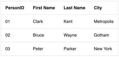
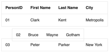
First, we will create a table element with four fields in the header and three records in the body. The records will only be draggable so we will initialize the Sortable widget on the tbody element. By default, when you click on a row and drag it, the placeholder will be empty and the hint will be a copy of the row you are moving. The placeholder is what is seen in the location the item is to be dropped into. The hint is what is dragged along with the cursor. This is an example of a table that has been made sortable:


<!DOCTYPE html>
<html>
  <head>
    <meta charset="utf-8">
    <title>Sortable</title>
    <link rel="stylesheet" href="https://kendo.cdn.telerik.com/2018.2.620/styles/kendo.bootstrap-v4.min.css">
    <script src="https://code.jquery.com/jquery-1.12.3.min.js"></script>
    <script src="https://kendo.cdn.telerik.com/2018.2.620/js/kendo.all.min.js"></script>
    <style>
      body {font-family: helvetica;}
      table, tr {border: 1px solid #ddd; border-collapse: collapse;}
      td, th {padding: 1em; text-align: left;}
    </style>
  </head>
   <body>
    <table id="grid">
      <thead>
        <tr>
          <th>PersonID</th>
          <th>First Name</th>
          <th>Last Name</th>
          <th>City</th>
        </tr>
      </thead>
      <tbody>
        <tr>
          <td>01</td>
          <td>Clark</td>
          <td>Kent</td>
          <td>Metropolis</td>
        </tr>
        <tr>
          <td>02</td>
          <td>Bruce</td>
          <td>Wayne</td>
          <td>Gotham</td>
        </tr>
        <tr>
          <td>03</td>
          <td>Peter</td>
          <td>Parker</td>
          <td>New York</td>
        </tr>
      </tbody>
    </table>
    <script>
      $(document).ready(function(){
        $('tbody').kendoSortable();
      });
    </script>
  </body>
</html>
Right now, it doesn’t look so nice having an empty space left behind when we move a row. Also, there is nothing indicating to the user that they are dragging the item because the cursor remains an arrow. We will see how to customize these features in the component’s API next.
Customizing the Sortable Table
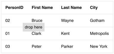
In the previous example, we used the tbody element to initialize the component. In the next example, we will use the table element as the container which we gave the id grid. Using the id of the root element for the sortable component is preferable when your list has been created with another Kendo UI component. In this case, the same element used to initialize the component would be used to make the component sortable. In this example, we will change our cursor to use a move icon. Then we will make the placeholder show the table row that we are dragging. Last, our hint will be changed to show a message that says “drop here.” Here is the updated code:

$('#grid').kendoSortable({
  cursor: 'move',
  cursorOffset: {top: 10, left: 30},
  container: '#grid tbody',
  filter: '>tbody >tr',
  placeholder: function(element) {
    return element.clone()
  },
  hint: '<span class="hint">drop here</span>'
});
Since the direct descendants of the table element, the thead and tbody, are not the elements we want to sort, we have to specify what the sortable items are. This is defined in the filter option. For the placeholder option, a function is used so we can get access to the draggable element’s jQuery object. For the hint, we used a string. Finally, the container option is used to set the boundaries where the hint can move around. By default, the hint will be able to move anywhere the cursor can move.
Making a Grid Sortable
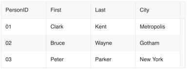
Last, we will look at how to integrate the Kendo UI Grid component with the Sortable component. First, we will make our table into a grid. We could use the same markup from our previous examples to initialize the grid. However, I will demonstrate another way to make a grid. We will abstract the data from the table’s HTML and put it into the grid’s dataSource. Then, we will define the header fields in the columns parameter. This is the new code for the grid:
<div id="grid"></div>
<script>
$(document).ready(function(){
  var grid = $('#grid').kendoGrid({
    columns: [
      { field: 'PersonID' },
      { field: 'First' },
      { field: 'Last' },
      { field: 'City' }
    ],
    dataSource: [
      {
        PersonID: '01',
        First: 'Clark',
        Last: 'Kent',
        City: 'Metropolis'
      },
      {
        PersonID: '02',
        First: 'Bruce',
        Last: 'Wayne',
        City: 'Gotham'
      },
      {
        PersonID: '03',
        First: 'Peter',
        Last: 'Parker',
        City: 'New York'
      }
    ]
  }).data('kendoGrid');
});
</script>
We can reuse the same parameters from our sortable component like so:
grid.table.kendoSortable({
  container: '#grid tbody',
  filter: '>tbody >tr',
  hint: function(element) {
    return $('<span class="hint">drop here</span>')
  },
  cursor: 'move',
  cursorOffset: {top: 10, left: 30},
  placeholder: function(element) {
    return element.clone()
  },
});

Summary
In this lesson, you saw how to take a table and make it sortable, how to make the table into a grid, and how to make the grid sortable. There are other ways you can use the Sortable component like dragging and dropping items into other lists. This is possible by specifying the other container in the connectWith option.
In the next episode, we will explore this feature in depth by building a Trello clone. Our Trello clone will be a UI built with the Sortable component and other Kendo UI components.
Try out Kendo UI for Yourself
Want to start taking advantage of the more than 70+ ready-made Kendo UI components, like the Grid or Scheduler? You can begin a free trial of Kendo UI today and start developing your apps faster.
Angular, React, and Vue Versions
Looking for UI component to support specific frameworks? Check out Kendo UI for Angular, KendoReact, or Kendo UI for Vue.
Resources

Alberta Williams
Alberta is a software developer and writer from New Orleans. Learn more about Alberta at github.com/albertaw.
