
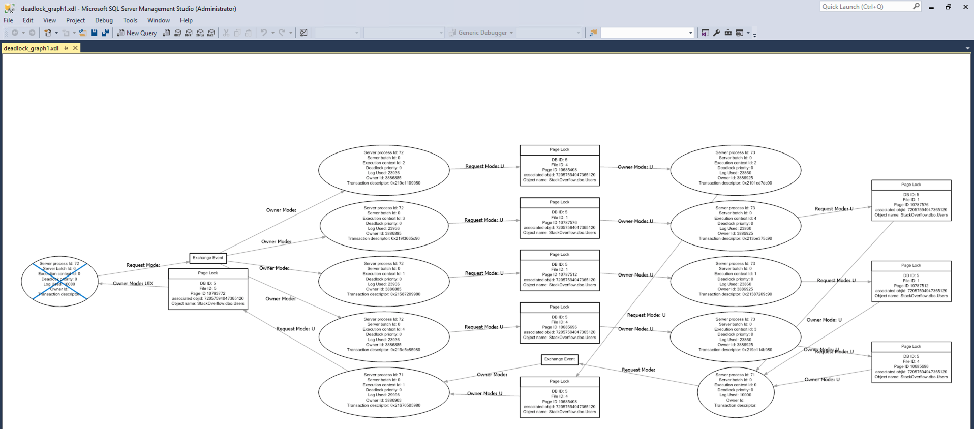
In SQL Server Management Studio, plain ol’ deadlock graphs look like this:
BOOOOO-RING. That’s why I prefer opening deadlock graphs in SentryOne Plan Explorer, which presents a much better visual in the form of a circle…a circle, let’s just stop there:
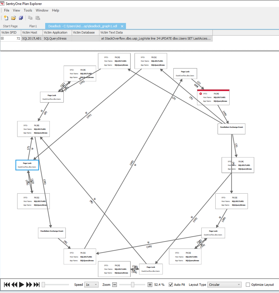
And Plan Explorer even has several different ways it can visualize deadlocks – hit the Layout Type dropdown at the bottom to choose:
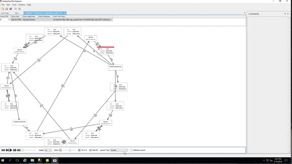
However, during the last Mastering Index Tuning class, @Dan_Clemens pointed out the Play button at the bottom – somehow I’d totally missed that over the years! Check this out:

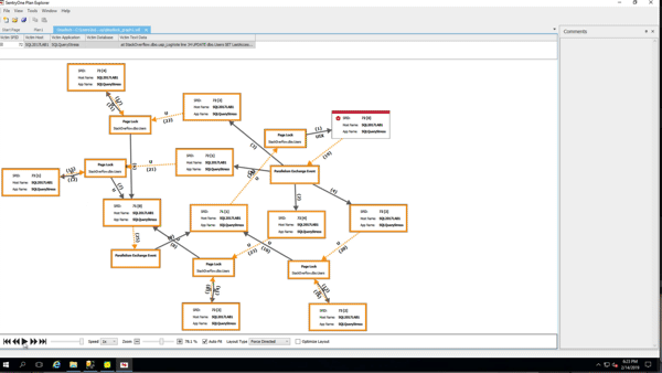
And all of the layouts support playback, too! Here’s playback in the Force Directed layout:
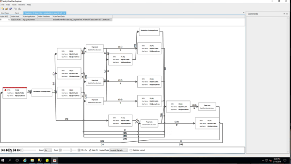
And in the Layered Digraph:
Somehow, that makes troubleshooting deadlocks suck just a little less. Thanks, Dan!

8 Comments. Leave new
I just discovered that earlier this week! It’s been amazingly helpful to step through and see the order of what’s happening.
There is also an “OptimizeLayout” checkbox down to the right. This removes all of the threads/nodes that aren’t directly involved with the deadlock. I had a deadlock showing over a hundred nodes and this reduced it to the 10 or so that were causing the issue.
This all changed just last year. So you’re off the hook Brent and didn’t didn’t totally miss that over the years. The team at SentryOne is awesome and I love their tools!! Thanks for highlighting just one aspect of this amazing tool they offer at no cost and completely spam free!! Here is Aaron’s blog about the updates. https://blogs.sentryone.com/aaronbertrand/new-deadlock-visualizations-in-sql-sentry-and-plan-explorer/
(disclosure: I do not work for SentryOne just a regular DBA that is a satisfied customer) haha!
Brent, I don’t know how you have the time to write so many blog posts.
But I appreciate them very much!
Brian
Hahaha, thanks!
This is really awesome and perfect timing as I am troubleshooting some deadlocks today.
How can I save a deadlock graph, when the deadlocks occurs randomly (depending who did what at which time), so that I can’t trace it in the profiler? I have the deadlock traceflag enabled, and see the deadlocks in the error log / Monitor software, but I have no idea how to create a graph that potentially would help me more than just to know which statement / SID produced the log
Hi Thomas – if you’re on SQL 2008 or higher, deadlocks graphs are captured automatically by the built-in System Health extended events session: https://matthewmcgiffen.com/2018/08/01/using-the-built-in-system-health-session/ You can save the XML for a deadlock as an XDL file and then you’ll be able to open it in Plan Explorer
Try sp_BlitzLock.