
- 5 Critical Elements that Lead You to an Award-Winning Design
- #2 Text: Keep It to the Minimum & Make It Easy to Read
- #3 Visuals: Identify the Right Patterns & Use Negative Space Wisely
- #4 Navigation: Make It Easy to Navigate & Entertaining to Scroll
- #5 Call to Action: Identify the Correct CTA & Don’t Be Afraid to Use It
- Wrapping It Up
- Frequently Asked Questions about Building Award-Winning One-Page Websites
This sponsored article was created by our content partner, BAW Media. Thank you for supporting the partners who make SitePoint possible.
Is your next project a one-page website? You might think designing it would be an easy task compared to the multi-page website designs. You’re in for a surprise.
Making a one-pager both visually appealing and user-friendly is harder than you think. The design effort alone could be a factor of 10 times greater than you normally put into a multi-page site. This is of the challenges involved in designing a one-pager. For example, you need to stuff a lot of valuable information into a much smaller space in a way that won’t turn users off
5 Critical Elements that Lead You to an Award-Winning Design
This guide is centered about 5 critical elements you need to take into account. It will help your one-pager become a success. They’re somewhat akin to fire, earth, water, air, and spirit, the 5 fundamental elements of nature. But they’re much more important for your purposes.
#1 The Goal: First and Foremost – Identify the Website’s Goal & Work Toward It
There’s no sense in starting a design phase if you haven’t settled upon an understanding of what you aim to achieve. That’s step one.
Step 2 is to take your understanding and plan the entire website structure around it.
It’s also worth noting that for a one-page website you’ll want to be driving the user journey toward a single goal.
What would this goal be? It could be:
- to recommend or sell something
- to announce an event
- to introduce and present your portfolio
- or, for any other single reason.
Now, you’re ready to start. Once you do, you’ll want to keep asking yourself what might chase visitors away and how to keep that from happening.
Any design approach that drags page load speed down can turn users off. Using parallax effects for example:
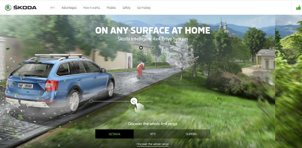
This website’s interactive effects are above the fold and they don’t drag down the page’s load speed.
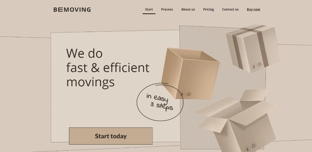
The static image in this BeTheme pre-built one-pager appears to be dynamic. As such, it doesn’t affect page load speed.
In this example, tiny animated items liven up this page without slowing anything down.
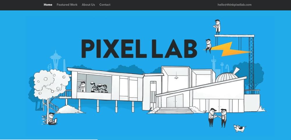
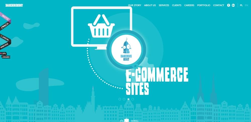
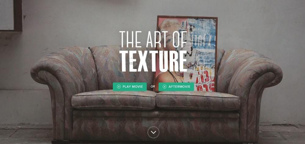
This page’s fresh look is a selling point in itself.

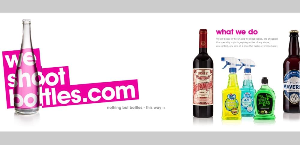
This Sheerlink page provides illustrates the important role large images and sliding panels can play in engaging users.
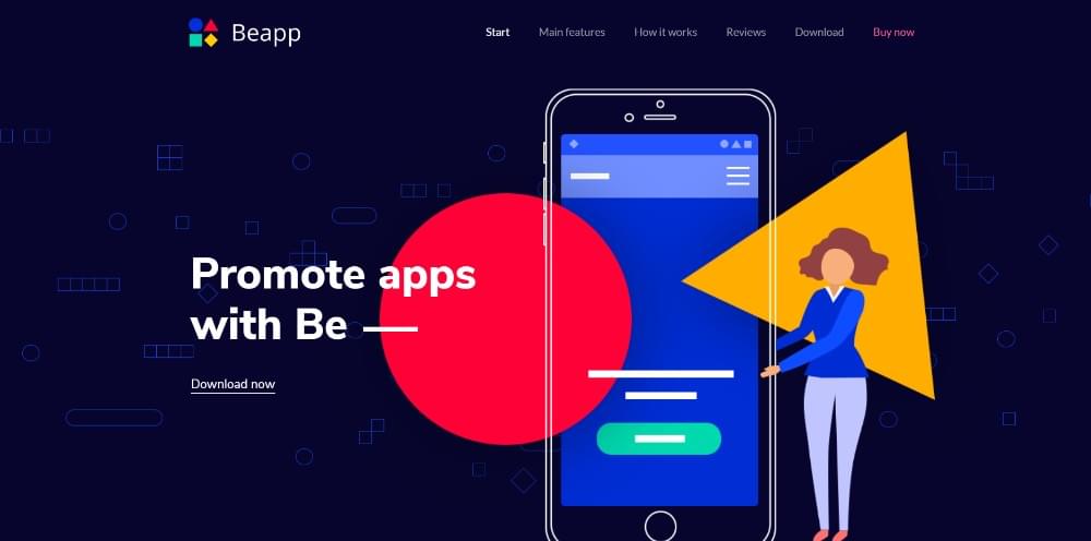
You don’t have to rely on a lengthy technical discourse to promote an app when a genuinely cool presentation featuring vivid colors will do the trick.
#2 Text: Keep It to the Minimum & Make It Easy to Read
Incorporating lengthy blocks of descriptive text in a one-page website is a no-no. It is a surefire way to send visitors elsewhere. You need to strip information down to the minimum amount necessary to get the message across. You can accomplish that by using bold headlines, bullet lists, and brief paragraphs.
A good approach is to separate the page into easy-to-follow sections. Use visuals and text together in a section – like in these examples:
This one-pager’s layout is so entertaining you’ll want to go through every section – at least once.
Neatly organized. Enough said.
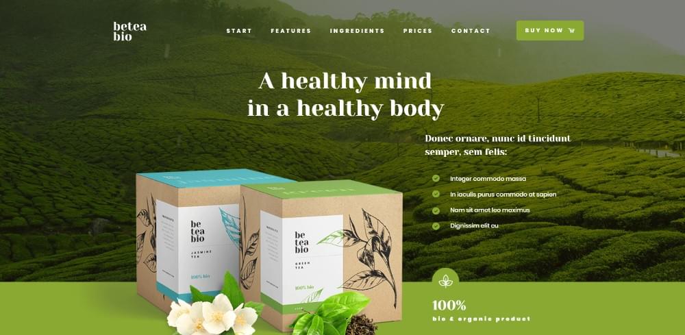
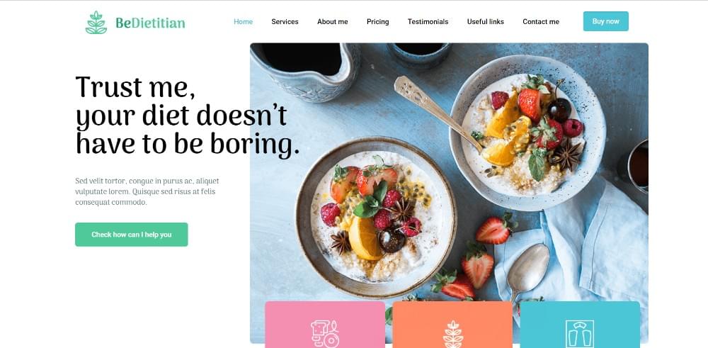
All the core information is above the fold, and bullet lists are employed to keep the message concise.
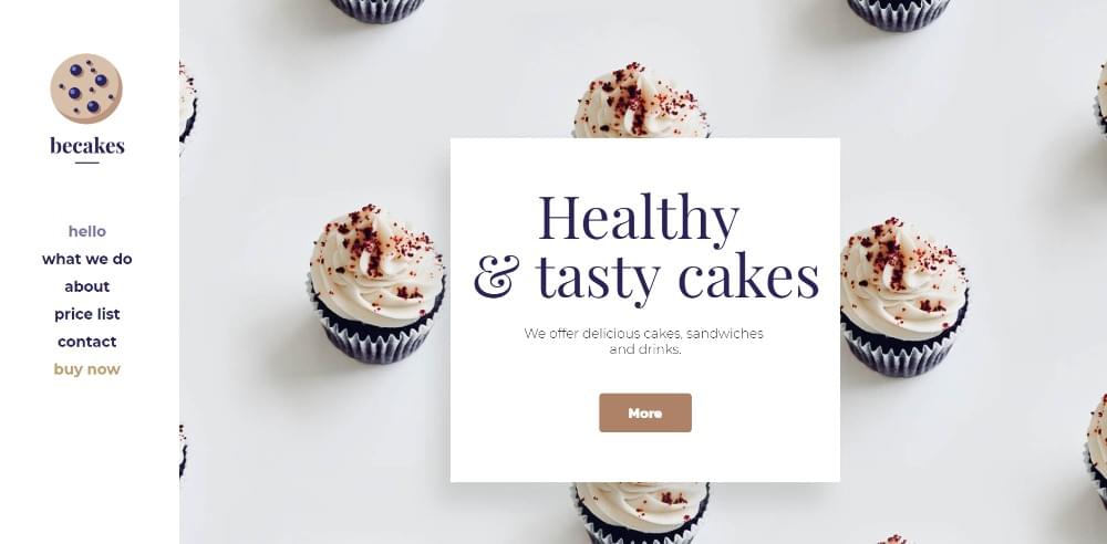
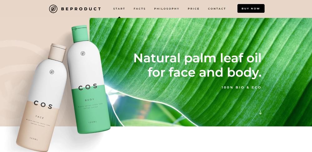
A good example of how large attractive images help make sales when accompanied by concise, descriptive text.

When a vehicle has the stature of a Mercedes-Benz, high quality images accompanied by a minimal amount of text will usually suffice.
#3 Visuals: Identify the Right Patterns & Use Negative Space Wisely
People read text in an F pattern and scan visuals in a Z pattern. Keep this in mind when you mix text and images. It will help you maintain a flow that directs users to the critical content. This is where white space can be used to your advantage. Use it to make text easier to read, to separate sections, and to keep people engaged and curious.

An excellent example of how white space can be used to create the impression of order.
Using white space as a canvas, this website designer produced wildly creative results.
This pre-built website’s use of white space gives an impression of order and makes the different sections stand out.
There’s nothing wrong with using a variety of design principles to the max to create an amazing visual splash like the one shown in this example.
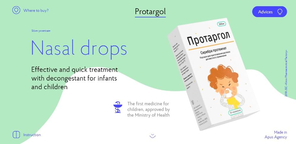
When was the last time you found a page promoting nasal drops exciting? Thanks to an ingenious use of slides, white space, and animations, this one-pager breaks the mold.
#4 Navigation: Make It Easy to Navigate & Entertaining to Scroll
We tend to think of navigation in purely mechanical terms. This makes it rather easy to create a system that instead of helping people can drive them off the page.
The key to keeping visitors engaged is to use a sidebar menu. Or, you can use a horizontal sticky menu as an alternative method. The goal should be to enable people to easily jump to a section of interest with a single click
An auto-scrolling nav link is another alternative. It’s effective and can even be entertaining.
Here are several examples of user-friendly navigation:

This designer’s website makes effective use of 3 auto-scrolling links.
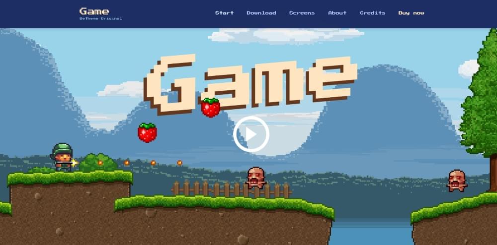
Be Game offers its visitors an entertaining approach to their navigation experience.
Three things stand out in this pre-built website; its color scheme and layout structure, and how to scan the page with 3 mouse scrolls.
Menus on the top and on the left help to navigate this site quickly.
#5 Call to Action: Identify the Correct CTA & Don’t Be Afraid to Use It
This design element is closely tied to #1, identifying a website’s goal. Once you know what you want the website to achieve, you shouldn’t have to hesitate to put CTA buttons to work. It’s especially easy to do with a one-pager since you’re normally directing people toward a single action. There can be exceptions of course.

This pre-built website’s CTA button is above the fold. There’s also one in the menu.
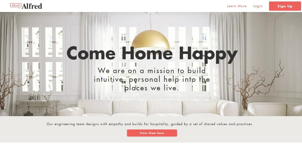
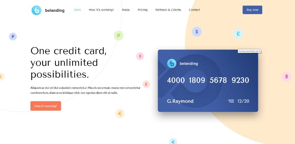
Two CTA buttons placed above the fold give users a choice as to what they want to see.

Pyrismic uses a simple opt-in form along with a bold CTA button.
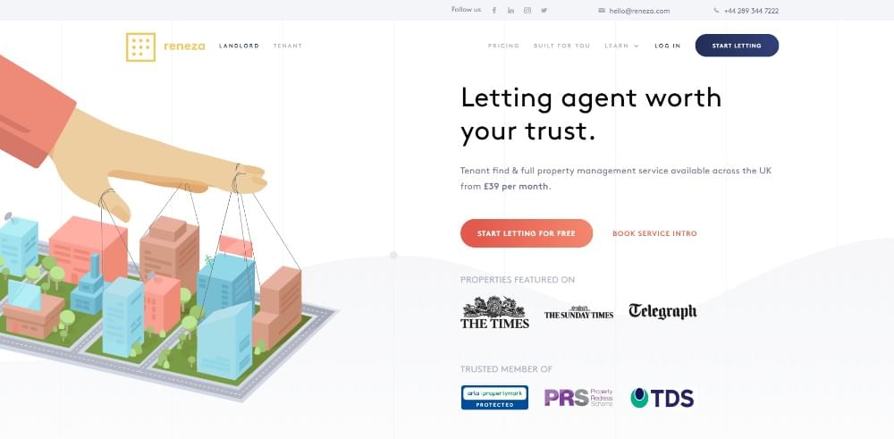
Reneza doesn’t fool around when working with CTA buttons, but they choose their colors and text sizes carefully.
Wrapping It Up
Now, you’ve been introduced to the 5 critical elements of one-page website design. You’ll want to work with them until you master the art of using them.
They may seem simple. You’ll discover that combining them effectively in a long form one-pager is hard work.
The good news is you can use pre-built websites. They have already incorporated these 5 elements into their designs. An excellent pre-built website resource is Be Theme It has an extensive library of over 60 one-pagers and 400+ pre-built websites of all kinds. You can customize any of them to fit your needs.
Frequently Asked Questions about Building Award-Winning One-Page Websites
What are the key elements to consider when designing a one-page website?
The key elements to consider when designing a one-page website include a clear and concise message, intuitive navigation, engaging visuals, compelling call-to-action, and responsive design. These elements ensure that your website is user-friendly, visually appealing, and effective in achieving its purpose.
How can I make my one-page website visually appealing?
To make your one-page website visually appealing, you can use high-quality images, videos, and infographics. You can also use a consistent color scheme and typography that aligns with your brand identity. Additionally, you can use white space effectively to make your content more readable and to highlight important elements on your page.
How can I ensure that my one-page website is user-friendly?
To ensure that your one-page website is user-friendly, you can use intuitive navigation that allows users to easily find the information they need. You can also use responsive design to ensure that your website looks good and functions well on all devices. Additionally, you can use clear and concise content to communicate your message effectively.
What is a compelling call-to-action and how can I create one for my one-page website?
A compelling call-to-action (CTA) is a prompt that encourages users to take a specific action, such as signing up for a newsletter, downloading a resource, or making a purchase. To create a compelling CTA for your one-page website, you can use persuasive language, a clear value proposition, and a visually striking design.
How can I optimize my one-page website for search engines?
To optimize your one-page website for search engines, you can use SEO best practices such as using relevant keywords in your content, meta tags, and alt tags. You can also use a clean and simple URL structure, and ensure that your website loads quickly. Additionally, you can use high-quality backlinks to improve your website’s authority and visibility in search engine results.
What are the benefits of having a one-page website?
One-page websites offer several benefits, including simplicity, ease of navigation, and the ability to focus on a single product, service, or idea. They are also easier to maintain and update compared to multi-page websites.
How can I measure the success of my one-page website?
You can measure the success of your one-page website by using analytics tools to track metrics such as traffic, bounce rate, conversion rate, and user engagement. These metrics can provide insights into how users are interacting with your website and whether it is achieving its objectives.
Can I use a one-page website for e-commerce?
Yes, you can use a one-page website for e-commerce. However, it is important to ensure that your website is designed to facilitate easy and secure transactions, and that it provides all the necessary information about your products or services.
What are some common mistakes to avoid when designing a one-page website?
Some common mistakes to avoid when designing a one-page website include cluttering the page with too much information, using confusing navigation, not optimizing for mobile devices, and not including a clear call-to-action.
How can I make my one-page website stand out from the competition?
To make your one-page website stand out from the competition, you can use unique and engaging visuals, compelling content, and innovative design elements. You can also offer a unique value proposition and ensure that your website provides a seamless user experience.
 SitePoint Sponsors