by Mandi Cai
Charting the waters (pt. 2): a comparison of JavaScript charting libraries
A deep dive into D3.js, Dygraphs, Chart.js, and Google Charts
The code for the charts I created in the header image is up on GitHub.
When I began creating charts and visualizing data, the only things I knew were “Consider Canvas for large datasets” and “D3 is magic”. I had no idea that there existed an entire ecosystem of charting libraries. These libraries are free, available, and complete with examples and documentation.
More importantly, each library has its own pros and cons with regards to the variety of charts, learning curve, level of customization, and out-of-the-box interactivity. So how does one decide?
I’ll compare a few popular JavaScript charting libraries in this article, specifically D3.js, Dygraphs, Chart.js, and Google Charts. Expect to learn how to create a JavaScript chart, a high-level comparison across libraries of the aforementioned factors (variety of charts, customization, etc.), and the use case I perceive to be best suited to each charting library.
But first, a quick introduction to why visualizing data is becoming increasingly important. You’re welcome to skip to the side-by-side comparison (Ctrl+F “Let’s compare!”).
Why chart and visualize data?
I’ve always thought of data visualizations as a better way to learn and engage an audience. Not everyone is a natural at absorbing information through text. My eyes glaze over when trying to extract numbers from a block of words. Text also assumes you’re familiar with the language it’s written in. I struggled with textbook readings in college. It’s plausible that non-native English speakers were having a hard time as well.
Alternatively, whenever I came across a beautiful, clarifying diagram amidst the piles of information, I immediately grasped the concepts and remembered them better too.
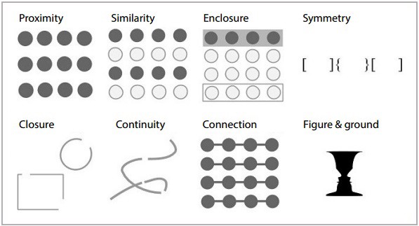
Our minds are not wired to quickly and thoroughly understand large chunks of text or piles of Excel rows. But what they do excel at is recognizing similarity, symmetry, connections between objects, and continuity, which are foundations of data visualization. Think Gestalt Principles.
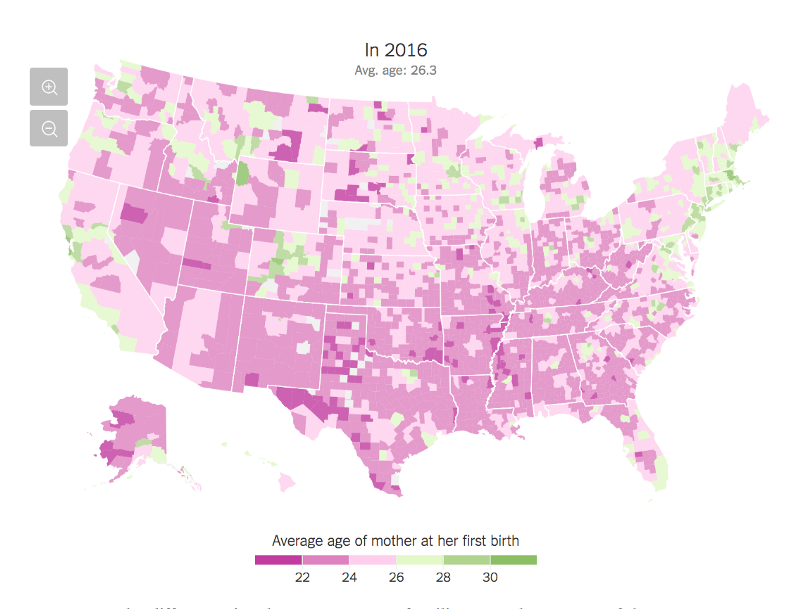
Here’s a snippet of some data from the Bureau of Labor Statistics about the unemployment rates across U.S. counties (represented by a FIPS code) in 2016.
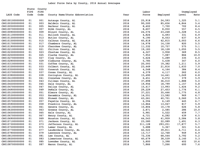
To spot trends or catch outliers, the average person would spend a significant amount of time staring at this data. They may scan each row and re-write figures on another sheet of paper. Not ideal.
But if we visualize the data as a geographic map, as Mike Bostock did in his Observable notebook:
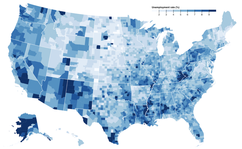
You can immediately see hotspots for higher unemployment. Instead of hours, you’ve now detected interesting patterns in seconds. That difference in time to understand can mean the difference between ditching a seemingly “incomprehensible” dataset, or alternatively, furthering your investigation. Creating accurate and accessible visualizations also allows viewers to catch inconsistencies or holes in the dataset, which holds the data more accountable.
The anatomy of a chart
Before jumping into the library comparison, I think the basic “anatomy” of a JavaScript chart warrants an overview. While working through these libraries, I noticed that all except for D3* adopted the same pattern for generating charts.
- Import the charting library into the HTML.
- Create a
<div> with an ID identifier, such as “my-first-chart”. - Fetch and load data in the JS. You may also define the data directly in the JS. Make sure you’ve linked this JS file in the HTML.
- Pass the data, the
<div> container, and an options object to a chart generator function. - Some libraries, like Google Charts, require calling
draw()to draw the generated chart. - Serve the code up on a Python server with
http-server -c-1 -p 8000and see your first chart atlocalhost:8000.
Examples
*D3 has been primarily used for charting, but it’s more of a collection of toolkits than your standard charting library. See this article for a better explanation.
Let’s compare!
When picking any library, I like to start with these evaluation questions:
- What’s the learning curve? (quality of documentation, code complexity)
- How much can I customize my charts?
- Is the library actively supported?
- What types of data does this library take?
- What modes of interactivity are offered?
- Does the library offer responsive charts?
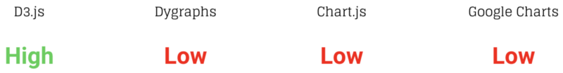
Learning curve
Dygraphs, Chart.js, and Google Charts have relatively small learning curves. They are great if you need to whip up charts in a couple of hours.
D3 has the highest learning curve, and the reason for this is the fine-grain, low-level control it offers. It’s more of a well-written library of advanced helper functions. D3 can theoretically be used in conjunction with other charting libraries.
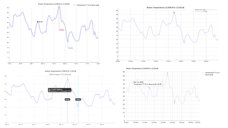
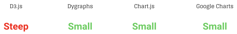
To explore a bit further, I created the same chart across all 4 libraries using Boston weather data from meteoblue. The code is up on GitHub.

…. and recorded the lines of code needed to make each chart:
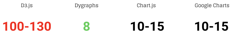
The lines of code support the original comparison of learning curves. D3 needs significantly more lines to get a basic chart up and running but provides more opportunity for customization.
Customization
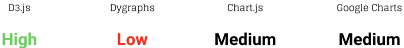
D3 shines in the customization arena. D3’s granularity and modularity is exactly why designers and developers favor it as the medium for stunning and unique visualizations. Chart.js and Google Charts offer numerous options that can be passed into a generator function, such as legend font size and thickness of a line.
Active development
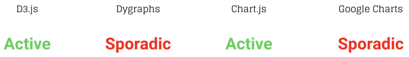
I define library development as the frequency of releases and the responsiveness of library maintainers to opened issues and feedback for improvement. A supportive and large community of users is also a plus. Usage encourages healthy change and accountability as the JavaScript ecosystem evolves.
Looking at the respective GitHub repositories, I discovered releases and resolved issues for Dygraphs and Google Charts to be more sporadic than D3 and Chart.js. D3 will not reach a halt in development any time soon. Its creator and contributors recently released a major version (v5.0) in 2018. They still actively contribute to the visualization community. Chart.js’s latest release also occurred pretty recently in 2018. The release addressed issues and enhancements. They are documented thoroughly in the release notes.
Types of data
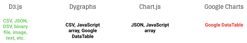
This speaks for itself. Fun fact: I used D3’s fetch library to fetch data. I used other libraries to chart it. D3 has fetch functions for almost all common data formats used in data visualization.
Interactivity
Dygraphs, Chart.js, and Google Charts all have some out-of-box interactivity features, like tool tips, zoom, and events. It’s difficult to introduce highly custom interactions because each library is so encapsulated. With D3, you accept that complicated and unique interactions are possible. The tradeoff is simple interactions, like a tool tip, must also be constructed from the ground up.
Responsiveness
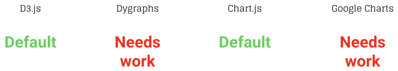
Chart.js and D3 offer responsive charts out of the box (for D3, specify a viewBox instead of width and height for the svg container). Dygraphs and Google Charts need some additional work to create responsive charts, like adding position: relative to the chart container or redrawing the chart on $(window).resize().
Dygraphs responsive chart (inspect the chart containers to see the CSS classes)
Responsive Google Charts Stack Overflow thread
Best used for?
Last but not least, I’ve listed the use case that I think each library is best suited for:
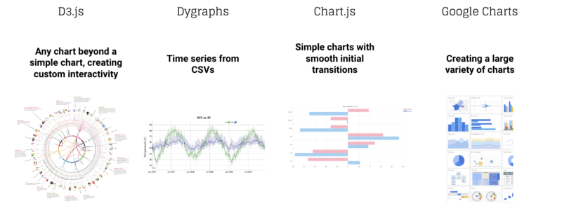
D3 is worth investing time in if you a) need a highly custom visualization and/or b) want helper functions to use in conjunction with other libraries.
I enjoyed Dygraphs for time series because the user can pan over the series and see the date and corresponding point by default. You can also highlight specific periods of time and select ranges of time.
Chart.js allows you to create simple, aesthetically pleasing charts that pop into the page seamlessly on load.
Finally, Google Charts offered the most variety of out-of-the-box charts, compared to the other libraries. In addition to standard charts, Google Charts also supports geographic maps, tree maps, sankey diagrams, etc.
3, 2, 1 … recap!
We’ve covered the many reasons why data visualization is powerful, the basic structure and steps to create a chart using a charting library, and a play-by-play comparison of 4 popular JavaScript libraries.
The most important step after you’ve selected a library and generated some visualizations is to communicate, and then iterate. Show your charts to others and ask them what they can and cannot interpret. Listen to their feedback and keep tweaking your charts. They’re teaching tools, and teaching tools should constantly evolve with the content and the viewers.
Thank you for reading!
- — — — — — — — — — — — — — — — — — — — — — — — — — — — — — — —
Code for the charts I created are up on GitHub.
Here are the presentation slides that led to this article.
If you want to read about Bokeh and D3, check out Charting the waters: between Bokeh and D3.
If you have any suggestions or feedback, drop a comment.