In a previous post, I covered the process of converting a Bootstrap carousel into a full-screen carousel with a random initial image. In this article, I’ll build on that and cover the art of animating Bootstrap carousels, drawing on the assistance of GSAP (GreenSock Animation Platform), a popular JavaScript library.
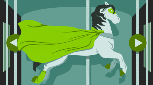
Before going any further, let’s look at what we’ll be building.
Building the Carousel
Be sure to include Bootstrap and jQuery (Bootstrap’s JavaScript components require it) in your page — for example, from a CDN:
<!DOCTYPE HTML>
<html>
  <head>
    <meta charset="utf-8">
    <title>Using GSAP for Animating Bootstrap Carousels</title>
    <link rel="stylesheet" type="text/css" href="https://maxcdn.bootstrapcdn.com/bootstrap/4.0.0/css/bootstrap.min.css">
  </head>
  <body>
    ...
    <script src="https://code.jquery.com/jquery-3.2.1.slim.min.js"></script>
    <script src="https://maxcdn.bootstrapcdn.com/bootstrap/4.0.0/js/bootstrap.min.js"></script>
  </body>
</html>
The basic structure of our carousel looks like this:
<div id="mycarousel" class="carousel slide" data-ride="carousel">
  <ol class="carousel-indicators">
    <li data-target="#mycarousel" data-slide-to="0" class="active"></li>
    <li data-target="#mycarousel" data-slide-to="1"></li>
  </ol>

  <div class="carousel-inner">

    <!-- first slide -->
    <div class="carousel-item first active" id="1">
      <!-- content here -->
    </div>

    <!-- second slide -->
    <div class="carousel-item second" id="2">
      <!-- content here -->
    </div>

  </div><!-- /carousel-inner -->

</div>
As you can see, it contains two slides. The first slide has a class of first and an ID of 1, while the second one has a class of second and an ID of 2.
Regarding their styles:
- we set their height equal to the viewport height
- we give them different background colors.
The associated CSS rules:
.item {
  height: 100vh;
}

.first {
  background: #D98F4F; /*orange*/
}

.second {
  background: #2c9cae; /*lightblue*/
}
This should be enough to give us a working carousel.
Building the First Slide
Next, we take advantage of Bootstrap’s helper classes (e.g. grid classes) to set up the contents for our slides.
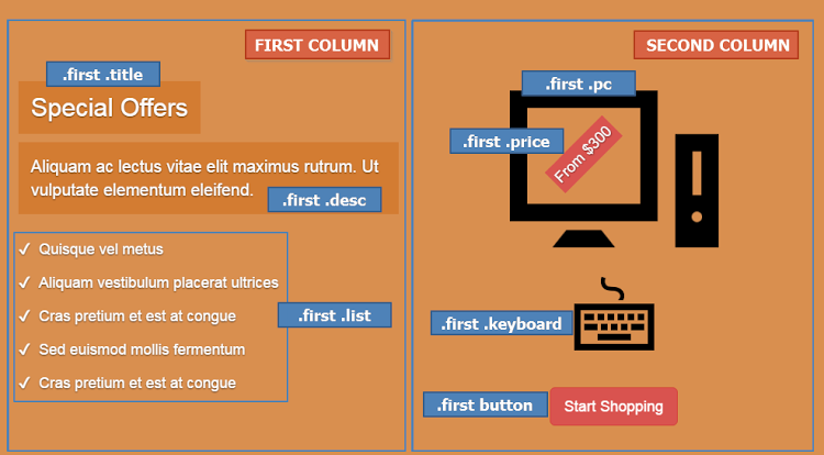
The markup for the first slide is the following:
<div class="carousel-item first active" id="1">
  <div class="carousel-caption">
    <div class="container">
      <div class="row justify-content-md-center">

        <div class="col">
          <h2 class="title">
            <!-- content here -->
          </h2>
          <p class="desc">
            <!-- content here -->
          </p>
          <ul class="list">
            <!-- list items here -->
          </ul>
        </div>

        <div class="col">
          <div class="pc-wrapper">
            <img class="pc" src="IMG_PATH" alt="" width="" height="">
            <div class="price">
              <!-- content here -->
            </div><!-- /price -->
          </div><!-- /pc-wrapper -->
          <img class="keyboard" src="IMG_PATH" alt="" width="" height="">
          <button type="button" class="btn btn-danger btn-lg">
            <!-- content here -->
          </button>
        </div>

      </div><!-- /row -->
    </div><!-- /container -->
  </div><!-- /carousel-caption -->
</div><!-- /carousel-item -->
If you’re following along, be sure to replace IMG_PATH with something sensible.
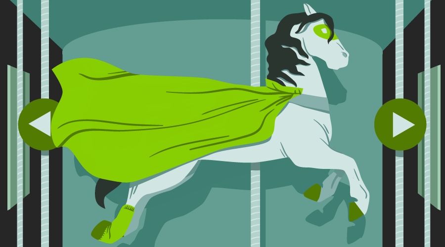
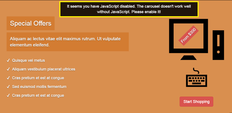
Here’s what the result looks like:
Building the Second Slide
In the same way, here’s the markup for the second slide:
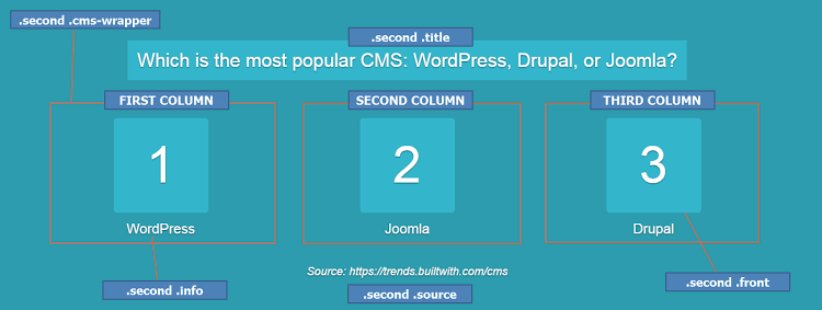
<div class="carousel-item second" id="2">
  <div class="carousel-caption">
    <div class="container">

      <h2 class="title">
        <span>
          <!-- content here -->
        </span>
      </h2>

      <div class="row justify-content-md-center">

        <div class="col cms-wrapper">
          <div class="cms">
            <div class="front">
              <!-- content here -->
            </div>
            <div class="back">
              <img class="img-fluid" src="IMG_PATH" alt="">
            </div><!-- /back -->
          </div><!-- /cms -->
          <p class="info">
            <!-- content here -->
          </p>
        </div><!-- /cms-wrapper -->

        <!-- two more columns here -->

      </div><!-- /row -->

      <div class="source">
        <!-- content here -->
      </div><!-- /source -->

    </div><!-- /container -->
  </div><!-- /carousel-caption -->
</div><!-- /carousel-item -->
And its visualization:
Note: For simplicity, we won’t extensively cover the styles for the inner parts of our slides. We’ll only refer to the styles that are important for the animations.
Initializing the Carousel
Next we initialize the carousel and disable default autoplay by passing interval:false to the configuration object:
var $carousel = $("#mycarousel");

$carousel.carousel({
  interval: false
});
Adding Keyboard Navigation
By default, Bootstrap carousel isn’t compliant with accessibility standards. In our case, though, let’s make the carousel a bit more accessible by adding keyboard navigation.
Here’s the required code:
$(document).keyup(function(e) {
  // right arrow
  if(e.which === 39) {
    $carousel.carousel("next");
  // left arrow
  } else if(e.which === 37) {
    $carousel.carousel("prev");
  }
});
So far, we’ve built a basic carousel which supports keyboard navigation.
Animating Bootstrap Carousels: First Animations
At this point, let’s try to make the carousel more appealing by adding some animations. To achieve this, we’ll take advantage of GSAP, one of the most powerful JavaScript animation libraries out there. If you’re looking for a thorough introduction to GreenSock, check out GreenSock for Beginners: a Web Animation Tutorial (Part 1).
Getting Started With GSAP
To incorporate GSAP into our projects, we have to visit its site and from there click the download button, which appears in the top-right corner of the page. This will open a modal dialog with a link to the project on a CDN.
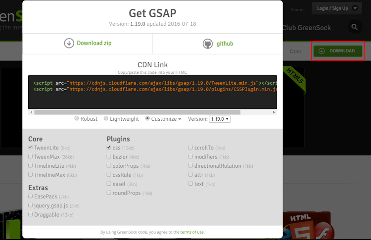
If we then select the Customize radio button, we can select the parts of the library we want to use. For our project, however, we’ll keep things simple and include just the full robust version of it.
Remember that we had to add jQuery to our project because Bootstrap’s carousel depends on it. But, keep in mind that GSAP is a pure JavaScript library, and thus it doesn’t require it.
Animating Bootstrap Carousels: the First Slide
By default, we want the content of our slides to be hidden:
.carousel-caption {
  opacity: 0;
}
Only when the page loads do we reveal and animate the contents of the first slide. To do this, we take advantage of TimelineLite, an animation tool that helps us build a sequence of tweens.
So, as soon as all page assets are ready, the firstTimeline function is executed:
// this variable stores the first timeline
var firstTl;

$(window).on("load", function() {
  firstTl = firstTimeline();
});
This function returns a timeline which determines the animations for the first slide:
function firstTimeline() {
  var tl = new TimelineLite();

  tl
    .to(".first .carousel-caption", 0.1, {opacity: 1})
    .from(".first .pc", 1, { y: -300, opacity: 0, ease: Bounce.easeOut})
    .from(".first .keyboard", 1, { y: 300, opacity: 0, ease: Bounce.easeOut}, "-=1")
    .staggerFrom(".first .list li", 0.75, {opacity: 0, cycle: {x: [-200, 200]}, ease: Power2.easeOut}, 0.15, "-=0.5")
    .from(".first .desc", 0.7, {x: 500, opacity: 0, ease: Power4.easeOut}, "-=0.5")
    .from(".first .title", 0.7, {x: -500, opacity: 0, ease: Power2.easeOut}, "-=0.7")
    .from(".first .price", 0.7, {scale: 0.01, ease: Power4.easeOut})
    .from(".first button", 0.7, { y: -700, autoAlpha: 0, ease: Bounce.easeOut}, "-=0.3");

  return tl;
}
More specifically, inside the function above we do the following:
- create a TimelineLite
- add tweens to the timeline using its to, from, and staggerFrom methods
- return the timeline.
Let’s take note of the parameters that we pass to the to and from methods:
- The DOM element that we want to animate.
- The duration of the animation in seconds.
- An object containing the properties that should be tweened and their respective (starting or end) values. Moreover, this object can also have some other special properties like the
easeproperty which defines the easing function. - The placement of the tween in the timeline. In other words, when this tween should be executed. For example, we want to run the animations for the
.first .pcand.first .keyboardelements at the same time. To do this, we set the value of thepositionparameter of the.first .keyboardelement to"-=1". The number “1” inside this value matches the duration of the animation of the.first .pcelement.
Similar to the to and from methods, we pass the same parameters to the staggerFrom method. The only difference is that we define one additional parameter (the fourth one) which specifies each tween’s start time. In our example, this value is set to 0.15. That said, the target elements won’t appear simultaneously but there will be a very small gap between their animations. Change this value to something big (e.g. 5), to see a clear difference in the effect.
Obviously, the best way to understand how the animations above work is to read the documentation. Plus, use the developer tools of your browser to see what styles GSAP applies to the target elements.
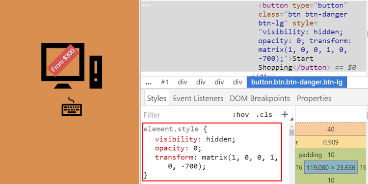
So let’s briefly have a closer look at the animations assigned to the button.
Initially the button has autoAlpha: 0 and y: -700. That means it’s visually hidden (opacity: 0, visibility: hidden) and located 700 pixels up from its original position (transform: matrix(1, 0, 0, 1, 0, -700)).
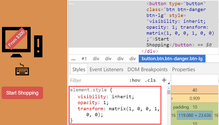
Then, when the animation plays, it becomes visible (opacity: 1, visibility: inherit) and returns back to its default position (transform: matrix(1, 0, 0, 1, 0, 0)).
Finally, the animation starts 0.3 seconds before the end of the timeline.
Tip: Use TimelineLite’s duration method to retrieve its duration. The key here is to understand how this value is calculated.
Great job so far! The animations for the first slide are ready! You can see them live in this Codepen demo: Using GSAP to Animate Bootstrap Carousels (Part 1).
Using Bootstrap’s Carousel Events
As we leave the first slide and move on to the second one (and vice versa), the contents of our slides should be hidden. It should appear as soon as the carousel completes its slide transition. To accomplish this behavior, we take advantage of the following things:
- The
slide.bs.carouselandslid.bs.carouselevents that Bootstrap provides. - GSAP’s TweenLite animation tool that helps us build a single tween. Note that in the previous section we used a TimelineLite to create a sequence of tweens.
Here’s the necessary code:
var $carouselCaption = $(".carousel-caption");

$carousel.on("slide.bs.carousel", function() {
  TweenLite.to($carouselCaption, 0.1, {opacity: 0});
});

$carousel.on("slid.bs.carousel", function () {
  TweenLite.to($carouselCaption, 0.1, {opacity: 1});
});
As we’ve discussed earlier, when the page loads, the animations for the first slide run. But when should they run again? Plus, what about the second slide and its animations? To answer all these questions, let’s add a few lines of code to the callback of the slid.bs.carousel event:
// these variables store the timelines
var firstTl, secondTl;

$carousel.on("slid.bs.carousel", function (e) {
  TweenLite.to($carouselCaption, 0.1, {opacity: 1});
  var slideId = e.relatedTarget.id;

  if(slideId === "1") {
    firstTl.restart();
  } else if(slideId === "2") {
    secondTl = secondTimeline();
  }
});
The code above does the following:
- It checks the
idof our slides. - If the
idis equal to1, the first slide has been loaded, and thus we’ve got to replay the animations for this slide. Remember that we’ve already created a timeline for these animations (within thefirstTimelinefunction), so we can use itsrestartmethod to play it again. - If the
idis equal to2, the second slide has been loaded, and thus thesecondTimelinefunction is executed (see next section).
Animating Bootstrap Carousels: the Second Slide
The secondTimeline function returns a timeline which determines the animations for the second slide:
function secondTimeline() {
  var tl = new TimelineLite({onComplete: allDone});

  tl
    .from(".second .title", 0.5, { y: -400, opacity: 0, ease: Sine.easeInOut})
    .staggerFrom(".second .cms-wrapper", 0.5, {scale: 0, rotation: 180, ease: Power2.easeInOut, onComplete: completeFunc}, 1.2);

  return tl;
}
More specifically, inside the function above we do the following:
- create a TimelineLite
- add tweens to the timeline using its
fromandstaggerFrommethods - return the timeline.
Although this timeline looks like the one we’ve previously created for the first slide, there are some things here that we haven’t seen before.
First, look at the object that we pass to the staggerFrom method. This contains a special property called onComplete. This property holds a function (i.e. completeFunc()) that’s fired when the animations for each of the target elements finish.
Let me explain.
By default, only the elements with the class of .second .front (i.e. numbers) are visible.

And the .second .back (i.e. CMS logos) and .second .info (i.e. CMS names) elements are hidden.
Here are the corresponding CSS rules:
.second .back {
  display: none;
  transform: scale(0);
}

.second .info {
  opacity: 0;
  transform: translateY(40px);
}
When the completeFunc function runs for each of the .second .cms-wrapper elements, we set up tweens that affect the visibility of the child elements. Specifically, we hide the .second .front element and then show (after 0.3 seconds delay) the .second .back and .second .info elements.

Below you can see the related JS code:
function completeFunc() {
  var $this = $(this.target),
      $info = $this.find(".info"),
      $front = $this.find(".front"),
      $back = $this.find(".back");

  TweenLite.to($front, 0.3, {display: "none", scale: 0});
  TweenLite.to($back, 0.3, {display: "block", scale: 1, delay: 0.3});
  TweenLite.to($info, 0.3, {opacity: 1, y: 0, delay: 0.3});
}
The second new thing in this timeline is the callback that runs when all animations finish. We specify this by passing a configuration object with an onComplete property (whose value is the allDone function) to the constructor function.
When the timeline completes, this function is triggered and shows the .second .source element which was initially invisible (opacity: 0, visibility: hidden).

Here’s the allDone function:
function allDone() {
  TweenLite.to(".second .source", 0.3, {autoAlpha: 1, delay: 1});
}
At this point, let’s examine the current state of our carousel: Using GSAP to Animate Bootstrap Carousels (Part 2).
The animations look good but there’s still a small problem with regards to the second slide. To be more specific, the first time we visit the second slide, the animations work as expected. However, in any other case (test it), the result isn’t the desired one, as the CMS logos don’t animate in.
To fix this issue, we have to restart the corresponding timeline (remember we did the same for the first slide) and clear the tweens (inline styles) defined in the completeFunc and allDone functions. Lastly, we pause the second timeline when the first one is active. With that in mind, once again we update the callback of the slid.bs.carousel event like this:
var counter = 0,
    firstTl,
    secondTl;

$carousel.on("slid.bs.carousel", function (e) {
  TweenLite.to($carouselCaption, 0.1, {opacity: 1});
  var slideId = e.relatedTarget.id;

  if(slideId === "1") {
    firstTl.restart();
    secondTl.pause();
  } else if(slideId === "2") {
    if(counter === 0) {
      secondTl = secondTimeline();
    } else {
      TweenLite.set([".second .front", ".second .back", ".second .info", ".second .source"], {clearProps:"all"});
      secondTl.restart();
    }
    counter++;
  }
 });
So, finally, here’s the new version of our carousel: Using GSAP to Animate Bootstrap Carousels (Part 3).
Customizing the Carousel When JavaScript is Disabled
The carousel is almost ready. Before wrapping things up, let’s customize its appearance when JavaScript is disabled. In such a scenario, the slides have to appear below each other and a custom message should encourage users to enable JavaScript.
Here’s the desired visualization:
One way to accomplish this behavior is by using the <noscript> tag. This option is great, yet it adds some additional code to our HTML, so let’s try something a little bit different.
By default, we add the no-js class to the <html> tag. As the browser parses the page, if JavaScript is enabled in this browser, the class is removed.
So first, in the HTML we add this code:
<p class="msg">
  It seems you have JavaScript disabled. The carousel doesn’t work well without JavaScript. Please enable it!
</p>
Then, in the CSS this one (mostly reset rules):
.msg {
  display: none;
  position: fixed;
  top: 5px;
  left: 50%;
  transform: translateX(-50%);
  padding: 7px;
  border: 5px solid #fff000;
  text-align: center;
  color: #fff;
  background: rgba(0, 0, 0, .85);
  z-index: 999;
}

.no-js .carousel-inner > .item {
  display: block;
}

.no-js .carousel-caption,
.no-js .second .info,
.no-js .second .source {
  opacity: 1;
}

.no-js .second .info {
  transform: none;
 }

.no-js .second .source {
  visibility: visible;
}

.no-js .carousel-indicators {
  display: none;
}

.no-js .msg {
  display: block;
}
Finally, in the <head> tag of our page we insert the following code snippet:
<script>
  document.documentElement.className = "";
</script>
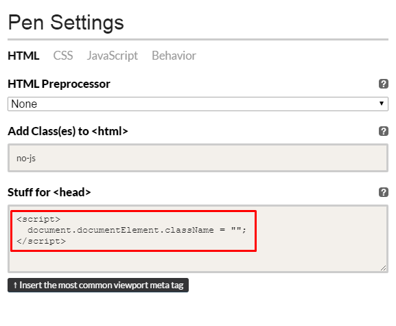
Keep in mind that we place this code within the <head> tag because we want it to be executed before the browser starts to paint the elements. This is important in order to prevent DOM flickering.
Here’s the final version of our carousel:
See the Pen Bootstrap Carousel with GSAP Animations by SitePoint (@SitePoint) on CodePen.
Conclusion
In this article, we went through the process of animating Bootstrap carousels with GSAP. You can find all the demos for this article in this Codepen collection. Without doubt, we covered a lot of ground but hopefully you enjoyed what we built and got an idea of GSAP’s power! Happy tweening!
Questions? Comments? Are you using GSAP in your projects? I’d love to hear from you in the comments below.
This article was peer reviewed by Joan Yinn and Yaphi Berhanu. Thanks to all of SitePoint’s peer reviewers for making SitePoint content the best it can be!
If you’ve got the basics of Bootstrap under your belt but are wondering how to take your Bootstrap skills to the next level, check out our Building Your First Website with Bootstrap 4 course for a quick and fun introduction to the power of Bootstrap.
Frequently Asked Questions (FAQs) about Animating Bootstrap Carousels with GSAP
How can I add a pause/play button to my GSAP carousel?
Adding a pause/play button to your GSAP carousel can enhance user interaction. To do this, you need to create a button and use GSAP’s built-in methods. The ‘pause()’ method stops the animation, and the ‘resume()’ method continues the animation from where it was paused. You can toggle between these two methods based on the button’s click event.
Can I animate individual carousel items using GSAP?
Yes, GSAP allows you to animate individual carousel items. You can use the ‘TweenMax.staggerFrom()’ or ‘TweenMax.staggerTo()’ methods to create staggered animations for each carousel item. This can create a more dynamic and engaging user experience.
How can I add navigation dots to my GSAP carousel?
Navigation dots can be added to your GSAP carousel to enhance user navigation. You can create a ‘dot’ for each carousel item and add a click event to each dot. When a dot is clicked, you can use the ‘TweenMax.to()’ method to animate the carousel to the corresponding item.
Can I use GSAP with Bootstrap 4 carousels?
Yes, GSAP can be used with Bootstrap 4 carousels. GSAP is a powerful animation library that can enhance the functionality and interactivity of Bootstrap carousels. You can use GSAP to animate carousel transitions, add user interaction features, and more.
How can I add a 3D effect to my GSAP carousel?
GSAP allows you to add a 3D effect to your carousel. You can use the ‘rotationY’ property to rotate carousel items along the Y-axis, creating a 3D effect. You can also use the ‘perspective’ property to control the depth of the 3D effect.
How can I add swipe functionality to my GSAP carousel?
Swipe functionality can be added to your GSAP carousel to enhance mobile user experience. You can use the ‘Draggable’ plugin from GSAP to add swipe functionality. The ‘Draggable’ plugin allows you to make any element draggable, including carousel items.
Can I use GSAP to animate carousel transitions?
Yes, GSAP can be used to animate carousel transitions. You can use the ‘TweenMax.to()’ method to animate the transition between carousel items. You can control the duration, easing, and properties of the transition.
How can I add a zoom effect to my GSAP carousel?
A zoom effect can be added to your GSAP carousel to create a more dynamic user experience. You can use the ‘scale’ property to zoom in or out of carousel items. You can animate the ‘scale’ property using the ‘TweenMax.to()’ method.
Can I use GSAP with Bootstrap 5 carousels?
Yes, GSAP can be used with Bootstrap 5 carousels. GSAP is a powerful animation library that can enhance the functionality and interactivity of Bootstrap carousels. You can use GSAP to animate carousel transitions, add user interaction features, and more.
How can I add a fade effect to my GSAP carousel?
A fade effect can be added to your GSAP carousel to create a smoother transition between carousel items. You can use the ‘opacity’ property to control the visibility of carousel items. You can animate the ‘opacity’ property using the ‘TweenMax.to()’ method.
 George Martsoukos
George is a freelance web developer and an enthusiast writer for some of the largest web development magazines in the world (SitePoint, Tuts+). He loves anything related to the Web and he is addicted to learning new technologies every day.