
Introducing the Telerik UI for Blazor Early Preview

Introducing the Telerik UI for Blazor, .NET UI components for the Blazor framework without legacy JavaScript dependencies.
Progress Software and the Telerik brand has a long history of supporting the .NET community with products like Telerik UI for ASP.NET AJAX, UI for ASP.NET, and UI for ASP.NET Core. This is why we’re proud to announce the early preview release of Telerik UI for Blazor!
Update: Telerik UI for Blazor is in full release now. This article was updated April 1, 2020 to supplement our initial announcement back in January 2019.
- What is Blazor
- What is a Razor Component
- What is Blazor Server
- Blazor Recommended Reading
- Built from the Ground-Up - 100% Native .NET
- Experimenting With Us
- Telerik UI for Blazor Early Preview
What is Blazor
Blazor is a new framework by the Microsoft ASP.NET team that introduces a next generation component model that allows developers to write Single Page Applications (SPA) without JavaScript. If Blazor sounds new to you that’s because it has only been in development since 2018, initially as an experimental project. The Blazor framework targets the Mono WebAssembly runtime (the .NET runtime compiled to wasm), thus allowing .NET to run on the client’s browser inspiring the name “Blazor” (Browser + Razor).

In this configuration the application’s resources including .dll files are delivered to the client and executed the Mono WebAssembly runtime.
What is a Razor Component
While Razor Component, and Blazor Component are widely used interchangeably, the correct terminology is Razor Component. The Razor component model is refreshingly simple in its design. Components can contain markup (HTML) and logic (C#) in a single Razor (cshtml) file. The component is capable of handling data binding, events, and dependency injection all without JavaScript.
The Counter Component below demonstrates the basic composition of a Razor component.

The counter component uses a basic HTML button to increment a counter field which is displayed within a paragraph tag. Because Blazor operates as a single page application all of the interactions in the component happen on the client. Updates to the browser’s Document Object Model (DOM) are handled by the Blazor framework though data binding.
What is Blazor Server
Microsoft supports the framework when running server-side in a mode called Blazor Server. This model offers some backwards compatibility with ASP.NET Core (MVC) and Razor Pages through specialized HTML Helpers and Tag Helpers. These options have our Telerik team excited for the future of ASP.NET development. Much like Blazor running on WebAssembly, Blazor Server allows developers to write Single Page Applications (SPA) without JavaScript.

The key difference between Blazor Wasm and Blazor Server is the way the application is deployed. Instead of Blazor running via WebAssembly on the client, the Blazor framework runs on the server as an executable. In this mode, ASP.NET Core hosts the application and provides a communication channel using SignalR technology. Using SignalR the application sends UI updates and receives changes and events as binary packets of data over a web socket connection. Since only the changes are sent over the connection, the payload is small and efficient.
Since Blazor Server utilizes the Blazor framework, components can be used in both deployment types.
Blazor Recommended Reading
If all of this is new to you, and it’s most likely that it is, then you should catch you up on all things Blazor. The free e-book Blazor: A Beginner's Guide: A quick start guide to productivity should bring you up to speed, or if you’re biting your nails to check out what’s below, we’ve included the TLDR as well.
Download Blazor: A Beginner's Guide
TLDR
Blazor is a .NET (SPA) framework that is generally associated with .NET running on Web Assembly. However, Blazor is capable of running under multiple scenarios including server-side using Blazor Server.
- Razor is a popular template markup syntax for .NET
- (Browser + Razor) Blazor is a .NET based web framework which can run on the client using WebAssembly or as:
- Blazor Server: The Blazor framework running on the server via SignalR
- Razor Components: The component model for both Blazor WebAssembly and Blazor Server
- All Blazor hosting models, both client and server-side, utilize C# APIs instead of JavaScript
- Blazor WebAssembly (wasm) is expected to ship in ASP.NET Core 3.2 (May 2020)
- Blazor Server is already generally available and supported since ASP.NET 3.0
Built from the Ground-Up — 100% Native .NET
Telerik UI for Blazor does not wrap existing jQuery/JavaScript products in C# and pretend it’s something new. With Telerik UI for Blazor we started from scratch and write components with .NET whenever possible. Alternatively we could have decided to wrap existing jQuery components, as short-term path, however we feel that the wrapper programming model is a leaky abstraction that would “bleed back” into the .NET API layer. In addition, we feel that a native .NET approach is a long term investment that will fetch larger gains in the long run. Consider this a modern day tortoise vs. hare story.
We can’t express enough how important both the JavaScript and .NET ecosystems are to us. We have UI libraries for developers of all skill types, however a segment of the .NET community has expressed the need for frontend web tooling that does not require JavaScript and we’re happy to have the opportunity to serve this community through Blazor.
Experimenting with Us
Blazor is an exciting prospect for .NET developers because it allows us to create full-stack .NET web applications. We have received countless feedback items requesting our support for this next generation platform.
Initially we offered Telerik UI For Blazor as an early preview release. This was a development model which closely resembled the effort being made by Microsoft with Blazor. Through a release cycle of small sets of functionality we gained feedback and knowledge about how our customers use the product. During the experimental phase Telerik UI for Blazor developers shared with us use cases, experience, roadblocks, and bugs.
Telerik UI for Blazor Early Preview
The initial offering included just a few popular UI components including the Data Grid, Tab Set, and Buttons. Through customer feedback we expanded the number of components and rage of APIs. We believe that building to our customers needs and recommendations is the path to success. Now that the preview phase is over we are ready for you to try Telerik UI for Blazor as a 30 day free trial.
Try Telerik UI for Blazor (Full Release)
Installing Telerik UI for Blazor
Installing Telerik UI for Blazor requires just a few simple steps. First, we'll need a 30-day free trial from Telerik.com. After creating an account, the browser will automatically download a product installer. The installer will add to our system the Telerik UI for Blazor NuGet package source, binaries, Visual Studio integration and demos. Once the installer is complete, we can choose to manually upgrade an existing project, or start a new project with one of the many templates included in the product. Since we’re already on the topic of installation, we’ll continue discussing the upgrade path before exploring the new-project templates.
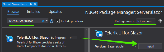
We’ll use what we learned from the previous chapter on Razor Class Libraries (RCL) to add the Telerik UI for Blazor to an existing application. As with any RCL we need to add a reference to the library. In this example we’ll use a private NuGet feed to acquire the Telerik UI for Blazor NuGet package. We’ll open the NuGet package manager in Visual Stuido, as shown below. Then select the package source, and search for Telerik to display the NuGet package. The private feed should already be available as it was added by the product’s installer, if needed the package source can easily be added manually by following the guides in the product documentation.
With the NuGet reference added we’ll need to reference the static assets from the library. In our project’s _Host.cshtml or index.html file we’ll add the library’s CSS and JavaScript interop files.
<head>
  <link rel="stylesheet" href=
 "_content/telerik.ui.for.blazor.trial/css/kendo-theme-default/all.css" />

  <script src="_content/telerik.ui.for.blazor.trial/js/telerik-blazor.js"
   defer></script>

  <!-- For commercial licenses use
  ref="_content/telerik.ui.for.blazor /-resource-"
  -->
</head>
In the head section we can also change the application theme using the CSS file path. Where the path name is /css/kendo-theme-default, we have the option to choose default, bootstrap, or material, shown below. With this single change all the components in the app can use the Google Material Design theme.
<link rel="stylesheet" href=
"_content/Telerik.UI.for.Blazor/css/kendo-theme-material/all.css" />
Telerik UI for Blazor also requires some services through dependency injection. The services are easily registered with the AddTelerikBlazor method called from our project’s entry point, Startup.cs for Blazor server, or Program.cs for WebAssembly.
// Blazor Server only, Startup.cs
services.AddTelerikBlazor();
// Blazor WebAssembly only, Program.cs
builder.Services.AddTelerikBlazor();
Since there are many components in the library and we’re likely to use them throughout the project we’ll add them to the global scope. Adding the Telerik.Blazor and Telerik.Blazor.Component to _Imports.razor will ensure we have access to the library anywhere the application.
@using Telerik.Blazor

@using Telerik.Blazor.Components
Finally, we’ll add the TelerikRootComponent to our application’s MainLayout. Telerik UI for Blazor has advanced features like modal windows, tool tips, and animations that need to register at the root element of the application and TelerikRootComponent will facilitate this for us.
@inherits LayoutComponentBase

<TelerikRootComponent>
    <div class="sidebar">
        <NavMenu />
    </div>
    <div class="main">
        @Body
    </div>
</TelerikRootComponent>
The installation is complete, and we are now ready to begin using the Telerik UI for Blazor in our application. To get familiar with the Telerik Grid we’ll modify the existing FetchData component and replace the static HTML with a fully featured component.
Blazor Data Grid
The Telerik UI for Blazor Data Grid has a long list of professional features. The data grid is capable of data binding, multi/selection, context-aware filtering, sorting, paging, themes, row/column templates, and multiple edit modes. Let’s see these features in action by replacing the hand coded table in the FetchData example, shown below with the Telerik Data Grid.

Locate the code for FetchData under the /Pages folder. Replace the entire table element with a TelerikGrid component. We can also eliminate the null check here as the Telerik Grid will do this operation internally.
<!-- all code below can be removed -->
@if (forecasts == null)
{
    <p><em>Loading...</em></p>
}
else
{
    <table class="table">
        <thead>
            <tr>
                <th>Date</th>
                <th>Temp. (C)</th>
                <th>Temp. (F)</th>
                <th>Summary</th>
            </tr>
        </thead>
        <tbody>
            @foreach (var forecast in forecasts)
            {
                <tr>
                    <td>@forecast.Date.ToShortDateString()</td>
                    <td>@forecast.TemperatureC</td>
                    <td>@forecast.TemperatureF</td>
                    <td>@forecast.Summary</td>
                </tr>
            }
        </tbody>
    </table>
}
The TelerikGrid component binds the Data property to forecasts which is an array of the WeatherForecast object. The grid also has the Pageable, FilterMode, Groupable, Reorderable, and Sortable properties enabled.
Inside of the TelerikGrid component, we define child components for each field we would like displayed in the grid. Because this is all C# code, we can set the Field property with C#'s nameof operator giving us type safety. Column headers are customizable through the Title property, when not set the header will automatically get the name of the property. In addition, templates can be used to display custom formats, images, and even other UI components.
Here a template is used to format the Date field.
<TelerikGrid Data=forecasts Sortable=true Pageable=true Groupable=true
             FilterMode=GridFilterMode.FilterRow Reorderable=true >
    <GridColumns>
        <GridColumn Field="@nameof(WeatherForecast.Date)">
            <Template>
                @( (context as WeatherForecast).Date.ToShortDateString() )
            </Template>
        </GridColumn>
        <GridColumn Field="@nameof(WeatherForecast.TemperatureF)"
                    Title="Temp (F)"/>
        <GridColumn Field="@nameof(WeatherForecast.TemperatureC)"
                    Title="Temp (C)"/>
        <GridColumn Field="@nameof(WeatherForecast.Summary)"/>
    </GridColumns>
</TelerikGrid>
With the HTML replaced with a Telerik Grid component we can now re-run the application and see the changes as shown below. Now we have a fully featured grid that is accessibility compliant.

Adding components to a project is relatively easy. With just a few steps we were able to transform a standard HTML component into something much more interactive and feature rich.
Summary
We’re excited to be part of the next generation of ASP.NET applications by supporting Blazor. Telerik UI for Blazor is available for download today. The package includes popular components like the Data Grid, Scheduler, and File Upload, all written from the ground up to take advantage of Blazor without JavaScript framework dependencies (there’s no jQuery this time folks). Throughout the years Microsoft will continue working on Blazor as part of .NET 5. We plan on keeping Telerik UI for Blazor up to date as the project progresses and look forward to hearing your feedback, seeing what you’ve built, and knowing what components you need for your next app.

Ed Charbeneau
Ed
Related Posts
Comments
All articles
Topics
Latest Stories
in Your Inbox
Subscribe to be the first to get our expert-written articles and tutorials for developers!
All fields are required