


Presentation Summary
Amadeus is one of the largest software companies in the world. The following post explores how the company built their YAC visualizer, which is a tool that allows Amadeus to explore their highly-distributed data architecture. They were able to develop this tool after they built out their cartography, conducted an inventory of their data architecture, and put together a map of all of their architectural components, which just so happened to look a lot like a graph.
With the help of Neo4j, they were able to visualize and explore their architecture to develop a simple, user-friendly tool that Amadeus employees could use to pull up-to-date and accurate information. Read the blog post below to learn how to apply these lessons at your company.
Full Presentation: Mastering Highly Distributed Architecture with Neo4j
What we’re going to be talking about today is how Amadeus has mastered a highly distributed architecture using Neo4j and our visualizer tool “Your Architecture Cartography” (YAC):
Who Is Amadeus?
Amadeus is a leading technology company dedicated to the global travel industry and is used in booking systems around the world for things like airline travel, hotels and rental cars.
We employ more than 15,000 people, and in 2016 alone, more than 595 million total bookings were processed using the Amadeus distribution platform, and 1.3 billion passengers boarded planes with Amadeus and Navitaire solutions. In 2017, Forbes named us one of the world’s top 15 software companies in its global rankings.

We’re working with a lot of the big groups across more than 190 countries – which means we’re represented in more countries than Starbucks and McDonald’s. But the interesting thing is most people don’t realise we exist, largely because we’re operating in the background.
Amadeus is highly transactional and diverse in our applications. We recently did a project which moved us away from IBM’s TPF stack, which meant that we had to find a way to process data for over 200 different applications, each with anything from 20 to 100 different components:

This meant we were reaching more than 55,000 transactions per second at peak in our core systems alone. We process nearly four billion transactions every single day, which results in 50 petabytes of data that needs to be stored on our systems.
Depending on how you look at the statistics, this is even more data than what is processed by Google.
Building the YAC Visualizer
We are a leader in research and development with huge investments in innovation, both through 40 sites dedicated sites for research and development and more than €4 billion over the last 13 years.
We took advantage of this history to explore how to take those systems with thousands of components and tackle them with Neo4j from both a technical and business standpoint.
Over the last two years, we have adopted Neo4j in order to better understand our architecture. How do we deploy things from an operational standpoint, and how do different members of our team – from product managers to operations experts – understand that environment? How can we develop a single tool that gives everybody the same view?
These were all difficult tasks we needed to tackle.
Building Out the High Level Cartography
Around three years ago, we started an ambitious project to build up the architectural cartography of our company that would link from products down to functionalities and applications. This was a nice goal, and we managed to accomplish it – but it was too high-level for what we had initially set out to do.
As we built out this cartography, we were hoping to apply a model that would allow people to add information to it. But our model was too rigid, and required a lot of time to add new types of information. Another major pain point was that everyone who wanted to update our cartography needed to download a package, install it locally, connect to a remote file and pull it off.
Not only did getting that up and running take a while, but it took five minutes to start up and pull the file from the server. It was so time intensive that people wouldn’t update their data, so we ended up with information that became static and useless.
We knew we needed something that was much more dynamic. We asked the questions: What do we want from a tool when we’re trying to understand our architecture, and what is it going to bring us?
The key area we looked at to answer these questions is flexibility. As you see in the previous examples, we really wanted something that didn’t have a rigid model so we could flex to new content and develop something that wasn’t a fat client.
We’re going to refer back to the below slide a few times as we walk through this story in order to give you a better feel for where we are in the process:
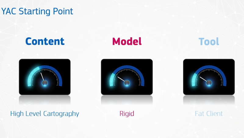
We already went through the first point related to content and our high-level data cartography, which is too rigid and resulted in a fat client. We had high-quality data for a while, but it degraded with time because of how time-intensive it was to make changes.
Conducting a Data and Architecture Inventory
Our next step was to figure out what we actually had, which is the first step in building an architectural model.
This was a huge turning point, because we realized that when you have a bunch of different UML and architectural diagrams, we were really a graph. You have one box connected to another with a direction and some properties about it.
The graph on the right-hand side shows all the languages used to connect to Neo4j:

We also realized we wanted to explore our architecture diagram.
Having something static, like a typical UML or architectural diagram, doesn’t give you the tangibility to easily see – how is my architecture deployed? What else is connected to it? What else can’t I see, and what am I missing?
Architecture Visualization
The next thing we wanted to do was visualize all of this. Having something which is static, as I say, wasn’t providing the right information.
Having an Excel report is maybe good when you’re throwing it towards your product management, but those of us working on the more technical side needed something that would allow us to do more exploration. What we really needed was a tool to help us visualize the data.
When we’re looking at the market, we realised that when we looked towards graph databases and Neo4j, along with KeyLines, and put the two together.
We were about six months into our process – and we made a few changes but it still wasn’t providing the right content to us – and the model was increasingly restrictive.
We were able to pick up a new version, make the client thinner and decrease our start-up time from five minutes to five seconds. But someone still had to install it locally, which meant making updates was still painful.
This led us to make a change. We started looking to Neo4j and graph databases to see what we could leverage that would help us understand our architecture.
Putting Together the Architectural Components
The first thing we started to grow out was our content, and we started with a very simple metamodel with 6,000 objects and 15,000 relationships:
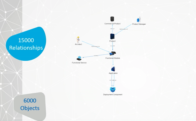
This was small, especially for a company the size of Amadeus, and it was obvious right away that it wasn’t going to provide enough flexibility.
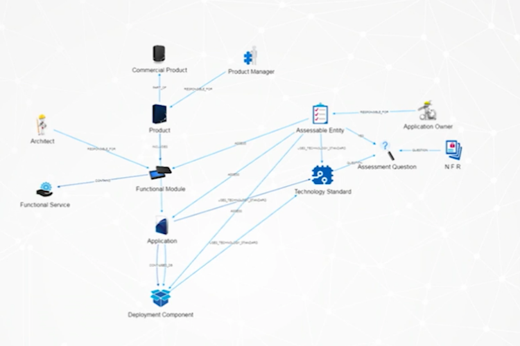
We started to grow into one of our sister products inside our group, which included how we assess applications and functionalities, the NFRs they have to adhere to and how they all fit together:
Next we spoke with our business intelligence group to ask: Could you show information in here? Can you show me where your data lake is, and what you’re storing in it? Can you help other business users understand whether or not we already have an insight that could answer someone’s query exactly, or would the answer exist if they made slight adjustments to their query?

We had a massive breakthrough when we jumped up to 700,000 relationships and 90,000 objects.
When we look at how we do our integration from our customers to our applications, their information is routed through our integrator. So we can loop from the right-hand side down and around into our applications:

How are they communicating with us? Which technical services are they using? So this suddenly bumped up the information and started bringing a lot more detail for the technical groups.
We also moved towards the operation side. How are we deploying this in terms of virtual and physical machines? How are they connected into the system? I have a descriptor of my application server and its IP, which means I can start leveraging to the next level underneath that and keep growing.
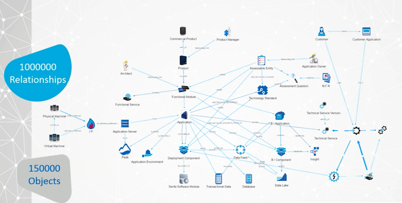
We also went to our business group to understand how they defined our products, and incredibly important thing for the research and development team to understand because, at the end of the day, our products are what we’re selling. Our business depends on it.
So it’s crucial to be able to answer questions like: How can we reuse something for another product family? How can we share functionality between different groups? Is there data hiding in the background that could be useful to us?
Here we hit above one million relationships, and we felt proud of the data architecture model we ultimately developed:

The image above is the clean view of our model, which looks quite nice. And as an enterprise architect you might be tempted to say, “Hey, this is my beautiful model. Isn’t it amazing?” Well, it’s not really the truth, as anybody can tell you when you do architecture work.
The real truth is much more like this:

While it looks very scary, it shows how dynamically interlinked the application is, which sits just in the middle and is the core of Amadeus from a technical standpoint.
Graph Visualization with Neo4j
Our next step was to visualize this information, which we were able to do with Keylines and Neo4j:

We added Elasticsearch and MariaDB to give us some other capabilities around the metamodel, and placed KeyLines on top with AngularJS to provide us some nice UI. We stuck to the KISS acronym by keeping our architecture simple.
When V1 landed, it was a big moment. We had taken something that was a proof of concept and developed it into a product that we could give to users. V2 improved upon our first model and provided a quick way to search our database for information.

You’ll notice that we have a couple of concepts across here, including functional module, product, application and technology standard.
Unfortunately, people either did not understand what these groups were, or had different understandings of the definitions. We had to simplify this – and still needed to understand the metamodel before we could actually work on the tooling.
Next we came up with this simple landing page, which looks much like some of the big search engines out there:

It allowed users to type any term and do a simple search. Even if people had varying understandings of what a product is, you could type in the name of the so-called product you’re looking for, and it would come up.
Below is a demo of how this works:
Our next demo will go through how people can contribute to the database. Roughly 90 percent of our sources are automated, and on a weekly basis we synchronise against 20 other repositories across Amadeus to pull in the latest information such as product listings, the deployment view and latest virtual machines. This is how we ensure our data stays up to date.
But we also wanted to provide people with the ability to contribute, which our following demo will run through:
And our last demo will take a look at advanced search:
We found it important to use those different repositories to build out a view across the entire enterprise. Most of the groups we have, whether they’re operational or technical, know their world very well. But they don’t necessarily connect to another area, and they can’t share terminology, which makes it difficult to understand any shared problems they might run into.
We started by looking into which products use JBoss EAP. Where is it actually deployed? What versions do we have out there?
We can expand to both virtual and physical machines, then to application servers and their descriptions, out to the applications themselves (thanks to our master data management system), and finally out to commercial products. We can see this in a single view as a graph, and throw it up as an Excel sheet:

Those of you who know Cypher will see how that works nicely. But we can have a viewpoint. So this is a very small example and certainly not the complete view.
Another useful view is to explore how a customer connects to our applications, which is really an age-old question. I have thousands of customers out there, and we want to know: How do they connect to my applications, and which services are they consuming?

We can build a view that allows us to see their applications. We can see how they’re routed through our systems and which technical services they’re using. (In the above example, we had to remove the names to maintain client confidentiality).
Below is a very simplified view of how we handle GDPR, which is one of our first use cases within an iterative type of module, and it requires agility:

We wanted to know: What could we do first, and what was the first thing we wanted to look at? We have customers, which contract products that touch data, and that are running on data centers.
While the above provides a very simple view, it gets complicated very quickly:
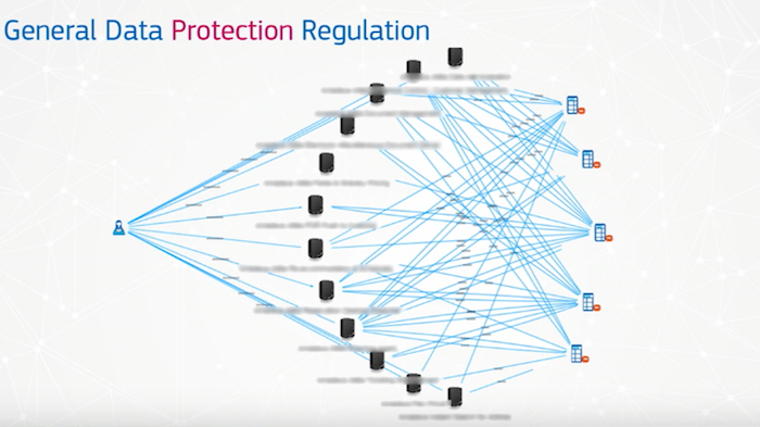
A customer often contracts multiple products within our ecosystem, and we have somewhere between 200 and 600 products available.
We use our knowledge of the metamodel to go down through the layers from a product and understand which databases it hits and what data is in those databases.
The above is how we visualize that. And the key thing to remember is that we hide this complexity from the customer while maintaining it internally.
In Review
We’re using Neo4j to manage our content at full steam and have automated systems filling in the information. We built an ETL tool that allows us to important millions of lines of information very quickly thanks to Neo4j, which also allows us to expand our model very quickly.
As we import more data, the model becomes more complex – which also means we have more to understand while we continue to show something simple to our users.
With our GDPR compliance example above, there is a long chain of relationships from that data to the product, which we can hide. And for those of you who have been using Neo4j for a while, we use the Neo4j APOC library to create virtual relationships that are then shown into the UI behind that. And since our tool is Neo4j-powered and web-based, we now have a flexible tool in an ecosystem that allows people to jump in and start updating information.
What’s Next for Amadeus?
One of the biggest pain points we have to address is the fact that we have a number of different repositories that all talk about the same thing. For example, there’s only one Thomas Lawrence, but I’m represented differently across different social platforms, such such as Facebook, LinkedIn, Instagram and Twitter. These all provide different views of the same entity (me), even though there’s only one me.
This requires a system that includes the concept of a golden record, i.e. a single record that is populated from multiple referentials in a single viewpoint. It’s incredibly important for us to keep all the sources that populate that record, because we know we are going to have to prove the accuracy of that data if we’re ever subject to a GDPR audit.
The techniques for pulling this information is the next big area we want to go into so that we can better understand our model, and leverage APOC and the newest version of Neo4j.
Another crucial area, also related to GDPR, is security. We already have a layer built into our tooling that allows us to customize what a given user can or can’t see – in terms of both objects and relationships. Every time we dig through the information on Neo4j, it gets thrown back to us, and then we very quickly sort out who can see what, which has required a lot of work.
We want to leverage more Neo4j as well and start using their procedures to help us with security.
Neo4j is a lot like a supercar. For those of you who are already using it, you know how incredibly powerful it is. For those of you who aren’t using it yet, you’ll quickly discover how powerful it is. And something I would like to emphasize is: Make sure it stays fun and accessible for your team to play with. At Amadeus we make sure that both tooling and Neo4j are available to the internal community so they can help enhance what we already have. Don’t keep it hidden away.
And now we have a graph that we can openly explore, and we’re always learning – something that’s crucial for everyone.
I’d like to thank the rest of the YAC team. There were only three or four of us working on this project over the past two years, and we’ve grown from working purely within the R&D area to our legal, corporate finance and corporate strategy departments, and are continually expanding our capabilities.
Explore how the world of graph technology intersects with master data management (MDM) in this white paper: Your Master Data Is a Graph: Are You Ready?. Click below to get your free copy.
Read the White Paper
Read the White Paper


