In the previous article Seaborn Library for Data Visualization in Python: Part 1, we looked at how the Seaborn Library is used to plot distributional and categorical plots. In this article we will continue our discussion and will see some of the other functionalities offered by Seaborn to draw different types of plots. We will start our discussion with Matrix Plots.
Matrix Plots
Matrix plots are the type of plots that show data in the form of rows and columns. Heat maps are the prime examples of matrix plots.
Heat Maps
Heat maps are normally used to plot correlation between numeric columns in the form of a matrix. It is important to mention here that to draw matrix plots, you need to have meaningful information on rows as well as columns. Continuing with the theme from the last article, let's plot the first five rows of the Titanic dataset to see if both the rows and column headers have meaningful information. Execute the following script:
import pandas as pd
import numpy as np

import matplotlib.pyplot as plt
import seaborn as sns

dataset = sns.load_dataset('titanic')

dataset.head()
In the output, you will see the following result:
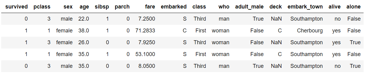
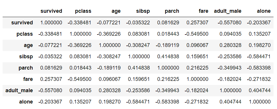
From the output, you can see that the column headers contain useful information such as the passengers survived, their age, fare etc. However the row headers only contain indexes 0, 1, 2, etc. To plot matrix plots, we need useful information on both columns and row headers. One way to do this is to call the corr() method on the dataset. The corr() function returns the correlation between all the numeric columns of the dataset. Execute the following script:
dataset.corr()
In the output, you will see that both the columns and the rows have meaningful header information, as shown below:
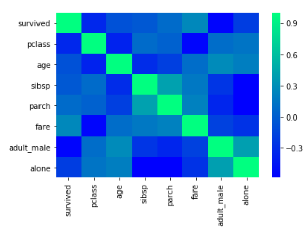
Now to create a heat map with these correlation values, you need to call the heatmap() function and pass it your correlation dataframe. Look at the following script:
corr = dataset.corr()
sns.heatmap(corr)
The output looks like this:
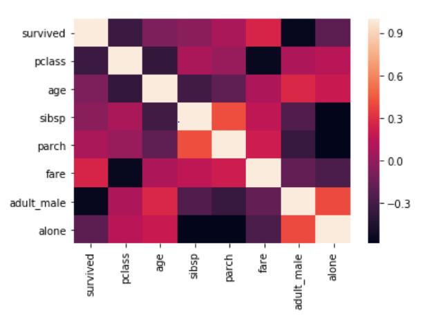
From the output, it can be seen that what heat map essentially does is that it plots a box for every combination of rows and column values. The color of the box depends upon the gradient. For instance, in the above image if there is a high correlation between two features, the corresponding cell or the box is white, on the other hand if there is no correlation, the corresponding cell remains black.
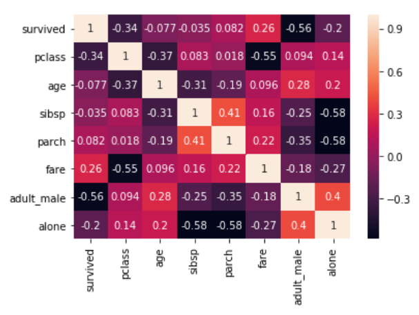
The correlation values can also be plotted on the heat map by passing True for the annot parameter. Execute the following script to see this in action:
corr = dataset.corr()
sns.heatmap(corr, annot=True)
Output:
You can also change the color of the heat map by passing an argument for the cmap parameter. For now, just look at the following script:
corr = dataset.corr()
sns.heatmap(corr, cmap='winter')
The output looks like this:
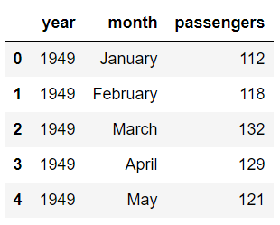
In addition to simply using correlation between all the columns, you can also use the pivot_table function to specify the index, the column and the values that you want to see corresponding to the index and the columns. To see the pivot_table function in action, we will use the "flights" data set that contains the information about the year, the month and the number of passengers that traveled in that month.
Execute the following script to import the data set and to see the first five rows of the dataset:
import pandas as pd
import numpy as np

import matplotlib.pyplot as plt
import seaborn as sns

dataset = sns.load_dataset('flights')

dataset.head()
Output:
Now using the pivot_table function, we can create a heat map that displays the number of passengers that traveled in a specific month of a specific year. To do so, we will pass month as the value for the index parameter. The index attribute corresponds to the rows. Next we need to pass year as the value for the column parameter. And finally for the values parameter, we will pass the passengers column. Execute the following script:
data = dataset.pivot_table(index='month', columns='year', values='passengers')
sns.heatmap(data)
The output looks like this:
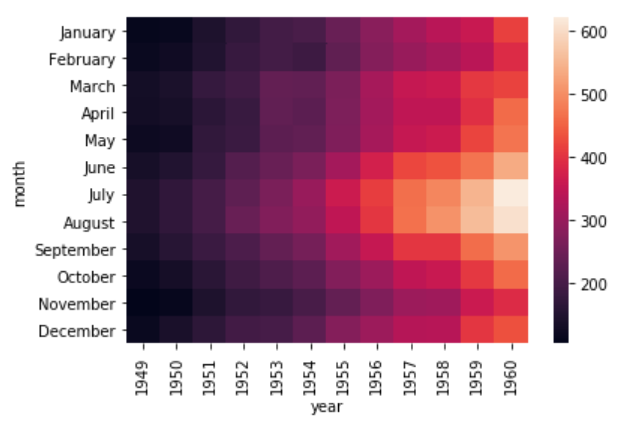
It is evident from the output that in the early years the number of passengers who took the flights was less. As the years progress, the number of passengers increases.
Currently, you can see that the boxes or the cells are overlapping in some cases and the distinction between the boundaries of the cells is not very clear. To create a clear boundary between the cells, you can make use of the linecolor and linewidths parameters. Take a look at the following script:
data = dataset.pivot_table(index='month', columns='year', values='passengers' )
sns.heatmap(data, linecolor='blue', linewidth=1)
In the script above, we passed "blue" as the value for the linecolor parameter, while the linewidth parameter is set to 1. In the output you will see a blue boundary around each cell:
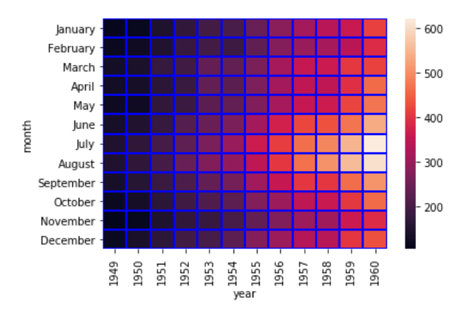
You can increase the value for the linewidth parameter if you want thicker boundaries.
Cluster Map
In addition to the heat map, another commonly used matrix plot is the cluster map. The cluster map basically uses Hierarchical Clustering to cluster the rows and columns of the matrix.
Let's plot a cluster map for the number of passengers who traveled in a specific month of a specific year. Execute the following script:
data = dataset.pivot_table(index='month', columns='year', values='passengers')
sns.clustermap(data)
To plot a cluster map, clustermap function is used, and like the heat map function, the dataset passed should have meaningful headers for both rows and columns. The output of the script above looks like this:
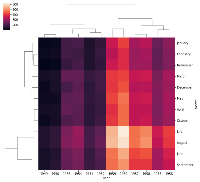
In the output, you can see months and years clustered together on the basis of the number of passengers that traveled in a specific month.
With this, we conclude our discussion about the Matrix plots. In the next section we will start our discussion about grid capabilities of the Seaborn library.
Seaborn Grids
Grids in Seaborn allow us to manipulate the subplots depending upon the features used in the plots.
Pair Grid
In Part 1 of this article series, we saw how pair plots can be used to draw scatter plots for all possible combinations of the numeric columns in the dataset.
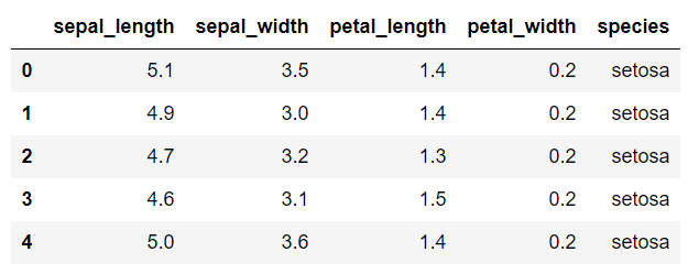
Let's revise the pair plot here before we can move on to the pair grid. The dataset we are going to use for the pair grid section is the "iris" dataset which is downloaded by default when you download the seaborn library. Execute the following script to load the iris dataset:
import pandas as pd
import numpy as np

import matplotlib.pyplot as plt
import seaborn as sns

dataset = sns.load_dataset('iris')

dataset.head()
The first five rows of the iris dataset look like this:
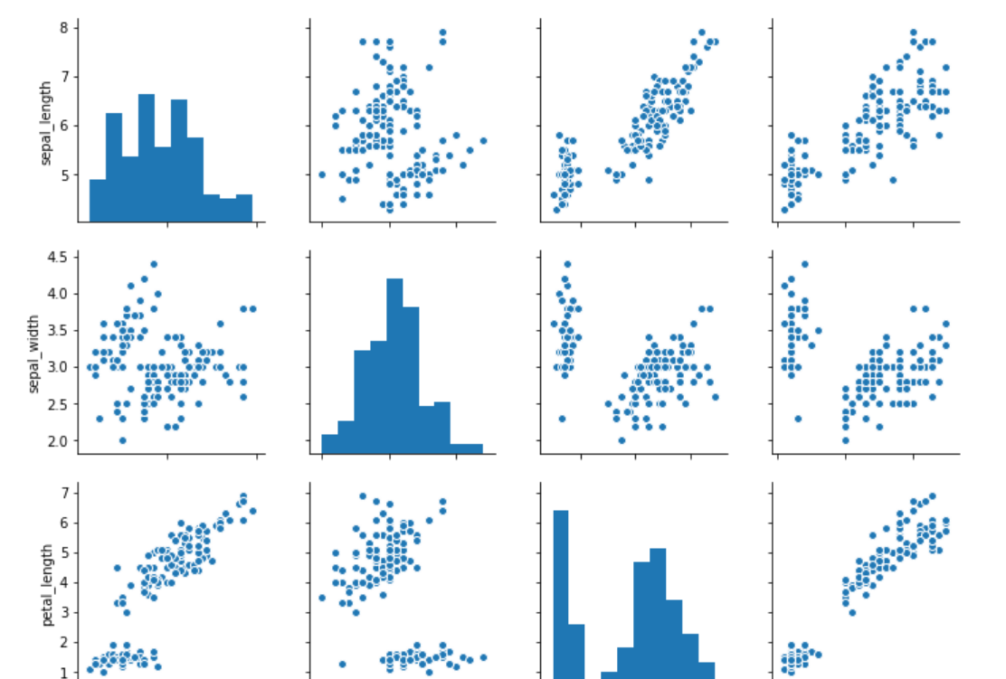
Now let's draw a pair plot on the iris dataset. Execute the following script:
sns.pairplot(dataset)
A snapshot of the out looks like this:
Now let's plot a pair grid and see the difference between the pair plot and the pair grid. To create a pair grid, you simply have to pass the dataset to the PairGrid function, as shown below:
sns.PairGrid(dataset)
Output:
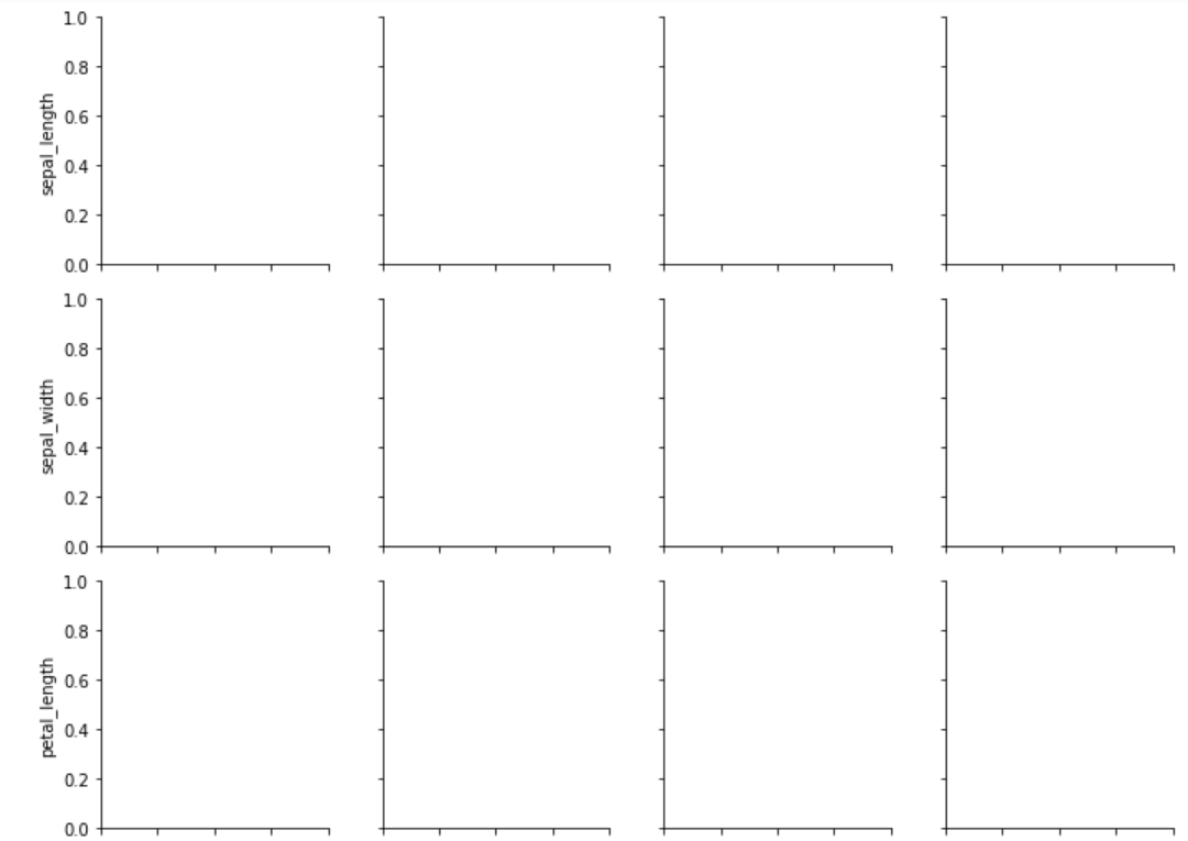
In the output, you can see empty grids. This is essentially what the pair grid function does. It returns an empty set of grids for all the features in the dataset.
Next, you need to call the map function on the object returned by the pair grid function and pass it the type of plot that you want to draw on the grids. Let's plot a scatter plot using the pair grid.
grids = sns.PairGrid(dataset)
grids.map(plt.scatter)
Check out our hands-on, practical guide to learning Git, with best-practices, industry-accepted standards, and included cheat sheet. Stop Googling Git commands and actually learn it!
The output looks like this:
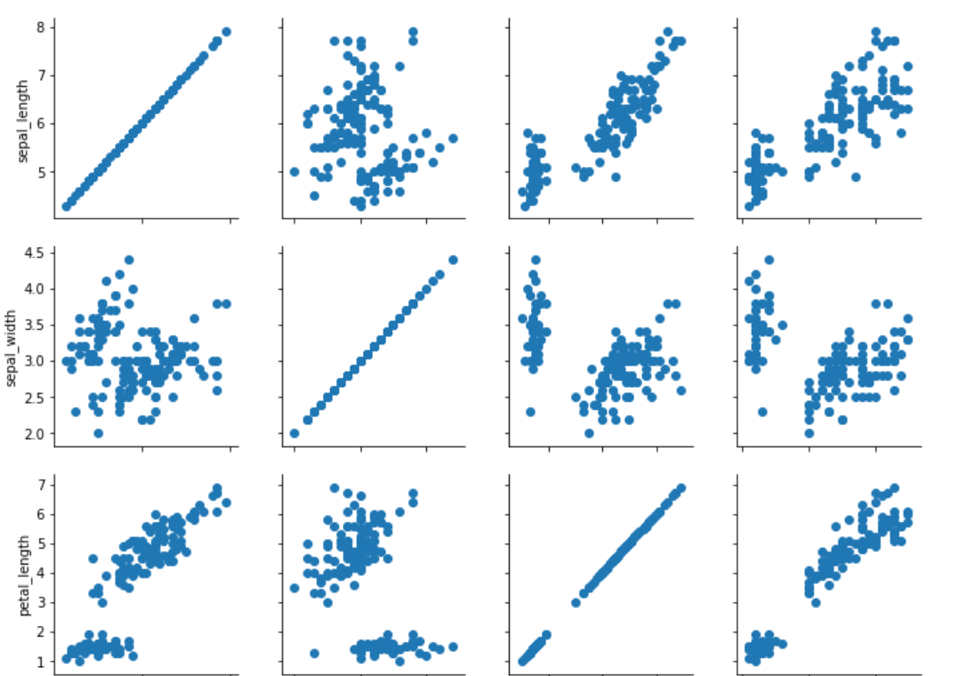
You can see scatter plots for all the combinations of numeric columns in the "iris" dataset.
You can also plot different types of graphs on the same pair grid. For instance, if you want to plot a "distribution" plot on the diagonal, a "kdeplot" on the upper half of the diagonal, and "scatter" plot on the lower part of the diagonal you can use map_diagonal, map_upper, and map_lower functions, respectively. The type of plot to be drawn is passed as the parameter to these functions. Take a look at the following script:
grids = sns.PairGrid(dataset)
grids.map_diag(sns.distplot)
grids.map_upper(sns.kdeplot)
grids.map_lower(plt.scatter)
The output of the script above looks like this:
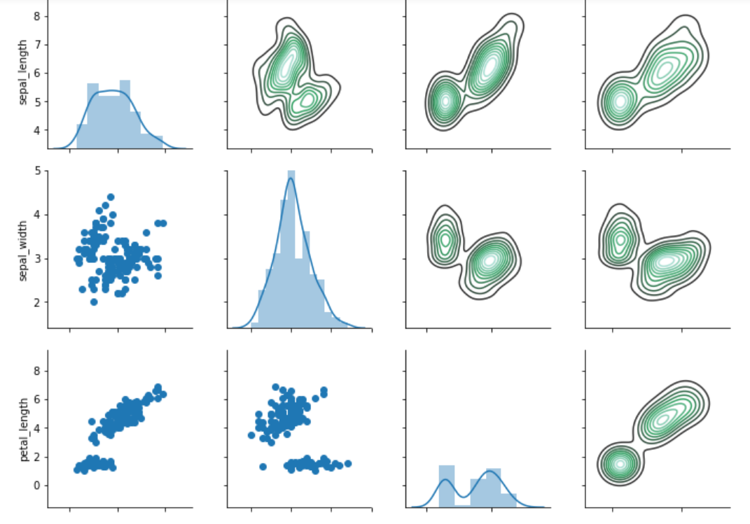
You can see the true power of the pair grid function from the image above. On the diagonals we have distribution plots, on the upper half we have the kernel density plots, while on the lower half we have the scatter plots.
Facet Grids
The facet grids are used to plot two or more than two categorical features against two or more than two numeric features. Let's plot a facet grid which plots the distributional plot of gender vs alive with respect to the age of the passengers.
For this section, we will again use the Titanic dataset. Execute the following script to load the Titanic dataset:
import pandas as pd
import numpy as np

import matplotlib.pyplot as plt
import seaborn as sns

dataset = sns.load_dataset('titanic')
To draw a facet grid, the FacetGrid() function is used. The first parameter to the function is the dataset, the second parameter col specifies the feature to plot on columns while the row parameter specifies the feature on the rows. The FacetGrid() function returns an object. Like the pair grid, you can use the map function to specify the type of plot you want to draw.
Execute the following script:
grid = sns.FacetGrid(data=dataset, col='alive', row='sex')
grid.map(sns.distplot, 'age')
In the above script, we plot the distributional plot for age on the facet grid. The output looks like this:
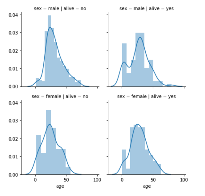
From the output, you can see four plots. One for each combination of gender and survival of the passenger. The columns contain information about the survival while the rows contain information about the sex, as specified by the FacetGrid() function.
The first row and first column contain the age distribution of the passengers where sex is male and the passengers did not survive. The first row and second column contain the age distribution of the passengers where sex is male and the passengers survived. Similarly, the second row and first column contain the age distribution of the passengers where sex is female and the passengers did not survive while the second row and second column contain the age distribution of the passengers where sex is female and the passengers survived.
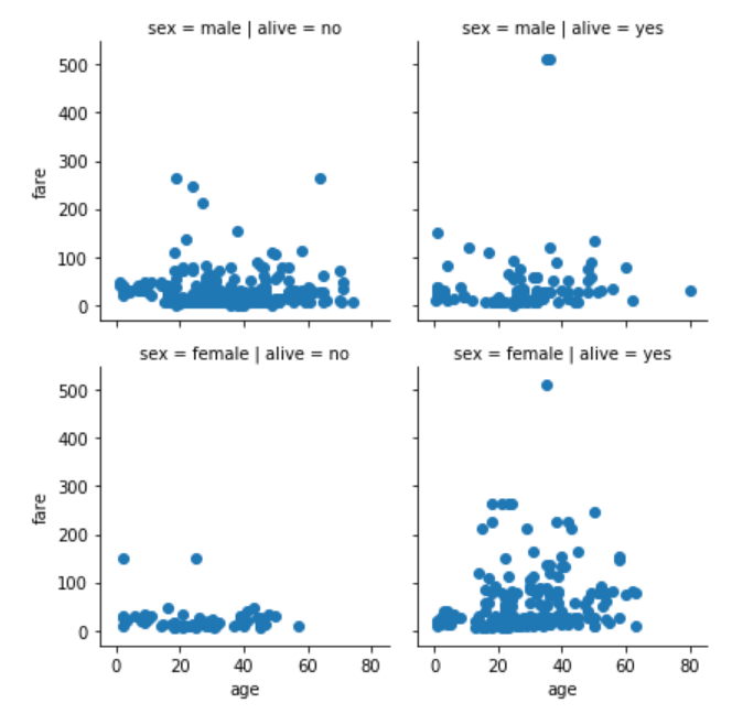
In addition to distributional plots for one feature, we can also plot scatter plots that involve two features on the facet grid.
For instance, the following script plots the scatter plot for age and fare for both the genders of the passengers who survived and those who didn't.
grid = sns.FacetGrid(data= dataset, col= 'alive', row = 'sex')
grid.map(plt.scatter, 'age', 'fare')
The output of the script above looks like this:
Regression Plots
Regression plots, as the name suggests are used to perform regression analysis between two or more variables.
In this section, we will study the linear model plot that plots a linear relationship between two variables along with the best-fit regression line depending upon the data.
The dataset that we are going to use for this section is the "diamonds" dataset which is downloaded by default with the seaborn library. Execute the following script to load the dataset:
import pandas as pd
import numpy as np

import matplotlib.pyplot as plt
import seaborn as sns

dataset = sns.load_dataset('diamonds')

dataset.head()
The dataset looks like this:
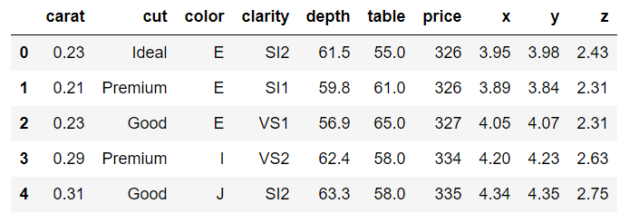
The dataset contains different features of a diamond such as weight in carats, color, clarity, price, etc.
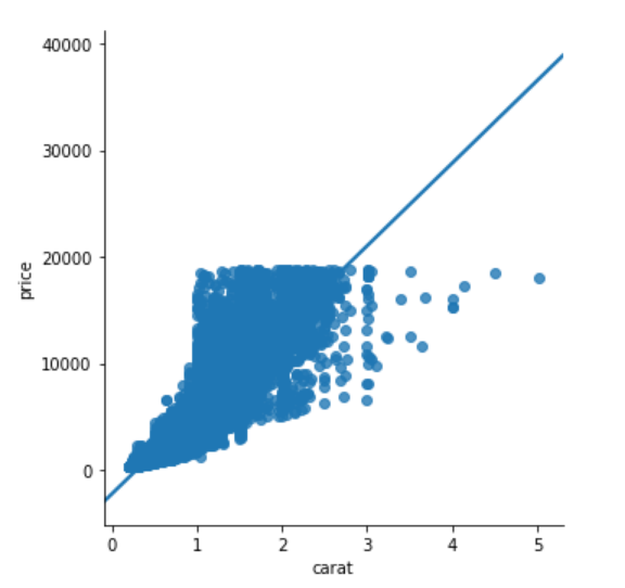
Let's plot a linear relationship between, carat and price of the diamond. Ideally, the heavier the diamond is, the higher the price should be. Let's see if this is actually true based on the information available in the diamonds dataset.
To plot the linear model, the lmplot() function is used. The first parameter is the feature you want to plot on the x-axis, while the second variable is the feature you want to plot on the y-axis. The last parameter is the dataset. Execute the following script:
sns.lmplot(x='carat', y='price', data=dataset)
The output looks like this:
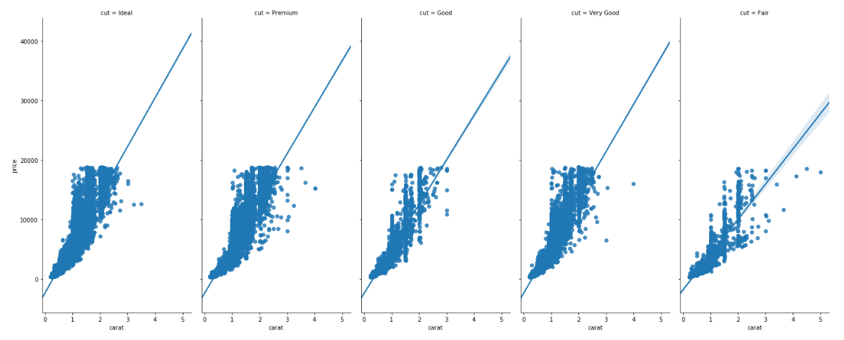
You can also plot multiple linear models based on a categorical feature. The feature name is passed as value to the hue parameter. For instance, if you want to plot multiple linear models for the relationship between carat and price feature, based on the cut of the diamond, you can use lmplot function as follows:
sns.lmplot(x='carat', y='price', data=dataset, hue='cut')
The output looks like this:
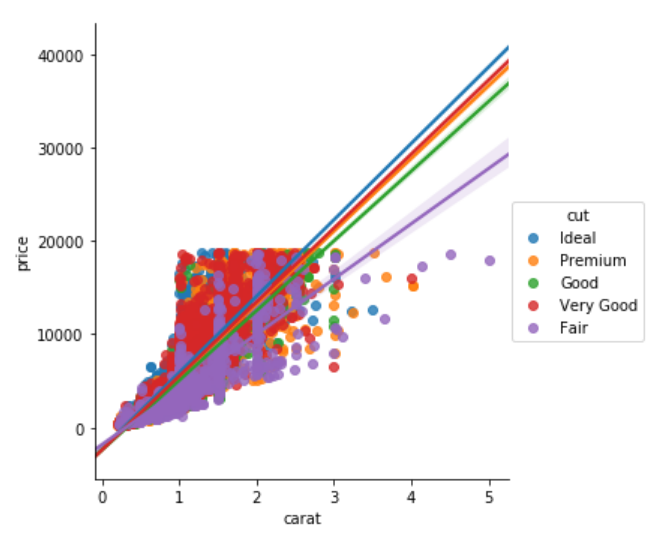
From the output, you can see that the linear relationship between the carat and the price of the diamond is steepest for the ideal cut diamond as expected and the linear model is the shallowest for the fair cut diamond.
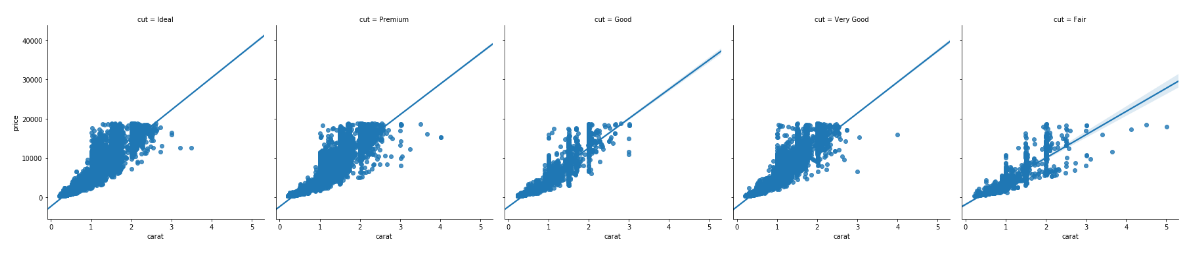
In addition to plotting the data for the cut feature with different hues, we can also have one plot for each cut. To do so, you need to pass the column name to the cols attribute. Take a look at the following script:
sns.lmplot(x='carat', y='price', data=dataset, col='cut')
In the output, you will see a separate column for each value in the cut column of the diamonds dataset as shown below:
You can also change the size and aspect ratio of the plots using the aspect and size parameters. Take a look at the following script:
sns.lmplot(x='carat', y = 'price', data= dataset, col = 'cut', aspect = 0.5, size = 8 )
The aspect parameter defines the aspect ratio between the width and height. An aspect ratio of 0.5 means that the width is half of the height as shown in the output.
You can see that although the size of the plot has changed, the font size is still very small. In the next section, we will see how to control the fonts and styles of the Seaborn plots.
Plot Styling
Seaborn library comes with a variety of styling options. In this section, we will see some of them.
Set Style
The set_style() function is used to set the style of the grid. You can pass the darkgrid, whitegrid, dark, white and ticks as the parameters to the set_style function.
For this section, we will again use the "titanic dataset". Execute the following script to see darkgrid style.
sns.set_style('darkgrid')
sns.distplot(dataset['fare'])
The output looks like this;
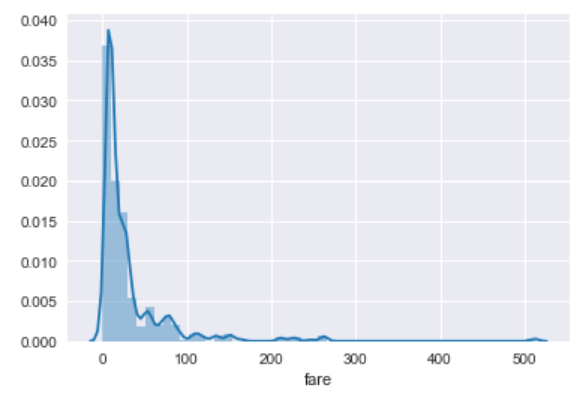
In the output, you can see that we have a dark background with grids. Let's see what whitegrid looks like. Execute the following script:
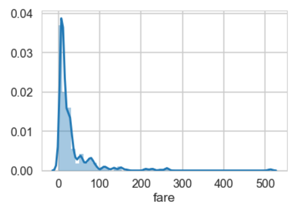
sns.set_style('whitegrid')
sns.distplot(dataset['fare'])
The output looks like this:
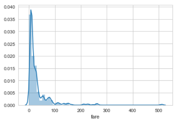
Now you can see that we still have grids in the background but the dark gray background is not visible. I would suggest that you try and play with the rest of the options and see which style suits you.
Change Figure Size
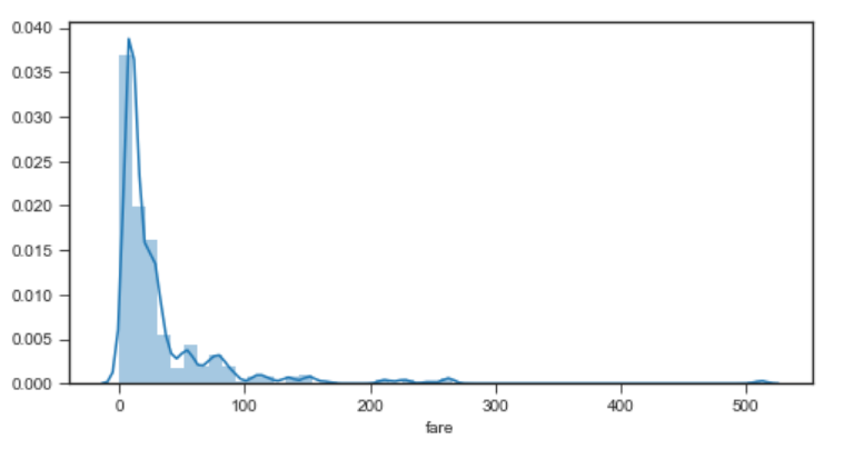
Since Seaborn uses Matplotlib functions behind the scenes, you can use Matplotlib's pyplot package to change the figure size as shown below:
plt.figure(figsize=(8,4))
sns.distplot(dataset['fare'])
In the script above, we set the width and height of the plot to 8 and 4 inches respectively. The output of the script above looks like this:
Set Context
Apart from the notebook, you may need to create plots for posters. To do so, you can use the set_context() function and pass it poster as the only attribute as shown below:
sns.set_context('poster')
sns.distplot(dataset['fare'])
In the output, you should see a plot with the poster specifications as shown below. For instance, you can see that the fonts are much bigger compared to normal plots.
Conclusion
Seaborn Library is an advanced Python library for data visualization. This article is Part 2 of the series of articles on Seaborn for Data Visualization in Python. In this article, we saw how to plot regression and matrix plots in Seaborn. We also saw how to change plot styles and use grid functions to manipulate subplots. In the next article, we will see how Python's Pandas library's built-in capabilities can be used for data visualization.