


Presentation Summary
Thomson Reuters has been collecting data for the last 150 years. It became clear that its financial analysis custers were struggling with two key challenges: data silos and the lack of a tool to easily uncover important data connections.
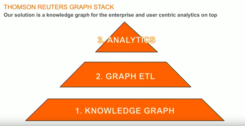
Powered with this knowledge, we set about building a solution to both of these problems – which we found in a data stack that relies on a knowledge graph, a graph ETL, and delivering crucial data analytics – which is where Neo4j comes in. This resulted in the development of an intelligent recommendation engine that allows financial analysts to more effectively analyze data and make important real-time decisions.
Full Presentation: Intelligent Recommendation Engine for Financial Analysts
This blog highlights how we developed a successful intelligent recommendation engine for financial analysts:
I work in product incubation in the innovation department at Thomson Reuters. We try to take entrepreneurial ideas and drag a large multibillion-dollar company, kicking and screaming, into the start-up era. We build and create new and exciting things, one of which I’m going to talk about today.
Our journey to GraphConnect started with us going out and listening to our customers to we identify their most pressing problems. After we identified these, we built our knowledge graph and harnessed the power of Neo4j.
Identifying the Customer Problems
We hosted financial services roundtables with the chief technology officers from some of the largest financial institutions in the world and asked them to anonymously identify their biggest challenge. The number one issue they face come with data silos, which keeps them from identifying and connecting their data.
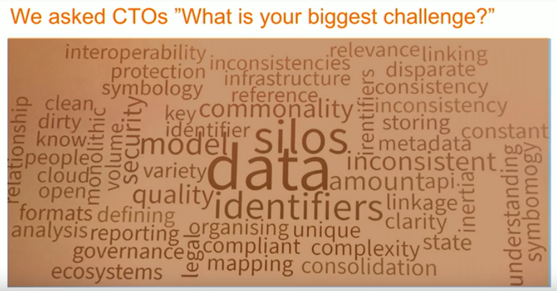
Some of our clients have between 20,000 and 100,000 data silos in their organizations – really astonishing complexity.
If I’m a CTO, I want a solution that’s flexible, because I know technology is going to change; something that’s open; and something that I can move to the cloud while connecting to my legacy systems. (Not to mention the importance of providing a platform that our analysts can easily use.)
Our next step was to ask our financial analysts: What ruins your day?
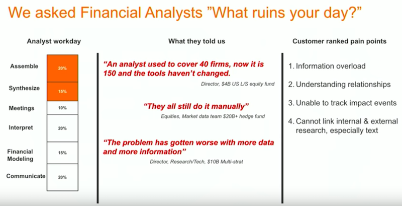
They reported that they spent about 35% of their time assembling reliable, accurate data. The truth is, they actually need much more time to work with data, but simply don’t have any additional time to dedicate to this one task.
Analysts are also covering more firms than they used to, leading to information overload while relying on essentially the same tools that existed historically. This makes it increasingly difficult to review data and provide accurate recommendations. And how do you track events? Doing a keyword search across text isn’t going to do it, especially when you just have a pile of digital papers in your inbox.
Identifying the Solution
Now that we had spoken our customers, we identified two major problems: siloed data as identified by CTOs, and data overload as identified by financial analysts. The solution was to develop a knowledge graph for the enterprise with a user-centric analytics tool sitting on the top:
It’s amazing how many big data strategies place the emphasis on the data technology rather than on the data itself – but data is truly at the center.
The second part of our stack allows us to carefully link, stitch and join our data together in order to provide useful financial data insights, which we can accomplish through a graph ETL. And the third part of our stack requires us to think about the financial analyst so we can come up with a way to deliver a tool that’s genuinely useful.
Let’s dive into the components of our graph stack.
The Knowledge Graph
A quick background on Thomson Reuters:
We have 50,000 employees in 100 countries who spend every day gathering and databasing millions of bits of data. We provide highly-structured, highly-normalised content analysts, human expertise, a huge partner network and an understanding of text and structured data.
We’ve been mining and using natural language processing (NLP) on news and on structured text for over 15 years. This is represented on the left-hand side of the slide below:
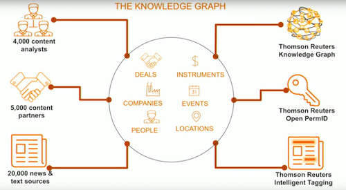
We brew all that content and link it to core entities like people, locations, events, and instruments in a well-described taxonomy of how the financial analysis world works, which is our knowledge graph (represented in the circle above). You can import that data into your own enterprise applications.
Every single piece of metadata has a unique, unchanging identifier, which is what allows you to connect and join data together. We’re providing the NLP system that we’ve been building for 15 years to our customers so they can access the same toolkit.
Below are some basic pieces of data you might want to connect:
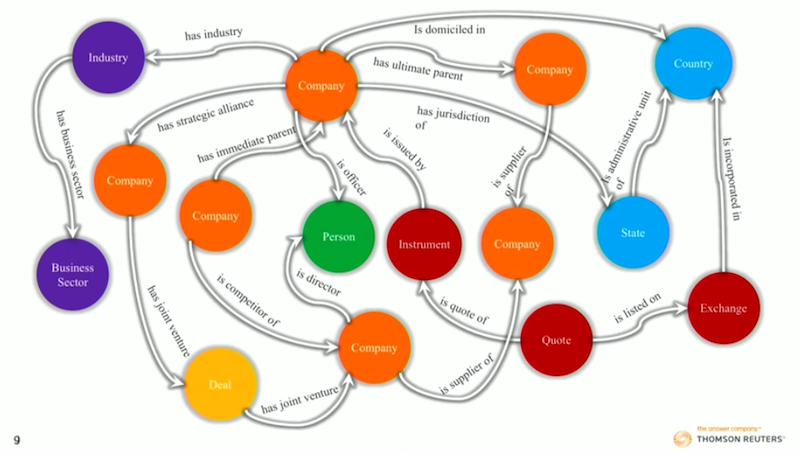
They are the strategic relationships around a company that might help you understand what it’s actually doing. Management may say one thing, but the reality might be very different – which you can understand from our graph.
Below are the data types included in our knowledge graph:
- 6 million organizations
- 3 million officers and directors. This data goes back to the mid-1980s and includes the officers and directors of every single public company, along with their entire work history and the companies they’ve worked for.
- 125 million equity instruments listed on any market anywhere in the world, organized in a highly normalised and described way.
- 75 million metadata objects, such as countries, regions, and cities, that add meaning and context to our data
- 200 million strategic relationships with information that answers the questions: who are my competitors? Who are my suppliers? Who has a joint venture to build this new product? Who’s an ally? Which industry am I in? What is the family tree of this organisation?
The Graph ETL
The knowledge graph is the core asset we deliver, but that’s just the beginning. It provides the foundation, but next you need a tool to deliver all the information.
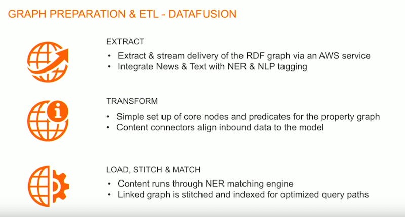
We extract our knowledge graph from our internal graph storage system, which includes meaning, and we deliver it. The transform step is really important as well, because you have to think about the property graph nodes and relationships you want to create, and how you want to model the data around those relationships. Within our data fusion platform, you can connect and join these different datasets together.
The final step is stitching, joining and linking the data together. We make sure that every organization in the underlying datasets our client has matches the data that’s coming from Thomson Reuters. Unless those connections are precise, you end up with lots of false matches and duplicates, so matching and stitching is absolutely crucial – which is really what our data fusion product does.
Let’s quickly go through data fusion, which is the data management layer that sits on top of our Knowledge Graph.
Within that, you can decide the entity types, i.e. is it an organization, is it a person, etc. You can set those up, and then those are the entities you’re going to join with the rest of your data to:
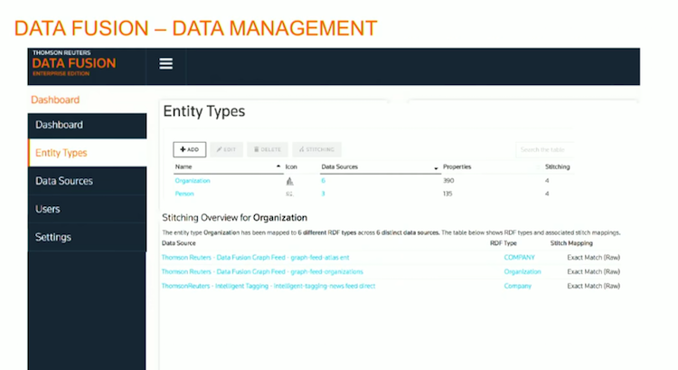
In this case, I have six different data sources linking into organizations, and three data sources linking into my “people” entity type.
Then I have all of my individual data sources streaming in:
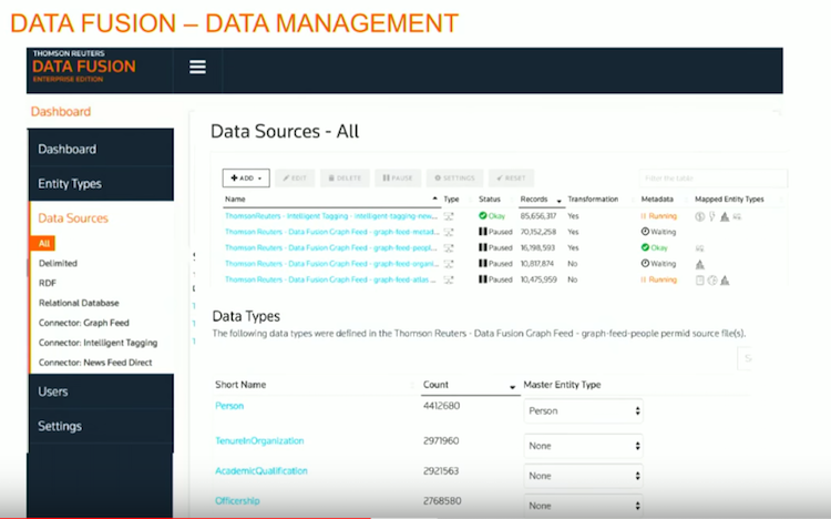
These are all streaming in in real-time, and are being indexed and joined against those core entities.
In this case I have people data, which includes their academic qualifications, officer information, and personal information. Within our data management platform you can decide which pieces you’re going to stitch into those core property graph nodes, which pieces to have as attributes on those nodes or edges, and which pieces you’re going to leave unstitched.
This provides the flexible administration tool for managing data that our customers are asking for. We also have an API to get data out of data fusion, and an explorer tool that allows you to visually explore the data.
That provides a window into the data management platform we created, but we’re not delivering analytics yet. Joining, linking and merging data is critical for what comes next – which is the added value on top of our graph stack, and specifically for our data analysts.
Delivering Analytics
Developing the graph analytics component is a bit interesting.
In Take One, we put the analytics into the ETL layer with the rest of the data, which didn’t work. In Take Two, we tried working with in-memory graph systems because they’re really fast – but they’re static, which doesn’t work when you have data that’s continually moving and updating. In Take Three, we tried using a different graph database that didn’t work out (I won’t say any more about that). And finally, with Take Four, we ended up landing on Neo4j. There were three main reasons we chose Neo4j.
The first is that the community is amazing. We were talking to Emil about the number of events, the number of developers, and the huge adoption amongst our customer base.
Also, the support is amazing. As soon as we signed up, we had a Slack channel with our developers who were solving problems with us within hours of signing an agreement. Enterprise customers get fantastic support from Neo4j. I also have to emphasize that Neo4j works. It’s fast, it’s performant and it does what we need it to do.
Let’s go over how we use Neo4j:
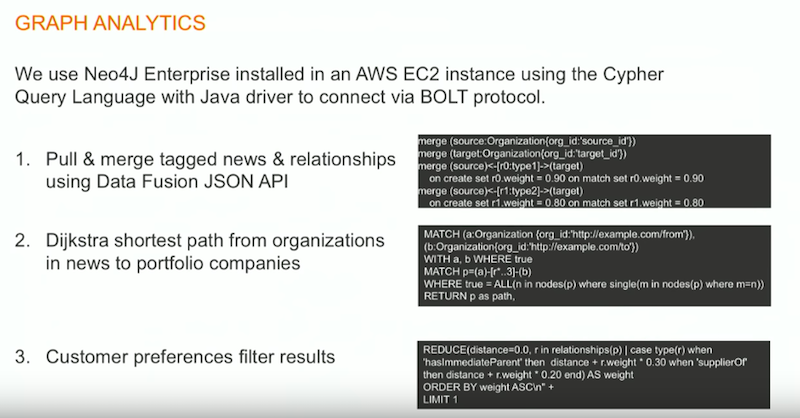
We put it in our Amazon Web Service user environment and use BOLT protocol with Cypher, a database language that’s really amazing – the statements are extremely concise, but very, very powerful.
We pull in data from the data fusion layer, which includes a huge volume of tagged news and additional relationships. We’re able to load all the data very quickly, and then match it and link it into our new instance. Then we run a whole range of shortest path calculations, and our customer sets preferences to filter the results.
Let’s take a step back and discus what we’re trying to do here.
As I said before, a financial analyst receives a constant stream of news, which they just put into their portfolios. And they know that beneath that portfolio are all the relevant customers, suppliers, joint ventures, alliances, and family trees – but they’re missing all that information. Our task is to surface that information without giving them information overload.
To do that, we tag the news to determine how relevant it is to that particular customer and assign a confidence score to the news article. Next we look at the subgraph from our own knowledge graph in the context of our entire knowledge graph to see how it connects with all the other news stories hitting the wire. Our end users decide and score the types and categories of relationships that go into that.
Below is a typical snapshot of one week of data:
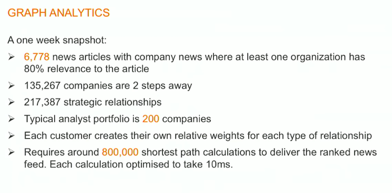
There are typically several thousand news articles published in any given week, and we have an algorithm that determines the relevance of any company mention in a news article, as well as an analysis of strategic relationships and companies that are two steps away. A typical portfolio is around 200 companies, so we analyze all the relevant data relationships for those companies, score the results, link it to streaming use, and return a graph.
This requires running approximately 800,000 shortest path calculations simultaneously, and we have multiple customers using the product at any given moment. Each individual calculation takes about 10 seconds, and while this is a lot faster than any of the other options we tried, we’re still working on how to make the whole thing a lot faster.
Recommendation Engine Demo
Below is a demo that walks us through how the recommendation engine works in real time:
This is a prototype for us at the moment, and something we’re using with our customers to demonstrate the power of the knowledge graph and graph database analytics.
There’s a lot more you can do here, and we see a huge potential for combining the real-time streaming of an updated knowledge graph, stitching it and linking it in a really structured way, and then using Neo4j as an analytics platform to build user applications.
Often when we talk about graphs we think the user wants to explore it, but often they don’t. Most of the time, they just want the answers to their questions. They want the calculations to help them save time and gain valuable insights – which is exactly what graphs provide.
Download this white paper, Sustainable Competitive Advantage: Creating Business Value through Data Relationships, and discover how your company can use graph database technology to leave your competition behind.
Read the White Paper
Read the White Paper


