Does a Hamburger Menu Belong in a WinForms App?

The hamburger menu is now available in your WinForms apps through the Telerik UI for WinForms NavigationView mode. You can have a modern looking WinForms app built so quickly you'll hardly believe it.
User interfaces are constantly evolving in a bid to make every user of an application a power user. We build applications with lots of great features and capabilities and we want these to be readily available and easily accessible to the end user.
Is it Familiar or Intuitive?
When I use a piece of software there are usually three different kinds of UI I encounter. First are the interactions I am already familiar with from other apps, such as a menu at the top, or a ribbon bar, or a multiple document interface. Second come the new things that are very intuitive as to how they are supposed to be used. This is what we usually refer to as awesome UI/UX - it's something I’m not familiar with but at the same time something that I seem to know how to use. Once such thing for me was radial menus. Although they have not gained much traction, I immediately felt comfortable using one right from the word go. The third kind are things hidden somewhere in the application that are sometimes impossible to find without external help, e.g. a functionality that has a shortcut but no other way of accessing it.
If you ask me, today’s topic, the so-called “hamburger menu” or “navigation drawer/view” as it's known in the UWP world, does fall into either the first or second group. It is more and more adopted in a variety on Windows 10 apps, and in Window 10 itself – see Settings, the Groove app and many more. The symbol with the three horizontal lines “≡” has become synonymous with a shortcut for a menu.
The main idea of this UI paradigm is to have the menu as the top-level navigation within your app and have all the content arranged in separate tabs. You can see this method of organizing an app all the way from phones to tablets to desktop to web apps. The reason for that is the built-in adaptability of the component. On small screens it can be just a button that when clicked displays the menu as an overlay over the content and goes away when not needed. On slightly bigger screens it can be a sliver on the side that can be expanded when needed. And on big screens or when lots of changing back and forth between tabs is needed it can stay expanded all the time.
Now you can incorporate this Windows 10 navigation paradigm into your WinForms application with Telerik UI for WinForms, using the NavigationView mode of RadPageView. And complimenting your app with the recently introduced Fluent theme, you will have a modern Windows Forms application. Let’s take a closer look at the actual control and how to make the most out of it.
Meet NavigationView
If you have experience with our controls suite this will be something you have probably done before. Still, if you are just joining the family, first welcome, and second don’t be intimidated by all the names I throw around here, using the component is a breeze. I bet you will feel as if it is something you know, quite well, how to do.
Drop a RadPageView on your form and add several pages through the smart tag or the Visual Studio Properties pane. Change the text of the pages and/or add images to them to make them prettier. Set the ViewMode property of the page view to NavigationView and you are all set. To let you in on a little secret, you can change the ViewMode first and then add pages, it works either way. And that’s it! You are ready to explore the different display modes the navigation view offers. To help with that allow me to navigate you through them.
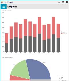
First let’s look at the Minimal display mode. Here we are looking for maximum working area and having the menu only when we need it. Also, if your users will be spending most of their time on one tab and will rarely venture to other ones, this will give them the cleanest working area UI-wise.
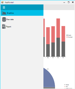
Second is the Compact display mode where we can eat up just a little bit of the screen real estate. This will give the user a quicker way to navigate within the application but will still give the content center stage. Once the users are familiar with the tabs and their respective icons they will not need to expand the menu as often and the shortcuts on the edge of the app will be very handy.

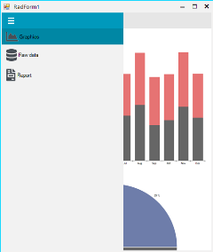
The third mode is for big screens where real estate is not a scarcity and we can keep the menu open for maximum clarity. You can see that the menu doesn't overlap the chart when expanded like the other modes, and instead pushes it out so that it can remain open.
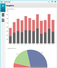
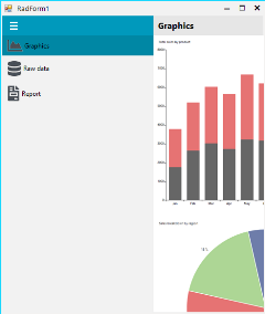
I mentioned adaptability earlier. You can have the navigation view adapt automatically to the space the control is given. This means that you can have your application running on different screen sizes and the navigation view will choose the best display mode depending on the amount of screen size it is given.
If you’re like me and love to explore new user interface options, then go ahead and download the latest version of Telerik UI for WinForms and start tinkering with the component. We would also love to hear from you, so please feel free to leave a comment below or in our feedback portal and share your thoughts.

Ivan Petrov
Ivan Petrov was a Senior Software Developer working at the Telerik WinForms DevLabs.
