Web components: from zero to hero
An introduction to writing raw web components
- What are web components?
- A Components lifecycle
- Building our to-do app
- Setting properties
- Setting attributes
- Reflecting properties to attributes
- Events
- Browser support and polyfills
- Wrapping up
Web components are getting more and more traction. With the Edge team's recent announcement of implementing Custom Elements and Shadow DOM, all major browsers will soon support web components natively. Companies like Github, Netflix, Youtube and ING are even already using web components in production. Neat! However, surprisingly enough, none of those huge, succesful companies have implemented a (you guessed it) to-do app!
So today, we'll be making a to-do app, because the world doesn't have enough implementations of to-do apps yet. You can take a look at what we'll be making here.
Before we start, I'd like to add a little disclaimer that this blogpost is intended to get a better grasp of the basics of web components. Web components are low level, and should probably not be used to write full blown applications without the use of any helper libraries, nor should they be compared to full blown frameworks.
🙋 What are web components?
- [x] Make a demo
- [ ] The boring stuff
- [ ] Setting properties
- [ ] Setting attributes
- [ ] Reflecting properties to attributes
- [ ] Events
- [ ] Wrap it up
First things first: Web components are a set of standards that allow us to write modular, reusable and encapsulated HTML elements. And the best thing about them: since they're based on web standards, we don't have to install any framework or library to start using them. You can start writing web components using vanilla javascript, right now!
But before we start getting our hands dirty, lets take a look at the specifications that let us write web components.
Custom Elements
The Custom Elements api allows us to author our own DOM elements. Using the api, we can define a custom element, and inform the parser how to properly construct that element and how elements of that class should react to changes. Have you ever wanted your own HTML element, like <my-cool-element>? Now you can!
Shadow DOM
Shadow DOM gives us a way to encapsulate the styling and markup of our components. It's a sub DOM tree attached to a DOM element, to make sure none of our styling leaks out, or gets overwritten by any external styles. This makes it great for modularity.
ES Modules
The ES Modules specification defines the inclusion and reuse of JS documents in a standards based, modular, performant way.
HTML Templates
The HTML <template> tag allows us to write reusable chunks of DOM. Inside a template, scripts don't run, images don't load, and styling/mark up is not rendered. A template tag itself is not even considered to be in the document, until it's activated. HTML templates are great, because for every instance of our element, only 1 template is used.
Now that we know which specifications web components leverage, let's take a look at a custom element's lifecycle. I know, I know, we'll get to the code soon!
♻️ A component's lifecycle
Let's take a look at a custom element's lifecycle. Consider the following element:
class MyElement extends HTMLElement {
    constructor() {
        // always call super() first
        super();
        console.log('constructed!');
    }

    connectedCallback() {
        console.log('connected!');
    }

    disconnectedCallback() {
        console.log('disconnected!');
    }

    attributeChangedCallback(name, oldVal, newVal) {
        console.log(`Attribute: ${name} changed!`);
    }

    adoptedCallback() {
        console.log('adopted!');
    }
}

window.customElements.define('my-element', MyElement);
constructor()
The constructor runs whenever an element is created, but before the element is attached to the document. We'll use the constructor for setting some initial state, event listeners, and creating the shadow DOM.
connectedCallback()
The connectedCallback is called when the element is inserted to the DOM. It's a good place to run setup code, like fetching data, or setting default attributes.
disconnectedCallback()
The disconnectedCallback is called whenever the element is removed from the DOM. Clean up time! We can use the disconnectedCallback to remove any event listeners, or cancel intervals.
attributeChangedCallback(name, oldValue, newValue)
The attributeChangedCallback is called any time your element's observed attributes change. We can observe an element's attributes by implementing a static observedAttributes getter, like so:
static get observedAttributes() {
    return ['my-attr'];
}
In this case, any time the my-attr attribute is changed, the attributeChangedCallback will run. We'll go more in-depth on this later this blog post.
✨ Hey! Listen!
Only attributes listed in the
observedAttributesgetter are affected in theattributeChangedCallback.
adoptedCallback()
The adoptedCallback is called each time the custom element is moved to a new document. You'll only run into this use case when you have <iframe> elements in your page.
registering our element
And finally, though not part of the lifecycle, we register our element to the CustomElementRegistry like so:
window.customElements.define('my-element', MyElement);
The CustomElementRegistry is an interface that provides methods for registering custom elements and querying registered elements. The first argument of the registries' define method will be the name of the element, so in this case it'll register <my-element>, and the second argument passes the class we made.
✨ Hey! Listen!
It's important to note how we name our web components. Custom element names must always contain a hyphen. For example:
<my-element>is correct, and<myelement>is not. This is done deliberately to avoid clashing element names, and to create a distinction between custom elements and regular elements.Custom elements also cannot be self-closing because HTML only allows a few elements to be self-closing. These are called void elements, like
<br/>or<img/>, or elements that don't allow children nodes.Allowing self-closing elements would require a change in the HTML parser, which is a problem since HTML parsing is security sensitive. HTML producers need to be able to rely on how a given piece of HTML parses in order to be able to implement XSS-safe HTML generation.
⚒ Building our to do app
- [x] Make a demo
- [x] The boring stuff
- [ ] Setting properties
- [ ] Setting attributes
- [ ] Reflecting properties to attributes
- [ ] Events
- [ ] Wrap it up
Now that we're done with all the boring stuff, we can finally get our hands dirty and start building our to do app! Click here to see the end result.
Let's start with an overview of what we're going to build.
-
A
<to-do-app>element:- Contains an array of to-do's as property
- Adds a to-do
- Removes a to-do
- Toggles a to-do
-
A
<to-do-item>element:- Contains a description attribute
- Contains an index attribute
- Contains a checked attribute
Great! Let's lay out the groundwork for our to-do-app:
to-do-app.js:
const template = document.createElement('template');
template.innerHTML = `
<style>
    :host {
    display: block;
    font-family: sans-serif;
    text-align: center;
    }

    button {
    border: none;
    cursor: pointer;
    }

    ul {
    list-style: none;
    padding: 0;
    }
</style>
<h1>To do</h1>

<input type="text" placeholder="Add a new to do"></input>
<button>✅</button>

<ul id="todos"></ul>
`;

class TodoApp extends HTMLElement {
    constructor() {
        super();
        this._shadowRoot = this.attachShadow({ 'mode': 'open' });
        this._shadowRoot.appendChild(template.content.cloneNode(true));
        this.$todoList = this._shadowRoot.querySelector('ul');
    }
}

window.customElements.define('to-do-app', TodoApp);
We're going to take this step by step. We first create a <template> by calling const template = document.createElement('template');, and then we set some HTML in it. We only set the innerHTML on the template once. The reason we're using a template is because cloning templates is much cheaper than calling .innerHTML for all instances of our component.
Next up, we can actually start defining our element. We'll use our constructor to attach our shadowroot, and we'll set it to open mode. Then we'll clone our template to our shadowroot. Cool! We've now already made use of 2 web components specifications, and succesfully made an encapsulated sub DOM tree.
What this means is that we now have a DOM tree that will not leak any styles, or get any styles overwritten. Consider the following example:
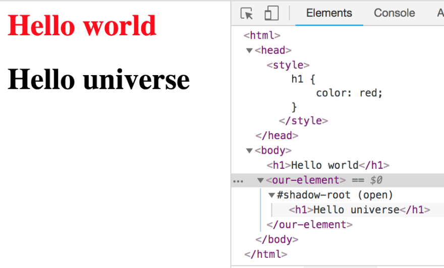
We have a global h1 styling that makes any h1 in the light DOM a red color. But because we have our h1 in a shadow-root, it does not get overwritten by the global style.
Note how in our to-do-app component, we've used a :host pseudo class, this is how we can add styling to the component from the inside. An important thing to note is that the display is always set to display: inline;, which means you can't set a width or height on your element. So make sure to set a :host display style (e.g. block, inline-block, flex) unless you prefer the default of inline.
✨ Hey! Listen!
Shadow DOM can be a little confusing. Allow me to expand a little bit on terminology:
Light DOM:
The light DOM lives outside the component's shadow DOM, and is basically anything that is not shadow DOM. For example, the
<h1>Hello world</h1>up there lives in the light DOM. The term light DOM is used to distinguish it from the Shadow DOM. It's perfectly fine to make web components using light DOM, but you miss out on the great features of shadow DOM.Open shadow DOM:
Since the latest version (V1) of the shadow DOM specification, we can now use
openorclosedshadow DOM. Open shadow DOM allows us to create a sub DOM tree next to the light DOM to provide encapsulation for our components. Our shadow DOM can still be pierced by javascript like so:document.querySelector('our-element').shadowRoot. One of the downsides of shadow DOM is that web components are still relatively young, and many external libraries don't account for it.Closed shadow DOM:
Closed shadow roots are not very applicable, as it prevents any external javascript from piercing the shadowroot. Closed shadow DOM makes your component less flexible for yourself and your end users and should generally be avoided.
Some examples of elements that do use a closed shadow DOM are the
<video>element.
📂 Setting properties
Cool. We've made our first web component, but as of now, it's absolutely useless. It would be nice to be able to pass some data to it and render a list of to-do's.
Let's implement some getters and setters.
to-do-app.js:
class TodoApp extends HTMLElement {
    ...

    _renderTodoList() {
        this.$todoList.innerHTML = '';

        this._todos.forEach((todo, index) => {
            let $todoItem = document.createElement('div');
            $todoItem.innerHTML = todo.text;
            this.$todoList.appendChild($todoItem);
        });
    }

    set todos(value) {
        this._todos = value;
        this._renderTodoList();
    }

    get todos() {
        return this._todos;
    }
}
Now that we have some getters and setters, we can pass some rich data to our element! We can query for our component and set the data like so:
document.querySelector('to-do-app').todos = [
    {text: "Make a to-do list", checked: false},
    {text: "Finish blog post", checked: false}
];
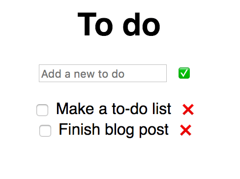
We've now succesfully set some properties on our component, and it should currently look like this:

Great! Except it's still useless because we cannot interact with anything without using the console. Let's quickly implement some functionality to add new to-do's to our list.
class TodoApp extends HTMLElement {
    ...

    constructor() {
        super();
        this._shadowRoot = this.attachShadow({ 'mode': 'open' });
        this._shadowRoot.appendChild(template.content.cloneNode(true));

        this.$todoList = this._shadowRoot.querySelector('ul');
        this.$input = this._shadowRoot.querySelector('input');

        this.$submitButton = this._shadowRoot.querySelector('button');
        this.$submitButton.addEventListener('click', this._addTodo.bind(this));
    }

    _addTodo() {
        if(this.$input.value.length > 0){
            this._todos.push({ text: this.$input.value, checked: false })
            this._renderTodoList();
            this.$input.value = '';
        }
    }

    ...
}
This should be easy enough to follow, we set up some querySelectors and addEventListeners in our constructor, and on a click event we want to push the input to our to-do's list, render it, and clear the input again. Ez 👏.

💅 Setting attributes
- [x] Make a demo
- [x] The boring stuff
- [x] Setting properties
- [ ] Setting attributes
- [ ] Reflecting properties to attributes
- [ ] Events
- [ ] Wrap it up
This is where things will get confusing, as we'll be exploring the differences between attributes and properties, and we'll also be reflecting properties to attributes. Hold on tight!
First, let's create a <to-do-item> element.
to-do-item.js:
const template = document.createElement('template');
template.innerHTML = `
<style>
    :host {
    display: block;
    font-family: sans-serif;
    }

    .completed {
    text-decoration: line-through;
    }

    button {
    border: none;
    cursor: pointer;
    }
</style>
<li class="item">
    <input type="checkbox">
    <label></label>
    <button>❌</button>
</li>
`;

class TodoItem extends HTMLElement {
    constructor() {
        super();
        this._shadowRoot = this.attachShadow({ 'mode': 'open' });
        this._shadowRoot.appendChild(template.content.cloneNode(true));

        this.$item = this._shadowRoot.querySelector('.item');
        this.$removeButton = this._shadowRoot.querySelector('button');
        this.$text = this._shadowRoot.querySelector('label');
        this.$checkbox = this._shadowRoot.querySelector('input');

        this.$removeButton.addEventListener('click', (e) => {
            this.dispatchEvent(new CustomEvent('onRemove', { detail: this.index }));
        });

        this.$checkbox.addEventListener('click', (e) => {
            this.dispatchEvent(new CustomEvent('onToggle', { detail: this.index }));
        });
    }

    connectedCallback() {
        // We set a default attribute here; if our end user hasn't provided one,
        // our element will display a "placeholder" text instead.
        if(!this.hasAttribute('text')) {
            this.setAttribute('text', 'placeholder');
        }

        this._renderTodoItem();
    }

    _renderTodoItem() {
        if (this.hasAttribute('checked')) {
            this.$item.classList.add('completed');
            this.$checkbox.setAttribute('checked', '');
        } else {
            this.$item.classList.remove('completed');
            this.$checkbox.removeAttribute('checked');
        }

        this.$text.innerHTML = this._text;
    }

    static get observedAttributes() {
        return ['text'];
    }

    attributeChangedCallback(name, oldValue, newValue) {
        this._text = newValue;
    }
}
window.customElements.define('to-do-item', TodoItem);
Note that since we're using a ES Modules, we're able to use
const template = document.createElement('template');again, without overriding the previous template we made.
And lets change our _renderTodolist function in to-do-app.js to this:
class TodoApp extends HTMLElement {

        ...

        _renderTodoList() {
            this.$todoList.innerHTML = '';

            this._todos.forEach((todo, index) => {
                let $todoItem = document.createElement('to-do-item');
                $todoItem.setAttribute('text', todo.text);
                this.$todoList.appendChild($todoItem);
            });
        }

        ...

    }
Alright, a lot of different stuff is going on here. Let's dive in. Previously, when passing some rich data (an array) to our <to-do-app> component, we set it like this:
document.querySelector('to-do-app').todos = [{ ... }];
We did that, because todos is a property of the element. Attributes are handled differently, and don't allow rich data, in fact, they only allow a String type as a limitation of HTML. Properties are more flexible and can handle complex data types like Objects or Arrays.
The difference is that attributes are defined on HTML elements. When the browser parses the HTML, a corresponding DOM node will be created. This node is an object, and therefore it has properties. For example, when the browser parses: <to-do-item index="1">, a HTMLElement object will be created. This object already contains several properties, such as children, clientHeight, classList, etc, as well as some methods like appendChild() or click(). We can also implement our own properties, like we did in our to-do-app element, which we gave a todos property.
Here's an example of this in action.
<img src="myimg.png" alt="my image"/>
The browser will parse this <img> element, create a DOM Element object, and conveniently set the properties for src and alt for us. It should be mentioned that this property reflection is not true for all attributes. (Eg: the value attribute on an <input> element does not reflect. The value property of the <input> will always be the current text content of the <input>, and the value attribute will be the initial text content.) We’ll go deeper into reflecting properties to attributes shortly.
So we now know that the alt and src attributes are handled as String types, and that if we'd want to pass our array of to-do's to our <to-do-app> element like this:
<to-do-app todos="[{...}, {...}]"></to-do-app>
We would not get the desired result; we're expecting an array, but actually, the value is simply a String that looks like an array.
✨ Hey! Listen!
- Aim to only accept rich data (objects, arrays) as properties.
- Do not reflect rich data properties to attributes.
Setting attributes works differently from properties as well, notice how we didn't implement any getters or setters. We added our text attribute to the static get observedAttributes getter, to allow us to watch for changes on the text attribute. And we implemented the attributesChangedCallback to react to those changes.
Our app should look like this, at this moment in time:
Boolean attributes
We're not done with attributes just yet. It would be nice to be able to check off some of our to-do's when we're done with them, and we'll be using attributes for that as well. We have to handle our Boolean attributes a little differently though.
The presence of a boolean attribute on an element represents the
Truevalue, and the absence of the attribute represents theFalsevalue.If the attribute is present, its value must either be the empty string or a value that is an ASCII case-insensitive match for the attribute's canonical name, with no leading or trailing whitespace.
The values "true" and "false" are not allowed on boolean attributes. To represent a false value, the attribute has to be omitted altogether.
<div hidden="true">is incorrect.
This means that only the following examples are acceptable for a true value:
<div hidden></div>
<div hidden=""></div>
<div hidden="hidden"></div>
And one for false:
<div></div>
So let's implement the checked attribute for our <to-do-item> element!
Change your to-do-app.js to this:
_renderTodoList() {
    this.$todoList.innerHTML = '';

    this._todos.forEach((todo, index) => {
        let $todoItem = document.createElement('to-do-item');
        $todoItem.setAttribute('text', todo.text);

    // if our to-do is checked, set the attribute, else; omit it.
        if(todo.checked) {
            $todoItem.setAttribute('checked', '');
        }

        this.$todoList.appendChild($todoItem);
    });
}
And change to-do-item to this:
 class TodoItem extends HTMLElement {

    ...

    static get observedAttributes() {
        return ['text', 'checked'];
    }

    attributeChangedCallback(name, oldValue, newValue) {
        switch(name){
            case 'text':
                this._text = newValue;
                break;
            case 'checked':
                this._checked = this.hasAttribute('checked');
                break;
        }
    }

    ...

}
Nice! Our application should look like this:

♺ Reflecting properties to attributes
- [x] Make a demo
- [x] The boring stuff
- [x] Setting properties
- [x] Setting attributes
- [ ] Reflecting properties to attributes
- [ ] Events
- [ ] Wrap it up
Cool, our app is coming along nicely. But it would be nice if our end user would be able to query for the status of checked of our to-do-item component. We've currently set it only as an attribute, but we would like to have it available as a property as well. This is called reflecting properties to attributes.
All we have to do for this is add some getters and setters. Add the following to your to-do-item.js:
get checked() {
    return this.hasAttribute('checked');
}

set checked(val) {
    if (val) {
        this.setAttribute('checked', '');
    } else {
        this.removeAttribute('checked');
    }
}
Now, every time we change the property or the attribute, the value will always be in sync.
🎉 Events
- [x] Make a demo
- [x] The boring stuff
- [x] Setting properties
- [x] Setting attributes
- [x] Reflecting properties to attributes
- [ ] Events
- [ ] Wrap it up
Phew, now that we're done with the hard bits, it's time to get to the fun stuff. Our application currently handles and exposes the data in a way we want to, but it doesn't actually remove or toggle the to-do's yet. Let's take care of that.
First, we're going to have to keep track of the index of our to-do-items. Let's set up an attribute!
to-do-item.js:
static get observedAttributes() {
    return ['text', 'checked', 'index'];
}

attributeChangedCallback(name, oldValue, newValue) {
    switch(name){
        case 'text':
            this._text = newValue;
            break;
        case 'checked':
            this._checked = this.hasAttribute('checked');
            break;
        case 'index':
            this._index = parseInt(newValue);
            break;
    }
}
Note how we're parsing the String type value to an integer here, since attributes only allow a String type, but we'd like the end user to be able to get the index property as an integer. And we also now have a nice example of how to deal with string/number/boolean attributes and how to handle attributes and properties as their actual type.
So let's add some getters and setters to to-do-item.js:
set index(val) {
    this.setAttribute('index', val);
}

get index() {
    return this._index;
}
And change our _renderTodoList function in to-do-app.js to:
_renderTodoList() {
    this.$todoList.innerHTML = '';

    this._todos.forEach((todo, index) => {
        let $todoItem = document.createElement('to-do-item');
        $todoItem.setAttribute('text', todo.text);

        if(todo.checked) {
            $todoItem.setAttribute('checked', '');
    }

        $todoItem.setAttribute('index', index);

        $todoItem.addEventListener('onRemove', this._removeTodo.bind(this));

        this.$todoList.appendChild($todoItem);
    });
}
Note how we're setting $todoItem.setAttribute('index', index);. We now have some state to keep track of the index of the to-do. We've also set up an event listener to listen for an onRemove event on the to-do-item element.
Next, we'll have to fire the event when we click the remove button. Change the constructor of to-do-item.js to the following:
constructor() {
    super();
    this._shadowRoot = this.attachShadow({ 'mode': 'open' });
    this._shadowRoot.appendChild(template.content.cloneNode(true));

    this.$item = this._shadowRoot.querySelector('.item');
    this.$removeButton = this._shadowRoot.querySelector('button');
    this.$text = this._shadowRoot.querySelector('label');
    this.$checkbox = this._shadowRoot.querySelector('input');

    this.$removeButton.addEventListener('click', (e) => {
        this.dispatchEvent(new CustomEvent('onRemove', { detail: this.index }));
    });
}
✨ Hey! Listen!
We can set
{ detail: this.index, composed: true, bubbles: true }to let the event bubble out of our components shadow DOM.
And add the _removeTodo function in to-do-app.js:
_removeTodo(e) {
    this._todos.splice(e.detail, 1);
    this._renderTodoList();
}
Sweet! We're able to delete to-do's:

And finally, let's create a toggle functionality as well.
to-do-app.js:
class TodoApp extends HTMLElement {
    ...

    _toggleTodo(e) {
        const todo = this._todos[e.detail];
        this._todos[e.detail] = Object.assign({}, todo, {
            checked: !todo.checked
        });
        this._renderTodoList();
    }


    _renderTodoList() {
        this.$todoList.innerHTML = '';

        this._todos.forEach((todo, index) => {
            let $todoItem = document.createElement('to-do-item');
            $todoItem.setAttribute('text', todo.text);

            if(todo.checked) {
                $todoItem.setAttribute('checked', '');
            }

            $todoItem.setAttribute('index', index);
            $todoItem.addEventListener('onRemove', this._removeTodo.bind(this));
            $todoItem.addEventListener('onToggle', this._toggleTodo.bind(this));

            this.$todoList.appendChild($todoItem);
        });
    }

    ...

}
And to-do-item.js:
class TodoItem extends HTMLElement {

    ...

    constructor() {
        super();
        this._shadowRoot = this.attachShadow({ 'mode': 'open' });
        this._shadowRoot.appendChild(template.content.cloneNode(true));

        this.$item = this._shadowRoot.querySelector('.item');
        this.$removeButton = this._shadowRoot.querySelector('button');
        this.$text = this._shadowRoot.querySelector('label');
        this.$checkbox = this._shadowRoot.querySelector('input');

        this.$removeButton.addEventListener('click', (e) => {
            this.dispatchEvent(new CustomEvent('onRemove', { detail: this.index }));
        });

        this.$checkbox.addEventListener('click', (e) => {
            this.dispatchEvent(new CustomEvent('onToggle', { detail: this.index }));
        });
    }

    ...

}

Success! We can create, delete, and toggle to-do's!
👻 Browser support and polyfills
- [x] Make a demo
- [x] The boring stuff
- [x] Setting properties
- [x] Setting attributes
- [x] Reflecting properties to attributes
- [x] Events
- [ ] Wrap it up
The last thing I'd like to address in this blog post is browser support. At time of writing, the Microsoft Edge team has recently announced that they'll be implementing custom elements as well as shadow DOM, meaning that all major browsers will soon natively support web components.
Until that time, you can make use of the webcomponentsjs polyfills, maintained by Google. Simply import the polyfill:
<script src="https://unpkg.com/@webcomponents/webcomponentsjs@2.0.0/webcomponents-bundle.js"></script>
I used unpkg for simplicity's sake, but you can also install webcomponentsjs with NPM. To make sure the polyfills have succesfully loaded, we can wait for the WebComponentsReady event to be fired, like so:
window.addEventListener('WebComponentsReady', function() {
    console.log('Web components ready!');
    // your web components here
});
💫 Wrapping up
- [x] Make a demo
- [x] The boring stuff
- [x] Setting properties
- [x] Setting attributes
- [x] Reflecting properties to attributes
- [x] Events
- [x] Wrap it up
Done!
If you've made it all the way down here, congratulations! You've learned about the web components specifications, (light/open/closed) shadow DOM, templates, the difference between attributes and properties, and reflecting properties to attributes.
But as you can probably tell, a lot of the code that we've written may feel a little clunky, we've written quite a lot of boiler plate (getters, setters, queryselectors, etc), and a lot of things have been handled imperatively. Our updates to the to do list aren't very performant, either.
"Web components are neat, but I don't want to spend all this time writing boiler plate and setting stuff imperatively, I want to write declarative code!", you cry.
Enter lit-html, which we'll cover in the next blog post.


Top comments (30)
@pascal Thanks for your detailed and informative article on Web Components.
You said: "It's perfectly fine to make web components using light DOM, but you miss out on the great features of shadow DOM."
I've just started playing with Web Components and am struggling with significant differences between using Light DOM and Shadow DOM. With Shadow DOM you need to use
<slot>'s to render markup from a parent web component in a child web component. In Light DOM<slot>'s don't exist and I've been unable to get parent markup to render in a child web component using Light DOM.Further they way you construct html in Shadow DOM seems to be different to Light DOM.
I'm using lit-element FWIW.
Others reading this note that Dev.to has a series of articles by Benny Powers which are definitely worth reading. Part 1 dev.to/bennypowers/lets-build-web-...
Hi Neville!
When writing raw web components, you can set the markup of the light DOM like so:
Notice how we omit attaching the shadowroot to our element, making it render to the light DOM instead.
In LitElement you can override the
createRenderRoot()and returnthisto make your element render to light dom instead. You're essentially changing the renderroot from the default shadowroot (LitElement defaults to using shadow DOM), to the light dom. You can see an example of that in action here:stackblitz.com/edit/create-lit-app...
Furthermore; yes, you are correct; when using shadow DOM, you can use slots to render markup from a parent into a child component. The slot API is part of shadow DOM, so you can't have one without the other. (eg: you can't use the slot API with light DOM).
Here's an example of using slots:
stackblitz.com/edit/create-lit-app...
And here's some recommended reading on using slots (the mozilla docs are an incredible reference for anything web components):
developer.mozilla.org/en-US/docs/W...
I hope that's helpful!
I can also vouch for benny's series, I've read them all, and they're all great and showcase really detailed and diverse examples of different web component technologies. :)
Edit: I'm currently working on part 2 of this series, which will talk more about lit-html/element.
Hi Pascal,
Thanks for your reply. I have been very successfully using Riot.js for quite a while in our Web App Clibu(clibu.com) and would like to move to using Web Components, hence my interest.
I starting playing with Lit-Element a few days ago and I am impressed so far, however as is often the case it is one step forward, two back. ;-)
I am aware of using Light DOM with lit-element which would be an easier initial transition, however I'm currently stuck on using nested components in Light DOM. I've put a sample at stackblitz.com/edit/create-lit-app... and you'll see that
<nested-light-dom>doesn't display any content.Am I right that this isn't possible without using Slots and therefore Shadow DOM?
You are correct, you'd have to use slots and shadow DOM to achieve something like this. Do you mind me asking what your use case for this is though? Generally components that use light DOM are simpler leaf/UI components.
Pascal, thanks for the clarification.
What I find somewhat confusing with custom elements is they don't behave like normal elements. For example:
displays "Hello Neville" whereas:
Only displays 'Hello'.
I've put up a sample of what I'm trying to accomplish at: stackblitz.com/edit/create-lit-app...
What I want is to have a Web Component that expands & collapses the Web Components nested inside it.
For some reason I don't yet understand the demo app is not working correctly, ie. there is no animation for the transition specified in
card-elementand the height doesn't reduce to zero.The same sample without using
card-elementworks perfectly. ie. Replace<card-element>in<container-element>with<div style="transition-...>I assume that my current lack of knowledge with Shadow DOM will explain the underlying issue, or not. ;-)
Hi Neville, I quickly hacked together this example for you:
stackblitz.com/edit/create-lit-app...
I hope that helps you :-) Feel free to reach out if you have any more questions.
Hi Pascal, that's great and works perfectly and is simpler. Any idea why my code didn't work, just curious.
in
card-element.js, change:to:
When querying for DOM in web components, you want to target the shadowRoot. Also, you were querying for and changing the height of the h1, while really, you wanted to change the height of the container div.
And you had a bunch of js you didnt really need 😛LitElement will take care of your properties for you. You can use your own getters and setters, but we didn't really need to here. I'll expand more on LitElement in part two of this blog series.
Thanks again, much to learn about shadow dom and LitElement. Happy enough though for my first week.
Can I suggest you include some downloadable examples in future articles. Stackblitz is awesome as well.
Often we just get pieces of Javascript which are great at explaining things, but when we try and run something like LitElement for the first time we get stuck with build tools and errors in the Browser until we get everything sorted out.
I hadn't found github.com/thepassle/create-lit-app when I started last Monday, which was a pity. I like Parcel.js which is what I'm using, but it took some time to get code that ran without errors.
I'll look forward to your future articles.
PS. My wife is Dutch. Amsterdam is great. ;-)
Yeah, takes some time to get used to web components, but when everything clicks they're well worth it (especially LitElement).
As for downloadable examples, you can find the source code of this blog over here: github.com/thepassle/webcomponents...
(You can run it locally with
python -m SimpleHTTPServer 8000, or any other method of serving)Feel free to reach out if you have any more questions, you can find me on twitter, and usually on the polymer slack.
Hi @pascal ! First of all thank you for the tutorial, is by far the best web-components tutorial I've faced to!
I have some doubts that I would like to solve :)
In the section Events I don't understand why do you handle the index as attribute instead of property:
Also in this section, you refer to this.index instead of this._index:
Is it OK or is it a mistake?
And the last one. In the section Reflecting properties to attributes I have the same problem with setters that I had with index. Why do you handle the checked as attribute instead of property??
Many thanks in advance and congrats for your work!
Hi Rafa, this is mostly because attribution/property syncing. Arguably the index property doesn't need to be an attribute, but it's a good showcase on how to sync attributes with properties, and how to deal with different types than Strings.
If you'd set
set index(val) { this._index = val }, the attribute won't be up to date with the property. When getting the index property, we can just read the attribute's value.Same goes for the checked property, you'll almost definitely want the attribute to stay in sync with property, and its a showcase on how to handle boolean attributes as well.
Hope that clarifies — feel free to let me know if you have any more questions 😊
Hi Pascal! Thanks for your quick answer!
I understand what you say, but I thought that it was necessary to maintain a "model" (based on properties) that is mapped to all the attributes. That's why I thought that all the getters and setter should point to properties, instead of attributes.
Would it be possible to do it that way? I mean, maintain a model (properties based) and at the same time maintain up to date the syncronization between attributes and properties?
In the other hand, I understand then that attribute-properties mapped is not always mandatory, depending or you component logic, right?
After a week with one dev pair trying to build a web component, this is the best post anyone on our team can find on the internet.
Every other web component tutorial seems like the author doesn't even have working code, and they miss important steps like how to include css.
Hi Pascal,
It seems the examples of the code running in stackblitz have no reference to index.js. It is never included in the page. How is the custom element code even running? The only script links are to node_modules.
Hey Lorless, stackblitz does some magic that adds the index.js. If you're trying it out locally you should add a
<script type="module" src="./index.js">to yourindex.html.Thanks! I wondered whether something like that was happening. The tutorial was good.
I'd additionally install es-dev-server as explained here. In case local development environment is not already set.
I've always wondered about web components and this well-written post seems like the perfect introduction to learning how to implement web components.
Hi Pascal, first of all it's a really nice article.
You said: We've currently set it only as an attribute, but we would like to have it available as a property as well. This is called reflecting properties to attributes.
Reflecting term is used vice versa or would be attribs to props ?
Hi Edson!
Good catch! That should be ‘reflecting properties to attributes’, we reflect a property to be available as an attribute on the node
tks man ... I found today another good explantion from aligator.io.
"alligator.io/web-components/attrib..."
Pascal, supposing you had a backend, how would you consume it? More prreciselly, supposing you need to persist the to-do list and validate each new to-do against some backend rule, how would do it? I guess you would need some third library, right? Which one would you suggest if you have to choose between ReactJs, Redux or litelement?
Hey — I somehow missed this post, sorry about that. In a more real life example, you could probably do a request to a backend using
fetchoraxiosor whatever you prefer to use. You can use Lit-Element as your app/component model, and you can even add Redux to that if you need it.Hi Pascal, I have a few questions. In the github code example for this you have the following index.html:
github.com/thepassle/webcomponents...
I don't understand why you would need import('./to-do-app.js'). You have imported the component at the top and in-fact you have used it already in the html body.
I've stepped through with the debugger and it looks like the constructor of to-do-app.js is not even invoked until after the script is finished, this is despite the fact that the html is already used in the html body!
Can you explain what is happening here?
This is brilliant. Probably the only tutorial you'll need to start.
Good job.
Hi! Thanks for this extremely well organized and detailed walk thru of a basic web component. It has cemented a lot of disparate information for me. I get it now. Thanks!
Thanks, I'm glad to hear that!
What about observing a component size change? In theory
ResizeObservershould work, but so far it fails.jsfiddle.net/h15e48fx/2/
Hi,
thanks for the great tutorial. I wonder how do you input font awesome symbols/characters to template directly, eg. the button:
?