Introducing the Crystal Theme for WPF and WinForms—Get Started in Minutes

Are you a "die-hard" Apple macOS Sierra fan? Have you ever wondered if you can build a WPF or WinForms application that has a similar look and feel? Now you can build a Mac-like user interface in minutes.
Our Mac-Inspired theme is now available as a part of the latest release of Telerik UI for WPF and WinForms. This post will walk you through how easy it is to use it in your applications, plus you'll get a sneak peek at the numerous customization opportunities that come with it.
Building WPF Applications with the Crystal Theme
As a UI components vendor, it is our goal to continuously bring you new ways to modernize the look and feel of your applications. Therefore, I'm excited to announce that it is finally here—the new, fully Mac-Inspired, Crystal theme:

This clean and simple, yet popular and trendy design is now offered to you on only one condition—using our awesome controls. 😀 You will not only find out that our interpretation of the theme is cut from the same cloth as the original, but that it also offers a large list of customization capabilities!
Like the previously announced themes for WPF, Crystal theme comes with options to change the default palette colors, depending on your needs—the easiest (and super handy) approach is to use our well-known Color Theme Generator:
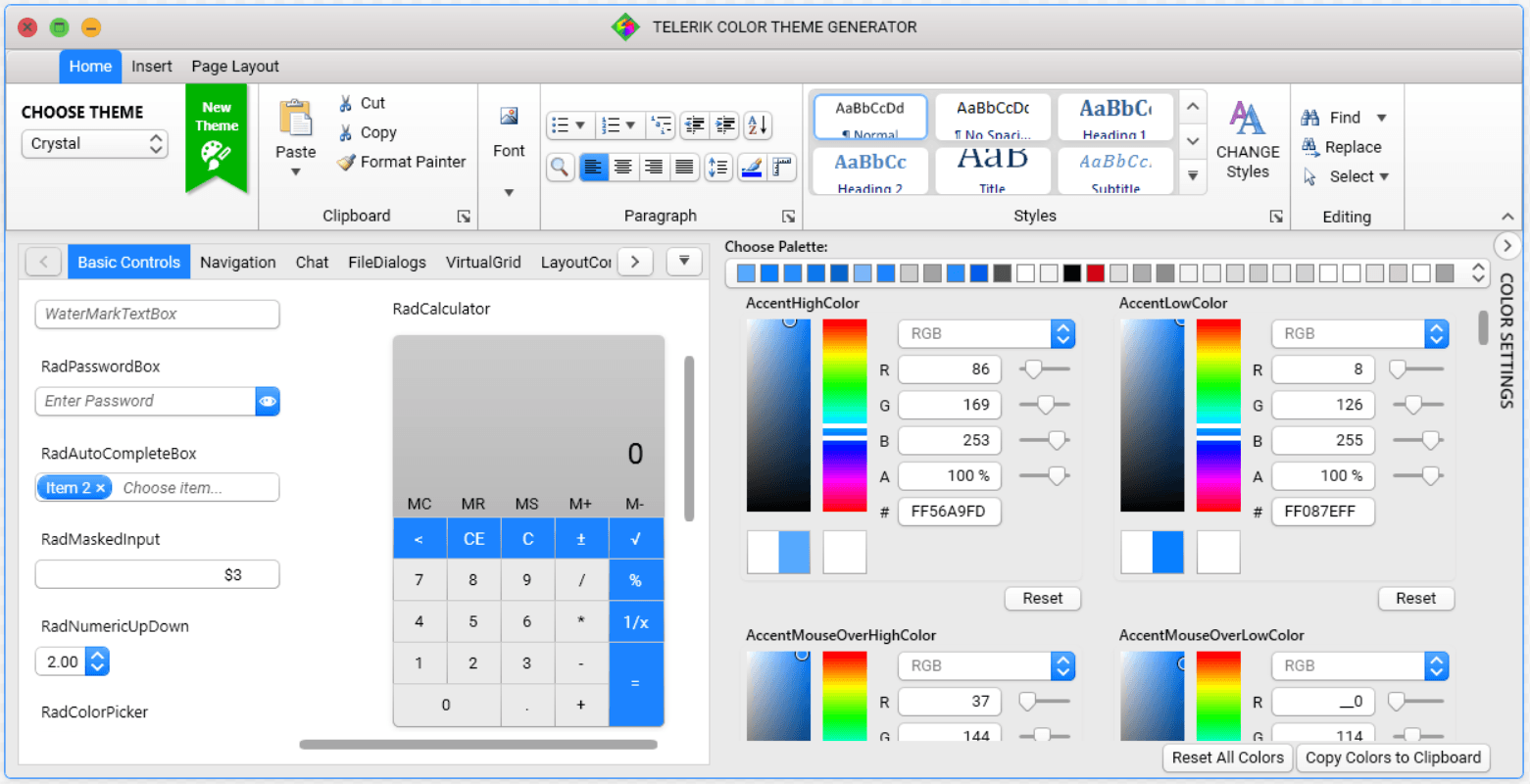
With this theme exposing all the properties of the MaterialAssist class, it's a piece of cake to visually modify a control without needing to modify its control template. I believe that there is no need to mention the support of custom CornerRadius, FocusThickness, ShadowDepth and much more. But what I certainly do need to mention is the WindowButtonsAlignment property. Yes, this one is a key feature to the theme's design—you just write one line of code and the minimize, maximize, restore and close buttons of your windows are moved to the right:
CrystalPalette.Palette.WindowButtonsAlignment = ButtonsAlignment.Right;Let's move on to the real part—how to add this awesome theme to your WPF application?
If you are a fan of using implicit styles (like me), you only need to open an application and click on any Telerik Control in Design View. Then click on the Theme element and choose the "Crystal" theme from the available choices.
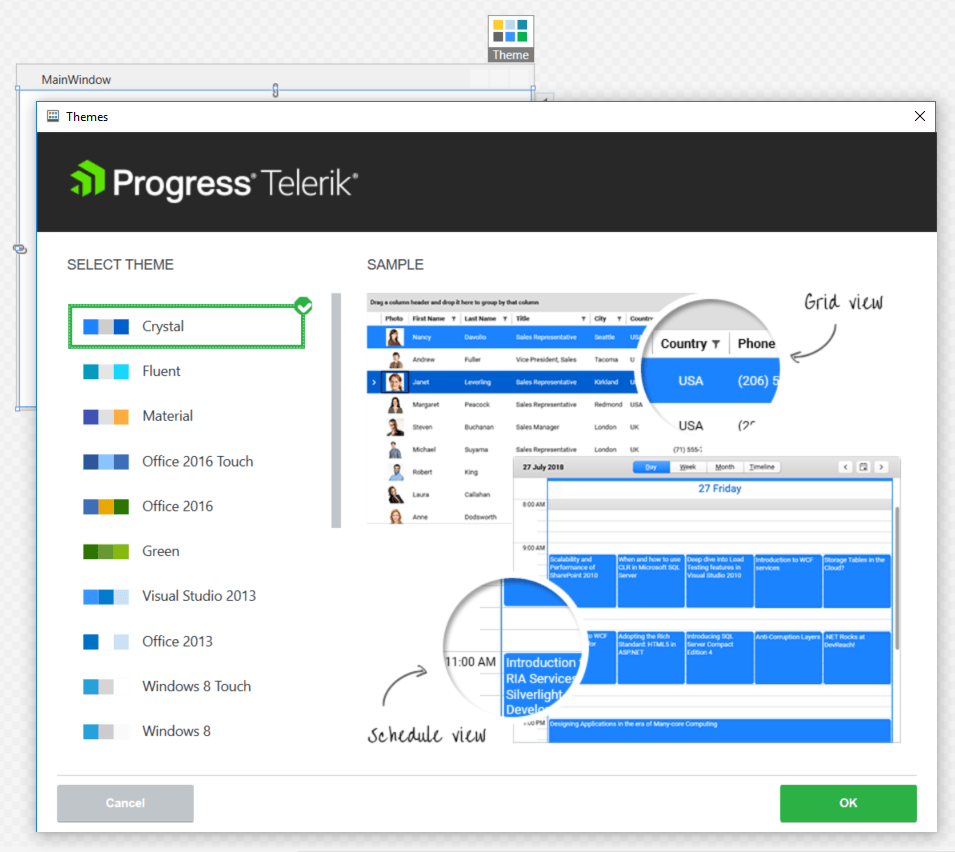
Voilà! Now you have yourself a brand new modern WPF app, that uses the brand new Crystal theme!

And if StyleManager is your thing, it's a breeze to use it!
public MainWindow()
{
  StyleManager.ApplicationTheme = new CrystalTheme();
  InitializeComponent();
}
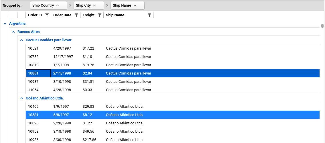
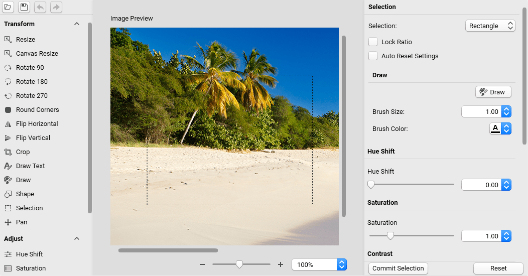
If I've managed to endear Crystal theme to your hearts, feel free to dig deeper into its features by checking out the documentation here. In the meantime, you can check out how some of the most popular controls in WPF look in "Crystal" form:

Building WinForms Applications with the Crystal Theme
As I mentioned earlier, staying fresh and modern is important, so a new theme is a logical addition to the WinForms suite as well.
You can see the full brilliance of Crystal theme in the Theme Viewer tool or inside the WinForms demo application:
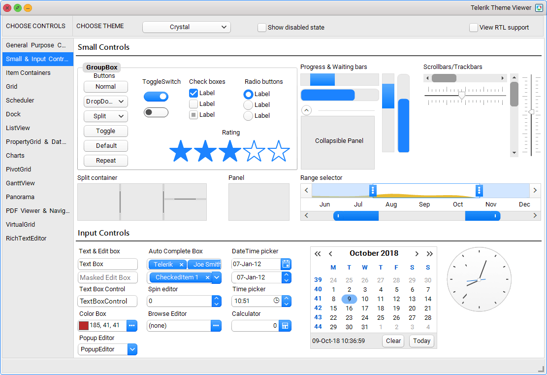
To apply the Crystal theme to an existing WinForms application, just add a single line of code:
ThemeResolutionService.ApplicationThemeName = "Crystal";If you decide to customize the theme the best way is to use the Visual Style Builder. This tool allows you to modify any setting of an existing theme:
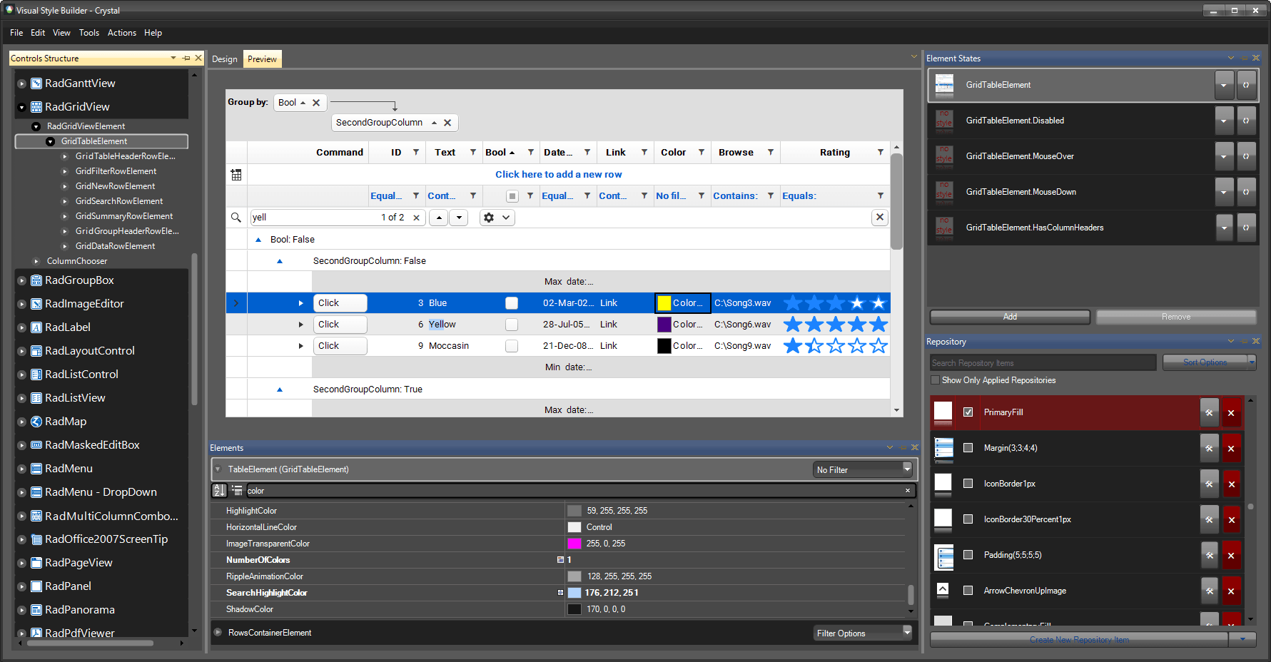
What makes this theme so different? As an addition to it, we have integrated Font Awesome. Yes, as part of our controls, you will now have access to more than 1300 free font glyphs, ready to be used just right out-of-the-box, no matter which theme you choose to use in your apps! There are three font variations included in the free version of font awesome: Solid, Regular and Brand. The following code shows how you can use Glyphs with RadLabel in your app:
this.radLabel1.LabelElement.CustomFont = "Font Awesome 5 Free Regular";
this.radLabel2.LabelElement.CustomFont = "Font Awesome 5 Free Solid";
this.radLabel3.LabelElement.CustomFont = "Font Awesome 5 Brands Regular";
The code snippet below consists of Unicode glyphs which can be copied from the Font Awesome's website:
this.radLabel1.Text = "\uF017 \uF4AD \uF0A4";
this.radLabel2.Text = "\uF1EB \uF0AD \uF19C";
this.radLabel3.Text = "\uF26B \uF293 \uF3B8";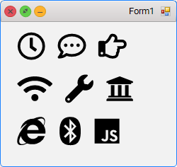
Try it Out Yourself and Share Your Feedback
Make sure to get the latest version and try out the new Crystal theme in Telerik UI for WPF and WinForms, and don't be shy—share your feedback! You can use the comments section below or any of the Feedback Portals (WPF and WinForms).
Download a trial today: WPF WinForms
We are more than excited to hear what you think, so if you have any comments or suggestions, we are always here to answer all your questions :).

Viktoria Grozdancheva
Viktoria is a Senior Front-end Developer with 5+ years of experience designing and building modern UI for desktop and mobile platforms on Microsoft/Telerik technology stacks. Her spare time is dedicated to friends and family and discovering new pieces of the world. Find her on Twitter and LinkedIn.
