
Human activity recognition is the problem of classifying sequences of accelerometer data recorded by specialized harnesses or smart phones into known well-defined movements.
It is a challenging problem given the large number of observations produced each second, the temporal nature of the observations, and the lack of a clear way to relate accelerometer data to known movements.
Classical approaches to the problem involve hand crafting features from the time series data based on fixed-sized windows and training machine learning models, such as ensembles of decision trees. The difficulty is that this feature engineering requires deep expertise in the field.
Recently, deep learning methods such as recurrent neural networks and one-dimensional convolutional neural networks, or CNNs, have been shown to provide state-of-the-art results on challenging activity recognition tasks with little or no data feature engineering.
In this tutorial, you will discover the ‘Activity Recognition Using Smartphones‘ dataset for time series classification and how to load and explore the dataset in order to make it ready for predictive modeling.
After completing this tutorial, you will know:
- How to download and load the dataset into memory.
- How to use line plots, histograms, and boxplots to better understand the structure of the motion data.
- How to model the problem, including framing, data preparation, modeling, and evaluation.
Kick-start your project with my new book Deep Learning for Time Series Forecasting, including step-by-step tutorials and the Python source code files for all examples.
Let’s get started.

How to Model Human Activity From Smartphone Data
Photo by photographer, some rights reserved.
Tutorial Overview
This tutorial is divided into 10 parts; they are:
- Human Activity Recognition
- Activity Recognition Using Smartphones Dataset
- Download the Dataset
- Load Data
- Balance of Activity Classes
- Plot Time Series Data for One Subject
- Plot Histograms Per Subject
- Plot Histograms Per Activity
- Plot Activity Duration Boxplots
- Approach to Modeling
1. Human Activity Recognition
Human Activity Recognition, or HAR for short, is the problem of predicting what a person is doing based on a trace of their movement using sensors.
Movements are often normal indoor activities such as standing, sitting, jumping, and going up stairs.
Sensors are often located on the subject, such as a smartphone or vest, and often record accelerometer data in three dimensions (x, y, z).
Human Activity Recognition (HAR) aims to identify the actions carried out by a person given a set of observations of him/herself and the surrounding environment. Recognition can be accomplished by exploiting the information retrieved from various sources such as environmental or body-worn sensors.
— A Public Domain Dataset for Human Activity Recognition Using Smartphones, 2013.
The idea is that once the subject’s activity is recognized and known, an intelligent computer system can then offer assistance.
It is a challenging problem because there is no clear analytical way to relate the sensor data to specific actions in a general way. It is technically challenging because of the large volume of sensor data collected (e.g. tens or hundreds of observations per second) and the classical use of hand crafted features and heuristics from this data in developing predictive models.
More recently, deep learning methods have been demonstrated successfully on HAR problems given their ability to automatically learn higher-order features.
Sensor-based activity recognition seeks the profound high-level knowledge about human activities from multitudes of low-level sensor readings. Conventional pattern recognition approaches have made tremendous progress in the past years. However, those methods often heavily rely on heuristic hand-crafted feature extraction, which could hinder their generalization performance. […] Recently, the recent advancement of deep learning makes it possible to perform automatic high-level feature extraction thus achieves promising performance in many areas.
— Deep Learning for Sensor-based Activity Recognition: A Survey
Need help with Deep Learning for Time Series?
Take my free 7-day email crash course now (with sample code).
Click to sign-up and also get a free PDF Ebook version of the course.
2. Activity Recognition Using Smartphones Dataset
A standard human activity recognition dataset is the ‘Activity Recognition Using Smartphones‘ dataset made available in 2012.
It was prepared and made available by Davide Anguita, et al. from the University of Genova, Italy and is described in full in their 2013 paper “A Public Domain Dataset for Human Activity Recognition Using Smartphones.” The dataset was modeled with machine learning algorithms in their 2012 paper titled “Human Activity Recognition on Smartphones using a Multiclass Hardware-Friendly Support Vector Machine.”
The dataset was made available and can be downloaded for free from the UCI Machine Learning Repository:
The data was collected from 30 subjects aged between 19 and 48 years old performing one of 6 standard activities while wearing a waist-mounted smartphone that recorded the movement data. Video was recorded of each subject performing the activities and the movement data was labeled manually from these videos.
Below is an example video of a subject performing the activities while their movement data is being recorded.
The six activities performed were as follows:
- Walking
- Walking Upstairs
- Walking Downstairs
- Sitting
- Standing
- Laying
The movement data recorded was the x, y, and z accelerometer data (linear acceleration) and gyroscopic data (angular velocity) from the smart phone, specifically a Samsung Galaxy S II.
Observations were recorded at 50 Hz (i.e. 50 data points per second). Each subject performed the sequence of activities twice, once with the device on their left-hand-side and once with the device on their right-hand side.
A group of 30 volunteers with ages ranging from 19 to 48 years were selected for this task. Each person was instructed to follow a protocol of activities while wearing a waist-mounted Samsung Galaxy S II smartphone. The six selected ADL were standing, sitting, laying down, walking, walking downstairs and upstairs. Each subject performed the protocol twice: on the first trial the smartphone was fixed on the left side of the belt and on the second it was placed by the user himself as preferred
— A Public Domain Dataset for Human Activity Recognition Using Smartphones, 2013.
The raw data is not available. Instead, a pre-processed version of the dataset was made available.
The pre-processing steps included:
- Pre-processing accelerometer and gyroscope using noise filters.
- Splitting data into fixed windows of 2.56 seconds (128 data points) with 50% overlap.
- Splitting of accelerometer data into gravitational (total) and body motion components.
These signals were preprocessed for noise reduction with a median filter and a 3rd order low-pass Butterworth filter with a 20 Hz cutoff frequency. […] The acceleration signal, which has gravitational and body motion components, was separated using another Butterworth low-pass filter into body acceleration and gravity.
— A Public Domain Dataset for Human Activity Recognition Using Smartphones, 2013.
Feature engineering was applied to the window data, and a copy of the data with these engineered features was made available.
A number of time and frequency features commonly used in the field of human activity recognition were extracted from each window. The result was a 561 element vector of features.
The dataset was split into train (70%) and test (30%) sets based on data for subjects, e.g. 21 subjects for train and nine for test.
This suggests a framing of the problem where a sequence of movement activity is used as input to predict the portion (2.56 seconds) of the current activity being performed, where a model trained on known subjects is used to predict the activity from movement on new subjects.
Early experiment results with a support vector machine intended for use on a smartphone (e.g. fixed-point arithmetic) resulted in a predictive accuracy of 89% on the test dataset, achieving similar results as an unmodified SVM implementation.
This method adapts the standard Support Vector Machine (SVM) and exploits fixed-point arithmetic for computational cost reduction. A comparison with the traditional SVM shows a significant improvement in terms of computational costs while maintaining similar accuracy […]
Now that we are familiar with the prediction problem, we will look at loading and exploring this dataset.
3. Download the Dataset
The dataset is freely available and can be downloaded from the UCI Machine Learning repository.
The data is provided as a single zip file that is about 58 megabytes in size. The direct link for this download is below:
Download the dataset and unzip all files into a new directory in your current working directory named “HARDataset“.
Inspecting the decompressed contents, you will notice a few things:
- There are “train” and “test” folders containing the split portions of the data for modeling (e.g. 70%/30%).
- There is a “README.txt” file that contains a detailed technical description of the dataset and the contents of the unzipped files.
- There is a “features.txt” file that contains a technical description of the engineered features.
The contents of the “train” and “test” folders are similar (e.g. folders and file names), although with differences in the specific data they contain.
Inspecting the “train” folder shows a few important elements:
- An “Inertial Signals” folder that contains the preprocessed data.
- The “X_train.txt” file that contains the engineered features intended for fitting a model.
- The “y_train.txt” that contains the class labels for each observation (1-6).
- The “subject_train.txt” file that contains a mapping of each line in the data files with their subject identifier (1-30).
The number of lines in each file match, indicating that one row is one record in each data file.
The “Inertial Signals” directory contains 9 files.
- Gravitational acceleration data files for x, y and z axes: total_acc_x_train.txt, total_acc_y_train.txt, total_acc_z_train.txt.
- Body acceleration data files for x, y and z axes: body_acc_x_train.txt, body_acc_y_train.txt, body_acc_z_train.txt.
- Body gyroscope data files for x, y and z axes: body_gyro_x_train.txt, body_gyro_y_train.txt, body_gyro_z_train.txt.
The structure is mirrored in the “test” directory.
We will focus our attention on the data in the “Inertial Signals” as this is most interesting in developing machine learning models that can learn a suitable representation, instead of using the domain-specific feature engineering.
Inspecting a datafile shows that columns are separated by whitespace and values appear to be scaled to the range -1, 1. This scaling can be confirmed by a note in the README.txt file provided with the dataset.
Now that we know what data we have, we can figure out how to load it into memory.
4. Load Data
In this section, we will develop some code to load the dataset into memory.
First, we need to load a single file.
We can use the read_csv() Pandas function to load a single data file and specify that the file has no header and to separate columns using white space.
|
1 |
dataframe = read_csv(filepath, header=None, delim_whitespace=True) |
We can wrap this in a function named load_file(). The complete example of this function is listed below.
|
1 2 3 4 5 6 7 8 9 10 |
# load dataset from pandas import read_csv # load a single file as a numpy array def load_file(filepath): dataframe = read_csv(filepath, header=None, delim_whitespace=True) return dataframe.values data = load_file('HARDataset/train/Inertial Signals/total_acc_y_train.txt') print(data.shape) |
Running the example loads the file ‘total_acc_y_train.txt‘, returns a NumPy array, and prints the shape of the array.
We can see that the training data is comprised of 7,352 rows or windows of data, where each window has 128 observations.
|
1 |
(7352, 128) |
Next, it would be useful to load a group of files, such as all of the body acceleration data files as a single group.
Ideally, when working with multivariate time series data, it is useful to have the data structured in the format:
|
1 |
[samples, timesteps, features] |
This is helpful for analysis and is the expectation of deep learning models such as convolutional neural networks and recurrent neural networks.
We can achieve this by calling the above load_file() function multiple times, once for each file in a group.
Once we have loaded each file as a NumPy array, we can combine or stack all three arrays together. We can use the dstack() NumPy function to ensure that each array is stacked in such a way that the features are separated in the third dimension, as we would prefer.
The function load_group() implements this behavior for a list of file names and is listed below.
|
1 2 3 4 5 6 7 8 9 |
# load a list of files, such as x, y, z data for a given variable def load_group(filenames, prefix=''): loaded = list() for name in filenames: data = load_file(prefix + name) loaded.append(data) # stack group so that features are the 3rd dimension loaded = dstack(loaded) return loaded |
We can demonstrate this function by loading all of the total acceleration files.
The complete example is listed below.
|
1 2 3 4 5 6 7 8 9 10 11 12 13 14 15 16 17 18 19 20 21 22 23 |
# load dataset from numpy import dstack from pandas import read_csv # load a single file as a numpy array def load_file(filepath): dataframe = read_csv(filepath, header=None, delim_whitespace=True) return dataframe.values # load a list of files, such as x, y, z data for a given variable def load_group(filenames, prefix=''): loaded = list() for name in filenames: data = load_file(prefix + name) loaded.append(data) # stack group so that features are the 3rd dimension loaded = dstack(loaded) return loaded # load the total acc data filenames = ['total_acc_x_train.txt', 'total_acc_y_train.txt', 'total_acc_z_train.txt'] total_acc = load_group(filenames, prefix='HARDataset/train/Inertial Signals/') print(total_acc.shape) |
Running the example prints the shape of the returned NumPy array, showing the expected number of samples and time steps with the three features, x, y, and z for the dataset.
|
1 |
(7352, 128, 3) |
Finally, we can use the two functions developed so far to load all data for the train and the test dataset.
Given the parallel structure in the train and test folders, we can develop a new function that loads all input and output data for a given folder. The function can build a list of all 9 data files to load, load them as one NumPy array with 9 features, then load the data file containing the output class.
The load_dataset() function below implements this behaviour. It can be called for either the “train” group or the “test” group, passed as a string argument.
|
1 2 3 4 5 6 7 8 9 10 11 12 13 14 15 16 |
# load a dataset group, such as train or test def load_dataset(group, prefix=''): filepath = prefix + group + '/Inertial Signals/' # load all 9 files as a single array filenames = list() # total acceleration filenames += ['total_acc_x_'+group+'.txt', 'total_acc_y_'+group+'.txt', 'total_acc_z_'+group+'.txt'] # body acceleration filenames += ['body_acc_x_'+group+'.txt', 'body_acc_y_'+group+'.txt', 'body_acc_z_'+group+'.txt'] # body gyroscope filenames += ['body_gyro_x_'+group+'.txt', 'body_gyro_y_'+group+'.txt', 'body_gyro_z_'+group+'.txt'] # load input data X = load_group(filenames, filepath) # load class output y = load_file(prefix + group + '/y_'+group+'.txt') return X, y |
The complete example is listed below.
|
1 2 3 4 5 6 7 8 9 10 11 12 13 14 15 16 17 18 19 20 21 22 23 24 25 26 27 28 29 30 31 32 33 34 35 36 37 38 39 40 41 42 |
# load dataset from numpy import dstack from pandas import read_csv # load a single file as a numpy array def load_file(filepath): dataframe = read_csv(filepath, header=None, delim_whitespace=True) return dataframe.values # load a list of files, such as x, y, z data for a given variable def load_group(filenames, prefix=''): loaded = list() for name in filenames: data = load_file(prefix + name) loaded.append(data) # stack group so that features are the 3rd dimension loaded = dstack(loaded) return loaded # load a dataset group, such as train or test def load_dataset(group, prefix=''): filepath = prefix + group + '/Inertial Signals/' # load all 9 files as a single array filenames = list() # total acceleration filenames += ['total_acc_x_'+group+'.txt', 'total_acc_y_'+group+'.txt', 'total_acc_z_'+group+'.txt'] # body acceleration filenames += ['body_acc_x_'+group+'.txt', 'body_acc_y_'+group+'.txt', 'body_acc_z_'+group+'.txt'] # body gyroscope filenames += ['body_gyro_x_'+group+'.txt', 'body_gyro_y_'+group+'.txt', 'body_gyro_z_'+group+'.txt'] # load input data X = load_group(filenames, filepath) # load class output y = load_file(prefix + group + '/y_'+group+'.txt') return X, y # load all train trainX, trainy = load_dataset('train', 'HARDataset/') print(trainX.shape, trainy.shape) # load all test testX, testy = load_dataset('test', 'HARDataset/') print(testX.shape, testy.shape) |
Running the example loads the train and test datasets.
We can see that the test dataset has 2,947 rows of window data. As expected, we can see that the size of windows in the train and test sets matches and the size of the output (y) in each the train and test case matches the number of samples.
|
1 2 |
(7352, 128, 9) (7352, 1) (2947, 128, 9) (2947, 1) |
Now that we know how to load the data, we can start to explore it.
5. Balance of Activity Classes
A good first check of the data is to investigate the balance of each activity.
We believe that each of the 30 subjects performed each of the six activities.
Confirming this expectation will both check that the data is indeed balanced, making it easier to model, and confirm that we are correctly loading and interpreting the dataset.
We can develop a function that summarizes the breakdown of the output variables, e.g. the y variable.
The function class_breakdown() below implements this behavior, first wrapping the provided NumPy array in a DataFrame, grouping the rows by the class value, and calculating the size of each group (number of rows). The results are then summarized, including the count and the percentage.
|
1 2 3 4 5 6 7 8 9 10 11 12 |
# summarize the balance of classes in an output variable column def class_breakdown(data): # convert the numpy array into a dataframe df = DataFrame(data) # group data by the class value and calculate the number of rows counts = df.groupby(0).size() # retrieve raw rows counts = counts.values # summarize for i in range(len(counts)): percent = counts[i] / len(df) * 100 print('Class=%d, total=%d, percentage=%.3f' % (i+1, counts[i], percent)) |
It may be useful to summarize the breakdown of the classes in the train and test datasets to ensure they have a similar breakdown, then compare the result to the breakdown on the combined dataset.
The complete example is listed below.
|
1 2 3 4 5 6 7 8 9 10 11 12 13 14 15 16 17 18 19 20 21 22 23 24 25 26 27 28 29 30 31 32 33 34 35 36 37 38 39 40 |
# summarize class balance from numpy import array from numpy import vstack from pandas import read_csv from pandas import DataFrame # load a single file as a numpy array def load_file(filepath): dataframe = read_csv(filepath, header=None, delim_whitespace=True) return dataframe.values # summarize the balance of classes in an output variable column def class_breakdown(data): # convert the numpy array into a dataframe df = DataFrame(data) # group data by the class value and calculate the number of rows counts = df.groupby(0).size() # retrieve raw rows counts = counts.values # summarize for i in range(len(counts)): percent = counts[i] / len(df) * 100 print('Class=%d, total=%d, percentage=%.3f' % (i+1, counts[i], percent)) # load train file trainy = load_file('HARDataset/train/y_train.txt') # summarize class breakdown print('Train Dataset') class_breakdown(trainy) # load test file testy = load_file('HARDataset/test/y_test.txt') # summarize class breakdown print('Test Dataset') class_breakdown(testy) # summarize combined class breakdown print('Both') combined = vstack((trainy, testy)) class_breakdown(combined) |
Running the example first summarizes the breakdown for the training set. We can see a pretty similar distribution of each class hovering between 13% and 19% of the dataset.
The result on the test set and on both datasets together look very similar.
It is likely safe to work with the dataset assuming the distribution of classes is balanced per train and test set and perhaps per subject.
|
1 2 3 4 5 6 7 8 9 10 11 12 13 14 15 16 17 18 19 20 21 22 23 |
Train Dataset Class=1, total=1226, percentage=16.676 Class=2, total=1073, percentage=14.595 Class=3, total=986, percentage=13.411 Class=4, total=1286, percentage=17.492 Class=5, total=1374, percentage=18.689 Class=6, total=1407, percentage=19.138 Test Dataset Class=1, total=496, percentage=16.831 Class=2, total=471, percentage=15.982 Class=3, total=420, percentage=14.252 Class=4, total=491, percentage=16.661 Class=5, total=532, percentage=18.052 Class=6, total=537, percentage=18.222 Both Class=1, total=1722, percentage=16.720 Class=2, total=1544, percentage=14.992 Class=3, total=1406, percentage=13.652 Class=4, total=1777, percentage=17.254 Class=5, total=1906, percentage=18.507 Class=6, total=1944, percentage=18.876 |
6. Plot Time Series Data for One Subject
We are working with time series data, therefore an import check is to create a line plot of the raw data.
The raw data is comprised of windows of time series data per variable, and the windows do have a 50% overlap. This suggests we may see some repetition in the observations as a line plot unless the overlap is removed.
We can start off by loading the training dataset using the functions developed above.
|
1 2 |
# load data trainX, trainy = load_dataset('train', 'HARDataset/') |
Next, we can load the ‘subject_train.txt‘ in the ‘train‘ directory that provides a mapping of rows to the subject to which it belongs.
We can load this file using the load_file() function. Once loaded, we can also use the unique() NumPy function to retrieve a list of the unique subjects in the training dataset.
|
1 2 3 |
sub_map = load_file('HARDataset/train/subject_train.txt') train_subjects = unique(sub_map) print(train_subjects) |
Next, we need a way to retrieve all of the rows for a single subject, e.g. subject number 1.
We can do this by finding all of the row numbers that belong to a given subject and use those row numbers to select the samples from the loaded X and y data from the training dataset.
The data_for_subject() function below implements this behavior. It will take the loaded training data, the loaded mapping of row number to subjects, and the subject identification number for the subject that we are interested in, and will return the X and y data for only that subject.
|
1 2 3 4 5 6 |
# get all data for one subject def data_for_subject(X, y, sub_map, sub_id): # get row indexes for the subject id ix = [i for i in range(len(sub_map)) if sub_map[i]==sub_id] # return the selected samples return X[ix, :, :], y[ix] |
Now that we have data for one subject, we can plot it.
The data is comprised of windows with overlap. We can write a function to remove this overlap and squash the windows down for a given variable into one long sequence that can be plotted directly as a line plot.
The to_series() function below implements this behavior for a given variable, e.g. array of windows.
|
1 2 3 4 5 6 7 8 9 |
# convert a series of windows to a 1D list def to_series(windows): series = list() for window in windows: # remove the overlap from the window half = int(len(window) / 2) - 1 for value in window[-half:]: series.append(value) return series |
Finally, we have enough to plot the data. We can plot each of the nine variables for the subject in turn and a final plot for the activity level.
Each series will have the same number of time steps (length of x-axis), therefore, it may be useful to create a subplot for each variable and align all plots vertically so we can compare the movement on each variable.
The plot_subject() function below implements this behavior for the X and y data for a single subject. The function assumes the same order of the variables (3rd axis) as was loaded in the load_dataset() function. A crude title is also added to each plot so we don’t get easily confused about what we are looking at.
|
1 2 3 4 5 6 7 8 9 10 11 12 13 14 15 16 17 18 19 20 21 22 23 24 25 26 27 28 |
# plot the data for one subject def plot_subject(X, y): pyplot.figure() # determine the total number of plots n, off = X.shape[2] + 1, 0 # plot total acc for i in range(3): pyplot.subplot(n, 1, off+1) pyplot.plot(to_series(X[:, :, off])) pyplot.title('total acc '+str(i), y=0, loc='left') off += 1 # plot body acc for i in range(3): pyplot.subplot(n, 1, off+1) pyplot.plot(to_series(X[:, :, off])) pyplot.title('body acc '+str(i), y=0, loc='left') off += 1 # plot body gyro for i in range(3): pyplot.subplot(n, 1, off+1) pyplot.plot(to_series(X[:, :, off])) pyplot.title('body gyro '+str(i), y=0, loc='left') off += 1 # plot activities pyplot.subplot(n, 1, n) pyplot.plot(y) pyplot.title('activity', y=0, loc='left') pyplot.show() |
The complete example is listed below.
|
1 2 3 4 5 6 7 8 9 10 11 12 13 14 15 16 17 18 19 20 21 22 23 24 25 26 27 28 29 30 31 32 33 34 35 36 37 38 39 40 41 42 43 44 45 46 47 48 49 50 51 52 53 54 55 56 57 58 59 60 61 62 63 64 65 66 67 68 69 70 71 72 73 74 75 76 77 78 79 80 81 82 83 84 85 86 87 88 89 90 91 92 93 94 95 96 97 |
# plot all vars for one subject from numpy import array from numpy import dstack from numpy import unique from pandas import read_csv from matplotlib import pyplot # load a single file as a numpy array def load_file(filepath): dataframe = read_csv(filepath, header=None, delim_whitespace=True) return dataframe.values # load a list of files, such as x, y, z data for a given variable def load_group(filenames, prefix=''): loaded = list() for name in filenames: data = load_file(prefix + name) loaded.append(data) # stack group so that features are the 3rd dimension loaded = dstack(loaded) return loaded # load a dataset group, such as train or test def load_dataset(group, prefix=''): filepath = prefix + group + '/Inertial Signals/' # load all 9 files as a single array filenames = list() # total acceleration filenames += ['total_acc_x_'+group+'.txt', 'total_acc_y_'+group+'.txt', 'total_acc_z_'+group+'.txt'] # body acceleration filenames += ['body_acc_x_'+group+'.txt', 'body_acc_y_'+group+'.txt', 'body_acc_z_'+group+'.txt'] # body gyroscope filenames += ['body_gyro_x_'+group+'.txt', 'body_gyro_y_'+group+'.txt', 'body_gyro_z_'+group+'.txt'] # load input data X = load_group(filenames, filepath) # load class output y = load_file(prefix + group + '/y_'+group+'.txt') return X, y # get all data for one subject def data_for_subject(X, y, sub_map, sub_id): # get row indexes for the subject id ix = [i for i in range(len(sub_map)) if sub_map[i]==sub_id] # return the selected samples return X[ix, :, :], y[ix] # convert a series of windows to a 1D list def to_series(windows): series = list() for window in windows: # remove the overlap from the window half = int(len(window) / 2) - 1 for value in window[-half:]: series.append(value) return series # plot the data for one subject def plot_subject(X, y): pyplot.figure() # determine the total number of plots n, off = X.shape[2] + 1, 0 # plot total acc for i in range(3): pyplot.subplot(n, 1, off+1) pyplot.plot(to_series(X[:, :, off])) pyplot.title('total acc '+str(i), y=0, loc='left') off += 1 # plot body acc for i in range(3): pyplot.subplot(n, 1, off+1) pyplot.plot(to_series(X[:, :, off])) pyplot.title('body acc '+str(i), y=0, loc='left') off += 1 # plot body gyro for i in range(3): pyplot.subplot(n, 1, off+1) pyplot.plot(to_series(X[:, :, off])) pyplot.title('body gyro '+str(i), y=0, loc='left') off += 1 # plot activities pyplot.subplot(n, 1, n) pyplot.plot(y) pyplot.title('activity', y=0, loc='left') pyplot.show() # load data trainX, trainy = load_dataset('train', 'HARDataset/') # load mapping of rows to subjects sub_map = load_file('HARDataset/train/subject_train.txt') train_subjects = unique(sub_map) print(train_subjects) # get the data for one subject sub_id = train_subjects[0] subX, suby = data_for_subject(trainX, trainy, sub_map, sub_id) print(subX.shape, suby.shape) # plot data for subject plot_subject(subX, suby) |
Running the example prints the unique subjects in the training dataset, the sample of the data for the first subject, and creates one figure with 10 plots, one for each of the nine input variables and the output class.
|
1 2 |
[ 1 3 5 6 7 8 11 14 15 16 17 19 21 22 23 25 26 27 28 29 30] (341, 128, 9) (341, 1) |
In the plot, we can see periods of large movement corresponding with activities 1, 2, and 3: the walking activities. We can also see much less activity (i.e. a relatively straight line) for higher numbered activities, 4, 5, and 6 (sitting, standing, and laying).
This is good confirmation that we have correctly loaded interpreted the raw dataset.
We can see that this subject has performed the same general sequence of activities twice, and some activities are performed more than two times. This suggests that for a given subject, we should not make assumptions about what activities may have been performed or their order.
We can also see some relatively large movement for some stationary activities, such as laying. It is possible that these are outliers or related to activity transitions. It may be possible to smooth or remove these observations as outliers.
Finally, we see a lot of commonality across the nine variables. It is very likely that only a subset of these traces are required to develop a predictive model.
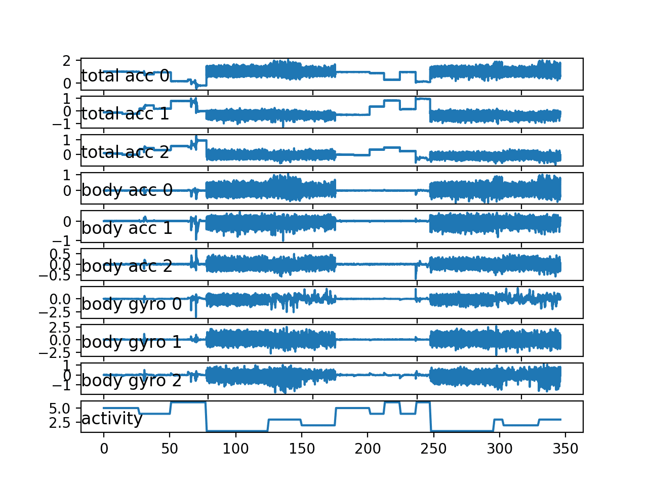
Line plot for all variables for a single subject
We can re-run the example for another subject by making one small change, e.g. choose the identifier of the second subject in the training dataset.
|
1 2 |
# get the data for one subject sub_id = train_subjects[1] |
The plot for the second subject shows similar behavior with no surprises.
The double sequence of activities does appear more regular than the first subject.
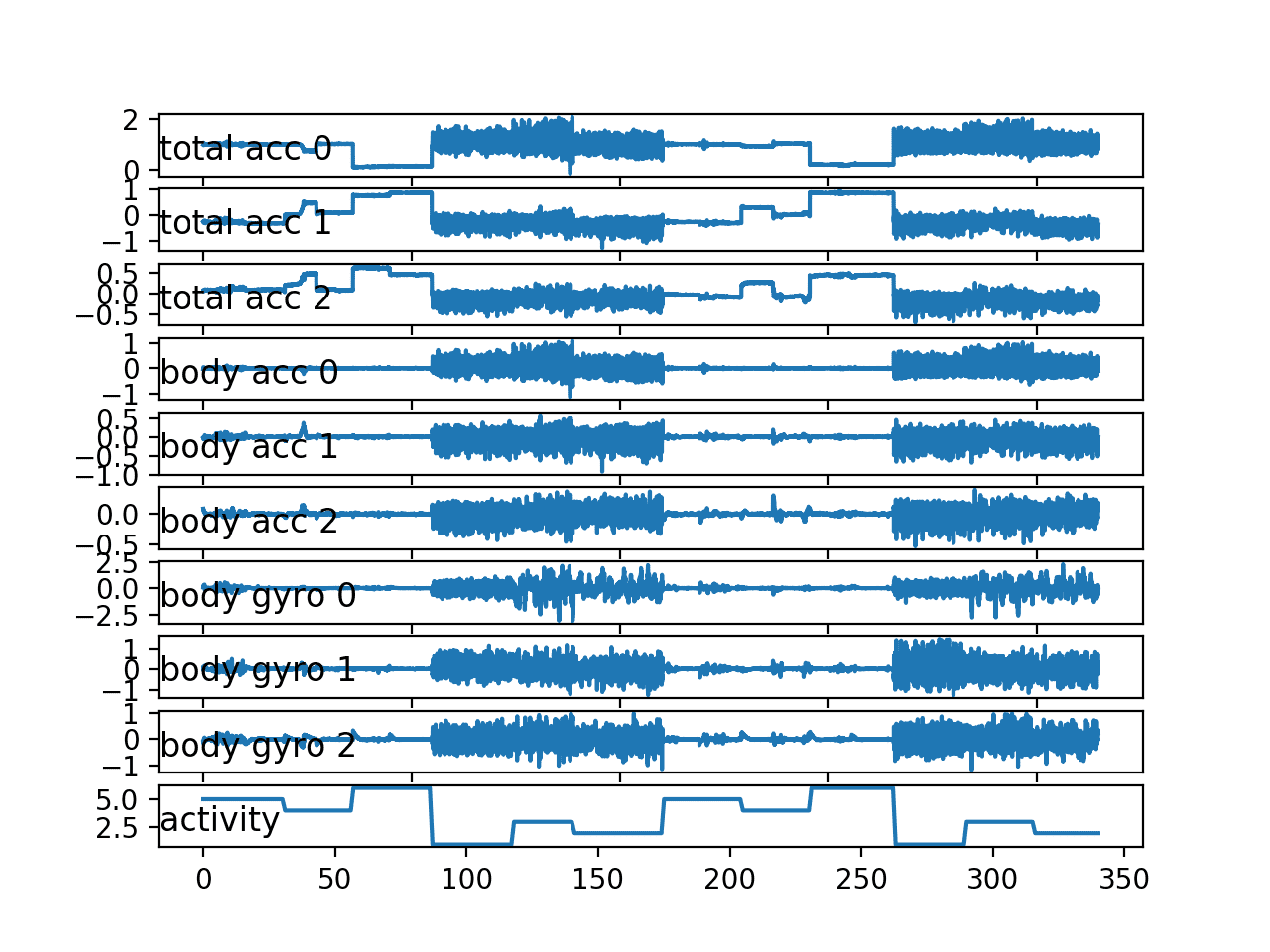
Line plot for all variables for a second single subject
7. Plot Histograms Per Subject
As the problem is framed, we are interested in using the movement data from some subjects to predict activities from the movement of other subjects.
This suggests that there must be regularity in the movement data across subjects. We know that the data has been scaled between -1 and 1, presumably per subject, suggesting that the amplitude of the detected movements will be similar.
We would also expect that the distribution of movement data would be similar across subjects, given that they performed the same actions.
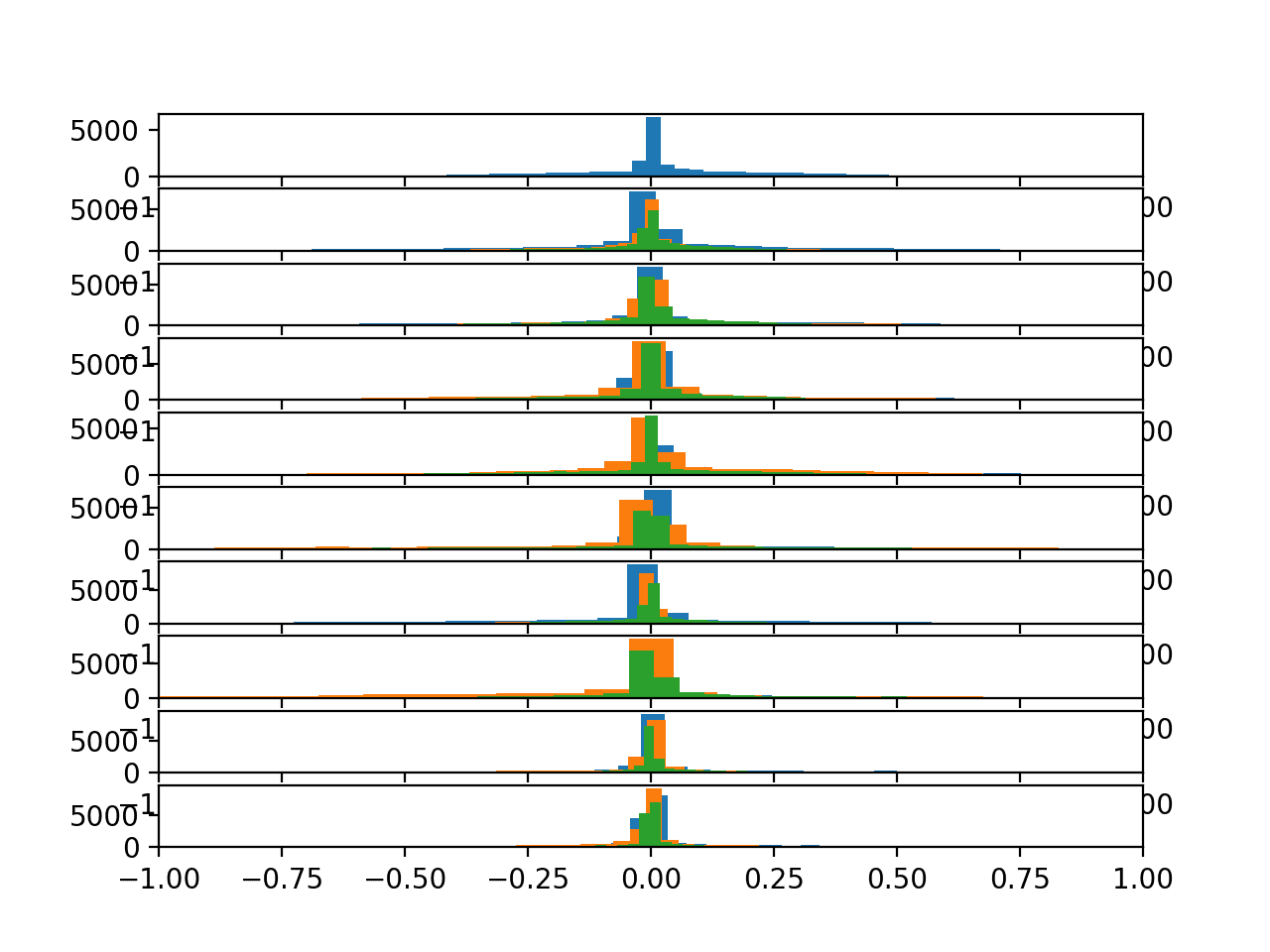
We can check for this by plotting and comparing the histograms of the movement data across subjects. A useful approach would be to create one plot per subject and plot all three axis of a given data (e.g. total acceleration), then repeat this for multiple subjects. The plots can be modified to use the same axis and aligned horizontally so that the distributions for each variable across subjects can be compared.
The plot_subject_histograms() function below implements this behavior. The function takes the loaded dataset and mapping of rows to subjects as well as a maximum number of subjects to plot, fixed at 10 by default.
A plot is created for each subject and the three variables for one data type are plotted as histograms with 100 bins, to help to make the distribution obvious. Each plot shares the same axis, which is fixed at the bounds of -1 and 1.
|
1 2 3 4 5 6 7 8 9 10 11 12 13 14 15 16 17 18 19 |
# plot histograms for multiple subjects def plot_subject_histograms(X, y, sub_map, n=10): pyplot.figure() # get unique subjects subject_ids = unique(sub_map[:,0]) # enumerate subjects xaxis = None for k in range(n): sub_id = subject_ids[k] # get data for one subject subX, _ = data_for_subject(X, y, sub_map, sub_id) # total acc for i in range(3): ax = pyplot.subplot(n, 1, k+1, sharex=xaxis) ax.set_xlim(-1,1) if k == 0: xaxis = ax pyplot.hist(to_series(subX[:,:,i]), bins=100) pyplot.show() |
The complete example is listed below.
|
1 2 3 4 5 6 7 8 9 10 11 12 13 14 15 16 17 18 19 20 21 22 23 24 25 26 27 28 29 30 31 32 33 34 35 36 37 38 39 40 41 42 43 44 45 46 47 48 49 50 51 52 53 54 55 56 57 58 59 60 61 62 63 64 65 66 67 68 69 70 71 72 73 74 75 76 77 78 79 80 81 82 |
# plot histograms for multiple subjects from numpy import array from numpy import unique from numpy import dstack from pandas import read_csv from matplotlib import pyplot # load a single file as a numpy array def load_file(filepath): dataframe = read_csv(filepath, header=None, delim_whitespace=True) return dataframe.values # load a list of files, such as x, y, z data for a given variable def load_group(filenames, prefix=''): loaded = list() for name in filenames: data = load_file(prefix + name) loaded.append(data) # stack group so that features are the 3rd dimension loaded = dstack(loaded) return loaded # load a dataset group, such as train or test def load_dataset(group, prefix=''): filepath = prefix + group + '/Inertial Signals/' # load all 9 files as a single array filenames = list() # total acceleration filenames += ['total_acc_x_'+group+'.txt', 'total_acc_y_'+group+'.txt', 'total_acc_z_'+group+'.txt'] # body acceleration filenames += ['body_acc_x_'+group+'.txt', 'body_acc_y_'+group+'.txt', 'body_acc_z_'+group+'.txt'] # body gyroscope filenames += ['body_gyro_x_'+group+'.txt', 'body_gyro_y_'+group+'.txt', 'body_gyro_z_'+group+'.txt'] # load input data X = load_group(filenames, filepath) # load class output y = load_file(prefix + group + '/y_'+group+'.txt') return X, y # get all data for one subject def data_for_subject(X, y, sub_map, sub_id): # get row indexes for the subject id ix = [i for i in range(len(sub_map)) if sub_map[i]==sub_id] # return the selected samples return X[ix, :, :], y[ix] # convert a series of windows to a 1D list def to_series(windows): series = list() for window in windows: # remove the overlap from the window half = int(len(window) / 2) - 1 for value in window[-half:]: series.append(value) return series # plot histograms for multiple subjects def plot_subject_histograms(X, y, sub_map, n=10): pyplot.figure() # get unique subjects subject_ids = unique(sub_map[:,0]) # enumerate subjects xaxis = None for k in range(n): sub_id = subject_ids[k] # get data for one subject subX, _ = data_for_subject(X, y, sub_map, sub_id) # total acc for i in range(3): ax = pyplot.subplot(n, 1, k+1, sharex=xaxis) ax.set_xlim(-1,1) if k == 0: xaxis = ax pyplot.hist(to_series(subX[:,:,i]), bins=100) pyplot.show() # load training dataset X, y = load_dataset('train', 'HARDataset/') # load mapping of rows to subjects sub_map = load_file('HARDataset/train/subject_train.txt') # plot histograms for subjects plot_subject_histograms(X, y, sub_map) |
Running the example creates a single figure with 10 plots with histograms for the three axis of the total acceleration data.
Each of the three axes on a given plot have a different color, specifically x, y, and z are blue, orange, and green respectively.
We can see that the distribution for a given axis does appear Gaussian with large separate groups of data.
We can see some of the distributions align (e.g. main groups in the middle around 0.0), suggesting there may be some continuity of the movement data across subjects, at least for this data.
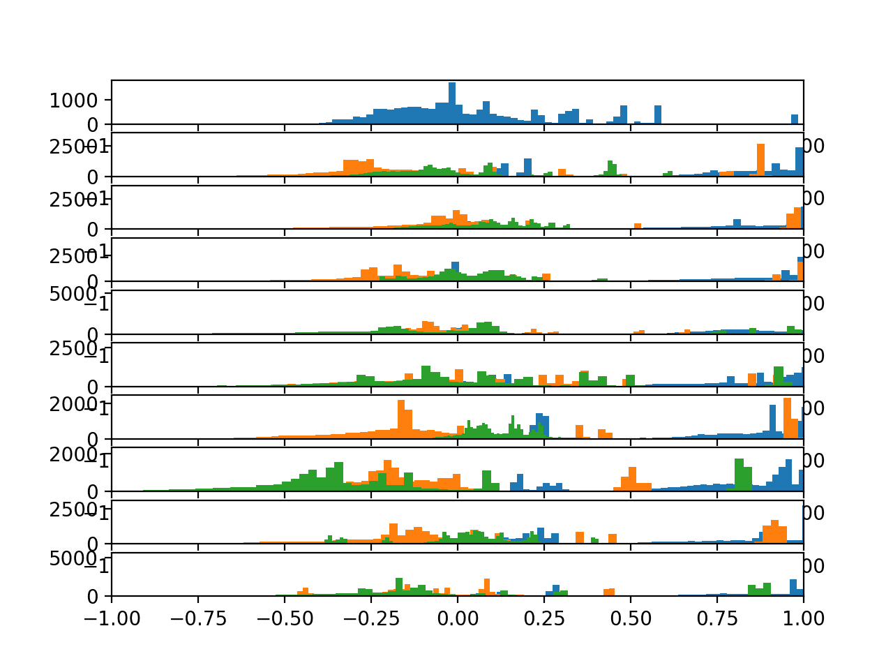
Histograms of the total acceleration data for 10 subjects
We can update the plot_subject_histograms() function to next plot the distributions of the body acceleration. The updated function is listed below.
|
1 2 3 4 5 6 7 8 9 10 11 12 13 14 15 16 17 18 19 |
# plot histograms for multiple subjects def plot_subject_histograms(X, y, sub_map, n=10): pyplot.figure() # get unique subjects subject_ids = unique(sub_map[:,0]) # enumerate subjects xaxis = None for k in range(n): sub_id = subject_ids[k] # get data for one subject subX, _ = data_for_subject(X, y, sub_map, sub_id) # body acc for i in range(3): ax = pyplot.subplot(n, 1, k+1, sharex=xaxis) ax.set_xlim(-1,1) if k == 0: xaxis = ax pyplot.hist(to_series(subX[:,:,3+i]), bins=100) pyplot.show() |
Running the updated example creates the same plot with very different results.
Here we can see all data clustered around 0.0 across axis within a subject and across subjects. This suggests that perhaps the data was centered (zero mean). This strong consistency across subjects may aid in modeling, and may suggest that the differences across subjects in the total acceleration data may not be as helpful.
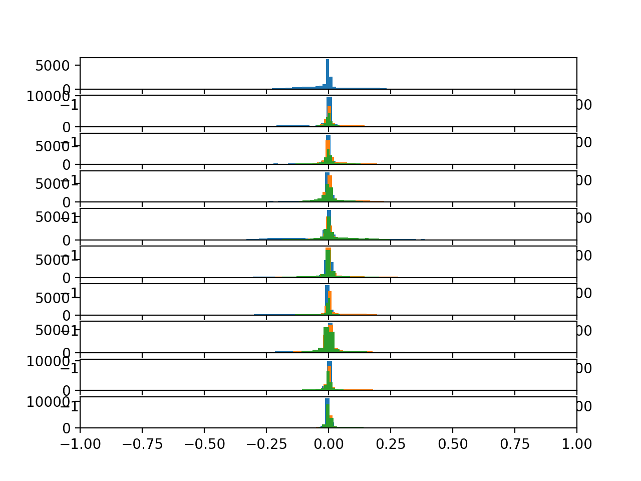
Histograms of the body acceleration data for 10 subjects
Finally, we can generate one final plot for the gyroscopic data.
The updated function is listed below.
|
1 2 3 4 5 6 7 8 9 10 11 12 13 14 15 16 17 18 19 |
# plot histograms for multiple subjects def plot_subject_histograms(X, y, sub_map, n=10): pyplot.figure() # get unique subjects subject_ids = unique(sub_map[:,0]) # enumerate subjects xaxis = None for k in range(n): sub_id = subject_ids[k] # get data for one subject subX, _ = data_for_subject(X, y, sub_map, sub_id) # body acc for i in range(3): ax = pyplot.subplot(n, 1, k+1, sharex=xaxis) ax.set_xlim(-1,1) if k == 0: xaxis = ax pyplot.hist(to_series(subX[:,:,6+i]), bins=100) pyplot.show() |
Running the example shows very similar results to the body acceleration data.
We see a high likelihood of a Gaussian distribution for each axis across each subject centered on 0.0. The distributions are a little wider and show fatter tails, but this is an encouraging finding for modeling movement data across subjects.
Histograms of the body gyroscope data for 10 subjects
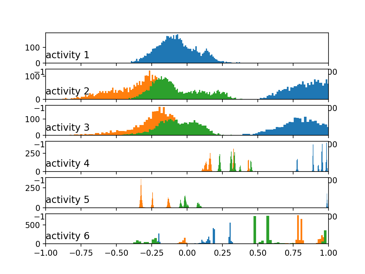
8. Plot Histograms Per Activity
We are interested in discriminating between activities based on activity data.
The simplest case for this would be to discriminate between activities for a single subject. One way to investigate this would be to review the distribution of movement data for a subject by activity. We would expect to see some difference in the distribution between the movement data for different activities by a single subject.
We can review this by creating a histogram plot per activity, with the three axis of a given data type on each plot. Again, the plots can be arranged horizontally to compare the distribution of each data axis by activity. We would expect to see differences in the distributions across activities down the plots.
First, we must group the traces for a subject by activity. The data_by_activity() function below implements this behaviour.
|
1 2 3 4 |
# group data by activity def data_by_activity(X, y, activities): # group windows by activity return {a:X[y[:,0]==a, :, :] for a in activities} |
We can now create plots per activity for a given subject.
The plot_activity_histograms() function below implements this function for the traces data for a given subject.
First, the data is grouped by activity, then one subplot is created for each activity and each axis of the data type is added as a histogram. The function only enumerates the first three features of the data, which are the total acceleration variables.
|
1 2 3 4 5 6 7 8 9 10 11 12 13 14 15 16 17 18 19 20 |
# plot histograms for each activity for a subject def plot_activity_histograms(X, y): # get a list of unique activities for the subject activity_ids = unique(y[:,0]) # group windows by activity grouped = data_by_activity(X, y, activity_ids) # plot per activity, histograms for each axis pyplot.figure() xaxis = None for k in range(len(activity_ids)): act_id = activity_ids[k] # total acceleration for i in range(3): ax = pyplot.subplot(len(activity_ids), 1, k+1, sharex=xaxis) ax.set_xlim(-1,1) if k == 0: xaxis = ax pyplot.hist(to_series(grouped[act_id][:,:,i]), bins=100) pyplot.title('activity '+str(act_id), y=0, loc='left') pyplot.show() |
The complete example is listed below.
|
1 2 3 4 5 6 7 8 9 10 11 12 13 14 15 16 17 18 19 20 21 22 23 24 25 26 27 28 29 30 31 32 33 34 35 36 37 38 39 40 41 42 43 44 45 46 47 48 49 50 51 52 53 54 55 56 57 58 59 60 61 62 63 64 65 66 67 68 69 70 71 72 73 74 75 76 77 78 79 80 81 82 83 84 85 86 87 88 89 90 91 92 |
# plot histograms per activity for a subject from numpy import array from numpy import dstack from numpy import unique from pandas import read_csv from matplotlib import pyplot # load a single file as a numpy array def load_file(filepath): dataframe = read_csv(filepath, header=None, delim_whitespace=True) return dataframe.values # load a list of files, such as x, y, z data for a given variable def load_group(filenames, prefix=''): loaded = list() for name in filenames: data = load_file(prefix + name) loaded.append(data) # stack group so that features are the 3rd dimension loaded = dstack(loaded) return loaded # load a dataset group, such as train or test def load_dataset(group, prefix=''): filepath = prefix + group + '/Inertial Signals/' # load all 9 files as a single array filenames = list() # total acceleration filenames += ['total_acc_x_'+group+'.txt', 'total_acc_y_'+group+'.txt', 'total_acc_z_'+group+'.txt'] # body acceleration filenames += ['body_acc_x_'+group+'.txt', 'body_acc_y_'+group+'.txt', 'body_acc_z_'+group+'.txt'] # body gyroscope filenames += ['body_gyro_x_'+group+'.txt', 'body_gyro_y_'+group+'.txt', 'body_gyro_z_'+group+'.txt'] # load input data X = load_group(filenames, filepath) # load class output y = load_file(prefix + group + '/y_'+group+'.txt') return X, y # get all data for one subject def data_for_subject(X, y, sub_map, sub_id): # get row indexes for the subject id ix = [i for i in range(len(sub_map)) if sub_map[i]==sub_id] # return the selected samples return X[ix, :, :], y[ix] # convert a series of windows to a 1D list def to_series(windows): series = list() for window in windows: # remove the overlap from the window half = int(len(window) / 2) - 1 for value in window[-half:]: series.append(value) return series # group data by activity def data_by_activity(X, y, activities): # group windows by activity return {a:X[y[:,0]==a, :, :] for a in activities} # plot histograms for each activity for a subject def plot_activity_histograms(X, y): # get a list of unique activities for the subject activity_ids = unique(y[:,0]) # group windows by activity grouped = data_by_activity(X, y, activity_ids) # plot per activity, histograms for each axis pyplot.figure() xaxis = None for k in range(len(activity_ids)): act_id = activity_ids[k] # total acceleration for i in range(3): ax = pyplot.subplot(len(activity_ids), 1, k+1, sharex=xaxis) ax.set_xlim(-1,1) if k == 0: xaxis = ax pyplot.hist(to_series(grouped[act_id][:,:,i]), bins=100) pyplot.title('activity '+str(act_id), y=0, loc='left') pyplot.show() # load data trainX, trainy = load_dataset('train', 'HARDataset/') # load mapping of rows to subjects sub_map = load_file('HARDataset/train/subject_train.txt') train_subjects = unique(sub_map) # get the data for one subject sub_id = train_subjects[0] subX, suby = data_for_subject(trainX, trainy, sub_map, sub_id) # plot data for subject plot_activity_histograms(subX, suby) |
Running the example creates the plot with six subplots, one for each activity for the first subject in the train dataset. Each of the x, y, and z axes for the total acceleration data have a blue, orange, and green histogram respectively.
We can see that each activity has a different data distribution, with a marked difference between the large movement (first three activities) with the stationary activities (last three activities). Data distributions for the first three activities look Gaussian with perhaps differing means and standard deviations. Distributions for the latter activities look multi-modal (i.e. multiple peaks).
Histograms of the total acceleration data by activity
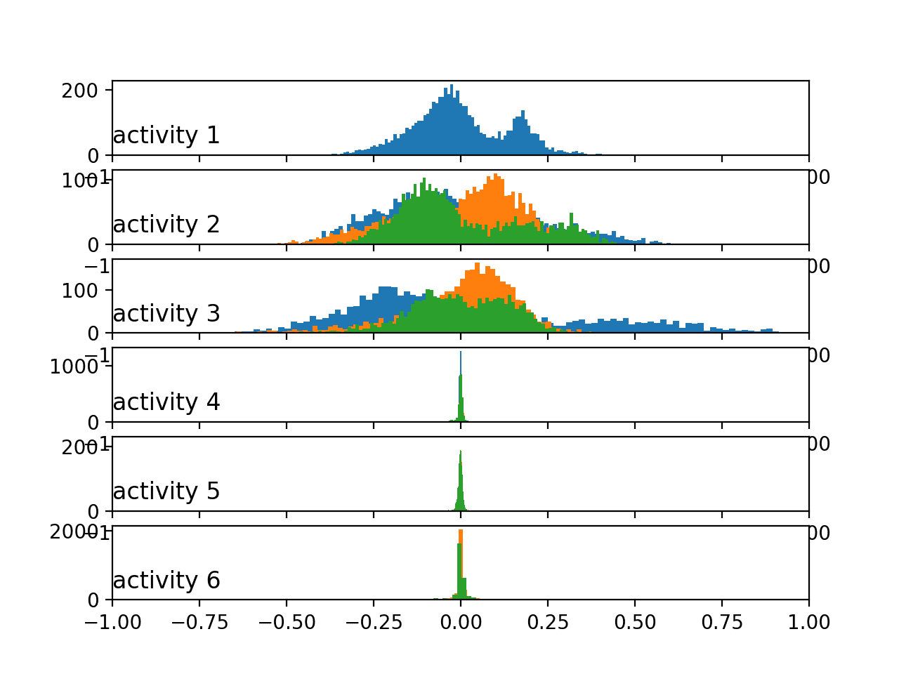
We can re-run the same example with an updated version of the plot_activity_histograms() that plots the body acceleration data instead.
The updated function is listed below.
|
1 2 3 4 5 6 7 8 9 10 11 12 13 14 15 16 17 18 19 20 |
# plot histograms for each activity for a subject def plot_activity_histograms(X, y): # get a list of unique activities for the subject activity_ids = unique(y[:,0]) # group windows by activity grouped = data_by_activity(X, y, activity_ids) # plot per activity, histograms for each axis pyplot.figure() xaxis = None for k in range(len(activity_ids)): act_id = activity_ids[k] # total acceleration for i in range(3): ax = pyplot.subplot(len(activity_ids), 1, k+1, sharex=xaxis) ax.set_xlim(-1,1) if k == 0: xaxis = ax pyplot.hist(to_series(grouped[act_id][:,:,3+i]), bins=100) pyplot.title('activity '+str(act_id), y=0, loc='left') pyplot.show() |
Running the updated example creates a new plot.
Here, we can see more similar distributions across the activities amongst the in-motion vs. stationary activities. The data looks bimodal in the case of the in-motion activities and perhaps Gaussian or exponential in the case of the stationary activities.
The pattern we see with the total vs. body acceleration distributions by activity mirrors what we see with the same data types across subjects in the previous section. Perhaps the total acceleration data is the key to discriminating the activities.
Histograms of the body acceleration data by activity
Finally, we can update the example one more time to plot the histograms per activity for the gyroscopic data.
The updated function is listed below.
|
1 2 3 4 5 6 7 8 9 10 11 12 13 14 15 16 17 18 19 20 |
# plot histograms for each activity for a subject def plot_activity_histograms(X, y): # get a list of unique activities for the subject activity_ids = unique(y[:,0]) # group windows by activity grouped = data_by_activity(X, y, activity_ids) # plot per activity, histograms for each axis pyplot.figure() xaxis = None for k in range(len(activity_ids)): act_id = activity_ids[k] # total acceleration for i in range(3): ax = pyplot.subplot(len(activity_ids), 1, k+1, sharex=xaxis) ax.set_xlim(-1,1) if k == 0: xaxis = ax pyplot.hist(to_series(grouped[act_id][:,:,6+i]), bins=100) pyplot.title('activity '+str(act_id), y=0, loc='left') pyplot.show() |
Running the example creates plots with the similar pattern as the body acceleration data, although showing perhaps fat-tailed Gaussian-like distributions instead of bimodal distributions for the in-motion activities.
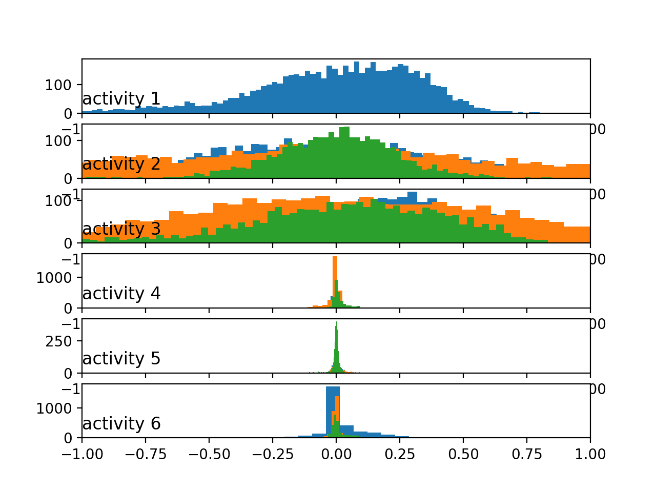
Histograms of the body gyroscope data by activity
All of these plots were created for the first subject, and we would expect to see similar distributions and relationships for the movement data across activities for other subjects.
9. Plot Activity Duration Boxplots
A final area to consider is how long a subject spends on each activity.
This is closely related to the balance of classes. If the activities (classes) are generally balanced within a dataset, then we expect the balance of activities for a given subject over the course of their trace would also be reasonably well balanced.
We can confirm this by calculating how long (in samples or rows) each subject spends on each activity and look at the distribution of durations for each activity.
A handy way to review this data is to summarize the distributions as boxplots showing the median (line), the middle 50% (box), the general extent of the data as the interquartile range (the whiskers), and outliers (as dots).
The function plot_activity_durations_by_subject() below implements this behavior by first splitting the dataset by subject, then the subjects data by activity and counting the rows spent on each activity, before finally creating a boxplot per activity of the duration measurements.
|
1 2 3 4 5 6 7 8 9 10 11 12 13 14 15 16 17 |
# plot activity durations by subject def plot_activity_durations_by_subject(X, y, sub_map): # get unique subjects and activities subject_ids = unique(sub_map[:,0]) activity_ids = unique(y[:,0]) # enumerate subjects activity_windows = {a:list() for a in activity_ids} for sub_id in subject_ids: # get data for one subject _, subj_y = data_for_subject(X, y, sub_map, sub_id) # count windows by activity for a in activity_ids: activity_windows[a].append(len(subj_y[subj_y[:,0]==a])) # organize durations into a list of lists durations = [activity_windows[a] for a in activity_ids] pyplot.boxplot(durations, labels=activity_ids) pyplot.show() |
The complete example is listed below.
|
1 2 3 4 5 6 7 8 9 10 11 12 13 14 15 16 17 18 19 20 21 22 23 24 25 26 27 28 29 30 31 32 33 34 35 36 37 38 39 40 41 42 43 44 45 46 47 48 49 50 51 52 53 54 55 56 57 58 59 60 61 62 63 64 65 66 67 68 69 70 71 72 73 74 75 76 77 78 79 80 81 82 83 84 85 |
# plot durations of each activity by subject from numpy import array from numpy import dstack from numpy import unique from pandas import read_csv from matplotlib import pyplot # load a single file as a numpy array def load_file(filepath): dataframe = read_csv(filepath, header=None, delim_whitespace=True) return dataframe.values # load a list of files, such as x, y, z data for a given variable def load_group(filenames, prefix=''): loaded = list() for name in filenames: data = load_file(prefix + name) loaded.append(data) # stack group so that features are the 3rd dimension loaded = dstack(loaded) return loaded # load a dataset group, such as train or test def load_dataset(group, prefix=''): filepath = prefix + group + '/Inertial Signals/' # load all 9 files as a single array filenames = list() # total acceleration filenames += ['total_acc_x_'+group+'.txt', 'total_acc_y_'+group+'.txt', 'total_acc_z_'+group+'.txt'] # body acceleration filenames += ['body_acc_x_'+group+'.txt', 'body_acc_y_'+group+'.txt', 'body_acc_z_'+group+'.txt'] # body gyroscope filenames += ['body_gyro_x_'+group+'.txt', 'body_gyro_y_'+group+'.txt', 'body_gyro_z_'+group+'.txt'] # load input data X = load_group(filenames, filepath) # load class output y = load_file(prefix + group + '/y_'+group+'.txt') return X, y # get all data for one subject def data_for_subject(X, y, sub_map, sub_id): # get row indexes for the subject id ix = [i for i in range(len(sub_map)) if sub_map[i]==sub_id] # return the selected samples return X[ix, :, :], y[ix] # convert a series of windows to a 1D list def to_series(windows): series = list() for window in windows: # remove the overlap from the window half = int(len(window) / 2) - 1 for value in window[-half:]: series.append(value) return series # group data by activity def data_by_activity(X, y, activities): # group windows by activity return {a:X[y[:,0]==a, :, :] for a in activities} # plot activity durations by subject def plot_activity_durations_by_subject(X, y, sub_map): # get unique subjects and activities subject_ids = unique(sub_map[:,0]) activity_ids = unique(y[:,0]) # enumerate subjects activity_windows = {a:list() for a in activity_ids} for sub_id in subject_ids: # get data for one subject _, subj_y = data_for_subject(X, y, sub_map, sub_id) # count windows by activity for a in activity_ids: activity_windows[a].append(len(subj_y[subj_y[:,0]==a])) # organize durations into a list of lists durations = [activity_windows[a] for a in activity_ids] pyplot.boxplot(durations, labels=activity_ids) pyplot.show() # load training dataset X, y = load_dataset('train', 'HARDataset/') # load mapping of rows to subjects sub_map = load_file('HARDataset/train/subject_train.txt') # plot durations plot_activity_durations_by_subject(X, y, sub_map) |
Running the example creates six box plots, one for each activity.
Each boxplot summarizes how long (in rows or the number of windows) subjects in the training dataset spent on each activity.
We can see that the subjects spent more time on stationary activities (4, 5 and 6) and less time on the in motion activities (1, 2 and 3), with the distribution for 3 being the smallest, or where time was spent least.
The spread across the activities is not large, suggesting little need to trim the longer duration activities or oversampling of the in-motion activities. Although, these approaches remain available if skill of a predictive model on the in-motion activities is generally worse.
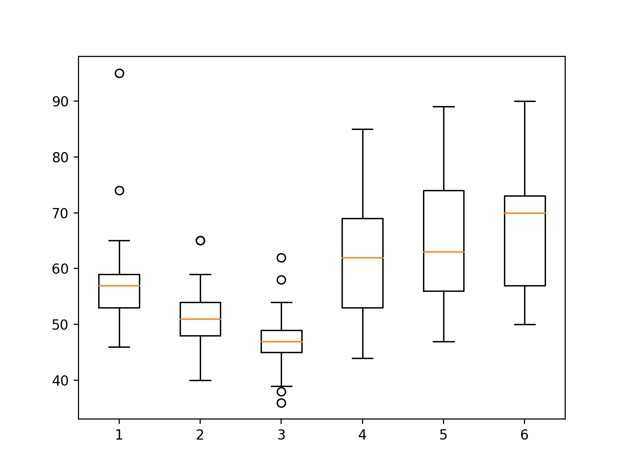
Boxplot of activity durations per subject on train set
We can create a similar boxplot for the training data with the following additional lines.
|
1 2 3 4 5 6 |
# load test dataset X, y = load_dataset('test', 'HARDataset/') # load mapping of rows to subjects sub_map = load_file('HARDataset/test/subject_test.txt') # plot durations plot_activity_durations_by_subject(X, y, sub_map) |
Running the updated example shows a similar relationship between activities.
This is encouraging, suggesting that indeed the test and training dataset are reasonably representative of the whole dataset.
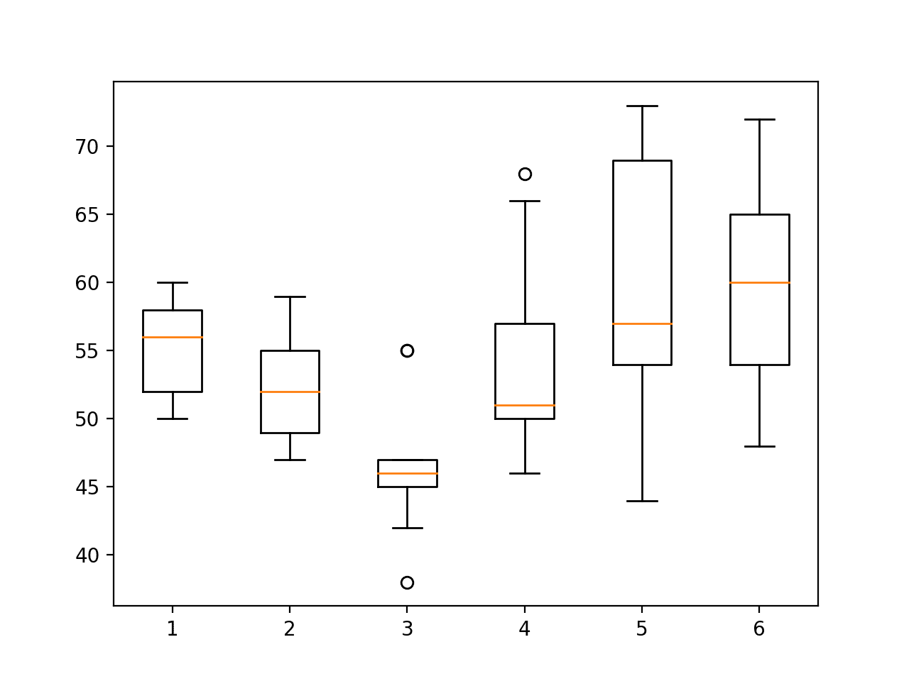
Boxplot of activity durations per subject on test set
Now that we have explored the dataset, we can suggest some ideas for how it may be modeled.
10. Approach to Modeling
In this section, we summarize some approaches to modeling the activity recognition dataset.
These ideas are divided into the main themes of a project.
Problem Framing
The first important consideration is the framing of the prediction problem.
The framing of the problem as described in the original work is the prediction of activity for a new subject given their movement data, based on the movement data and activities of known subjects.
We can summarize this as:
- Predict activity given a window of movement data.
This is a reasonable and useful framing of the problem.
Some other possible ways to frame the provided data as a prediction problem include the following:
- Predict activity given a time step of movement data.
- Predict activity given multiple windows of movement data.
- Predict the activity sequence given multiple windows of movement data.
- Predict activity given a sequence of movement data for a pre-segmented activity.
- Predict activity cessation or transition given a time step of movement data.
- Predict a stationary or non-stationary activity given a window of movement data
Some of these framings may be too challenging or too easy.
Nevertheless, these framings provide additional ways to explore and understand the dataset.
Data Preparation
Some data preparation may be required prior to using the raw data to train a model.
The data already appears to have been scaled to the range [-1,1].
Some additional data transforms that could be performed prior to modeling include:
- Normalization across subjects.
- Standardization per subject.
- Standardization across subjects.
- Axis feature selection.
- Data type feature selection.
- Signal outlier detection and removal.
- Removing windows of over-represented activities.
- Oversampling windows of under-represented activities.
- Downsampling signal data to 1/4, 1/2, 1, 2 or other fractions of a section.
Predictive Modeling
Generally, the problem is a time series multi-class classification problem.
As we have seen, it may also be framed as a binary classification problem and a multi-step time series classification problem.
The original paper explored the use of a classical machine learning algorithm on a version of the dataset where features were engineered from each window of data. Specifically, a modified support vector machine.
The results of an SVM on the feature-engineered version of the dataset may provide a baseline in performance on the problem.
Expanding from this point, the evaluation of multiple linear, non-linear, and ensemble machine learning algorithms on this version of the dataset may provide an improved benchmark.
The focus of the problem may be on the un-engineered or raw version of the dataset.
Here, a progression in model complexity may be explored in order to determine the most suitable model for the problem; some candidate models to explore include:
- Common linear, nonlinear, and ensemble machine learning algorithms.
- Multilayer Perceptron.
- Convolutional neural networks, specifically 1D CNNs.
- Recurrent neural networks, specifically LSTMs.
- Hybrids of CNNs and LSTMS such as the CNN-LSTM and the ConvLSTM.
Model Evaluation
The evaluation of the model in the original paper involved using a train/test split of the data by subject with a 70% and 30% ratio.
Exploration of this pre-defined split of the data suggests that both sets are reasonably representative of the whole dataset.
Another alternative methodology may be to use leave-one-out cross-validation, or LOOCV, per subject. In addition to giving the data for each subject the opportunity for being used as the withheld test set, the approach would provide a population of 30 scores that can be averaged and summarized, which may offer a more robust result.
Model performance was presented using classification accuracy and a confusion matrix, both of which are suitable for the multi-class nature of the prediction problem.
Specifically, the confusion matrix will aid in determining whether some classes are easier or more challenging to predict than others, such as those for stationary activities versus those activities that involve motion.
Further Reading
This section provides more resources on the topic if you are looking to go deeper.
Papers
- Deep Learning for Sensor-based Activity Recognition: A Survey.
- A Public Domain Dataset for Human Activity Recognition Using Smartphones, 2013.
- Human Activity Recognition on Smartphones using a Multiclass Hardware-Friendly Support Vector Machine, 2012.
API
Articles
- Human Activity Recognition Using Smartphones Data Set, UCI Machine Learning Repository
- Activity recognition, Wikipedia
- Activity Recognition Experiment Using Smartphone Sensors, Video.
Summary
In this tutorial, you discovered the Activity Recognition Using Smartphones Dataset for time series classification and how to load and explore the dataset in order to make it ready for predictive modeling.
Specifically, you learned:
- How to download and load the dataset into memory.
- How to use line plots, histograms, and boxplots to better understand the structure of the motion data.
- How to model the problem including framing, data preparation, modeling, and evaluation.
Do you have any questions?
Ask your questions in the comments below and I will do my best to answer.
Develop Deep Learning models for Time Series Today!

Develop Your Own Forecasting models in Minutes
...with just a few lines of python code
Discover how in my new Ebook:
Deep Learning for Time Series Forecasting
It provides self-study tutorials on topics like:
CNNs, LSTMs,
Multivariate Forecasting, Multi-Step Forecasting and much more...
Finally Bring Deep Learning to your Time Series Forecasting Projects
Skip the Academics. Just Results.


Jason, nice peace of work like always. I only wish that you have had the code for communicating to the phone (android for instance) instead of loading sampled data.
Thanks.
Good suggestion!
There are several open sources demoing how to collect data from the phone (cf github).
In my app (under development) I am collecting accel data (using a sliding window of 10 sec), and upon certain trigger, save to temporary file and upload to google cloud. Not trivial task due to all the pesky security.
If this is on interest to anyone, please let me know and I will try to derive a sample app.
Sounds like a challenging problem!
please help me how to recognize activity via application
I am very interested in this. I am working on a school project which is a 6 unit course. I have been reading about Human Activity Recognition and chosen it as my topic. I have even started development for the mobile application. I am stuck on how I will collect the accelerometer and gyroscope data with the required sliding window and how to use this data for prediction.
I think collect the data first, via the phone, then restructure it to have a sliding window – if needed.
hi sir
I am interested in developing an android application (human activity Recognition)by taking data from mobile phone.
please help to how to take data from it
Sorry, I don’t know about android.
Thank you very much ,
please if you have any article about activity recognition or anomaly detection from activity let me know thank you again.
I have a number of posts coming on activity recognition.
I also cover the topic in detail in this book:
https://machinelearningmastery.com/deep-learning-for-time-series-forecasting/
Thanks for sharing it.
You’re welcome.
Thank you Jason.
You’re welcome.
Is there a similar dataset for falls of sorts? I found a lot of references regarding fall detection of elderly people but not of younger (20-60 year old). Specifically I want to identify fall during riding (which is NOT easier as one expects since I don’t have velocity data).
Thanks for the blog posts!
I expect there is, I don’t know off hand, perhaps try a search?
I have implemented a model using Keras to model a LSTM for this same problem, you can take a look at https://github.com/servomac/Human-Activity-Recognition.
Nice work!
Hi
I have a question: If a research is interested in actual data so why researcher transforms data. Transform have different patterns and model.
Yes, we transform data to better expose the structure of the patterns in the data to the learning algorithm. No other reason.
Awesome post on human activity recognition.
Thanks John!
i need to recognize human activity in real time via smart phone ?please help me with it.
I don’t have examples that run on smartphones, sorry.
Hey there!
I’m using the Wireless Sensor Data Mining (WISDM) dataset which include:
http://www.cis.fordham.edu/wisdm/dataset.php
Number of examples: 1,098,207
Number of attributes: 6
Class Distribution
Walking: 424,400 (38.6%)
Jogging: 342,177 (31.2%)
Upstairs: 122,869 (11.2%)
Downstairs: 100,427 (9.1%)
Sitting: 59,939 (5.5%)
Standing: 48,395 (4.4%)
My question is about data preparation for this dataset.
I’m about to use CONV2D-LSTM network, so I choose to pick the size of 90×3.
The way I’m doing this is just move a 90×3 window with 45 step over data vertically.
First of all does this overlapping (45) help?
Then I pick 60% of data for training, 20% for test and 20% for validation. The way is pick 60%,20% and 20% of each person’s data to be sure about each person (36) has it’s share in training and testing and validation
Does my Idea OK?
Thanks
I’m not familiar with this dataset, sorry. I recommend experimenting and confirming your chosen configuration is stable.
Thanks.
It’s my master’s thesis and I consider Your answer as a good point.
I appreciate that
And as a professional, what’s your idea about how many layer is suitable for this kind of data and activities ? I’m using CONV2D(as a feature extractor) and LSTM.
I recommend testing a suite of network configurations/number of layers in order to see what works best for your specific dataset.
Hi Jason,
Amazing work. Any link to the signal processing part of it relevant to removing noise please? How the filters like third-order median filter and a third-order lowpass Butterworth filter (cutoff frequency = 20Hz).. Also how the normalisation is done here.
Sorry, I don’t have tutorials on those topics. Perhaps look into some DSP libraries? Even scipy can achieve some of this.
Hi Sir,
please explain me the dataset a bit, I am finding it hard to get a hold of it…
let me tell u what i have understood :::;
we have 6 time series from acc and gyro sensors.
for each time series we are dividing it into windows with 128 samples each…we have total 7352 points where each point corresponds to one activity.
It is also mentioned in the dataset description that ” A total of 561 features were extracted to describe each activity window” I am getting confused here…there are 128 samples in each window and each window represents 561 features..getting confused here..
Yes.
The extracted features are available as part of the dataset, but we don’t have to use them, in fact, I don’t use them in most of my examples.
Hi Sir,
What does Y axis representing in “Histograms of the total acceleration data for 10 subjects”?
like 2500 5000 etc?…X-axis is from -1 to 1 since data is scaled..what about Y axis?
Good question, recall that a histogram counts the frequency of observations on the x axis.
Hello Sir,
I have gather data from two sensor “accelerometer” and “gyroscope” . I want to train a single model on this data .Can guide how i can built my data set like “UCI” or any other approach which fulfill my task. Thank you
Perhaps you can use the examples with the UCI dataset as a starting point and adapt them for your needs?
But accelerometer and “gyroscope” are giving me different values. accelerometer are giving me 12 values in one second ,on the other hand gyroscope are giving me 24 values .So I am unable to map and construct dataset like UCI. So guide me about this .Thank You
I Have Not find resource which help me to construct dataset like UCI sensor Dataset.
You may need to write custom code to do that. Go slowly and try and leverage code for preparing other dataset.
If it is too challenging, perhaps hire a developer to do what you need? Say on upwork.com?
Perhaps you need to scale the data?
Ok
I have trained a Lstm model on “accelerometer” and “gyroscope” on 50 Hz dataset . Now I want to deploy this model to get predictions . For training I have set up
TIME_STEP = 100
SEGMENT_TIME_SIZE = 180
Now I am thinking how actually I Pass testing data set to get prediction from trained model.What will be the accurate way to get prediction and avoid from false result
Following links to the repository which I am using for this project
https://github.com/bartkowiaktomasz/har-wisdm-lstm-rnns
if you cannot understand my question….i can repeat my question
You can call model.predict() to make predictions on new data.
Perhaps this will help:
https://machinelearningmastery.com/how-to-make-classification-and-regression-predictions-for-deep-learning-models-in-keras/
ok,I get your point
Thanks!
But as in LSTM You pass data in defined segment size and it give back result of that segment after prediction . So I am thinking how accurate method to pass segment size ,so i get accurate result.
Sorry, Id on’t understand your question. Can you elaborate?
hi, Do you have any examples where the windows are calculated via python code in the raw data? Also, do you have any examples of hand-crafted features calculated from the raw data?
Yes, perhaps start here:
https://machinelearningmastery.com/start-here/#deep_learning_time_series
thank you. may I ask you something else and check my intuition? If we know that the data was collected at 50 HZ in 10 s how can I define the duration of the window? I am using the literature reference (between 1 and 2 s may bay) and I choose let’s say 2 s? So I will have 100 samples on the 2s windows.
The model is agnostic to timing, all it knows are input samples.
Perhaps test different window sizes on your input data and compare results?
thanks, Jason. Are you aware of privacy technologies in deep learning? differential privacy or federated learning?
No, sorry.
Hi every one, I just start to learn machine learning and I need some help execute EMD decomposition on CSV file data (Z axe from accelerometrer recorded with ma smartphone)
What is the EMD decomposition?
Sir, I’m experimenting with raw accelerometer data collected from Samsung Galaxy Note3. Which is the best filter to preprocess the data that I can apply in Python. Thanks and regards
Perhaps try a few approaches and select the method that results in the best performance for your specific dataset.
hello sir
I have collected data using smartphone i want label the data according two types normal and abnormal movement
could you help my how can i label the output and how can i filter the noise
Thank you
Perhaps label manually initially, then see how you can automate it.
Hi! please provide me the code how can I find out Accuracy of Human recognition.
Perhaps start here:
https://machinelearningmastery.com/how-to-develop-rnn-models-for-human-activity-recognition-time-series-classification/
Thank you, Dr. @Jason Brownlee, for all these amazing tutorials. I understood how you compare the data of the three axes (x,y,z) for each activity by creating a seperate distribution for each axis, but what if I have accelerometer data from two different devices and I want to compare the data distribution of these two devices , is it possible to combine the three axes (x,y,z) into one distribution that represents the data collected by a device? Can I somehow summarize the data of all activities and from the three axes into one distribution that corresponds to the device?
I don’t think it makes sense to combine the two sets of observations. You can feed them both in to a model if needed.
Thank you for your response, Dr Jason. I apologize for the confusion, my problem is not in feeding the data to the model but in comparing the distribution of the accelerometer data of two different devices (smartphones or smartwatches). Basically I am trying to explain visually why the model performance decreases if it was developed on one device and then deployed on another new device. My idea based on this article is to average the magnitude of the three axes data and then calculate histogram or boxplot for each device. Do you think this makes sense? What do you suggest?
Comparing the two sample distributions sounds like a good start, e.g. with a statistical hypothesis test.
Yeah, I think a statistical test will make more sense in my case. Thank you for the tip 🙂
So how can the HAR be predicted by the given dataset?
Here is an example:
https://machinelearningmastery.com/cnn-models-for-human-activity-recognition-time-series-classification/
Hi, pro. Jason, I always benefit a lot from your tutorials. These days, I am doing a project about human-activity-recognition, I used some filters to filter the time series data, and made some transformation like fft, PSD, etc. Meanwhile, I sliced the data into windows but did not normalize it, then I imported MLP in sklearn. However, I found it perform better on time series than on features-extracted data. It really confused me a lot, does that mean my method of features extractions is wrong? Thanks a lot for your time, I would really appreciate it if you could reply to me.
Perhaps this is a property of your dataset and chosen model.
You can try exploring alternate models and data preparations in order to learn more about your dataset.
Dear Dr. Brownlee, could you please explain regarding “6. Plot Time Series Data for One Subject” , what does value 341 represent (and why time series axis x goes to 350) – and it changes by subject. My understanding was that this axis will always be 128 data points?
Best regards!
I believe we are plotting all data or most data with overlaps removed.
hello,
I have a large pandas data frame data.
like this:
data(‘x’, ‘y’, ‘z’, ‘Label data’)
I want to apply a sliding window with a 50% overlap on this data frame. and then I want to extract common features (mean, standard deviation, variance) feature from each window.
please help me with this with some examples.
See this:
https://machinelearningmastery.com/convert-time-series-supervised-learning-problem-python/
Hello Prof.Jason
I would like to ask about what are differences between X_train and inertial signals and why were you loading the inertial signals but you didn’t do that with the X_train ?
I guess the X_train is the data before separation by 3rd ButterWorth filter, isn’t it ?
From the post: ”
Inertial Signals” folder that contains the preprocessed data.
What do you mean by X_train? What does it contain? the written file ‘READ ME.txt’ contains 561 engineered features. so it means the X_train is before preprocessing “raw_data”, does not it?
Training dataset.
Sir, actually I didn’t get it. I know what it means by the training set.
But what is actually the core difference between X_train and inertial_Signals?
Are the inertial_Signals the result of making a preprocessing on the training set?
What is the relationship between X_train and inertial_Signals?
Internal signals contains pre-processed (raw) data – that we use in this tutorial.
X_train.txt and y_train.txt contain the engineered features – that we do not use in this tutorial.
The difference is described in the section “3. Download the Dataset”.
I think they make different calculations on the inertial Signals to extract the training set.
is it right?
internal signals is the raw data.
If you continue to have trouble, perhaps read the original paper.
Wonderful Explained, Sir please attach video link if you have like this project.
Thanks.
I don’t have videos.
Hi Dr. Brownlee,
Thank you for the this informative and structured article. I am currently working on a project where I have to actually predict the quality performance of a single weight lifting exercise (5 quality classes).
I am using the raw sensor data and plan to frame the project as predicting the activity quality given a time step of movement data. Should this be also treated as a time-series?
I randomly split the data into validation and train and using a Random Forest model resulted in a high accuracy rate ~ 97% but I understand that this does not imply my decisions are correct
Yes, it sounds like time series.
If the observations are temporally ordered, you must evaluate the model using walk-forward validation or similar methods:
https://machinelearningmastery.com/backtest-machine-learning-models-time-series-forecasting/
Thank youu!
You’re welcome!
Hello Jason,
First I’d like to thank you for sharing this post with us.
And I wanted to ask about the histograms of sensors per activity – how come that in all 3 signals (total_acc, body_acc and body_gyro) the y and z axes signals (green and orange) are missing from activity 1 (walking). only the x-axis signal (the blue) seems active.
Thanks,
Hi…Thank you for your question. We will review the histograms. Have you execute the code? Is so, are your histograms different?
Hi James,
I have executed the code and got the same results.
but atleast to my understanding, the x and y do have values that should appear in the histograms of activity #1.
I have not got the chance to try and find a solution yet.
If you have, or if you think that the current histograms are correct I would love to hear.
Thanks,