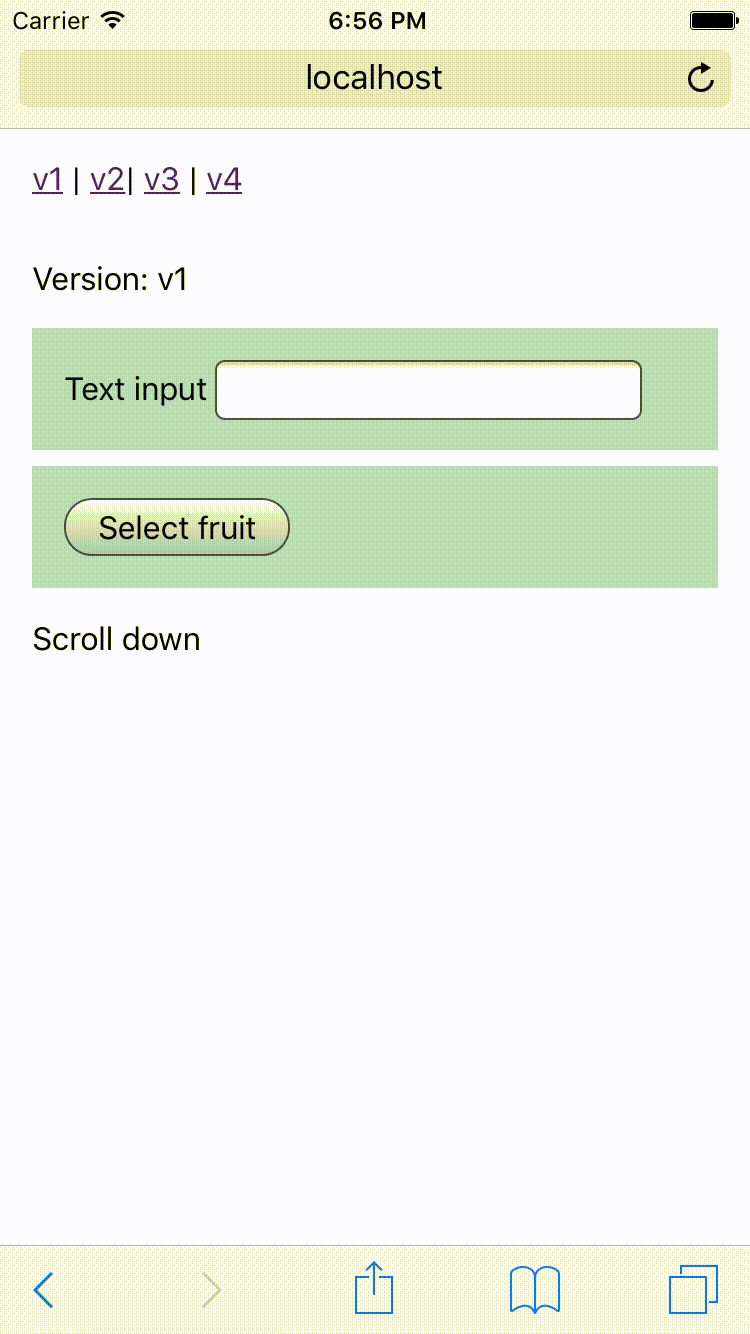
Imagine you need to implement a mobile-friendly form, beyond traditional inputs you need to implement fullscreen infinite calendar and a fullscreen combo box. Let's talk about "fullscreen". How hard you expect it would be? Should be not hard - just use fullscreen div with z-index and fixed position. Right? That what I thought.
Attempt number 1
Let's use div which will cover all screen
.FullScreenOne {
  position: fixed;
  bottom: 0;
  left: 0;
  right: 0;
  top: 0;
  z-index: 1;
  background: #fff;
}
It works, except user can use Tab (or ⌃ and ⌄ in iOS) to move cursor out of modal.
Attempt number 2
Use Reach Dialog (in addition to previous solution). Dialog will set aria-hidden on all nodes at the document.body root except for the currently active dialog. This traps the virtual cursor inside the dialog.
Side note: I tried react-focus-lock, but it doesn't work in iOS (I mean for ⌃ and ⌄).
It works, except when the user wants to scroll the content of the modal, but instead, they will scroll content behind the modal.

Attempt number 3
Use ScrollLocky (in addition to previous solution). ScrollLocky blocks any interactions with the rest of a page with the help of react-locky and position: relative on the body.
It works, except when the user scrolls down and bottom chrome of the Mobile Safari get's hidden, but later it is possible to trigger the appearance of bottom chrome and part of the modal will be hidden.

Attempt number 4
Use mobile-safari-fullscreen (in addition to previous solution). It will always force to show the bottom of browser chrome when modal is opened.

Side note: WindowSize can be used instead mobile-safari-fullscreen. I would say this is the preferred solution, this demo is more to show how much edge case is possible.
<WindowSize>
  {({ height }) => (
    <ul style={{ height }}>
      <li />
    </ul>
  )}
</WindowSize>
Conclusion
This kind of small details is what makes frontend development hard and interesting same time. If you liked this post read my post about the UX of images on the web.
PS Different browser have the different behavior of focus. The most noticeable is Mobile Safari which doesn't allow to focus on links and buttons ¯\_(ツ)_/¯.
Check out this GitHub repo for the full code for this post.


Top comments (2)
Examples 2, 3 and 4 are 404
Thanks for notifying me. I tested locally. Will fix in 5 minutes with react-snap