Sines, Curves, Exponentials and more in the Telerik Reporting Graph

Though not obvious at first, you can customize your Telerik Reporting graphs to display almost any math function. Read on to see how.
You may often find that it's useful to display overlay curves in a Telerik Reporting Graph item. Whether you want to show an upper-limit, lower-limit, or how well your data fits a normal distribution – a curve line based on a mathematical function can be very handy. The issue is that the Graph Item was designed to display explicit literal values based on a discrete dataset. How then can an overlay be added to the graph when the Y-axis values are not found in the data? Keeping reading to find out.
In this example we're using data from the Northwind dataset to produce a real-world graph of sales figures for the month of July. However, the style and data for the underlying graph doesn't necessarily matter for the overlay.
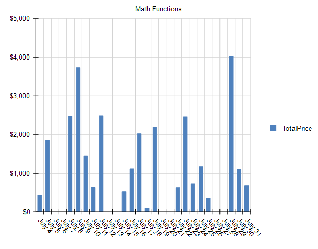
Let's assume that an overzealous Sales Manager expects their team to achieve exponential growth for the month of July and wanted to add an overlay to this graph. Those values aren't contained in the source data – so how can they be charted?
The trick lies in the built-in ColumnNumber() function in Telerik Reporting. The ColumnNumber() function provides a 1 for the first value, 2 for the second value, and so on. This becomes the X variable in your math function. You may then derive Y as a function of X.
Let's work through a concrete example using the simple linear progression: $$f(x) = y$$
The first step is to add a new cartesianCoordinateSystem to the Graph's CoordinateSystem Collection.

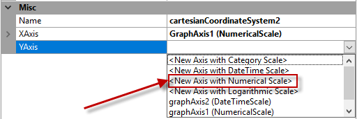
In the new cartesianCoordinateSystem, create a new NumericalScale for both the XAxis and YAxis.
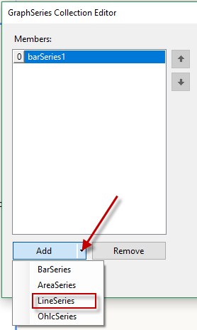
The next step is to create the actual Series that will produce the linear progression. Open the Series Collection Editor for the Graph, and add a new Line Series.

Set the following properties for the new Line Series:
- Appearance -> LineType : Smooth
- CoordinateSystem: (Select the CoordinateSystem you created above)
- Data -> CategoryGroup: (select the existing CategoryGroup that was created with the data-bound series)
- Data -> SeriesGroup: (select the existing SeriesGroup that was created with the data-bound series)
- Data -> X: = ColumnNumber() (The equal sign is required)
- Data -> Y: = ColumnNumber()
Click OK and you'll see the new linear progression in the Graph:
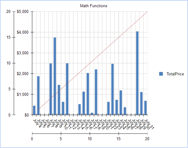
This Graph is fully functional now, but it doesn't look great – so let's hide some of the extra Scales and Gridlines.
Open the GraphCoordinateSystem Collection Editor again – and select the new cartesianCoordinateSystem we created for the linear progression. Update the following properties.
- Misc -> XAis -> MajorGridLineStyle -> Visible : False
- Misc -> YAis -> MajorGridLineStyle -> Visible : False
- Misc -> XAis -> Style -> Visible : False
- Misc -> YAis -> Style -> Visible : False
Let's also make the Line in the linear progression easier to see. Open the Series Collection Editor and apply the following style to the LineSeries.
- Appearance -> LineStyle -> LineWidth : 3px
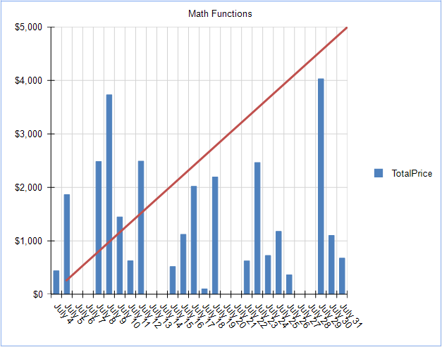
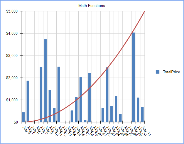
Now that we're created a Series and CoordinateSystem dedicated to math functions, changing the function is very easy. Let's change to an exponential progression.
To accomplish this, simply update the Y value in the series.

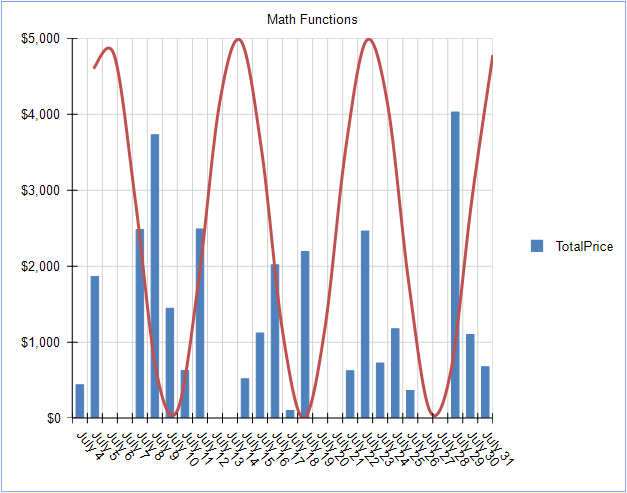
We can get more advanced and generate a Sine Wave by changing the expression again:

Up to this point, we've handled simple math functions, but what about something a little more advanced, such as a Normal Distribution equation: $$f(x) = {1 \over \delta\sqrt{2\pi}}e^{-{1/2 ({x-u \over {\delta}})}}$$
This equation is too complex to be expressed with the Telerik Reporting expression editor. However, this is a perfect use-case for a User Function. User functions allow you to build custom expressions in C# or VB.NET, and utilize them seamlessly in the Telerik Reporting expression editor.
For example, the above equation can be expressed in C# using the following method.
[Function(Category = "Curves", Namespace = "Math", Description = "Normal Curve")]
  public static double NormalCurve(double x, double mean, double stdDev)
  {
    double y = (1 / (stdDev * Math.Sqrt(2 * Math.PI))) * Math.Exp(-1 * (Math.Pow(x - mean, 2) / (2 * Math.Pow(stdDev, 2))));
    return y;
  }
Which when applied to the Y value of the LineSeries, produces a normal distribution curve:
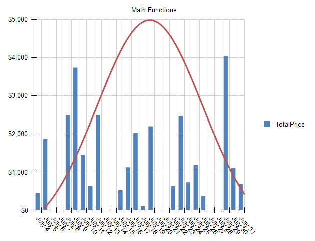
You can see that the Telerik Reporting Graph Item, when combined with User Functions, can display any math functions that produce discrete values.
What curves can you create using this technique? Share your results in the comments below!
Try it Out and Share Feedback
We want to know what you think—you can download a free trial of Telerik Reporting today and share your thoughts in our Feedback Portal, or right in the comments below.
Start your trial today: Telerik Reporting
Tried Telerik DevCraft?
You can get Reporting with Telerik DevCraft. Make sure you've downloaded a trial or learn more about DevCraft bundles. DevCraft gives you access to all the toolsets, allowing you to say "no" to ugly apps for the desktop, web, or mobile.

Rick Hellwege
Rick Hellwege is a software engineer, maker, and Principal Sales Engineer at Progress. Rick has a passion for experimenting with the latest technologies and frameworks, and constantly finding out how things work. When not writing code and driving demos, he can either be found on the most remote peaks of New England’s White Mountains, covered in sawdust in his workshop, or digging the earth in his garden.
