
How to Edit a Table Row on Click with the Kendo UI for Angular Data Grid

This Angular Grid component can allow users to visualize and edit data themselves. See for yourself!
When working with data in our applications, users often want to visualize it and occasionally need to edit it. As developers, we need to craft an intuitive and appealing way to both visualize and edit the data.
For instance, we might need to create a grid, combined with a form that contains custom controls to align with the data types present in each row or cell. Defining how these controls should appear and function can become a challenging and daunting task, especially when such configurations must be repeated across various sections.
One solution that can save time for your company and simplify tasks for your developers is to leverage the capabilities of the Grid from Progress Kendo UI for Angular. This tool empowers you to edit entire rows or specific cells with precision, allowing you to customize and control data editing seamlessly.
Rather than detailing each feature of Kendo UI for Angular Grid, I will demonstrate just how straightforward it is to enable users to edit data within Angular apps using a practical example. In this article, we’ll cover:
- Installing Kendo UI for Angular Grid
- Enabling Row Editing in Kendo Data Grid
- Implementing Validation and Updating Data
Scenario
We have provided a list of NBA players and want to perform the following tasks:
- Display the players’ list in the grid.
- Allow row editing on click within the element.
- Ensure names are not left empty.
- Display a calendar when editing the date.
Let’s go! 🏀
Set Up the Project
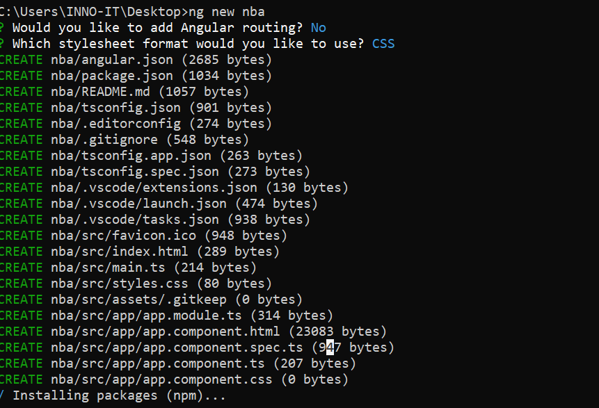
Create a new app by running the command in the terminal:
ng new nba
Answer the CLI question with default options:
Go to the nba folder, edit the app.component.html and remove the default HTML to be ready for our next step.
Install Kendo UI for Angular Data Grid
Now, continue to use the Angular schematic to install the Kendo UI for Angular Data Grid into our app by running the following command in the terminal.
ng add @progress/kendo-angular-grid
It automatically adds the Kendo UI for Angular Data Grid Module to the app.module, making the Kendo UI for Angular Grid component available for use.
Note: If you are using Angular v17 or higher, the default will be standalone in new applications. Standalone apps do not have modules, so this set up will be a little different. Essentially, after the install, you will need to import each Kendo UI component you require into the individual component files.
import { NgModule } from '@angular/core';
import { BrowserModule } from '@angular/platform-browser';

import { AppComponent } from './app.component';
import { GridModule } from '@progress/kendo-angular-grid';
import { BrowserAnimationsModule } from '@angular/platform-browser/animations';

@NgModule({
  declarations: [
    AppComponent
  ],
  imports: [
    BrowserModule,
    GridModule,
    BrowserAnimationsModule
  ],
  providers: [],
  bootstrap: [AppComponent]
})
export class AppModule { }
Perfect! Let’s start to write code!
The Fake Data
We’re going to use fake data to populate the grid. For this purpose, we’ll define a type NbaPlayer and create a list of sample NBA player data.
Start by creating a new file named mock.ts and add the following content:
// Define the NBA player type

export type NbaPlayer = {
  id: string;
  name: string;
  points: number;
  rebounds: number;
  assist: number;
  height: number;
  captain: boolean;
  startDate: string;
};

// Sample NBA player data
export const players: Array<NbaPlayer> = [
  {
    id: '1',
    name: 'LeBron James',
    points: 28,
    rebounds: 8,
    assist: 9,
    height: 6.8,
    captain: true,
    startDate: '10/10/2003',
  },
  {
    id: '2',
    name: 'Stephen Curry',
    points: 32,
    rebounds: 6,
    assist: 6,
    height: 6.2,
    captain: true,
    startDate: '11/11/2009',
  },
  {
    id: '3',
    name: 'Kevin Durant',
    points: 29,
    rebounds: 7,
    assist: 5,
    height: 6.9,
    captain: false,
    startDate: '12/12/2007',
  },
...
]
This sets the foundation for our grid by creating the required data structure and providing sample data. Next, we’ll integrate this with our Kendo UI Grid component.
Using the Data Grid
Before using the Kendo UI Data Grid to show and edit the players list, we want to create a component players-grid to utilize the Kendo UI for Angular Data Grid component to render and edit player information.
Next, using the Angular CLI, we will create the players-grid component using the -t flag for an inline template, which prevents the creation of an HTML file. Run the following command:
 –ng g c components/players-grid –t

CREATE src/app/components/players-grid/players-grid.component.spec.ts (635 bytes)
CREATE src/app/components/players-grid/players-grid.component.ts (239 bytes)
CREATE src/app/components/players-grid/players-grid.component.css (0 bytes)
UPDATE src/app/app.module.ts (588 bytes)
Open players-grid.component.ts and add a new property called players to link with the player array. Replace <p>players-grid works!</p> with the kendo-grid component and bind the data property to nbaPlayers.
import { Component} from '@angular/core';

@Component({
  selector: 'app-player-edit-row',
  template: `<kendo-grid [data]="nbaPlayers"
> </kendo-grid>`,
  styleUrls: ['./player-edit-row.component.css'],
})
export class PlayerEditRowComponent {
 nbaPlayers = players;
}
Note: If you are using standalone, you will need to import the PlayersGridComponent:
import { Component } from '@angular/core';
import { RouterOutlet } from '@angular/router';
import { PlayersGridComponent } from './components/players-grid/players-grid.component';


@Component({
selector: 'app-root',
standalone: true,
imports: [RouterOutlet, PlayersGridComponent],
templateUrl: './app.component.html',
styleUrl: './app.component.css'
})
export class AppComponent {
title = 'nba';
}
Alright, we’ve successfully configured the players-grid component. Now, let’s incorporate it into app.component.html.
Open app.component.html and insert the <app-players-grid/> component. Your HTML should resemble:
<app-players-grid/>
After saving the changes, run ng serve -o. The app should now display the list of players.
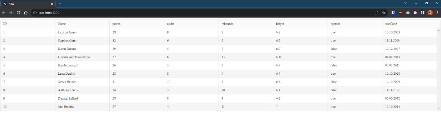
Magic! The Grid is up and running! The real magic comes from the Kendo UI for Angular Data Grid. It simplifies our work by automatically binding properties in the Grid when possible. It’s a feature we’ll be tweaking, but it’s undeniably handy.
The Columns
Before making our grid editable, it’s crucial to control which columns will be displayed.
The Kendo UI Grid offers the <kendo-grid-column> component, which comes with two properties: title and field. These allow us to define the columns that will be rendered.
The nbaPlayers is an array of the NbaPlayer type, each with a set of properties.
export type NbaPlayer = {
  id: string;
  name: string;
  points: number;
  rebounds: number;
  assist: number;
  height: number;
  captain: boolean;
  startDate: string;
};
We can bind to all properties or exclude some. When we want to specify which columns to bind to, we should use the kendo-grid-column component.
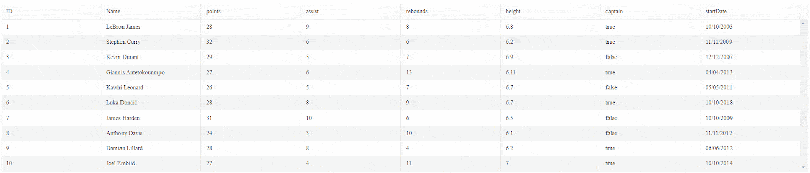
Inside the kendo-grid, add the kendo-grid-column component. Set the title property for the column title and the field property for the column field.
<kendo-grid
    [data]="nbaPlayers"
  >
     <kendo-grid-column title="ID" field="id"> </kendo-grid-column>
    <kendo-grid-column title="Name" field="name"> </kendo-grid-column>
    <kendo-grid-column title="Points" field="points"> </kendo-grid-column>
    <kendo-grid-column title="Assists" field="assist"> </kendo-grid-column>
    <kendo-grid-column title="Rebounds"field="rebounds"> </kendo-grid-column>
    <kendo-grid-column title="Captain"field="captain"> </kendo-grid-column>
    <kendo-grid-column title="Start Date" field="startDate"> </kendo-grid-column>
  </kendo-grid>
Save the changes. Now, the grid will display all columns except for the height column.
Before Turning to Editable
Before diving into creating an interface that allows users to edit, there are several factors to consider. Our goal is to provide an excellent user experience and maintain control over the editing process.
Important considerations include:
- Displaying relevant controls for data. Example: When users are editing a number, they should encounter a numeric input to minimize errors.
- Monitoring edit events. Example: We need to revert from the edit form back to the grid once the user finishes their edits or clicks elsewhere.
- Custom value display and binding: Example: While a user-friendly checkbox might indicate “true” or “false,” we may want to display “Yes” or “No” instead.
- Field validation: Example: When a user is editing, they should be informed about which fields are mandatory.
This isn’t an exhaustive list since we’re aiming for brevity in this article. Rather than building all these features from scratch, we’ll leverage the capabilities of the Kendo UI for Angular Data Grid.
The Kendo UI Grid offers all these features (and more), enabling us to implement an editable grid quickly and painlessly. This efficiency might just give you some extra time for a Netflix binge or an early evening at home.
Let’s get coding!
Make the Kendo UI for Angular Data Grid Editable
Angular offers two methods for working with forms: reactive and template-driven forms. Similarly, the Kendo UI for Angular Data Grid provides two mechanisms for enabling editability using either the kendoGridReactiveEditing or kendoGridTemplateEditing directives.
The directives make CRUD operations straightforward, whether by cell or row. In our scenario, we’ll opt for the reactive approach. We prefer reactive forms because they leverage Angular’s FormBuilder, simplifying the construction of reactive forms and allowing us to define our form group, controls and validations.
Read more about reactive forms.
Before getting started, it’s essential to add both FormsModule and ReactiveFormsModule to the imports section of app.module.ts. Afterward, open the players-grid.component and inject the FormBuilder using the constructor.
export class PlayersGridComponent {
  nbaPlayers = players;
  formBuilder = inject(FormBuilder);
Alternatively, if using standalone, you will simply import the FormBuilder into your component’s imports array:
import { Component, inject } from '@angular/core';
import { GridModule } from '@progress/kendo-angular-grid';
import { players } from '../../../../src/app/mock';
import { FormBuilder } from '@angular/forms';

@Component({
selector: 'app-players-grid',
standalone: true,
imports: [GridModule],
template: `...`,
styleUrl: './players-grid.component.css'
})
export class PlayersGridComponent {
  nbaPlayers = players;
  formBuilder = inject(FormBuilder);
}
What Do We Need to Do?
Remember we need a form? We must connect the form with the Kendo UI for Angular Data Grid using events, allowing the grid to switch to edit mode and linking the grid field with the form.
First, create a new method called createFormGroup, taking a NbaPlayer object as a parameter (it represents a row in our grid). Use the form builder to create a form for each field and bind the values to the form.
The final code will look like:
  private createFormGroup(player: NbaPlayer): any {
    return this.formBuilder.group({
      id: player.id,
      name: player.name,
      points: player.points,
      assist: player.assist,
      rebounds: player.rebounds,
      height: player.height,
      captain: player.captain,
      startDate: player.startDate,
    });
  }
The form is complete. Next, we need to configure the grid to connect the form with the built-in editor.
Read more about the kendo-column component.
Show the Editor Component
This is one of my favorite features of Kendo UI for Angular Data Grid. It provides an easy way to connect the data with a component related to that data using the editor property. It supports multiple types of editors, such as numeric, text, Boolean and date. The editor displays an input related to a specific type, for example:
- For dates, it displays the powerful Kendo UI Calendar.
- Text and numbers use the text and numeric editors, respectively.
- Boolean values utilize a checkbox.
Let’s activate this for all columns except for ID.
   <kendo-grid-column title="ID" field="id"> </kendo-grid-column>
    <kendo-grid-column title="Name" field="name" editor="text">
    </kendo-grid-column>
    <kendo-grid-column field="points" editor="numeric"> </kendo-grid-column>
    <kendo-grid-column field="assist" editor="numeric"> </kendo-grid-column>
    <kendo-grid-column field="rebounds" editor="numeric"> </kendo-grid-column>
    <kendo-grid-column field="height" editor="numeric"> </kendo-grid-column>
    <kendo-grid-column field="captain" editor="boolean"> </kendo-grid-column>
    <kendo-grid-column field="startDate" editor="date"> </kendo-grid-column>
We have the editor, but how do we connect the form with it?
Kendo UI for Angular Data Grid provides built-in cellClick and cellClose events. We will link each event to specific methods to handle our editing logic. Let’s begin with cellClick. We’ll associate it with a new method named cellEditClick, passing the event as a parameter.
<kendo-grid
    [data]="nbaPlayers"
     (cellClick)="cellEditClick($event)"
    ....>
The method receives the event and retrieves cell information it provides, such as the row, column and item. The item is then passed to the createFormGroup method to connect the reactive forms with the values.
The finalized code looks like:
cellEditClick(cellEvent: CellClickEvent) {
  cellEvent.sender.editCell(
    cellEvent.rowIndex,
    cellEvent.columnIndex,
    this.createFormGroup(cellEvent.dataItem)
  );
}
Save the changes and see what happens.
Yes! When you double-click on a cell, it dynamically creates an input text, checkbox or even a calendar, all with just a few lines of code.
Hmm… something is not as expected. The values were not saved, and there’s no validation. How can we save the values and trigger validations?
Add Validators
The entity responsible for the form is the FormGroup. We can use Angular validators to make our forms a bit stricter. Import the Validators from import { FormBuilder, Validators } from '@angular/forms'; in the form declaration. Instead of using the property directly, use an array, passing the property and the validator.
Example: for the name, use Validators.required and for points, use Validators.min(1).
The final code looks like:
private createFormGroup(player: NbaPlayer): any {
    return this.formBuilder.group({
      id: player.id,
      name: [player.name, Validators.required],
      points: [player.points, Validators.min(1)],
      assist: player.assist,
      rebounds: player.rebounds,
      height: player.height,
      captain: player.captain,
      startDate: player.startDate,
    });
  }
}
Next, we have to perform some steps:
- Update the value.
- Validate and perform the update only if it is valid.
- Close the row.
To update, we create a method to find the player and update by ID, using the findIndex method from the nbaPlayers array.
private updatePlayer(player: NbaPlayer) {
    const playerIndex = this.nbaPlayers.findIndex((p) => p.id === player.id);
    this.nbaPlayers[playerIndex] = player;
  }
Next, connect the closeCell event to a new method, cellCloseClick, passing the event and a template variable reference linked to the Grid.
<kendo-grid
    [data]="nbaPlayers"
    #playerGrid
    (cellClose)="cellCloseClick($event, playerGrid)"
            ....>
Add the new method cellCloseClick with two parameters: the event and the GridComponent. Our method will perform the following tasks:
- Get the value and valid property from the FormGroup.
- If valid, then call the method
updatePlayerwith the value and call the methodcloseCell.
The final code looks like:
cellCloseClick(cellEvent: CellCloseEvent, playerGrid: GridComponent) {
  const { value, valid } = cellEvent.formGroup;
  if (valid) {
    this.updatePlayer(value);
    playerGrid.closeCell();
  }
}
Save the changes and reload the application. Now, try to edit the values and play with the grid.
Conclusion
We have successfully configured your Kendo UI for Angular Data Grid to enable click-to-edit functionality for rows. Making our grid editable not only adds fun but also simplifies the addition of complex logic, validation and more. Introducing in-cell editing to the grid streamlines the editing process for your users.
I recommend exploring the Kendo UI documentation further to harness even more of the Grid’s powerful features!
If you haven’t yet taken Kendo UI for Angular for a spin, remember it comes with a free 30-day trial.
- Source code: https://github.com/danywalls/edit-kendo-ui-for-angular-datagrid
- Source code updated to standalone & v17: https://github.com/alyssamichelle/kendo-ui-grid-nba

Dany Paredes
Dany Paredes is a Google Developer Expert on Angular and Progress Champion. He loves sharing content and writing articles about Angular, TypeScript and testing on his blog and on Twitter (@danywalls).
Related Posts
Comments
All articles
Topics

Latest Stories
in Your Inbox
Subscribe to be the first to get our expert-written articles and tutorials for developers!
All fields are required