
Data Science embodies a delicate balance between the art of visual storytelling, the precision of statistical analysis, and the foundational bedrock of data preparation, transformation, and analysis. The intersection of these domains is where true data alchemy happens – transforming and interpreting data to tell compelling stories that drive decision-making and knowledge discovery. Just as Leonardo da Vinci masterfully blended scientific observation with artistic genius, we will explore how the art of storytelling in data science can illuminate insights with the same precision and beauty. In this post, we will navigate through our Data Science Mind Map to unpack and simplify this process while providing links that showcase concrete examples.
Let’s get started.

The Da Vinci Code of Data: Mastering The Data Science Mind Map
Photo by Alexandre Debiève. Some rights reserved.
Overview
This post is divided into two parts; they are:
- Mastering The Data Science Mind Map
- The Art of Storytelling in Data Science
Mastering The Data Science Mind Map
In our quest to master the Data Science Mind Map, we emphasize the critical importance of the foundational Python packages that every data scientist should be familiar with. These packages form the pillars of our Mind Map, representing the triad of essential skills: data preparation, visualization, and statistical analysis. They are tools and building blocks that enable us to transform raw data into a compelling narrative. As we proceed, we will delve into each package’s unique role and its dual or singular functions within the data science workflow, exploring their synergy and individual strengths in crafting data stories.
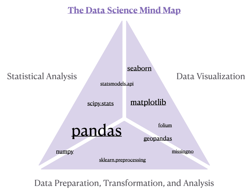
Pandas: The brainchild of Wes McKinney, pandas stands out as a foundation for data wrangling and as a bridge to statistical analysis. In pandas, the DataFrame is not just a data structure; it is the cornerstone upon which data manipulation, transformation, and analysis are built. This two-dimensional, size-mutable, and potentially heterogeneous tabular data structure is akin to a spreadsheet loaded right into Python. With its rows and columns neatly organized, the DataFrame makes data operations both intuitive and efficient. Each method, whether it’s DataFrame.describe() for statistical summaries, DataFrame.groupby() for aggregation, or DataFrame.pivot_tables() for advanced reshaping, is applied to a DataFrame, unlocking the full potential of your data. As shown in our detailed post on decoding data with descriptive statistics, pandas allows you to distill complex datasets into meaningful statistics efficiently, a vital step before any further analysis. Moreover, understanding data types is pivotal, as it determines the type of analysis you can perform. Our post on classifying variables guides you through this critical stage, where methods like DataFrame.dtypes and DataFrame.select_dtypes() in pandas facilitate the discernment and manipulation of different data categories. The DataFrame.query() function lets you filter with ease, making complex SQL-like querying in Python a breeze, and offering a more dynamic approach to data manipulation. For more in-depth examples and applications of these methods, consider exploring the insights in the posts on transforming real estate data and harmonizing data techniques here.
Numpy: A foundational library for numerical computation in Python, enabling data scientists to perform complex mathematical calculations and data manipulation with ease and speed. In our post on hypothesis testing, we leveraged numpy to efficiently calculate key statistical measures such as the mean, serving as a pivotal step in setting the groundwork for conducting hypothesis tests. While pandas excels at handling tabular data, numpy follows suit by providing support for arrays, forming a formidable duo in the data science toolkit.
Sklearn.preprocessing: Despite the depth of this series not extending into machine learning, it’s worthwhile to highlight sklearn.preprocessing for its role in data transformations, specifically with the QuantileTransformer(). This technique was demonstrated in our post that discussed how to combat skew.
Missingno: Themissingno package uniquely bridges the gap between preprocessing, analysis, and visualization in the data science workflow. It specializes in providing a graphical representation of missing data within a dataset, thus serving a dual function: it aids in the early stages of data cleaning and preparation by visually identifying patterns of missingness, and it also facilitates exploratory data analysis by revealing underlying structures or anomalies that could influence subsequent statistical analyses. In our post, Revealing the Invisible: A Guide to Missing Data in Python, we delve into how missingno can be used to efficiently detect and handle missing data, demonstrating its critical role in ensuring the integrity and robustness of your data science projects. Through intuitive visualizations, missingno not only enhances data preprocessing but also enriches the analytical narrative by shedding light on aspects of the data that often remain obscured.
Geopandas: This package extends the functionalities of pandas into the realm of geospatial data, making it an indispensable tool for both data preprocessing and visualization in geographical contexts. It allows data scientists to easily manipulate and analyze spatial data, integrating seamlessly with other Python libraries for geospatial analysis. With Geopandas, you can perform sophisticated spatial operations, merge spatial datasets, and conduct spatial joins, all while maintaining the familiar pandas DataFrame structure. This capability ensures that handling geospatial data is as intuitive as working with tabular data. Moreover, Geopandas excels in visualizing geospatial data, enabling the creation of maps that can reveal compelling insights into geographical patterns and relationships. In our post, From Data to Map: Mastering Geospatial Analysis with Python, we showcase how Geopandas can transform raw geospatial data into informative maps, highlighting its dual role in both preprocessing and visually interpreting spatial data within the data science workflow.
Folium: Specializing in the singular role of creating interactive maps, folium leverages the mapping strengths of the Leaflet.js library within the Python environment. It excels at building rich, interactive geospatial visualizations, allowing for the dynamic representation of data overlaid on maps. This capability is invaluable for projects requiring intuitive spatial data exploration and presentation, making folium a go-to library for geospatial mapping.
Matplotlib and Seaborn: These two packages emerge as pivotal threads, interwoven to enhance the fabric of analytical storytelling. Matplotlib, the foundational library, offers extensive flexibility and control, laying the groundwork for creating a wide array of static, animated, and interactive visualizations. It serves as the bedrock upon which seaborn is built, with the latter extending matplotlib‘s capabilities by offering a high-level interface for drawing attractive and informative statistical graphics. seaborn specializes in making complex visualizations accessible, integrating tightly with pandas DataFrames to streamline the process from data manipulation to representation. This synergy is particularly evident when exploring feature relationships and uncovering patterns within datasets, as seaborn‘s advanced plotting functions, like pair plots, build upon matplotlib‘s foundational structures to provide richer, more insightful visual narratives. Our posts on exploring feature relationships and utilizing pair plots delve into how seaborn and matplotlib, in conjunction with pandas, form a cohesive visualization suite. Together, these libraries offer an unparalleled toolkit for data scientists aiming to translate complex data insights into compelling visual stories, highlighting the interconnectedness and distinct strengths of each package in the visualization ecosystem.
Statsmodels.api: This tool is particularly useful in the realm of statistical visualization through its QQ plots (Quantile-Quantile plots) functionality, aiding in the assessment of whether data distributions match theoretical expectations, typically the normal distribution. We demonstrate this technique in this post. The generation of a QQ plot involves comparing the sorted values of the sample data against the expected values of the chosen theoretical distribution, providing a graphical method to evaluate the assumption of normality critical to many parametric statistical tests.
Scipy.stats: As the data science journey progresses from descriptive to inferential statistics, scipy.stats emerges as a pivotal toolkit. This package is fundamental for conducting a wide range of statistical tests and analyses that form the backbone of inferential statistics, enabling data scientists to draw meaningful conclusions from their data. Within scipy.stats, you find an extensive array of functions designed for hypothesis testing, confidence interval estimation, and much more, making it indispensable for rigorous statistical investigation.
Our exploration of statistical techniques through various posts demonstrates the versatility and power of scipy.stats:
- In Inferential Insights: Confidence Intervals, we delve into how confidence intervals can provide a range of plausible values for an unknown parameter, showcasing the
t.intervalfunction for calculating intervals based on sample data. - A Dive into Hypothesis Testing illustrates the core of inferential statistics, employing tests like the t-test to evaluate hypotheses about our data.
- Our examination of the Chi-Squared Test with the Ames Housing Dataset uses the
chi2_contingencyfunction to test for independence between categorical variables. - Leveraging ANOVA and Kruskal-Wallis Tests highlights how
scipy.statssupports both parametric (ANOVA) and non-parametric (Kruskal-Wallis) tests to assess the effects of categorical variables (‘YrSold’) on continuous outcomes (‘SalePrice’). - Utilizing the non-parametric Kolmogorov-Smirnov test, we compare transformed data against the normal distribution, demonstrating the transformative power of methods like Quantile, Log, and Box-Cox to combat data with skewed distributions.
Scipy.stats thus plays a crucial role in transitioning data science efforts from understanding what is in the data (descriptive statistics) to inferring the implications of that data (inferential statistics), providing a comprehensive suite for statistical testing and analysis.
The Data Science Mind Map introduces you to a collection of Python libraries, each playing a distinct yet interconnected role in the broader data science landscape. From the data structuring prowess of pandas and the numerical might of numpy, to the cleaning insights provided by missingno and the geographical intelligence of geopandas; from the captivating visualizations afforded by folium, matplotlib, and seaborn, to the analytical depth and statistical rigor of statsmodels.api and scipy.stats — each library contributes a unique thread to the interdisciplinary nature of Data Science.
Kick-start your project with my book The Beginner’s Guide to Data Science. It provides self-study tutorials with working code.
The Art of Storytelling in Data Science
Imagine the process of storytelling in data science as Leonardo da Vinci embarking on the creation of a masterpiece. Each brushstroke, choice of color, and play of light and shadow serve a purpose, much like the elements of our data narrative. Let’s explore this artistic journey.
Sketching the Outline: Before touching brush to canvas, Leonardo spent countless hours in preparation. He dissected human bodies to understand anatomy, studied the properties of light and shadow, and sketched detailed drawings. Similarly, our first step in data storytelling involves deep diving into the dataset, understanding its variables, and planning our analysis. This stage sets the foundation for a narrative that is both accurate and compelling.
Choosing the Palette: Just as Leonardo mixed his paints to achieve the perfect hues, a data storyteller selects tools and techniques from the Data Science Mind Map. The choice of Python packages, such as pandas for data manipulation, matplotlib and seaborn for visualization, or scipy.stats for statistical analysis, becomes our palette, allowing us to illuminate insights from the data.
Creating Depth with Perspective: Leonardo’s use of perspective gave his paintings depth, making them more lifelike and engaging. In data storytelling, we create depth through analysis, examining the data from multiple angles to uncover underlying patterns and relationships. This perspective helps us build a narrative that resonates with the audience, providing them with insights beyond the surface.
Highlighting with Light and Shadow: Leonardo was a master of chiaroscuro, the technique of using light and shadow to bring drama and focus to his paintings. In our data story, visualizations serve as our light and shadow, highlighting key findings and drawing the audience’s attention to the most important insights. Through effective visualization, we can make complex data understandable and memorable.
The Final Masterpiece: When Leonardo presented his finished work, it was not just a painting; it was a story captured in time, evoking emotion and provoking thought. Our data story, culminating in the presentation of our findings, aims to do the same. It’s where our preparation, analysis, and visualization come together to inform, persuade, and inspire our audience to action.
Just as viewers stand in front of a da Vinci painting, absorbing its beauty and depth, we invite your audience to reflect on the data driven stories you will tell. This reflection is where understanding deepens, and the true impact of your work is felt, echoing the enduring legacy of da Vinci’s art.
Further Reading
Tutorials
Resources
Summary
In this final post of our Data Science series, we unveiled the art and science behind turning raw data into compelling narratives that inform and inspire action. By traversing the Data Science Mind Map, we’ve seen how foundational tools and techniques serve as the building blocks for data preparation, analysis, and visualization, enabling the transformation of complex datasets into insightful stories. Drawing an analogy to Leonardo da Vinci’s masterful blend of art and science, we’ve explored the storytelling process in Data Science as a creative endeavor that, much like painting a masterpiece, requires careful preparation, the right tools, and a keen eye for detail to reveal the stories hidden within data. This post has aimed to simplify the data science process and inspire you to approach your data with the curiosity of a scientist and the heart of an artist.
Specifically, you learned:
- The essential role of foundational tools as depicted in The Data Science Mind Map.
- The process of storytelling in data science, from setting the stage, to creating depth, and finally, presenting the ‘masterpiece’ that evokes understanding and action.
Do you have any questions? Please ask your questions in the comments below, and I will do my best to answer.
Get Started on The Beginner's Guide to Data Science!
Learn the mindset to become successful in data science projects
...using only minimal math and statistics, acquire your skill through short examples in Python
Discover how in my new Ebook:
The Beginner's Guide to Data Science
It provides self-study tutorials with all working code in Python to turn you from a novice to an expert. It shows you how to find outliers, confirm the normality of data, find correlated features, handle skewness, check hypotheses, and much more...all to support you in creating a narrative from a dataset.


No comments yet.