
In the realm of real estate, understanding the intricacies of property features and their impact on sale prices is paramount. In this exploration, we’ll dive deep into the Ames Housing dataset, shedding light on the relationships between various features and their correlation with the sale price. Harnessing the power of data visualization, we’ll unveil patterns, trends, and insights that can guide stakeholders from homeowners to real estate developers.
Let’s get started.

Feature Relationships 101: Lessons from the Ames Housing Data
Photo by Andraz Lazic. Some rights reserved.
Overview
This post is divided into three parts; they are:
- Unraveling Correlations
- Visualizing with Heatmaps
- Dissecting Feature Relationships through Scatter Plots
Unraveling Correlations
Correlation is a statistical measure that illustrates the extent to which two variables change together. A positive correlation indicates that as one variable increases, the other also tends to increase, and vice versa. Conversely, a negative correlation implies that as one variable increases, the other tends to decrease.
|
1 2 3 4 5 6 7 8 9 10 |
# Load the Dataset import pandas as pd Ames = pd.read_csv('Ames.csv') # Calculate the correlation of all features with 'SalePrice' correlations = Ames.corr(numeric_only=True)['SalePrice'].sort_values(ascending=False) # Display the top 10 features most correlated with 'SalePrice' top_correlations = correlations[1:11] print(top_correlations) |
This prints:
|
1 2 3 4 5 6 7 8 9 10 11 |
OverallQual 0.790661 GrLivArea 0.719980 TotalBsmtSF 0.652268 1stFlrSF 0.642623 GarageCars 0.639017 GarageArea 0.635029 YearBuilt 0.544569 FullBath 0.535175 GarageYrBlt 0.521105 YearRemodAdd 0.514720 Name: SalePrice, dtype: float64 |
From the Ames Housing dataset, the top features most correlated with housing prices are:
- OverallQual: Overall Quality of the house, rated on a scale from 1 (Very Poor) to 10 (Very Excellent).
- GrLivArea: Above Ground Living Area, measured in square feet. It encompasses the living area that is not in the basement.
- TotalBsmtSF: Total Basement Area, represented in square feet. This combines both the finished and unfinished areas of the basement.
- 1stFlrSF: First Floor Square Feet, indicating the size of the first floor of the house.
- GarageCars: Size of Garage in terms of car capacity. This represents the number of cars that can fit into the garage.
- GarageArea: Size of Garage, measured in square feet. It gives a sense of the total area covered by the garage.
- YearBuilt: Original Construction Date, indicating the year when the primary construction of the house was completed.
- FullBath: Full Bathrooms Above Grade. This counts the number of full bathrooms (i.e., with a sink, toilet, and either a tub or shower) that are not in the basement.
- GarageYrBlt: Year Garage was Built. This specifies the year the garage was constructed. For houses without a garage, this feature can be null.
- YearRemodAdd: Remodel Date. It indicates the year of remodeling or addition, with the same year as construction if no remodeling or additions.
Features most correlated are the features with best predictive power. If you build a model to predict housing prices, these are the subset of input features with a high possibility of success. Correlated features may also caused by some other common factor, which itself is a topic in data science that you would like to investigate and elaborate on.
The code above prints correlations[1:11] because correlations[0] is the SalesPrice, which by definition is 1.0. From a feature selection perspective, you should also check correlations[-10:] for the most negatively correlated features, which may also be powerful in explaining the prices. This is not the case in this particular dataset.
Kick-start your project with my book The Beginner’s Guide to Data Science. It provides self-study tutorials with working code.
Visualizing with Heatmaps
Heatmaps provide a powerful visual tool to represent data in a two-dimensional space, with colors indicating magnitudes or frequencies. In the context of correlations, a heatmap can beautifully illustrate the strength and direction of relationships between multiple features. Let’s dive into a heatmap showcasing the correlations among the top features most correlated with SalePrice.
|
1 2 3 4 5 6 7 8 9 10 11 12 13 14 15 16 17 18 19 20 21 |
# Import required libraries import seaborn as sns import matplotlib.pyplot as plt # Select the top correlated features including SalePrice selected_features = list(top_correlations.index) + ['SalePrice'] # Compute the correlations for the selected features correlation_matrix = Ames[selected_features].corr() # Set up the matplotlib figure plt.figure(figsize=(12, 8)) # Generate a heatmap sns.heatmap(correlation_matrix, annot=True, cmap="coolwarm", linewidths=.5, fmt=".2f", vmin=-1, vmax=1) # Title plt.title("Heatmap of Correlations among Top Features with SalePrice", fontsize=16) # Show the heatmap plt.show() |
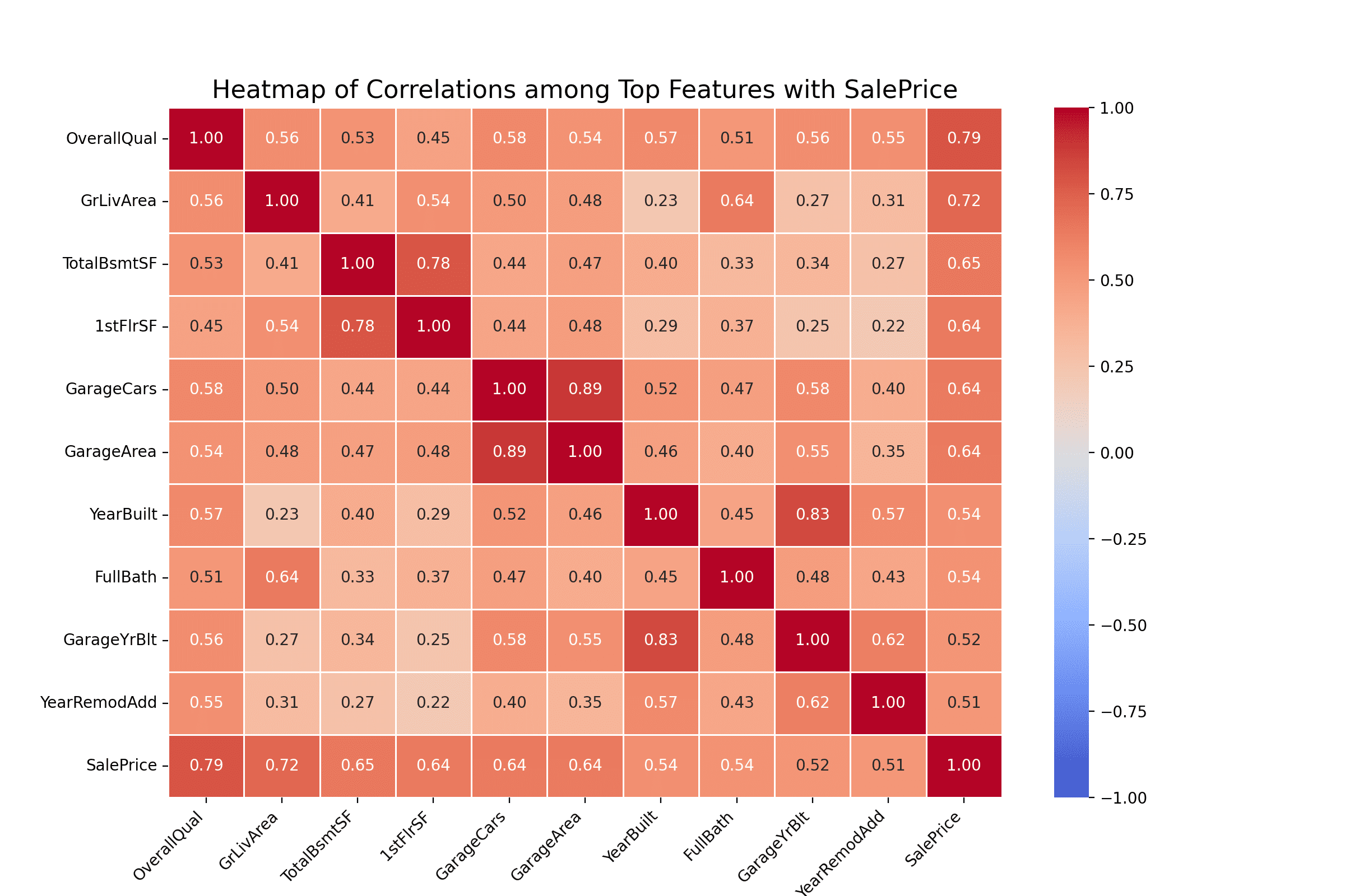
Heatmaps are a fantastic way to visualize the strength and direction of relationships between multiple variables simultaneously. The color intensity in each cell of the heatmap corresponds to the magnitude of the correlation, with warmer colors representing positive correlations and cooler colors indicating negative correlations. There is no blue in the heatmap above because only the 10 most positively correlated columns are concerned.
In the heatmap above, we can observe the following:
- OverallQual, representing the overall quality of the house, has the strongest positive correlation with SalePrice, with a correlation coefficient of approximately 0.79. This implies that as the quality of the house increases, the sale price also tends to increase.
- GrLivArea and TotalBsmtSF, representing the above-ground living area and total basement area respectively, also show strong positive correlations with the sale price.
- Most of the features have a positive correlation with SalePrice, which indicates that as these features increase or improve, the sale price of the house also tends to go up.
- It’s worth noting some features are correlated with each other. For example, GarageCars and GarageArea are strongly correlated, which makes sense as a larger garage can accommodate more cars.
Such insights can be invaluable for various stakeholders in the real estate sector. For instance, real estate developers can focus on improving specific features in homes to increase their market value.
Below is the complete code:
|
1 2 3 4 5 6 7 8 9 10 11 12 13 14 15 16 17 18 19 20 21 22 23 24 |
import seaborn as sns import matplotlib.pyplot as plt import pandas as pd # Load the Dataset Ames = pd.read_csv('Ames.csv') # Calculate the top 10 features most correlated with 'SalePrice' correlations = Ames.corr(numeric_only=True)['SalePrice'].sort_values(ascending=False) top_correlations = correlations[1:11] # Select the top correlated features including SalePrice selected_features = list(top_correlations.index) + ['SalePrice'] # Compute the correlations for the selected features correlation_matrix = Ames[selected_features].corr() # Set up the matplotlib figure plt.figure(figsize=(12, 8)) # Generate a heatmap sns.heatmap(correlation_matrix, annot=True, cmap="coolwarm", linewidths=.5, fmt=".2f", vmin=-1, vmax=1) plt.title("Heatmap of Correlations among Top Features with SalePrice", fontsize=16) plt.show() |
Dissecting Feature Relationships through Scatter Plots
While correlations provide a preliminary understanding of relationships, it’s crucial to visualize these relationships further. Scatter plots, for instance, can paint a clearer picture of how two features interact with each other. Moreover, it’s essential to discern between correlation and causation. A high correlation does not necessarily imply that one variable causes changes in another. It merely indicates a relationship.
|
1 2 3 4 5 6 7 8 9 10 11 12 13 14 15 16 17 18 19 20 21 22 23 24 25 26 27 28 29 30 31 32 33 34 35 36 37 |
# Import required libraries import pandas as pd import matplotlib.pyplot as plt import seaborn as sns Ames = pd.read_csv('Ames.csv') # Setting up the figure and axes fig, ax = plt.subplots(2, 2, figsize=(15, 12)) # Scatter plot for SalePrice vs. OverallQual sns.scatterplot(x=Ames['OverallQual'], y=Ames['SalePrice'], ax=ax[0, 0], color='blue', alpha=0.6) ax[0, 0].set_title('House Prices vs. Overall Quality') ax[0, 0].set_ylabel('House Prices') ax[0, 0].set_xlabel('Overall Quality') # Scatter plot for SalePrice vs. GrLivArea sns.scatterplot(x=Ames['GrLivArea'], y=Ames['SalePrice'], ax=ax[0, 1], color='red', alpha=0.6) ax[0, 1].set_title('House Prices vs. Ground Living Area') ax[0, 1].set_ylabel('House Prices') ax[0, 1].set_xlabel('Above Ground Living Area (sq. ft.)') # Scatter plot for SalePrice vs. TotalBsmtSF sns.scatterplot(x=Ames['TotalBsmtSF'], y=Ames['SalePrice'], ax=ax[1, 0], color='green', alpha=0.6) ax[1, 0].set_title('House Prices vs. Total Basement Area') ax[1, 0].set_ylabel('House Prices') ax[1, 0].set_xlabel('Total Basement Area (sq. ft.)') # Scatter plot for SalePrice vs. 1stFlrSF sns.scatterplot(x=Ames['1stFlrSF'], y=Ames['SalePrice'], ax=ax[1, 1], color='purple', alpha=0.6) ax[1, 1].set_title('House Prices vs. First Floor Area') ax[1, 1].set_ylabel('House Prices') ax[1, 1].set_xlabel('First Floor Area (sq. ft.)') # Adjust layout plt.tight_layout(pad=3.0) plt.show() |
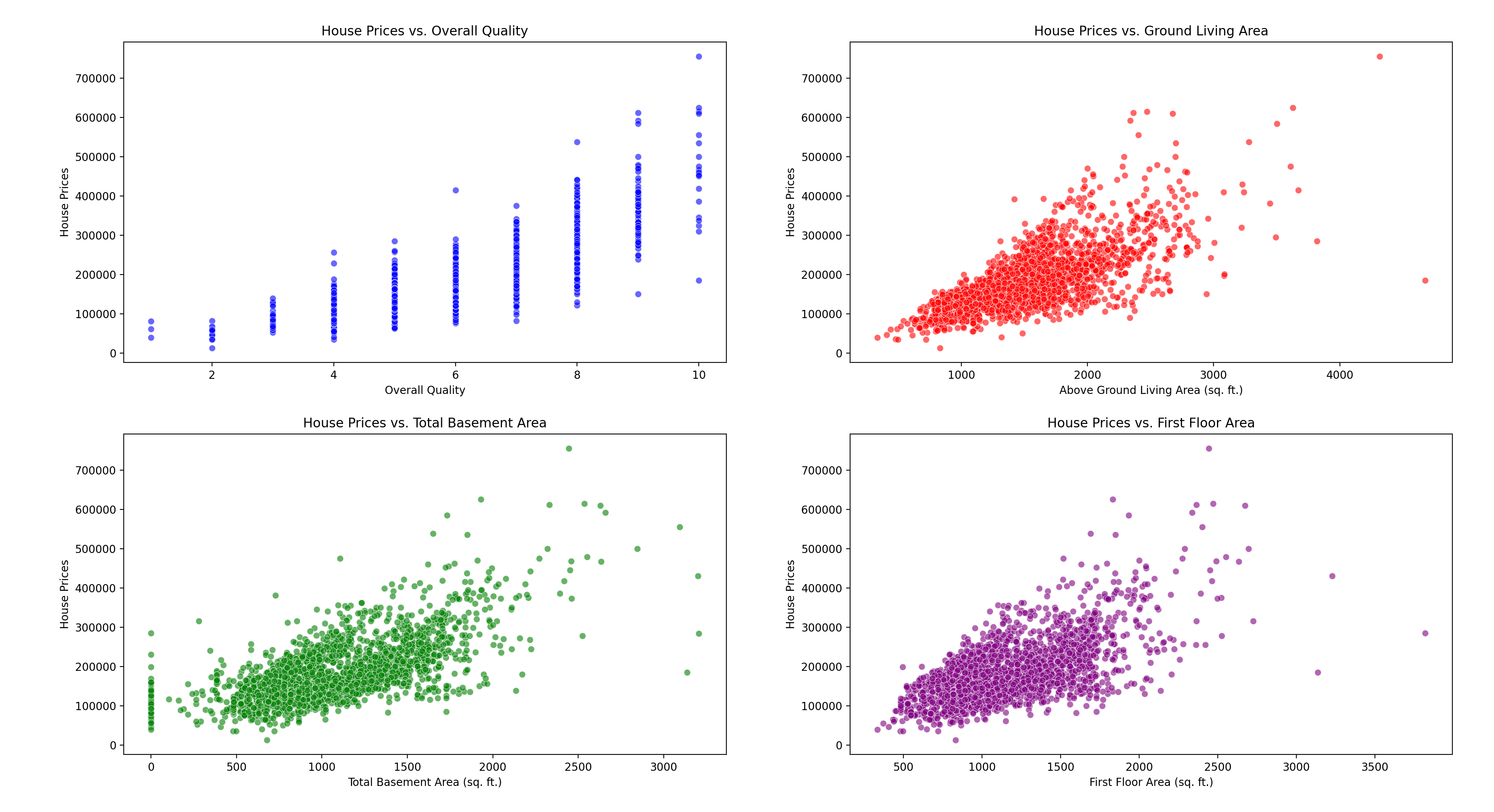
The scatter plots emphasize the strong positive relationships between sale price and key features. As the overall quality, ground living area, basement area, and first floor area increase, houses generally fetch higher prices. However, some exceptions and outliers suggest that other factors also influence the final sale price. One particular example is from the “House Prices vs. Ground Living Area” scatter plot above: At 2500 sq. ft. and above, the dots are dispersed, suggesting that there is a wide range in the house price in which the area is not strongly correlated or not effectively explained.
Further Reading
This section provides more resources on the topic if you want to go deeper.
Resources
Summary
In exploring the Ames Housing dataset, we embarked on a journey to understand the relationships between various property features and their correlation with sale prices. Through heatmaps and scatter plots we unveiled patterns and insights that can significantly impact real estate stakeholders.
Specifically, you learned:
- The importance of correlation and its significance in understanding relationships between property features and sale prices.
- The utility of heatmaps in visually representing correlations among multiple features.
- The depth added by scatter plots, emphasizing the importance of dissecting individual feature dynamics beyond mere correlation coefficients.
Do you have any questions? Please ask your questions in the comments below, and I will do my best to answer.
Get Started on The Beginner's Guide to Data Science!
Learn the mindset to become successful in data science projects
...using only minimal math and statistics, acquire your skill through short examples in Python
Discover how in my new Ebook:
The Beginner's Guide to Data Science
It provides self-study tutorials with all working code in Python to turn you from a novice to an expert. It shows you how to find outliers, confirm the normality of data, find correlated features, handle skewness, check hypotheses, and much more...all to support you in creating a narrative from a dataset.


 for Feature Selection in Python")
No comments yet.