
Geospatial visualization has become an essential tool for understanding and representing data in a geographical context. It plays a pivotal role in various real-world applications, from urban planning and environmental studies to real estate and transportation. For instance, city planners might use geospatial data to optimize public transportation routes, while real estate professionals could leverage it to analyze property value trends in specific regions. Using Python, we can harness the power of libraries like geopandas, matplotlib, and contextily to create compelling visualizations. In this post, we’ll dive deep into a code snippet that visualizes house sale prices in Ames, Iowa, breaking down each step to understand its purpose and functionality.
Let’s get started.

From Data to Map: Visualizing Ames House Prices with Python
Photo by Annie Spratt. Some rights reserved.
Overview
This post is divided into six parts; they are:
- Installing Essential Python Packages
- Importing Necessary Libraries
- Loading and Preparing the Data
- Setting the Coordinate Reference System (CRS)
- Creating a Convex Hull
- Visualizing the Data
Installing Essential Python Packages
Before we dive into the world of geospatial visualization with Python, it’s crucial to set up your development environment correctly. On Windows, you can open either Command Prompt or PowerShell. If you’re using macOS or Linux, the Terminal application is your gateway to the command-line world. Additionally, to ensure that you have access to all the necessary Python libraries, it’s essential to have access to the Python Package Index (PyPI), the official third-party software repository for Python packages.
To install the essential packages, you can use the following commands on your terminal or command-line interface:
|
1 2 3 4 5 |
pip install pandas pip install geopandas pip install matplotlib pip install contextily pip install shapely |
Once you’ve successfully installed the required packages, you’re ready to import the necessary libraries and begin your geospatial visualization journey.
Kick-start your project with my book The Beginner’s Guide to Data Science. It provides self-study tutorials with working code.
Importing Necessary Libraries
Before diving into the visualization, it’s essential to import the necessary libraries that will power our visualization.
|
1 2 3 4 5 |
import pandas as pd import geopandas as gpd import matplotlib.pyplot as plt import contextily as ctx from shapely.geometry import Point |
We’ll be using several Python libraries, including:
- pandas: For data manipulation and analysis.
- geopandas: To handle geospatial data.
- matplotlib: For creating static, animated, and interactive visualizations.
- contextily: To add basemaps to our plots.
- shapely: For manipulation and analysis of planar geometric objects.
Loading and Preparing the Data
The Ames.csv dataset contains detailed information about house sales in Ames, Iowa. This includes various attributes of the houses, such as size, age, and condition, as well as their geographical coordinates (latitude and longitude). These geographical coordinates are crucial for our geospatial visualization, as they allow us to plot each house on a map, providing a spatial context to the sale prices.
|
1 2 3 4 5 6 |
# Load the dataset Ames = pd.read_csv('Ames.csv') # Convert the DataFrame to a GeoDataFrame geometry = [Point(xy) for xy in zip(Ames['Longitude'], Ames['Latitude'])] geo_df = gpd.GeoDataFrame(Ames, geometry=geometry) |
By converting the pandas DataFrame into a GeoDataFrame, we can leverage geospatial functionalities on our dataset, transforming the raw data into a format suitable for geospatial analysis and visualization.
Setting the Coordinate Reference System (CRS)
The Coordinate Reference System (CRS) is a fundamental aspect of accurate geospatial operations and cartography, determining how our data aligns on the Earth’s surface. The distance between two points will differ under a different CRS, and the map will look different. In our example, we set the CRS for the GeoDataFrame using the notation “EPSG:4326,” which corresponds to the widely-used WGS 84 (or World Geodetic System 1984) latitude-longitude coordinate system.
|
1 2 |
# Set the CRS for the GeoDataFrame geo_df.crs = "EPSG:4326" |
WGS 84 is a global reference system established in 1984 and is the de facto standard for satellite positioning, GPS, and various mapping applications. It uses a three-dimensional coordinate system with latitude and longitude defining positions on the Earth’s surface and altitude indicating height above or below a reference ellipsoid.
Beyond WGS 84, numerous coordinate reference systems cater to diverse mapping needs. Choices include the Universal Transverse Mercator (UTM), providing planar, Cartesian coordinates suitable for regional mapping; the European Petroleum Survey Group (EPSG) options, such as “EPSG:3857” for web-based mapping; and the State Plane Coordinate System (SPCS), offering state-specific systems within the United States. Selecting an appropriate CRS depends on factors like scale, accuracy, and the geographic scope of your data, ensuring precision in geospatial analysis and visualization.
Creating a Convex Hull
A convex hull provides a boundary that encloses all data points, offering a visual representation of the geographical spread of our data.
|
1 2 3 4 5 |
# Create a convex hull around the points convex_hull = geo_df.unary_union.convex_hull convex_hull_geo = gpd.GeoSeries(convex_hull, crs="EPSG:4326") convex_hull_transformed = convex_hull_geo.to_crs(epsg=3857) buffered_hull = convex_hull_transformed.buffer(500) |
The transformation from “EPSG:4326” to “EPSG:3857” is crucial for a couple of reasons:
- Web-based Visualizations: The “EPSG:3857” is optimized for web-based mapping applications like Google Maps and OpenStreetMap. By transforming our data to this CRS, we ensure it overlays correctly on web-based basemaps.
- Buffering in Meters: The buffer operation adds a margin around the convex hull. In “EPSG:4326”, coordinates are in degrees, which makes buffering in meters problematic. By transforming to “EPSG:3857”, we can accurately buffer our convex hull by 500 meters, providing a clear boundary around Ames.
By buffering the convex hull, we not only visualize the spread of our data but also provide a geographical context to the visualization, emphasizing the region of interest.
Visualizing the Data
With our data prepared, it’s time to bring it to life through visualization. We’ll plot the sale prices of individual houses on a map, using a color gradient to represent different price ranges.
|
1 2 3 4 5 6 7 8 9 10 11 12 13 |
# Plotting the map with Sale Prices, a basemap, and the buffered convex hull as a border fig, ax = plt.subplots(figsize=(12, 8)) geo_df.to_crs(epsg=3857).plot(column='SalePrice', cmap='coolwarm', ax=ax, legend=True, markersize=20) buffered_hull.boundary.plot(ax=ax, color='black', label='Buffered Boundary of Ames') ctx.add_basemap(ax, source=ctx.providers.CartoDB.Positron) ax.set_axis_off() ax.legend(loc='upper right') colorbar = ax.get_figure().get_axes()[1] colorbar.set_ylabel('Sale Price', rotation=270, labelpad=20, fontsize=15) plt.title('Sale Prices of Individual Houses in Ames, Iowa with Buffered Boundary', fontsize=18) plt.show() |
The color gradient used, ‘coolwarm’, is a diverging colormap. This means it has two distinct colors representing the two ends of a spectrum, with a neutral color in the middle. In our visualization:
- Cooler colors (blues) represent houses with lower sale prices.
- Warmer colors (reds) signify houses with higher sale prices.
This choice of colormap allows readers to quickly identify areas with high and low property values, offering insights into the distribution of house sale prices in Ames. The buffered boundary further emphasizes the region of interest, providing context to the visualization.
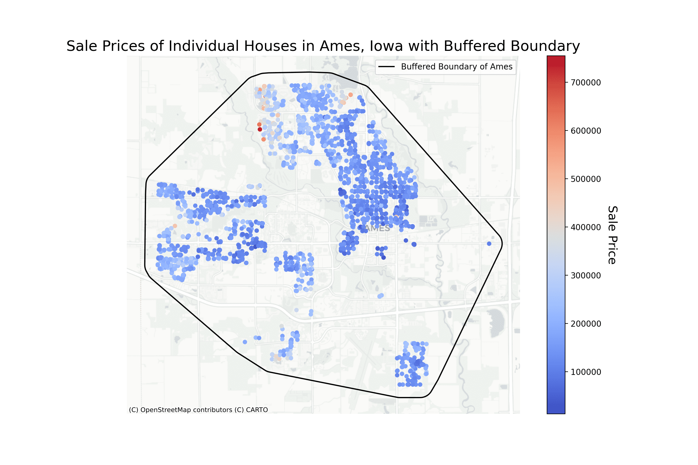
This map is a combination of several components: The basemap, brought in by contextily from OpenStreetMap, depicts the terrain at a particular latitude-longitude. The colored dots are based on the data from the pandas DataFrame but converted to a geographic CRS by geopandas, which should align with the basemap.
Further Reading
This section provides more resources on the topic if you want to go deeper.
Tutorials
Resources
Summary
In this post, we delved into the intricacies of geospatial visualization using Python, focusing on the visualization of house sale prices in Ames, Iowa. Through a meticulous step-by-step breakdown of the code, we unveiled the various stages involved, from the initial data loading and preparation to the final visualization. Understanding geospatial visualization techniques is not just an academic exercise; it holds profound real-world implications. Mastery of these techniques can empower professionals across a spectrum of fields, from urban planning to real estate, enabling them to make informed, data-driven decisions rooted in geographical contexts. As cities grow and the world becomes increasingly data-centric, overlaying data on geographical maps will be indispensable in shaping future strategies and insights.
Specifically, from this tutorial, you learned:
- How to harness essential Python libraries for geospatial visualization.
- The pivotal role of data preparation and transformation in geospatial operations.
- Effective techniques for visualizing geospatial data, including the nuances of setting up a color gradient and integrating a basemap.
Do you have any questions? Please ask your questions in the comments below, and I will do my best to answer.
Get Started on The Beginner's Guide to Data Science!
Learn the mindset to become successful in data science projects
...using only minimal math and statistics, acquire your skill through short examples in Python
Discover how in my new Ebook:
The Beginner's Guide to Data Science
It provides self-study tutorials with all working code in Python to turn you from a novice to an expert. It shows you how to find outliers, confirm the normality of data, find correlated features, handle skewness, check hypotheses, and much more...all to support you in creating a narrative from a dataset.


 for Machine Learning")


Hi Vinod!
I followed your instructions to the letter, but when I arrived to:
# Plotting the map with Sale Prices, a basemap, and the buffered convex hull as a border
—-> 3 geo_df.to_crs(epsg=3857).plot(column=’SalePrice’, cmap=’coolwarm’, ax=ax, legend=True,
4 markersize=20)
I got:
ValueError: Cannot transform naive geometries. Please set a crs on the object first.
and a blank graph shown up.
Any advice?
Hi Jose:
Thank you very much for reading my blog and experimenting with the code.
Prior to the block of code you highlight, can you double check if you executed these lines that were highlighted above?
# Set the CRS for the GeoDataFramegeo_df.crs = "EPSG:4326"
For the visual to work, you will need to execute all the layers of code illustrated from start to finish.
Please keep me posted on your progress.
Regards,
Vinod
is it a machine learning project?
Hi Mahmood…The content in this tutorial is a great example of how to visualize data for machine learning projects.