
Unveiling the All-New Exciting Enhancements of Kendo UI for Angular DateInputs

See what’s new in the Date Input components—your end users will thank you!
Are you ready to boost your applications and give your users an enhanced date-input experience? If the answer is yes, you’re in luck!
With the latest release, the DateInput, DatePicker, DateTimePicker and TimePicker from Progress Kendo UI for Angular have received a new set of enhancements that integrate really well with each other. And I promise you they will make your life easier!
Let’s explore them together and see how you might benefit from them.
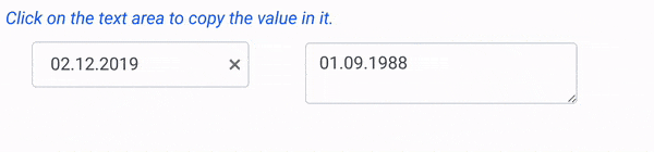
Improved Copy & Paste Between Date Inputs
One of the most wanted improvements is finally out! Coming right out of the box, copying and pasting dates between date input fields has become a breeze. Without a doubt you’ll get more seamless user experience and—best of all—you save time.
Auto-Tab Behavior
Switching between date segments (e.g., day, month, year, hours, etc.) just got more comfortable with the new autoSwitchParts option. It is now in the developer’s control to decide whether the focus should move automatically from one segment to another within the Kendo UI for Angular DateInput while typing.
import { Component } from '@angular/core';

@Component({
selector: 'my-app',
template: `
<div>
<p>Select a date:</p>
<kendo-dateinput
   [autoSwitchParts]="false"
   [value]="value">
     </kendo-dateinput>
</div> `
export class AppComponent {
public value: Date = new Date(2000, 2, 10);
}
Customizable Auto-Switch Keys
Not only do the Date Inputs allow you to define the auto-tab behavior, but you can also define which keys, when pressed, will automatically switch to the next segment. Provide a custom collection to autoSwitchKeys and enjoy better control over the date input’s interaction. You can set any keyboard key to trigger the switching, e.g., |, &, ;. The sky is your limit!
Enhance the above auto-tab behavior example by defining your own switch keys:
<kendo-dateinput
        [autoSwitchKeys]="autoSwitchKeys"
        ...
 ></kendo-dateinput>
…
public autoSwitchKeys = ["-", ";", "+"];
Disable Mouse Wheel Changes
We all know how sensitive the mouse wheel can be—you might not even notice it! In certain cases, you might want to prevent users from changing date values using the mouse wheel. No more accidental date changes that might ruin data accuracy. This simple, yet efficient option comes to the rescue—enableMouseWheel!
import { Component } from "@angular/core";

@Component({
  selector: "my-app",
  template: `
    <div>
      <p>Select a date:</p>
      <kendo-dateinput
        [enableMouseWheel]="false"
        [value]="value"
      ></kendo-dateinput>
    </div>
  `,
  })
export class AppComponent {
  public value: Date = new Date(2000, 2, 10);
}
Caret Mode
The caret mode feature provides an alternative data entry experience by making the cursor’s position visible. Setting the allowCaretMode option to true will show a blinking caret inside the DateInput, either when a date segment is partially complete, or when autoSwitchParts is false.
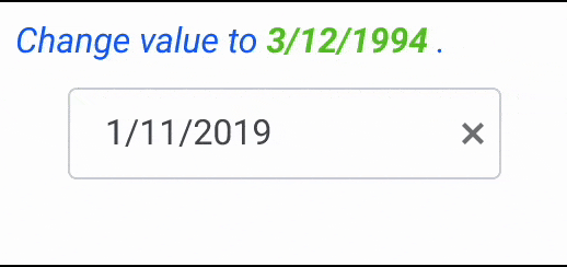
Auto-Filling
A real game-changer in the date editing, the autofill option, when enabled, will automatically fill in missing sections of a date when the component loses focus.
For example, if a user only enters the day, month or year portion of the date and then clicks outside the input field, the component will automatically complete the missing parts to the current date.
This enhancement promises to significantly speed up data entry and save your users a lot of time!

At the end of the day, the all-new Kendo UI for Angular Date Input enhancements take date editing to the next level and pave the way toward convenience of usage. To see these features in action, check out the latest version of the @progress/kendo-angular-dateinputs library and integrate these features right away in your applications. You’ll thank me for these later!
Happy date inputting!
Try Kendo UI for Angular
Don’t forget that you can try the Date Inputs plus 110 other fully native Angular components free for 30 days!

Stefani Tsolova
Stefani is a Software Engineering Manager at Progress, leading the Kendo UI for Angular team with a background in coding and a pinch of graphic design. Beyond the digital realm, she channels her passion for problem-solving into baking, reveling in the precision of recipes. When putting the whisk aside, she indulges her creative side through puzzles and hands-on DIY crafts.
Related Posts
Comments
All articles
Topics

Latest Stories
in Your Inbox
Subscribe to be the first to get our expert-written articles and tutorials for developers!
All fields are required