
We’ve been building a sample application — a multi-image gallery blog — for performance benchmarking and optimizations. At this point, our application serves the same image regardless of the resolution and screen size it’s being served in. In this image resizing tutorial, we’ll modify it to serve a resized version depending on display size.
Objective
There are two stages to this improvement.
- We need to make all images responsive wherever this might be useful. One place is the thumbnails on the home page and in the gallery pages, and another is the full-size image when an individual image is clicked in the gallery.
- We need to add resizing-logic to our app. The point is to generate a resized image on the fly as it’s demanded. This will keep non-popular images from polluting our hard drive, and it’ll make sure the popular ones are, on subsequent requests, served in optimal sizes.
Responsive Images?
As this post explains, images in the modern web are incredibly complex. Instead of just <img src="mypic.jpg"> from the olden days, we now have something crazy like this:
<picture>
<source media="(max-width: 700px)" sizes="(max-width: 500px) 50vw, 10vw"
srcset="stick-figure-narrow.png 138w, stick-figure-hd-narrow.png 138w">

<source media="(max-width: 1400px)" sizes="(max-width: 1000px) 100vw, 50vw"
srcset="stick-figure.png 416w, stick-figure-hd.png 416w">

<img src="stick-original.png" alt="Human">
</picture>
A combination of srcset, picture and sizes is necessary in a scenario where you’re doubtful that if you use the same image for a smaller screen size, the primary subject of the image may become too small in size. You want to display a different image (more focused on the primary subject) in a different screen size, but still want to display separate assets of the same image based on device-pixel ratio, and want to customize height and width of the image based on viewport.
Since our images are photos and we always want them to be in their default DOM-specified position filling up the maximum of their parent container, we have no need for picture (which lets us define an alternative source for a different resolution or browser support — like trying to render SVG, then PNG if SVG is unsupported) or sizes (which lets us define which viewport portion an image should occupy). We can get away with just using srcset, which loads a different size version of the same image depending on the screen size.
Adding srcset
The first location where we encounter images is in home-galleries-lazy-load.html.twig, the partial template that renders the home screen’s galleries list.
<a class="gallery__link" href="{{ url('gallery.single-gallery', {id: gallery.id}) }}">
  <img src="{{ gallery.images.first|getImageUrl }}" alt="{{ gallery.name }}"
    class="gallery__leading-image card-img-top">
</a>
We can see here that the image’s link is fetched from a Twig filter, which can be found in the src/Twig/ImageRendererExtension.php file. It takes the image’s ID and the route’s name (defined in the annotation in ImageController‘s serveImageAction route) and generates a URL based on that formula: /image/{id}/raw -> replacing {id} with the ID given:
public function getImageUrl(Image $image)
{
  return $this->router->generate('image.serve', [
      'id' => $image->getId(),
  ], RouterInterface::ABSOLUTE_URL);
}
Let’s change that to the following:
public function getImageUrl(Image $image, $size = null)
{
  return $this->router->generate('image.serve', [
      'id' => $image->getId() . (($size) ? '--' . $size : ''),
  ], RouterInterface::ABSOLUTE_URL);
}
Now, all our image URLs will have --x as a suffix, where x is their size. This is the change we’ll apply to our img tag as well, in the form of srcset. Let’s change it to:
<a class="gallery__link" href="{{ url('gallery.single-gallery', {id: gallery.id}) }}">
  <img src="{{ gallery.images.first|getImageUrl }}"
       alt="{{ gallery.name }}"
       srcset="
           {{ gallery.images.first|getImageUrl('1120') }}  1120w,
           {{ gallery.images.first|getImageUrl('720') }} 720w,
           {{ gallery.images.first|getImageUrl('400') }}  400w"
       class="gallery__leading-image card-img-top">
</a>
If we refresh the home page now, we’ll notice the srcset’s new sizes listed:
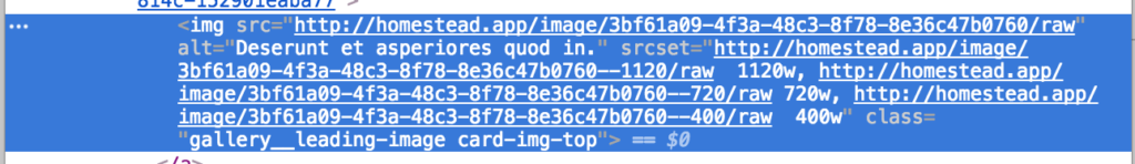
This isn’t going to help us much, though. If our viewport is wide, this will request full-size images, despite them being thumbnails. So instead of srcset, it’s better to use a fixed small thumbnail size here:
<a class="gallery__link" href="{{ url('gallery.single-gallery', {id: gallery.id}) }}">
  <img src="{{ gallery.images.first|getImageUrl('250') }}"
       alt="{{ gallery.name }}"
       class="gallery__leading-image card-img-top">
</a>
We now have thumbnails-on-demand, but which get cached and fetched when they’re already generated.
Let’s hunt down other srcset locations now.
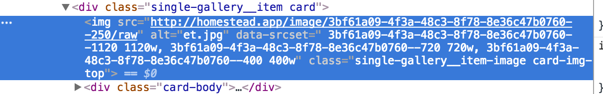
In templates/gallery/single-gallery.html.twig, we apply the same fix as before. We’re dealing with thumbnails, so let’s just shrink the file by adding the size parameter into our getImageUrl filter:
<img src="{{ image|getImageUrl(250) }}" alt="{{ image.originalFilename }}"
    class="single-gallery__item-image card-img-top">
And now for the srcset implementation, finally!
The individual image views are rendered with a JavaScript modal window at the bottom of the same single-gallery view:
{% block javascripts %}
    {{ parent() }}

    <script>
        $(function () {
            $('.single-gallery__item-image').on('click', function () {
                var src = $(this).attr('src');
                var $modal = $('.single-gallery__modal');
                var $modalBody = $modal.find('.modal-body');

                $modalBody.html('');
                $modalBody.append($('<img src="' + src + '" class="single-gallery__modal-image">'));
                $modal.modal({});
            });
        })
    </script>
{% endblock %}
There’s an append call which adds the img element into the modal’s body, so that’s where our srcset attribute must go. But since our image URLs are dynamically generated, we can’t really call the Twig filter from within the script. One alternative is to add the srcset into the thumbnails and then use it in the JS by copying it from the thumb elements, but this would not only make the full-sized images load in the background of the thumbnails (because our viewport is wide), but it would also call the filter 4 times for each thumbnail, slowing things down. Instead, let’s create a new Twig filter in src/Twig/ImageRendererExtension.php which will generate the full srcset attribute for each image.
public function getImageSrcset(Image $image)
{
    $id = $image->getId();
    $sizes = [1120, 720, 400];
    $string = '';
    foreach ($sizes as $size) {
        $string .= $this->router->generate('image.serve', [
            'id' => $image->getId() . '--' . $size,
        ], RouterInterface::ABSOLUTE_URL).' '.$size.'w, ';
    }
    $string = trim($string, ', ');
    return html_entity_decode($string);
}
We mustn’t forget to register this filter:
public function getFilters()
{
    return [
        new Twig_SimpleFilter('getImageUrl', [$this, 'getImageUrl']),
        new Twig_SimpleFilter('getImageSrcset', [$this, 'getImageSrcset']),
    ];
}
We have to add these values into a custom attribute, which we’ll call data-srcset on each individual thumbnail:
<img src="{{ image|getImageUrl(250) }}"
      alt="{{ image.originalFilename }}"
      data-srcset=" {{ image|getImageSrcset }}"
      class="single-gallery__item-image card-img-top">
Now each individual thumbnail has a data-srcset attribute with the required srcset values, but this doesn’t trigger because it’s in a custom attribute, data to be used later.
The final step is updating the JS to take advantage of this:
{% block javascripts %}
    {{ parent() }}

    <script>
        $(function () {
            $('.single-gallery__item-image').on('click', function () {
                var src = $(this).attr('src');
                var srcset = $(this).attr('data-srcset');
                var $modal = $('.single-gallery__modal');
                var $modalBody = $modal.find('.modal-body');

                $modalBody.html('');
                $modalBody.append($('<img src="' + src + '" srcset="' + srcset + '" class="single-gallery__modal-image">'));
                $modal.modal({});
            });
        })
    </script>
{% endblock %}
Adding Glide
Glide is a library which does what we want — on-demand image resizing. Let’s install it.
composer require league/glide
Next, let’s register it in the app. We do this by adding a new service into src/Services with the following content:
<?php
namespace App\Service;

use League\Glide;

class GlideServer
{
    private $server;

    public function __construct(FileManager $fm)
    {
        $this->server = $server = Glide\ServerFactory::create([
            'source' => $fm->getUploadsDirectory(),
            'cache' => $fm->getUploadsDirectory().'/cache',
        ]);
    }

    public function getGlide()
    {
        return $this->server;
    }
}
The service consumes the already declared FileManager service which is auto-injected because of Symfony’s new auto-wiring approach. We declare both the input and output path as the uploadsdir, give the output dir a cache suffix, and add a method for returning the server. The server is basically the instance of Glide which does the resizing and serves back a resized image.
We need to make the getUploadsDirectory method in FileManager public, as it’s currently private:
public function getUploadsDirectory()
{
    return $this->path;
}
Finally, let’s modify the ImageController’s serveImageAction method so that it looks like this:
/**
 * @Route("/image/{id}/raw", name="image.serve")
 */
public function serveImageAction(Request $request, $id, GlideServer $glide)
{
    $idFragments = explode('--', $id);
    $id          = $idFragments[0];
    $size        = $idFragments[1] ?? null;

    $image = $this->em->getRepository(Image::class)->find($id);

    if (empty($image)) {
        throw new NotFoundHttpException('Image not found');
    }

    $fullPath = $this->fileManager->getFilePath($image->getFilename());

    if ($size) {

        $info        = pathinfo($fullPath);
        $file        = $info['filename'] . '.' . $info['extension'];
        $newfile     = $info['filename'] . '-' . $size . '.' . $info['extension'];
        $fullPathNew = str_replace($file, $newfile, $fullPath);

        if (file_exists($fullPath) && ! file_exists($fullPathNew)) {

            $fullPath = $fullPathNew;
            $img      = $glide->getGlide()->getImageAsBase64($file,
                ['w' => $size]);

            $ifp = fopen($fullPath, 'wb');

            $data = explode(',', $img);
            fwrite($ifp, base64_decode($data[1]));
            fclose($ifp);
        }
    }

    $response = new BinaryFileResponse($fullPath);
    $response->headers->set('Content-type',
        mime_content_type($fullPath));
    $response->headers->set('Content-Disposition',
        'attachment; filename="' . $image->getOriginalFilename() . '";');

    return $response;
}
This method now explodes the image ID by double-dash, separating size from the image ID. Once Doctrine fetches the image’s filepath from the database, the size is re-attached to the filename if one was passed in, otherwise the original image is used. If this image doesn’t exist, one is generated from the original path and saved for later use.
For demonstration purposes, we’re taking a longer way around here and generating files manually by appending the size to them and saving them into the uploads folder. It should be noted that you can also use the outputImage method from Glide to directly output the image, and it’ll be served straight from the cache subfolder, not saving it with a suffix in the main upload folder. You can also use the makeImage method to just create the image and let the old logic of fetching the image take over. That’s the approach we picked below:
/**
 * @Route("/image/{id}/raw", name="image.serve")
 */
public function serveImageAction(Request $request, $id, GlideServer $glide)
{
    $idFragments = explode('--', $id);
    $id          = $idFragments[0];
    $size        = $idFragments[1] ?? null;

    $image = $this->em->getRepository(Image::class)->find($id);

    if (empty($image)) {
        throw new NotFoundHttpException('Image not found');
    }

    $fullPath = $this->fileManager->getFilePath($image->getFilename());

    if ($size) {

        $info        = pathinfo($fullPath);
        $file        = $info['filename'] . '.' . $info['extension'];

        $cachePath = $glide->getGlide()->makeImage($file, ['w' => $size]);
        $fullPath = str_replace($file, '/cache/' . $cachePath, $fullPath);
    }

    $response = new BinaryFileResponse($fullPath);
    $response->headers->set('Content-type',
        mime_content_type($fullPath));
    $response->headers->set('Content-Disposition',
        'attachment; filename="' . $image->getOriginalFilename() . '";');

    return $response;
}
Our on-demand-image-resizing business is operational. Now all we have to do is test things.
Testing
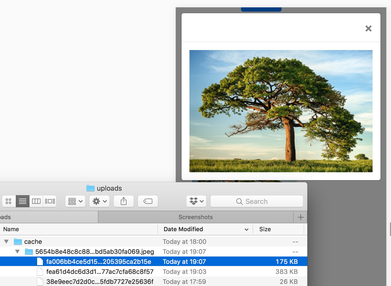
As soon as we refresh the home page, which will be a little slower now, the images will start being generated in the var/uploads folder. Let’s check it out, without scrolling to the second page.
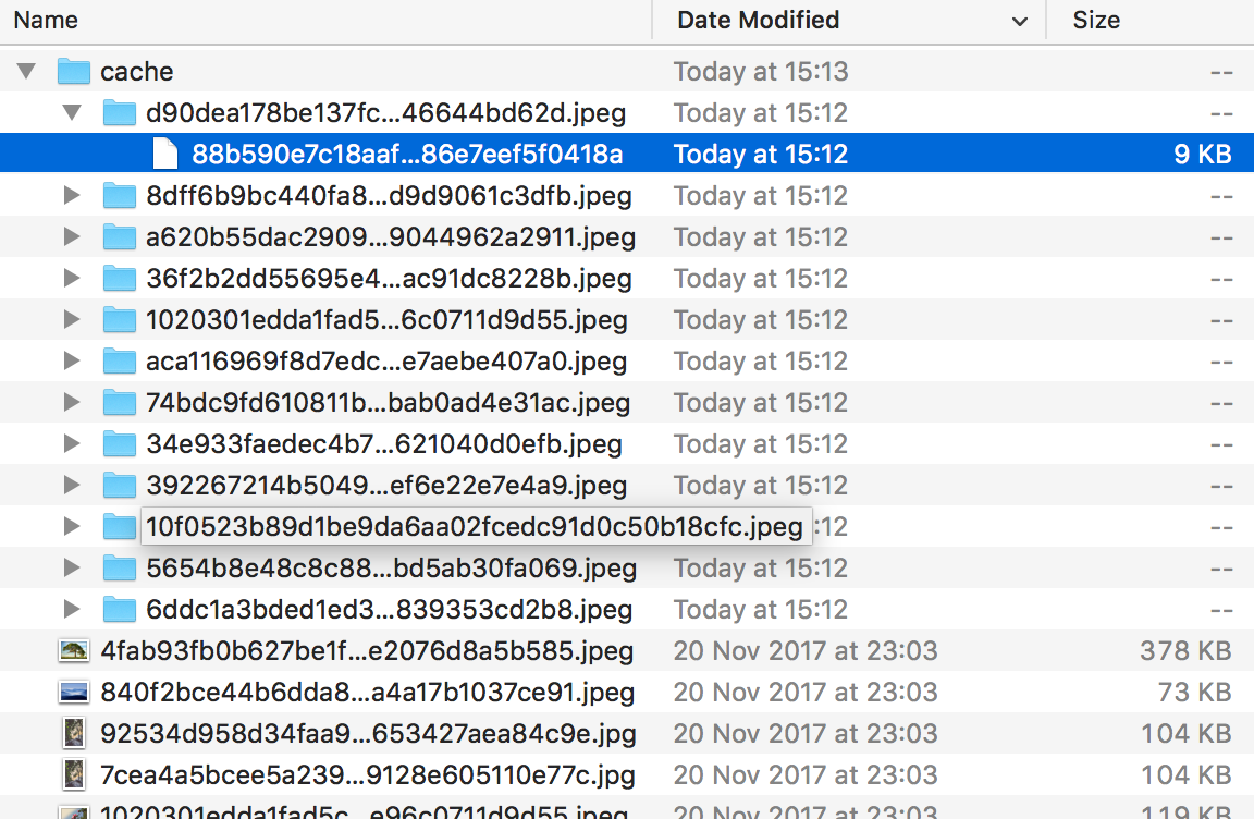
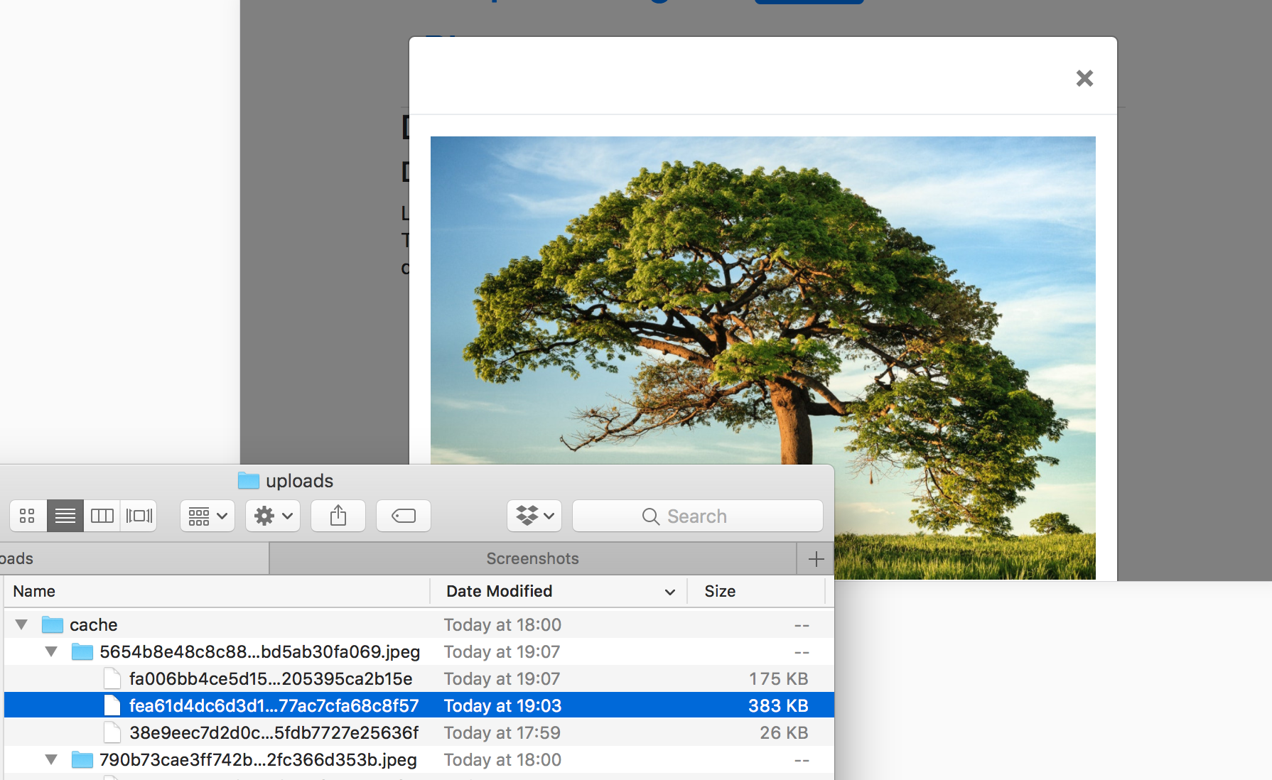
Sure enough, we now have a tiny thumbnail version of every image in the home page, and that’s the image that’s getting served. Notice the small file sizes. Now let’s access a gallery and click on an image to get a big version of it.
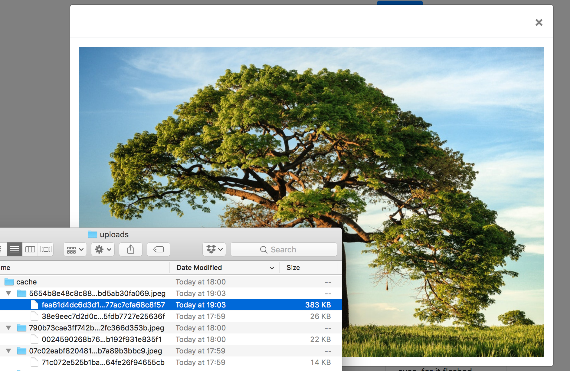
Yep, our image got generated from the original.
But what about mobile? In modern browsers, it’s easy enough to turn on mobile mode. Let’s try opening a gallery image in mobile view and check the image folder afterwards.
What if we change orientation and check the folder then?
Success, our image’s mobile size has been successfully generated, and the full screen image from before has been reused because that’s how big our “mobile’s” screen is in landscape mode. On-demand srcset was successfully implemented!
The app with these upgrades in place has been tagged as this release.
Conclusion
In this post, we went through the process of optimizing images for delivery in a photo-oriented site. We kept the thumbnails at a fixed size for best results, and with full screen images we focused on implementing srcset — a simple addition to any modern website — in tandem with Glide, an on-demand image resizing package that can do the heavy lifting for us.
But while we’re resizing images, wouldn’t it be smart to also auto-optimize them for quality and size by removing metadata? And is it really the best option to be resizing them on demand while the user is waiting or is there another, more practical approach? Find out in the next part.
Frequently Asked Questions on On-Demand Image Resizing
How does on-demand image resizing improve website performance?
On-demand image resizing can significantly enhance website performance by reducing the load time of images. Instead of loading the full-size image, the website loads a resized version that fits the viewer’s screen, which is typically smaller and thus quicker to load. This not only improves the user experience by reducing wait times but also saves bandwidth, which can be particularly beneficial for users with limited data plans.
What are the key differences between on-demand image resizing and traditional image resizing?
Traditional image resizing involves manually resizing each image before uploading it to the website. This can be time-consuming and inefficient, especially for websites with a large number of images. On the other hand, on-demand image resizing automatically resizes images as they are requested by the user. This means that the same image can be served at different sizes to different users, depending on their specific needs and device capabilities.
How can I implement on-demand image resizing in Symfony?
Symfony provides a bundle called LiipImagineBundle that allows you to implement on-demand image resizing. You can install this bundle using Composer and then configure it according to your needs. The bundle provides a range of filters that you can use to resize images, including scale, crop, and thumbnail filters. You can apply these filters to your images using the ‘apply_filter’ function in your templates.
Can I resize an image on upload in Symfony?
Yes, you can resize an image on upload in Symfony. This can be done using the VichUploaderBundle, which allows you to automatically resize images as they are uploaded. You can configure the bundle to resize images to a specific size or to a percentage of their original size. This can be particularly useful if you want to ensure that all images uploaded to your website are of a consistent size.
How can I serve resized S3 images on the fly?
Serving resized S3 images on the fly can be achieved using a service like AWS Lambda. You can set up a Lambda function to automatically resize images as they are requested from your S3 bucket. This function can be triggered by an API Gateway, which will pass the requested image size to the function. The function will then retrieve the original image from S3, resize it to the requested size, and return the resized image to the user.
What are the benefits of using a CDN for on-demand image resizing?
Using a Content Delivery Network (CDN) for on-demand image resizing can significantly improve the speed at which images are delivered to users. CDNs have servers located all around the world, which means that images can be served from the server closest to the user, reducing latency. Additionally, CDNs can cache resized images, meaning that if the same image is requested at the same size again, it can be served directly from the cache, further improving performance.
How does on-demand image resizing affect SEO?
On-demand image resizing can have a positive impact on SEO. Faster loading times can improve user experience, which is a factor that search engines take into account when ranking websites. Additionally, by serving images that are appropriately sized for the user’s device, you can avoid issues with mobile usability, which can also affect your website’s search engine ranking.
Can on-demand image resizing be used with responsive web design?
Yes, on-demand image resizing is a perfect complement to responsive web design. With responsive design, the layout of your website adapts to the size of the user’s screen. With on-demand image resizing, the images on your website can also adapt to the user’s screen size, ensuring that your website looks great and performs well on all devices.
What are the potential drawbacks of on-demand image resizing?
While on-demand image resizing has many benefits, there are also potential drawbacks to consider. One of these is the processing power required to resize images on the fly, which can put a strain on your server if you have a high-traffic website. Additionally, if you’re using a third-party service for on-demand image resizing, there may be costs associated with this service.
How can I optimize my on-demand image resizing setup?
There are several ways to optimize your on-demand image resizing setup. One is to use a CDN, which can cache resized images and serve them from a server close to the user. Another is to use a service like AWS Lambda, which can resize images in the cloud, reducing the load on your server. Additionally, you can optimize your images before uploading them, for example by reducing their quality or using a more efficient file format.
 Bruno Skvorc
Bruno is a blockchain developer and technical educator at the Web3 Foundation, the foundation that's building the next generation of the free people's internet. He runs two newsletters you should subscribe to if you're interested in Web3.0: Dot Leap covers ecosystem and tech development of Web3, and NFT Review covers the evolution of the non-fungible token (digital collectibles) ecosystem inside this emerging new web. His current passion project is RMRK.app, the most advanced NFT system in the world, which allows NFTs to own other NFTs, NFTs to react to emotion, NFTs to be governed democratically, and NFTs to be multiple things at once.