How to Implement a Pixel-perfect iOS UI Design
In this article, Toptal Freelance Developer Roman Stetsenko explains what it takes to create a pixel-perfect iOS interface from the ground up and why it matters.

In this article, Toptal Freelance Developer Roman Stetsenko explains what it takes to create a pixel-perfect iOS interface from the ground up and why it matters.

Roman is a skilled Apple developer with expertise in iOS, watchOS, and tvOS, and a degree in automation. He loves creating an elegant UX.
Expertise
PREVIOUSLY AT

You’ve probably heard the phrase “pixel-perfect design” countless times, without even considering what it means, or what it should mean. In recent months, there’s a chance you’ve been hearing about the decline of the pixel-perfect design concept, but there’s a small problem with those claims, especially when it comes to iOS UI design.
Namely, the definition of pixel-perfect design isn’t carved in stone like most iOS UI guidelines. People interpret it in different ways, hence the problem—pixel perfection may seem passé to some, but others will continue using the principle for years to come, albeit under a different name. It’s mostly a nomenclature problem.
What is pixel-perfect UI design?
Since there is no clear definition of pixel perfection, my understanding of the pixel-perfect design concept is that everything is done to maximize sharpness and fidelity. Once the design is implemented, it looks identical on any iPhone display with no artifacts or issues of any kind.
Creating a pixel-perfect iOS app UI means you are creating a design with pixels in mind and implementing the exact same design on the screen, down to every pixel on the referenced design, all while making sure it’s responsively adapted to other devices.
But Why Pixel-perfect Design?
UI designers do their best to create interfaces that are easy to perceive and interact with. It is the developer’s professional duty to respect the designer’s work and implement the interface exactly as delivered.
With non-pixel-perfect apps, users aren’t likely to experience any significant issues that will prevent them from using and enjoying the app, but pixel-perfect apps definitely look sharper, cleaner, and more consistent.
Due to the highly competitive nature of Apple’s App Store, every bit of polish that improves the overall appearance and user experience is welcome. It may help differentiate your app and make it more visible, and thus more profitable.
This quick iOS UI design guide will take you through the process from the basic design stage to implementation, from a designer’s and developer’s perspective.
Creating an iOS UI Design
Let’s get started. Pixel-perfect applications obviously start off as pixel-perfect designs, and we all know where these come from nowadays.
Essential iOS Interface Design Tools
I think I’m accurate in saying that Sketch has become the de facto standard for web and mobile UI/UX designers. While Adobe XD is an up-and-coming alternative, it lags behind Sketch in terms of popularity.
Next, we will choose the artboard size. Nowadays, we have iOS devices with different screen sizes and aspect ratios and we need to choose one size to create our design. Thanks to Auto Layout, it will be seamlessly adapted to other display sizes. If need be, you can create different layout variations for different Size Classes.
The only real question here is: How should the designer share information on adapting designs for different displays with the developer?
Luckily, there is no need to write down specs for each one, as the Auto Layout plugin for Sketch will take care of that. The designer merely needs to set the desired auto layout, export to different screen sizes with a click, and the developer will understand how to place layout constraints and make sure everything looks good, whether on an iPhone X or the good old iPhone 5.
Note: Since version 44, the Sketch team has dramatically improved resizing controls, giving users more power and control over how the layers should behave when their parent is resized.
Setting Up Your Design
That sounds great, but we still haven’t chosen the size we’ll use to create our design. According to David Smith’s iOS stats, 57% of all iPhone users rely on 4.7-inch displays, introduced in the iPhone 6/6s and subsequently used in the iPhone 7 and even the recently launched iPhone 8.
I am sure you’re all familiar with Apple’s 4.7-inch displays by now, but in case you’re not a numbers person, we are talking about 750x1334-pixel displays with 326 pixels per inch (PPI). This is standard Retina display and in code we will have one half of the resolution. Therefore, I suggest you start with 375x667 pixels.
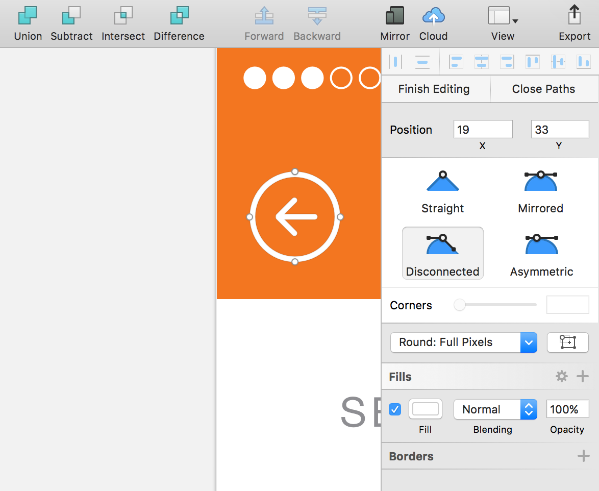
Next, we need to be sure that our iOS UI design maximizes sharpness. To reach this goal, you need to turn on pixel fitting:
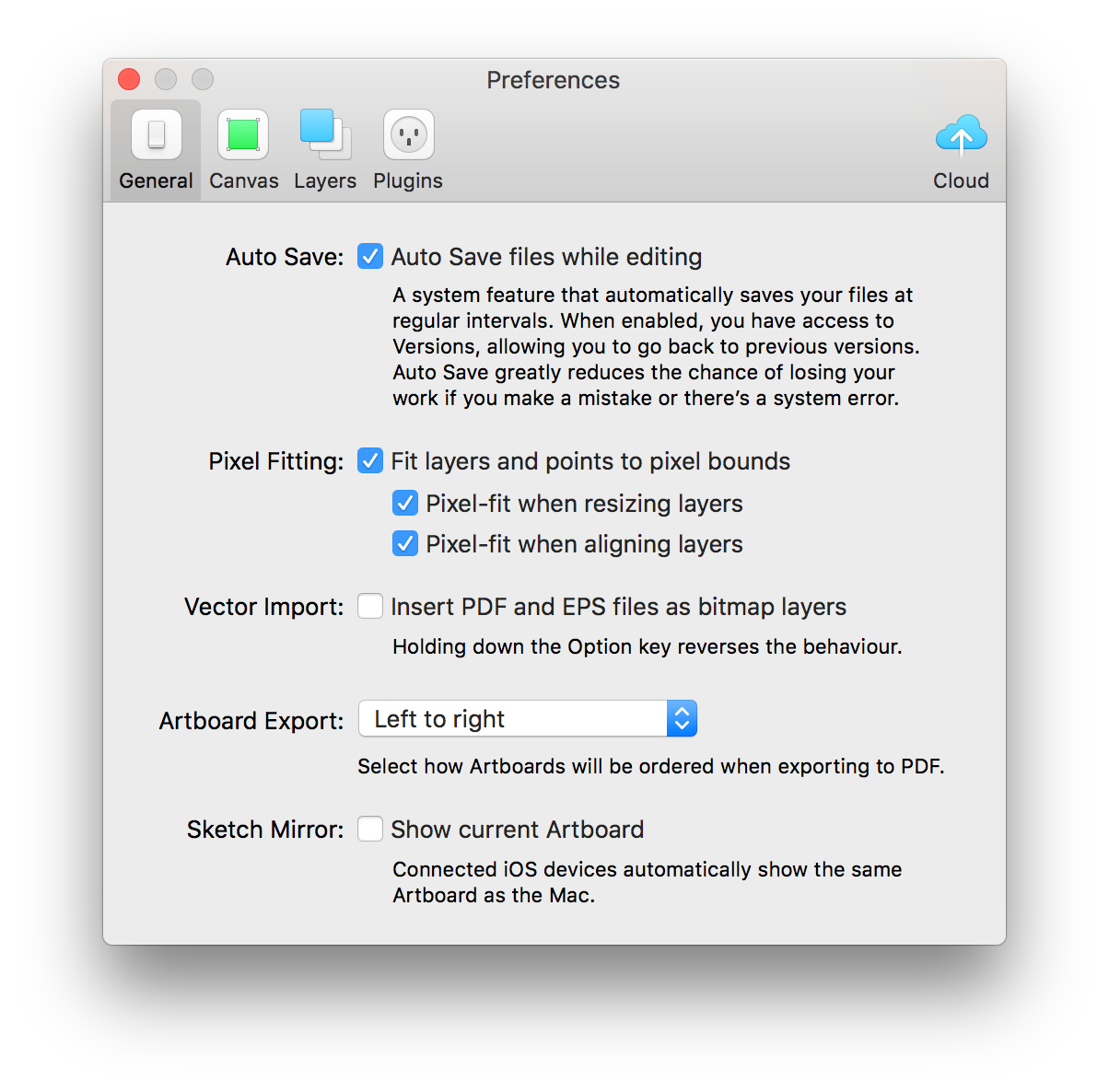
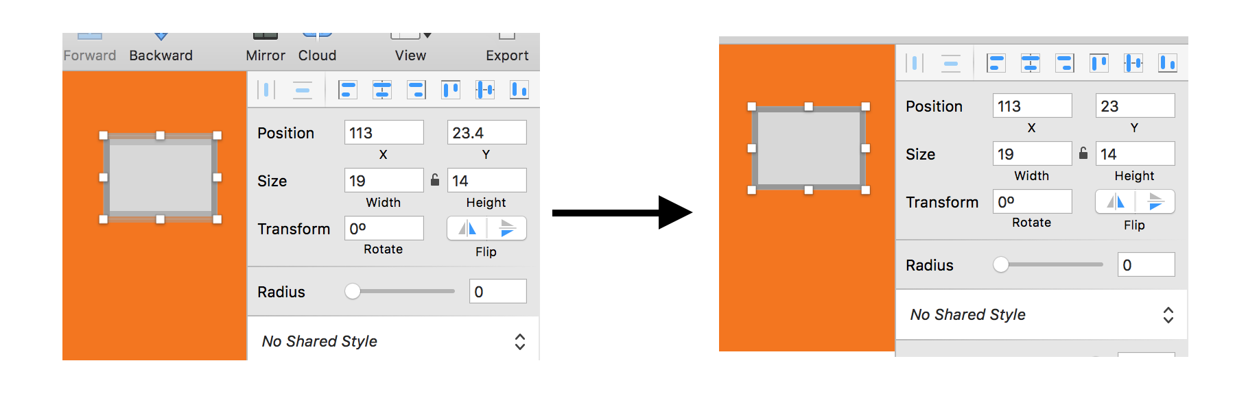
Here is an example of a simple rectangle with and without pixel fitting:
Use Round: Full Pixels when editing vector objects:
These are obviously just the basics, and for a closer look at pixel-perfect iOS UI elements in Sketch, you should check out the official tutorial.
Feel free to use complex vector animations, because a developer can easily play it using the Lottie library. You can play Adobe After Effects animations on a mobile device without suffering from any scaling artifacts. Merely provide the JSON file to the developer and that’s it.
Use the sRGB color profile as much as possible. If sRGB is not enough on wide gamut displays, you will need to provide either colors or graphic assets (one sRGB and another with embedded color profile). Detailed info on color profiles is available in Apple’s Human Interface Guidelines (HIG) should you need it.
Custom Code for Pixel-perfect Results
Great! Now we know enough to create a pixel-perfect design; how do we share it with the developer? We obviously need to reach into our toolbox.
Choosing the Right Tools
There are incredibly useful tools for sharing the designer’s work with developers - Zeplin. Just use it and the developer will have almost all the necessary information to ensure that your UI design works: graphic assets, fonts and colors used in the design, text, and much more. Pretty much the only thing the designer may need to provide at this point are the font files, in case they used fonts that not included in iOS.
Another cool tool is PaintCode, which can generate code from vector images. PaintCode uses your SVG paths and color data to generate Swift or ObjC classes. With PaintCode, you can use expressions, variables, etc. to create passive/active states of your buttons, up/down states, dynamic text, animation from variables, and much more.
You will obviously need to rely on Xcode and a few standard iOS development tools, but we’ll get to that later.
It is extremely useful if you have to dynamically update only a specific part of a design asset, e.g., change the base color for a gradient background on the chat icon. And, as a convenient bonus, your app will lose weight.
Ok, the developer finally has everything they need, so how do we perfectly implement pixel-perfect design (pardon the pun)?
Setting Up and Syncing Your Tools
With Zeplin, you should get almost everything you need, provided the designer sets everything up correctly. If something is overlooked or unclear, Zeplin provides an effective comments feature, allowing the designer and developer to quickly identify and resolve potential issues. Even if everything is done correctly, the comments can be used for feedback and minor improvements.
However, as we all know, things don’t always go as planned, so sometimes the developer will need to pick a color, even if the designer provided the color palette used in the app.
To do this properly, you need to synchronize your tools:
-
Set your display color profile to sRGB: go to System Preferences - Displays - Color and choose sRGB IEC61966-2.1.
-
In Digital Color Meter, or any other color picker tool, choose to display in sRGB.
-
Check that the color profile in the Xcode color palette is set to Device RGB.
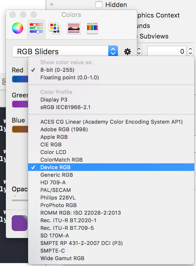
Note: Images can have an embedded color profile. If this is the case, you will need to adapt your tools to this profile if you want to grab the correct color from this image. Luckily, this should be an exception, and you shouldn’t experience such cases too often.
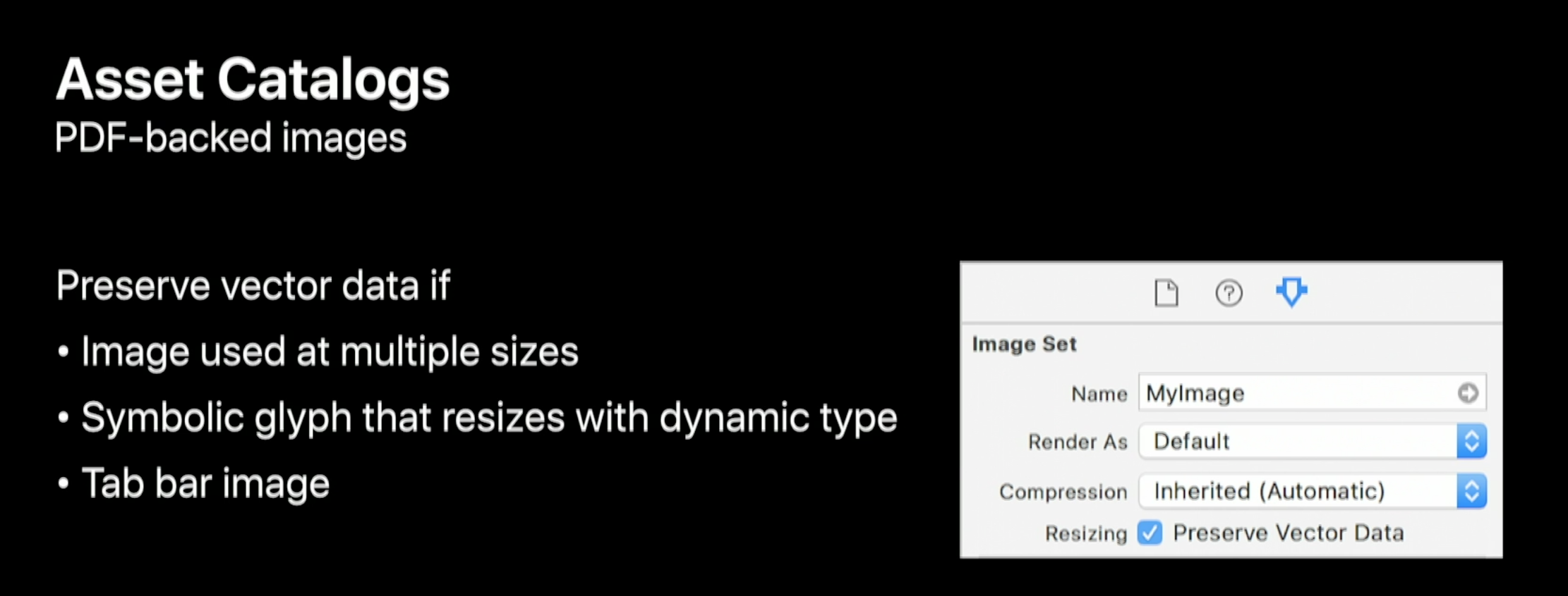
In Xcode 9, remember to Preserve Vector Data when needed. While it will increase the app size, this will also allow you to use your image for any display size. However, on iOS 10 and earlier versions of Apple’s mobile OS, the images will not be scaled up using the additional vector data.
Instead, older OS versions will use legacy scaling mechanisms and will leave you with a blurry image when scaling up beyond the original size. You can check out Apple’s official documentation for additional information on this particular issue.
Finally, the developer will need to make sure the sizes and distances match the original design as closely as possible. If there’s any questionable information in Zeplin, you can measure distances between different iOS UI components with variations on screen rules. One of them is xScope, an on-screen ruler with a lot practical features.
Bringing Your iOS UI Design to Life
When it comes to implementing iOS UI design, there are a few approaches to choose from: Storyboard, XIB, and custom code.
-
Storyboard - Visualizes screens and navigation between them, but there are no options to inherit a design from one controller in another.
-
XIBs - Visualizes one screen or its part, easy to inherit. Prior to Xcode 9, there was no option to use top/bottom layout guides, while in Xcode 9 we can use Safe Area.
-
Code - By far the most flexible option, but does not provide immediate visualization.
For storyboards, you will need to split your design into flows, e.g., LoginFlow.storyboard, SettingsFlow.storyboard, or NewsFeedFlow.storyboard. That way, you will keep your storyboards lightweight.
Group UI elements into blocks. This simplifies support for all constraints. Don’t be lazy and place named views in order, as they appear on screen from the top down. Keep in mind that the bottom will be displayed above the top one. This will help you find different views faster.
See the following example for ungrouped and grouped elements:
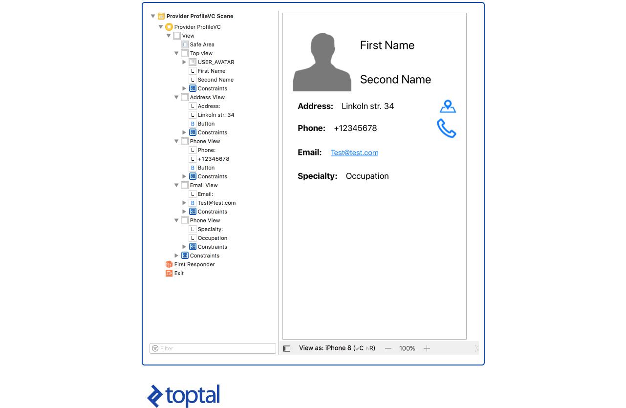
If you have multiple objects that are left/right aligned, don’t align them to the edge with offset. The better approach is to align to the previous element or to implement a special _ffset view_with a width constraint. If you need to change the offset sometime in the future, this will make it somewhat easier.
To use colors in IB, you can prepare a palette on the bottom of Xcode Color Picker.
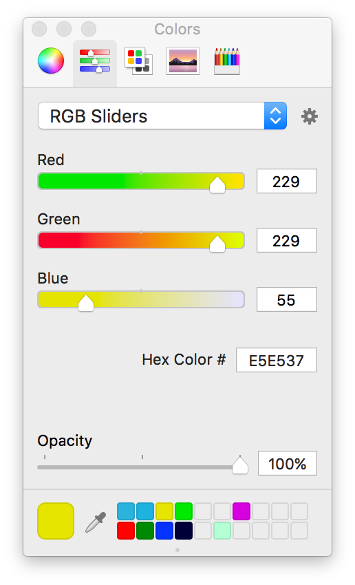
Note: If your app’s minimum iOS version is 11, you can use the “Named Colors” option in Asset Catalog.
Wrapping Up
That’s it. Now we just need to send the result to the QA team, check that everything is in order, and voilà! Our pixel-perfect app is ready.
The goal of this article was to provide a linear and simple example of pixel-perfect iOS UI design, getting the best results in as little time as possible. Collaboration between UI designers and developers isn’t always this simple and frictionless, but that’s an issue for another article.
Further Reading on the Toptal Blog:
Understanding the basics
What is "pixel-perfect"?
Pixel-perfect means that a design maximizes sharpness and is implemented to deliver maximum fidelity in the actual product. Creating pixel-perfect apps means you are creating designs that are implemented to look identical on different devices, down to the last pixel.
How did the pixel-perfect concept emerge?
The simple answer would be that the smartphone industry got highly competitive. Smartphones were endowed with excellent high-resolution displays, and strong competition conspired to create sophisticated users and raise expectations.
Wait, this is 2017, don’t we have tools that take care of this?
Not really. Most currently available tools are too complex for the average designer. If designers want to harness their full potential, they will need programming skills, too. While some designers double as competent developers, most do not.
Is the pixel-perfect approach suitable for all projects?
No it is not. There is no reason to go through the whole process if the design being implemented isn’t complete (e.g., mockups), or if the goal of the project is to create an MVP on short notice, or even test a design concept. Naturally, this does not apply to A/B UI testing.
Roman Stetsenko
Kharkiv, Ukraine
Member since October 22, 2012
About the author
Roman is a skilled Apple developer with expertise in iOS, watchOS, and tvOS, and a degree in automation. He loves creating an elegant UX.
Expertise
PREVIOUSLY AT