
How Jetpack Compose Measuring Works
A high level overview on producing custom rich UI in Compose
Jetpack Compose is a game changer for Android developers. It provides an easy and flexible toolset for building UI. However, using Jetpack Compose beyond its basic tenets Box, Column, Row — might need us to put a little more work into one of two related areas: measuring/layout and performance. This article compiles a series of concepts that hopefully offers you a mental model that will be useful to tackle both.
This blog assumes that you have had your first experiences with Jetpack Compose, creating a couple of simple screens, and/or reading some starting tutorials. However, there are no hard prerequisites for its understanding.
Emitting to a tree
One of the first things you learn about Compose is that it’s declarative. Parts of the code that need to be run again will be called automatically. That’s the famous recomposition. But what is Compose made of really, and why is it so much better than classic Android views?
Take the following composable, for example:
Column { Text(text = "Hello there") Text(text = "This is an example") Button(text = "Close", onClick= {...})}
Well, you can picture the execution of the @Composable code as a tree. One method calls three other, and those another, etc., etc., forming a tree.
Column Text BasicText “Hello there” Text BasicText “This is an example” Button BasicText “Close”
But the actual tree is built under the hood: Compose emits a tree internally that tracks the UI that is being produced. How it’s emitted or where it’s tracked is not as important as to know what a Composable code ends up generating.
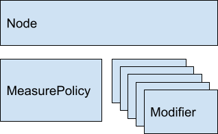
Everything is a Node (and modifiers)
Everything that Compose generates is called a node. A button is a node. Text is a node. That fancy container is a node. When you use the printToLog method to debug the UI structure, it prints “Node #1, … .”
If you look at the implementation of the Box method, you’ll find a call to the Layout method. Open the definition of BasicText (Compose core text method) and you’ll find another Layout call.
Every Compose node is generated via this core method Layout. It’s just a rectangle in the screen, and it will always do two things: calculate its size and paint itself.
The Layout method – that is, a Compose node – receives three things:
- A content lambda: It generates its children nodes.
- A measure policy: The calculation for its own size (and positioning for child nodes).
- A list of Modifiers: Modifiers are just decorators on either the measuring, or the drawing.
Examples
Simple text
Measuring: The measure policy uses the text and the assigned typography to find out how big in pixels it is.
Drawing: It calls Canvas.drawText (text, typeface, …).
Button
Measuring:
- Uses a simple text inside (previous example)
- Adds a fixed padding to the text measurement
Drawing:
- Paints a color rectangle first
- Paints a simple text inside (previous example)
Column
Measuring:
- Measures every child
- Width = children.max (it.width)
- Height = children.sumOf ( it.height )
Drawing:
- Draws each child on its position (calculated via the measured children sizes).
The point in all these examples is that each element only has code for what it needs to do. Or even better, the code composes simple elements that only do one little thing. The button will have text + padding + background. The Column will add up the sizes.
So the code needed to implement and run something is exactly proportional to the needed functionality. This is in sharp contrast to Android Views, where any raw View allocates more than 500 bytes in memory for mostly unused features, and browsing View.java is an adventure in itself. That’s because View needs to take care of all the cross-cutting concerns of a View, while a Compose UI bunches together the list of features it needs for each particular case.
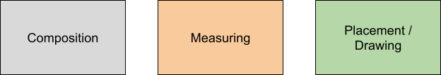
The phases: (re)composition, measuring, drawing
Sooner or later you’ll find yourself thinking in recomposition, “When does Compose decide to recreate UI?” You want to make sure it happens as few times as needed.
This video has good pointers around performance. The target timestamp (7:16 - Procrastination) describes the most important concept in Compose: the three phases of building UI.
Any UI is:
- Composed/recomposed: This means running the @Composable code you write. It will emit a tree of Nodes+Modifiers.
- Measured: Generated nodes (containers and children) will decide sizes and locations.
- Drawn: Here’s when the background color gets painted, the text written, etc.
The aforementioned video stresses how certain changes in the UI might not need to execute one or more steps. For instance, an animated color background might need drawing again, but not measuring anything. That will increase the performance a great deal.
When does something get recomposed? It gets recomposed when any mutable state that the original composition reads is changed.
When does something get remeasured? When the mutable state that the original measuring code reads is changed.
When does something get redrawn? When the mutable state that the original drawing code reads is changed.
So, if you want to avoid measuring once and again, make the drawing code the only one reading the animated color. Or at least make the measuring code be the one to read the changing mutable state, but not the main @Composable code.
Ok, but do you do all this?
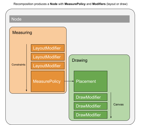
Remember, Compose UI is just nodes with modifiers.
- (Re)composition: Builds the tree of nodes with modifiers
- Each node is measured: Layout-related modifiers will decorate the measure call
- Each node is drawn: Draw-related modifiers will decorate the draw call
Now our diagram can be more accurate:
Measuring (MeasurePolicy.measure)
Now that we have an understanding of the big picture, let’s focus on measuring. This will be especially useful when you need to create your own MeasurePolicy for a custom component.
The Layout method receives three things:
- A content lambda: To generate children nodes
- A list of 0 or more Modifiers to apply to your node
- A MeasurePolicy
Once the (re)composition phase has happened and all the children nodes have been generated by the content lambda, the measuring phase starts. MeasurePolicy is its implementation.
The only method you are required to implement is MeasurePolicy.measure. The rest are optional methods to calculate the node’s intrinsic size (think of it as natural or desired size), which will be discussed later.
MeasurePolicy.measure receives:
- A list of measurables: that is, the children nodes that the content lambda generates
- A Constraints instance: how small or big this node is allowed to be; literally, minWidth, maxWidth, minHeight, maxHeight
Your job is to:
- Measure your children (this is the recursive part).
- Decide your size.
- Decide where to position the measured children.
Normally you measure all your children:
- Remember passing proper constraints to your children:
- Are they affected by your own maximum width or height?
- Are they affected by your own minimum constraints, or can they be as small as they want?
- Are they affected by other child nodes you need to measure first?
- Is there any padding that offsets constraints (if you are max=100, is your child max=80)?
Based on your children measures and the constraints, you decide on your size:
- Ok, you have children of a certain size, which means you should be X size.
- Do your constraints allow that?
Normally you do something like:
val measuredChildren = …val myWidth = ...some calculation on measuredChildren...val finalWidth = constraints.constrainWidth(myWidth)
Then you return:
layout(finalWidth, finalHeight) { // placement code: child1.placeRelative(x1, y1) child2.placeRelative(x2, y2) ...}
The placement code will position the children at the right coordinates. That is inside a lambda because it will be invoked as part of the Placement/Drawing phase. This is important: all compose nodes will be measured recursively. Then the main node will be placed and it will place its children recursively. Some children might never be placed (if the container decides they are not needed yet).
Constraints
Constraints are much better than their Android View counterparts. They provide both minimum and maximum width/height. For instance:
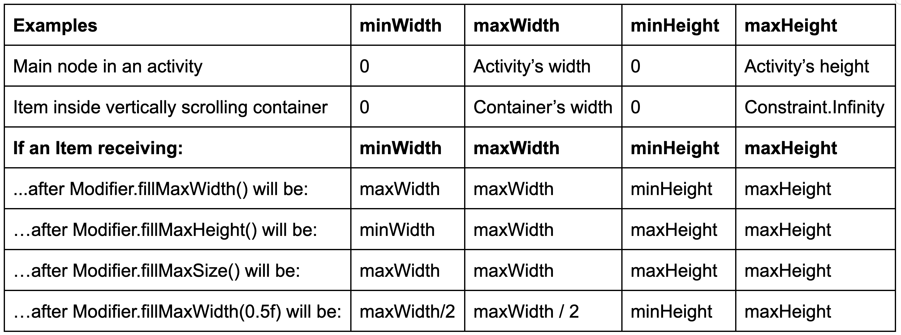
In essence:
- Constraints are a given from the place your component is used.
- They are available only at measure time, not composition.
- They include minimum and maximum dimensions.
- Some layout-related Modifiers (e.g., fillMaxWidth) decorate the measuring step, so they change the constraints received by the affected node.
Imagine Modifier.padding. It’s a layout modifier too:
A practical example
Consider this composable:
Row(Modifier.height(100.dp).fillMaxWidth()) { Box(Modifier.fillMaxWidth(0.33f).fillMaxHeight().background(Color.Red)) Box(Modifier.fillMaxWidth(0.33f).fillMaxHeight().background(Color.Green)) Box(Modifier.fillMaxWidth(0.33f).fillMaxHeight().background(Color.Blue))}
It renders the following:
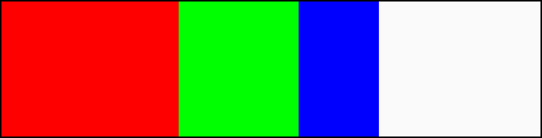
This code is the topmost UI: It has all the whole screen available. At measure time the row receives these constraints:
- Width: [0, screenWidth]
- Height: [0, screenHeight]
The constraints pass through all the (layout-related) modifiers:
- After height(100.dp): Constraints’ height is set to [100, 100]: minimum and maximum to the same value.
- After fillMaxWidth(): Minimum width is set to the maximum width: [screenWidth, screenWidth].
Therefore, the row gets a single, concrete value for its size: W = screenWidth, H = 100. It doesn’t even have to check with its children.
How are Boxes inside the Row measured? Each one of them receives max constraints because they are inside the Row that was given a size. However, they don’t receive a minimum size, as the Row is happy to accommodate smaller items.
The first Box receives these constraints:
- Width: [0, screenWidth]
- Height: [0, 100]
The constraints pass through the modifiers:
- After fillMaxWidth(fraction = 0.33f): the minimum and maximum width get set to 33% of the maximum width: [screenWidth / 3, screenWidth / 3].
- After fillMaxHeight(): the minimum gets set to the maximum allowed size: in this case [100, 100].
Now the Box gets an exact size: W = screenWidth / 3, H = 100. And only then paints the background color on that concrete size.
For the remaining Boxes, Row uses the remaining space as maximum. Therefore, they will use a third of that remaining space, becoming smaller than the previous one.
Thinking about Modifiers and their ordering
We can follow a Modifiers chain declaration and imagine how they affect constraints and the drawing at the same time.
For example:
Box( Modifier .fillMaxSize() .background(Color.Red) .padding(10.dp) .background(Color.Green) .padding(10.dp) .background(Color.Blue))) { ... }
Generates:
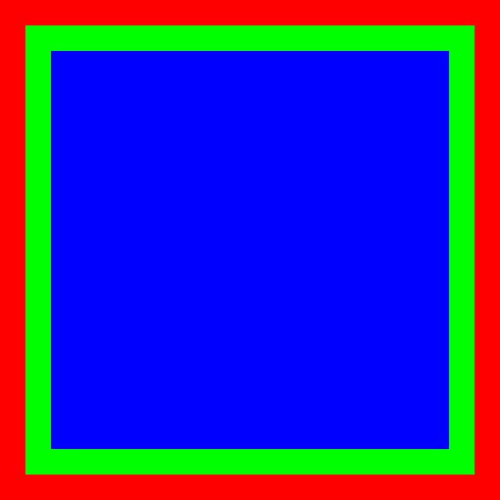
This Box will:
- size(200.dp, 200.dp): set the constraints to a fixed given size
- background(Red): on that area, paint Red
- padding(10.dp): reduce the area by 10.dp on each side
- background(Green): on that reduced area paint Green
- padding(10.dp): reduce the area by another 10.dp on each side
- background(Blue): on that smaller area paint Blue
Notice how you can follow the Modifiers and see what it does in order. That’s why they say that the Modifier order matters!
Intrinsic sizes
Intrinsic size can be thought of as the natural size of a component, or its desired size. A Compose node (a layout) receives its MeasurePolicy, which implements measure — the actual measuring and placing code — and intrinsic size-related methods.
Compose has a default implementation for them, which ok most of the time, but it’s worth knowing how intrinsics works in case you need to override the default implementation.
The first you’ll notice is that there are four intrinsic methods on MeasurePolicy:
fun minIntrinsicWidth(height: Int): Intfun maxIntrinsicWidth(height: Int): Intfun minIntrinsicHeight(width: Int): Intfun maxIntrinsicHeight(width: Int): Int
Why is there a minimum intrinsic size and a maximum intrinsic size?
The second thing you’ll notice is that:
- Methods returning an intrinsic width receive a height parameter
- Methods returning an intrinsic height receive a width parameter Why?
Let’s focus on the first question. Usually a component will have just one intrinsic size. Minimum and maximum will return the same value. But consider text:
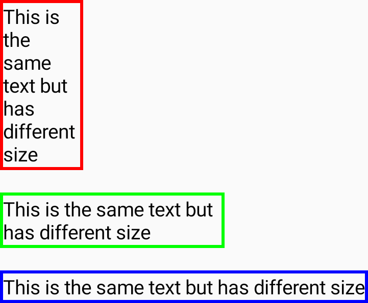
If you have a long text it might have a different width depending on where you place it. If the available width is small, it will span several lines. If there’s enough room it can be one very long single line. So minimum and maximum are defined as:
- Minimum: the minimum size at which it can be drawn properly
- Maximum: the maximum size beyond which there won’t be any visual change
For a text node with several words, for instance, “Very long text for intrinsics”:
- Minimum intrinsic width: will be the width of the intrinsics word, probably the longest, as the text can be laid out one word per line if needed. If we make it smaller, the text won’t show up properly, no matter how we try.
- Maximum intrinsic width: will be the width of a single line with all the text: “Very long text for intrinsics.” If we increase the width, the text won’t be any different.
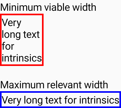
Hammering the point home: Minimum intrinsic size is the minimum size it can be shown properly, and maximum intrinsic size is the maximum size beyond which it won’t suffer any change.
Another nontrivial example
Imagine an icon button bar. We want to show a Row of icons with actions:

But we want the component to be able to hide some buttons if there’s no more space. It will show whatever it can and leave a More button on the right to display the rest in a dropdown menu:

Its minimum intrinsic width technically is just the More button, having all the buttons hidden in a dropdown. Its maximum width is the width of all the buttons one after another without any restriction, beyond which there’s no point in making it bigger.
That input param for intrinsic methods
Now we know what minimum and maximum are. What are the width/height parameters received? Well, the intrinsic width might depend on the available height, and vice versa.
Let’s use the text example again. We said that its minimum height would be when the text is laid out all in one line:
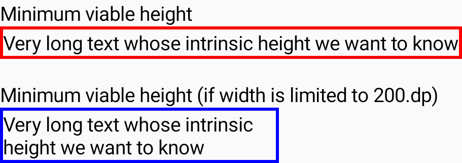
What if we have only 200dp of width? Height will be affected. If there’s only 200dp of width, the minimum height won’t be just one line (it doesn’t fit; it’s the height of two lines instead). So it’s important to know how much available width there is for min/maxIntrinsicHeight methods.
The same happens in the other direction. Some components might need to know how much height is available to decide on what’s the minimum or maximum width. For instance, if there’s only enough height for one line of text, then the minimum width will necessarily be the width of the full text in one line. It won’t fit otherwise!
Of course, text is the paradigmatic example. It’s core to any UI system and has a lot of special cases. Most of the components won’t have this complexity. But in cases where you change your UI depending on the constraints, you might want to be explicit about intrinsic sizes, especially if you use those values.
Using intrinsic values
A typical example is a popover with several options, one per line. We might want to show text with a radio button on the right. The radio buttons need to be all aligned to the right. To achieve that we need to know what’s the longest option and make them all be that size:
That’s where intrinsic sizes (in particular maxIntrinsicWidth) come in handy.
Take a look at this:
Column(Modifier.width(IntrinsicSize.Max)) { // Each text + radio button is encapsulated in OptionItem. OptionItem(Modifier.fillMaxWidth(), ...) OptionItem(Modifier.fillMaxWidth(), ...) OptionItem(Modifier.fillMaxWidth(), ...)}
In this example the Column says, “I want to be as wide as my maximum intrinsic width,” by using the .width(IntrinsicSize) modifier. That calls the Column’s node maxIntrinsicWidth method. For a Column, the max intrinsic width is calculated as the maximum of each child’s maxIntrinsicWidth.
For an option item, we can define that its maximum intrinsic width is just the max intrinsic width of the text (all in one line) plus the intrinsic width of the radio button.
That means that if each Row needs 200, 300, and 400 pixels, respectively, the Column will say that its max intrinsic width is 400.
Once the Column is sized, all the Rows inside will say, “I want to use all the available width,” which happens to be that convenient 400.
If, instead, we told the Column to be its minimum intrinsic width, it will request that same minimum from each option, and this would be the result: basically the greater of the minimum widths of the options, which are made of text, so the text will be split into several lines.

BoxWithConstraints and SubComposeLayout
Compose phases are: composition, measuring, then layout and drawing. All composition (creation of nodes) happens before measuring anything. There are some very special occasions when this is not possible.
- Cases where there’s a very long (in principle, unbounded) list. Composing all the nodes would be very expensive. But we have no idea how many fit in the viewport. This is solved by LazyColumn and other similar lazy layouts.
- Cases where the UI might change depending on the space available. Think of an app that wants to show an overview/detail split when the screen is big enough (in a tablet, for instance) but only a simple screen otherwise.
- Any case in which at composition time you need to know the actual available space.
If so, we need to merge the composition and the measurement phases into one. There are three Compose components that use this approach to a different extent:
- BoxWithConstraints
- SubComposeLayout
- And all the lazy layouts (like LazyColumn, LazyVerticalGrid, LazyLayout, etc.)
They are used for cases when the size is needed to decide on what to compose: measuring and composition cannot be separate passes. There are two paradigmatic examples:
- Deciding between a phone-like UI or a tablet-like UI at root level
- Building content on demand inside Lazy containers (they are equivalent to classical view’s approach RecyclerView). They need to create items and measure them one by one until all the available space is covered.
Unless you absolutely need this, it’s better not to use them. Why?
Loss of intrinsic sizes: All these methods are implemented based on SubComposeLayout, which is a composable that creates its sub-tree of nodes later, when already measuring. They cannot provide their intrinsic size because they don’t know what their content will be. They are naturally given a size from outside. If you need a component to vary its UI but still have some intrinsic size, you might be well-served by a custom layout which can produce all the nodes it needs and places only the ones it needs.
Performance hit: By combining composition and measure passes, performance might take a hit. First, each time measuring happens, recomposition will happen again, and measuring pass will happen every time the rest of the UI needs to remeasure, or if any value read during measurement changes. To that regard, Lazy containers have some cleverness around performance, such as caching and whatnot, but it adds complexity. So, use it only when absolutely necessary.
Conclusion
Jetpack Compose has a very well-defined structure to create UI. It has three phases: composition, measuring, and drawing. Knowing those phases is important to improve performance (not causing unnecessary recompositions). The measuring phase is maybe the phase we talk about less, but having a strong grasp on its concepts allows for effective components:
- Each node is a measurable.
- Each measurable gets measured exactly once.
- Each measurable has cheap-to-calculate intrinsic sizes.
- Intrinsic size is important for complex and flexible UIs. This article is focused on walking you through these concepts so you can come back to them when your custom UI (with custom measuring) needs it the most. Hopefully this is a light but powerful enough summary for you to know exactly where to look.
Links
Example of how the knowledge of the phases (composition, measuring, drawing) can help: https://youtu.be/EOQB8PTLkpY?t=436
Authored By


