
Help us investigate a new Welcome Experience in Visual Studio 17.6 Preview 2
A central theme across Visual Studio releases is ‘get to code’ quickly. Over the years, we’ve tried many approaches to accelerate start up, project selection or creation, and restoration of previous state. In Visual Studio 2019 we created the modal ‘start window’ experience that optimized for getting to the primary action most developers take when starting the shell. Since that release, there’s been mixed feedback. Much of the critical feedback revolved around the modality interruption when switching between solutions. That has led us to reconsider other options for “get to code.”
With your feedback in mind, we started experimenting with a new Welcome Experience. We’re only just starting our initial investigations in this area, and we know there’s a lot of work we need to do here to ensure a great experience. Read on for more information on what we’re thinking and download Visual Studio 17.6 Preview 2 today to give it a try and share your feedback:
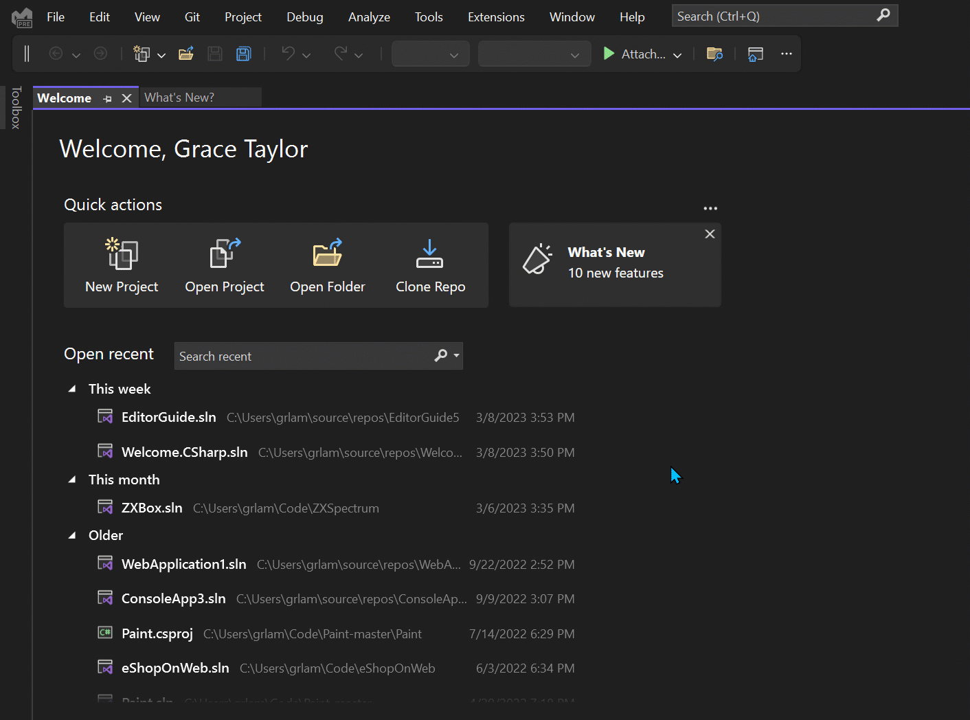
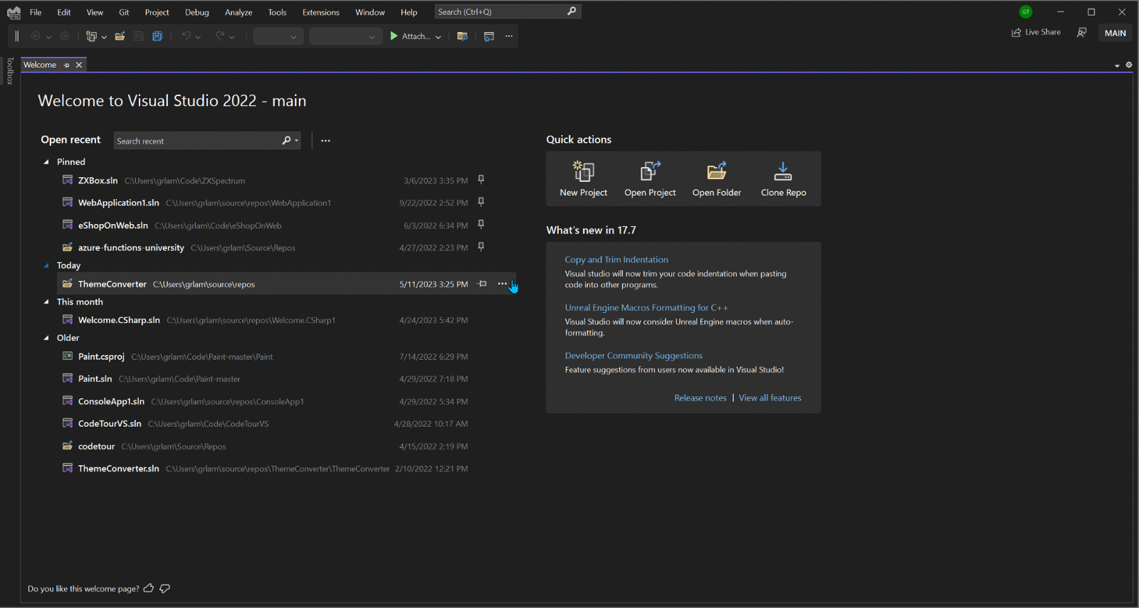
Once you update to Visual Studio 17.6 Preview 2, you’ll get a sneak peek at some of our first attempts at improving the experience on launch of Visual Studio, informed by the previous start page versions, while leveraging the performance and UX improvements that were made for the start window. You’ll encounter an in-IDE Welcome tab instead of the modal Start Window, allowing you to jump right into the shell.
The Welcome page presents all the options you’re used to accessing from the Start Window as a tabbed document window in the IDE itself. These include:
- Your most recently used project list
- A search box for recent projects
- Quick links for creating a new project, opening an existing project, opening a folder, and cloning a repository
You’ll also find a new tile linking to the “What’s New” page, which shows information on some of the new features shipped in Visual Studio. If you’d like to free up some space on the Welcome tab, you can close the What’s New tile. This is a first step toward bringing additional customization to the page. Be sure to let us know what else would be useful to you for customizing your Welcome experience.
Let us know what you think!
Give the new Welcome page a try and let us know how it works for you. Let us know if there are any tiles or customizations you’d like added, or whether there’s anything we can improve about the already existing experience. We’ve created an item in Developer Community to serve as a hub for discussing the early work around this experience. Please join in the conversation there!
If you’re interested in seeing Developer News in the Welcome page, please upvote this item. If you have any other feedback, please feel free to share in Developer Community!
Edit May 30 2023:
Thanks everyone for your feedback! We’ve iterated based on your input and we’ve adjusted the design as well as the Most Recently Used (MRU) capability. Take a look at this blog post for more details.
 Light
Light Dark
Dark
26 comments
Great to see that it moved back to page, from windows. but items may be better organized. Make two tabs – Using projects and New projects. Using projects contain currently used projects based on spending time, not historical openings. If some projects are insidde repo folder, then this should be viewed as projects inside such folder. Recent opening dates should be only small attributes to viewed projects / folders.
Seconfd tab – New projects – contains tree based pane with hierarchy: Languages -> Platforms -> Project types and list of project templates, as it was in older VSs. This will speed up finding required project type. Remove ‘recent project templatest’, and small fixed section with remaining commands like cloning repository, and others. Commands ‘open folder’ and ‘open project / solution’, are rarily used, may be removed, as it will be available via commends in menu, do not think they need special – first look – place
Please also bring back older style of organised constrols in project’s properties. Current vertical string of project’s parameters it total mistake
This is a huge step forward (back to what we had) and definitely a better experience.
When it comes to a “great experiences” is it worth taking a slightly different approach to “Get to code quickly” and introducing an AI sentence where you can describe what you want instead, similar to the Bing integration. We have all seen the impact ChatGTP has had on the creation of code and the suggested results. How good would it be if it actually gave us the initial code as a solution/project! Now there is a true Get to Code quickly experience and it’ll save all that copy and paste to/from applications. Not only that but the applications would hold the context that new questions could use.
This is a good start. I think it would be beneficial if you could add a way to pin / favorite projects. Even if it only gets saved in localappdata or somewhere else on the machine, it would be a huge help. Glad to see this update Grace!
The Start Window has supported pinning projects since it was added. Mouse over the project in the recent list and the option to pin is there. Pinned projects are moved to the top of the list and left there. Is there some functionality that is missing that you might want? If so then please use the link to the Developer Community feedback for this feature so they can be notified of what you are looking for.
I appreciate your effort and have these suggestions:
– The empty space below the project list should be used to increase the height of project list
– The whole content should be centered horizentaly
Totally agree, the layout waste lots of space.
This has already been requested in the Developer Community feedback item that was linked to in the article. Please add your additional feedback there.
this comment has been deleted.
Thanks for the feedback. Here is a link to the Developer Community feedback page.
https://developercommunity.visualstudio.com/t/Welcome-customizations-in-Visual-Studio/10311633
Much better than current version.
Why not to show What’s New directly in the right panel? The horizontal space is wide enough to show both panels side by side.
Honestly my version of “get to code” is to turn all these things off. There are a wealth of things that could be done to improve the experience of using Visual Studio day in day out, and a simple “welcome” dialog that appears for all of ten or fifteen seconds before I get it out of the way feels like a waste of developer effort to me.
Please just stop including all kind of “fancy” features that are just contributing to slow down vs more and more.
Visual Studio today is a shame in terms of performance, especially startup and loading projects performance.
I’ve been working with all versions of vs since 2008, 2010, 2012, 2013, 2015, 2017, 2019 and now with the slowest one of all: 2022
Massive performance penalties started with 2022.
Guys, you really have to think in regaining VS user’s trust and bring back the speed VS has in its old good days.
I think in all the current development you do, you should put performance considerations/issues on the table.
For welcome page I would keep it simple: most important one: just allow me to pin(add to favorite) a few solutions and show a few as recents.
Just don’t over-engineer this page, please do not bother making more and more network connections at startup, & new traffic + all kind of analytics or AI things + showing news. Actually stop showing any news by default, ideally include an option to disable at all from showing it in VS in case you still want to add it.
99% of time dev’s are using Visual Studio not to read news, for news we can read your blog, don’t slow down VS with unnecessarily things.
Let the developers to to enjoy a performant IDE
Yeah, but how else would they improve the engagement KPIs?
Isn’t the “pick a project” start window of VS2022 faster to load comparing with the full-sized IDE window?
For me, the load time depends much more on my computer setup. I still remember VS2010 starts for 10 seconds from mechanical drive on my old laptop,.
I totally agree that there should be little network connections at startup.
I like the new screen but I think the list entries should be bigger or maybe shown as icons, as it would help in reading them clearly.
I like the old Welcome dialog, but I think this solution is better – loading up the IDE and putting this right in there, rather than a separate dialog. I like the icons across the top too, it looks nice!
I think an option for enabling Developer News on the side, for those who want it, and a method for pinning projects to the top of the list would make this perfect!
It would be nice if you could be more consistent with your wording. You often write “Project”, when you actually mean “Solution”. This can be rather confusing 🙁
I guess that “New Project” will actually create an new solution.
New Project is correct in most cases. You are adding a new project to an existing solution or you’re creating a new project and VS will auto-generate a solution for you. There is actually only 1 template that creates just a solution. And if you’re in “simple” solution explorer mode you don’t even see the solution. This is/was an attempt to hide the solution from the common(?) case of having a single project.
I actually don’t see any difference than what’s in 17.5. You think that moving the quick actions from the right to the top is a “new” welcoming experience? It’s nothing but a cosmetic change. In my book, they are the same.
Prior to the preview the Start Window is a modal popup that you have to interact with to get rid of. That is why there was an option to “continue without code” when all you wanted to do was get into VS to make adjustments. With the preview it is now a document window which means you don’t have to dismiss it to work in the IDE.
I will check out the new experience, but I do prefer the start modal. As for slowness of VS 2022, companies need to realize that a run of the mill 4 or 8 core and 8 or 12 threads with 16 or 32GB of RAM doesn’t cut it these days. That said, I run it on an AMD powered 8 core 16 thread w/ 16 GB of RAM and it is leaps and bounds better of an experience than my work machine that was 4 times more expensive that has a 8 core 12 thread intel and 32GB of RAM. For the big personal projects I move over to my 32 core 64 thread w/ 1TB RAM desktop and it’s heaven. I am not saying don’t worry about efficiencies, but I do feel that the start tab is a big step backwards. I guess I could be convinced if there were even better tab management, and you need to take that with a grain of salt as I am know to have 60+ tabs open at any given moment on a regular basis.
TLDR Keep up the good work, you all make us more efficient and our jobs a little easier.
Thank you
Thanks, it’s a good move compared to the previous modal, which was a disruption if you wanted to close the solution and minimize VS, because you had to close the modal before you could minimize.
The Welcome line is a waste of space since the recent list is more important than this and could make use of the vertical space. If the quick actions were all you were displaying, then sure, the Welcome line wouldn’t be a big deal. You already have the tab named Welcome.
Recents:
You could also list them side-by-side/2-columns if there’s enough width, but if you don’t do that, then at least make the whole section stretch with Window width, keeping the solution name and file path a larger width percent than date/time like you have now, but have those percents get bigger with Window width.
Hello, Microsft Visual Studio Developer Team, could you create a solution dashboard with metrics and more… XD
Speaking of “getting to code quickly”, something happened in VS 2022 such that if I just want to make a new text file, I get two massive slowdowns. First I get a slowdown while it “initializes templates” and I see lots of network activity during this time. I just want to create a blank text file. This used to be nearly instantaneous in older versions of VS and was lightning fast (even on a 20 year old machine!) in VC6. Now because of the online template gallery it takes forever just to pick the “new text file” option. Then on the first edit of the newly created editor window I get another massive “initializing templates” slowdown and again lots of network activity.
Making a blank editor window for a text file should never be something that requires me to go out to the network and “initialize templates”. And no, it doesn’t happen just once, this happens every time I try to create a new source file in VS. It’s faster to drop out to the console and do “copy nul: foo.txt” and then open foo.txt in the VS editor.
VS does a LOT of Internet communication, and for me I’ve discovered it’s the bulk of why it can feel slow sometimes. I don’t know all of what it does over the Internet, but I know that these days Microsoft does a boat-load of telemetry in all of their products, and for some of their products, it tracks each button click on menus and right-clicks.
I was actually a fan of the smaller start window. Is it possible to bring that back?