
Keep Your Users Notified with the Brand-New WinForms TaskbarButton

The WinForms TaskbarButton enables users to interact with the application button in the taskbar. Take a closer look!
With R1 2023, Progress Telerik UI for WinForms provides a way for the users to interact with the application button in the taskbar. When the application button on the taskbar is right-clicked, a jump list is displayed and you can execute custom actions, open hyperlinks, group the items in custom categories and show recent/frequent files.
In this blog, we will check out all the new features.
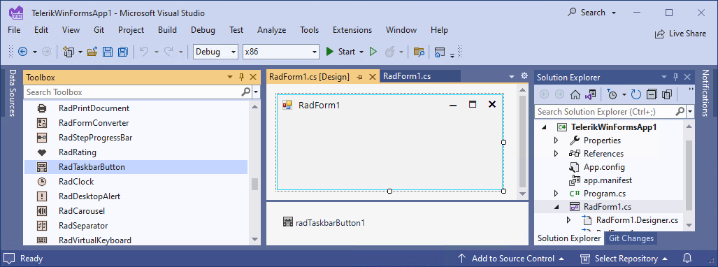
The RadTaskbarButton wraps most of the newly introduced features. Therefore, we will start by adding a RadTaskbarButton component from the toolbox.
Overlay Icon
The first feature we will preview is the overlay icon. It is a small image/badge that is positioned on top of the application icon and can be used to display to the end user a change in the application status or to notify the user that something has happened and needs to be checked.
Here is a code sample that shows how to set the overlay icon.
this.radTaskbarButton1.OverlayIcon = Resources.success;The screenshot below is a semitransparent icon that indicates a success overlay icon over the green progress logo.
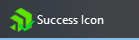
This specific overlay icon is almost invisible on top of the green background icon. So, when we want to add an overlay icon to the application, we need to have in mind that the overlay icon will be displayed on top of the main application icon on the taskbar, it is displayed in the corner of the main application icon and the users can use light or dark background of the windows taskbar.
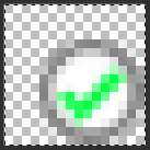
To ensure that the overlay icon will be always clearly visible, it might be a good idea to use images with a solid background and maybe a border. The image below illustrates a modified overlay image positioned over the same progress logo used.

Now the success icon is clearly visible.
If we want a little bit more delicate status indication, we might need a little bit smaller badge. Here we should be aware that, by default, Windows stretches the overlay logo image to 16 x 16 pixels. If you need a smaller image, you can use an image with some transparent pixels like this:
And the applied image on the application:

When you no longer need to notify the user, simply set the overlay icon to null.
this.radTaskbarButton1.OverlayIcon = null;
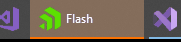
Flash
Another helpful feature that will grab immediately the attention of the user is when the application button starts flashing.
There are different flash settings: flash until the application is focused, flash several times, and endless flashing until the developer stops it with code.
this.radTaskbarButton1.FlashUntilActive();Progress Indication
The application can notify the user about the progress of a time-consuming operation. A great example is the Visual Studio compilation progress, which is always indicated in the application button in the taskbar.
Let’s have a look at the different progress options:
Normal – Progress indicated in green color, used when the program is running normally.
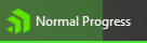
this.radTaskbarButton1.ProgressState = TaskbarProgressState.Normal;
this.radTaskbarButton1.ProgressPercentage = 70;
Paused – Progress indicated in yellow color, usually used to determine a paused state.

Error – Progress indicated in red color, usually used to determine an error state.

Indeterminate – In cases when you do not have information on how long will the waiting operation continue, you can display the indeterminate progress with a pulsing green indicator.

When the time-consuming operation is finished, just reset the progress state to its default value:
this.radTaskbarButton1.ProgressState = TaskbarProgressState.NoProgress;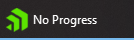
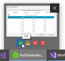
Thumbnail
The thumbnail preview window is shown when the mouse hovers over the application in the taskbar.
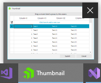
Preview Image
The main part of the thumbnail is the thumbnail preview image. It is a small screenshot of the form. If you need to focus on a specific control, you can set it as a ClipControl and it will be used in the thumbnail preview. Here is how to select the RadGridView control in the clip rectangle:
this.radTaskbarButton1.ClipControl = this.radGridView1; 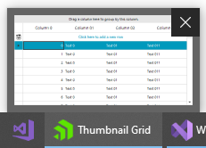
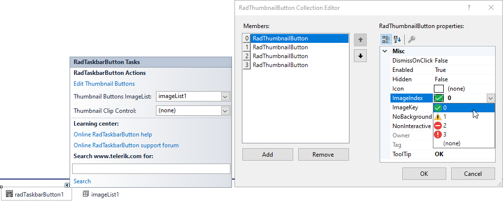
Thumbnail Buttons
The thumbnail hosts a thumbnail toolbar which consists of thumbnail buttons that are used to interact with the application.
The design time experience is straightforward. You can create and customize thumbnail buttons with ease in the designer surface and attach image resources from ImageList.
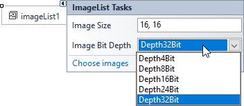
Keep in mind that if you use ImageList to hold the images for the thumbnail buttons, is it a good idea to set the Image Bit Depth to 32. Otherwise, the image corners might look blurry or pixelated:
Note that due to the native windows API restrictions, the thumbnail buttons can be added to an application only once. Thumbnail buttons cannot be removed once they are applied to the application. Instead, the buttons can be hidden, which makes them non-visible in the thumbnail toolbar. When you need them you can make them visible.
To get notified when a thumbnail button has been clicked, simply subscribe to the ThumbnailButtonClick event of the RadTaskbarButton. In the event arguments, the ThumbnailButton instance will be passed as a parameter.
private void RadTaskbarButton1_ThumbnailButtonClick(object sender, ThumbnailButtonEventArgs e)
{
    Bitmap img = new Bitmap(this.imageList1.Images[e.Button.ImageIndex]);
    this.Icon = Icon.FromHandle(img.GetHicon());
}
Thumbnail Tooltip
The thumbnail tooltip is a usual Windows tooltip that is displayed above the thumbnail preview when you keep the mouse over the application button.
this.radTaskbarButton1.ThumbnailTooltip = "This is thumbnail tooltip text";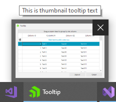
RadTaskbarManager
The RadTaskbarManager class provides APIs to interact with the taskbar button of the application. The RadTaskbarButton class utilizes them and provides a developer-friendly way to consume the most meaningful of them.
For example, if you want to use only the overlay icon and do not want to create and add the RadTaskbarButton component in the designer, you can use the static SetOverlayIcon method:
RadTaskbarManager.SetOverlayIcon(this.Handle, Resources.success-updated);To remove the icon pass null as a parameter:
RadTaskbarManager.SetOverlayIcon(this.Handle, null);A full list of the RadTaskbarManager methods is available in this TaskBarManager documentation article.
Jump List
A JumpList is a list of associated files, actions or links associated with your application.
RadJumpList radJumpList = new RadJumpList("My Application", this.Handle);When all the contents are added or updated in the jump list, we need to call the Refresh method in order to update the jump list and taskbar.
radJumpList.Refresh();Jump Tasks
The items in the default Tasks category are represented by the JumpLink class. Jump Links (tasks) are action items that can open a hyperlink, open the program with given arguments, start an application or open a file.
Hyperlinks
Opens a hyperlink in the default browser when clicked.
Open executable files
Start the given program.
Open a File Using Its Default Open Program
Open a file using the default program in windows.
Start the Same Program with the Given Parameters
Jump Items
The jump item represents a file with a specified file path.
Note that the file extension must be associated with the application, otherwise an invalid operation exception will occur: “The file type is not registered with this application.”
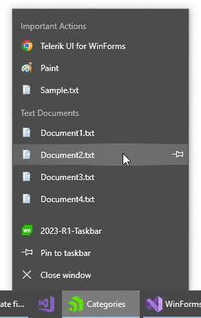
Custom Categories
The JumpItems and JumpLinks can be organized into groups called custom categories.
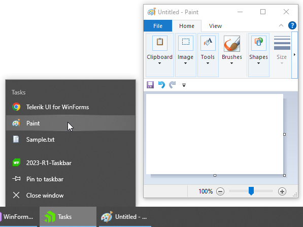
JumpListCategory actionsCategory = new JumpListCategory("Important Actions");
JumpLink taskLink = new JumpLink("https://www.telerik.com/products/winforms", "Telerik UI for WinForms");
actionsCategory.JumpItems.Add(taskLink);

JumpLink taskApp = new JumpLink(Path.Combine(Environment.SystemDirectory, "mspaint.exe"), "Paint");
actionsCategory.JumpItems.Add(taskApp);

JumpLink taskFile = new JumpLink(@"C:\Temp\Sample.txt", "Sample.txt");
actionsCategory.JumpItems.Add(taskFile);

radJumpList.Categories.Add(actionsCategory);

JumpListCategory documentsCategory = new JumpListCategory("Text Documents");
for (int i = 1; i <= 4; i++)
{
    JumpItem jumpItem = new JumpItem($"Document{i}.txt");
    documentsCategory.JumpItems.Add(jumpItem);
}

radJumpList.Categories.Add(documentsCategory);
Recent and Frequent Categories
The recent and frequent categories are well known from popular programs such as Visual Studio. Similar to the jump items, these categories require a specific file type to be associated with the application to make it possible to see the items in these categories.
The KnownCategory property of RadJumpList determines whether to display recent, frequent items or none of them.
radJumpList.KnownCategory = JumpListKnownCategory.Recent;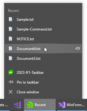
Sign up for a Trial
Feel free to sign up for our free 30-day trial, which gives you access to the components as well as our outstanding technical support at zero cost. Just head to the Telerik UI for WinForms overview page or click the button below to sign up for a trial today!
Time For Feedback
Oh, and one more thing. We would be more than happy to hear your thoughts and suggestions once you try the theme and the other release goodies, so please drop us a line in the comments section below or by visiting the Telerik UI for WinForms Feedback Portal.

Todor Vyagov
Todor Vyagov is a Software Developer on the WinForms team at Progress.
Related Posts
Comments
All articles
Topics

Latest Stories
in Your Inbox
Subscribe to be the first to get our expert-written articles and tutorials for developers!
All fields are required