
4 Things Web Designers Can Do to Ensure Brand Consistency

When building a product that digitally represents a brand and enables them to do business online, ensuring that their brand identity is consistently implemented throughout it is crucial. In this post, we’ll look at four things that web designers can do to make sure this happens.
Regardless of what type of digital products you design, consistency is critical to the user experience.
Deviating from established styles and standards can create usability issues—making it difficult to find critical information and to effortlessly engage with the UI. It can also impair brand recognition, which is important if you want users to be able to recognize your brand on other channels and to trust it when they do encounter it.
In this post, we’ll go over a number of things that web designers can do to ensure that branding is consistently implemented throughout each digital product they build.
Ways to Maintain Brand Consistency Throughout Your Product
As a web designer, you might have a crystal-clear idea of the brand identity and imagery that needs to be conveyed throughout the product you’re building. But it’s not enough to just know what the brand identity is.
To ensure that you consistently imbue your product with the same voice, visual style and user experience, employ the following strategies:
1. Use Specialists
Human error is responsible for a good many issues we experience online. Sometimes those errors come from the product creators and other times from the users.
Inconsistent implementation of design or copy is a good example of how our errors as creators lead to users making more errors. Consistency in creation can keep this from happening.
Who Your Creators Are Can Impact Consistency
For example, let’s say you’re building a new website. It’s relatively small—just a couple dozen pages—and so you consider doing it all yourself. But there’s a big problem with that:
While it might seem as though you’re saving money by not delegating something like copywriting or development to someone else, it will cost you in other ways.
For starters, it will cost you in terms of time. Even if you’re good at writing or coding, someone who is great at it will get it done more quickly than you. In addition, their work will produce better results.
Secondly, the more time you work on a product, the more likely you are to fatigue and that fatigue will lead to sloppiness and forgetfulness. By delegating certain tasks to specialists, you’ll maximize your energy and focus and will be less likely to make mistakes when it comes to consistently implementing the visual design.
Finding Devoted Specialists Will Improve Your Results
You know how meetings can get messy and client feedback becomes unusable when there are too many cooks in the kitchen? A similar thing happens when you have too many people contributing to the product as well.
So, it’s not just delegating tasks to specialists that matters. You need to find a dedicated specialist who will work on the product and not just a bunch of writers, developers, proofreaders, etc. who step in when help is needed.
Even if you’re an independent designer and don’t have the resources of an agency, this is something you can do. I have a number of clients who do this and it works out well for them.
They collaborate with numerous freelance copywriters. Each specializes in different types of projects and styles of writing. When a job comes up that’s in their wheelhouse or that they’ve already worked on, they call on that specific writer. That one writer then works on the job from start to finish. And if updates are needed, they’re the one who works on it.
By using a specialist who can play to their strengths—and commit to working on certain products over time—you’ll end up with better, more consistent results in the end.
2. Create a Style Guide and/or Design System
Making sure you have the right team in place is going to help a lot. However, if you’re relying solely on their memories or personal note-taking as it pertains to a product’s branding, you might still run into consistency issues—especially the larger a project is and the longer it takes to finish.
This is why brand identity and guidelines need to be documented. In addition, they should be published to the cloud (privately or publicly) so that everyone on your team has ready access to everything.
Now, you have two ways to do this. One option is to create a style guide. The other is a design system.
A style guide is a document that lays down a brand’s visual design standards and rules for how to use them. Some brands also have a writing style guide to address the standards and rules as it pertains to their copy.
The visual style guide usually includes information on how to use:
- Logos
- Color palettes
- Typography
- Iconography
- Photography
Many of them also provide a summary of the brand, its personality and values, and so on.
You’ll find Spotify’s visual style guide for developers online:

While Spotify provides clear guidelines on how to visually represent its brand, it also provides additional guidelines on how to provide attribution for Spotify.
Bullhorn is another brand that’s made its style guide publicly available:

This one is a bit closer to what we normally see in style guides. This document serves as the brand’s framework. It first provides context on who the brand is and what it does before outlining how it’s to be visually depicted.
This additional context can help team members better understand the why of what they do.
A design system, on the other hand, is a robust set of documentation related to the design of a product. It includes:
- A visual style guide that breaks down the brand’s unique design standards and rules
- Documentation that provides additional guidelines on what drives the decision-making process (it’s often informed by UX principles, accessibility guidelines and more)
- A toolkit that defines which tools—including design software, UI kits, etc.—that everyone will use to create the product
- UI patterns
- Code snippets
- Downloadable assets
A design system is the complete rulebook for building, contributing to and maintaining a product. Because of the amount of time it takes to put one of these together, a design system is ideal for products that require regular maintenance and updates.
Many major brands publish their design systems to the web. GitLab is one such organization that does this. Here is its Pajamas Design System:

Unlike style guides, which are usually a single-page document, design systems are more complex and need to be organized into different parts. You can see that here with the Pajamas design system that provides information on its Brand, Product, Research and Accessibility guidelines.
Audi is another company that’s published its design system to the web:

The top Fundamentals section is where the style guide lives. It includes guidelines for colors, typography, layouts, animation, tone of voice and more. The guides at the bottom provide documentation and assets depending on where and when the Audi brand appears.
3. Use Tools That Work with Your Design System
So the next step in this is to use tools that sync with your design system. This way, you and your team won’t constantly have to reference your documentation. It’ll still be needed—especially at the start of a project and when someone new joins the team—but you won’t have to depend on it as much if your design system works with your tools.
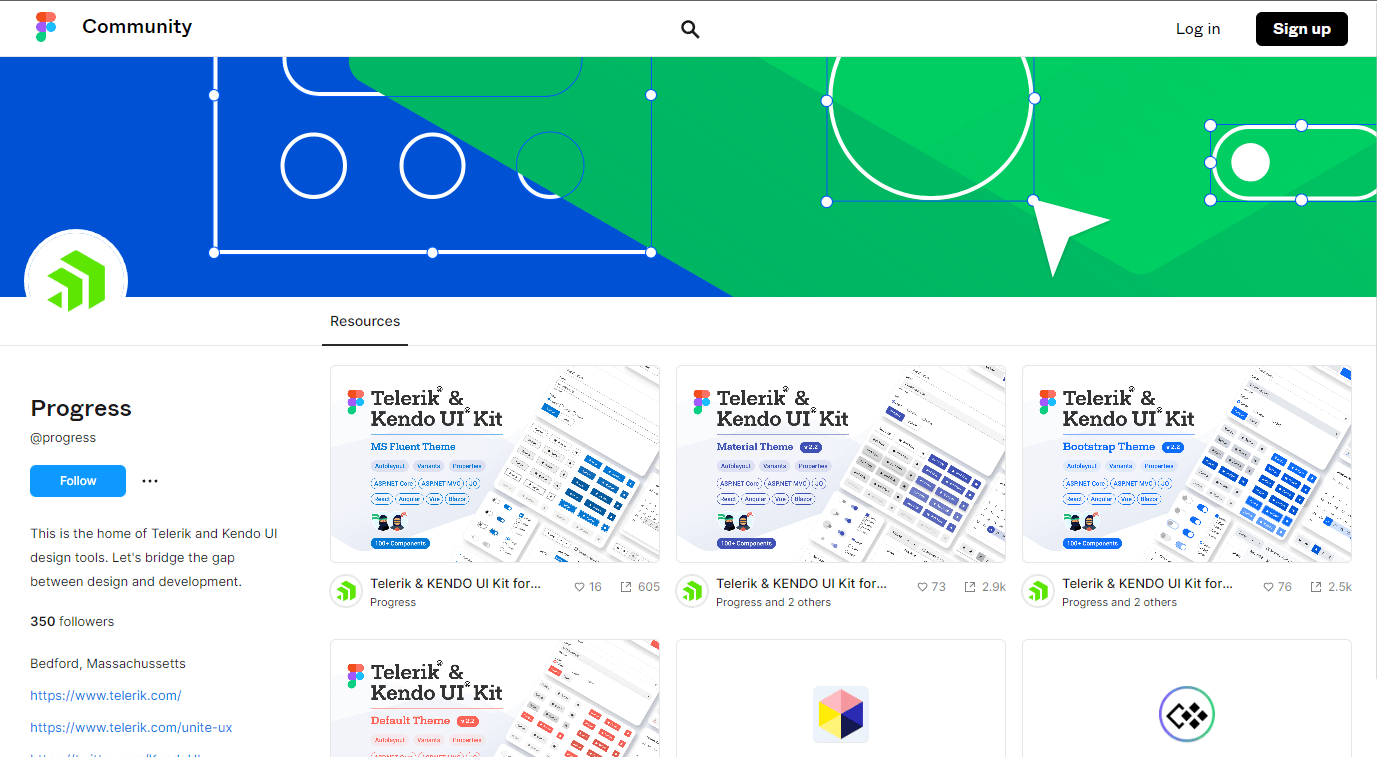
Figma is one such tool designed to help with this. It is made to help design and development teams come together with ease. You can utilize a tool like the Progress Telerik and Kendo UI Figma Kits to springboard your app design from a set of already styled components.
In fact, Kathryn Grayson Nanz wrote a post called Using Figma Kits To Kick-Start Your Design System highlighting how you can use Figma Kits to get a design system MVP (Minimum Viable Product) up and running with minimal time investment and zero financial cost since the Kits are free.
Any tool that can help you deliver brand-consistent design and code is worth exploring. It could not only simplify the design-to-development handoff, but also shorten the overall product development time.
4. Create a Media Kit
This last tip is optional. However, if press and marketing are important to your brand, then a media kit is a good idea.
A media kit is a stripped-down version of your style guide. Basically, it’s a way for a brand to deliver its visual assets to third parties and to ensure that they maintain consistency with the established branding online.
There are a number of assets you might want to provide on your Press or Media page. It really just depends on why third parties would be accessing it in the first place.
For example, Slack is a huge player in the SaaS space. As such, it gets tons of media coverage. The clearer it can be with regards to its brand as a whole and how to visually represent it online, the better.
That’s why its media kit includes:
- Product screenshots
- Leadership photos
- Images of their people and offices
In addition, it has embedded its style guide at the bottom of the kit:

This way, third parties fully understand what Slack stands for and why its visual identity looks as it does.
Another brand that provides the media with assets is Rover.com. This media kit includes:
- Rover sitter images
- Rover website and app images
- A guide on how to become a dog-friendly company
- Company fact sheet
- A promotional video
- Social media graphic with company stats

This collection of assets accomplishes a number of things. For starters, it ensures that third parties (including sitters who want to promote their Rover.com businesses) use high-quality visual assets to do so. It also provides facts about the company, which should save Rover.com’s press team time in answering questions since the information is readily available online.
The Darden family of restaurants is another organization that offers up a media library for third parties:

This is a much more simplified version of a media kit. It includes each of the individual brand’s logos as well as an exterior shot of the establishments. This is really all you need to include in your own media library in order for it to be helpful to news outlets.
For larger software and tech companies, they need to provide assets depicting their products and team members and what-not. But if the brand is really only getting mentioned in news articles and the like, then a logo and exterior photo will do just fine.
Wrap-up
Inconsistency in how a brand is depicted visually, how its voice is portrayed or how users feel when interacting with the product can create huge problems. With regards to the product, in particular, inconsistency can negatively impact user engagement, conversion and retention rates.
Consistency, on the other hand, makes a brand feel more stable, authentic and relatable. It also makes its products (and connected marketing channels) feel effortless to use.
As a web designer, there are certain things you can do to ensure that branding is consistent throughout the products you build. The four strategies above will help you consistently implement branding while also saving you time in having to deal with the issues that come about due to inconsistencies.

Suzanne Scacca
A former project manager and web design agency manager, Suzanne Scacca now writes about the changing landscape of design, development and software.
Related Posts
Comments
All articles
Topics
Web Mobile DesktopDesktop
Design
Productivity
People

Latest Stories
in Your Inbox
Subscribe to be the first to get our expert-written articles and tutorials for developers!
All fields are required