Best Practices for Designing Breadcrumbs for Mobile

The breadcrumbs navigation is an important feature on the web. However, some of the design techniques that work for larger screens don’t translate well to mobile. In this post, we’ll look at four tips to help designers create more usable and accessible breadcrumbs for mobile.
The breadcrumb navigation has become one of those elements that’s been around long enough that most people recognize its purpose when they see it. When done right, breadcrumbs can tell a visitor where they are, where they can go, and give them an easy way to skip back through levels of content.
The only problem is that breadcrumbs aren’t always used correctly on the web—especially on mobile websites and in mobile apps. Some sites use them when they shouldn’t. And others design them in a way that adds friction to the user experience.
In this post, we’re going to look at the two types of breadcrumbs you can use in web design and then go through some tips for better mobile breadcrumb design.
Types of Mobile Breadcrumb Navigations
Technically, there are three types of breadcrumb navigation. However, only two of them are relevant and useful today:
Location-Based Breadcrumbs
The right way to do location-based breadcrumbs is to display links based on hierarchy as The Motley Fool does:

Each link in the chain is a subcategory of the one before it:
Investing > Stock Market > Types of Stocks > Small Cap Stocks
This example shows us how breadcrumbs can take users back through levels of content on a page, even if they haven’t been to those higher-level categories or pages before.
Another way that location-based breadcrumbs have been used is to display the user’s history during that session. While it seems good in theory, this kind of breadcrumb structure can get messy very quickly as a user’s potentially erratic movements around a site or app will be depicted there. The better option is to display their location in an ordered and logical way with hierarchy-based breadcrumbs.
Attribute-Based Breadcrumbs
The other type of breadcrumbs we use are based on attributes or characteristics of the page the user is looking at. This is commonly used in ecommerce to help users see how their category and variant selections got them to the product they’re currently looking at.
This type of breadcrumb trail might look like this:
Women’s > Petites > Dresses > Sleeveless Dresses > White Dresses
Ecommerce sites and apps aren’t the only ones that can use this type of breadcrumbs though. Here’s an example from Rasmussen University:

Each link in the chain tells us which campus location we’re looking at (or which list of campus options):
Locations / [State Name] / [City Name]
Users can seamlessly switch states and cities all from this breadcrumb navigation, making their search for the right campus go quickly. It also puts the entire offering into better perspective as they can see what all their options are at once.
Tips for Designing Better Breadcrumbs for Mobile
Because we have limited horizontal space to work with on mobile as well as dexterity and accessibility issues to consider, there are certain design rules we have to consider specifically for mobile breadcrumbs.
Use Them Only When Your Users Will Benefit from Them
In general, a website that has at least three levels of categories or attributes would benefit from using breadcrumbs. This applies to desktop just as much as it does to mobile.
But when we talk about three levels, we’re not referring to what we see here on the NVIDIA website:

There are three levels displayed here:
Home > Platforms > Omniverse
If you look more closely, however, you’ll see that the site really only goes one level deep to “Platforms.” I’m pretty sure “Omniverse” isn’t a subcategory—it’s just a shortened version of the full page’s name. However, I can’t confirm that since none of the breadcrumbs link out to anything (which is a problem).
While a website like NVIDIA doesn’t need breadcrumbs, a mobile website like the one for Barnes & Noble certainly does:

There are a couple of issues with the mobile breadcrumb design on this site. For starters, the breadcrumbs don’t appear until about halfway down the page—beneath two oversized promotional banners. These banners belong on the homepage or as small notification bars affixed to the top of the site and away from the internal search and product pages. But because they’re here, the breadcrumbs are now in a location where they’re more difficult to find.
In addition, the breadcrumbs never go deeper than “Books” so far as I can tell. I tried going to pages for larger categories like “Features” as well as for individual books in a variety of genres. The breadcrumbs always seem to be the same:
Home > Books
A store with as many products and genres as Barnes & Noble is missing a big opportunity here. Think about a book like Twilight, for example. An attribute-based breadcrumb navigation would have been useful. Something like:
Books > Fiction > YA Fiction > Vampires
Users interested in a book like this could’ve used those breadcrumbs to backtrack to relevant categories instead of going through the rigamarole of using the hamburger menu again.
Avoid Wrapping Breadcrumbs When Possible
Wrapping breadcrumbs is generally a no-no. This is especially so on mobile since every line added for breadcrumbs is one fewer line of content the user can see on their screen.
Here’s an example wrapping on the Search Engine Land website:

The breadcrumbs take up three lines at the top of this post instead of one. That’s because there’s a lot of wasted space.
For starters, we don’t need the “Search Engine Land” (i.e., Home) link included in the breadcrumb navigation when the website’s logo appears just above it.
I know some argue that “Home” should always be the start of the breadcrumb navigation, but I don’t think it makes any sense. It would be like putting a newsletter subscription banner at the bottom of the homepage and then having that same subscription form in the footer directly below it. We don’t need to replicate functionality in our designs when there’s so little space and time to waste.
We can also get rid of the blog post title from the breadcrumb chain: “Common questions and answers about SEO certification from Google.” Again, it’s the very next thing people see on the page, so why duplicate it? Especially when it requires two additional lines to fit.
“Channel” is also something we don’t need. While it might be relevant for the designers when building out the structure of the site, “Channel” means nothing to readers. If they’re going to backtrack to anything, it’s going to be the “SEO” category.
Instead, only include necessary links in your breadcrumb trail as Verizon does:

Verizon’s breadcrumb structure makes sense. For instance, the person looking at audio accessories really only needs to go as far back as “Shop” since it aligns with their intent.
Secondly, Verizon doesn’t include the name of the page in the trail. Instead it leaves the structure open-ended with a “>” separator at the end. This lets visitors know that they’re not on the “Audio” page.
If you’re looking for a way to make your breadcrumb structures shorter and to avoid wrapping, removing the unnecessary elements is one way to do it. Another option is to include only the last three levels/links and then placing an ellipsis (…) before them. If users want to go up a higher level, they can use the ellipsis to take them there.
Be Careful With Scrollable Breadcrumbs
Another way that designers have addressed the issue of lengthy breadcrumb navigation on mobile is to make them scrollable. Like this one on the American Express Business Class blog:

In the GIF above, I pull up two different pages to demonstrate how the scrollable breadcrumbs on this site look and work. In the first example, the breadcrumbs are as follows:
Trends and Insights > Planning for Growth > Strategy
It doesn’t require too much scrolling, but that’s not the only problem we have.
At first glance, it looks like the text might have gotten cut off since all we see is “Strat” and half of the letter “e,” followed by white space. If a user doesn’t realize they can scroll to see more, they might miss some of the links—not on this one, but on a longer breadcrumb trail like the next one we see:
Trends and Insights > Planning for Growth > Strategy > Product Development
What’s more, we’re getting into tricky territory when it comes to accessibility. If a user doesn’t rely on a screen reader or keyboard to access the various links on the page, then they’re going to be using their fingers to do so. And if someone doesn’t have the dexterity to scroll left and right, or if they don’t even realize that’s a possibility, this design is going to present some problems for your users.
So, the scroll really should go.
Cutting out irrelevant and duplicate info from your breadcrumb structures will help. Another thing you can do is create alternate labels for your content specifically for breadcrumbs. That way, you keep each level or label to no more than a couple words, and the full breadcrumb structure can be visible without the need to scroll.
By the way, if you can’t avoid scrolling and you prefer it to wrapping, another solution is to add a visual signal to the right edge of the screen so that users know there’s more to see. Like a right-pointing arrowhead (>). Most people should take that as a sign that the breadcrumbs are scrollable.
Use Size and Space To Improve the Tap Targets
We have to consider how certain design choices can impact the accessibility of the breadcrumbs as it relates to both findability and clickability.
For starters, your breadcrumbs should be easy to find on the page—placing them between the header and page title is a good place to start. Users know to look at the top-right corner of the page for breadcrumbs, so placing them in a predictable spot will speed things up.
Making sure they’re sized and styled so that they’re easy to read is important, too. The Lowe’s mobile site has a good example of this:
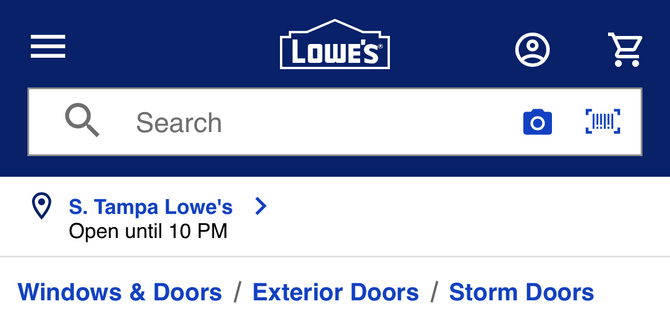
Each breadcrumb is styled in Lowe’s blue hyperlink color. They’re also a bit bigger than the location info that appears above them, so the users’ eyes won’t have to compete for attention between the two blocks of content.
Just be careful about how big you go with breadcrumbs. You want them to be easy to find on mobile, but not so big that they overwhelm the rest of the content or push it too far down the page. Aiming for around the 16-pixel font minimum is a good benchmark.
As for ensuring that the tap targets are clear and that users won’t miss them or accidentally click one of the other breadcrumbs, make use of white space as wikiHow does:
 > Yoga." sfref="[images%7COpenAccessDataProvider]1dd06b8d-09b0-449c-8541-f126beb54323" />
There’s a good amount of white space around the entire breadcrumb structure as well as between each breadcrumb and the subsequent separator.
The designer made a couple other spacing choices that will benefit their users. First is that the breadcrumbs are all caps. If you’re confident that your breadcrumb names and chains are short enough, then going the all-caps route could add some extra size to the click targets. They also use the double-arrowhead (“>>”) separator. Unlike a single arrowhead (“>”) or slash (“/”), this one takes up a bit more room, which increases the space between the click targets.
Again, just be mindful of how much extra space you add around and in between your breadcrumbs as you don’t want to push them into wrapping or scrolling territory if you don’t have to.
Wrapping Up
Mobile web design is always a delicate balancing act. You want to provide users with as much helpful content and features as possible, but you don’t want it to come at the expense of usability or accessibility.
When it comes to designing mobile breadcrumbs, we have some good practices to follow. Use breadcrumbs on websites that are more than three levels deep. Try to stay away from wrapping and scrolling breadcrumbs. And use size and space to your users’ advantage. Keep those rules in mind and you should be able to create breadcrumb navigations that help your users get more from your mobile sites and apps.

Suzanne Scacca
A former project manager and web design agency manager, Suzanne Scacca now writes about the changing landscape of design, development and software.

