In this article, I want to take you through an example project that I built recently — a totally original type of visualization using the D3 library, which showcases how each of these components add up to make D3 a great library to learn.
D3 stands for Data Driven Documents. It’s a JavaScript library that can be used to make all sorts of wonderful data visualizations and charts.
If you’ve ever seen any of the fabulous interactive stories from the New York Times, you’ll already have seen D3 in action. You can also see some cool examples of great projects that have been built with D3 here.
The learning curve is pretty steep for getting started with the library, since D3 has a few special quirks that you probably won’t have seen before. However, if you can get past the first phase of learning enough D3 to be dangerous, then you’ll soon be able to build some really cool stuff for yourself.
There are three main factors that really make D3 stand out from any other libraries out there:
- Flexibility. D3 lets you take any kind of data, and directly associate it with shapes in the browser window. This data can be absolutely anything, allowing for a huge array of interesting use cases to create completely original visualizations.
- Elegance. It’s easy to add interactive elements with smooth transitions between updates. The library is written beautifully, and once you get the hang of the syntax, it’s easy to keep your code clean and tidy.
- Community. There’s a vast ecosystem of fantastic developers using D3 already, who readily share their code online. You can use sites like bl.ocks.org and blockbuilder.org to quickly find pre-written code by others, and copy these snippets directly into your own projects.
The Project
As an economics major in college, I had always been interested in income inequality. I took a few classes on the subject, and it struck me as something that wasn’t fully understood to the degree that it should be.
I started exploring income inequality using Google’s Public Data Explorer …

When you adjust for inflation, household income has stayed pretty much constant for the bottom 40% of society, although per-worker productivity has been skyrocketing. It’s only really been the top 20% that have reaped more of the benefits (and within that bracket, the difference is even more shocking if you look at the top 5%).
Here was a message that I wanted to get across in a convincing way, which provided a perfect opportunity to use some D3.js, so I started sketching up a few ideas.
Sketching
Because we’re working with D3, I could more or less just start sketching out absolutely anything that I could think of. Making a simple line graph, bar chart, or bubble chart would have been easy enough, but I wanted to make something different.
I find that the most common analogy that people tended to use as a counterargument to concerns about inequality is that “if the pie gets bigger, then there’s more to go around”. The intuition is that, if the total share of GDP manages to increase by a large extent, then even if some people are getting a thinner slice of pie, then they’ll still be better off. However, as we can see, it’s totally possible for the pie to get bigger and for people to be getting less of it overall.
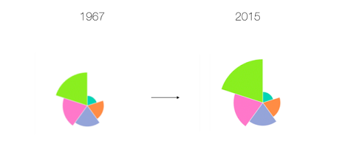
My first idea for visualizing this data looked something like this:
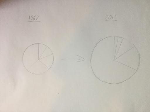
The idea would be that we’d have this pulsating pie chart, with each slice representing a fifth of the US income distribution. The area of each pie slice would relate to how much income that segment of the population is taking in, and the total area of the chart would represent its total GDP.
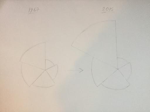
However, I soon came across a bit of a problem. It turns out that the human brain is exceptionally poor at distinguishing between the size of different areas. When I mapped this out more concretely, the message wasn’t anywhere near as obvious as it should have been:
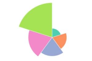
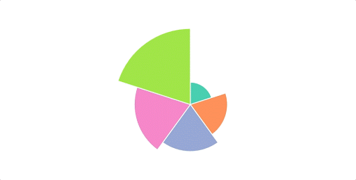
Here, it actually looks like the poorest Americans are getting richer over time, which confirms what seems to be intuitively true. I thought about this problem some more, and my solution involved keeping the angle of each arc constant, with the radius of each arc changing dynamically.
Here’s how this ended up looking in practice:
I want to point out that this image still tends to understate the effect here. The effect would have been more obvious if we used a simple bar chart:
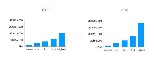
However, I was committed to making a unique visualization, and I wanted to hammer home this message that the pie can get bigger, whilst a share of it can get smaller. Now that I had my idea, it was time to build it with D3.
Borrowing Code
So, now that I know what I’m going to build, it’s time to get into the real meat of this project, and start writing some code.
You might think that I’d start by writing my first few lines of code from scratch, but you’d be wrong. This is D3, and since we’re working with D3, we can always find some pre-written code from the community to start us off.
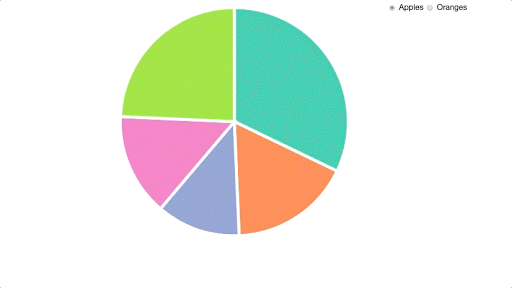
We’re creating something completely new, but it has a lot in common with a regular pie chart, so I took a quick look on bl.ocks.org, and I decided to go with this classic implementation by Mike Bostock, one of the creators of D3. This file has probably been copied thousands of times already, and the guy who wrote it is a real wizard with JavaScript, so we can be sure that we’re starting with a nice block of code already.
This file is written in D3 V3, which is now two versions out of date, since version 5 was finally released last month. A big change in D3 V4 was that the library switched to using a flat namespace, so that scale functions like d3.scale.ordinal() are written like d3.scaleOrdinal() instead. In version 5, the biggest change was that data loading functions are now structured as Promises, which makes it easier to handle multiple datasets at once.
To avoid confusion, I’ve already gone through the trouble of creating an updated V5 version of this code, which I’ve saved on blockbuilder.org. I’ve also converted the syntax to fit with ES6 conventions, such as switching ES5 anonymous functions to arrow functions.
Here’s what we’re starting off with already:
I then copied these files into my working directory, and made sure that I could replicate everything on my own machine. If you want to follow along with this tutorial yourself, then you can clone this project from our GitHub repo. You can start with the code in the file starter.html. Please note that you will need a server (such as this one) to run this code, as under the hood it relies on the Fetch API to retrieve the data.
Let me give you a quick rundown of how this code is working.
Walking Through Our Code
First off, we’re declaring a few constants at the top of our file, which we’ll be using to define the size of our pie chart:
const width = 540;
const height = 540;
const radius = Math.min(width, height) / 2;
This makes our code super reusable, since if we ever want to make it bigger or smaller, then we only need to worry about changing these values right here.
Next, we’re appending an SVG canvas to the screen. If you don’t know much about SVGs, then you can think about the canvas as the space on the page that we can draw shapes on. If we try to draw an SVG outside of this area, then it simply won’t show up on the screen:
const svg = d3.select("#chart-area")
  .append("svg")
    .attr("width", width)
    .attr("height", height)
  .append("g")
    .attr("transform", `translate(${width / 2}, ${height / 2})`);
We’re grabbing hold of an empty div with the ID of chart-area with a call to d3.select(). We’re also attaching an SVG canvas with the d3.append() method, and we’re setting some dimensions for its width and height using the d3.attr() method.
We’re also attaching an SVG group element to this canvas, which is a special type of element that we can use to structure elements together. This allows us to shift our entire visualization into the center of the screen, using the group element’s transform attribute.
After that, we’re setting up a default scale that we’ll be using to assign a new color for every slice of our pie:
const color = d3.scaleOrdinal(["#66c2a5", "#fc8d62", "#8da0cb","#e78ac3", "#a6d854", "#ffd92f"]);
Next, we have a few lines that set up D3’s pie layout:
const pie = d3.pie()
  .value(d => d.count)
  .sort(null);
In D3, layouts are special functions that we can call on a set of data. A layout function takes in an array of data in a particular format, and spits out a transformed array with some automatically generated values, which we can then do something with.
We then need to define a path generator that we can use to draw our arcs. Path generators allow us to draw path SVGs in a web browser. All that D3 really does is to associate pieces of data with shapes on the screen, but in this case, we want to define a more complicated shape than just a simple circle or square. Path SVGs work by defining a route for a line to be drawn between, which we can define with its d attribute.
Here’s what this might look like:
<svg width="190" height="160">
  <path d="M10 80 C 40 10, 65 10, 95 80 S 150 150, 180 80" stroke="black" fill="transparent"/>
</svg>

The d attribute contains a special encoding that lets the browser draw the path that we want. If you really want to know what this string means, you can find out about it in MDN’s SVG documentation. For programming in D3, we don’t really need to know anything about this special encoding, since we have generators that will spit out our d attributes for us, which we just need to initialize with some simple parameters.
For an arc, we need to give our path generator an innerRadius and an outerRadius value in pixels, and the generator will sort out the complex maths that goes into calculating each of the angles for us:
const arc = d3.arc()
  .innerRadius(0)
  .outerRadius(radius);
For our chart, we’re using a value of zero for our innerRadius, which gives us a standard pie chart. However, if we wanted to draw a donut chart instead, then all we would need to do is plug in a value that’s smaller than our outerRadius value.
After a couple of function declarations, we’re loading in our data with the d3.json() function:
d3.json("data.json", type).then(data => {
  // Do something with our data
});
In D3 version 5.x, a call to d3.json() returns a Promise, meaning that D3 will fetch the contents of the JSON file that it finds at the relative path that we give it, and execute the function that we’re calling in the then() method once it’s been loaded in. We then have access to the object that we’re looking at in the data argument of our callback.
We’re also passing in a function reference here — type — which is going to convert all of the values that we’re loading in into numbers, which we can work with later:
function type(d) {
  d.apples = Number(d.apples);
  d.oranges = Number(d.oranges);
  return d;
}
If we add a console.log(data); statement to the top our d3.json callback, we can take a look at the data that we’re now working with:
{apples: Array(5), oranges: Array(5)}
  apples: Array(5)
    0: {region: "North", count: "53245"}
    1: {region: "South", count: "28479"}
    2: {region: "East", count: "19697"}
    3: {region: "West", count: "24037"}
    4: {region: "Central", count: "40245"}
  oranges: Array(5)
    0: {region: "North", count: "200"}
    1: {region: "South", count: "200"}
    2: {region: "East", count: "200"}
    3: {region: "West", count: "200"}
    4: {region: "Central", count: "200"}
Our data is split into two different arrays here, representing our data for apples and oranges, respectively.
With this line, we’re going to switch the data that we’re looking at whenever one of our radio buttons gets clicked:
d3.selectAll("input")
  .on("change", update);
We’ll also need to call the update() function on the first run of our visualization, passing in an initial value (with our “apples” array).
update("apples");
Let’s take a look at what our update() function is doing. If you’re new to D3, this might cause some confusion, since it’s one of the most difficult parts of D3 to understand …
function update(value = this.value) {
  // Join new data
  const path = svg.selectAll("path")
    .data(pie(data[value]));

  // Update existing arcs
  path.transition().duration(200).attrTween("d", arcTween);

  // Enter new arcs
  path.enter().append("path")
    .attr("fill", (d, i) => color(i))
    .attr("d", arc)
    .attr("stroke", "white")
    .attr("stroke-width", "6px")
    .each(function(d) { this._current = d; });
}
Firstly, we’re using a default function parameter for value. If we’re passing in an argument to our update() function (when we’re running it for the first time), we’ll use that string, or otherwise we’ll get the value that we want from the click event of our radio inputs.
We’re then using the General Update Pattern in D3 to handle the behavior of our arcs. This usually involves performing a data join, exiting old elements, updating existing elements on the screen, and adding in new elements that were added to our data. In this example, we don’t need to worry about exiting elements, since we always have the same number of pie slices on the screen.
First off, there’s our data join:
// JOIN
const path = svg.selectAll("path")
  .data(pie(data[val]));
Every time our visualization updates, this associates a new array of data with our SVGs on the screen. We’re passing our data (either the array for “apples” or “oranges”) into our pie() layout function, which is computing some start and end angles, which can be used to draw our arcs. This path variable now contains a special virtual selection of all of the arcs on the screen.
Next, we’re updating all of the SVGs on the screen that still exist in our data array. We’re adding in a transition here — a fantastic feature of the D3 library — to spread these updates over 200 milliseconds:
// UPDATE
path.transition().duration(200)
  .attrTween("d", arcTween);
We’re using the attrTween() method on the d3.transition() call to define a custom transition that D3 should use to update the positions of each of its arcs (transitioning with the d attribute). We don’t need to do this if we’re trying to add a transition to most of our attributes, but we need to do this for transitioning between different paths. D3 can’t really figure out how to transition between custom paths, so we’re using the arcTween() function to let D3 know how each of our paths should be drawn at every moment in time.
Here’s what this function looks like:
function arcTween(a) {
  const i = d3.interpolate(this._current, a);
  this._current = i(1);
  return t => arc(i(t));
}
We’re using d3.interpolate() here to create what’s called an interpolator. When we call the function that we’re storing in the i variable with a value between 0 and 1, we’ll get back a value that’s somewhere between this._current and a. In this case, this._current is an object that contains the start and end angle of the pie slice that we’re looking at, and a represents the new datapoint that we’re updating to.
Once we have the interpolator set up, we’re updating the this._current value to contain the value that we’ll have at the end (i(a)), and then we’re returning a function that will calculate the path that our arc should contain, based on this t value. Our transition will run this function on every tick of its clock (passing in an argument between 0 and 1), and this code will mean that our transition will know where our arcs should be drawn at any point in time.
Finally, our update() function needs to add in new elements that weren’t in the previous array of data:
// ENTER
path.enter().append("path")
  .attr("fill", (d, i) => color(i))
  .attr("d", arc)
  .attr("stroke", "white")
  .attr("stroke-width", "6px")
  .each(function(d) { this._current = d; });
This block of code will set the initial positions of each of our arcs, the first time that this update function is run. The enter() method here gives us all the elements in our data that need to be added to the screen, and then we can loop over each of these elements with the attr() methods, to set the fill and position of each of our arcs. We’re also giving each of our arcs a white border, which makes our chart look a little neater. Finally, we’re setting the this._current property of each of these arcs as the initial value of the item in our data, which we’re using in the arcTween() function.
Don’t worry if you can’t follow exactly how this is working, as it’s a fairly advanced topic in D3. The great thing about this library is that you don’t need to know all of its inner workings to create some powerful stuff with it. As long as you can understand the bits that you need to change, then it’s fine to abstract some of the details that aren’t completely essential.
That brings us to the next step in the process …
Adapting Code
Now that we have some code in our local environment, and we understand what it’s doing, I’m going to switch out the data that we’re looking at, so that it works with the data that we’re interested in.
I’ve included the data that we’ll be working with in the data/ folder of our project. Since this new incomes.csv file is in a CSV format this time (it’s the kind of file that you can open with Microsoft Excel), I’m going to use the d3.csv() function, instead of the d3.json() function:
d3.csv("data/incomes.csv").then(data => {
  ...
});
This function does basically the same thing as d3.json() — converting our data into a format that we can use. I’m also removing the type() initializer function as the second argument here, since that was specific to our old data.
If you add a console.log(data) statement to the top of the d3.csv callback, you’ll be able to see the shape of the data we’re working with:
(50) [{…}, {…}, {…}, {…}, {…}, {…}, {…} ... columns: Array(9)]
  0:
    1: "12457"
    2: "32631"
    3: "56832"
    4: "92031"
    5: "202366"
    average: "79263"
    top: "350870"
    total: "396317"
    year: "2015"
  1: {1: "11690", 2: "31123", 3: "54104", 4: "87935", 5: "194277", year: "2014", top: "332729", average: "75826", total: "379129"}
  2: {1: "11797", 2: "31353", 3: "54683", 4: "87989", 5: "196742", year: "2013", top: "340329", average: "76513", total: "382564"}
  ...
We have an array of 50 items, with each item representing a year in our data. For each year, we then have an object, with data for each of the five income groups, as well as a few other fields. We could create a pie chart here for one of these years, but first we’ll need to shuffle around our data a little, so that it’s in the right format. When we want to write a data join with D3, we need to pass in an array, where each item will be tied to an SVG.
Recall that, in our last example, we had an array with an item for every pie slice that we wanted to display on the screen. Compare this to what we have at the moment, which is an object with the keys of 1 to 5 representing each pie slice that we want to draw.
To fix this, I’m going to add a new function called prepareData() to replace the type() function that we had previously, which will iterate over every item of our data as it’s loaded:
function prepareData(d){
  return {
    name: d.year,
    average: parseInt(d.average),
    values: [
      {
        name: "first",
        value: parseInt(d["1"])
      },
      {
        name: "second",
        value: parseInt(d["2"])
      },
      {
        name: "third",
        value: parseInt(d["3"])
      },
      {
        name: "fourth",
        value: parseInt(d["4"])
      },
      {
        name: "fifth",
        value: parseInt(d["5"])
      }
    ]
  }
}

d3.csv("data/incomes.csv", prepareData).then(data => {
    ...
});
For every year, this function will return an object with a values array, which we’ll pass into our data join. We’re labelling each of these values with a name field, and we’re giving them a numerical value based on the income values that we had already. We’re also keeping track of the average income in each year for comparison.
At this point, we have our data in a format that we can work with:
(50) [{…}, {…}, {…}, {…}, {…}, {…}, {…} ... columns: Array(9)]
  0:
  average: 79263
  name: "2015"
  values: Array(5)
    0: {name: "first", value: 12457}
    1: {name: "second", value: 32631}
    2: {name: "third", value: 56832}
    3: {name: "fourth", value: 92031}
    4: {name: "fifth", value: 202366}
  1: {name: "2014", average: 75826, values: Array(5)}
  2: {name: "2013", average: 76513, values: Array(5)}
  ...
I’ll start off by generating a chart for the first year in our data, and then I’ll worry about updating it for the rest of the years.
At the moment, our data starts in the year 2015 and ends in the year 1967, so we’ll need to reverse this array before we do anything else:
d3.csv("data/incomes.csv", prepareData).then(data => {
  data = data.reverse();
  ...
});
Unlike a normal pie chart, for our graph, we want to fix the angles of each of our arcs, and just have the radius change as our visualization updates. To do this, we’ll change the value() method on our pie layout, so that each pie slice always gets the same angles:
const pie = d3.pie()
  .value(1)
  .sort(null);
Next, we’ll need to update our radius every time our visualization updates. To do this, we’ll need to come up with a scale that we can use. A scale is a function in D3 that takes an input between two values, which we pass in as the domain, and then spits out an output between two different values, which we pass in as the range. Here’s the scale that we’ll be using:
d3.csv("data/incomes.csv", prepareData).then(data => {
  data = data.reverse();
  const radiusScale = d3.scaleSqrt()
    .domain([0, data[49].values[4].value])
    .range([0, Math.min(width, height) / 2]);
  ...
});
We’re adding this scale as soon as we have access to our data and we’re saying that our input should range between 0 and the largest value in our dataset, which is the income from the richest group in the last year in our data (data[49].values[4].value). For the domain, we’re setting the interval that our output value should range between.
This means that an input of zero should give us a pixel value of zero, and an input of the largest value in our data should give us a value of half the value of our width or height — whichever is smaller.
Notice that we’re also using a square root scale here. The reason we’re doing this is that we want the area of our pie slices to be proportional to the income of each of our groups, rather than the radius. Since area = πr2, we need to use a square root scale to account for this.
We can then use this scale to update the outerRadius value of our arc generator inside our update() function:
function update(value = this.value) {
  arc.outerRadius(d => radiusScale(d.data.value));
  ...
});
Whenever our data changes, this will edit the radius value that we want to use for each of our arcs.
We should also remove our call to outerRadius when we initially set up our arc generator, so that we just have this at the top of our file:
const arc = d3.arc()
  .innerRadius(0);
Finally, we need to make a few edits to this update() function, so that everything matches up with our new data:
function update(data) {
  arc.outerRadius(d => radiusScale(d.data.value));

  // JOIN
  const path = svg.selectAll("path")
    .data(pie(data.values));

  // UPDATE
  path.transition().duration(200).attrTween("d", arcTween);

  // ENTER
  path.enter().append("path")
    .attr("fill", (d, i) => color(i))
    .attr("d", arc)
    .attr("stroke", "white")
    .attr("stroke-width", "2px")
    .each(function(d) { this._current = d; });
}
Since we’re not going to be using our radio buttons anymore, I’m just passing in the year-object that we want to use by calling:
// Render the first year in our data
update(data[0]);
Finally, I’m going to remove the event listener that we set for our form inputs. If all has gone to plan, we should have a beautiful-looking chart for the first year in our data:
Making it Dynamic
The next step is to have our visualization cycle between different years, showing how incomes have been changing over time. We’ll do this by adding in call to JavaScript’s setInterval() function, which we can use to execute some code repeatedly:
d3.csv("data/incomes.csv", prepareData).then(data => {
  ...

  function update(data) {
    ...
  }

  let time = 0;
  let interval = setInterval(step, 200);

  function step() {
    update(data[time]);
    time = (time == 49) ? 0 : time + 1;
  }

  update(data[0]);
});
We’re setting up a timer in this time variable, and every 200ms, this code will run the step() function, which will update our chart to the next year’s data, and increment the timer by 1. If the timer is at a value of 49 (the last year in our data), it will reset itself. This now gives us a nice loop that will run continuously:
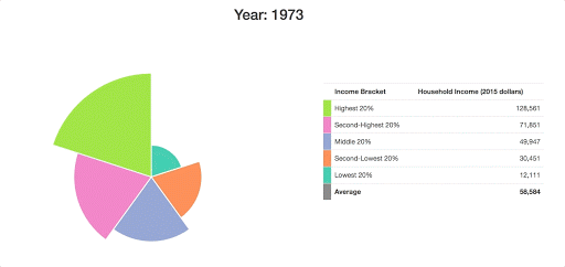
To makes things a little more useful. I’ll also add in some labels that give us the raw figures. I’ll replace all of the HTML code in the body of our file with this:
<h2>Year: <span id="year"></span></h2>

<div class="container" id="page-main">
  <div class="row">
    <div class="col-md-7">
      <div id="chart-area"></div>
    </div>

    <div class="col-md-5">
      <table class="table">
        <tbody>
          <tr>
            <th></th>
            <th>Income Bracket</th>
            <th>Household Income (2015 dollars)</th>
          </tr>
          <tr>
            <td id="leg5"></td>
            <td>Highest 20%</td>
            <td class="money-cell"><span id="fig5"></span></td>
          </tr>
          <tr>
            <td id="leg4"></td>
            <td>Second-Highest 20%</td>
            <td class="money-cell"><span id="fig4"></span></td>
          </tr>
          <tr>
            <td id="leg3"></td>
            <td>Middle 20%</td>
            <td class="money-cell"><span id="fig3"></span></td>
          </tr>
          <tr>
            <td id="leg2"></td>
            <td>Second-Lowest 20%</td>
            <td class="money-cell"><span id="fig2"></span></td>
          </tr>
          <tr>
            <td id="leg1"></td>
            <td>Lowest 20%</td>
            <td class="money-cell"><span id="fig1"></span></td>
          </tr>
        </tbody>
        <tfoot>
          <tr>
            <td id="avLeg"></td>
            <th>Average</th>
            <th class="money-cell"><span id="avFig"></span></th>
          </tr>
        </tfoot>
      </table>
    </div>
  </div>
</div>
We’re structuring our page here using Bootstrap’s grid system, which lets us neatly format our page elements into boxes.
I’ll then update all of this with jQuery whenever our data changes:
function updateHTML(data) {
  // Update title
  $("#year").text(data.name);

  // Update table values
  $("#fig1").html(data.values[0].value.toLocaleString());
  $("#fig2").html(data.values[1].value.toLocaleString());
  $("#fig3").html(data.values[2].value.toLocaleString());
  $("#fig4").html(data.values[3].value.toLocaleString());
  $("#fig5").html(data.values[4].value.toLocaleString());
  $("#avFig").html(data.average.toLocaleString());
}

d3.csv("data/incomes.csv", prepareData).then(data => {
  ...
  function update(data) {
    updateHTML(data);
    ...
  }
  ...
}
I’ll also make a few edits to the CSS at the top of our file, which will give us a legend for each of our arcs, and also center our heading:
<style>
  #chart-area svg {
    margin:auto;
    display:inherit;
  }

  .money-cell { text-align: right; }
  h2 { text-align: center; }

  #leg1 { background-color: #66c2a5; }
  #leg2 { background-color: #fc8d62; }
  #leg3 { background-color: #8da0cb; }
  #leg4 { background-color: #e78ac3; }
  #leg5 { background-color: #a6d854; }
  #avLeg { background-color: grey; }


  @media screen and (min-width: 768px) {
    table { margin-top: 100px; }
  }
</style>
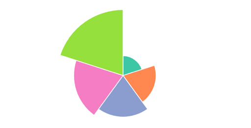
What we end up with is something rather presentable:
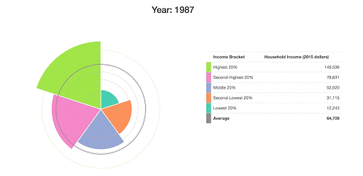
Since it’s pretty tough to see how these arcs have changed over time here, I want to add in some grid lines to show what the income distribution looked like in the first year of our data:
d3.csv("data/incomes.csv", prepareData).then(data => {
  ...
  update(data[0]);

  data[0].values.forEach((d, i) => {
    svg.append("circle")
      .attr("fill", "none")
      .attr("cx", 0)
      .attr("cy", 0)
      .attr("r", radiusScale(d.value))
      .attr("stroke", color(i))
      .attr("stroke-dasharray", "4,4");
  });
});
I’m using the Array.forEach() method to accomplish this, although I could have also gone with D3’s usual General Update Pattern again (JOIN/EXIT/UPDATE/ENTER).
I also want to add in a line to show the average income in the US, which I’ll update every year. First, I’ll add the average line for the first time:
d3.csv("data/incomes.csv", prepareData).then(data => {
  ...

  data[0].values.forEach((d, i) => {
    svg.append("circle")
      .attr("fill", "none")
      .attr("cx", 0)
      .attr("cy", 0)
      .attr("r", radiusScale(d.value))
      .attr("stroke", color(i))
      .attr("stroke-dasharray", "4,4");
  });

  svg.append("circle")
    .attr("class", "averageLine")
    .attr("fill", "none")
    .attr("cx", 0)
    .attr("cy", 0)
    .attr("stroke", "grey")
    .attr("stroke-width", "2px");
});
Then I’ll update this at the end of our update() function whenever the year changes:
function update(data) {
  ...
  svg.select(".averageLine").transition().duration(200)
    .attr("r", radiusScale(data.average));
}
I should note that it’s important for us to add each of these circles after our first call to update(), because otherwise they’ll end up being rendered behind each of our arc paths (SVG layers are determined by the order in which they’re added to the screen, rather than by their z-index).
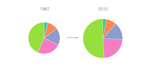
At this point, we have something that conveys the data that we’re working with a bit more clearly:
Making it Interactive
As a last step, I want us to add in some controls to let the user dig down into a particular year. I want to add in a Play/Pause button, as well as a year slider, allowing the user to pick a particular date to look at.
Here’s the HTML that I’ll use to add these elements onto the screen:
<div class="container" id="page-main">
  <div id="controls" class="row">
    <div class="col-md-12">
      <button id="play-button" class="btn btn-primary">Play</button>
      <div id="slider-div">
        <label>Year: <span id="year-label"></span></label>
        <div id="date-slider"></div>
      </div>
    </div>
  </div>
  ...
</div>
We’ll need to add some event listeners to both of these elements, to engineer the behavior that we’re looking for.
First off, I want to define the behavior of our Play/Pause button. We’ll need to replace the code that we wrote for our interval earlier to allow us to stop and start the timer with the button. I’ll assume that the visualization starts in a “Paused” state, and that we need to press this button to kick things off.
function update(data) {
  ...

  let time = 0;
  let interval;

  function step() {
    update(data[time]);
    time = (time == 49) ? 0 : time + 1;
  }

  $("#play-button").on("click", function() {
    const button = $(this);
    if (button.text() === "Play"){
      button.text("Pause");
      interval = setInterval(step, 200);
    } else {
      button.text("Play");
      clearInterval(interval);
    }
  });
  ...
}
Whenever our button gets clicked, our if/else block here is going to define a different behavior, depending on whether our button is a “Play” button or a “Pause” button. If the button that we’re clicking says “Play”, we’ll change the button to a “Pause” button, and start our interval loop going. Alternatively, if the button is a “Pause” button, we’ll change its text to “Play”, and we’ll use the clearInterval() function to stop the loop from running.
For our slider, I want to use the slider that comes with the jQuery UI library. I’m including this in our HTML, and I’m going to write a few lines to add this to the screen:
function update(data) {
  ...
  $("#date-slider").slider({
    max: 49,
    min: 0,
    step: 1,
    slide: (event, ui) => {
      time = ui.value;
      update(data[time]);
    }
  });

  update(data[0]);
  ...
}
Here, we’re using the slide option to attach an event listener to the slider. Whenever our slider gets moved to another value, we’re updating our timer to this new value, and we’re running our update() function at that year in our data.
We can add this line at the end of our update() function so that our slider moves along to the right year when our loop is running:
function update(data) {
  ...

  // Update slider position
  $("#date-slider").slider("value", time);
}
I’ll also add in a line to our updateHTML() function (which runs whenever our visualization changes), which can adjust the value of the label based on the current year in the data:
function updateHTML(data) {
  // Update title
  $("#year").text(data.name);

  // Update slider label
  $("#year-label").text(data.name);

  // Update table values
  $("#fig1").html(data.values[0].value.toLocaleString());
  ...
}
I’ll throw in a few more lines to our CSS to make everything look a little neater:
<style>
  ...
  @media screen and (min-width: 768px) {
    table { margin-top: 100px; }
  }

  #page-main { margin-top: 10px; }
  #controls { margin-bottom: 20px; }

  #play-button {
    margin-top: 10px;
    width: 100px;
  }

  #slider-div {
    width:300px;
    float:right;
  }
</style>
And there we have it — our finished product — a fully functioning interactive data visualization, with everything working as expected.

Hopefully, this tutorial demonstrated the real power of D3, letting you create absolutely anything you can imagine.
Getting started with D3 from scratch is always a tough process, but the rewards are worth it. If you want to learn how to create custom visualizations of your own, here are a few online resources that you might find helpful:
- An overview of SitePoint’s D3.js content.
- The introduction to the library on D3’s homepage. This runs through some of the most basic commands, showing you how to make your first few steps in D3.
- “Let’s Make a Bar Chart” by Mike Bostock — the creator of D3 — showing beginners how to make one of the simplest graphs in the library.
- D3.js in Action by Elijah Meeks ($35), which is a solid introductory textbook that goes into a lot of detail.
- D3’s Slack channel is very welcoming to newcomers to D3. It also has a “learning materials” section with a collection of great resources.
- This online Udemy course ($20), which covers everything in the library in a series of video lectures. This is aimed at JavaScript developers, and includes four cool projects.
- The multitude of example visualizations that are available at bl.ocks.org and blockbuilder.org.
- The D3 API Reference, which gives a thorough technical explanation of everything that D3 has to offer.
And don’t forget, if you want to see the finished version of the code that I was using in the article, then you can find it on our GitHub repo.
Frequently Asked Questions (FAQs) on Interactive Data Visualization with JavaScript and D3
What is the significance of D3 in interactive data visualization?
D3, which stands for Data-Driven Documents, is a JavaScript library that is widely used for creating interactive data visualizations. It allows you to bind arbitrary data to a Document Object Model (DOM), and then apply data-driven transformations to the document. D3 is not a monolithic framework that seeks to provide every conceivable feature. Instead, it solves the crux of the problem: efficient manipulation of documents based on data. This avoids proprietary representation and affords extraordinary flexibility, exposing the full capabilities of web standards such as HTML, SVG, and CSS.
How does D3 differ from other JavaScript libraries for data visualization?
D3 is unique because it gives you the flexibility to create data visualizations that are not possible with other libraries. It allows you to directly manipulate the DOM, which means you have complete control over your visualization’s final appearance. D3 also uses a declarative approach, which means you define what you want the end result to look like, and D3 figures out how to get there.
Can I use D3 for large datasets?
Yes, D3 is capable of handling large and complex datasets. It has powerful data manipulation capabilities that allow you to work with data in any format. D3 also has built-in functions for loading data from different sources, making it easier to integrate with your existing data infrastructure.
How can I make my D3 visualizations interactive?
D3 provides several methods for adding interactivity to your visualizations. You can use event listeners to respond to user actions like clicks or mouse movements, and you can use transitions to animate changes in your data. D3 also supports zooming and panning, which can be useful for exploring large datasets.
What are some common use cases for D3?
D3 is used in a wide range of fields, from journalism to science to business. Some common use cases include creating interactive maps, building dynamic charts and graphs, visualizing complex networks, and creating custom data-driven animations.
Do I need to know JavaScript to use D3?
Yes, a basic understanding of JavaScript is necessary to use D3 effectively. D3 is a JavaScript library, so you will need to write JavaScript code to create your visualizations. However, D3’s API is designed to be intuitive and easy to learn, so even if you’re not a JavaScript expert, you can still create powerful visualizations with D3.
Can I use D3 with other JavaScript libraries or frameworks?
Yes, D3 can be used alongside other JavaScript libraries or frameworks. For example, you can use D3 to create the visualization component of a larger application built with a framework like React or Angular.
Is D3 suitable for real-time data visualization?
Yes, D3 is well-suited for real-time data visualization. It has a flexible data update mechanism that allows you to easily update your visualizations as new data comes in. This makes D3 a great choice for applications like dashboards or live data feeds.
How can I learn D3?
There are many resources available for learning D3. The official D3 website has a wealth of documentation and examples, and there are numerous online tutorials and courses that cover D3 in depth. Practice is also key – the more you use D3, the more comfortable you’ll become with its concepts and API.
What are the limitations of D3?
While D3 is a powerful tool, it does have some limitations. It requires a good understanding of JavaScript and web standards, which can be a barrier for beginners. D3 also leaves a lot of decisions up to the developer, which can be overwhelming if you’re not sure where to start. Finally, while D3 is capable of handling large datasets, performance can become an issue with very large or complex visualizations.
 Adam Janes
Adam first fell in love with D3.js as an economics and computer science student at Harvard University. He now works as a data visualization engineer, helping companies from all around the world to find the best ways to display their data. He also teaches an online course on Udemy, offering students a comprehensive introduction to D3 over 93 video lectures. You can get the course for only $20 here.