

In this article, we are going to look at using charts with Angular and ASP.NET Core Web API to visualize the relationship between data.
We’ll use Google Charts to create the visualization. It is a Javascript-based library used for data charting and visualization. We can create various types of charts using user-supplied data with the help of the Google Chart API. These charts are highly interactive and customizable.
Let’s get going.

Configuring the ASP.NET Core Web API
Before we implement the google charts in our Angular app, we need to configure our API to get the data from the database.
Let’s create a model class named Language:
public class Language
{
    public int Id { get; set; }
    public string Name { get; set; }
    public int SpeakersInMillions { get; set; }
}
Let’s use Entity Framework Core to create a table “Languages” using this model class:
public class DataContext : DbContext
{
    public DataContext(DbContextOptions options) : base(options)
    {
    }

    public DbSet<Language> Languages { get; set; }
}
This takes care of the creation of the table. However, it’s still empty.
Let’s create a seeding method to create the required data in the database:
public void SeedData()
{
    var languageData = File.ReadAllText("Data/LanguageSeedData.json");
    var languages = JsonSerializer.Deserialize<List<Language>>(languageData);

    if (!_context.Languages.Any())
    {
        _context.Languages.AddRange(languages);
    }

    _context.SaveChanges();
}
Now, let’s call the method SeedData() at the application startup so that we have some data in our database as soon as the application starts:
using (var scope = app.Services.CreateScope())
{
    var dataContext = scope.ServiceProvider.GetRequiredService<DataContext>();
    dataContext.Database.Migrate();

    new Seed(dataContext).SeedData();
}
The final step towards having our API ready to send data is to add a controller.
Let’s add a method named GetLanguageStats() in the LanguagesController that returns a 200 status code with a list of Language objects as a response when languageStats does exist:
[HttpGet("[action]")]
public IActionResult GetLanguageStats()
{
    var languageStats = _repo.GetLanguages().ToList();

    if (languageStats != null && languageStats.Count > 0)
        return Ok(languageStats);

    return BadRequest();
}
We can now receive the data from this method into our Angular application.
Configure the Angular Application
Now that we have our API ready to send the language data, let’s start configuring our Angular app to receive the data.
Let’s add a service named LanguageService:
export class LanguageService {
  constructor(private http: HttpClient) {}

  private languageApiUrl = environment.apiUrl + 'languages/GetLanguageStats';

  GetLanguageStatistics() {
    return this.http.get<any>(this.languageApiUrl).pipe(
      map((result) => {
        return result;
      })
    );
  }
}
This class uses HttpClientModule to establish communication and retrieve the data from the Web API.
At this point, we have been able to fill the database table with data, use our ASP.NET Core Web API to retrieve that data, and have an HTTP request in the service to get the data to our Angular application.
Display the Data From the API on the UI
We have an open-source Angular-based wrapper for Google Charts called angular-google-charts that we’ll use in our application for the Google Charts visualizations.
To use the module, let’s first install it in the src directory of the application:
npm i angular-google-charts
Once installed, we’ll need to import the GoogleChartsModule in the app.module.ts class:
import { GoogleChartsModule } from 'angular-google-charts';

imports: [
   ...
   GoogleChartsModule
],
We can customize the Google Charts using multiple configuration settings:
Title
We use the title property to set the title of the graph. It takes string as a value:
title="Bar Chart"
Type
The type property determines the type of graph for visualizing data. It takes an enum ChartType as the value. The enum has values like AreaChart, BarChart, PieChart, etc.
Data
The data property contains the actual data based on which we populate the graph:
data = [
   ['English', 1132],
   ['Mandarin', 1117],
   ['Hindi', 665],
   ['Spanish', 534],
   ['French', 280],
   ['Arabic', 274]
];
Column Names
The column names property takes an array of strings as its value. This configures the column names to display in the graph:
columnNames = ['Language', 'Speakers (millions)'];
Options
We use the options property to configure other miscellaneous options in the graph:
options = {
  is3D: true
}
Let’s look at the app.component changes to understand the configuration better.
To create a donut chart, we’ll need to make changes in the app.component.ts file:
export class AppComponent implements OnInit {
  pieChart = ChartType.PieChart;

  data: any[] = [];

  columnNames = ['Language', 'Speakers (millions)'];

  width = 600;

  height = 400;

  donutOptions = {
    pieHole: 0.5
  }

  constructor(private languageService: LanguageService) {}

  ngOnInit(): void {
    this.languageService.GetLanguageStatistics().subscribe((result) => {
      this.data = [];

      for (let row in result) {
        this.data.push([
          result[row].name.toString(),
          result[row].speakersInMillions,
        ]);
      }
    });
  }
}
Here, we can inject the LanguageService class as a dependency and call the GetLanguageStatistics() method. In addition to that, we can implement the OnInit interface and subscribe to the result on ngOnInit() and assign the result data to the data property of Google Charts.
And, in the app.component.html file, we provide the configuration settings:
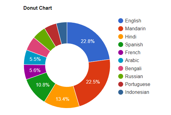
<google-chart
  title="Donut Chart"
  [type]="pieChart"
  [data]="data"
  [columns]="columnNames"
  [width]="width"
  [height]="height"
  [options]="donutOptions"
>
</google-chart>
With the changes applied, we can now see the data visualized as a donut chart:
Commonly Used Charts
Similar to the Pie Chart, Google Charts also provides other types of graphs like Area Chart, Geo Chart, Bar Chart, Column Chart, Histograms, etc.
Let’s look at some of the commonly used graphs:
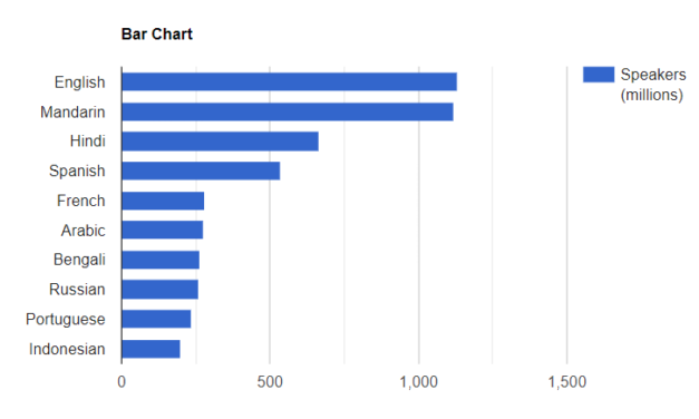
Bar Chart
We use bar charts to visualize comparative data organized into different categories. The y-axis represents the categories and the x-axis represents the numerical values associated with the categories:
<google-chart
  title="Bar Chart"
  [type]="barChart"
  [data]="data"
  [columns]="columnNames"
  [width]="width"
  [height]="height"
>
</google-chart>
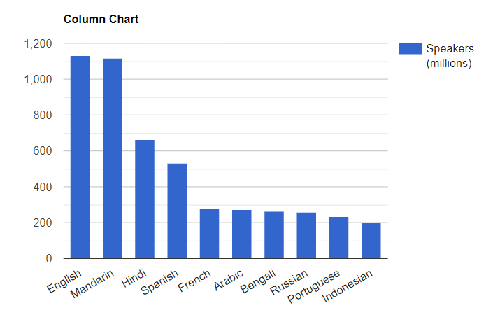
Column Chart
A column chart is similar to bar charts in its mode of data presentation. It is the vertical version of a bar chart where the x-axis represents the categories and the y-axis represents the numerical values of the categories:
<google-chart
  title="Column Chart"
  [type]="columnChart"
  [data]="data"
  [columns]="columnNames"
  [width]="width"
  [height]="height"
>
</google-chart>
Pie Chart
A pie chart breaks the data into parts. Each part (or slice) represents one category and it provides us with the perspective of how each part relates to the whole data:
<google-chart
  title="Pie Chart"
  [type]="pieChart"
  [data]="data"
  [columns]="columnNames"
  [width]="width"
  [height]="height"
>
</google-chart>
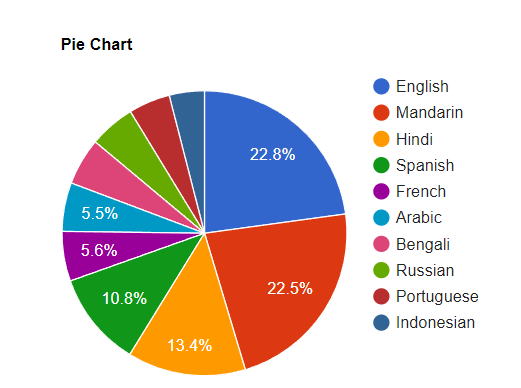
We can also create a 3D pie chart by using is3D: true in the options property of the google-chart component:
options = {
  is3D: true,
};
The donut chart is also a type of pie chart we can create with the pieHole option set to a number between 0 and 1. However, the is3D and pieHole options do not work together and the pieHole option is ignored if we use them together.
Line Chart
We use line charts to show the change in the numerical value of one variable over the progression of the other variable. They are best used to show the trends in data over time and are not necessarily the best choice for categorical data:
<google-chart
  title="Line Chart"
  [type]="lineChart"
  [data]="data"
  [columns]="columnNames"
  [width]="width"
  [height]="height"
>
</google-chart>

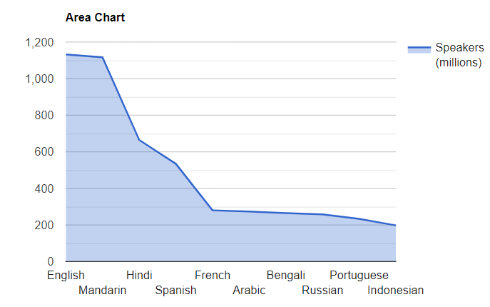
Area Chart
Area charts are a combination of line charts and bar charts. We use them to show how a group’s numerical value changes with the progression of the other variable. These charts, similar to line charts are best used to visualize the change in data over time:
<google-chart
  title="Area Chart"
  [type]="areaChart"
  [data]="data"
  [columns]="columnNames"
  [width]="width"
  [height]="height"
>
</google-chart>
Conclusion
We’ve learned about using Google Charts in an Angular application with ASP.NET Core Web API as the data provider. We made use of the angular-google-charts wrapper to display the charts in our application and went through different types of commonly used charts.
Thanks for the very good article! Is it possible to use angular-google-charts also with a angular 13 application? I am getting an error when trying to install it…
Hello. Well, based on their GitHub repo (PRs https://github.com/FERNman/angular-google-charts/pulls), they are working on the update for Angular 14. So I believe they will have an update soon.