Using Conditional Logic to Improve Form Design and UX

Good form design requires more than user-friendly design decisions related to spacing, font selection, error messages, etc. These things are all important to usability, but let’s look at how conditional logic can take form design to the next level.
I recently moved to a new state and have been doing all the not-so-fun stuff you do when getting settled. DMV visits (ugh). Doctor appointments (major ugh). Trying out different fitness studios (that one’s all right). While they’re all very different activities, one thing is the same across the board: Paperwork.
The problem with these forms is that they’re almost always static PDFs or actual paperwork. In other words, everyone receives the same form. And the provider usually has to highlight the areas they need you to fill out. This creates extra work for them as well as for you as the user.
Website forms aren’t immune to this problem either.
While good design can certainly improve the user experience, sometimes you just can’t get around the tedious nature of forms. That is, unless you use conditional logic when designing your digital forms.
So, that’s what I’d like to look at in this post—the benefits of equipping your forms with conditional logic and some great examples of websites using it today.
Ways To Improve Your Website Forms With Conditional Logic
Conditional logic is a set of IF/THEN statements programmed into the backend of your form. So when a user enters a specific answer, the form will adapt based on the rules you program into it.
You can use conditional logic on pretty much all of your forms (except maybe the login):
- Contact
- Support
- Ecommerce checkout
- Quote requests
- Demo requests
- Event signups
- Digital product downloads
- Appointment scheduling
- Job applications
There are a number of reasons to make your website forms dynamic. Let’s look at some examples.
1. Make the Form Feel More Personal
When your website serves different types of users, it can be hard designing a site that appeals to all of them at once, let alone designing a form that does the same thing.
With forms, though, you don’t have to settle for a one-size-fits-all solution, nor do you need to direct certain users to “skip ahead” so they can focus on the most relevant bits. Conditional logic effectively enables you to design one dynamic form for all segments of users.
Let’s take a look at the quote request form on the Two Men and a Truck website.
After entering some basic contact information, users encounter this question: “How Can We Help You?”
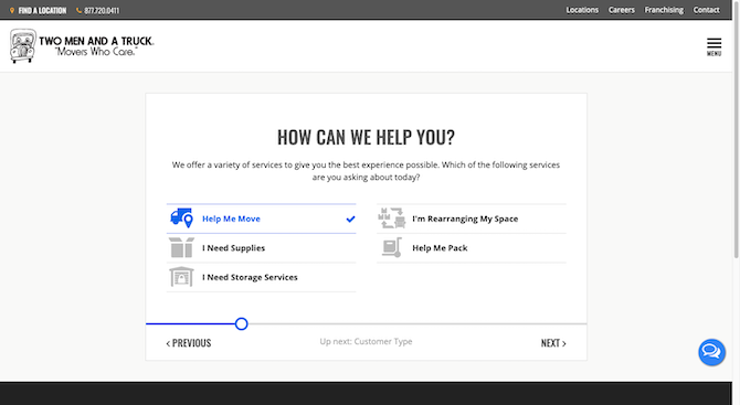
Each service/user segment is clearly defined here. What the user selects will determine what appears on the next screen.
For example, this is what users who need supplies see:
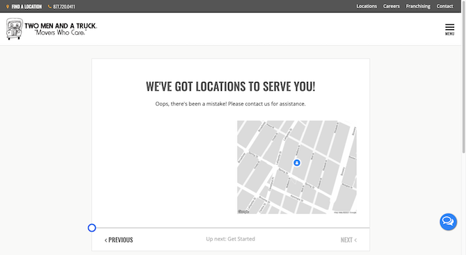
Because I’m not in a location served by this company, I don’t see much. However, users who do will see a map and corresponding location information where they can pick up moving supplies.
Users who instead need help moving will see this screen:
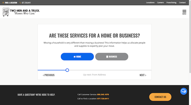
You can see how this form has been designed to carefully segment users. By providing precise answers, they’ll receive a more precise quote in the end.
Users who need help moving out of their home see this screen next:
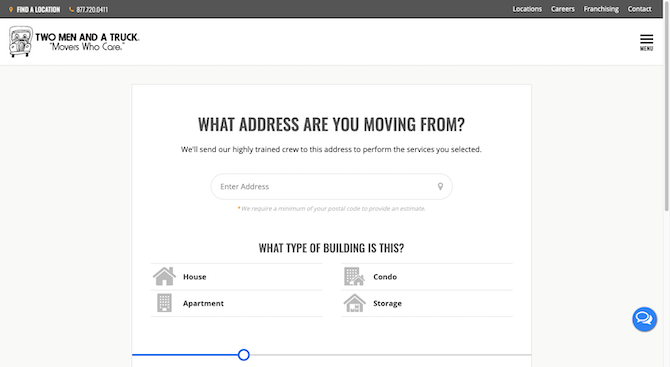
If this had been a business customer, they’d be asked to fill in their company name and email address. Their building choices would be:
- Office
- Warehouse
- Retail
- Storage
So, really, the conditional logic benefits everyone involved. The user fills in questions that help them receive the very best and personalized response (and service). The company also benefits as they don’t have excess fields to sift through. Only the most pertinent details reach their inbox.
2. More Efficiently Handle Customer Inquiries
Conditional logic can do more than just segment your users. It can also be used to organize and route requests to the corresponding department.
For larger companies, this will definitely come in handy. It’s also something to consider when it comes to tech support.
I can’t tell you how many times I’ve had issues with this due to a lack of conditional logic. While an open-ended field might seem like a simple and attractive way to let the user explain what they need, there are very few people qualified to handle every inquiry. Users either end up dealing with someone who doesn’t know what they’re talking about or they get shuffled around amongst team members until they find a solution.
The Kraken cryptocurrency trading app has a great example of how to use conditional logic to head off these kinds of problems:
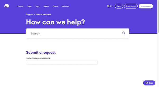
The support form starts out simply enough: “Please choose your issue below.” Once the user selects a category, the form begins to transform:
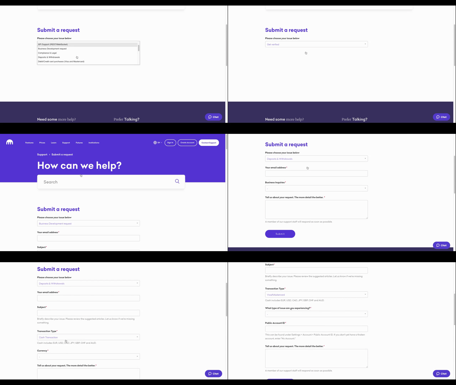
There are a couple of reasons why this is going to lead to a great user experience.
For starters, it’s not an open-ended “What can we do for you?” field. Those suck. Plain and simple. You take all that time filling out the field and then the person who gets back to you ends up asking even more questions.
Secondly, it’s not just one field where conditional logic applies. As the user fills out more and more information, the form transforms even further. This ensures that their issue is properly documented and then routed to the exact person who should be handling it.
3. Get Users Through Your Forms More Quickly
Lengthy forms can be intimidating, especially when you’re expected to get the transaction over and done with in no time at all.
One way to deal with the issue of size and the perceived amount of work associated with it is to break a form into steps and to use a breadcrumb progress bar/navigation at the top.
I think that’s the best solution we have in terms of designing lengthy forms to be more user-friendly. That said, this only really fixes the issue of perception. Conditional logic, on the other hand, allows you to deal with the matter of time and work.
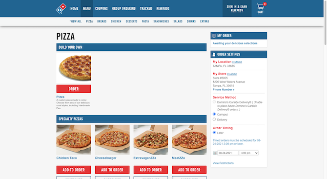
Let’s use Domino’s ordering system as an example of what to do.
When a customer goes to the Pizza ordering page, they see this:
Whether they choose to build their own pizza or one of the specialty pizzas, the next thing they see is the Domino’s Pizza Builder pop-up form:
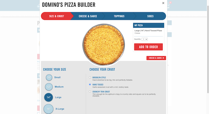
The top of the form is like other multi-step forms with the breadcrumb navigation and the current step highlighted in red. But down below is handled much differently from the typical website form.
In this example, I selected the “Build Your Own” pizza. So it’s not like there are any topping or preparation presets that Domino’s could’ve added to the form for me. Right? Nope.
Rather than force me to make every single choice on every page, the form has already been filled out for me:
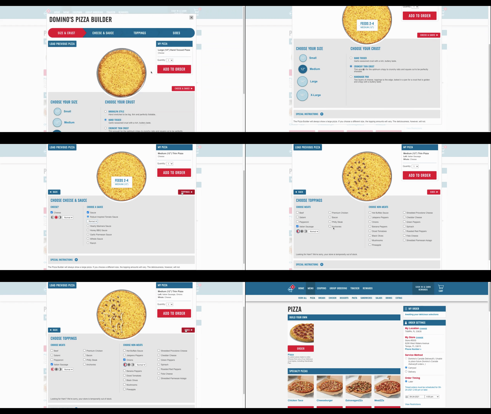
By using conditional logic to load preset selections into the form, there’s less work for the user to do. Not only that, the right presets can make them feel like you’ve taken the time to get to know them. Just make sure the presets are based on data. If the user is logged in, you can program the presets to load based on previous account activity and preferences. If they’re not, just use the most popular selections as the presets.
Obviously, this kind of conditional logic won’t work for forms with open-ended questions. However, ones with lots of multiple choice questions it certainly would.
Wrap-up
As designers and developers, it’s important to consider how the aesthetics of a form can impair or improve usability. However, that’s not the only way to address common form usability issues.
Conditional logic is a really useful tool in improving the website visitor’s experience with forms. Not only will it help you give them a cleaner look, but they can also greatly streamline the process of filling them out. Your clients will love them too as they reduce the amount of extrapolation and administration they have to do when managing the form’s responses.

Suzanne Scacca
A former project manager and web design agency manager, Suzanne Scacca now writes about the changing landscape of design, development and software.

