Introduction
Today, no website is complete without CSS. The user experience is heavily dependent on the CSS applied to the website. Without CSS, the website will look extremely unpleasant. So to make a website attractive and user-friendly, it is necessary to apply top-notch CSS.
Since its introduction in 1996, CSS has changed a lot. Over time CSS has undergone many changes and lots of new features are added to it. Moreover, to make the developer comfortable, CSS frameworks, libraries, and tools are invented. One such tool is styled-components and in this article, we will discuss what are styled-components and how to use them in React.
What is “styled-components”?
In simple terms, “styled-component” is a “CSS-in-JS” solution. It is a library for React that is used to create CSS components in JavaScript. The best feature of styled-components is that the CSS is written in JavaScript only.
Following are the benefits of using styled-components in React:
- styled-components are plain CSS. The syntax used for CSS in styled-components is similar to traditional CSS.
- There is no need to create separate CSS files.
- It automatically removes all the unused CSS.
- It automatically adds vendor prefixes, thus boosting the browser’s performance.
- There is no need to learn anything extra for styled-components.
Using styled-components
Let’s understand the working of styled-components with the help of a simple example.
Observe the following component.
import React, { useState } from "react";
const App = () => {
const [count, setCounter] = useState(0);
return (
<div>
<button onClick={() => setCounter(count + 1)}>Click</button>
<h2>{count}</h2>
</div>
);
};
export default App;
It is a simple component with a div, button, and heading. When the button is clicked, the value inside the heading will increment by one.
This is it looks as of now.

Let’s style this component using styled-components. First, Install styled-components using the Node Package Manager (npm).
npm install styled-components
Create a new file and name it “styles.js”. Though we can use styled-components in the same file, using a separate JavaScript file is recommended.
Before starting, let’s understand the syntax of styled-components.
const <ComponentName> = styled.<ElementName>`
//CSS
`
First, we have to give a name to the component, and then, using “styled” (imported from “styled-components”), the element name will be used. The CSS will be written inside the left quotes.
Let’s start by styling the div.
export const ContainerDiv = styled.div`
text-align: center;
margin: 40px 40px;
padding: 20px 0;
background-color: #e5dede;
`;
The name for the <div> is “ContainerDiv” and inside the left quotes, CSS for it is defined. You can see, that the syntax used for CSS is just like the normal CSS. Let’s add it to the App component.
import React, { useState } from "react";
import { ContainerDiv } from "./styles";
const App = () => {
const [count, setCounter] = useState(0);
return (
<ContainerDiv>
<button onClick={() => setCounter(count + 1)}>Click</button>
<h2>{count}</h2>
</ContainerDiv>
);
};
export default App;
To use the styled component, we need to import it inside the App.js file and then replace the div tag with it. Basically, it is a div tag only but with additional styles.
Let’s check the output.

Similarly, let’s create components for the button and heading.
export const Button = styled.button`
padding: 5px 40px;
color: red;
font-size: 20px;
`;
export const Heading = styled.h2`
font-size: 30px;
color: red;
`;
This is how styles.css looks.
import styled from "styled-components";
export const ContainerDiv = styled.div`
text-align: center;
margin: 40px 40px;
padding: 20px 0;
background-color: #e5dede;
`;
export const Button = styled.button`
padding: 5px 40px;
color: red;
font-size: 20px;
`;
export const Heading = styled.h2`
font-size: 30px;
color: red;
`;
Let’s use them in the App component as well.
import React, { useState } from "react";
import { Button, ContainerDiv, Heading } from "./styles";
const App = () => {
const [count, setCounter] = useState(0);
return (
<ContainerDiv>
<Button onClick={() => setCounter(count + 1)}>Click</Button>
<Heading>{count}</Heading>
</ContainerDiv>
);
};
export default App;
This is how it looks now.
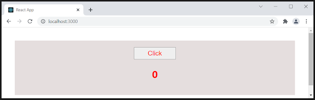
So using the styled-components, we can style HTML elements and create custom components with normal CSS.
Wrapping it up
As mentioned earlier, CSS is very important in modern web development. But using traditional CSS can be tough and time-consuming. The “styled-components” is a very useful tool used to create custom CSS components with minimal effort. There is no need to learn any extra stuff for using styled components. It is just CSS-in-JSS.
- 8 best VS Code extensions for React Developers
- 6 Ways to optimize the performance of React Application
- What is Lifting up the state means in React.js
- What are Higher-Order Components in React
- How to create custom hooks in React.js
- 5 Best React.js courses for beginners
- How to use PropType in React.js with example
- How to use React form using JSX
- What is Context API in React.js with example
- How to use Context and useReducer in state management
- What is render props in React.js with example
- useReducer example in React app
- How to create a dynamic list in React.js with example
No comments:
Post a Comment
Feel free to comment, ask questions if you have any doubt.