The series so far:
- Text Mining and Sentiment Analysis: Introduction
- Text Mining and Sentiment Analysis: Power BI Visualizations
- Text Mining and Sentiment Analysis: Analysis with R
- Text Mining and Sentiment Analysis: Oracle Text
- Text Mining and Sentiment Analysis: Data Visualization in Tableau
- Sentiment Analysis with Python
Previous articles in this series have focused on platforms like Azure Cognitive Services and Oracle Text features to perform the core tasks of Natural Language Processing (NLP) and Sentiment Analysis. These easy-to-use platforms allow users to quickly analyze their text data with easy-to-use pre-built models. Potential drawbacks of this approach include lack of flexibility to customize models, data locality & security concerns, subscription fees, and service availability of the cloud platform. Programming languages like Python and R are convenient when you need to build your models for Natural Language Processing and keep your code as well as data contained within your data centers. This article explains how to do sentiment analysis using Python.
Python is a versatile and modern general-purpose programming language that is powerful, fast, and easy to learn. Python runs on interpreters, making it compatible with multiple platforms, and is widely used in applications for web platforms, graphical interfaces, data science, and machine learning. Python is increasingly gaining popularity in data analysis and is one of the most widely used languages for data science. You can learn more about Python from the official Python Software Foundation website.
Initial setup
This article makes use of Anaconda open-source Individual Edition distribution for demos. It is one of the easiest ways for individual practitioners to work on data science and machine learning with Python. It comes with an easy-to-use interface, and the toolkit enables you to work with thousands of open-source packages and libraries. This section walks through the steps of setting up Anaconda and launching a jupyter notebook.
- Follow this link to the Anaconda website and download the Anaconda Individual Edition that works with your operating system. This demo is built on a Windows 10 machine.
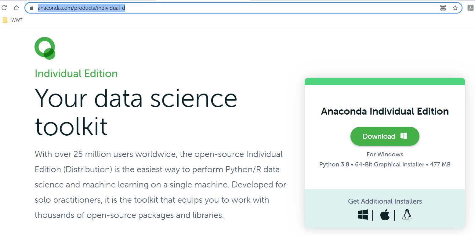
Figure 1. Download Anaconda Individual Edition
- After the download completes, launch the installer and follow prompts to run through the guided installation steps
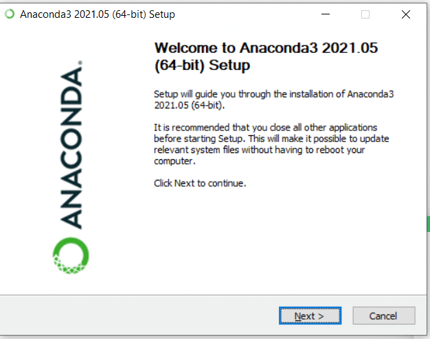
Figure 2. Anaconda Setup guide for installation
- On the Advanced Options screen of this Setup guide, check the box for Add Anaconda3 to my PATH environment variable. While the setup guide doesn’t recommend it for Windows, you may find it useful sometimes to run Anaconda commands from the command line.
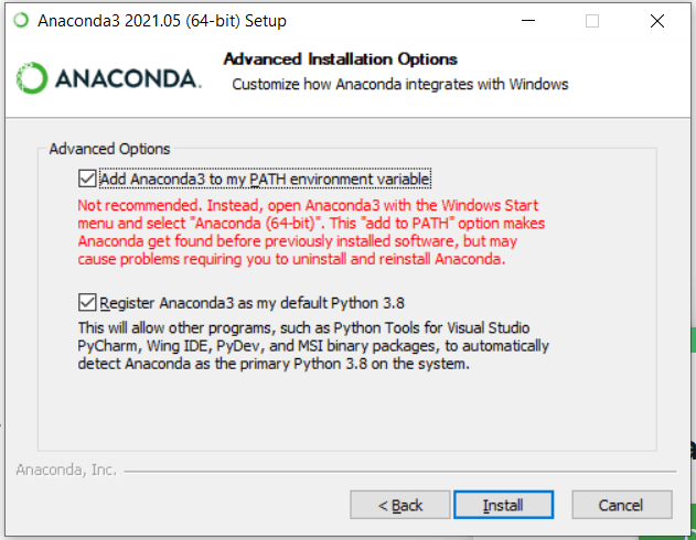
Figure 3. Anaconda setup advanced options
- The installation process takes a few minutes to run. Upon successful completion, you should see the following screen.
Figure 4. Installation complete
- If Anaconda Navigator doesn’t start automatically at this point, then Go to Windows start menu > Anaconda3 > Anaconda Navigator
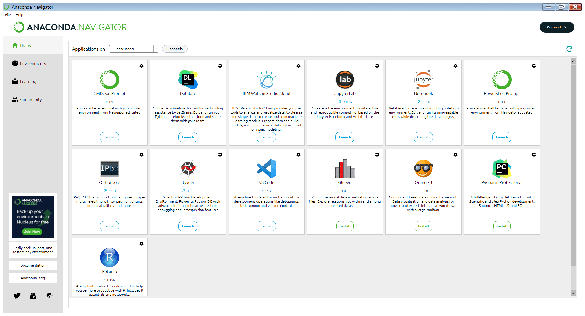
Figure 5. Launch jupyter from Anaconda Navigator
The Anaconda Navigator window presents you with several practical applications. Applications like Spyder and PyCharm are development environments for Python, VS Code is an extensible general-purpose code editor. Jupyter Notebook is an open-source web-based interactive computing notebook environment that allows users to create and share human-readable documents with live code, visualizations, and comments. JupyterLab is Jupyter’s next-generation notebook interface that is flexible and supports a wide range of workflows in data science, machine learning, and scientific computing. This article uses Jupyter Notebook for demos.
- From the Anaconda Navigator window, launch Jupyter Notebook, which opens the root folder in your machine’s default browser
- On the top right side of this screen, click New > Notebook: Python 3
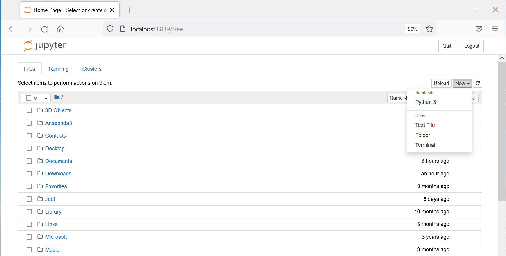
Figure 6. Create a new Python notebook
- The new notebook (file name untitled.ipynb) will open in the same web browser
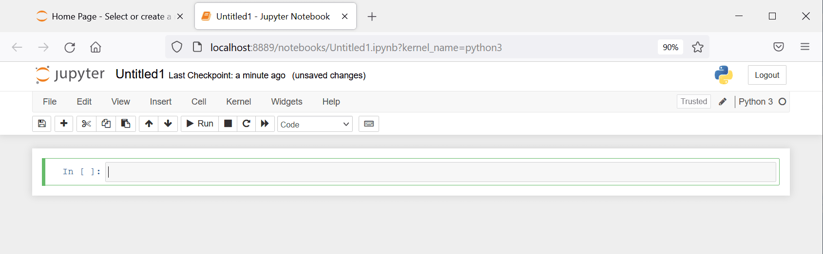
Figure 7. New notebook
- Use this link to download the demo data file from my Github Repository and save it at a convenient location on your machine (this demo data file was used in previous articles of this series)
- If you are new to Jupyter notebooks, I recommend taking a few minutes to familiarize yourself with the interface. Readers may also follow the Beginner’s tutorial to Jupyter Notebook linked in the References section.
Import modules for sentiment analysis
This section introduces readers to Python modules used for sentiment analysis
- The sys module is always available and provides access to variables and functions that interact with the interpreter.
- The re module provides operations for regular expression matching, useful for pattern and string search.
- pandas is one of the most widely used open-source tools for data manipulation and analysis. Developed in 2008, pandas provides an incredibly fast and efficient object with integrated indexing, called DataFrame. It comes with tools for reading and writing data from and to files and SQL databases. It can manipulate, reshape, filter, aggregate, merge, join and pivot large datasets and is highly optimized for performance.
- matplotlib is an easy-to-use, popular and comprehensive library in Python for creating visualizations. It supports basic plots (like line, bar, scatter, etc.), plots of arrays & fields, statistical plots (like histogram, boxplot, violin, etc.), and plots with unstructured coordinates.
- The Natural Language Toolkit, commonly known as NLTK, is a comprehensive open-source platform for building applications to process human language data. It comes with powerful text processing libraries for typical Natural Language Processing (NLP) tasks like cleaning, parsing, stemming, tagging, tokenization, classification, semantic reasoning, etc. NLTK has user-friendly interfaces to several popular corpora and lexical resources Word2Vec, WordNet, VADER Sentiment Lexicon, etc.
- This article uses the VADER lexicon with NLTK’s
SentimentIntensityAnalyzerclass to assign a sentiment score to each comment in the demo dataset. Valence Aware Dictionary and Sentiment Reasoner (VADER) is a lexicon and rule-based sentiment analysis toolset with a focus on sentiments contained in general text applications like online comments, social media posts, and survey responses. Please follow this link to learn more VADER and SentimentIntensityAnalyzer modules of NLTK.
The Code snippet below will load the necessary modules and download the ‘vader_lexicon’ for sentiment analysis. This code also creates a short alias pd for referencing pandas and plt for referencing matplotlib modules later in the code. Copy this code snippet into the first cell of your new jupyter notebook and run it.
|
1 2 3 4 5 6 |
import re import pandas as pd import matplotlib.pyplot as plt import nltk from nltk.sentiment.vader import SentimentIntensityAnalyzer nltk.download('vader_lexicon') |
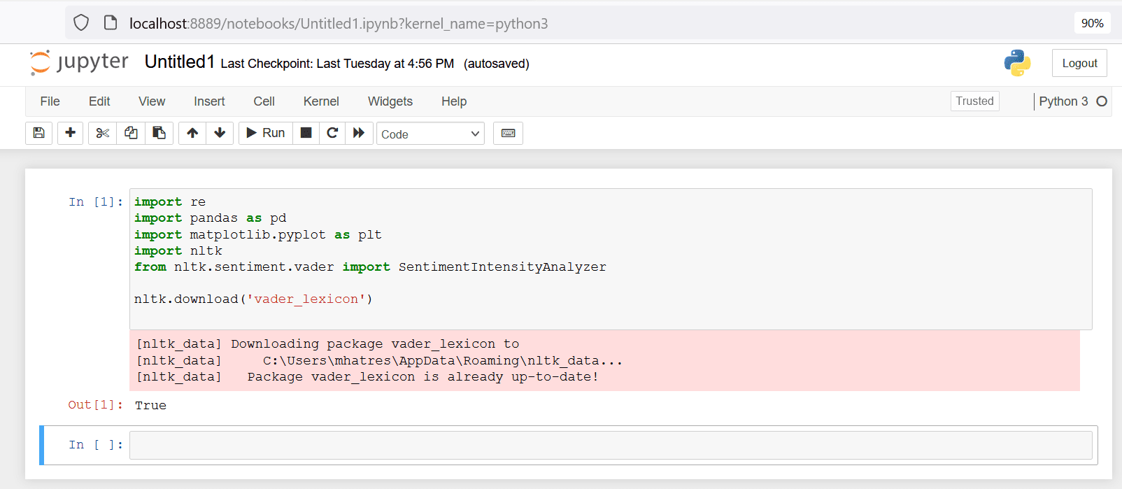
Figure 8. Import relevant modules and download VADER lexicon
Import demo data file and pre-process text
This step uses the read_excel method from pandas to load the demo input datafile into a panda dataframe.
Add a new field row_id to this dataframe by incrementing the in-built index field. This row_id field serves as the unique key for this dataset to uniquely identify a row and will be used later in the code for merging two dataframes.
The code snippet below performs these two tasks and prints the top ten rows of the resulting dataframe. Copy this code snippet into the next cell of your jupyter notebook and run that cell.
|
1 2 3 4 5 6 |
#df = pd.read_excel (r'Path where the Excel file is stored\File name.xlsx') df = pd.read_excel (r'C:\Users\mhatres\Documents\RedGateDemos\SentimentAnalysis\TeamHealthRawDataForDemo.xlsx') # adding an row_id field to the dataframe, which will be useful for joining later df["row_id"] = df.index + 1 #print first 10 rows print (df.head(10)) |
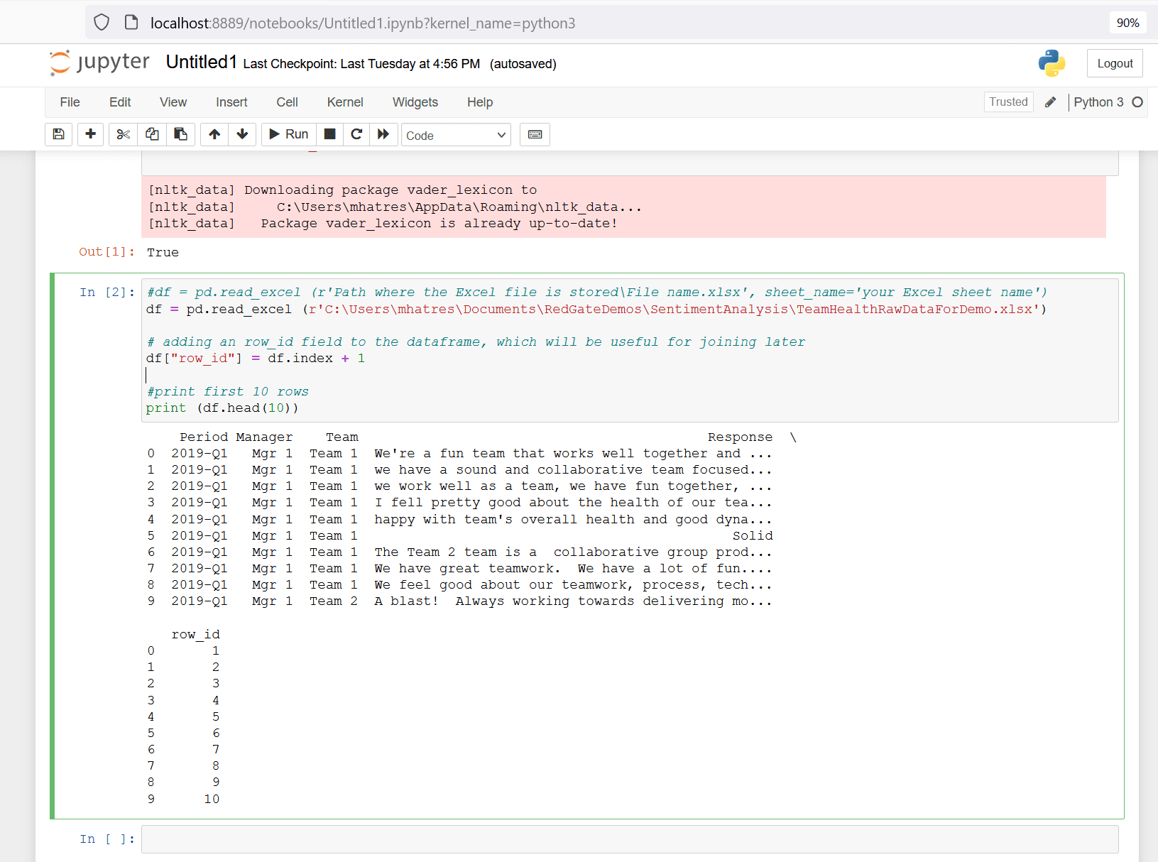
Figure 9. import file into pandas dataframe
The next step will subset row_id and Response fields into a new dataframe, which is the input format required for by the SentimentIntensityAnalyzer class. This step also cleans up the text data by removing all non-alphabet characters and converting all text to lower case.
The code snippet below performs these two tasks and prints the top ten rows of the resulting dataframe. Copy this code snippet into the next cell of your jupyter notebook and run that cell.
|
1 2 3 4 5 6 7 8 |
#create a new data frame with "id" and "comment" fields df_subset = df[['row_id', 'Response']].copy() #data clean-up #remove all non-aphabet characters df_subset['Response'] = df_subset['Response'].str.replace("[^a-zA-Z#]", " ") #covert to lower-case df_subset['Response'] = df_subset['Response'].str.casefold() print (df_subset.head(10)) |
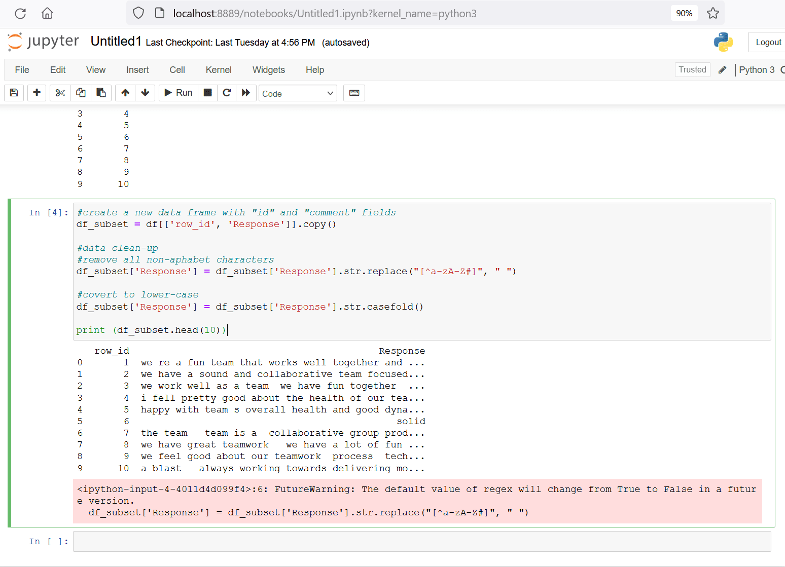
Figure 10. pre-process and format text
Generate sentiment polarity scores
The SentimentIntensityAnalyzer class uses the Valence Aware Dictionary and sEntiment Reasoner (VADER) in NLTK. The sentiment lexicon in VADER is a list of lexical features like words and phrases labeled as positive or negative according to their semantic orientation. Its rule-based approach is especially good at detecting sentiments in common applications like social media posts, product or service reviews, and survey responses.
VADER also generates a numeric score in the range of negative one (-1) to positive one (+1) to indicate the intensity of how negative or positive the sentiment is. This is called the polarity score and is implemented by the polarity_score method of the SentimentIntensityAnalyzer class.
- Polarity score in the range of -1 to -0.5 typically indicates negative sentiment
- Polarity score greater than -0.5 and less than +0.5 typically indicates neutral sentiment
- Polarity score in the range of +0.5 to 1 typically indicates positive sentiment
Run the following code snippet in next cell of your jupyter notebook to create a dataframe for staging the output of the SentimentIntensityAnalyzer.polarity_scores method.
|
1 2 3 4 5 |
# set up empty dataframe for staging output df1=pd.DataFrame() df1['row_id']=['99999999999'] df1['sentiment_type']='NA999NA' df1['sentiment_score']=0 |
The next few steps involve instantiating an object of the class SentimentIntensityAnalyzer and running a for-loop to iterate the polarity_scores method over each row of input text dataframe df_subset. Another for loop is embedded with the earlier loop to write the sentiment polarity score for each sentiment type to an intermediate dataframe. The three sentiment type values are.
- neg for negative sentiment
- neu for neutral sentiment
- pos for positive sentiment
- compound for an overall score that combines negative, positive, and neutral sentiments into a single score.
At the end of the for loop, clean the output dataframe by:
- Deleting the dummy row from the output dataframe
- Removing any duplicate rows that could potentially creep into the output dataframe
- Filtering the output dataframe to only keep rows for sentiment type of compound
The code snippet below performs these tasks and prints the top ten rows of the resulting dataframe. Copy this code snippet into the next cell of your jupyter notebook and run that cell. Depending on the size of your input dataset and machine resources, this step may need a few minutes to complete.
|
1 2 3 4 5 6 7 8 9 10 11 12 13 14 15 16 17 18 |
print('Processing sentiment analysis...') sid = SentimentIntensityAnalyzer() t_df = df1 for index, row in df_subset.iterrows(): scores = sid.polarity_scores(row[1]) for key, value in scores.items(): temp = [key,value,row[0]] df1['row_id']=row[0] df1['sentiment_type']=key df1['sentiment_score']=value t_df=t_df.append(df1) #remove dummy row with row_id = 99999999999 t_df_cleaned = t_df[t_df.row_id != '99999999999'] #remove duplicates if any exist t_df_cleaned = t_df_cleaned.drop_duplicates() # only keep rows where sentiment_type = compound t_df_cleaned = t_df[t_df.sentiment_type == 'compound'] print(t_df_cleaned.head(10)) |
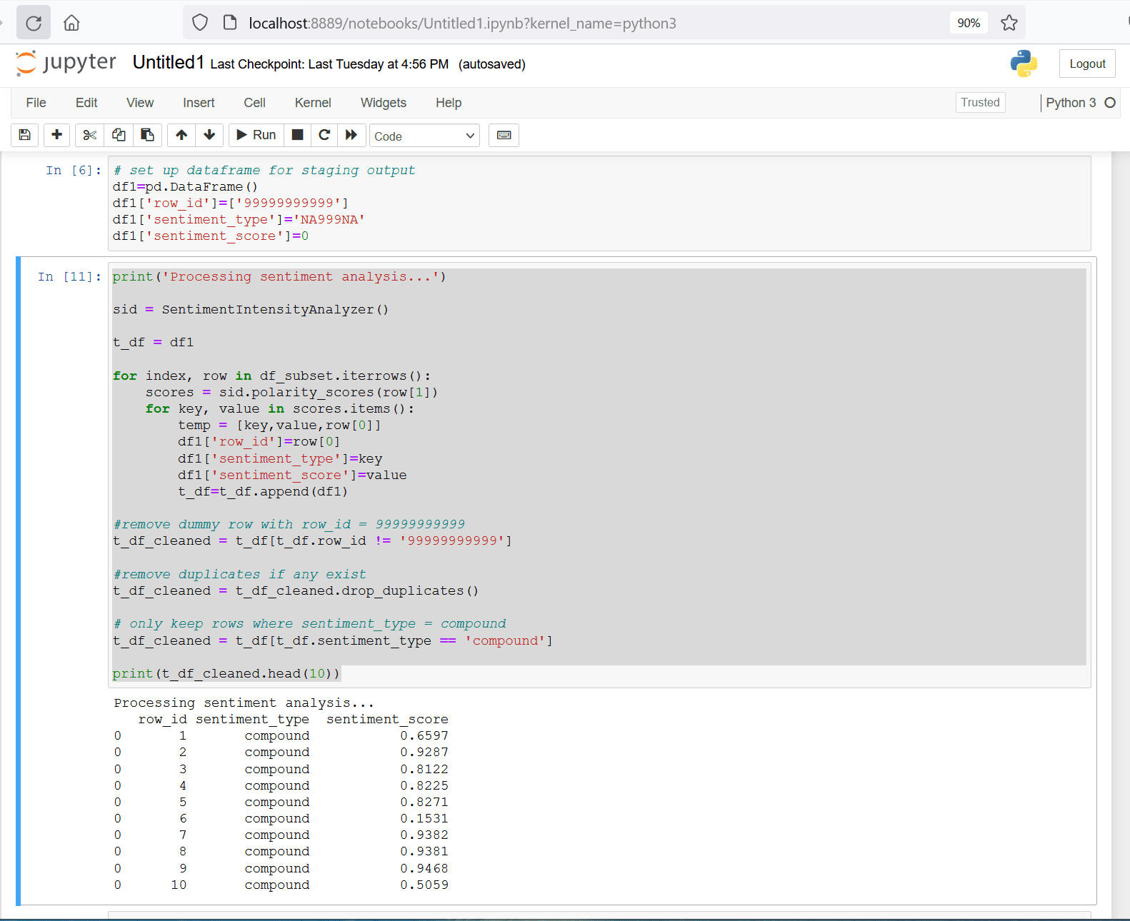
Figure 11. generate sentiment polarity scores and clean the output dataframe
Merge this output dataframe t_df_cleaned with the input dataframe df using the field row_id. This dataframe merge operation in Python is conceptually similar to performing a join on two database tables in SQL. The merged dataframe will have the following fields and one row per survey response.
- Period
- Manager
- Team
- Response
- Row_id
- Sentiment_type
- Sentiment_score
The code snippet below performs this merge operation and prints the top ten rows of the resulting dataframe. Copy this code snippet into the next cell of your jupyter notebook and run that cell.
|
1 2 3 |
#merge dataframes df_output = pd.merge(df, t_df_cleaned, on='row_id', how='inner') print(df_output.head(10)) |
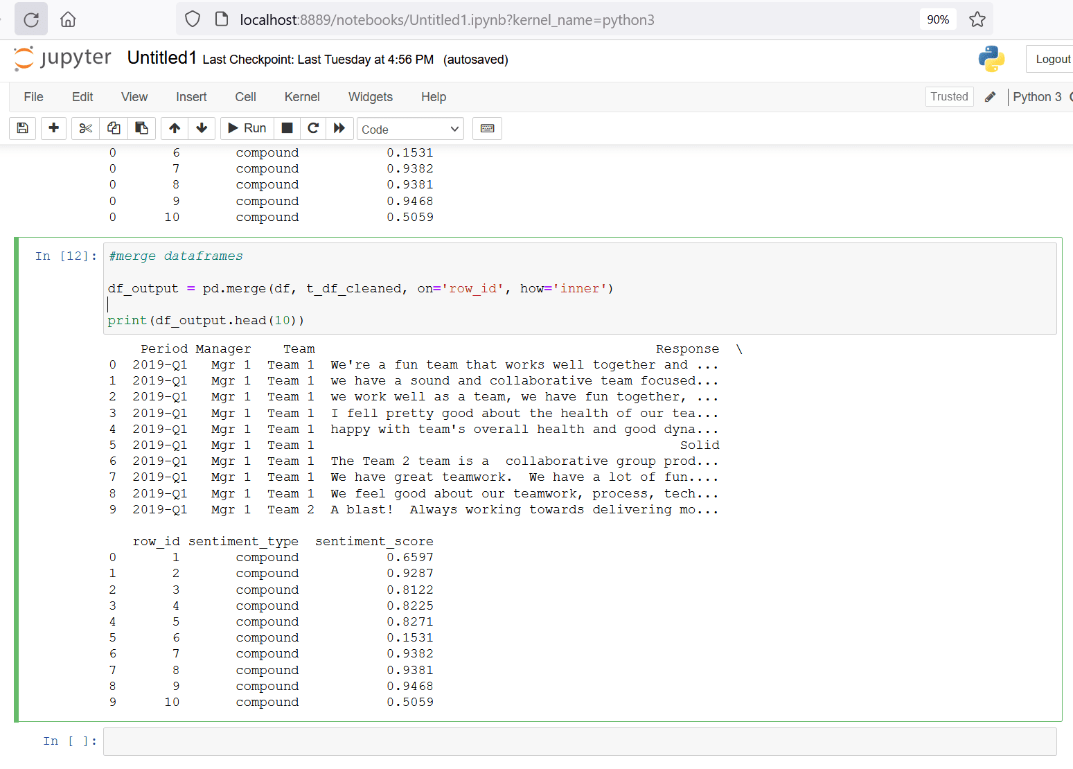
Figure 12. Merge dataframes
Follow this link to learn more about the merge operation in pandas.
Visualize sentiment analysis output
This section will demonstrate how to analyze, visualize, and interpret the sentiment scores generated by the previous steps.
Use the describe method in pandas to generate summary statics of values in the Sentiment_score field. These summary statistics reveal the numerical insights of this dataset using aggregate metrics like count, min, max, median, etc.
The code snippet below generates summary statistics of sentiment_score field of df_output dataframe.
|
1 |
df_output[["sentiment_score"]].describe() |
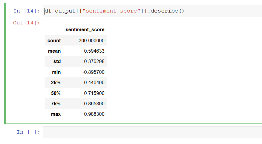
Figure 13. Summary statistics
A quick review of these summary statistics reveals the following insights.
- The
minvalue is -0.895700, which indicates the polarity or intensity of the most negative response is strongly negative (range of sentiment polarity score is -1 to +1) - The
maxvalue is +0.988300, which indicates the polarity or intensity of the most positive response is highly positive (range of sentiment polarity score is -1 to +1) - The
meanvalue is +0.594633 which indicates the average polarity or intensity of sentiment across all responses is in the positive territory.
The next step uses matplotlib to create various charts to analyze the sentiment scores by the available attributes of Period, Team, and Manager.
The responses in this dataset span across four quarters. Identifying how the mean of sentiment score trends over this time period would reveal deeper insights. The following code snippet demonstrates how to plot the mean sentiment score for each quarter (Period on x-axis and mean sentiment score for each period on y-axis). Copy this code snippet into the next cell of your jupyter notebook and run that cell.
|
1 2 3 4 5 |
#generate mean of sentiment_score by period dfg = df_output.groupby(['Period'])['sentiment_score'].mean() #create a bar plot dfg.plot(kind='bar', title='Sentiment Score', ylabel='Mean Sentiment Score', xlabel='Period', figsize=(6, 5)) |
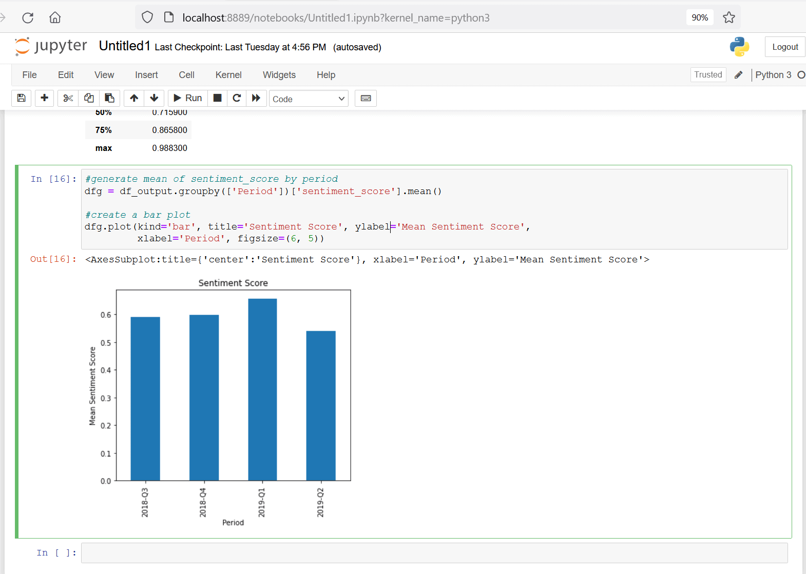
Figure 14. plot mean of sentiment score by period
This bar plot shows the mean sentiment score across all teams
- remained relatively unchanged from 2018-Q3 to 2018-Q4
- improved marginally from 2018-Q4 to 2019-Q1
- decreased in 2019-Q2
This decrease in the last quarter could indicate some employees felt less positive about their team’s health in that quarter. While a decrease in one quarter is certainly not alarming, it could be a Key Performance Indicator (KPI) for managers to watch in future quarters, in case the downward trend continues and needs further investigation.
This dataset includes responses from nine teams. Studying the mean of sentiment scores for each team might reveal interesting insights about how these teams compare against each other. The following code snippet plots the mean sentiment score for each team (Team on x-axis and mean of sentiment score for each team on y-axis). Copy this code snippet into the next cell your jupyter notebook and run that cell.
|
1 2 3 |
dfg = df_output.groupby(['Team'])['sentiment_score'].mean() dfg.plot(kind='bar', title='sentiment_score', ylabel='Mean Sentiment Score', xlabel='Team', figsize=(6, 5)) |
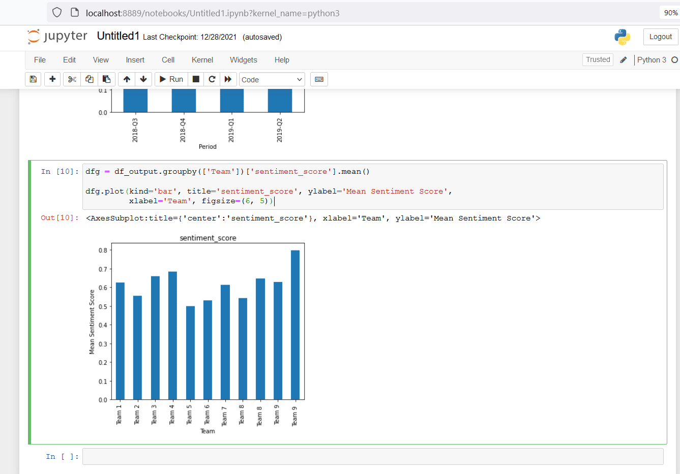
Figure 15. plot mean of sentiment score by Team
This bar plot reveals.
- Team 9 has the highest mean sentiment score, indicating this team seems most healthy over all four quarters, across all nine teams
- Management might want to understand what makes members of Team 9 feel highly positive about their team’s health. These insights might be applicable to other teams to help improve their scores
- Team 5 has the lowest mean sentiment score, indicating this team seems least healthy over all four quarters, across all nine teams
- This insight might encourage the manager of Team 5 to investigate the reasons behind their team’s lower scores and potentially take steps to improve their team’s health.
While the previous two bar charts help uncover interesting insights using the mean sentiment score, averages can sometimes hide nuances in the data. For example, figure 15 shows Team 5 has an average sentiment score of 0.5, which can be interpreted as “neutral”. Is it in the “neutral” range because all team members feel neutral about their team’s health, and there is consensus within this team? Or is it neutral because about half of the team feel strongly positive about their team’s health, and the other half feel strongly negative and the approach of using averages is masking this polarization within the team?
A boxplot, also known as a box and whiskers plot is a great way to learn such insights by studying the center and spread of numerical data. A box plot is a method of graphically depicting groups of numerical data through their quartiles. Box plots may also have lines extending from the boxes (whiskers), indicating variability outside the upper and lower quartiles, hence the terms box-and-whisker plot. It is commonly used in descriptive statistics and is an efficient way of visually displaying data distribution through their quartiles. They take up less space and are very useful when comparing data distribution between groups.
This section uses seaborn to create the boxplot. Seaborn is a popular statistical data visualization library in Python. It’s based on matplotlib and provides easy to use high-level interfaces for creating engaging and information statistical charts. Seaborn is pre-installed in the Anaconda environment used in this demo and available to simply import into the jupyter notebook.
The following code snippet imports the seaborn library and creates the boxplot with these parameters.
- Data set to build the boxplot is specified using parameter
data=df_output - Column for x-axis is specified using parameter
x=’Team’ - Column for x-axis is specified using parameter
y=’sentiment_score’ notch = Trueparameter creates a visual indicator (notch) to quicky identify median values- Outliers are hidden using the parameter
showfliers=False - Title of the chart is set using
set(title='Sentiment Score by Team') - Labels for X and Y axis are set using
plt.xlable()andplt.ylable()methods plt.xticks(rotation=90)orients the Team names vertically along x-axis
Copy this code snippet into the next cell of your jupyter notebook and run that cell.
|
1 2 3 4 5 6 7 8 |
import seaborn as sns #create seaborn boxplots by group sns.boxplot(x='Team', y='sentiment_score', notch = True, data=df_output, showfliers=False).set(title='Sentiment Score by Team') #modify axis labels plt.xlabel('Team') plt.ylabel('Sentiment Score') plt.xticks(rotation=90) |
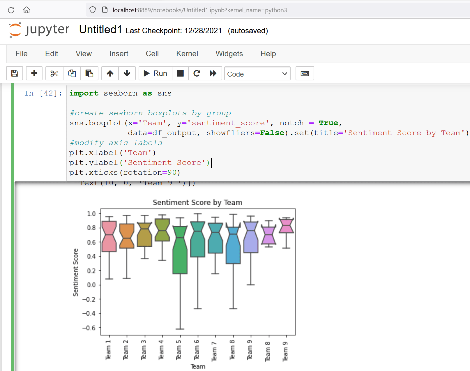
Figure 16. Boxplot
This boxplot reveals interesting insights about how members within each team feel about their team’s health.
- The box for Team 5 is the tallest box, which indicates a wider spread in the sentiment scores of responses from this team. This spread is a sign of polarization within the team, which means some team members feel strongly positive about their team’s health while others feel strongly negative. The manager of Team 5 might be able to use this deep-dive insight, along with their knowledge of each team member’s workload and professional context, to identify and possibly address any concerns impacting their team’s health.
- The box for Team 9 is shortest, indicating a narrow spread of sentiment scores, which means most members of Team 9 feel the same way about their team’s health. The notch indicates a median value of sentiment scores for this team is around 0.8, which is strongly positive.
Conclusion
This article
- Demonstrated Anaconda setup and how to run python scripts with Jupyter notebooks
- Gave an overview of libraries used for the sentiment analysis
- Walked through data loading and clean-up steps
- Described a methodical approach to generate and use sentiment polarity scores
- Created visualizations in python and used them to gain valuable insights
References
- Python – https://www.python.org/
- Anaconda – https://www.anaconda.com/products/individual-d
- Beginner’s tutorial to Jupyter Notebook – https://www.dataquest.io/blog/jupyter-notebook-tutorial/
- Python pandas documentation – https://pandas.pydata.org/docs/index.html
- Natural Language Toolkit (NLTK) – https://www.nltk.org/index.html
- Matplotlib – https://matplotlib.org/stable/index.html
- Pandas documentation for groupby aggregate – https://pandas.pydata.org/docs/reference/api/pandas.core.groupby.DataFrameGroupBy.aggregate.html
- Box and whiskers plot – https://www.statisticshowto.com/probability-and-statistics/descriptive-statistics/box-plot/
- Seaborn for statistical data visualization in Python – https://seaborn.pydata.org/
- Github link to Team Health demo dataset – https://github.com/SQLSuperGuru/SentimentAnalysis/blob/main/TeamHealthRawDataForDemo.xlsx
- Github link to demo jupyter notebook – https://github.com/SQLSuperGuru/SentimentAnalysis/blob/main/Redgate_SentimentAnalysisWithPython_Demo.ipynb

Load comments