
- What Is a Linear Gauge Chart?
- The Four Steps to Building a JavaScript Linear Gauge
- The Steps for Making a JavaScript Linear Gauge
- Defining the Linear Scale and Axis for the Gauge Chart
- Setting the Bar Pointer and the Label
- Creating the LED Pointer and Setting the Color Attribute
- Declaring the Gauges with the Target Value of Each Data Point
- Setting the Layout of the Linear Gauges
- Drawing the Chart
- Making the Chart Accessible
- Customizing the Linear Gauge
- Conclusion
- Frequently Asked Questions (FAQs) on Creating a Linear Gauge Chart in JavaScript
This article presents an easy-to-follow guide for building an interactive linear gauge chart in JavaScript.
We’ll show how to quickly create a cool and interactive linear gauge chart that highlights Covid-19 vaccination data around the world. Our chart will allow us to visualize the status of Covid-19 vaccination at the time of writing, and will display two types of data — showing how far away we are from the halfway target of both partially and fully vaccinating the global population.

What Is a Linear Gauge Chart?
Data visualization is an invaluable tool, given the vast amount of data being created and numerous possibilities for gleaning information from data. Data visualization is particularly useful for identifying trends, interpreting patterns, and communicating complex ideas to the target audience.
A linear gauge chart represents a vertical or horizontal linear scale that shows the required values, with a color scale along with single or multiple pointers. The minimum and maximum values of the data range can be set over the axes according to the data being represented. The pointer position indicates the current value of the metric.
A gauge chart can display a single value or multiple values using an individual pointer or a combination of markers. The pointer can be a needle or a line with a marker of any shape like a circle, square, rectangle or triangle.
The linear gauge chart type is an effective visual representation for displaying how close or far the values are from the desired data point.
Types of linear gauges
The several types of linear gauges are thermometer chart, bullet chart, tank chart and LED chart. The mercury thermometer — consisting of minor ticks that displays the temperature with the pointer value — is a classic example of a linear gauge chart.
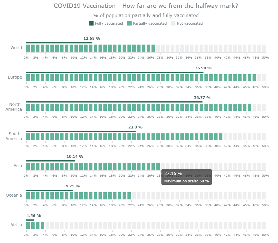
The linear gauge visualization we’ll be building
Here’s a sneak peek at the final linear gauge chart. Follow this tutorial to learn how we build this interesting and informative linear gauge chart with JavaScript.
The Four Steps to Building a JavaScript Linear Gauge
It’s always useful to have some skills with technologies like HTML and JavaScript. But in this tutorial, we’re using a JS charting library that makes it easier to create compelling charts like the linear gauge even with minimal technical knowledge.
There are several JavaScript charting libraries for visualizing data with ease, and here we’re creating the linear gauge chart with AnyChart. This library is flexible, with extensive documentation, and it consists some great examples. Moreover, it has a playground for experimenting with code and is free for non-commercial use. If you want to buy a licensed version, you can check out the available options, and if you’re an educational or not-for-profit organization, you can get in touch for a free license here.
The Steps for Making a JavaScript Linear Gauge
These are the basic steps for creating a linear gauge chart:
- Create a basic HTML page.
- Include the necessary JavaScript files.
- Add the data.
- Write the JavaScript code for the chart.
Let’s look through each of these steps in detail below.
1. Create a basic HTML page
The first thing we need to do is make an HTML page that will hold our visualization. We add a <div> block element and give it an ID so we can reference it later:
<html lang="en">
  <head>
    <title>JavaScript Linear Gauge</title>
    <style type="text/css">
      html, body, #container {
        width: 100%; height: 100%; margin: 0; padding: 0;
      }
    </style>
  </head>
  <body>
    <div id="container"></div>
  </body>
</html>
The width and height attributes of the <div> are set to 100% so that the chart is rendered across the entire screen. These attributes can be modified according to requirements.
2. Include the necessary JavaScript files
The next step is to reference the JS links in the HTML page. We’ll use the AnyChart library for this tutorial, so let’s include the corresponding files from their CDN.
To create a linear gauge chart, we’ll need to add three scripts: the core module, the linear gauge module, and the table module:
<html lang="en">
  <head>
    <title>JavaScript Linear Gauge</title>
    <style type="text/css">
      html, body, #container {
        width: 100%; height: 100%; margin: 0; padding: 0;
      }
    </style>
  </head>
  <body>
    <div id="container"></div>
    <script>
      // All the code for the JS linear gauge will come here
    </script>
    <script src="https://cdn.anychart.com/releases/8.10.0/js/anychart-core.min.js"></script>
    <script src="https://cdn.anychart.com/releases/8.10.0/js/anychart-linear-gauge.min.js"></script>
    <script src="https://cdn.anychart.com/releases/8.10.0/js/anychart-table.min.js"></script>
  </body>
</html>
3. Add the data values
The data for the linear gauge chart is collected from Our World in Data and included in the code. On that site, we can see the percentage of the people having received one and two Covid vaccine doses for each continent in the whole world.
Because (at the time of writing) none of the numbers is greater than 50%, we’ve kept the maximum limit of the axis of all the linear gauges as 50%, and we compare how far away from that mark each continent is, as well as the global figure. We indicate at least partially vaccinated figures with LED representation, and the fully vaccinated numbers with a bar pointer. We’ll see how the data is added in the last step.
So then, our initial steps are all done, and now let’s add the code to make a linear gauge chart with JavaScript!
4. Write the JavaScript code for the chart
Before adding any code, we enclose everything in a function that makes sure that the entire code inside it executes only once the page is loaded.
Creating a linear gauge chart involves a couple of steps and is a bit more complex than the other basic chart types. But that doesn’t mean it’s very difficult, and we’ll go through each step to understand how the chart is made.
Defining the Linear Scale and Axis for the Gauge Chart
We have multiple pointers in our chart. So, let’s start with making a function that accepts two values: one for the bar pointer, and one for the LED gauge. We’ll then create a gauge, set the data, and specify the layout as horizontal. Next, we’ll set the range of the scales and the axes. We’ll make a linear scale with the minimum and maximum ranges. For the axis, we’ll define the attributes and set the orientation:
function drawGauge(value, settings) {
  // Create gauge with settings
  const gauge = anychart.gauges.linear();
  gauge.data([value, settings.value]);
  gauge.layout('horizontal');

  // Set scale for gauge
  const scale = anychart.scales.linear();
  scale.minimum(0).maximum(settings.maximum).ticks({ interval: 2 });

  // Set axis for gauge
  const axis = gauge.axis(0);
  axis.width('1%').offset('43%').scale(scale).orientation('bottom');
}
Setting the Bar Pointer and the Label
Now, we’ll create the bar pointer and the label for the bar series. The label is given an offset to avoid overlap with the pointer:
// Create and set bar point
const barSeries = gauge.bar(0);

barSeries
  .scale(scale)
  .width('4%');

// Create and set label with actual data
const labelBar = barSeries.labels();
labelBar
  .enabled(true)
  .offsetY('-15px');
Creating the LED Pointer and Setting the Color Attribute
In the LED points, we’ll specify the gap between the points and use the dimmer property to set the color of the residual LED points to indicate a non-lit effect. We’ll also declare the color scale of the lit LED points:
// Create and set LED point
const ledPointer = gauge.led(1);

ledPointer
  .offset('10%')
  .width('30%')
  .count(settings.maximum)
  .scale(scale)
  .gap(0.55)
  .dimmer(function () {
    return '#eee';
  });

ledPointer.colorScale().colors(['#63b39b', '#63b39b']);
Declaring the Gauges with the Target Value of Each Data Point
For making the linear gauge for each continent, we’ll call the above defined function for every region with its data. The first number indicates the target value data, and the second variable is an object with the LED data. The maximum remains a constant 50, while value is the percent value of fully vaccinated population for each data point. This value will be displayed by the pointer:
// Create gauges
const world = drawGauge(13.68, { maximum: 50, value: 27.13 });
const europe = drawGauge(36.98, { maximum: 50, value: 47.28 });
const nAmerica = drawGauge(36.77, { maximum: 50, value: 46.53 });
const sAmerica = drawGauge(22.8, { maximum: 50, value: 40.54 });
const asia = drawGauge(10.14, { maximum: 50, value: 27.16 });
const oceania = drawGauge(9.75, { maximum: 50, value: 22.12 });
const africa = drawGauge(1.56, { maximum: 50, value: 3.04 });
Setting the Layout of the Linear Gauges
To display each of the linear gauges one under the other, we’ll define a table and add the title along with each data point as a separate row. We’ll add the various properties of the layout, such as the alignment and font size. We’ll also define parameters for the first row, since it’s the title, and set the width attribute of first column to 100% since we don’t need any more columns:
// Create table to place gauges
const layoutTable = anychart.standalones.table();
layoutTable
  .hAlign('right')
  .vAlign('middle')
  .fontSize(14)
  .cellBorder(null);

// Put gauges into the layout table
layoutTable.contents([
  [null, 'Covid-19 Vaccination - How far are we from the halfway mark?'],
  ['World', world],
  ['Europe', europe],
  ['North America', nAmerica],
  ['South America', sAmerica],
  ['Asia', asia],
  ['Oceania', oceania],
  ['Africa', africa]
]);

// Set height for first row in layout table
layoutTable
  .getRow(0)
  .height(50)
  .fontSize(22)
  .hAlign('center');

// Set the first column to 100% width
layoutTable.getCol(0).width(100);
Drawing the Chart
The last step is to reference the <div> container that we added in the previous step, and to draw the chart:
// Set container id and initiate drawing
layoutTable.container('container');
layoutTable.draw();
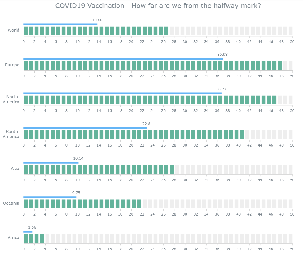
And that’s it. We now have a fully functional and beautiful JavaScript linear gauge chart! The code for this initial version of the linear gauge can be viewed on CodePen.
Making the Chart Accessible
It’s aways a good practice to make sure that charts are accessible to as many people as possible. So, keeping a11y in mind, we’ve made a basic version of the linear gauge chart that’s better suited for screen readers. You can check this out here and also read more about this aspect in the documentation of the AnyChart JavaScript library.
Customizing the Linear Gauge
The default linear gauge chart that we’ve made looks awesome right now, but making a few modifications will enhance the readability and make the chart even more awesome. JavaScript libraries are perfect for not only creating charts quickly, but also for customizing the visualizations as required. The charting libraries offer a lot of configuration options for controlling the behavior and aesthetics of the charts. Let’s make some small but effective tweaks to our current linear gauge chart.
Color modification
To make the linear gauge look more cohesive, let’s make the color attribute of the bar pointer a darker version of the LED points. We’ll that by specifying the fill and stroke attributes of the bar:
// Create and set bar point
const barSeries = gauge.bar(0);
barSeries
  .scale(scale)
  .width('4%')
  .fill('#296953')
  .stroke('#296953');
Adding a legend to our linear gauge chart
Since we’ve used different colors for the bar, the lit and non-lit LED pointers, it’s a good practice to provide a legend to explain the colors. We’ll make a legend and add it below the title of the chart:
// Create stand alone legend
const legend = anychart.standalones.legend();
legend
.position('center')
.items([
    { text: 'Fully vaccinated', iconFill: '#296953' },
    { text: 'Partially vaccinated', iconFill: '#63b39b' },
    { text: 'Not vaccinated', iconFill: '#eee' }
]);
Tooltip formatting
To facilitate better data communication, let’s format the tooltip to make it more informational by displaying the values in percentage form and indicating that the maximum value for the gauge is 50%:
// Set gauge tooltip
gauge
    .tooltip()
    .useHtml(true)
    .titleFormat('{%Value} %')
        .format(
        'Maximum on scale: ' +
        settings.maximum +
        ' %'
    );
Check out the entire code for this version on CodePen.
Axis and labels formatting
The last thing we’ll do is display all the data values as percentage values to avoid any confusion. We’ll also add a subtitle as a row in the table below the title to indicate that values are percentages. One final thing will be to beautify the bar labels with bolder fonts.
The entire final code for this JavaScript linear gauge chart can been found on CodePen.
See the Pen Linear Gauge (JS) – Final by SitePoint (@SitePoint) on CodePen.
Conclusion
In this step-by-step tutorial, we’ve seen how creating functional and visually appealing JavaScript charts is not too difficult with a good JavaScript library. Check out the documentation and examples to better understand the features and properties of the linear gauge. Please ask any questions if in doubt about this chart or other visualizations.
There are multiple chart options provided by AnyChart, and there are many other JavaScript charting libraries as well for creating beautiful visualizations.
Let’s all get vaccinated and stay healthy to get on with creating more visualizations!
Frequently Asked Questions (FAQs) on Creating a Linear Gauge Chart in JavaScript
What is a Linear Gauge Chart and where is it used?
A Linear Gauge Chart is a type of data visualization tool used in JavaScript. It is a graphical representation of data where the data points are represented by markers on a linear scale. This type of chart is commonly used in scenarios where there is a need to display data that changes over time. For instance, it can be used to monitor the progress of a task, track changes in temperature, or measure performance against a specific goal.
How do I create a Linear Gauge Chart in JavaScript?
Creating a Linear Gauge Chart in JavaScript involves several steps. First, you need to include the necessary JavaScript libraries in your HTML file. Next, you need to create a container for the chart in your HTML. Then, you can create a new instance of the chart, configure its properties, and add data to it. Finally, you need to render the chart. The specific steps and code required may vary depending on the library you are using.
Can I customize the appearance of my Linear Gauge Chart?
Yes, most JavaScript charting libraries allow you to customize the appearance of your Linear Gauge Chart. You can change the color, size, and style of the markers, the scale, and the labels. You can also add a title, a legend, and tooltips to your chart. The specific options available may vary depending on the library you are using.
How do I add data to my Linear Gauge Chart?
Adding data to your Linear Gauge Chart involves creating an array of data points and passing it to the chart’s data property. Each data point is an object that includes a value and, optionally, a label. The specific format required may vary depending on the library you are using.
How do I update the data in my Linear Gauge Chart?
Updating the data in your Linear Gauge Chart typically involves modifying the array of data points and re-rendering the chart. Some libraries also provide methods for adding, removing, or updating individual data points without having to re-render the entire chart.
Can I use a Linear Gauge Chart to display real-time data?
Yes, many JavaScript charting libraries support real-time data. This means you can update the chart as new data becomes available, without having to reload the page. This is particularly useful for applications that need to display constantly changing data, such as stock prices or sensor readings.
How do I handle errors when creating a Linear Gauge Chart?
Error handling when creating a Linear Gauge Chart in JavaScript typically involves using try-catch blocks to catch and handle any exceptions that may occur. You should also validate your data before passing it to the chart to ensure it is in the correct format.
Can I export my Linear Gauge Chart to an image or PDF?
Yes, many JavaScript charting libraries provide functionality for exporting charts to various formats, including images and PDFs. This allows you to easily share your charts or include them in reports or presentations.
How do I add interactivity to my Linear Gauge Chart?
Adding interactivity to your Linear Gauge Chart can enhance the user experience. Many JavaScript charting libraries provide options for adding interactive features such as tooltips, zooming and panning, and click or hover events.
Can I use a Linear Gauge Chart in a responsive design?
Yes, most JavaScript charting libraries support responsive design. This means the chart will automatically adjust its size and layout to fit the available space, making it suitable for use on both desktop and mobile devices.
 Shachee Swadia
Visualizer. Writer. Coder. Hopeful humanist. Hopeless optimist. Happy soul. I am a freelance data designer who enjoys working with data and presenting it in a form that is visually appealing as well as insightful.