
You’ve certainly heard it before: “What gets measured gets done.”
It’s true: what you observe and measure is what you can improve.
The key to any improvement is to first identify what to measure and then collect the related metrics. Using those metrics, you can tune the underlying work and analyze the effectiveness of any changes. Then repeat the cycle until you’ve sufficiently improved.
At Couchbase, we needed to improve some of our day-to-day operations, so we created observability dashboards to help us identify issues and track improvement. We used a combination of Prometheus, which simplifies storing and querying time-series data, and Grafana, which can be used to make stunning data visualizations. In addition, we used Couchbase to store historical data for later use with its Full-Text Search and Analytics tools.
In this article, we’ll walk you through how to build your own observability dashboard using Prometheus, Grafana and Couchbase.
Your in-house data source pipelines may vary – as might your data visualization software. However, the steps we’ll show you today should be applicable across a number of tools and deployments.
Generic Observability Dashboard: Design & Architecture
In order to build a reusable and scalable tool, it’s better to work from common designs and templates as a first step. From there, you can customize as needed. With this approach, it’s quick and easy to develop future dashboards.
The diagram below shows the generic architecture of the observability dashboards we’ll build together:
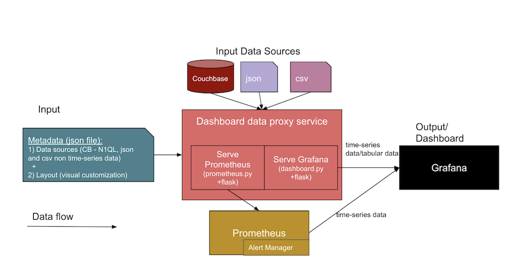
In this architecture, two different data inputs form an interface to the dashboard service. Let’s take a closer look at each of these below.
- JSON metadata about the dashboard
- Data source definitions, including information about the data sources (like DB URL, SQL, credentials), the file paths, and Jenkins artifacts URLs.
- The Grafana layout template (or visual dashboard view), which we’ll design first and then use as templates for panels in our later dashboards.
- The actual data source files from
.jsonand.csvfiles and from Couchbase.- The design of these observability dashboards supports various data sources like Couchbase Server, and direct files like JSON documents and CSV (Comma Separated Values) files. You can extend the databoard proxy service code (in
dashboard.py) to parse other data formats as needed.
- The design of these observability dashboards supports various data sources like Couchbase Server, and direct files like JSON documents and CSV (Comma Separated Values) files. You can extend the databoard proxy service code (in
The expected output will be a Grafana dashboard UI and Prometheus time-series collected metrics from the two inputs listed above. The central part of the above diagram shows the different services in the collection that support the creation of the dashboards.
Let’s take a closer look at the different facets and services included in the architecture diagram:
- Dashboard proxy service:
- This is a generic Python Flask web app service (
dashboard.py) that interacts with the Grafana service to serve the tabular data and other APIs like/query,/add,/importand/exportendpoints. You can develop a similar one to have a generic template (JSON) for the panels on Grafana and attach the graph data points and tabular-data points as target JSON to display on your Grafana dashboard.
- This is a generic Python Flask web app service (
- Prometheus export service:
- This is a custom Prometheus exporter (say
prometheus.py) Flask web app service that connects to the data sources and serves the requests from Prometheus itself. At a high level, this acts as a bridge between the Prometheus and datasources. Note that this service is needed only when the data source is to be maintained for time series (many trends need this).
- This is a custom Prometheus exporter (say
- Grafana service:
- This is the regular Grafana tool itself that you use to create panels and display as dashboards.
- Prometheus service:
- This is the regular Prometheus tool itself that holds your metrics as time-series data.
- Alert Manager:
- The Alert Manager has custom alert rules that receive alerts when certain thresholds are met.
- Other services:
- Couchbase: You might already be using this NoSQL document database, but if not, you can install it through a container or directly on a different host. Couchbase stores your data as JSON documents, or you can have it store required fields as separate documents for historic trends while preparing your health or trend data.
- Docker: You’ll need to install the docker agent software on the host in order to use this containerized service deployment.
Sample Dashboard JSON Structure
In the table below, you’ll see a sample of the structure of both the input metadata and the input data source.
| Input metadata JSON structure: | Input data sources structure: |
{ |
//Couchbase source |
Deploying the Observability Dashboard Services
Use the docker-compose file below to bring up all of the required services – e.g., Dashboard proxy, Grafana, Prometheus, Exporter, Alert manager – that appear in the architecture diagram above for our observability dashboards. You can install Couchbase on a different host to store your growing high-volume data.
To bring up: docker-compose up
Next, visit http://host:3000 for the Grafana page.
To bring down: docker-compose down
|
1 2 3 4 5 6 7 8 9 10 11 12 13 14 15 16 17 18 19 20 21 22 23 24 25 26 27 28 29 30 31 32 33 34 35 36 37 38 39 40 41 42 43 44 45 46 47 48 49 50 |
version: "2" services: dashboard: restart: unless-stopped build: ../../ ports: - 5001:5000 environment: - GRAFANA_HOST=http://admin:password@grafana:3000 volumes: - ./config/targets.json:/app/targets.json grafana: image: grafana/grafana:8.0.1 restart: unless-stopped volumes: - ./config/grafana:/var/lib/grafana environment: GF_INSTALL_PLUGINS: "simpod-json-datasource,marcusolsson-csv-datasource,ae3e-plotly-panel" GF_AUTH_ANONYMOUS_ENABLED: "true" GF_PLUGINS_ALLOW_LOADING_UNSIGNED_PLUGINS: "ae3e-plotly-panel" GF_RENDERING_SERVER_URL: http://renderer:8081/render GF_RENDERING_CALLBACK_URL: http://grafana:3000/ ports: - 4000:3000 renderer: image: grafana/grafana-image-renderer:latest prometheus: restart: unless-stopped image: prom/prometheus volumes: - ./config/prometheus.yml:/etc/prometheus/prometheus.yml - ./config/alert.rules.yml:/etc/prometheus/alert.rules.yml exporter: restart: unless-stopped build: ../../exporter volumes: - ./config/queries.json:/app/queries.json alertmanager: restart: unless-stopped image: prom/alertmanager ports: - 9093:9093 volumes: - ./config/alertmanager.yml:/etc/alertmanager/alertmanager.yml - ./config/alert_templates:/etc/alertmanager/templates |
The above service reference files content – or snippets for brevity – can be found in the implementation section below.
Using these tools, you can create a wide variety of dashboards to suit your requirements. We’ll walk through three types of example dashboards to give you an idea of what’s possible.
Example Dashboards: Overview
| # | Dashboard | Measurements | Metrics |
| 1 | Functional Regression Testing Cycles dashboards | Trends among functional regression testing cycles at both the build level & component level | total tests, passed, failed, aborts, total time, fresh run time, etc. |
| 2 | Infra VMs usage dashboards, including Static VMs & Dynamic VMs | Resources utilization & history | active count, available count, compute hours/max/created per day, week, month |
| 3 | Infra VMs Health dashboards, Static Servers, Jenkins Slaves VMs | VM health monitoring, alerts & history tracking of VMs | ssh_fail, pool_os vs real_os, cpu-memory-disk-swap usages, file descriptors, firewall rules, pool_mac_address vs real_mac_address, booted days, total and product processes, installed app versions and services etc. |
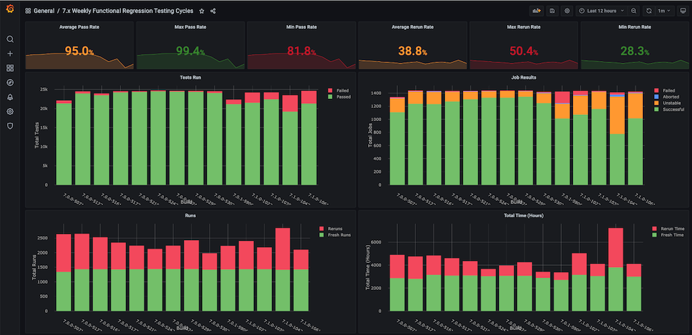
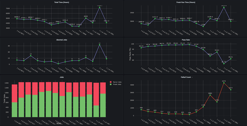
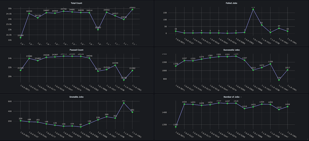
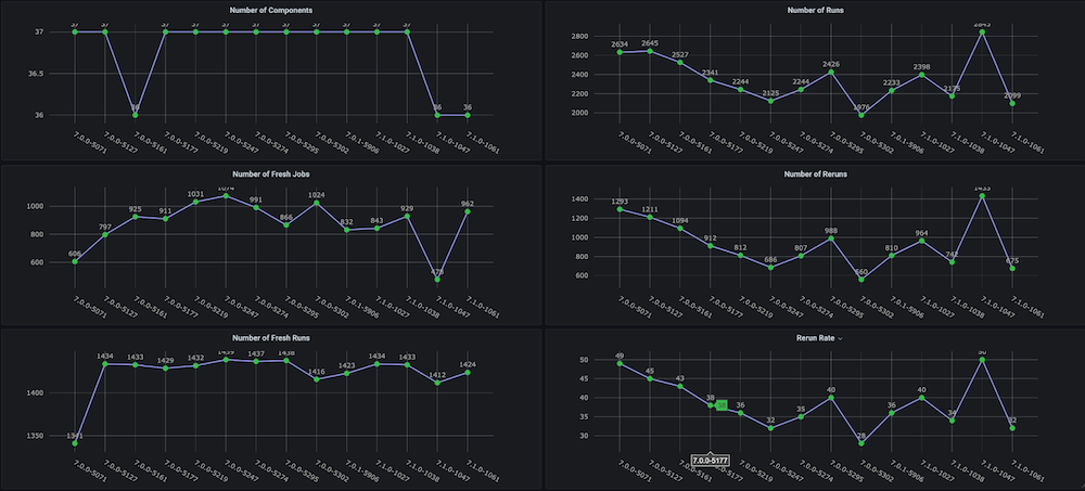
Dashboard #1: Functional Regression Testing Cycles Dashboard
Problem: Before we created this dashboard for ourselves, there were no trend graphs on the regression test cycles with metrics like total time taken, pass rate, fresh vs. reruns (e.g., due to infrastructure issues), inconsistent number of aborts and failures, and also no separate component- or module-level trends.
Solution: The plan was to create a run analyzer script that analyzes the test data that is already stored in the Couchbase bucket. After that, we get the time-series data for the last n number of builds and targeted metrics for each build.
Dashboard snapshots:
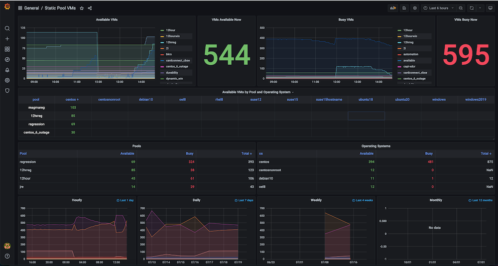
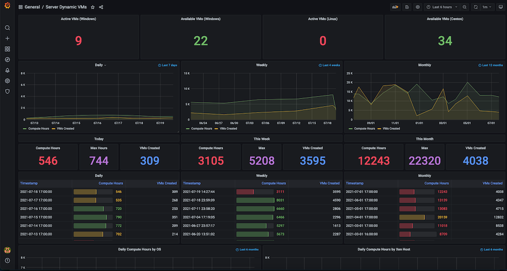
Dashboard #2: Infrastructure Resources / VMs Usage Dashboard
Problem: Prior to building this dashboard, we had a large number of static and dynamic virtual machines but there was no tracking of how the hardware resources were utilized. We had no insight into metrics such as active VMs used at the time, available count, machine time used, or compute hours on a daily, weekly or monthly basis.
Solution: Our plan was to first collect the data for all the VMs such as dynamically allocating and releasing IPs, exact time creation, and release times, as well as any groupings such as pools, etc. Most of this data already existed in Couchbase Server (managed by the respective service managers). Using the flexibility of the SQL++ query language (aka N1QL), we were able to extract that data into a format suitable for the graphs we wanted to show in this observability dashboard.
Dashboard snapshots:
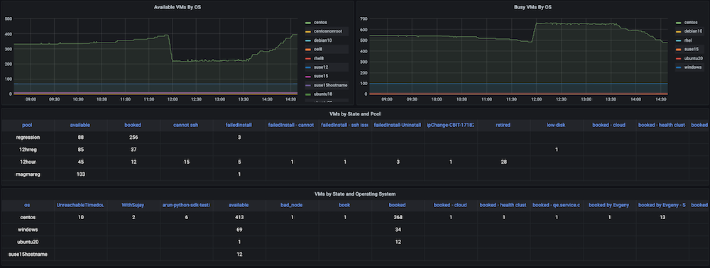
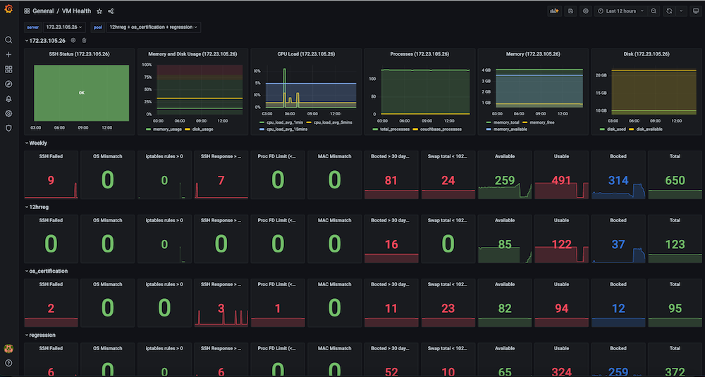
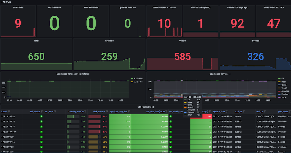
Dashboard #3: Infrastructure VMs Health Dashboard
Problem: Before we had this dashboard, regression test runs were failing inconsistently, and there were low-hanging issues with the VMs. Some of the issues included SSH Failures, OS mismatches, VM IP switches, too many open files, swap issues, need reboots, duplicate IPs among multiple runs, high memory usage, disk full (/ or /data), firewall rules stopping the endpoint connection, slave issues due to high memory, and disk usage were all common. There was no observability dashboard to look at and observe these metrics and also no checks and alerts for the test infrastructure health.
Solution: We decided to create an automatic periodic health check that captures metrics data for the targeted VMs such as ssh_fail, pool_os vs real_os, cpu-memory-disk-swap usages, file descriptors, firewall rules, pool_mac_address vs real_mac_address, booted days, total and Couchbase processes, installed Couchbase version and services. (In sum, we captured ~50 metrics). These metrics are exposed as a Prometheus endpoint that is displayed in Grafana, and the information is also saved in Couchbase for future data analysis. Alerts were also created to monitor the key health metrics for issues to allow for quick intervention and finally achieve increased stability of the test runs.
Dashboard snapshots:
Implementation
So far, you’ve seen the high-level architecture of the observability dashboards, what services are required, what kind of dashboards you might need, and also how to deploy these services. Now, it’s time to look at some implementation details.
Our first stop is the collection and storage of metrics and the data visualization of the dashboards. Most of the data storage and display steps are similar for all use cases, but the metrics data collection depends on which metrics you choose to target.
How to Get Health Data for Your Dashboards
For the infrastructure monitoring use case, you have to collect various health metrics from hundreds of VMs to create a stable infrastructure.
For this step, we created a Python script that does the SSH connection to the VMs in parallel (multiprocessing pool) and collects the required data. In our case, we also have a Jenkins job that periodically runs this script and collects the health data (CSV), and then saves it to the Couchbase database.
The reason we created this custom script – rather than the readily available node exporter provided by Prometheus – is that some of the required metrics were not supported. In addition, this solution was simpler than deploying and maintaining the new software on 1000+ servers. The code snippet below shows some of the checks being done at the VM level.
|
1 2 3 4 5 6 7 8 9 10 11 12 13 14 15 16 17 18 19 20 21 22 23 24 25 26 27 28 29 30 31 32 33 34 35 |
def check_vm(os_name, host): client = SSHClient() client.set_missing_host_key_policy(AutoAddPolicy()) ... cpus = get_cpuinfo(client) meminfo = get_meminfo(client) diskinfo = get_diskinfo(client) uptime = get_uptime(client) ... return ssh_status, '', ssh_resp_time, real_os_version, cpus, meminfo, diskinfo, uptime, uptime_days, systime, cpu_load, cpu_total_processes, fdinfo, \ iptables_rules_count, mac_address, swapinfo, cb_processes, cb_version, cb_running_serv, cb_ind_serv def get_cpuinfo(ssh_client): return ssh_command(ssh_client,"cat /proc/cpuinfo |egrep processor |wc -l") def get_meminfo(ssh_client): return ssh_command(ssh_client,"cat /proc/meminfo |egrep Mem |cut -f2- -d':'|sed 's/ //g'|xargs|sed 's/ /,/g'|sed 's/kB//g'") def get_diskinfo(ssh_client): return ssh_command(ssh_client,"df -ml --output=size,used,avail,pcent / |tail -1 |sed 's/ \+/,/g'|cut -f2- -d','|sed 's/%//g'") def get_uptime(ssh_client): return ssh_command(ssh_client, "uptime -s") def get_cpu_users_load_avg(ssh_client): return ssh_command(ssh_client, "uptime |rev|cut -f1-4 -d','|rev|sed 's/load average://g'|sed 's/ \+//g'|sed 's/users,/,/g'|sed 's/user,/,/g'") def get_file_descriptors(ssh_client): return ssh_command(ssh_client, "echo $(cat /proc/sys/fs/file-nr;ulimit -n)|sed 's/ /,/g'") def get_mac_address(ssh_client): return ssh_command(ssh_client, "ifconfig `ip link show | egrep eth[0-9]: -A 1 |tail -2 |xargs|cut -f2 -d' '|sed 's/://g'`|egrep ether |xargs|cut -f2 -d' '") def get_mac_address_ip(ssh_client): return ssh_command(ssh_client, "ip a show `ip link show | egrep eth[0-9]: -A 1 |tail -2 |xargs|cut -f2 -d' '|sed 's/://g'`|egrep ether |xargs|cut -f2 -d' '") |
The below code snippet shows you how to connect to Couchbase using Python SDK 3.x with key-value operations, getting a document, or saving a document in the database.
|
1 2 3 4 5 6 7 8 9 10 11 12 13 14 15 16 17 |
try: self.cb_cluster = Cluster("couchbase://"+self.cb_host, ClusterOptions(PasswordAuthenticator(self.cb_username, self.cb_userpassword), \ timeout_options=ClusterTimeoutOptions(kv_timeout=timedelta(seconds=10)))) self.cb_b = self.cb_cluster.bucket(self.cb_bucket) self.cb = self.cb_b.default_collection() except Exception as e: print('Connection Failed: %s ' % self.cb_host) print(e) def get_doc(self, doc_key, retries=3): # .. return self.cb.get(doc_key) def save_doc(self, doc_key, doc_value, retries=3): #... self.cb.upsert(doc_key, doc_value) #... |
Implementing the Dashboard Proxy Service
For the tests observability use cases, the data is in a Jenkins artifact URL and also in Couchbase Server. To bridge these multiple data sources together (CSV, DB), we created a proxy API service that would accept requests from Grafana and return the data format understood by Grafana.
The below code snippets give the implementation and service preparation details.
dashboard.py
|
1 2 3 4 5 6 7 8 9 10 11 12 13 14 15 16 17 18 19 20 21 22 23 24 25 26 27 28 29 |
# Dashboard API service @app.route("/query", methods=['POST']) def query(): """ /query responds to a Grafana data request and is formatted as either data points for time series data or rows and columns for tabular data """ for target in request.json['targets']: data_type = target['type'] if data_type == "timeseries": datapoints = calculate_datapoints(target) elif data_type == "table": datapoints = calculate_rows_and_columns(target) ... def calculate_datapoints(target): """ Returns data in a time series format datapoints is formatted as a list of 2 item tuples in the format [value, timestamp] """ ... if target['source'] == "couchbase": ... elif target['source'] == "json": ... elif target['source'] == "csv": |
Dockerfile
|
1 2 3 4 5 6 7 8 9 10 11 |
FROM ubuntu:latest ENV DEBIAN_FRONTEND "noninteractive" RUN apt-get update -y && apt-get install -y python3-dev python3-pip python3-setuptools cmake build-essential RUN mkdir /app COPY ./requirements.txt /app WORKDIR /app RUN pip3 install -r requirements.txt COPY ./dashboard.py /app COPY ./entrypoint.sh /app ENTRYPOINT ["./entrypoint.sh"] |
entrypoint.sh
|
1 2 |
#!/bin/bash python3 dashboard.py $GRAFANA_HOST |
requirements.txt
|
1 2 3 |
couchbase==3.0.7 Flask==1.1.2 requests==2.24.0 |
How to Get the Tabular Data in Grafana
Grafana is a great tool for viewing time-series data. However, sometimes you want to show some non-time-series data in the same interface.
We achieved this goal using the Plotly plugin which is a JavaScript graphing library. Our main use case was to illustrate trends across a variety of important metrics for our weekly regression testing runs. Some of the most important metrics we wanted to track were pass rate, the number of tests, aborted jobs, and total time is taken. Since the release of Grafana 8, there is limited support for bar graphs. At the time of writing, the bar graph functionality is still in beta and doesn’t offer all of the features we require, such as stacking.
Our goal was to support generic CSV/JSON files or a Couchbase SQL++ query and view the data as a table in Grafana. For maximum portability, we wanted to have a single file that would define both the data sources and Grafana template layout together.
For the tabular data to be displayed, below are the two viable options.
- Write a UI plugin for Grafana
- Provide a JSON proxy using the JSON datasource plugin
We chose option 2 for our implementation, since it seemed simpler than trying to learn the Grafana plugin tools and creating a separate UI plugin for the configuration.
Note that since finishing this project, a new plugin has been released that allows you to add CSV data to Grafana directly. If viewing tabular data from a CSV is your only requirement, then this plugin is a good solution.
Implementing the Prometheus Service
prometheus.yml
|
1 2 3 4 5 6 7 8 9 10 11 12 13 14 15 16 17 18 |
# Prometheus global config global: scrape_interval: 1m # Set the scrape interval to every 15 seconds. Default is every 1 minute. scrape_timeout: 30s # Alertmanager configuration alerting: alertmanagers: - static_configs: - targets: - alertmanager:9093 rule_files: - "alert.rules.yml" - job_name: "prometheus" static_configs: - targets: ["localhost:9090"] - job_name: "automation_exporter" static_configs: - targets: ["exporter:8000"] |
alert.rules.yml
|
1 2 3 4 5 6 7 8 9 10 11 12 13 14 15 16 17 18 19 |
groups: - name: alert.rules rules: - alert: PoolVMDown expr: vm_health_ssh_status == 0 for: 1m annotations: title: "Server Pool VM {{ $labels.ipaddr }} SSH Failed" description: "{{ $labels.ipaddr }} SSH failed with error: {{ $labels.ssh_error }}." labels: severity: "critical" - alert: PoolVMHighDiskUsage expr: disk_usage >= 95 for: 1m annotations: title: "Server Pool VM {{ $labels.ipaddr }} high disk usage" description: "{{ $labels.ipaddr }} has disk usage of {{ $value }}%" labels: severity: "critical" |
How to Get Custom Metrics through the Prometheus Exporter
Many cloud-native services integrate directly with Prometheus to allow centralized metrics collection for all of your services.
We wanted to see how we could utilize this technology to monitor our existing infrastructure. If you have services that don’t directly expose a Prometheus metrics endpoint, the way to solve it is to use an exporter. In fact, there is even a Couchbase exporter to expose all of the important metrics from your cluster. (Note: In Couchbase Server 7.0, a Prometheus endpoint is directly available, and internally, Couchbase 7 uses Prometheus for server stats collection and management to service the web UI).
While creating our observability dashboards, we had various data stored in JSON files, in CSV files, and in Couchbase buckets. We wanted a way to expose all of this data and show it in Grafana both in tabular format and as time-series data using Prometheus.
Prometheus expects a simple line-based text output. Here’s an example from our server pool monitoring:
|
1 2 |
available_vms{pool="12hrreg"} 1 available_vms{pool="regression"} 16 |
Let’s take a closer look at how to implement data sources from both CSV files and from Couchbase directly.
CSV Files as Your Data Source
Each time Prometheus polls the endpoint, we fetch the CSV, and for each column, we expose a metric, appending labels for multiple rows if a label is supplied in the config.
For the above example, the CSV looks like:
|
1 2 3 |
pool,available_count 12hrreg,1 regression,16 |
Couchbase as Your Data Source
Each time Prometheus polls the endpoint, we execute the SQL++ queries defined in the config, and for each query, we expose a metric, appending labels for multiple rows if a label is supplied in the config.
Below is an example SQL++ response that produces the above metrics:
|
1 2 3 4 5 6 7 8 |
[{ “pool”, “12hrreg”, “count”: 1 }, { “pool”, “regression”, “count”: 16 }] |
This exporter Python service exposes a /metrics endpoint to be used in Prometheus. These metrics are defined in queries.json and define which queries and CSV columns should be exposed as metrics. See the below JSON snippet (reduced for brevity) as an example.
queries.json
|
1 2 3 4 5 6 7 8 9 10 11 12 13 14 15 16 17 18 19 20 21 22 23 24 25 26 27 28 29 30 31 32 33 34 35 36 37 38 39 40 41 42 43 44 45 46 47 48 49 50 51 52 53 54 55 56 |
{ "clusters": { "static_vms": { "host": "<ip-address>", "username": "Administrator", "password": "xxxx" }, ... }, "queries": [ { "name": "available_vms", "cluster": "static_vms", "query": "SELECT poolId as `pool`, COUNT(*) AS count FROM (SELECT poolId FROM `QE-server-pool` WHERE IS_ARRAY(poolId)=FALSE and state='available' UNION ALL SELECT poolId FROM `QE-server-pool` UNNEST poolId where `QE-server-pool`.state = 'available' ) AS pools group by poolId", "description": "Available VMs for each server pool", "value_key": "count", "labels": ["pool"] }, ... ], "csvs": { "vm_health": "http://<jenkins-host-job-url>/lastSuccessfulBuild/artifact/vm_health_info.csv/", ... }, "columns": [ { "name": "memory_usage", "csv": "vm_health", "description": "Memory usage", "column": "memory_use(%)", "labels": ["ipaddr"] }, { "name": "disk_usage", "csv": "vm_health", "description": "Disk usage", "column": "disk_use%", "labels": ["ipaddr"] }, { "name": "cpu_load_avg_5mins", "csv": "vm_health", "description": "CPU load average (5mins)", "column": "cpu_load_avg_5mins", "labels": ["ipaddr"] }, { "name": "vm_health_ssh_status", "csv": "vm_health", "description": "SSH Status", "column": "ssh_status", "labels": ["ipaddr", "ssh_error", "pool_state", "couchbase_version", "pool_ids"] }, ... ] } |
exporter.py
|
1 2 3 4 5 6 7 8 9 10 11 12 13 14 15 16 17 18 19 20 21 22 23 24 25 26 27 28 29 30 31 32 33 34 35 36 37 38 39 40 41 42 43 44 45 46 47 48 49 50 51 52 53 54 55 56 57 58 |
for options in settings['queries'] + settings["columns"]: log.info("Registered metrics collection for {}".format(options['name'])) def get_labels(row, options): rename_map = options.get("rename", {}) return ["{}=\"{}\"".format(rename_map[label] if label in rename_map else label, row[label]) for label in options["labels"]] def collect_cb(clusters, metrics, options): rows = clusters[options["cluster"]].query(options["query"]).rows() for row in rows: if len(options["labels"]) > 0: labels = get_labels(row, options) metrics.append("{}{{{}}} {}".format( options["name"], ",".join(labels), row[options["value_key"]])) else: metrics.append("{} {}".format( options["name"], row[options["value_key"]])) def collect_csv(metrics, options) csvfile = requests.get(csvs[options["csv"]]).text.splitlines() reader = DictReader(csvfile) for row in reader: if options["column"] not in row or row[options["column"]] == "": continue if len(options["labels"]) > 0: labels = get_labels(row, options) metrics.append("{}{{{}}} {}".format( options["name"], ",".join(labels), row[options["column"]])) else: metrics.append("{} {}".format( options["name"], row[options["column"]])) @app.route("/metrics") def metrics(): metrics = [] clusters = {} for [cluster_name, options] in settings['clusters'].items(): if cluster_name not in clusters: try: clusters[cluster_name] = Cluster('couchbase://'+options['host'], ClusterOptions( PasswordAuthenticator(options['username'], options['password']))) except Exception as e: log.warning("Couldn't connect to cluster {}".format(e)) log.debug("Connected to {}".format(options['host'])) for options in settings["queries"] + settings["columns"]: log.debug("Collecting metrics for {}".format(options["name"])) try: if "cluster" in options: collect_cb(clusters, metrics, options) elif "csv" in options: collect_csv(metrics, options) else: raise Exception("Invalid type") except Exception as e: log.warning("Error while collecting {}: {}".format( options["name"], e)) return Response("\n".join(metrics), mimetype="text/plain") |
Implementing the Alert Manager Service
Prometheus also supports alerting where it tracks specific metrics for you over time. If that metric starts returning results, it will trigger an alert.
For the example above you could add an alert for when the regression pool has no servers available. If you specify the query as available_vms{pool="regression"} == 0 that will return a series when there are 0 available. Once added, Prometheus tracks this for you (default is every minute). If that is all you do, you can visit the Prometheus UI and the alerts tab will show you which alerts are firing.
With the Alert Manager, you can take this a step further and connect communications services so that Prometheus can alert you via email or a Slack channel, for example, when an alert fires. This means you can be informed immediately via your preferred method when something goes wrong. At Couchbase, we set up alerts to be notified of high disk usage on servers as well as when servers could not be reached via SSH. See the example below:
alertmanager.yml
|
1 2 3 4 5 6 7 8 9 10 11 12 13 14 15 16 17 18 |
global: resolve_timeout: 1m smtp_from: qa@couchbase.com smtp_smarthost: mail-com.mail.protection.outlook.com:25 route: group_by: ["alertname"] group_wait: 10s group_interval: 10s repeat_interval: 24h receiver: "infra-email" matchers: - alertname =~ PoolVMDown|PoolVMOSMismatch|PoolVMHighDiskUsage|SlaveVMHighDiskUsage|SlaveVMHighDiskUsageData receivers: - name: "infra-email" email_configs: - to: jake.rawsthorne@couchbase.com,jagadesh.munta@couchbase.com |
Conclusion
In conclusion, we hope you can learn from our experience of creating observability dashboards that help you hone in on the metrics that matter most in your implementation or use case with the power of data visualization.
In our case, this effort allowed us to find server infrastructure and test stability issues. Building dashboards also reduced the number of failed tests as well as the total regression time for multiple product releases.
We hope this walkthrough helps you build better observability dashboards in the future.
Also, we’d like to extend special thanks to Raju and the QE team for their feedback on improving the targeted metrics.
Building something awesome?<br/ >Why not build it on Couchbase?
Hi this is a very good blog but seems its incomplete at many stages like how to run . Please help me with git code as i want to try this execution .very less information on how to use couchbase and what form is used for post in your code . Please help or suggest if you have git code at some repository and full instrctions