
R has a lot of options for plotting symbols, but sometimes you might want a something not in the base set. This post will cover a way to get a custom plotting symbol in R. The code is available on github.
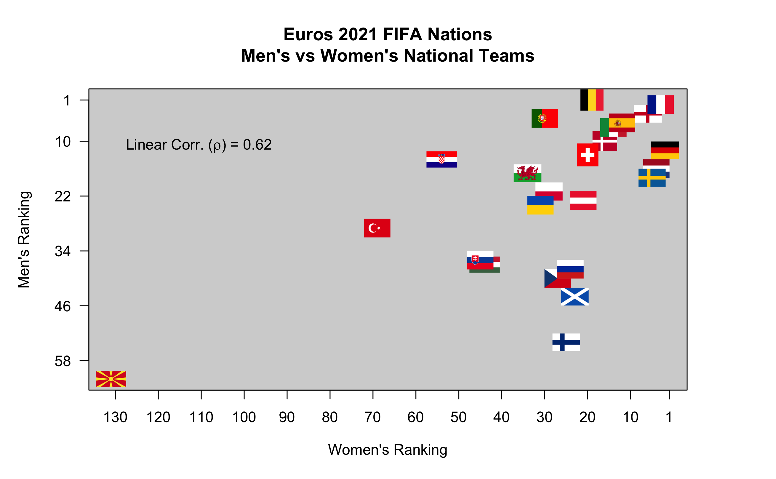
I will use data is for 24 nations that competed in the 2021 Euros (men’s) tournament, specifically the FIFA rankings of the men’s and women’s national teams (accessed 12 Aug 2021). Using a flag to represent the country seems reasonable, and easier than text or plotting symbol and color combinations. Plus, it might add a bit of visual interest.
Although this might seem specialized, it highlights changing backgrounds in R base graphics, controlling aspect ratios, and adding mathematical notation to plots.
Some prep work before coding comes in handy. First, I downloaded PNG files of each country’s flag and saved it with the country’s name. Next, I checked Wikipedia for the aspect ratio of each flag and added it to my CSV file of the FIFA rankings.
The code begins by loading the library we will be using for a custom PCH and then reading in my data from the CSV. The men’s rankings range from 1 to 62 and the women’s rankings from 2 to 131.
library(png) # library for a custom pch

df <- read.csv('/Users/calvinwhealton/Documents/GitHub/euros_2021_rankings/fifa_national_team_rankings.csv',
               header=T) # read-in data from csv

# calculating ranges for men's and women's teams
men_range <- range(df$Men.s.National.Team)
women_range <- range(df$Women.s.National.Team)
Next, we set the basic parameters of the plot. Using the PNG function allows me to save it directly to a file and have a stable image process I an fine tune. The height and width needed to me modified until the axes were close to the same scale (10 ranks on x = 10 ranks on y). This will make life easier when trying to scale the flags with the aspect ratio.
# setting plot to save as a png file
# checked the output file to make sure
# axes were on the same scale, or close to it
png(filename='/Users/calvinwhealton/Documents/GitHub/euros_2021_rankings/fifa_euro_plot.png'
    ,width=round(women_range[2]/15,2)
    ,height=round(men_range[2]/11.5,2)
    ,units='in'
    ,res=300)

par(mar=c(5,5,5,5)) # plot margins
Now, we can initialize the plot. Because we are not plotting the data yet, we can simply label the axes. Default axis ticks would include 0, so I used more natural axis ticks. The gray background makes flags with white more visible.
# setting up the base scatter plot
# used \ to get the "'" in titles
plot(x=NA
     ,y=NA
     ,ylab=expression('Men\'s Ranking')
     ,xlab=expression('Women\'s Ranking')
     ,main='Euros 2021 FIFA Nations\nMen\'s vs Women\'s National Teams'
     ,xlim=rev(women_range) # reverse axes to rank 1 is top right
     ,ylim=rev(men_range) # reverse axes to rank 1 is top right
     ,las=1 # rotate vertical axis labels to be horizontal
     ,xaxt='n' # no default x axis
     ,yaxt='n' # no default y axis
)

# adding axes
axis(side=1, at=c(1,seq(10,women_range[2],10)),las=1)
axis(side=2, at=c(1,seq(10,men_range[2],12)),las=1)

# adding a gray background to the plot
# many flgs have a white portion that would disappear otherwise
rect(xleft=par('usr')[1],xright=par('usr')[2]
     ,ybottom=par('usr')[3],ytop=par('usr')[4]
     ,col='lightgray')
Now comes the fun part. Not all flags are shaped the same. The two extremes in these countries are Switzerland (aspect ratio = 1) and Croatia, Hungary, and North Macedonia (aspect ratio = 2). We will be telling the function the corners of where to plot the flag, so using the same x and y offset for all flags will lead to distortions.
To solve this problem, I set a value for the area of all flags. This will ensure that each country has the same visual impact. After some math, that means the x and y dimensions for each flag can be found based on the aspect ratio. Once we have all these, we can loop through the countries, calculate the coordinates for the flag corners, and use the country’s flag as the plotting symbol.
# setting approximate "area" for each country flag
flag_area <- 25

# looping over all the rankings
for(i in 1:nrow(df)){
  # read in the image and set it to a variable
  img <- readPNG(paste('/Users/calvinwhealton/Documents/GitHub/euros_2021_rankings/flags/',df$Country[i],'.png',sep=''))

  # math for same flag areas (approximately)
  # area = dx*dy = (dy^2)*(aspect_ratio)
  # dy = sqrt(area/aspect_ratio)
  # dx = sqrt(area*aspect_ratio)
  dy <- sqrt(flag_area/df$Aspect.Ratio[i])
  dx <- sqrt(flag_area*df$Aspect.Ratio[i])

  # plot the png image as a raster
  # need the image and coordinates
  # men's team on y axis, women's team on x axis
  rasterImage(image=img
              ,ytop=df$Men.s.National.Team[i]+dy/2
              ,ybottom=df$Men.s.National.Team[i]-dy/2
              ,xleft=df$Women.s.National.Team[i]-dx/2
              ,xright=df$Women.s.National.Team[i]+dx/2)
}
For a little bit of fun, and to illustrate one way to get Greek letters in a plot notation, I calculated the correlation of these ranks. The last line of this code closes the figure file.
# adding a text correlation
# using linear correlation of ranks, not rank correlation
correl <- round(cor(df$Men.s.National.Team,df$Women.s.National.Team),2)

# adding text notation for correlation
text(x=women_range[2]-20,
     y=men_range[1]+10,
     labels = bquote(paste(," Linear Corr. (",rho,") = ",.(correl),sep=""))
     )

# close file
dev.off()
And we are done! We see that the flags do look to be about the same area and have approximately correct aspect ratios. (I won’t say low long it took me to get that part figured out…) I hope this provides a fun way to change up your plots and help an audience better understand the data. Although I used flags here because it seemed the most natural for this data, any PNG file could be used based on your data and needs.

Pingback: 12 Years of WaterProgramming: A Retrospective on >500 Blog Posts – Water Programming: A Collaborative Research Blog