

Your First SwiftUI App: The War Card Game
Step 1: Introduction The War Card Game App is our tried and tested beginners’ app that will help you get a grasp of the core concepts in iOS development in no time. By the time you complete this app you will have taken the first step to app development and hopefully inspire you to learn… View Article
Written by
Chris_Ching
Last Updated on
Aug 03 2021
Step 1: Introduction
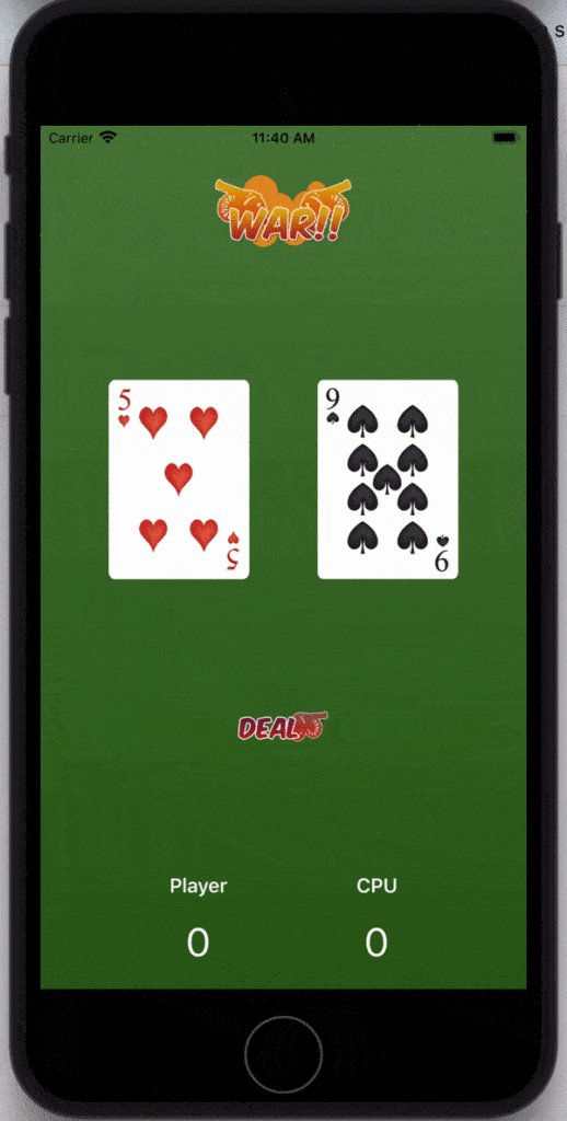
The War Card Game App is our tried and tested beginners’ app that will help you get a grasp of the core concepts in iOS development in no time. By the time you complete this app you will have taken the first step to app development and hopefully inspire you to learn more.
The final product:
Step 2: Xcode
The first step in making an iOS app is to download Xcode.
Xcode is Apple’s Integrated Development Environment (IDE) for macOS. It is used to develop software for macOS, iOS, iPadOS, watchOS, and tvOS.
So the basic requirement would be that you have a Mac, so you will be able to download Xcode and start developing apps.
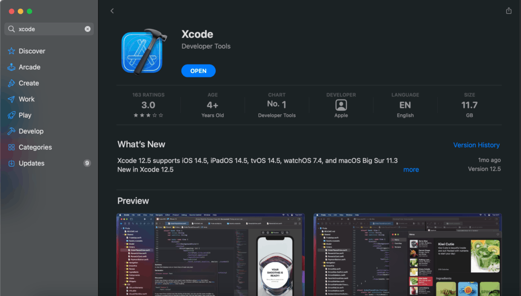
Via the App Store
If you have a relatively new Mac you should be able to download Xcode in the AppStore easily.
About the required disk space
Take note that Xcode requires a lot of disk space, although it says that it takes around 12 GB here that would be just the base files. Along the way Xcode will get bigger and bigger as it installs additional components and simulators.
It would be best to have around 30 GB – 50GB of free space, so you won’t run into problems.
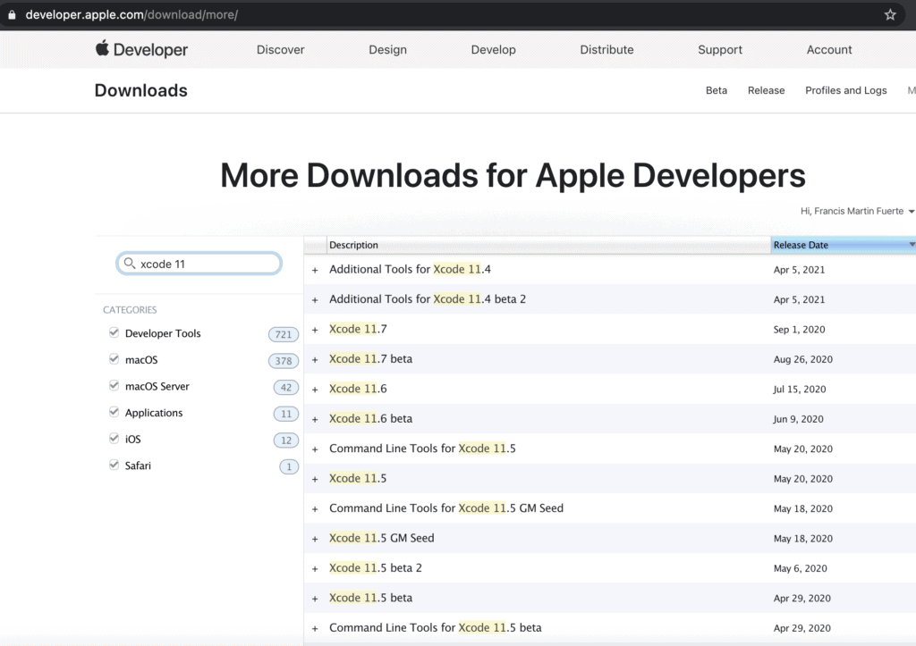
Via Apple developer site (Direct Download)
If you have an older macOS and device you can instead download older versions of Xcode in the Apple developer website, note that Swift UI is only available since Xcode 11 so any older than that, and you will have to check out our older UIKit version tutorial.
Step 3: Create your project
Assuming you installed Xcode already just go ahead and start a new project.
Select the App option
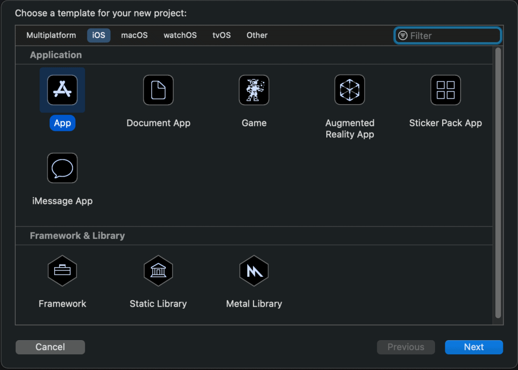
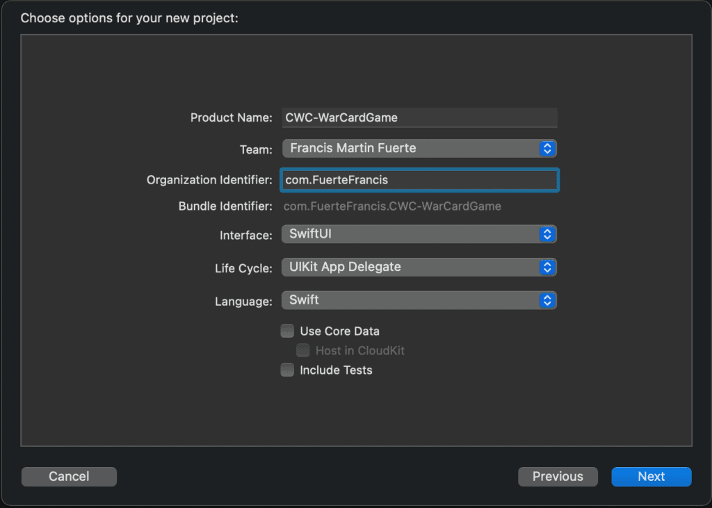
Add your Product Name, the Team is basically your Apple ID so if its not selected just log-in using your Apple ID. Make sure that the Interface is SwiftUI then click next.
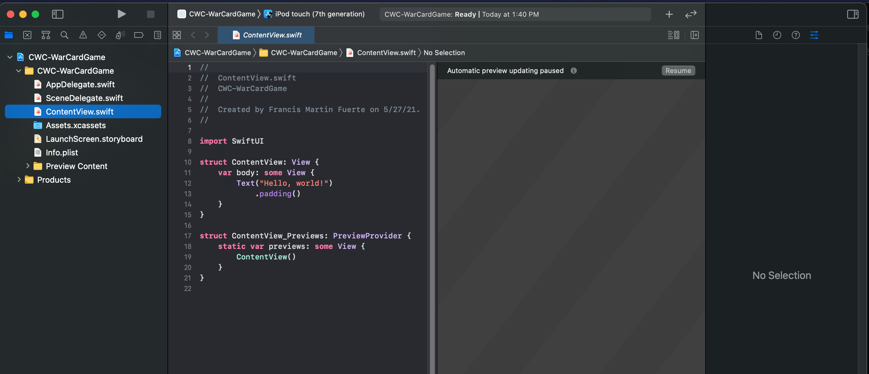
And that’s it, you should be able to see your project like so.
Step 4: Getting to know Xcode
Before we get started on development it would be best to know what the things are in your screen. There are 4 major parts of Xcode that you need to know in order to better understand what you are doing.
1. Navigator Panel
Its known mainly for the listing of files for your project.
There are other tabs that will be used to navigate to different areas of your project as well, but we won’t go over that in this article.
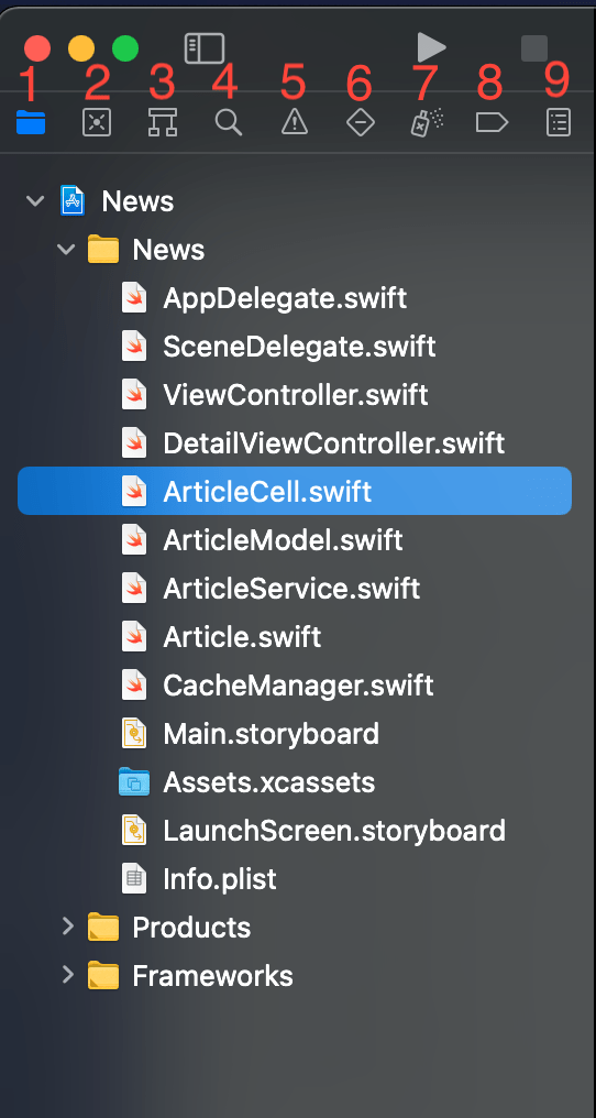
2. Editor Area
Clicking on an item from the Navigator Area it usually opens up in this big area at the middle which is called the editor area.
The contents of the editor area change according to what you selected in the navigator area. So if you select the assets file notice how the content on the middle changes as supposed to when a swift file was selected.
3. Inspector Area
At the far right we have the inspector area or also known as the utilities area.
It is used either display information and help on the editor area. Or have an option to configure or edit what was selected in the editor area.
- Show quick help
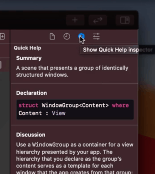
This portion shows some quick information about the keyword or piece of code that you have selected.
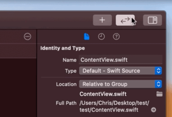
- Identity and Type
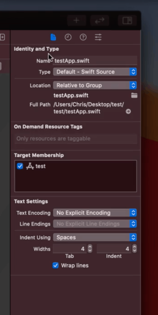
This one shows information about the file you currently have open. Information such as what the type of file it is, here it is located and which app it is included in.
- Attributes tab
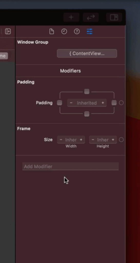
This part works similarly to the quick help tab but instead of the help you get an interface that lets you modify some properties of the code you selected.
4. Tool bar

This is the top area of your screen.
The buttons at the far left and the far right of the toolbar shows and hides the navigator area and inspector area respectively.
So if you need more space or want a bigger view you can opt to do that.
- Status Bar

This is the part at the middle which shows that Xcode is currently doing. It also shows if you have any errors or shows any warnings that might come from some mistakes while coding.
- Simulator area

This part lets you run or stop the app for the simulator.
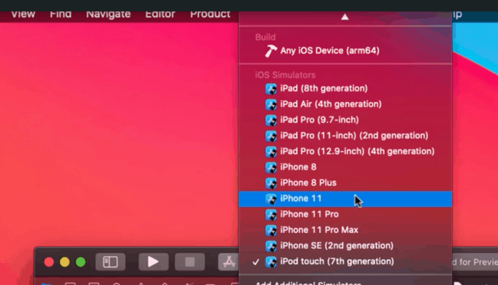
The simulator is basically a virtual device that you choose from the list. You can also connect your actual device and run it by selecting it on the top of this list.
- Source Control
This button probably won’t be useful to you as a beginner. This is because this button is the one responsible in tracking changes/revisions to the file when you are using a repository for your project.
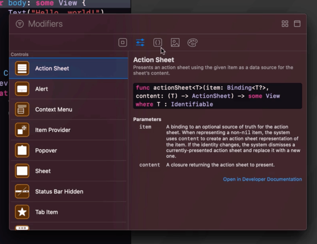
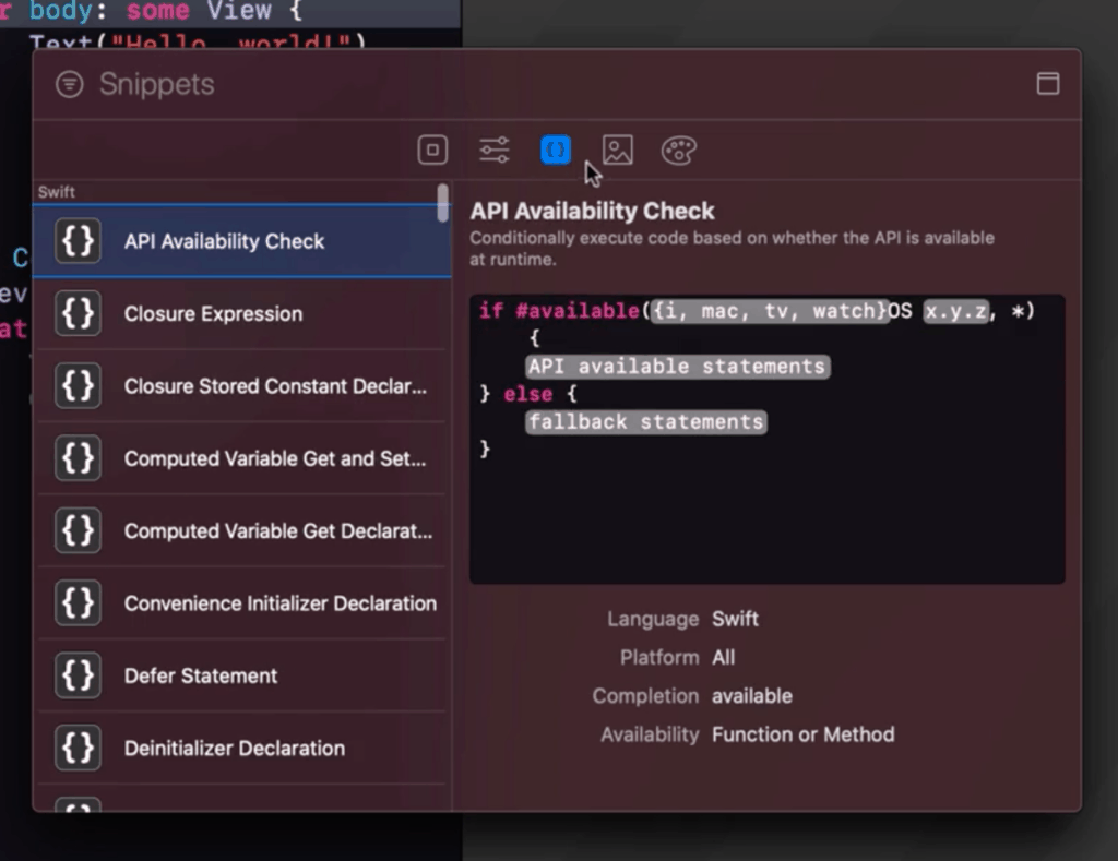
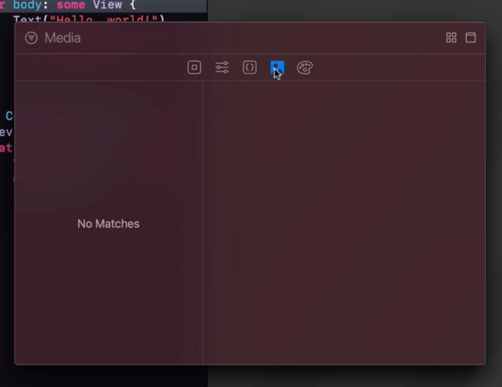
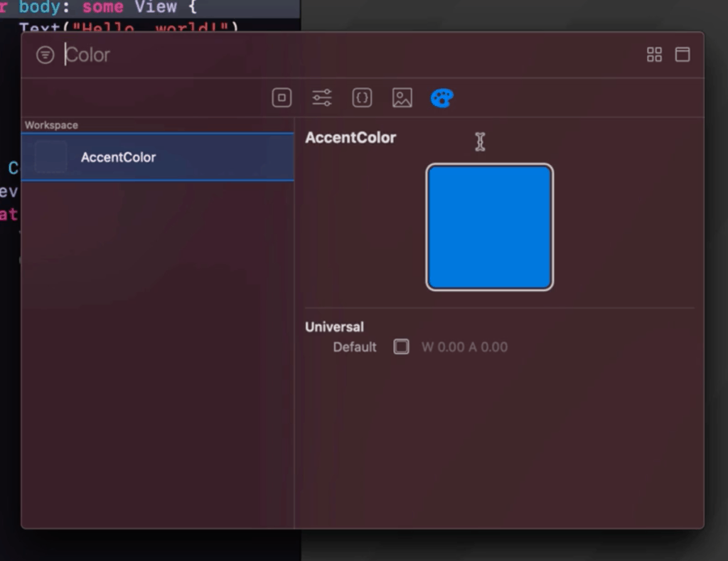
- Library
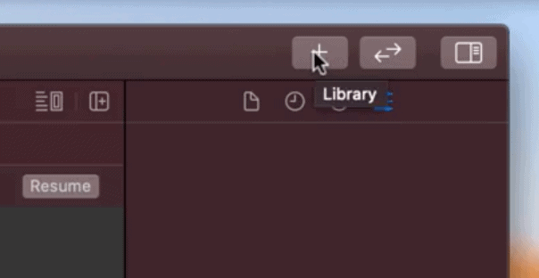
This is the library button which will pop up a menu that contains various things that will be useful for your app
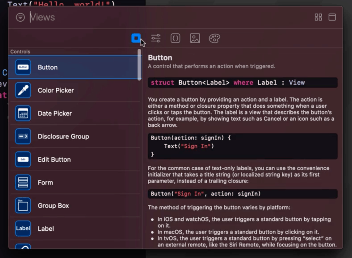
- Views – This contains the list of UI elements that you can easily drag and drop when making your app.
- Modifiers – This contains the modifiers or actions that you can apply to your app.
- Snippets – shows a list of code snippets that you can easily fill-up and reuse on your app.
- Media – contains an all the assets that you have added to the app
- Color – contains all the colors you have set for the app
5. Files and properties
- Root
Clicking on the root file of your directory will open up the project properties of the app.
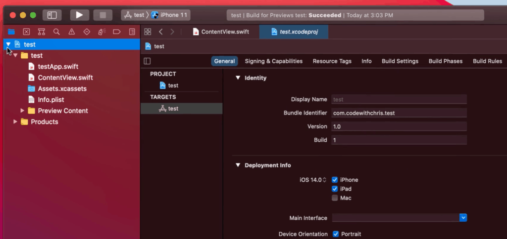
This contains settings like what iOS version you will be supporting, what orientations are allowed, what devices (iPhone, iPad, Mac) are allowed, etc.
- Info.plist
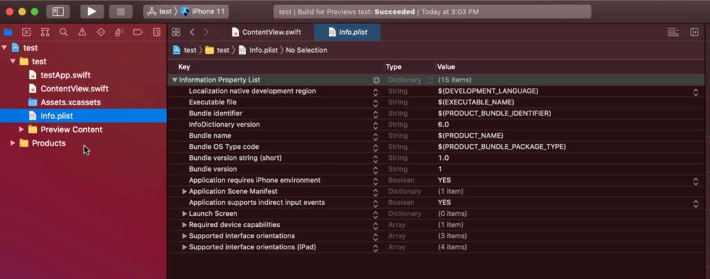
This file contains additional configuration settings for the app. This is also where you will be adding support for Permissions for the apps.
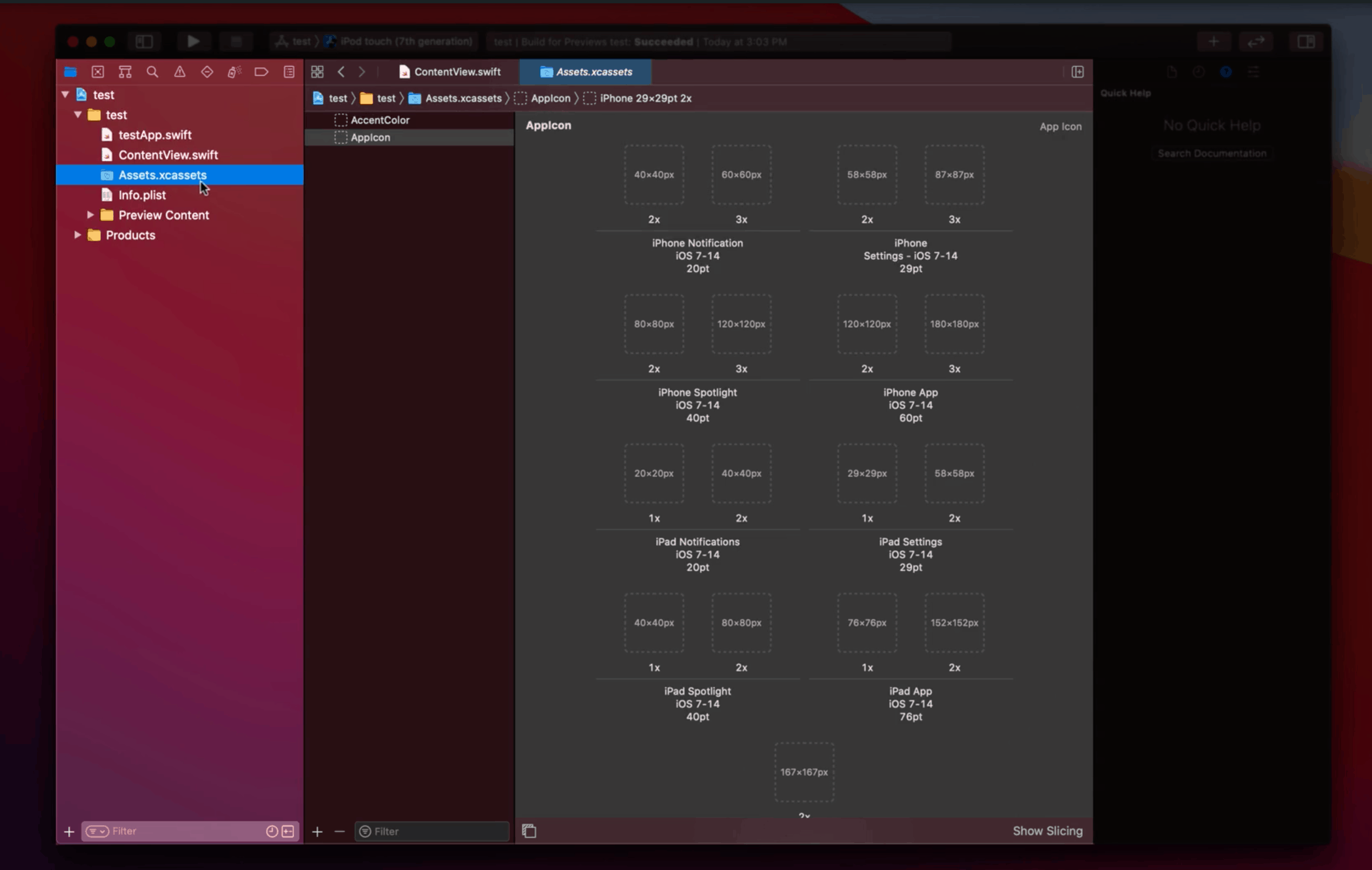
- Assets and Preview Assets
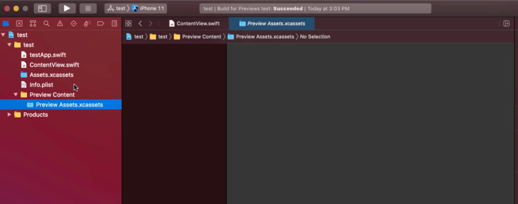
The Assets are where the files like images will be placed when you want to include it in your app. Usually you have your background image and custom graphics for the UI.
The Preview Assets works similar to the Asset, but it won’t be part of the final output/bundle of the app and will only be just for debugging
- Products
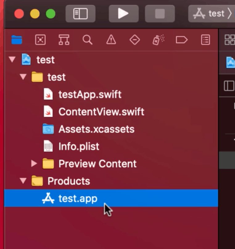
This is basically the output file/app that was generated by Xcode. You don’t really need to do anything here or even have a need to access it. This folder can be safely ignored.
Step 5: How to run/see the user interface
You might be wondering what does the sample code even look like? How is the user interface being built?
There are two ways to be able to see the user interface.
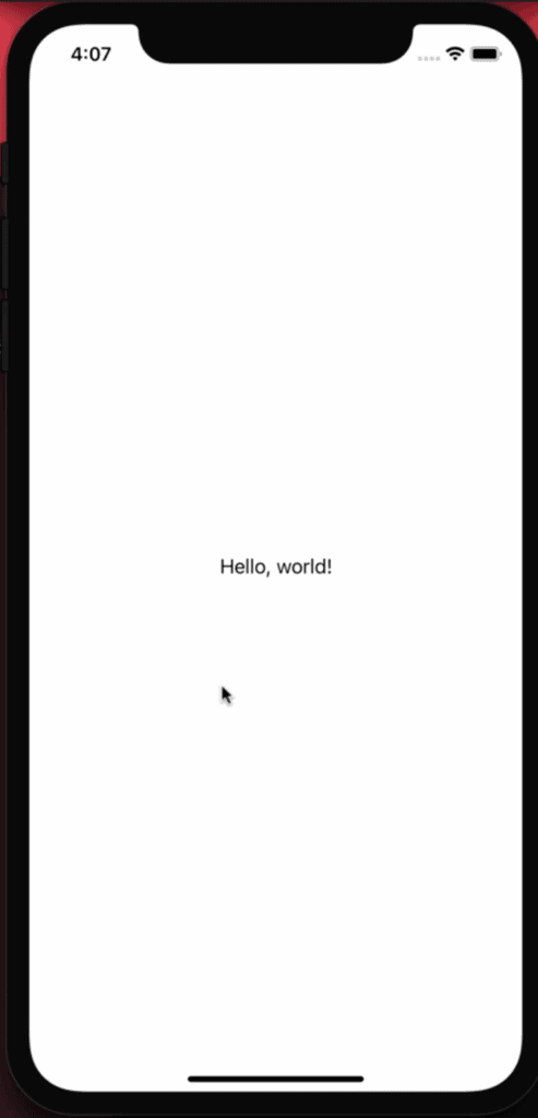
1. Run it on the simulator
Just choose a device and run it. Usually the first time you used the emulator it will take a while for the app to run. Just like how its like when you have a new phone. Once you got it running and set it up though it should load really fast.
2. Load it in the preview
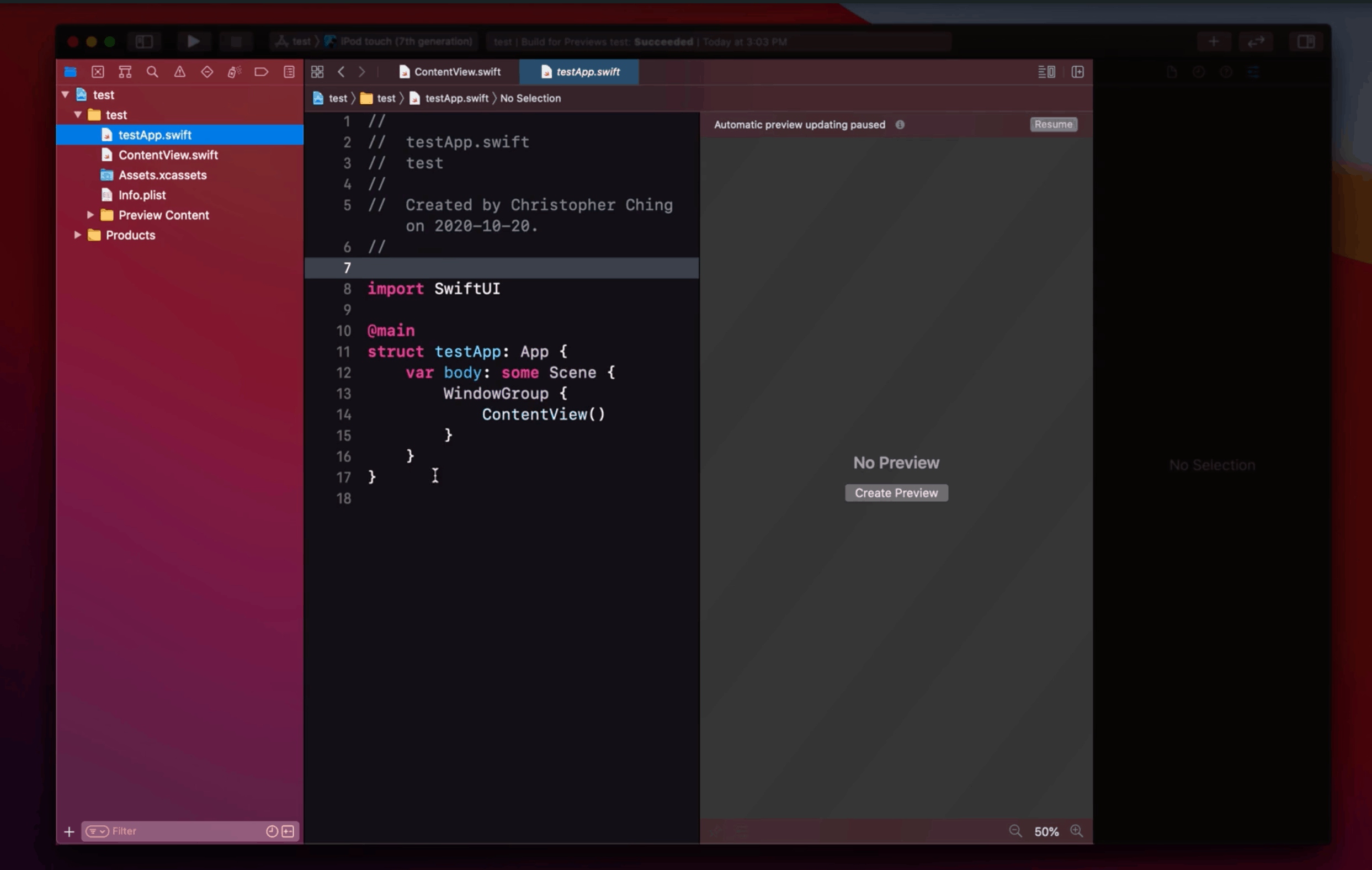
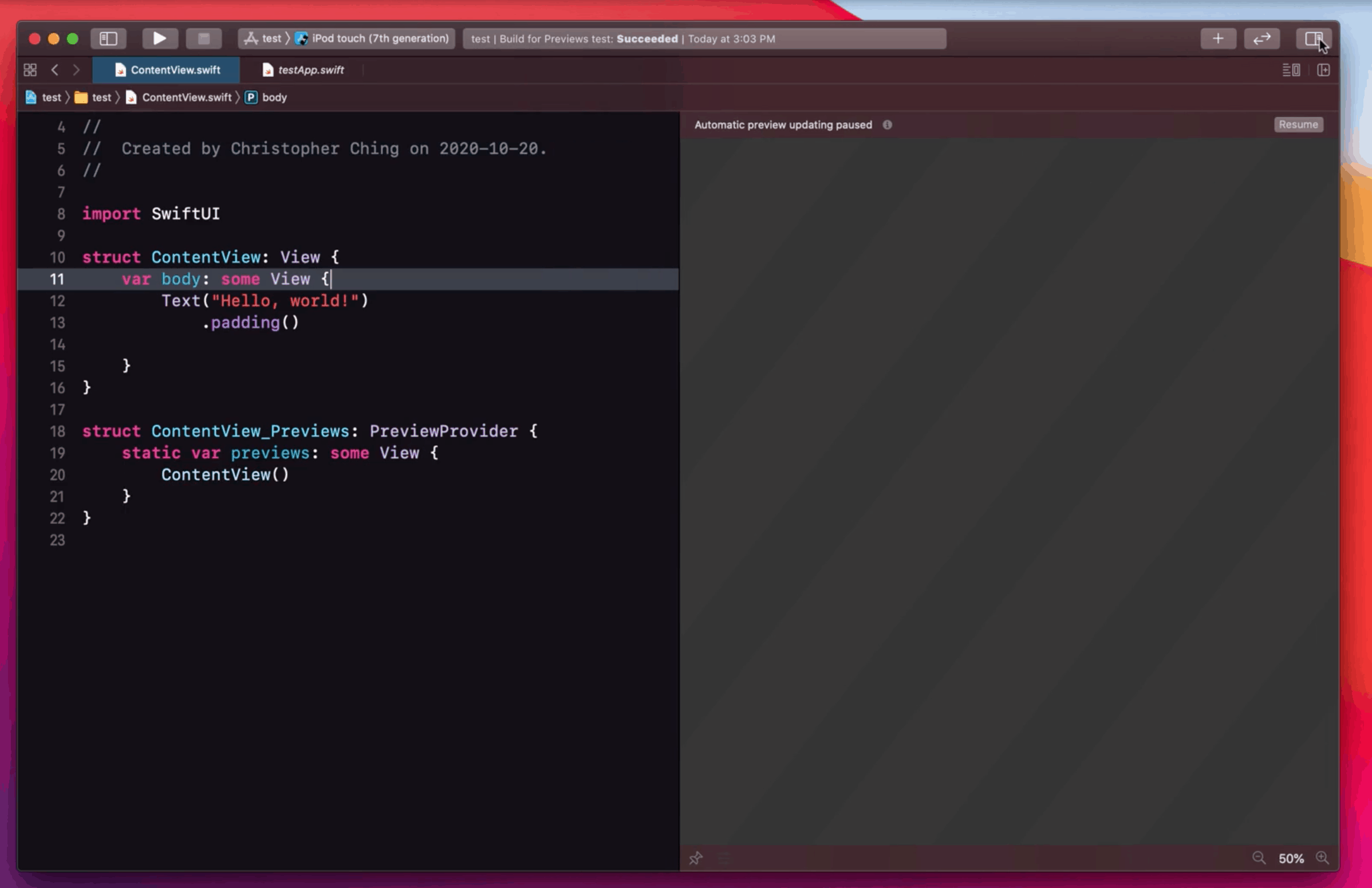
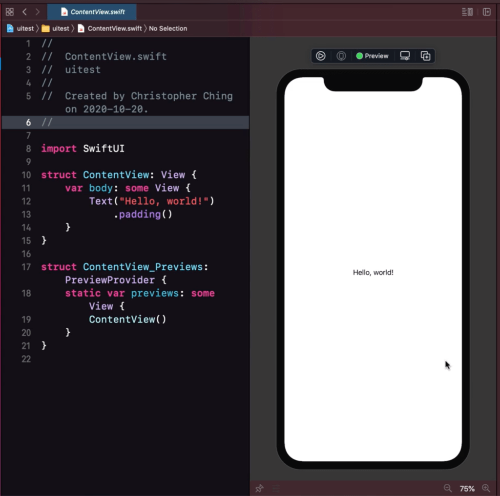
The preview is located just beside your code in the editor area. It’s the blank part to the right.
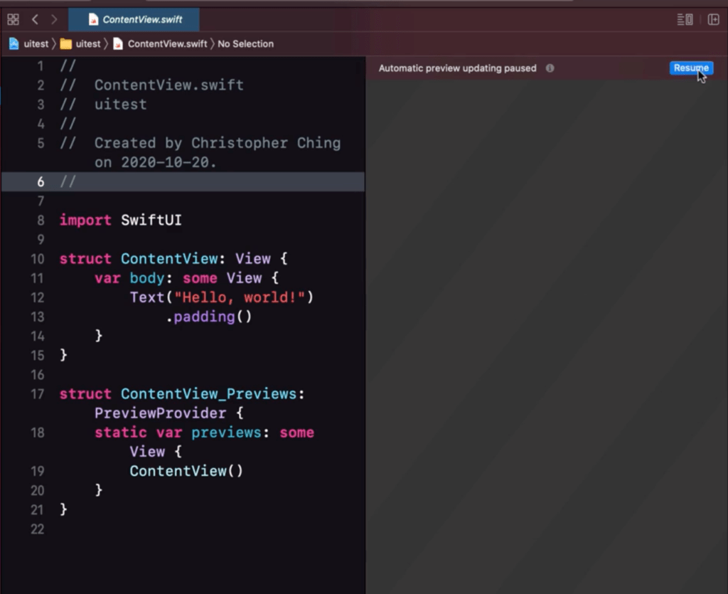
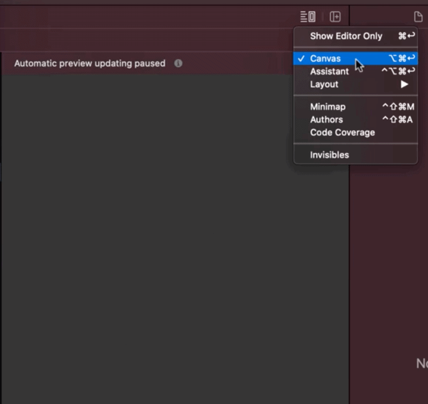
If this area doesn’t exist in your editor area try to check if you have canvass checked as shown here.
If its there just simply click the resume button to start it up, and it should show you a preview.
This preview is actually similar to simulator, if you change the zoom of the preview it will show you a “phone” border for it.
What are the difference between simulator and preview?
The main difference is that the simulator is like a virtual device, you have almost your full iOS features there along with other apps. The preview is. just that, a preview of your on a device. You can’t interact with it like unlike a virtual phone.
Why use the preview then?
Although a preview is limited in functionality, it does make up for it on how fast you can see the changes to your code.
As you build your UI you will be able to see how it looks like on the preview even without running your app.
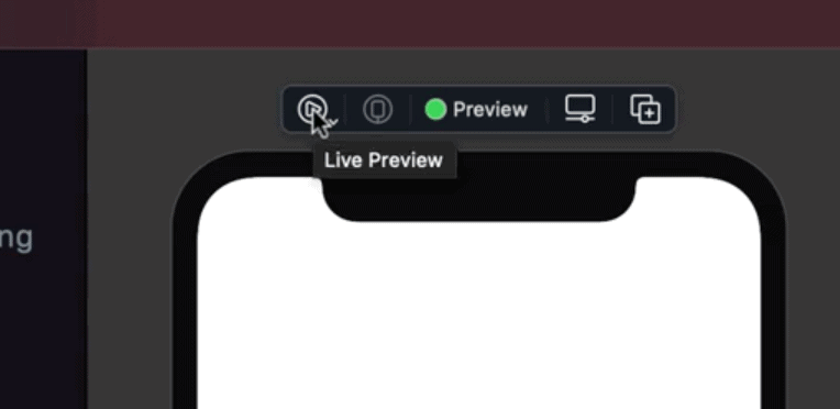
You can also “run” the preview if you want, so that you interact with it a bit similar to a simulator. Just like on the play button to activate “live preview” mode.
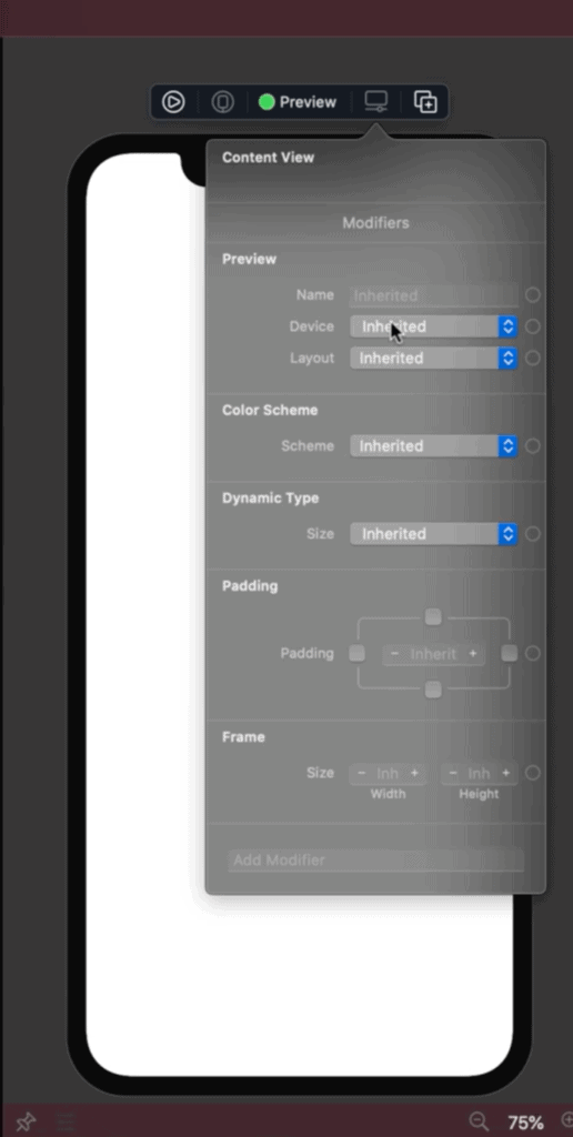
You also have the option to change settings of the “preview” device easily by clicking on this icon.
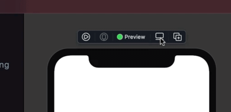
This will allow you to change phones/device, maybe change the theme to light and dark, etc.
Thus, I would be ideal to use the preview when building/coding your app. And then use the simulator when you want to run the app and play around with it.
Step 6: How to build the user interface
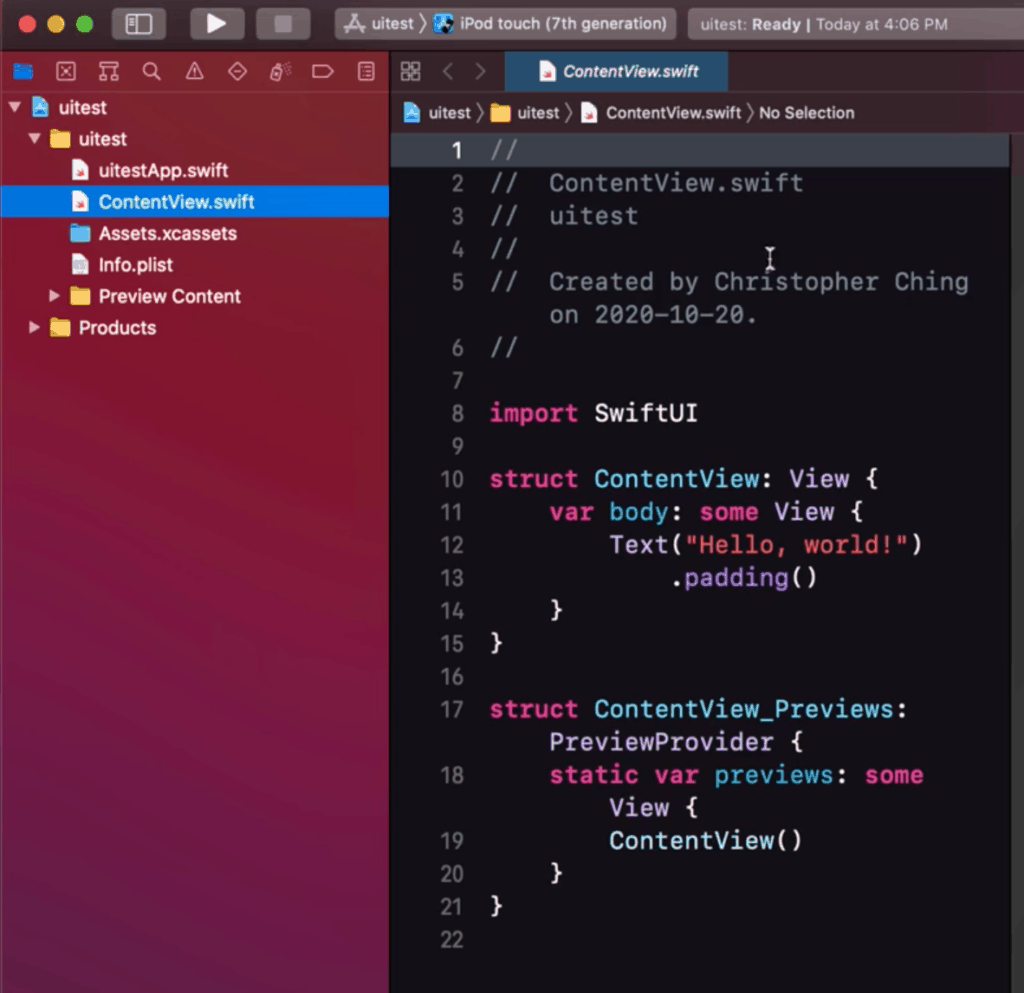
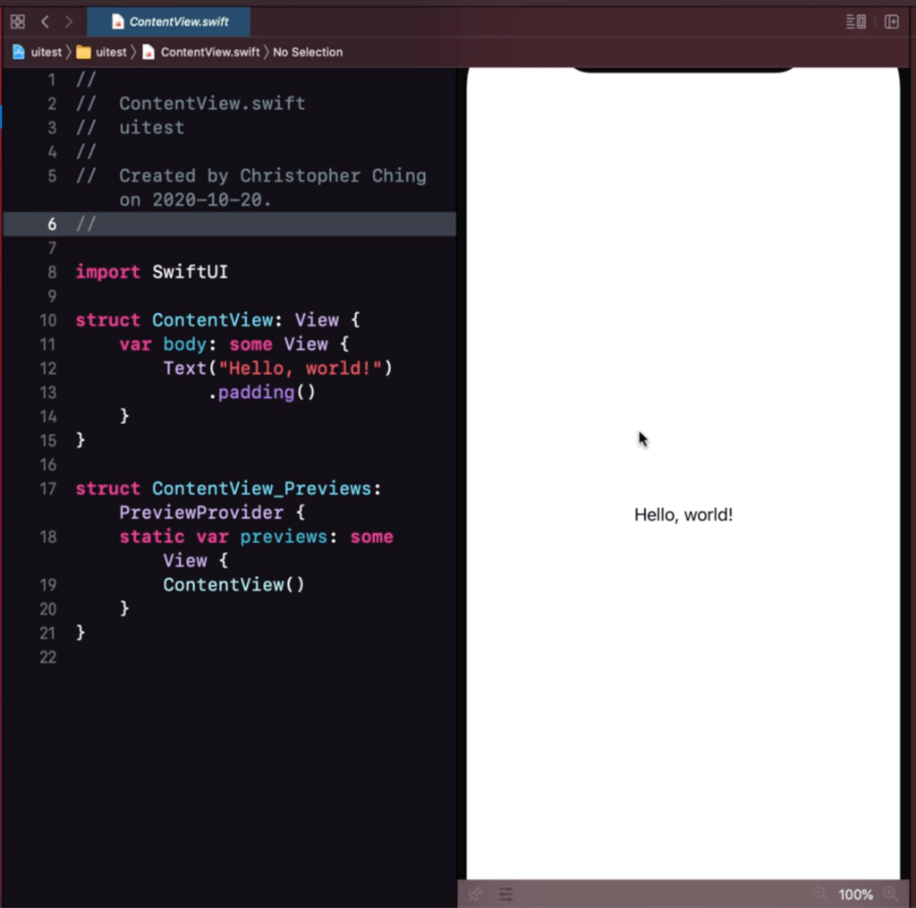
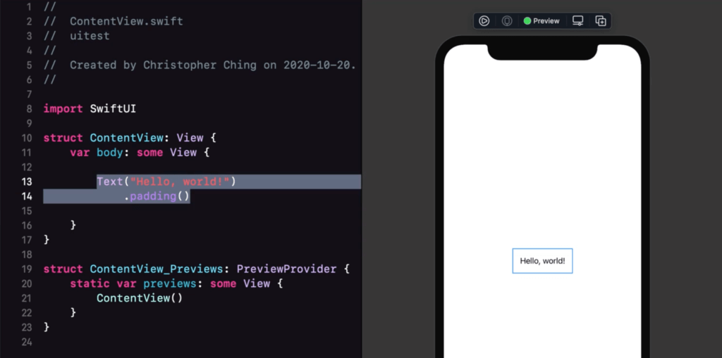
Let’s disect how the simplest user interface should work. Right now we see a “Hello, world!” on the screen, of course we can assume it’s this bit of code right here:
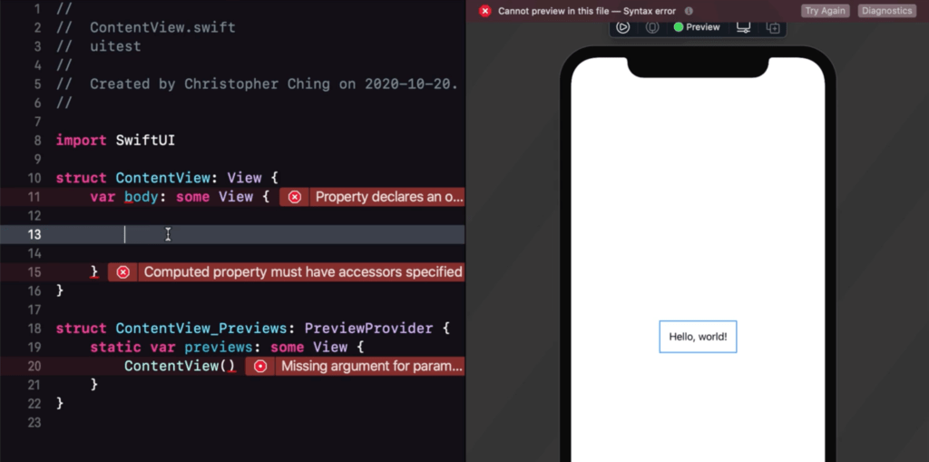
If we were to delete that there would be a ton of errors that will pop-up. That it because the “body” or View, needs exactly 1 user interface item in order to work.
Only 1 user interface item? But a normal screen has more than 1
Yes its true that it needs exactly 1 item, but that item can be a container that houses the other items that you need as well.
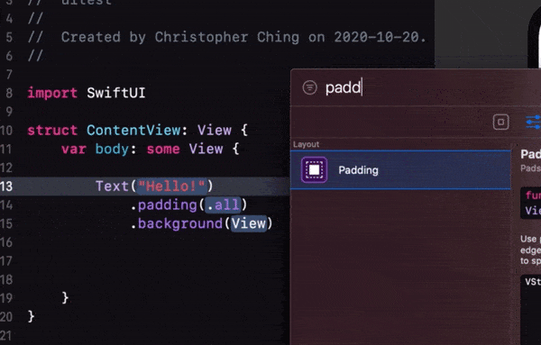
For now, lets experiment but putting back the “Text” data like so:
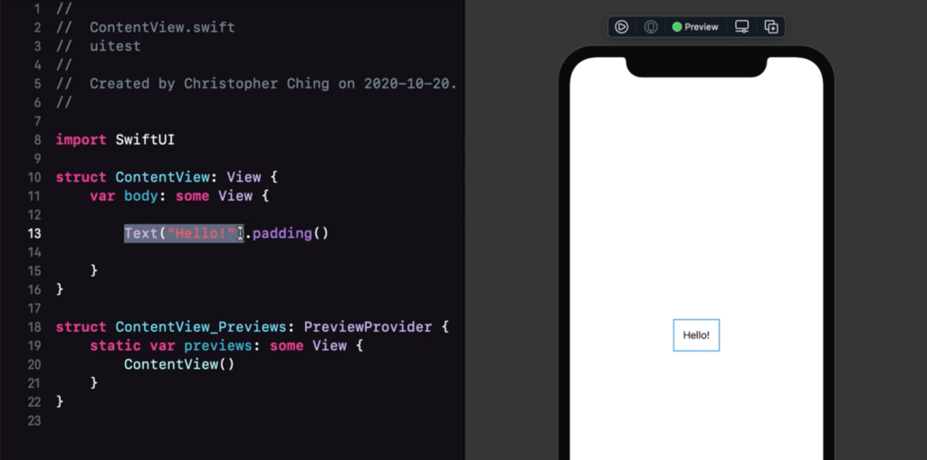
The first part (highlighted part) is our actual user interface element which is then followed by a modifier called padding:

We can add multiple modifiers on one element just do a dot (.)
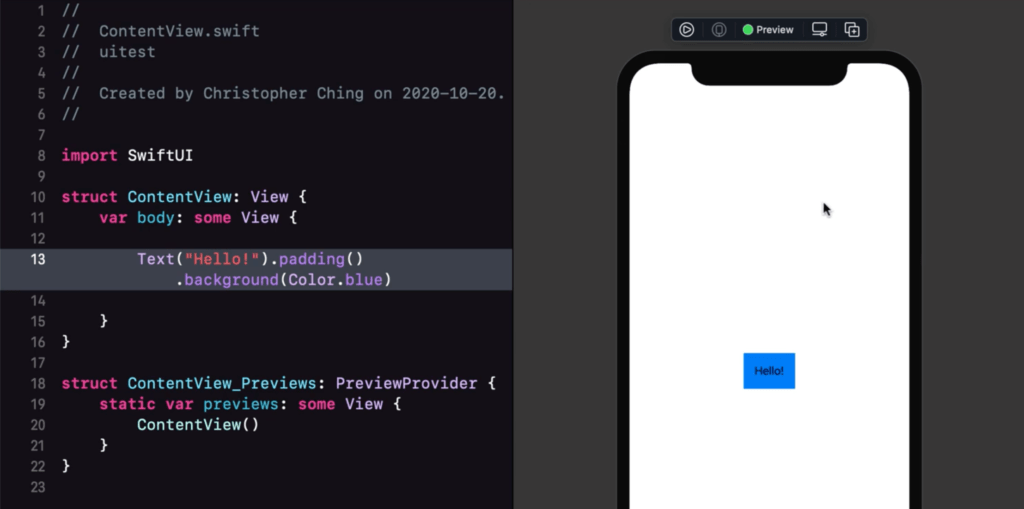
This is the most basic way to work with building your user interface elements. You start by adding an element, then follow it up by a modifier to make it suit your taste.
Are there other ways?
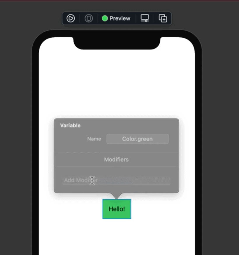
Yes, remember what we discussed earlier about the inspector/utility area? You can do the edits from there when you select the user interface element.
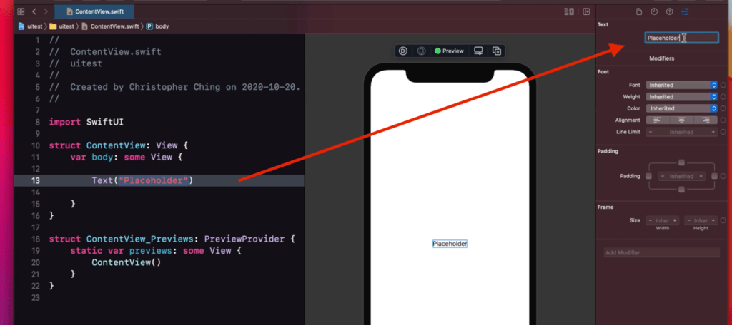
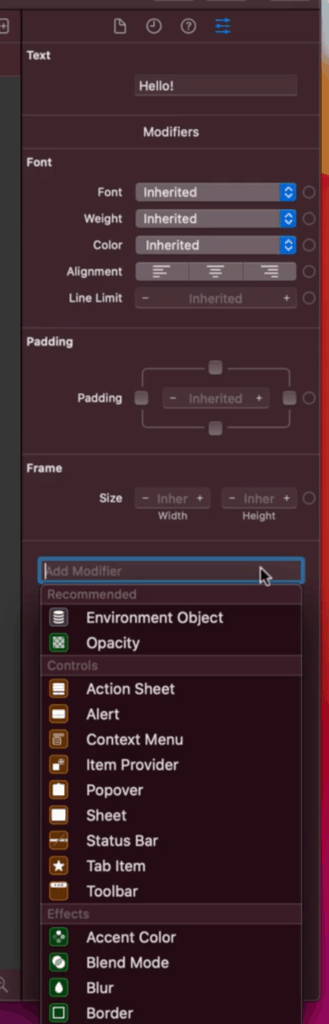
From here you can check out the different properties than you can modify. You can also add a custom modifier at the bottom, just search for what you want.
You can also add elements and modifiers by dragging and dropping them from the Library.
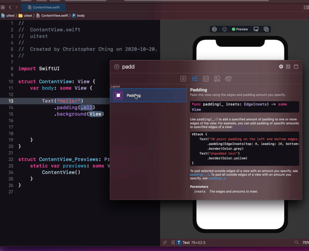
There is also an option to change modifiers via the preview. Just select the element then press Command⌘ + right click.
It will show a menu and just select Show SwiftUI Inspector
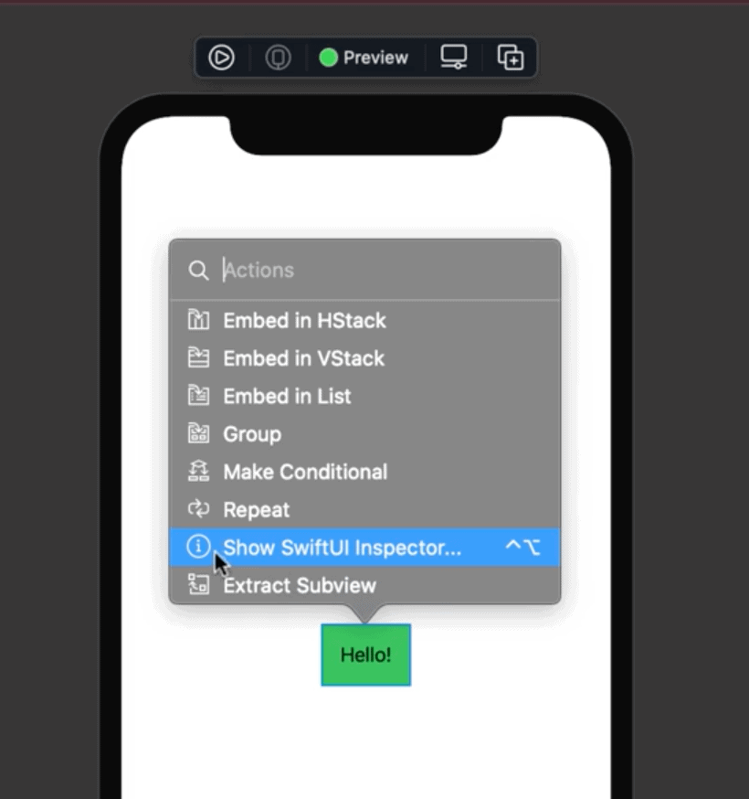
This command will allow you to view the current modifiers applied to it while also giving the option to add it here directly
Step 7: Preparing the assets
We are now ready to start our work regarding the War Card App. However, now is a good time to add the assets for this project.
You can download the assets that we used for this project here.
After you downloaded the assets you can then exact it and just drag and drop all the contents to the Assets folder in Xcode.
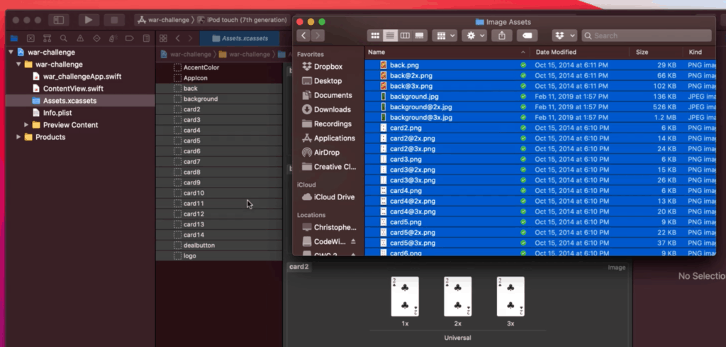
Doing so will automatically populate all the assets.
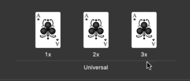
Notice that there are 1x, 2x, and 3x sizes in Xcode. This is mainly used and determined by the system automatically. 3x being the clearest and biggest copy while 1x is the smallest and will most probably be blurry on high-end phones.
If you want to create your own assets I recommend using Prepo (Free on the App Store) to help you generate the 1x, 2x, and 3x versions of your images as well as the different icon sizes for your app.
Step 8: Add a background
To start off, on your code add in a ZStack container and inside the stack add in an Image that uses our asset called “background“.
ZStack {
   Image("background")
}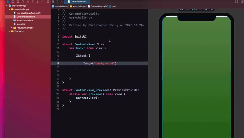
Notice that in the preview the background did not take up the whole space and has a white background at the top.
It is important to understand that by default Xcode will try to fit the contents of your app inside the SafeArea.
This SafeArea is the part of the screen where there will not be obstructions to your UI elements as shown on the white lines here (could be bigger or smaller depending on the iPhone model):
So in order to set a background that reach the edges of the screen you will need to use a modifier called ignoresSafeArea or edgesIgnoringSafeArea.
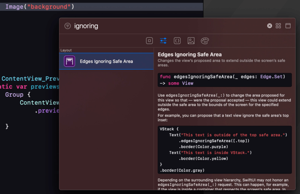
Adding this modifier to the background image ensures that it will fill up the whole screen instead of being constrained inside the SafeArea.
ZStack {
   Image("background").ignoresSafeArea()
}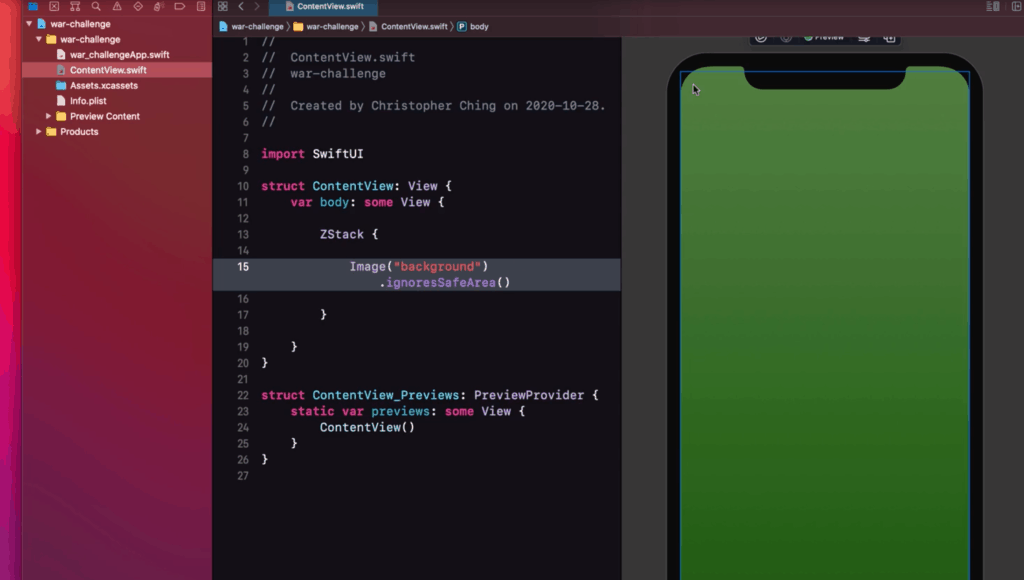
If you noticed we used a ZStack as the base container. This is because using this stack allows us to “bury” the 1st element (which is the background) at the bottom of the stack. This ensures that it will stay in the background and not cover up all the other UI elements after it.
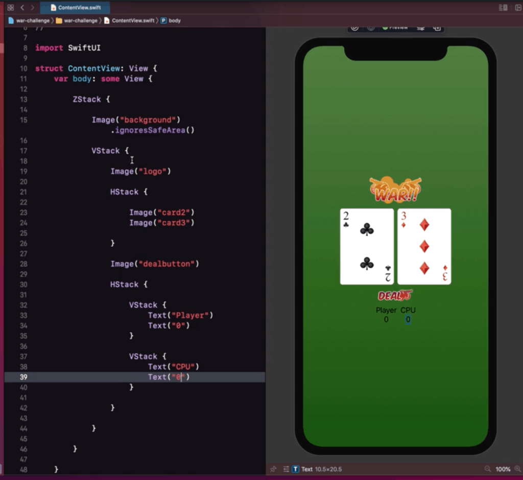
Step 9: Add the other UI Elements
For the next step we want the other UI elements to be arranged vertically on the screen, we can use a VStack for this. Here’s the code for all the UI Elements which we’ll walk through together below.
ZStack {

            Image("background").ignoresSafeArea()

            VStack {
                Spacer()
                Image("logo")
                Spacer()
                HStack {
                    Spacer()
                    Image("card2")
                    Spacer()
                    Image("card3")
                    Spacer()
                }
                Spacer()

                Image("dealbutton")

                Spacer()
                HStack {
                    Spacer()
                    VStack {
                        Text("Player")
                        Text("0")
                    }
                    Spacer()
                    VStack {
                        Text("CPU")
                        Text("0")
                    }
                    Spacer()
                }
                Spacer()

            }

        }
1. Add the logo/header
The first element of our VStack should be the Header or the Logo of our app, we can do this by simply adding another Image that uses our asset called “logo“
2. Add the Cards play area
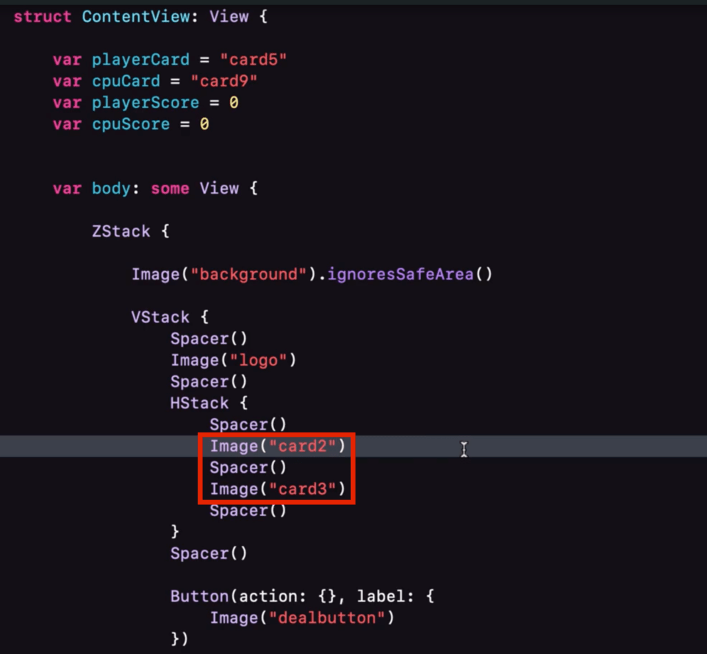
Now we want to have two cards to be side by side, one for the player and one for the computer (opponent), we can do this by simply putting them inside an HStack.
Then just add two separate Images for now that uses different numbered cards from out assets.
3. Add the deal “button”
Since we don’t want to discuss buttons yet, you can temporarily use an Image as placeholder for the button that we will be adding later on.
This is also a great way to have an easy to set up UI by just using images as temporary placeholders for buttons and other stuff.
So for this part just add an Image that uses our asset called “dealbutton“
4. Add score labels
Similar to the Side by Side cards above, we need to set up score labels for both the player and the cpu. We can do this by starting off with an HStack. Add two separate VStack that has two placeholder Text; the name of the player/cpu and their scores (0).
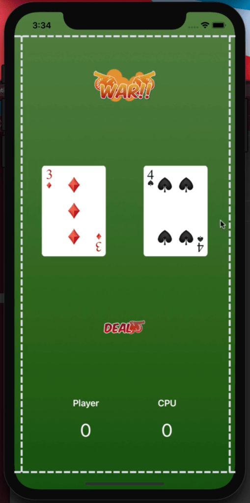
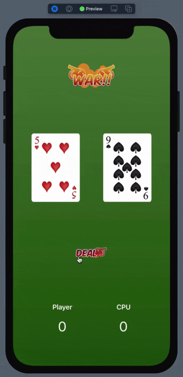
So far, if you added everything as instructed you will be able to see your preview and code like this.
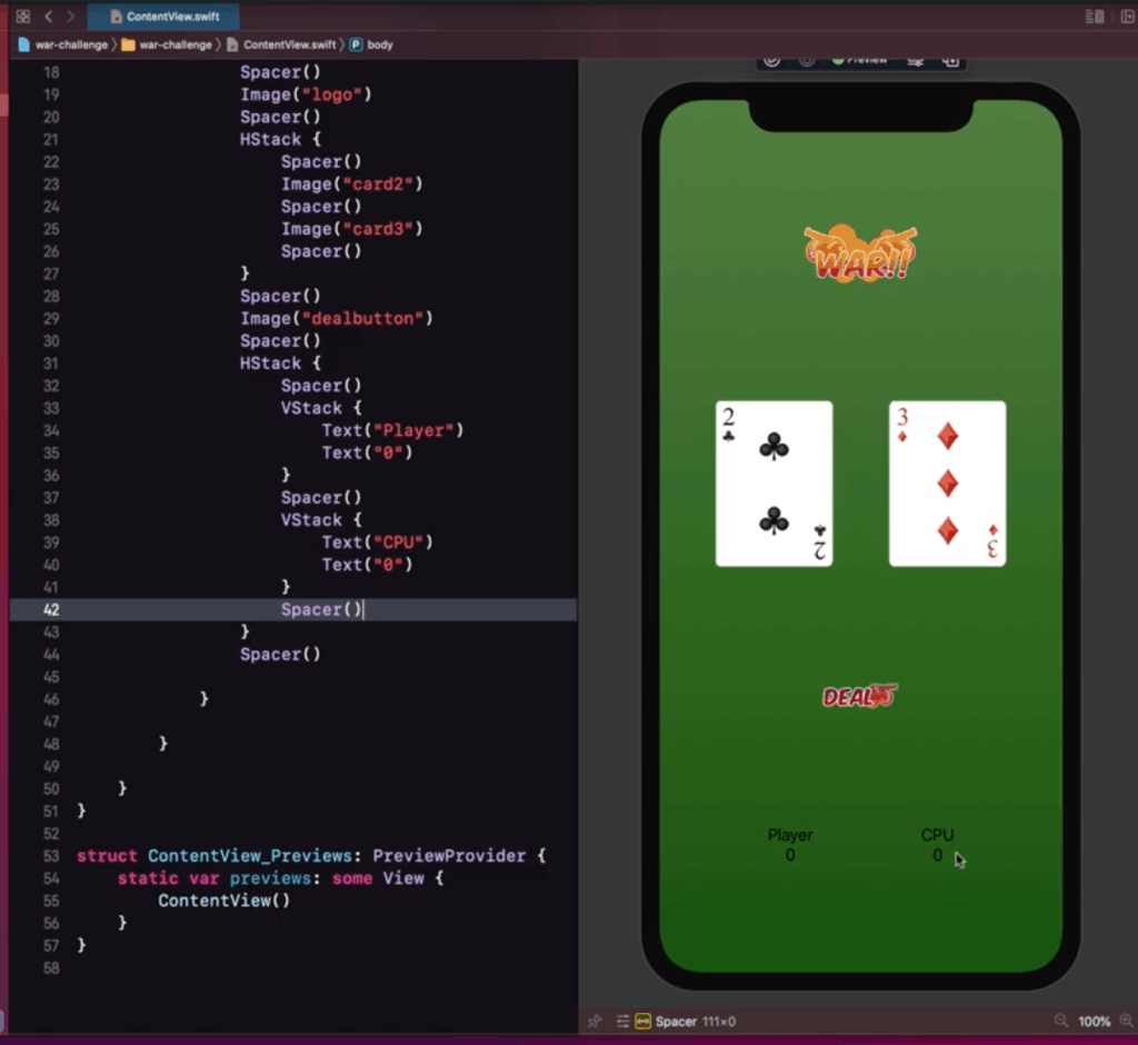
5. Add spacers
Notice how the UI elements are all bundled up together. We can use Spacers to be able to fill up gaps in the UI. Let’s try it just below the logo.
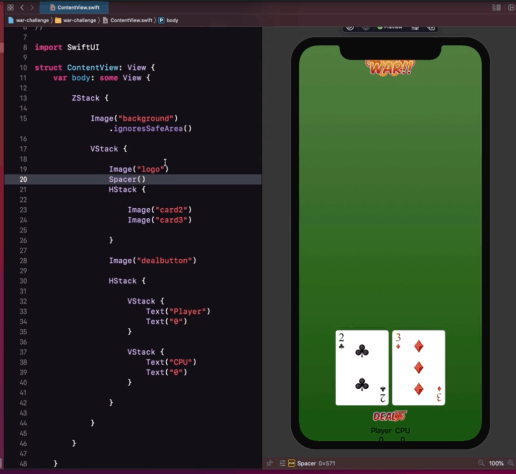
As you can see the Spacer took up all the remaining free space of the stack. Using more spacers will make it “evenly” distribute the free space all around your app. So add a bunch of them in between your UI Elements and at the start and end.
It should look like this by the time you are done:
6. Modify the Score Labels
If we look at our preview we can notice that the score labels are a little hard to read. We should modify it, so it looks clearer and maybe bigger.
For this part we set the player/cpu label to be of font type (using font) headline, we also changed the color of the text (using foregroundColor) to white. Also added a little padding at the bottom to add some space for the score label.
For the score we set the label to be of font type (using font) largeTitle, we also changed the color of the text (using foregroundColor) to white.
Once you are done the UI should look like this:
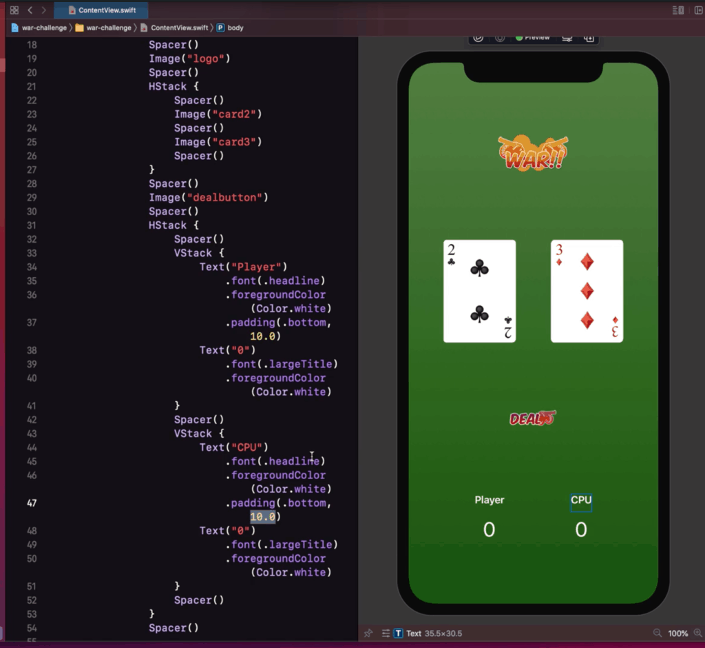
HStack {
     Spacer()
     VStack {
        Text("Player")
           .font(.headline)
           .foregroundColor(Color.white)
           .padding(.bottom, 10.0)
        Text("0")
           .font(.largeTitle)
           .foregroundColor(Color.white)
     }
     Spacer()
     VStack {
        Text("CPU")
           .font(.headline)
           .foregroundColor(Color.white)
           .padding(.bottom, 10.0)
        Text("0")
           .font(.largeTitle)
           .foregroundColor(Color.white)
        }
     Spacer()
}
Our UI now looks nice, clean, and ready for the next step!
Step 10: Add the deal button
A button is a type of Interactive UI element. It’s basically a UI element with an “action” coupled with it.
A basic “text” type button is done by doing a Button(title, action). However, you can also customize the button appearance by doing a Button(action, label). The label being a custom view.
Thus, we can change our old Image “deal” button and wrap it around the Button(action, label) element, being the that the image is the one inside the label.
We can ignore the action for now, since it will be covered in the next step.
So your code now sorta looks like this
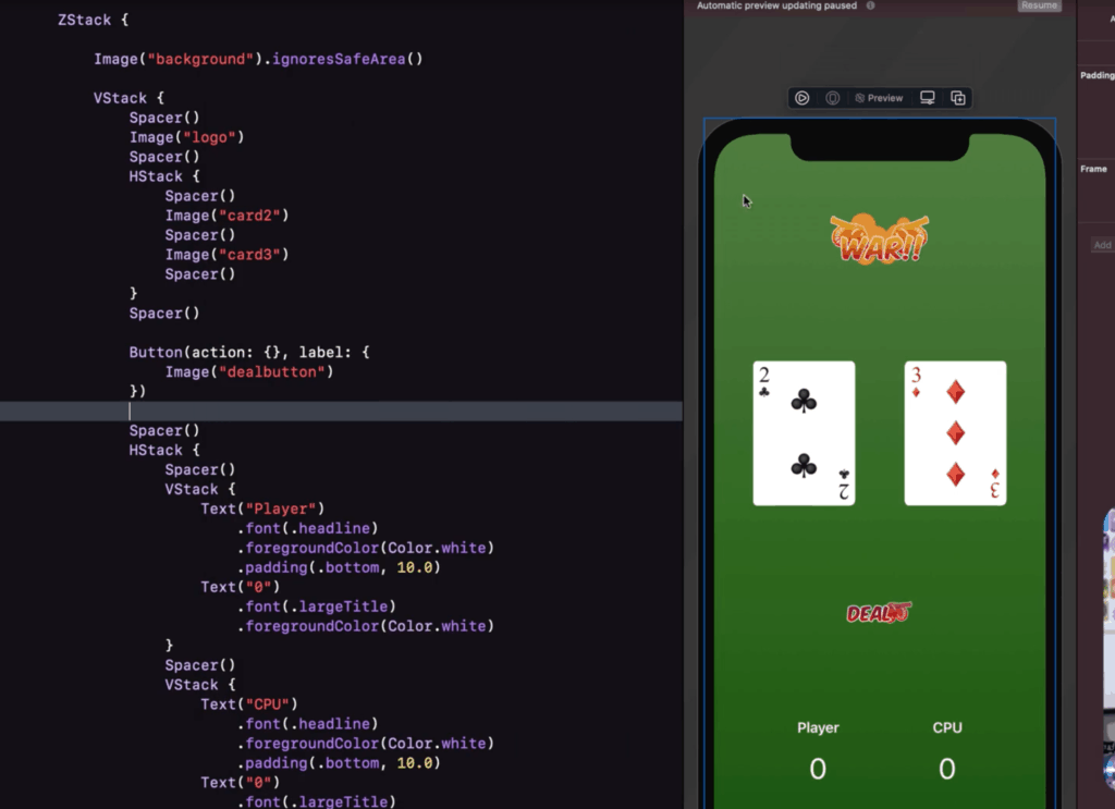
 Button(action: { },
        label: {
           Image("dealbutton")
        })
Visually there should not be any changes to the UI. But when you run on the simulator or the live preview, and you will notice that the button is now clickable.
Step 11: Adding Variables
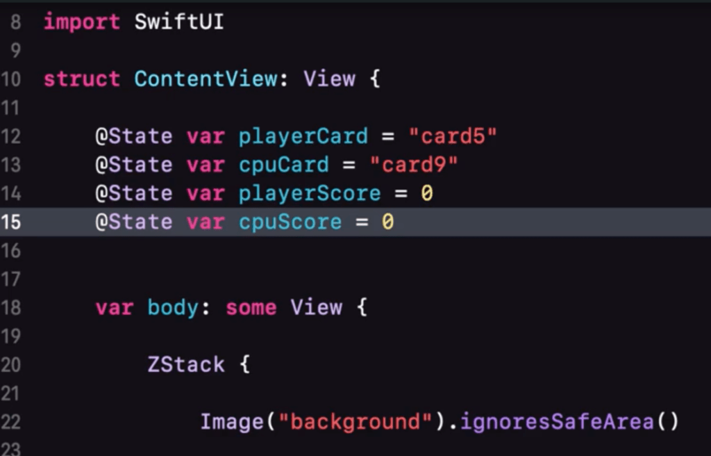
If you analyze the app, you will notice that there are 4 things we need to keep track of. The player card, the cpu card, the profile score, and the cpu score.
Let’s make some placeholder variables for them shall we, Also make sure that you declare it outside of the “body“ since you cannot declare it inside the views.
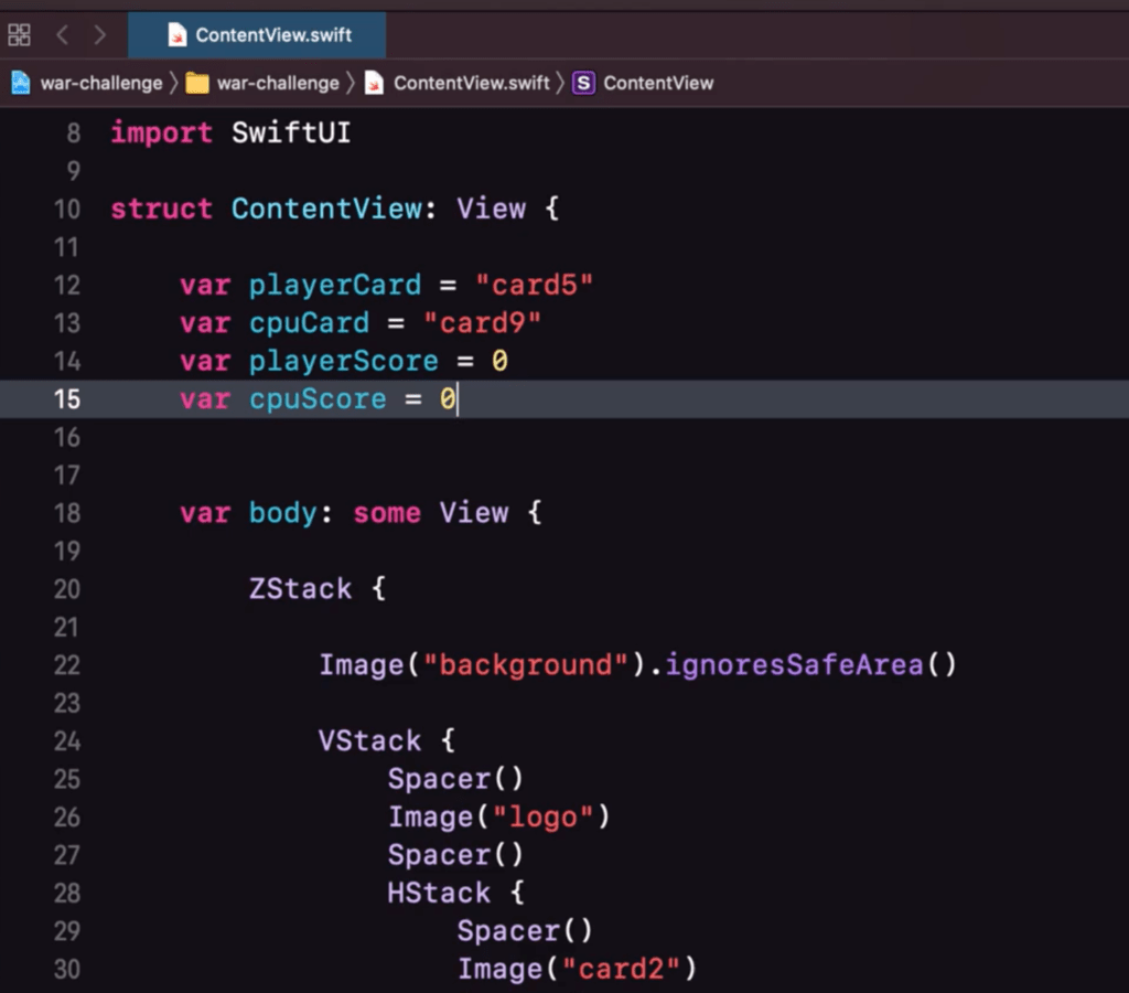
var playerCard = "card5"
var cpuCard = "card9"
var playerScore = 0
var cpuScore = 0
So the concept is that we want to randomly cycle through the cards and compare both cards to see who gets the score.
But first off, how do we even reflect the changes to the UI?
Modify player and cpu images
Notice in our display that we actually have hard coded values for the 1st and 2nd image.
We want this to be able to adapt to the values that we have specified. You can actually do this quite easily by just changing the content of the image to the variable. It should look like this:
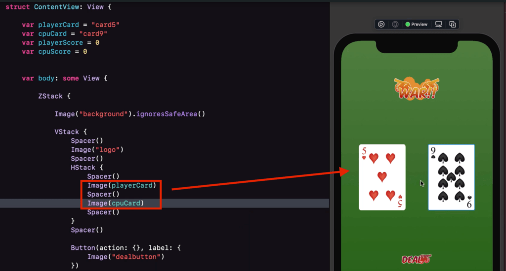
You will then notice that just by doing that, we have the image change dynamically according to what value the variable is set.
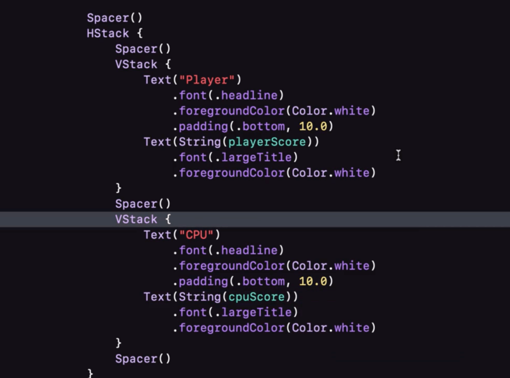
Modify Text scores
Using the same logic we can then also change the values of the player score and cpu score. However, you might notice that you can’t just directly set the value of playerScore to the Text.
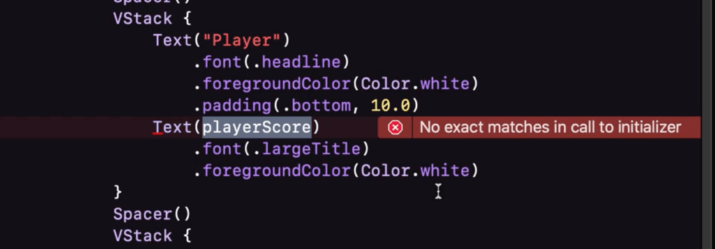
This is because there is a datatype mismatch. A Text usually asks for a String but our playerScore variable is of type Int. The easiest way to bypass this is just type-cast the value by doing a String(value).
The codes so far:
 ZStack {

            Image("background").ignoresSafeArea()

            VStack {
                Spacer()
                Image("logo")
                Spacer()
                HStack {
                    Spacer()
                    Image(playerCard)
                    Spacer()
                    Image(cpuCard)
                    Spacer()
                }
                Spacer()

                Button(action: {},
                label: {
                    Image("dealbutton")
                })

                Spacer()
                HStack {
                    Spacer()
                    VStack {
                        Text("Player")
                            .font(.headline)
                            .foregroundColor(Color.white)
                            .padding(.bottom, 10.0)
                        Text(String(playerScore))
                            .font(.largeTitle)
                            .foregroundColor(Color.white)
                    }
                    Spacer()
                    VStack {
                        Text("CPU")
                            .font(.headline)
                            .foregroundColor(Color.white)
                            .padding(.bottom, 10.0)
                        Text(String(cpuScore))
                            .font(.largeTitle)
                            .foregroundColor(Color.white)
                    }
                    Spacer()
                }
                Spacer()

            }

        }
Step 12: Adding the state
Let’s try adding to modify our player card when we press the button. So go ahead and head to the action portion of your button ui element.
Now try to modify the vaue of playerCard inside this function.
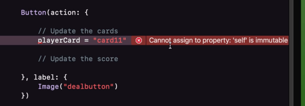
You will notice that the error said that the property is immutable. This simply means that the variables cannot be edited.
This is because after launching your app, the structure (ContentView) values cannot be edited anymore.
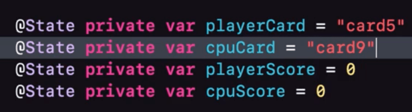
So to make it editable you can assign it as a @State property. This will allow us to update the values in it.
@State private var playerCard = "card5"
@State private var cpuCard = "card9"
@State private var playerScore = 0
@State private var cpuScore = 0
The @State properly also notifies the UI when the value changes, so it will automatically trigger to update the UI and make the changes.
Also, since we won’t be needing to share the @State properties for other views it would be best to keep it as a private variable, so we can keep it secure.
Step 13: Randomizing the cards
The next step would be to be able to cycle through our list of cards and display it to the screen.
One way we can do that is by utilizing Int.random(in: range). Where range is a range of values from N to N. So something like this.
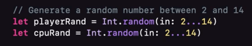
We will then use that random number generated as a Prefix to our “card” string so can we can determine what card it will show. Don’t forget to type-cast the number, so it doesn’t cause an error,

Button(action: {
// Generate a random number between 2 and 14
let playerRand = Int.random(in: 2...14)
let cpuRand = Int.random(in: 2...14)
// Update the cards
playerCard = "card" + String(playerRand)
cpuCard = "card" + String(cpuRand)
},
label: {
Image("dealbutton")
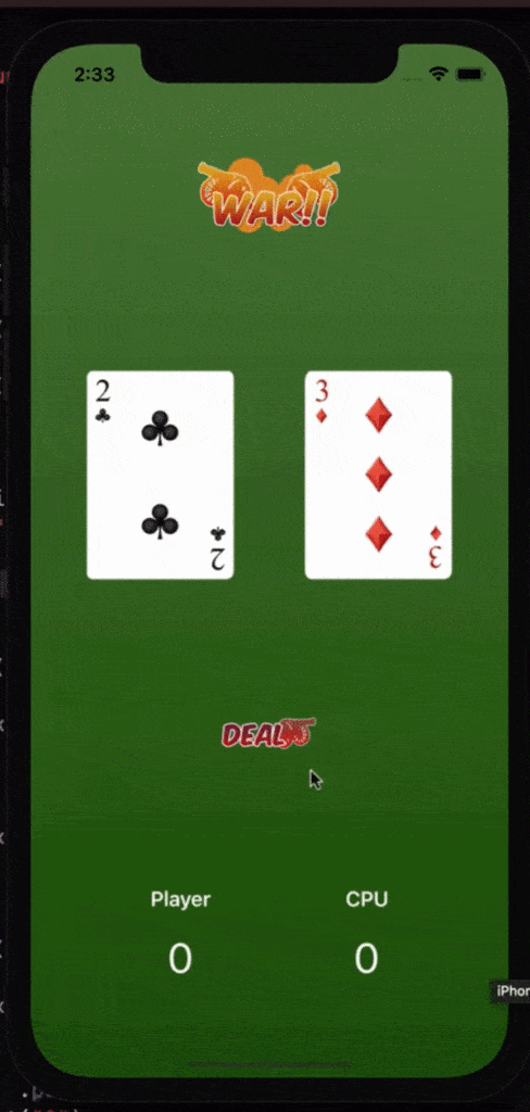
})Now if we test out button it should behave like this:

Step 14: Adding logic (and the scores)
The final part is to add logic in our app. It should be able to determine who will get the score/point based on who has the higher card value.
We can do logical expressions easily by using if-else statements.
Since we already have a value earlier to determine the prefix or value of the card, we can just use that value to compare and determine who gets the point.
So just compare the value of playerRand to cpuRand, and depending on who wins, will get their score updated by adding a +1.
You can update the score either by doing a playerScore = playerScore + 1 or you can use a shortcut expression of this which is playerScore += 1.
Your codes should look like this:
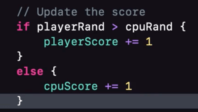
Button(action: {
           // Generate a random number between 2 and 14
           let playerRand = Int.random(in: 2...14)
           let cpuRand = Int.random(in: 2...14)

           // Update the cards
           playerCard = "card" + String(playerRand)
           cpuCard = "card" + String(cpuRand)

           // Update the score
           if playerRand > cpuRand {
              playerScore += 1
           }
           else if cpuRand > playerRand {
              cpuScore += 1
           }

        },
        label: {
           Image("dealbutton")
        })
Step 15: Profit!
Run your app!
Congratulations! You have completed the War Card App. I hope that you enjoyed the journey in making this first step in iOS development a reality.
If you are interested in a more detailed version of this tutorial you can check out our course here. Which you can sign up for the free 14 lesson course (it’s actually this app + concepts and detailed explanations)
See you around! 🙂
