
So many people transitioned from working at the office to working from home during 2020 and 2021, and a large number of them will have attended at least one Zoom or Teams call where they either presented or viewed a PowerPoint presentation. It quickly became one of the most common forms of team-wide or company-wide communication during the pandemic. With that in mind, I planned to write this post solely about making PowerPoint slides accessible. But then I started paying closer attention to people on video calls, and I noticed that the way we present information can be just as much of a barrier as the slides we show. So rather than repeating the same information that’s already available on WebAIM or Microsoft’s support documentation for making your slides accessible, I’ll focus on what happens after you hit “Save” and send out your meeting invitation.
“Can everybody see my screen?”
Typically, this is the first thing the presenter says when they start sharing, right? Well, not everyone on the call may be able to see your screen, but this is something that presenters rarely consider. The result: it may be very difficult for people with visual disabilities to understand what you’re presenting. Here are a few guidelines you can follow to be more inclusive.
When presenting:
- Explain visual information
- Pay attention to your audience
- Make your slides available and accessible
Explain visual information
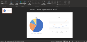
Most presentations I attend have more than one eye-sore slide that relies heavily on graphical data dumps. They are usually filled border to border with charts, graphs, and imagery that is impossible to follow even for sighted people. Usually, these are the slides that make me want to check my email instead of pay attention. But since I don’t foresee graphic-heavy slides ever going away, let’s at least talk about how to present them accessibly.
Every chart or graph has a point to make: You added the chart or graph to the slide to reinforce some key metric or data point. So be sure to verbally summarize that point. Not only will that help non sighted attendees understand the information, but you will also have the gratitude of everyone who didn’t want to interpret for themselves what all the different-colored bars or pie slices meant. Rather than saying things like, “As you can see, we did really well in the fourth quarter,” try elaborating a bit more: “We had a great fourth quarter with revenues hitting 25% above our target!” See how much more meaningful that is for everyone?
Of course, we can’t talk about visual information without bringing up the fluff that people tend to add. Think carefully about whether it’s really worth ruining the flow of your presentation to point out the decorative graphic of a lightbulb with little shine lines coming off of it in the top corner of your slide. If you’re adding tons of fluff to your slides, don’t feel the need to point them all out, and make sure that you add to your slides in a way that they won’t interrupt assistive technologies. Approach them the same way that you would the alt text for images. If you’d normally give an image empty alt text (alt=””), give the same treatment when describing your slide content. Visuals that are decorative—like clip art—may seem like a good idea, but they can be annoying for attendees who can’t see the screen, particularly when those visuals elicit verbal reactions from those who can.
Pay attention to your audience
Presenter: “Next slide, please”
[presentation moves to the next slide]
Attendees: [laughter]
Me (not looking at the slide because I’m multitasking): What just happened?
It’s easy to fall into this trap without realizing it. Funny anecdotal imagery or even poor slide transitions have lead to attendees verbally reacting more times than I can count. Because screen-reader users are rarely taken into consideration for video calls, these reactions go unexplained.
In a past life, I attended a team-building event that used a Jeopardy-style game over PowerPoint as an icebreaker. Each slide would have a question, and after about fifteen seconds, the presenter would advance the slide and the answer would fly in from the side. Then some people would cheer, while others would moan. Thinking back now, if I hadn’t been able to see each answer slide in, I would’ve completely lost out on the ability to participate because the correct answer was never verbally announced. I would’ve had a rough idea of how many people in the room had gotten it right or wrong, but I would’ve had no idea whether my own answer was correct.
It’s easy to just ride the high that your expert PowerPoint skills made people gasp in surprise because of how you transitioned into your big point. It takes conscious effort to recognize when those moments might call for you to verbally follow up on what people are reacting to. Or you could do everyone a favor and minimize those unnecessary transitions in the first place. Much like how it can be harmful to hide information behind clicks on the web, most of the time it’s much more useful to expose the information the whole time (unless, of course, you’re playing Jeopardy). And if it would require more time for you to explain things in detail, summarize to the best of your ability. In addition, make sure all of the more detailed information that you omitted by summarizing is available in your slides so attendees can go back later and get the complete picture.
Make your slides available and accessible
People showed up to your presentation, right? That means that it’s been on their calendar for some time, which means you had to send out the invite far enough in advance so that people could plan to attend. Wouldn’t it be great if those slides of yours were just attached to the invite? That way, people could follow along in whatever way was best for them, whether that’s skimming through them ahead of time, following along during the presentation, or following up on what they had needed to afterward. It would certainly save the inevitable question during your Q&A of “Will these slides be made available?”
Here are some extra techniques beyond what’s mentioned by WebAIM or Microsoft to make sure your slides will make sense to screen-reader users. Making your PowerPoint presentations accessible ultimately shares many strategies with accessibility for web, and in many places, presentation accessibility can even be measured against WCAG 2.1 success criteria. Generally speaking, you want to make sure your content is structured, reads in a logical order, and works well with assistive technologies. Below are a few things to consider when creating your presentations.
Hidden slide text
If you’re familiar with accessibility for the web, then you know what I mean by “screen reader only” or “visually hidden” text. This is when text is presented on a web page in a way that it’s visually suppressed but is still exposed to screen readers. But did you know that you can do something similar in PowerPoint? If you position text off of the slide, it won’t appear when presented, but it’ll still be in the reading order for screen-reader users.
This is incredibly useful in a couple of scenarios:
- Making sure all slides have a title. Sometimes you might not want a slide to have a visual title. But titles are important they help screen-reader users navigate between slides.
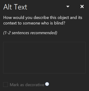
- Providing text alternatives. PowerPoint lets you provide text alternatives to graphics through the Alt Text Pane (available under the Shape Format or Picture Format ribbons). But if the text alternative is too long screen readers will stop announcing the content partway through. In that case, mark the graphic as decorative (a feature that’s only available in more recent versions of PowerPoint) and provide a text alternative off of the slide.
Structure your content
Unfortunately, we don’t have multiple “heading” levels in PowerPoint as we do in HTML There’s the slide’s title (announced as a “heading level 1”) and that’s it. The rest of the content within each slide is just read sequentially without any hierarchy. That’s why I’m an advocate of the “one idea per slide” approach. Each slide should have one point to get across, and that point should be summarized in the slide’s title. Try not to use large or bold text within your slide to break it down into smaller sections of content because that structure will only be available visually.
One form of structure we do have is ordered and unordered lists. Use them. Don’t create your own look-alike “lists” using visual layout and custom graphics or shapes in place of bullets. That being said, there are some quirks to built-in lists that you should be aware of:
- When you add a new item to a list, PowerPoint will create a little “shadow” bullet or number until you start typing the content. If you navigate away from the list, that disappears—but in the background, there is still a list item there for it. This list item is picked up by screen readers, and this will cause screen readers to wrongly announce the number of items in the list. Always backspace to remove any blank lines at the end of your lists to fix this.
- There’s a bug in both JAWS 2020 and JAWS 2021 where if you change the text formatting within a list item, it will mess with the list’s semantics. In JAWS 2020, it will wrongly announce the number of list items. In JAWS 2021, the list semantics will be ignored completely.
Be careful with spacing
Using the space bar, tab, or enter keys to force text to wrap or to create visual layout can cause screen-readers to unexpectedly pause when reading content. Instead, type each full sentence in one line and adjust the size of its textbox so it wraps how you want.
Tables… don’t use them for layout
Only use tables for displaying tabular data. Never use them for layout. Unlike in HTML, the grid semantics cannot fully be removed. PowerPoint always assumes that the first row or column contains the header cells. I’m not sure whether anyone is trying to make complex tables in PowerPoint these days, but unfortunately, complex headers cannot be effectively communicated to assistive technologies as things are right now.
Title your presentation
Most people don’t know about this, but the presentation itself can be given a descriptive title (which is different from its filename). If this title isn’t set, then it will always default to “PowerPoint Presentation,” which is far from useful. To change the title, go to File > Info > Properties > Title.
One last thing…
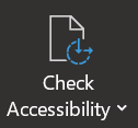
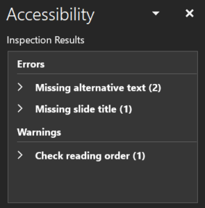
I’d be remiss if I didn’t plug PowerPoint’s built-in accessibility checker. It’s an incredibly useful tool that will call out common accessibility misses, like slides without titles, weird reading orders, or graphics without text alternatives. You can find the accessibility checker under the Review ribbon by activating the Check Accessibility button.
Before closing, I want to extend a big thanks to Isabel Holdsworth and Ryan Jones for sharing their perspectives with me on this topic. Their input completely changed the direction I took with this post, and I think this piece is much more useful for it.
Learn more about creating inclusive online meetings by registering for the on-demand webinar: Can Everybody See My Screen?