5 Rules for Designing Your App to Get More Referrals

Many apps have referral programs, but not every app succeeds in convincing users to participate. In this post, we’ll explore what you can do as a designer to get more users to first locate your referral program details and then share it with others.
There are many ways apps make money, from regular subscriber payments to in-app ads.
Word-of-mouth marketing, or referral marketing, is another great way to generate revenue from an app and to do so passively. Basically, it works like this:
- The app offers users an incentive to tell others about it.
- Users take a unique referral link and pass it on to others with a special incentive built in for them as well.
- When those people sign up for the app and start spending money (either on the app itself or on purchases within it), the referrer and referred receive their incentives.
- Your app, as a result, increases its user base and generates more income over the long haul—without having to do anything but publish details of the referral program in the app.
If you have a solid product and a sweet enough incentive to participate in the referral program, users should be more than happy to participate.
But how, when and where exactly do you let them know about the details of the referral program? Here are some rules to follow as you design your referral elements:
Rule 1: Put a Link to It Under Additional Settings
When building an app, you’re at a slight disadvantage when it comes to referral marketing. Compared to service providers that form person-to-person relationships with their customers or users, there’s no one in the app that can say:
“I’m so glad to hear that you were pleased with your experience. Would you mind letting your colleagues and friends know in case they’re looking for help as well?”
Really, you don’t want to detract too much from the app experience with these kinds of requests anyway. That’s why it’s best to put a link to your referral program a little deeper inside the navigation.
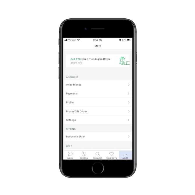
Take, for instance, the Rover app:
The referral program link doesn’t appear in the main navigation bar. Instead, users must navigate to the “More” tab to find it. Even then, the link isn’t called “Referral Program”. It appears twice in this menu and they’re both done in a more welcoming fashion.
The first is the illustrated banner at the top that says:
“Get $20 when friends join Rover—Share now”
The second is the page called “Invite friends”.
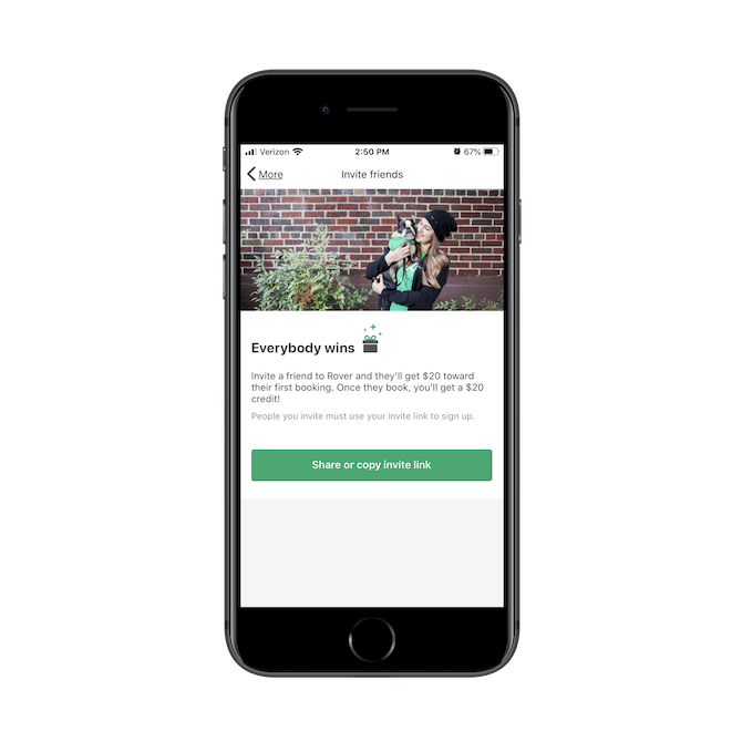
Both links take Rover users to the following page:
By including your referral program details deeper in the navigation, it takes the pressure off of users to participate. That said, the benefits of referral programs are widely known, so if users are pleased with your app, they’ll know exactly where to go looking for the details.
Rule 2: Only Promote It Inside the App When It Makes Sense
There’s another area of your app where you might want to promote your referral program and that’s within the main content of the app. There are really only a few conditions where this is acceptable though:
- When the app has a ton of content or a large inventory that the link can be tucked into after a few scrolls.
- When the promotion is so minimally designed that it’s easy to miss if the user is quickly scanning the app.
- When the offer directly impacts the outcome of the user’s next purchase or two, and it makes sense for them to take action sooner rather than later.
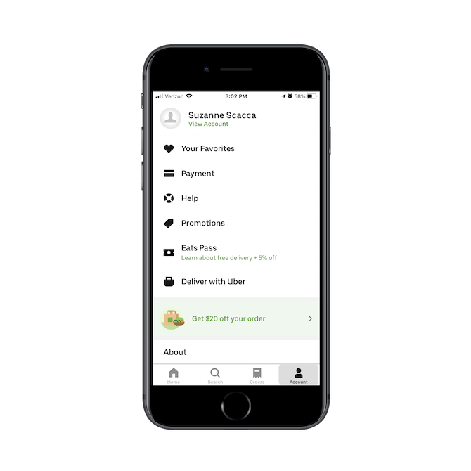
The Uber Eats app is one that’s handled this nicely. To start, this is how the referral program incentive is mentioned in the navigation:
The light-green highlighted bar stands out from the rest of the pages under “Account” settings. And if the colors don’t attract enough attention, the offer to “Get $20 off your order” will.
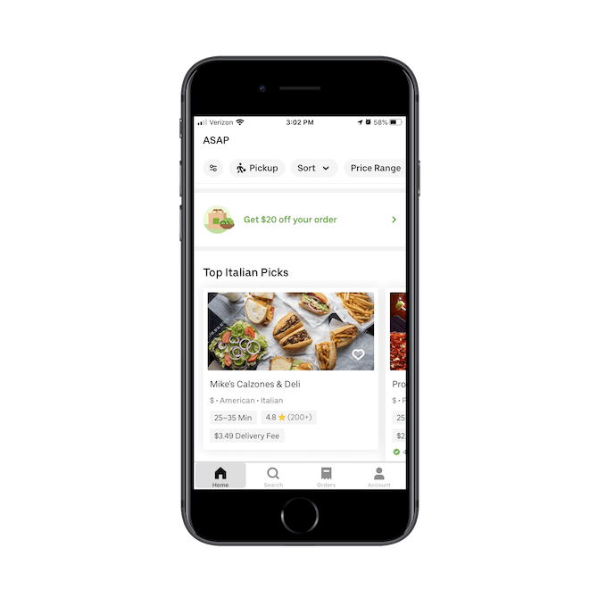
Uber Eats includes this same banner, icon and message within the main content of its app, too:
The only difference between the design in the navigation and the one here is that this banner has a white background. In designing it this way, the banner doesn’t stick out as much to users who are quickly scrolling through the list of restaurants for ideas on where to order delivery or pickup from.
Basically, if you feel it’s necessary to give users an additional reminder of the referral program, make sure it doesn’t distract from the main purpose of the app. Let them stumble upon it when they’re ready to see it.
Rule 3: Emphasize the Referrer’s Incentive
We have to be very careful when writing copy for websites or apps. If we use jargon that only we understand, it’ll be really difficult to get users onboard with it. And if we use messaging that’s only self-serving, we stand to push them even further away.
If we want users to embrace the solutions we’re trying to put in their hands—and that includes referral programs—we have to frame it in a way that says:
“You come first.”
For this example, I’m going to show you how Airbnb gets this both right and wrong.
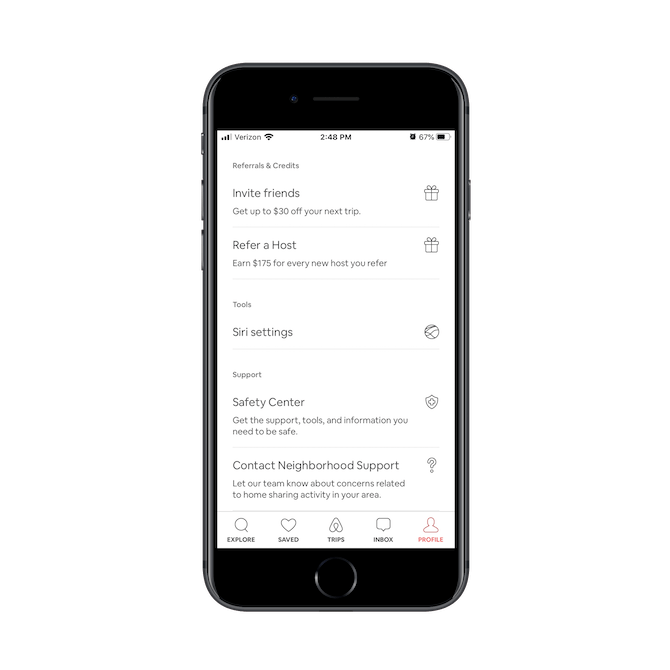
Here is how the referral program (there are two, actually) is broached in the navigation:
The first link encourages users to “Invite friends”. While I like that the second line expands on what the actual incentive is, I think this could be handled more succinctly. Perhaps with:
“Invite your friends. Get $30 off.”
The same goes for the second link, which encourages users to “Refer a Host”. While I get why they didn’t want to use “invite” or “get” again here, the words “Refer” and “Earn” just seem too clinical. I’d probably change this to:
“Share with homeowners. Make $175.”
I know it seems like an insignificant detail, but you have to remember that you’re trying to convince users to click through, learn about the program and then take advantage of it. While Airbnb is right to provide the referrer’s payout incentives in the navigation, tucking them away in secondary text that could easily be missed is not the best idea.
Be sure to work with your copywriter to ensure that your referral page links get the attention they deserve.
Rule 4: Create a Succinct and Attractive Referral Landing Page
As I mentioned already, there really isn’t a whole lot of mystery when it comes to referral marketing. We know that we need to incentivize users to share apps with others, and our users understand that most apps are going to offer them this opportunity.
That’s why you really shouldn’t waste any time when it comes to presenting them with the details of your referral program, especially in an app.
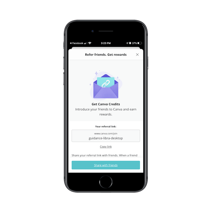
For example, this is the referral program page for the Canva app:
This page has most of what you need to sell users on participating in a referral program:
- An eye-catching design
- A quick invitation to participate
- A unique referral link and one-click “Copy link” button
However, it’s missing one important thing: a clear and concise incentive.
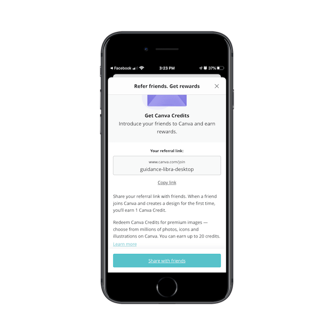
It’s not until users scroll down the referral page (if they even realize they need to) that they’ll learn what they get in return:
There’s no need for these explanatory paragraphs down here. All Canva needs to do is swap out the vague “rewards” talk above with details on the earned credits for premium images. That would allow users to quickly scan the page to see if it’s worth participating.
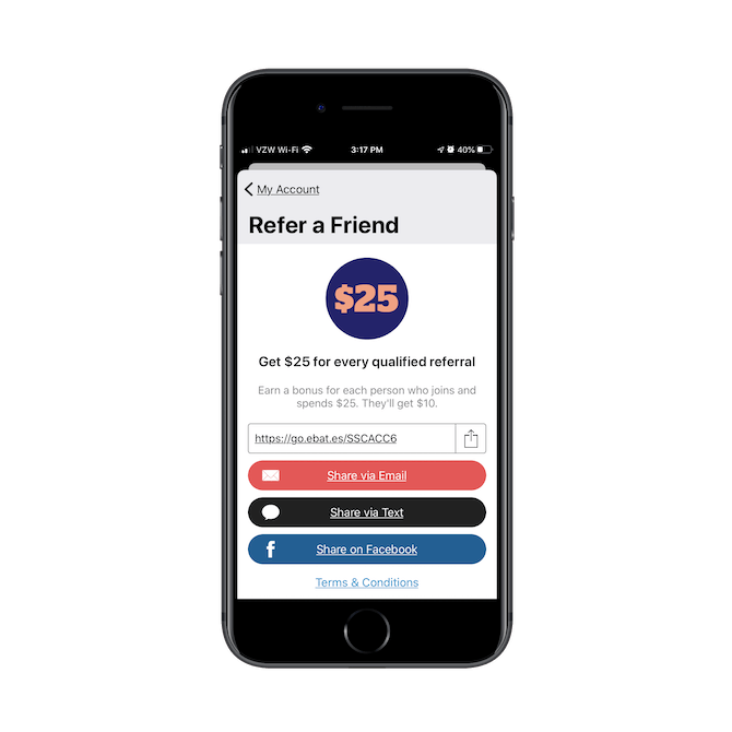
An app that handles this more effectively is Rakuten:
This page is perfect. It has an eye-catching design. It’s clear right from the get-go what users are going to get by participating ($25 for qualified referrals). And sharing is made simple by the email, text and Facebook quick-share links.
If your users were intrigued enough to click to this page, don’t waste their time with vague details or too-long pages. Just get right to it.
Rule 5: Simplify the Sharing Steps
Last, but not least, make it easy for your users to start sharing their referral links. We’ve already seen a few examples of how you might do this.
I’m going to show you one more.
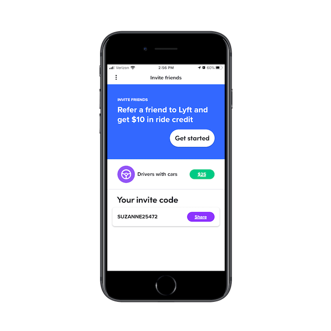
This is Lyft’s referral program page:
The page looks great, right? Pay close attention to where it says “Your invite code”.
For starters, the code is personalized, which is a nice touch. Rather than give users a random string of letters and numbers to share with their friends, they have something that’s personally connected to them.
Secondly, Lyft doesn’t force users to share their referral links by a few pre-selected options. Nor does it just give them a link to copy and force them to do the rest.
When users click “Share”, their phone’s share options automatically open. This way, they can quickly send the invite code to:
- Their personal phone contacts
- Someone through a messenger app
- Someone through email
- Their notepad where they store key bits of information like this
They can also copy the code and manually share it with social media followers and friends.
By making use of telephony features, you’ll make it much easier for users to share your app with who they want and where they want to in a matter of seconds.
How to Design Your App to Get More Referrals
While you might not be responsible for putting together details of the referral program, you can design the referral elements so that more users become aware of it and are compelled to take advantage of it.
Just remember that your users are well-informed of the benefits of referral programs. There’s no need to shove it in their faces. Just follow the rules above and gently lead them to their incentive.

Suzanne Scacca
A former project manager and web design agency manager, Suzanne Scacca now writes about the changing landscape of design, development and software.

