New Features and Improvements in Telerik TabView for Xamarin

Telerik TabView for Xamarin can be used to implement tab-based navigation in your Xamarin applications. You can add tabs in your app and display different content in each tab. In addition, the control has a variety of features and different customization options.
With our first release of the 2021, we have added additional features and improvements in the TabView control. We have added disabled tabs, swiping inside the TabView contents, and scrolling tabs to the control’s features set. And as a result, these features lead to many improvements in the control. 👏
In this blog post I will get you familiar with the latest features introduced in the TabView control and how you can use them in your application.
Disabled Tabs
Providing an option in the TabView control which allows to prevent a concrete tab from the TabView Header to be clicked was one of the most voted feature request in our feedback portal. As I ❤️️ to say, we listen to our customers, and the result is visible -> RadTabView control has a support for Disabled Tabs.😍
Using a single property IsEnabled allows you to choose which tab to disable.
In the example below, the Disabled Tab is the Vacation Tab:
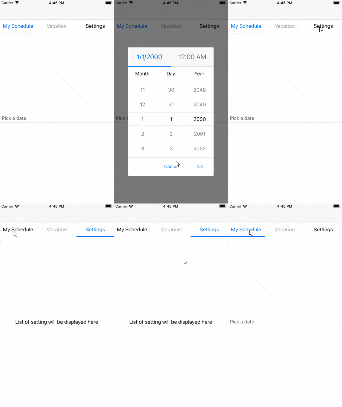
<telerikPrimitives:RadTabView x:Name="tabView"> <telerikPrimitives:RadTabView.Items> <telerikPrimitives:TabViewItem HeaderText="My Schedule"> <telerikPrimitives:TabViewItem.Content> <StackLayout HorizontalOptions="Center" VerticalOptions="Center"> <teleriInput:RadDateTimePicker Placeholder="Pick a date"/> </StackLayout> </telerikPrimitives:TabViewItem.Content> </telerikPrimitives:TabViewItem> <telerikPrimitives:TabViewItem HeaderText="Vacation" IsEnabled="False"> <telerikPrimitives:TabViewItem.Content> <Label Text="Next Vacation is Summer Vacation"/> </telerikPrimitives:TabViewItem.Content> </telerikPrimitives:TabViewItem> <telerikPrimitives:TabViewItem HeaderText="Settings"> <telerikPrimitives:TabViewItem.Content> <StackLayout VerticalOptions="Center" HorizontalOptions="Center"> <Label Text="List of setting will be displayed here"/> </StackLayout> </telerikPrimitives:TabViewItem.Content> </telerikPrimitives:TabViewItem> </telerikPrimitives:RadTabView.Items></telerikPrimitives:RadTabView>and this is how the TabView looks when there is a disabled tab

Change TabView Content with Swiping
Another top voted feature request in our feedback portal. And as a result you can use it from R1 2021 official release Telerik UI for Xamarin version 2021.1.119.1.
Now changing the content of the tabs using swipe gesture is the default behavior of the TabView for Xamarin control. Another option you can use is whether you want an animation or not while swiping through the tabs.
You can enable the animation setting IsContentSwipingAnimationEnabled to True
If you want to prevent the swiping feature you will need to set the IsContentSwipingEnabled bool property to False. The default value of the IsContentSwipingEnabled property is True.
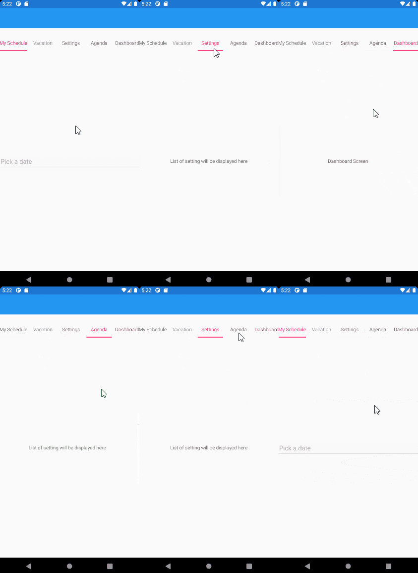
In the video below we can see how the selected tab is changed using swipe gesture 😉

Scrolling Inside the TabView Header
If there are too many items in the TabView control and they cannot fit into the tab strip area Overflow Button is displayed. Now you can choose whether you want the Overflow Button to be visualized or scrolling inside the TabView Header.
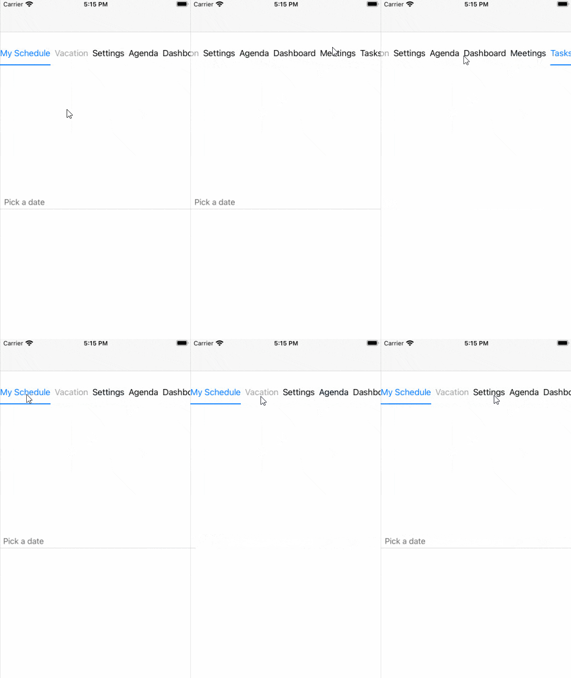
What should you do if you want to scroll inside the Header? - It is very simple and easy 🤗 You would need to use the RadTabView Header property of type TabViewHeader - just set its IsScrollable property to True.
<telerikPrimitives:RadTabView x:Name="tabView"> <telerikPrimitives:RadTabView.Header> <telerikPrimitives:TabViewHeader IsScrollable="True" ItemSpacing="5"/> </telerikPrimitives:RadTabView.Header>and how the scrolling works;

Your Feedback Is Important—Let Us Know What You Think
We hope these features will make the control usage more intuitive by the uses of the application🤩.
As always, we encourage you to share your ideas or opinions on the controls and thus play a role for shaping our roadmap. You can write in the Telerik UI for Xamarin feedback portal or simply raise a ticket.

Dobrinka Yordanova
Dobrinka Yordanova is a Technical Support Engineer, part of the Progress Telerik UI for Xamarin & UWP team in Sofia, Bulgaria. She holds a master's degree in Computer Systems and Technologies. Her passion is traveling around the world and exploring multicultural environments. In her spare time she likes making sushi, playing console games and hanging out with friends.
