Beautiful UI and Outstanding Performance Fresh from the Oven with CardView for WPF

With the R1 2021 release we introduced a brand new control in the Telerik UI for WPF suite. The CardView control is here to shake up your data layouts! Let’s place the cards on the table and order them in a cool tableau in this article.
Do you want to do something different regarding your data visualization? Or maybe your customers need to display their business cards in a more efficient and elegant way than with the standard data grid? Then CardView is the perfect fit for you. The component design is inspired by Microsoft Outlook Business Card view, but it brings several additional features like grouping, expand/collapse of cards and other sweets.
In addition to the component specific features, the package contains also built-in localization that automatically translates the control’s setting texts based on the currently applied UI culture. Another thing that is included is the fast and furious UI virtualization which allows you to load large amounts of data, but render only the cards displayed within the viewport, thus boosting the performance. And on top of this, you benefit from theming support which allows you to choose from one of the predefined designs and make your UI as pretty as a picture.
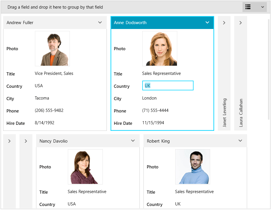
In the following lines, I would like to dive into the features of the control and present you its capabilities.
One Drop-Down to Rule Them All
All the cool features of CardView are brought under the command of the drop-down menu located on its right top side. This includes grouping, where the user can interactively organize the data with a simple drag and drop action. Sorting, where you can re-order the cards and groups. And filtering, which allows you to display your cards based on one or more conditions.
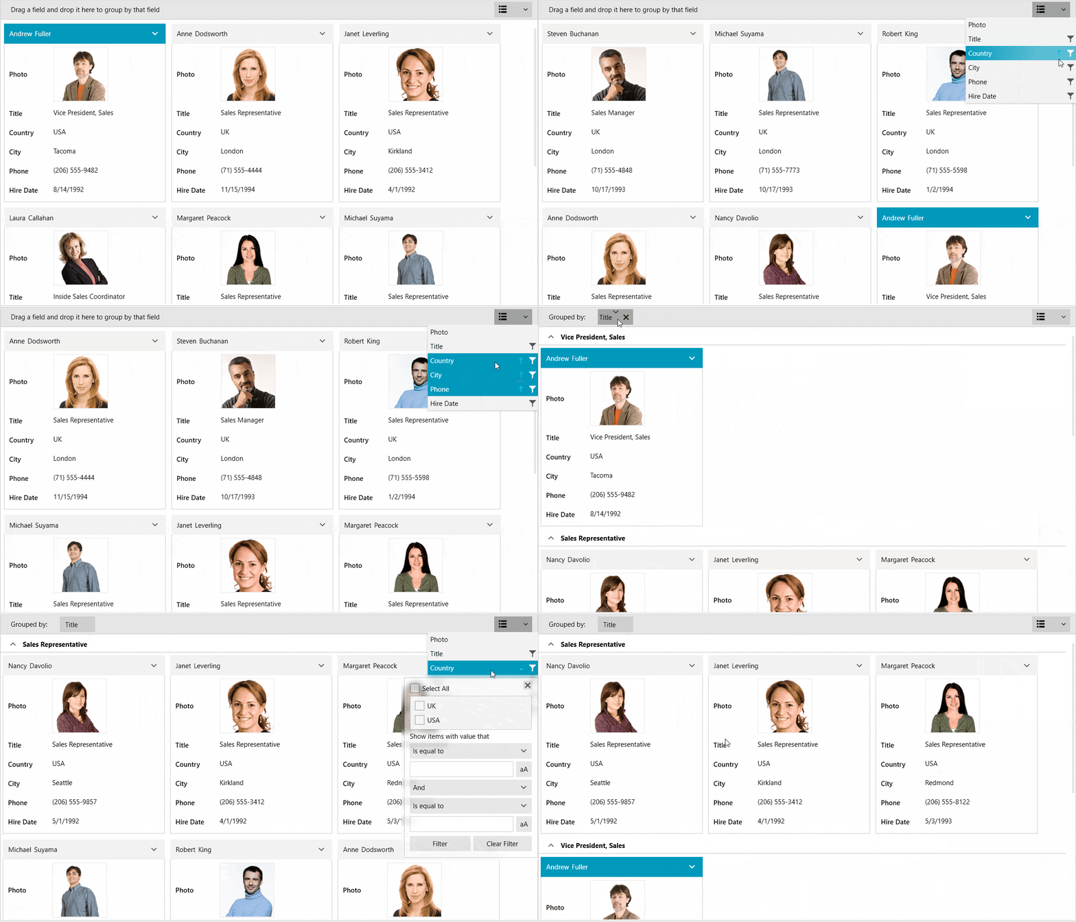
If you want to take full control over this set of features, or in other words, if you want to manipulate them in code-behind, you can take advantage of the QueryableCollectionView class as described in the help documentation.
Pick a Card
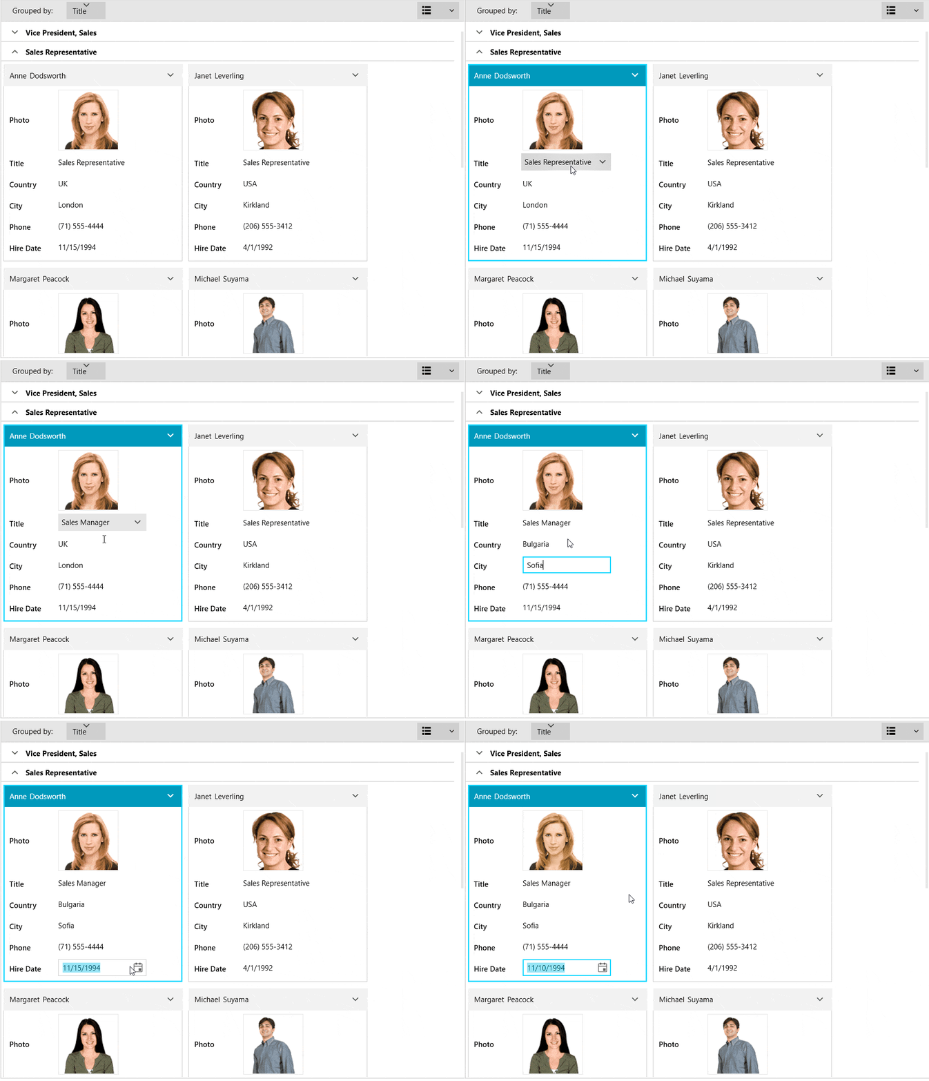
Selection of a card is as easy as clicking on it in the UI. This highlights it and enables you to start editing its data fields. With the customizable editor templates each data field can use a different editor.
Hide Your Cards
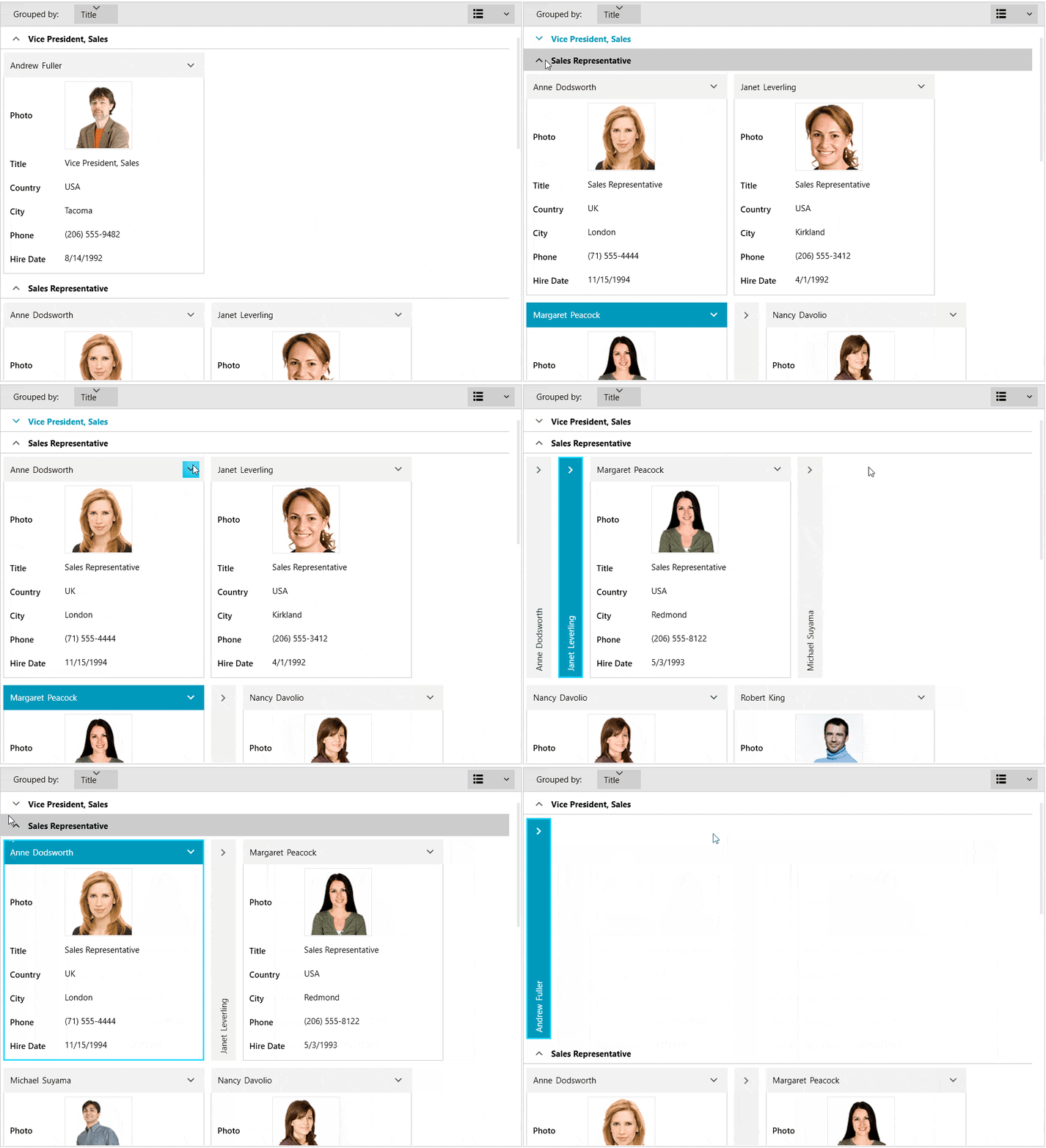
The built-in expand and collapse support of cards and groups is a great way to hide all card information and leave only the header part visible. This way you can give focus only to one or several specific cards or groups within the view.
Customize Cards
In case you want to replace some information or portions of the UI in the cards you can easily do so using the built-in customization capabilities of the component. You can swap the standard TextBox editors for a ComboBox, a NumericUpDown or whatever floats your boat. In addition to this, the card and group headers are also customizable. Not to mention the filtering control part. Hint, hint: Check the help documentation.
Draw Me Like One of Your French Controls
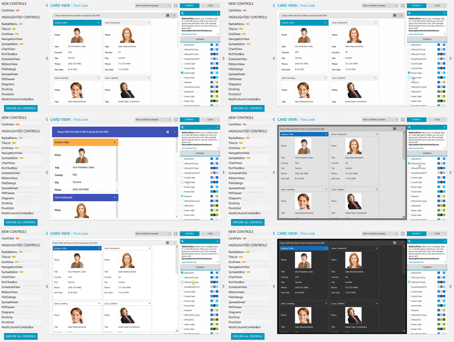
One of the greatest features of All Telerik controls—including CardView—is the rich set of built-in themes that you can easily switch even at run-time. All the images in this post are showcasing the Light color variation of the Fluent theme. It is not necessary to create a greenfield project to test out the different designs. Instead, check out the Telerik UI for WPF Controls Demo where most examples give you the opportunity to change the current theme and be astonished by the great designs.
All Around the World
Some businesses find it critical to translate their application’s UI to different languages so they can reach a broader audience. In this relation, CardView translates the texts of its UI settings to several different languages, including German, Spanish, French and few more. The UI is automatically translated based on the current culture of the application. Jump onto the help documentation train for a full list of supported languages and bonus information on how to implement custom localization.
Get Started
A great place to start with CardView for WPF is the documentation where all features of the component are described along with runnable code snippets. Anyway, I would try to make a bit easier for you and create a small demonstration in the next few lines. The following example will show you how to create a simple business cards view populated with custom business objects.
Let’s start by referencing the required Telerik assemblies. Those are:
- Telerik.Windows.Controls.dll
- Telerik.Windows.Controls.Data.dll
- Telerik.Windows.Controls.Input.dll
- Telerik.Windows.Data.dll
The next step is to create a class that describes the cards.
public class BusinessCard
{
    public string ContactName { get; set; }
    public string PhoneNumber { get; set; }
    public string Email { get; set; }
    public string Website { get; set; }
    public string Title { get; set; }
}
For the sake of simplicity, we can populate the source in the MainWindow of the application.
private static Random rndNumberGenerator = new Random(0);
public MainWindow()
{
    InitializeComponent();
    var firstNames = new List<string>() { "Laura", "Anne", "Margaret", "Michael", "Robert", "Steven" };
    var lastNames = new List<string>() { "Suyama", "Davolio", "Buchanan", "King", "Peacock", "Leverling" };
    var titles = new List<string>() { "Sales Representative", "Sales Manager", "Inside Sales Coordinator", "Vice President, Sales" };
    var source = new ObservableCollection<BusinessCard>();
    for (int i = 0; i < 10; i++)
    {
        var firstName = firstNames[rndNumberGenerator.Next(0, firstNames.Count)];
        var lastName = lastNames[rndNumberGenerator.Next(0, lastNames.Count)];
        source.Add(new BusinessCard()
        {
            ContactName = firstName + " " + lastName,
            PhoneNumber = "(71) 555-4444",
            Email = firstName.ToLower()[0] + "." + lastName.ToLower() + "@telerikdemo.com",
            Website = firstName.ToLower() + lastName.ToLower() + ".com",
            Title = titles[rndNumberGenerator.Next(0, titles.Count)]
        });
    }
    DataContext = source;
}
And the final step would be to define the CardView control in XAML and set its properties.
<telerik:RadCardView ItemsSource="{Binding}"
                     CardHeaderBinding="{Binding ContactName}"
                     MinorLength="250"
                     AutoGenerateDataFieldDescriptors="False">
    <telerik:RadCardView.DataFieldDescriptors>
        <telerik:CardDataFieldDescriptor DataMemberBinding="{Binding Title}" />
        <telerik:CardDataFieldDescriptor DataMemberBinding="{Binding PhoneNumber}" Header="Phone"/>
        <telerik:CardDataFieldDescriptor DataMemberBinding="{Binding Email}" />
        <telerik:CardDataFieldDescriptor DataMemberBinding="{Binding Website}" />
    </telerik:RadCardView.DataFieldDescriptors>
</telerik:RadCardView>
Finale
I hope this features overview renders useful for you. From this point on, you should be able to start devising clever UI solutions with the component. Begin your journey with Telerik UI for WPF with a quick download from your telerik.com account. If you are new to the product, you can get a free 30-day trial:
If you have any feedback or questions on the controls, I strongly encourage you to send us your comments. You can do this in the comments section below or in the Feedback Portal.

Martin Ivanov
Martin Ivanov is a technical support engineer working alongside the developers on the Progress Telerik UI for WPF team in Sofia. He has been working on Telerik support resources since 2013, when he graduated Telerik Academy and joined the company. In his spare time, Martin loves to test new experiences and skills which varies from digital painting, dancing classes, playing video games to trying different sports and playing the guitar. Find him on LinkedIn if you want to chat.
