

Material Design is a design system that helps teams build high-quality digital experiences. It brings together style, interaction, and motion to create hierarchy, meaning, and continuity throughout the application.
Material Design comes with material components for Android that are necessary to ensure developers come up with beautiful designs. In this tutorial, you'll get an overview of several of these Android components and build a login page using Material Design.
The login page will contain the following components:
- the app logo
- username and password text fields
- a login button
- a reset password link
Prerequisites
- basic knowledge of Android development
- Android Studio (learn more here if you don't have it already)
- an Android emulator or physical device


Getting Started
To create a new project in Android Studio, select the Empty Activity, and click Next. Enter a name, pick a location, and select an API level. Click Finish to create the project.
Add Project Dependencies
Navigate to the app module's build.gradle file and add the MDC Android support library as shown below. Then sync the project.
1 |
api 'com.google.android.material:material:1.1.0-alpha06' |
The Main Activity Layout
Now we'll edit the main Activity layout main_activity.xml. The main activity contains a simple ConstraintLayout which acts as a container for the TextView component.
1 |
<?xml version="1.0" encoding="utf-8"?>
|
2 |
<androidx.constraintlayout.widget.ConstraintLayout xmlns:android="https://schemas.android.com/apk/res/android" |
3 |
xmlns:app="http://schemas.android.com/apk/res-auto" |
4 |
xmlns:tools="http://schemas.android.com/tools" |
5 |
android:layout_width="match_parent" |
6 |
android:layout_height="match_parent" |
7 |
tools:context=".MainActivity"> |
8 |
|
9 |
<TextView
|
10 |
android:layout_width="wrap_content" |
11 |
android:layout_height="wrap_content" |
12 |
android:text="Hello World!" |
13 |
app:layout_constraintBottom_toBottomOf="parent" |
14 |
app:layout_constraintLeft_toLeftOf="parent" |
15 |
app:layout_constraintRight_toRightOf="parent" |
16 |
app:layout_constraintTop_toTopOf="parent" /> |
17 |
|
18 |
</androidx.constraintlayout.widget.ConstraintLayout>
|
ConstraintLayout provides a drag-and-drop interface that allows you to position a given widget relative to another one. You can constrain a widget on the horizontal and vertical axis.
AppCompat Theme and Colors
The theme for our application is set to Theme.MaterialComponents.DayNight.DarkActionBar by default. Let's change it to Theme.Appcompact.Light.DarkActionBar. The theme.xml file also defines other colors, as shown below.
1 |
<resources xmlns:tools="http://schemas.android.com/tools"> |
2 |
<!-- Base application theme. -->
|
3 |
<style name="Theme.RUBBY" parent="Theme.MaterialComponents.DayNight.DarkActionBar"> |
4 |
<!-- Primary brand color. -->
|
5 |
<item name="colorPrimary">@color/purple_500</item> |
6 |
<item name="colorPrimaryVariant">@color/purple_700</item> |
7 |
<item name="colorOnPrimary">@color/white</item> |
8 |
<!-- Secondary brand color. -->
|
9 |
<item name="colorSecondary">@color/teal_200</item> |
10 |
<item name="colorSecondaryVariant">@color/teal_700</item> |
11 |
<item name="colorOnSecondary">@color/black</item> |
12 |
<!-- Status bar color. -->
|
13 |
<item name="android:statusBarColor" tools:targetApi="l">?attr/colorPrimaryVariant</item> |
14 |
<!-- Customize your theme here. -->
|
15 |
|
16 |
<item name="colorOnBackground">@color/white</item> |
17 |
</style>
|
18 |
</resources>
|
The color system allows us to quickly change the color scheme of the entire application.
-
colorPrimaryandcolorSecondaryare the colors of your brand.colorSecondaryprovides more ways to accent select parts of your UI. -
colorPrimaryVariantandcolorSecondaryVariantare lighter or darker shades ofcolorPrimaryandcolorSecondary. -
colorOnPrimaryis used to tint elements displayed on top of the primary colors, such as text and icons. -
colorOnSecondaryis used to tint elements displayed on top of the secondary colors, such as text and icons. -
colorBackgroundis the background color of your app.
The Material Design color system is meant to create harmony in apps. The Google standards describe how to create a color palette that is intended to enhance the user experience. The diagram below shows an example of a color palette that can be used with Material Design.


How to Use the Material Design Color Palette
When choosing the colors for your app, it is recommended to limit them to three primary hues and one secondary color. The primary color is the color that appears most frequently across your app's screens and components. A secondary color is optional and provides a contrast to your application. You can also use a primary color to provide contrast. The secondary color should be used for specific actions such as:
- text fields and cursors
- floating buttons
- text selection
- progress bars
- selection controls, buttons, and sliders
- links
The UI below shows a representation of the correct use of color in Material Design.


Material Design Components
As mentioned earlier in the tutorial, Material Design apps use Material Design components. Some of these include:
- Android menus and toolbar
- floating action buttons (FABs), snackbars, and CoordinatorLayout
- floating labels
- AppBar
- collapsing toolbar
- navigation drawer and menus
- Android animations
- RecyclerView and CardView
Lets start by adding the logo using the material design ImageView component. Delete the TextView and add the following to main_activity.xml.
1 |
<com.google.android.material.imageview.ShapeableImageView
|
2 |
android:id="@+id/logo" |
3 |
android:layout_width="0dp" |
4 |
android:layout_height="250dp" |
5 |
android:layout_margin="10dp" |
6 |
android:layout_marginTop="44dp" |
7 |
android:background="@drawable/logo" |
8 |
app:layout_constraintEnd_toEndOf="parent" |
9 |
app:layout_constraintHorizontal_bias="0.473" |
10 |
app:layout_constraintStart_toStartOf="parent" |
11 |
app:layout_constraintTop_toTopOf="parent" /> |
Next, add the username and password text fields. We'll use the Material Design text field component, which includes built-in functionality that displays a floating label and error messages.
1 |
<com.google.android.material.textfield.TextInputEditText
|
2 |
android:id="@+id/text_username" |
3 |
android:layout_width="match_parent" |
4 |
android:layout_height="40dp" |
5 |
android:layout_marginStart="8dp" |
6 |
android:layout_marginTop="52dp" |
7 |
android:layout_marginEnd="8dp" |
8 |
android:backgroundTint="#FFFFFF" |
9 |
android:hint="@string/username" |
10 |
android:inputType="text" |
11 |
app:layout_constraintEnd_toEndOf="parent" |
12 |
app:layout_constraintHorizontal_bias="0.0" |
13 |
app:layout_constraintStart_toStartOf="parent" |
14 |
app:layout_constraintTop_toBottomOf="@+id/logo" /> |
15 |
|
16 |
<com.google.android.material.textfield.TextInputEditText
|
17 |
android:id="@+id/password" |
18 |
android:layout_width="match_parent" |
19 |
android:layout_height="40dp" |
20 |
android:layout_marginStart="8dp" |
21 |
android:layout_marginTop="32dp" |
22 |
android:layout_marginEnd="8dp" |
23 |
android:hint="@string/password" |
24 |
android:inputType="textPassword" |
25 |
app:layout_constraintBottom_toBottomOf="parent" |
26 |
app:layout_constraintEnd_toEndOf="parent" |
27 |
app:layout_constraintHorizontal_bias="0.0" |
28 |
app:layout_constraintStart_toStartOf="parent" |
29 |
app:layout_constraintTop_toBottomOf="@+id/text_username" |
30 |
app:layout_constraintVertical_bias="0.0" /> |
The android:inputType="textPassword" attribute hides the input text when someone is entering the password.
Don't forget to add the string resources for the text fields in the strings.xml file.
1 |
<resources>
|
2 |
<string name="app_name">RUBBY</string> |
3 |
<string name="username">Username</string> |
4 |
<string name="password">Password</string> |
5 |
</resources>
|
Configure a Vector Asset
Vector assets allow you to configure images with a single vector graphic. Let's add vector assets for the username and password text fields. Go to drawable > New > Vector asset and choose a person clip art image for the username text field.


Repeat the same process and select a lock for the password text field.
Two XML files have now been created in the drawable folder, and you can use the drawable file with the attribute android:drawableStart, as shown below.
1 |
<com.google.android.material.textfield.TextInputEditText
|
2 |
|
3 |
android:id="@+id/username" |
4 |
android:drawableTint="#D500F9" |
5 |
android:drawableStart="@drawable/person" |
6 |
|
7 |
/>
|
8 |
1 |
<com.google.android.material.textfield.TextInputEditText
|
2 |
android:id="@+id/password" |
3 |
android:drawableStart="@drawable/lock" |
4 |
android:drawableTint="#D500F9" |
5 |
|
6 |
/>
|
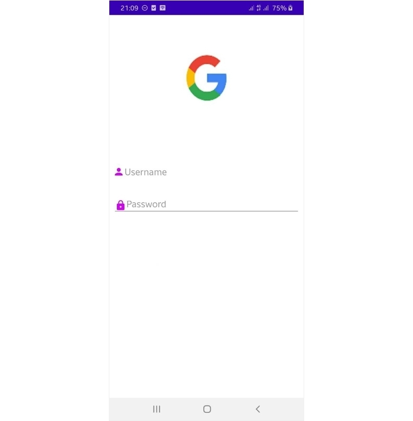
The app should now look like this.


Next, add the Login button. We'll use the Material Design Button component, which comes with a built-in ink ripple effect.
1 |
<com.google.android.material.button.MaterialButton
|
2 |
android:id="@+id/login_button" |
3 |
android:layout_width="200dp" |
4 |
android:layout_height="wrap_content" |
5 |
android:text="@string/login" |
6 |
app:backgroundTint="@color/purple_200" |
7 |
app:layout_constraintBottom_toBottomOf="parent" |
8 |
app:layout_constraintEnd_toEndOf="parent" |
9 |
app:layout_constraintHorizontal_bias="0.498" |
10 |
app:layout_constraintStart_toStartOf="parent" |
11 |
app:layout_constraintTop_toBottomOf="@+id/password" |
12 |
app:layout_constraintVertical_bias="0.287" /> |
Lastly, add the forgot password TextView below the login button.
1 |
<com.google.android.material.textview.MaterialTextView
|
2 |
android:id="@+id/forgot_password" |
3 |
android:layout_width="wrap_content" |
4 |
android:layout_height="40dp" |
5 |
android:autoLink="web" |
6 |
android:text="@string/forgot_password" |
7 |
android:textColorLink="#00B0FF" |
8 |
android:textSize="22sp" |
9 |
app:layout_constraintBottom_toBottomOf="parent" |
10 |
app:layout_constraintEnd_toEndOf="parent" |
11 |
app:layout_constraintStart_toStartOf="parent" |
12 |
app:layout_constraintTop_toBottomOf="@+id/login_button" |
13 |
app:layout_constraintVertical_bias="0.347" /> |
Round Background
Let's create a round background for the elements. Go to Drawable > New drawable resource and add the folllowing.
1 |
<?xml version="1.0" encoding="utf-8"?>
|
2 |
<shape xmlns:android="http://schemas.android.com/apk/res/android"> |
3 |
<solid android:color="#F5F5F8"/> <!-- this one is ths color of the Rounded Button --> |
4 |
<corners
|
5 |
android:bottomRightRadius="10dp" |
6 |
android:bottomLeftRadius="10dp" |
7 |
android:topLeftRadius="10dp" |
8 |
android:topRightRadius="10dp"/> |
9 |
</shape>
|
Add the background to the text fields and button.
1 |
<com.google.android.material.textfield.TextInputEditText
|
2 |
..............................
|
3 |
android:id="@+id/username" |
4 |
android:background="@drawable/round_button" |
5 |
............./> |
6 |
<com.google.android.material.textfield.TextInputEditText
|
7 |
..............................
|
8 |
android:id="@+id/password" |
9 |
android:background="@drawable/round_button" |
10 |
............./> |
11 |
<com.google.android.material.button.MaterialButton
|
12 |
...................
|
13 |
android:id="@+id/login_button" |
14 |
android:background="@drawable/round_button" |
15 |
...................
|
16 |
/>
|
17 |
The final app should look like this:


Conclusion
In this tutorial, you've learned some Material Design fundamentals and discovered how to apply colors in Material Design to fit your brand. The key to a beautiful application in Material Design lies in bringing different elements together while following the Material Design principles. To learn more, check out the following articles:


.jpeg)
.jpeg)


