This tutorial shows you how to use Column widget in Flutter.
Column is a widget that displays its children in a vertical array. If you want to define several widgets rendered in a vertical column according to their order, the Column widget is suitable for that purpose. The usage examples of Column widget, including how to customize the layout, can be found in this tutorial.
Using Column Widget
Below is the constructor of Column widget.
  Column({
    Key key,
    MainAxisAlignment mainAxisAlignment = MainAxisAlignment.start,
    MainAxisSize mainAxisSize = MainAxisSize.max,
    CrossAxisAlignment crossAxisAlignment = CrossAxisAlignment.center,
    TextDirection textDirection,
    VerticalDirection verticalDirection = VerticalDirection.down,
    TextBaseline textBaseline = TextBaseline.alphabetic,
    List<Widget> children = const <Widget>[],
  }
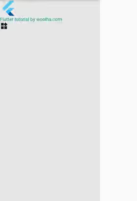
It doesn't have any required argument. Usually, you need to pass the list of widgets to be rendered as children argument.
  Container(
    width: 300,
    color: Color.fromARGB(100, 200, 200, 200),
    child: Column(
      children: [
        FlutterLogo(
          size: 50,
        ),
        const Text('Flutter tutorial by woolha.com', style: const TextStyle(color: Colors.teal)),
        Icon(Icons.widgets),
      ],
    ),
  )
Output:

Set Main Axis Alignment
By default, the children are aligned to the start of the main axis. You can change that behavior by passing mainAxisAlignment. The possible values are:
start: Place the children as close to the start of the main axis as possible.end: Place the children as close to the end of the main axis as possible.center: Place the children as close to the middle of the main axis as possible.spaceAround: Place the free space evenly between the children as well as half of that space before and after the first and last child.spaceBetween: Place the free space evenly between the children.spaceEvenly: Place the free space evenly between the children as well as before and after the first and last child.
Here's an example with the mainAxisAlignment is set to spaceEvenly.
  Container(
    width: 300,
    color: Color.fromARGB(100, 200, 200, 200),
    child: Column(
      mainAxisAlignment: MainAxisAlignment.spaceEvenly,
      textBaseline: TextBaseline.alphabetic,
      children: [
        FlutterLogo(
          size: 50,
        ),
        const Text('Flutter tutorial by woolha.com', style: const TextStyle(color: Colors.teal)),
        Icon(Icons.widgets),
      ],
    ),
  )
Output:

You can see the difference between the possible values from the pictures below.
start
center
end
spaceAround
spaceBetween
spaceEvenly
Set Cross Axis Alignment
By default, the children are aligned to the center in the cross axis, which means they are positioned to the center of the x-axis. To change the alignment of the children in the cross axis, you need to pass crossAxisAlignment argument. The values you can pass are:
start: Place the children as close to the start of the cross axis as possible.end: Place the children as close to the end of the cross axis as possible.center: Place the children so that their centers align with the middle of the cross axis.stretch: Require the children to fill the cross axis.baseline: Place the children along the cross axis such that their baselines match.
If you set the crossAxisAlignment to stretch, it's also necessary to pass textBaseline argument.
  Container(
    width: 300,
    color: Color.fromARGB(100, 200, 200, 200),
    child: Column(
      crossAxisAlignment: CrossAxisAlignment.basline,
      textBaseline: TextBaseline.alphabetic,
      children: [
        FlutterLogo(
          size: 50,
        ),
        const Text('Flutter tutorial by woolha.com', style: const TextStyle(color: Colors.teal)),
        Icon(Icons.widgets),
      ],
    ),
  )
Output:

Below are the screenshots that show the difference between the possible values.
start
center
end
baseline
stretch
Set Main Axis Size
The size of the widget in the main axis, which is the height for a Column widget, maximizes the amount of free space along the main axis by default. In others word, it will be as tall as possible. To change that behavior, pass mainAxisSize argument and set the value to MainAxisSize.min. That will make the height to depend on the total height of its children.
min: Minimize the amount of free space along the main axismax: Maximize the amount of free space along the main axis
  Container(
    width: 300,
    color: Color.fromARGB(100, 200, 200, 200),
    child: Column(
      mainAxisSize: MainAxisSize.min,
      children: [
        FlutterLogo(
          size: 50,
        ),
        const Text('Flutter tutorial by woolha.com', style: const TextStyle(color: Colors.teal)),
        Icon(Icons.widgets),
      ],
    ),
  )
Output:

Set Vertical Direction
From the previous examples, the children are rendered from top to bottom according to the order they're defined. Passing verticalDirection argument allows you to set whether the children should be rendered from top to bottom or vice versa.
  Container(
    width: 300,
    color: Color.fromARGB(100, 200, 200, 200),
    child: Column(
      verticalDirection: VerticalDirection.up,
      children: [
        FlutterLogo(
          size: 50,
        ),
        const Text('Flutter tutorial by woolha.com', style: const TextStyle(color: Colors.teal)),
        Icon(Icons.widgets),
      ],
    ),
  )
Output:

Layout Algorithm
To understand how Flutter places the children of a Column widget, you need to understand the layout algorithm.
- Layout each child a null or zero flex factor with unbounded vertical constraints and the incoming horizontal constraints. If the
crossAxisAlignmentisCrossAxisAlignment.stretch, use tight vertical constraints that match the incoming max width. - Take children with non-zero flex factors and set the height according to the flex factor.
- Take the remaining children and set the horizontal constraints to be the same as in step 1. The vertical constraints are based on the space allocated in step 2. Children with
Flexible.fitproperty is set toFlexFit.tightwill be given tight constraints. Otherwise, children withFlexible.fitproperty is set toFlexFit.loosewill be given loose constraints. - Set the width of the
Columnto be the maximum width of the children. That means the width will always satisfy the horizontal constraints). - Set the height of the
Columndepending onmainAxisSizeproperty. - Move the position of each child according to
mainAxisAlignmentandcrossAxisAlignment.
For controlling the width of the children, you may need to wrap some of the children as the child of another widget such as Expanded or Flexible. Below is an example that wrap the second child of the above examples as the child of an Expanded widget. Therefore, the width of the second child will fill the available space.
  Column(
    children: [
      FlutterLogo(
        size: 50,
      ),
      Expanded(
        child: Container(
          width: double.infinity,
          color: Colors.teal,
          child: Center(
            child: const Text(
              'Woolha.com is a blog about programming',
              style: const TextStyle(color: Colors.white, fontSize: 30),
              textAlign: TextAlign.center,
            ),
          ),
        ),
      ),
      Icon(Icons.widgets),
    ],
  )
Output:

Column Parameters
Key key: The widget's key.MainAxisAlignment mainAxisAlignment: How the children should be placed along the main axis. Defaults toMainAxisAlignment.start.MainAxisSize mainAxisSize: How much space should be occupied in the main axis.. Defaults toMainAxisSize.max.CrossAxisAlignment crossAxisAlignment: How the children should be placed along the cross axis. Defaults toCrossAxisAlignment.center.TextDirection textDirection: used to set the order to lay children out horizontally and how start and end should be interpreted in the horizontal direction..VerticalDirection verticalDirection: used to set the order to lay children out vertically and how start and end should be interpreted in the ;vertical direction. Defaults toVerticalDirection.down.TextBaselinetextBaseline: The baseline to use if aligning items using their baseline. Defaults toTextBaseline.alphabetic.List<Widget> children: The widgets below this widget in the tree. Defaults toconst []
Full Code
  import 'package:flutter/material.dart';

  void main() => runApp(MyApp());

  class MyApp extends StatelessWidget {

    @override
    Widget build(BuildContext context) {
      return MaterialApp(
        title: 'Woolha.com Flutter Tutorial',
        home: _ColumnExample(),
      );
    }
  }

  class _ColumnExample extends StatelessWidget {

    @override
    Widget build(BuildContext context) {
      return Scaffold(
        appBar: AppBar(
          title: const Text('Woolha.com Flutter Tutorial'),
        ),
        body: Container(
          width: 300,
          color: Color.fromARGB(100, 200, 200, 200),
          child: Column(
  //          mainAxisAlignment: MainAxisAlignment.spaceEvenly,
  //          verticalDirection: VerticalDirection.up,
  //          crossAxisAlignment: CrossAxisAlignment.baseline,
  //          textBaseline: TextBaseline.alphabetic,
  //          mainAxisSize: MainAxisSize.min,
            children: [
              FlutterLogo(
                size: 50,
              ),
  //            const Text('Flutter tutorial by woolha.com', style: const TextStyle(color: Colors.teal)),
              Expanded(
                child: Container(
                  width: double.infinity,
                  color: Colors.teal,
                  child: Center(
                    child: const Text(
                      'Woolha.com is a blog about programming',
                      style: const TextStyle(color: Colors.white, fontSize: 30),
                      textAlign: TextAlign.center,
                    ),
                  ),
                ),
              ),
              Icon(Icons.widgets),
            ],
          ),
        ),
      );
    }
  }
Summary
The Column widget allows us to arrange multiple children in the same vertical column. You can utilize the optional named arguments to customize several things such as the alignment of the children, the main axis size, and the render direction. This widget is very common to use and therefore you need to know about it.
You can also read about:
