What’s New in Kendo UI for Vue with R1 2021

The R1 2021 release of Kendo UI for Vue has arrived bringing new native UI components for Vue including the MultiSelect, Window, and more.
For Vue developers we are here to kick off the year with a bang! The R1 2021 release for Kendo UI for Vue is here and it brings a set of new native components for Vue along with enhancements to existing components. Let’s dive right in and see what is new in Kendo UI for Vue with R1 2021.
New Native Vue Components
New Component: MultiSelect

The new native Vue MultiSelect component from Kendo UI for Vue offers users an intuitive user experience for selecting multiple values within a dropdown. Each selected value can appear as a list of entries and listed out as strings or as tokens and users can easily delete entries using mouse interactions or keyboard navigation.
This Vue component is perfect for scenarios that require the look-and-feel of a simple input but give users the ability to select multiple values.
Check out the Kendo UI for Vue MultiSelect Component in action right here.
New Component: Window
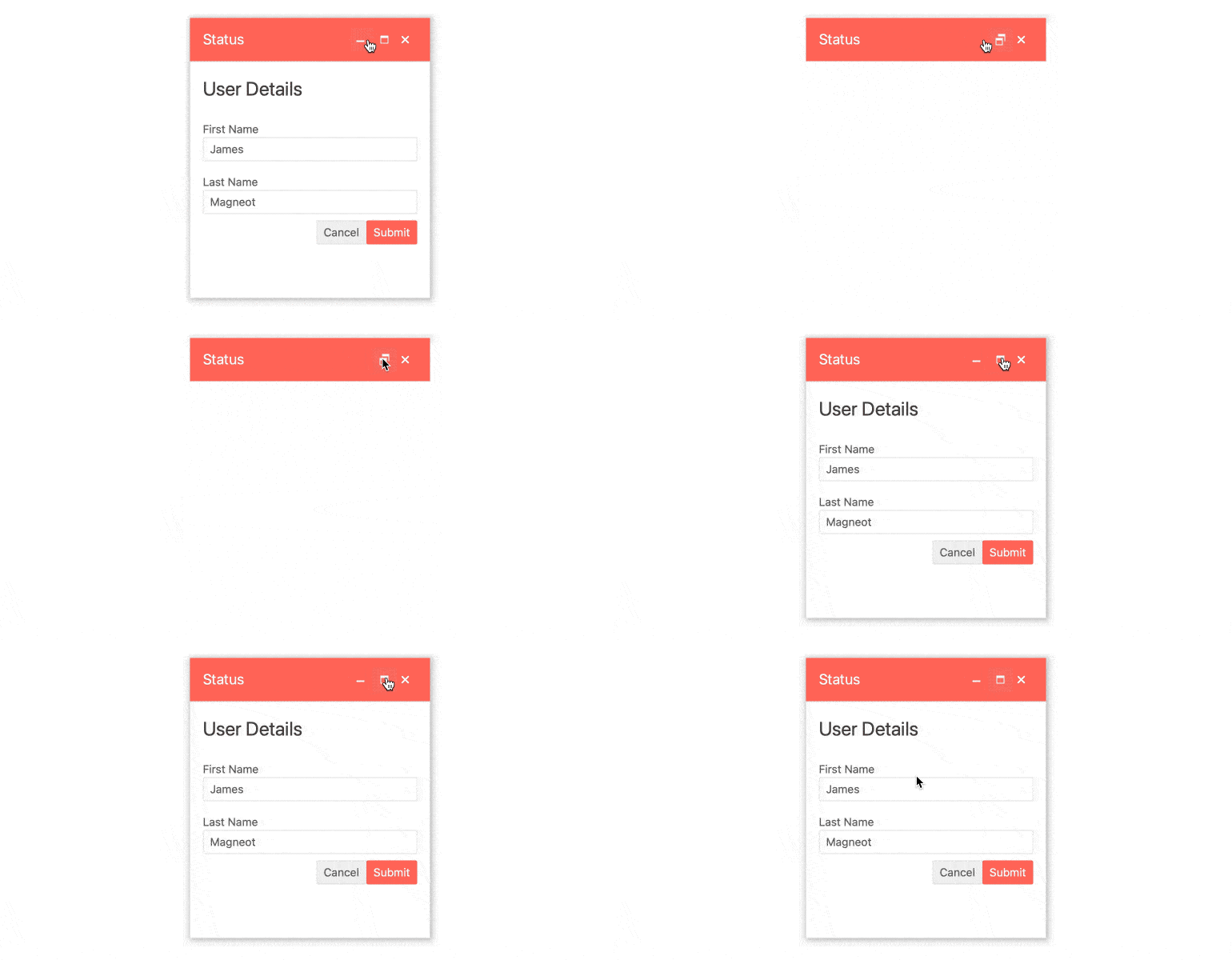
With the new Kendo UI for Vue Window component developers can now easily add in a window experience similar to that of desktop windows within any Vue application.
Aspects of the Vue Window like the title, the action items that allow for minimizing and maximizing, and the content, can all be configured ahead of time and controlled using our intuitive API.
For a closer look at the Vue Window component head on over to the Kendo UI for Vue Window documentation.
New Component: TimePicker
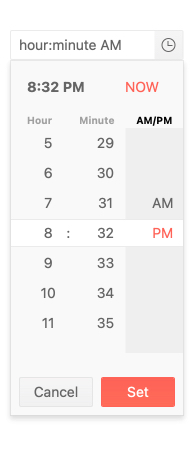
Continuing the trend of adding pickers in to the Kendo UI for Vue library, with R1 2021 we are officially introducing the Vue TimePicker component. This input element allows users to select a time from an available drop down list or they can input their desired time using their keyboard. Of course, this comes with built-in validation and prevents characters not related to time from being inserted in to the TimePicker’s input.
To play around with the Vue TimePicker and to see all available configuration options, head on over to the Kendo UI for Vue TimePicker documentation section.
New Component: DateTimePicker
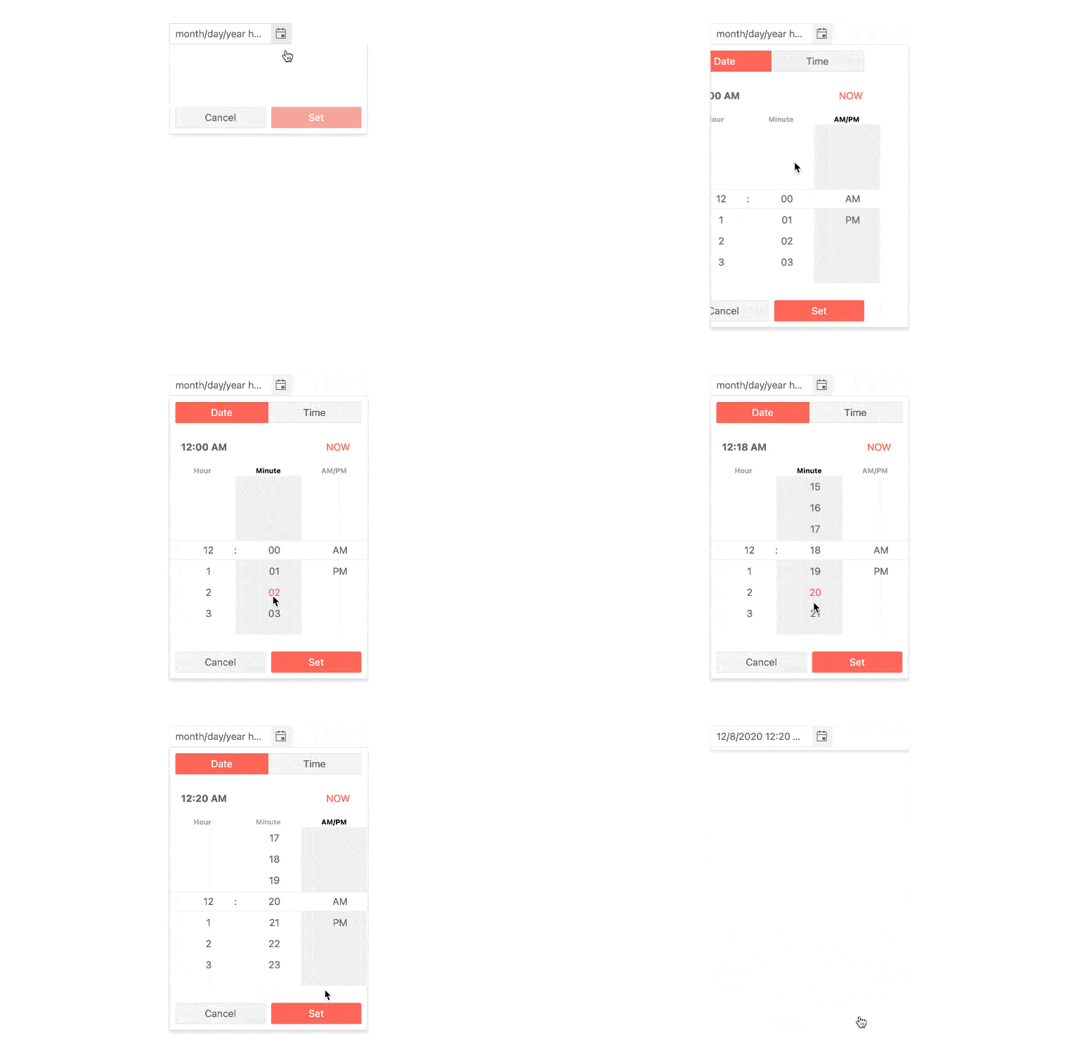
Wrapping up the list of most popular pickers in the Kendo UI collection, we also managed to release the Kendo UI for Vue DateTimePicker component. This picker combines the Vue DatePicker and TimePicker components into a single interface, allowing users to pick both the Date and the Time that they desire.
Selecting either Date or Time is done through the provided drop down and features a Vue Calendar to select the date and a list of available time slots. Alternatively, users can input both date and time using just their keyboard.
To play around with the Kendo UI for Vue DateTimePicker component you can refer to this documentation article.
New Component: Slider
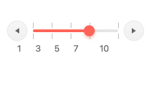
Last but not least, with R1 2021 Kendo UI for Vue also introduced the Vue Slider component. This is one of those UI components that makes your Vue applications pop by letting users select a value within a range through dragging a single handler across a visual range. This is a great substitute for regular inputs where a value needs to be provided and developers can set up the minimum and maximum values of the range through a single configuration option for each.
Check out the Kendo UI for Vue Slider component documentation right here.
Expanded Component Features
Grid - Keyboard Navigation
With R1 2021 the Kendo UI for Vue Grid has expanded its keyboard navigation capabilities to cover more scenarios related to interacting with the Vue Data Grid using just the keyboard. This is greatly improves the accessibility of the Kendo UI for Vue Grid component and lets users that need to use their keyboard to do actions like editing, selection, paging, and more through keyboard shortcuts.
For insight into common types of keyboard navigation and how to implement them in your Kendo UI for Vue Grid, check out this documentation article!
Grid - Checkbox Selection in the Column Menu
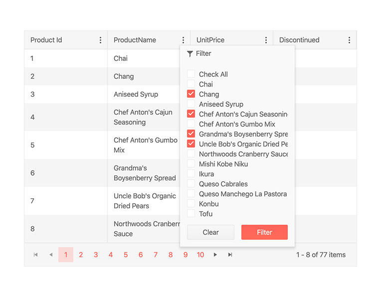
Adding on to the growing list of features in the Vue Data Grid, with R1 2021 we are also introducing the ability for the Kendo UI for Vue Grid’s column menu to showcase a list of available columns in the current data set and offer users the ability to show or hide a column based on selecting or deselecting a checkbox.
Head on over to the Kendo UI for Vue Data Grid Column Menu docs and demos for more information.
We Want Your Feedback!
Did we miss a UI component that you need for your Vue applications? Or maybe you need a feature in an existing component? Well, we want to hear from you! Feel free to add comment in the comment section below, or submit an item to our Kendo UI for Vue feedback portal. Every component and feature in the R1 2021 release came from feedback from our customers so make sure to make your voice heard!
Register for our Live R1 2021 Webinar
If you want to see everything I just covered in action or ask myself and the rest of the Kendo UI for Vue crew any questions join us for the Kendo UI R1 2021 Release Webinar on Thursday, January 28th starting at 11:00 AM ET. For more details head on over to our webinar registration page. Seats are limited so don’t forget to snag your spot today!
Join Us on Twitch
Looking for even more? You can also catch us on a special full-day Twitch session from 8am - 5pm ET on January 29th.

Carl Bergenhem
Carl Bergenhem was the Product Manager for Kendo UI.
