How do you make sure your app looks great on every single one of the 24,000+ Android devices in the world, especially now that there are Android watches and smart TVs? How do you make sure your app displays every element of your design and is thoroughly readable and enjoyable, whether it’s viewed on a 2-inch watch or a large tablet? Responsive UI Design is your answer.
In the words of Paul Sawers of Venturebeat.com, “The sheer number of different Android screen sizes, ranging from the miniscule to the massive, is mind-boggling.” In fact, even Apple devices are now a little more fragmented that they used to be a couple of years ago. There are a number of different screen sizes spread across the iPhone 6, iPhone 6 plus, iPhone 5, iPhone 4 and the many different iPads. And of course, now there’s the ever-controversial iPhone X, that comes with a whole other set of design challenges. Do check out our post on iPhone X design hacks right here.
Clearly, designers are bound to have a hard time designing apps that can adapt intuitively to each of these screen sizes. Thankfully, we have responsive layouts in material design that adapt to any possible screen size out there. Now, making the best of responsive design techniques is crucial to producing spectacular interfaces, because responsive design isn’t just one technology, it is a set of different techniques that need to be used in a combination.
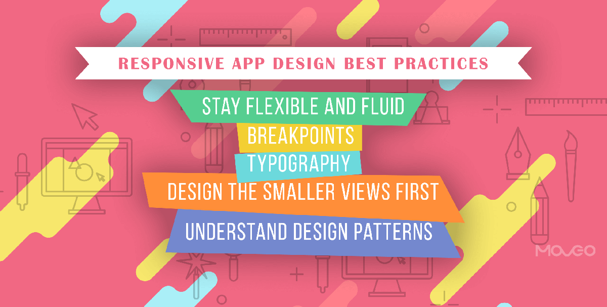
Today, let’s talk about some responsive UI best practices that will help you design apps that look stunning on any device of any screen size.
1. The First Rule – Stay Flexible and Fluid
The most important aspect of responsive design is flexibility. Every element of your design – be it the images, text blocks, layouts, media – must be flexible. Making sure every item that appears on your screen is fluid allows you to resize, reposition and reflow them any way you need to and still fit together like the perfect jigsaw puzzle.
Render your images at their native dimension if you have the space in your HTML container. For smaller screens, you could try cropping some parts of the image without affecting the impact of the image. You can check out a great post on how to do this right here. Another tip is to use Scalar Vector Graphics in place of raster graphics, to ensure that they stay same at any size.
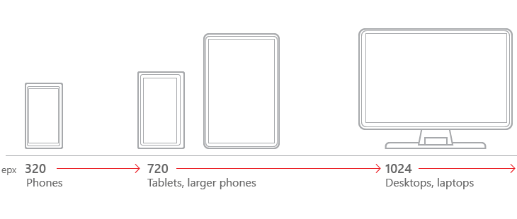
2. Breakpoints
The breakpoint system is a way of categorizing different screen-sizes into classes, by specifying a width at which your UI will change. These breakpoints mark your transition to a new class of screen sizes. There are no hard and fast rules about this and you can choose how many and what breakpoints you choose, but ideally, it is a good idea to categorize at least 4 breakpoints.
Using these breakpoints as a template, you can design versions of your UI to define how the app will look on each screen size. However, note that this does not mean your UI will be completely static in each class of devices. That defies the purpose of responsive design. Your UI will still adapt and adjust to every specific device based on the percentages assigned to each UI element.
3. Typography
Designers know what a big part of web design typography really is. Everything comes down to your choice of the typeface and appropriate sizing of it. To maintain scalability, make sure that your text is accessible. Do this by ensuring enough color contrast and a font that is clear and legible, even at smaller sizes. Also remember to make the headlines scalable.
Another thing to remember is to use real text as fast as possible, and not use text in image form. This way, text will load up quickly, for images are heavier. Also, real text can be read out by text-to-speech synthesizers while image cannot. Users can also enlarge real text as they feel right.
4. Design the Smaller Views First
Having a solid understanding of element priority is integral to responsive design. When you work on the smaller phone screens, the entire design becomes more longitudinal, with different elements showing up in a list. That’s when it is important to display the most important parts first. Now this sounds simple in theory, but sometimes, it’s hard to decide what comes first, especially when the image, a quote and a text block, complement each other and only look good together.
Designing for the smaller screen first lets you get your priorities in place, and the larger screens become easier thereafter.
5. Understand Design Patterns and Choose Well
Luke Wroblewski of Google has classified 5 major multi-device layout patterns that guide responsive design using fluid grids and media query adjustments. They are:
- Mostly Fluid: A multi-column layout with larger margins on the bigger screens. The mostly fluid design pattern stacks columns vertically and relies on fluid grids. The good thing is that the actual layout doesn’t really change unless you’re dealing with a really small screen.
- Column Drop: This is another popular multi-column pattern that drops columns along the way as the screen gets narrower. In this case, the layout changes while the overall size of each element tends to stay the same.
- Layout Shifter: This one’s one of the most adaptive across changing screen sizes. It uses different layouts on large, medium and small screens. However, as you can imagine, this one requires far too much work.
- Tiny Tweaks: As the name suggests, this pattern only makes small adaptations as the screen size changes. While it is great for extremely simple unidirectional pages, few apps actually are that simple.
- Off Canvas: While most patterns tend to stack columns vertically on smaller screens, off-canvas uses the little space in the left margins to hide navigation options until someone taps on them to expose them fully or slide them out.
Depending on your design requirements and tasted, you can use any of these patterns in responsive UI design. Thankfully, these patterns cover up most situations that may arise in a design sprint, so you have a better handle on responsive design.
Conclusion
The most interesting thing about responsive design is that it is so evolving. There is no fixed pattern to adhere to and you can always come up with a new way to make sure your UI adapts to any screen size. So start experimenting and see what you can come up with. Keep designing, and don’t forget to share your experiences right here.