Whether or not you know the name, you know what a monospace font is. The distinctive text you expect in an editor like Visual Studio Code is set in a monospace font, and they’ve become synonymous with code itself. They’re distinguished from other fonts by having fixed-width characters which all occupy the same amount of horizontal space. If you spend a lot of time in your code editor, you should take some time to choose the best monospace font for developers according to your preferences.
There’s nothing you’ll spend more time looking at, and you should consider this as important as choosing the right peripherals for your work setup.
Graphical limitations are the reason monospace fonts first featured in computing, but they’re still used in text editors today because of their readability. Let’s take a look at the high-quality, free monospace fonts that have been designed for developers and help you make the right call for you.
Because, let’s face it, coding demands heavy concentration!
I’ve divided this list into three sections. The first lot are the pretty popular mainstays. Then there are some that I consider underrated. And then there are some I consider overrated.
Along the way, I’ll let you know which is my favorite, which is the popular favorite, and my pick for outlandish, wildcard favorite. But in case you’ve got the TL;DRs and can’t wait for the verdict, here they are:
- Popular choice: Fira Code
- Editor’s choice: JetBrains Mono
- Outlandish choice: Monoid (because of its Font Awesome support!)
Popular Monospace Fonts
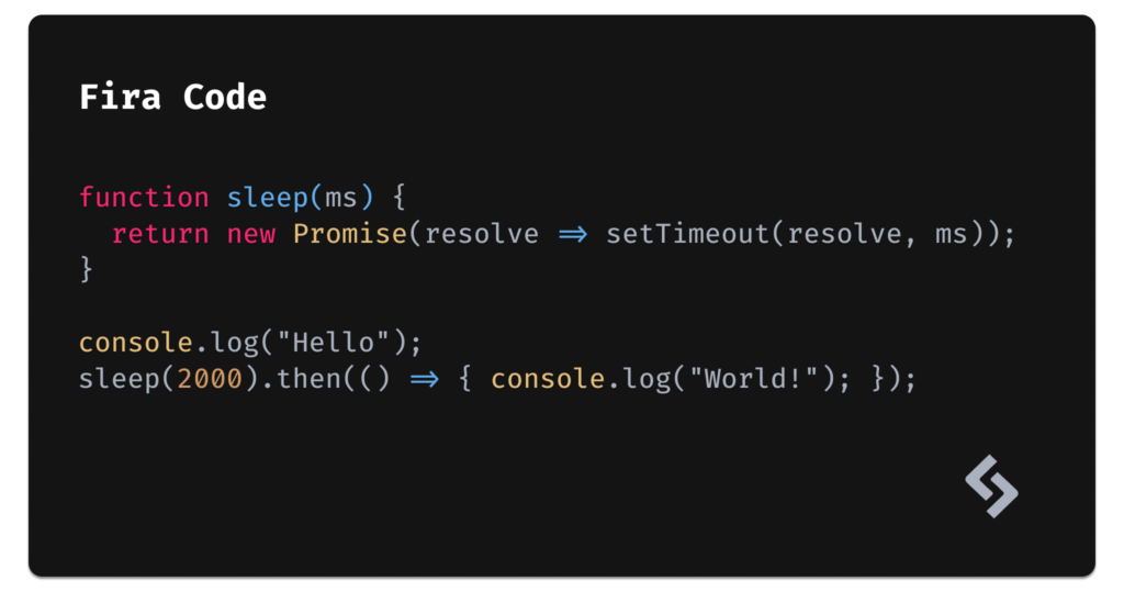
Fira Code (popular choice)
- Ligatures: yes
- Cursive italics: no
- License: free (OFL)
- Legibility: high /
very high - Designer/foundry: multiple designers
Undoubtably the most commonly used monospace font ever, Fira Code is a spin on Fira Mono. The difference is that Fira Code contains code-specific ligatures (this is when two graphemes/letters are joined together as a single glyph). It’s available on Google Fonts so you literally can’t go wrong with this one.
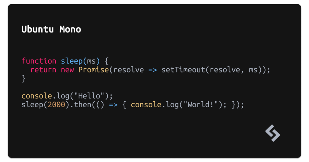
Ubuntu Mono
- Ligatures: no
- Cursive italics: no
- License: free (Ubuntu Font)
- Legibility: high /
very high - Designer/foundry: Dalton Maag
What sets Ubuntu Mono apart is that it’s designed for multiple (spoken) languages. Its unique style also makes it suitable for use in design as well, as either a body or display/heading font. If you’re looking for a monospace font that’s charming but versatile, Ubuntu Mono is certainly worth a minute of your time.
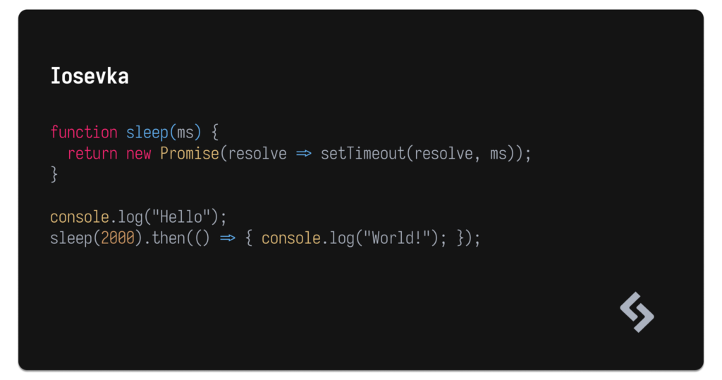
Iosevka
- Ligatures: yes
- Cursive italics: yes
- License: free (OFL)
- Legibility: high /
very high - Designer/foundry: Belleve Invis
Iosevka also supports a number of spoken languages — 162 to be exact — and includes nine different weights, a variety of ligatures for various coding languages, and even a few character variants. It’s a very common monospace font (like Fira Code) and a fine choice if you like monospace fonts that are a little condensed.
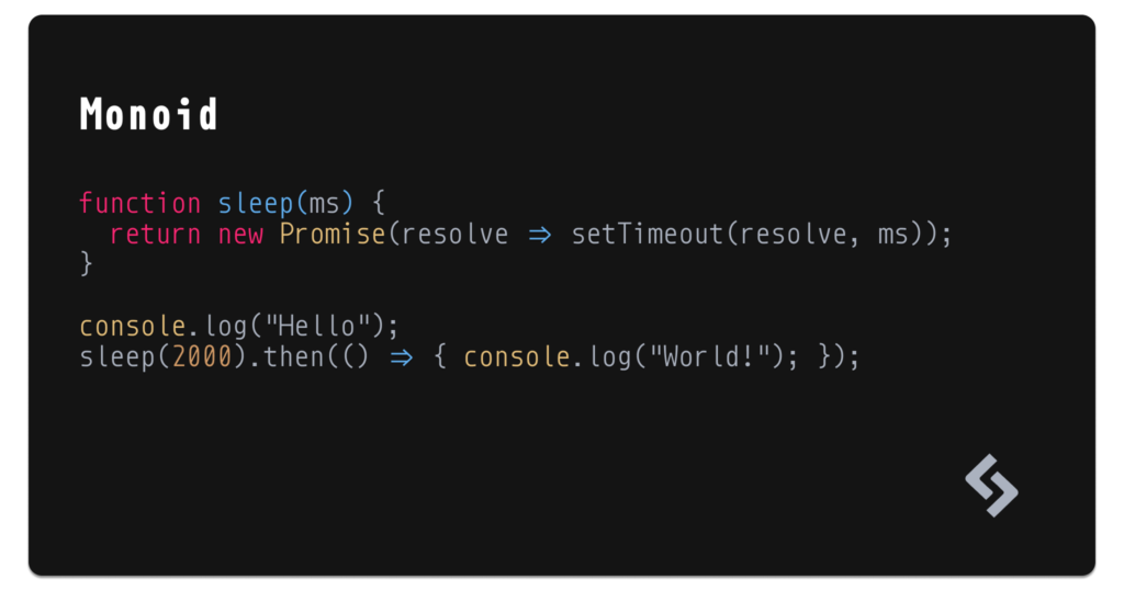
Monoid (outlandish choice)
- Ligatures: yes
- Cursive italics: no
- License: free (MIT/OFL)
- Legibility: high /
very high - Designer/foundry: Andreas Larsen
- Features: Font Awesome support!
Apart from being semi-condensed (like Iosevka), the sharp ligatures, supersized operators, and overall clean design makes Monoid a favourite of mine. Additionally, Font Awesome class references (such as <i class="fas fa-xxx"></i>) are automatically replaced with the actual icon, which is really, really awesome.
Monoid looks nice in small font sizes and low-res displays too.
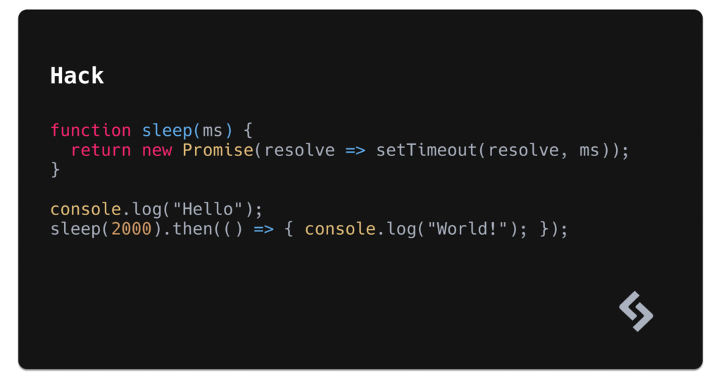
Hack
- Ligatures: no
- Cursive italics: no
- License: free (MIT)
- Legibility:
high/ very high - Designer/foundry: Source Foundry
Although it’s visually dull, Hack otherwise checks all of the boxes. That being said, Hack is open source and marketed as “No Frills. No Gimmicks.” So it’s supposed to lack style by default. Hack includes 1573 glyphs, four weights, and is shipped by 129 open-source contributors (130 if you include yourself in that!).
Hack isn’t on Google Fonts, but surprisingly they include an embed URL, which is more than most non-Google fonts offer.
A few more …
Underrated Monospace Fonts
Okay, so the fonts I’ve already covered could have been my article on the 12 best monospace fonts. But there are plenty more worth talking about, and we haven’t even gotten to my top pick yet! The following are ones I consider to be underrated.
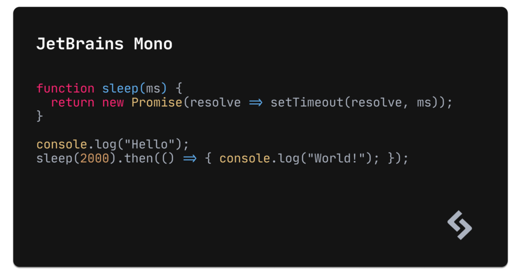
JetBrains Mono (editor’s choice)

- Ligatures: yes
- Cursive italics: no
- License: free (Apache 2.0)
- Legibility:
high/ very high - Designer/foundry: Jetbrains
Perhaps not as well known as other (mostly Google) fonts, JetBrains Mono is free, open source, and designed for 145 code languages, featuring 139 ligatures. The attention to detail is stunning, with crystal-clear distinction between near-identical characters (for example, o vs. 0, 1 vs. l vs. I, and so on …).
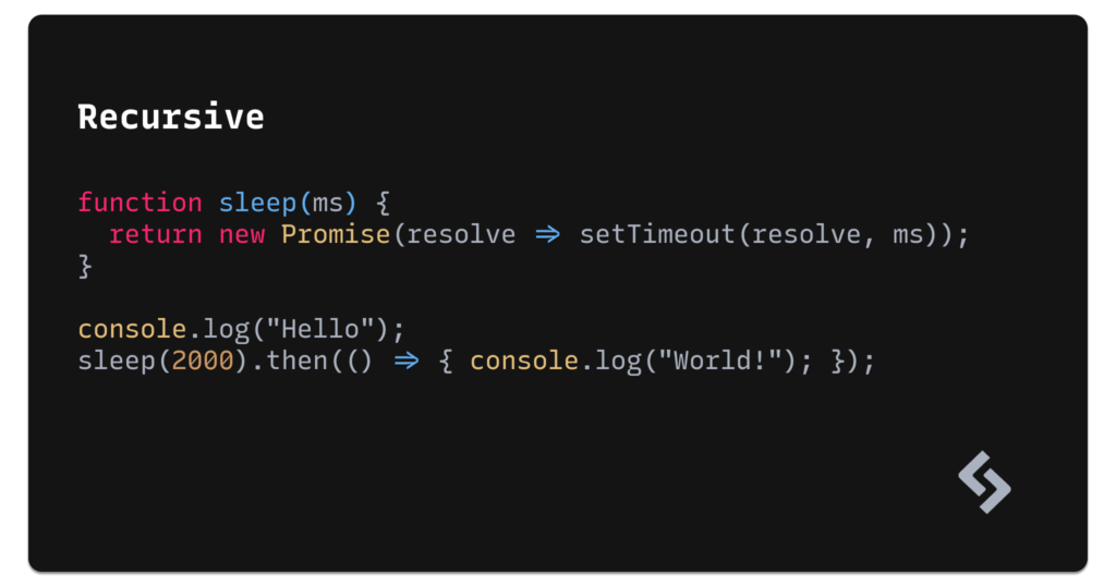
Recursive
- Ligatures: yes
- Cursive italics: yes
- License: free (SIL)
- Legibility:
high/ very high - Designer/foundry: Arrow Type
- Features: variable styles
Recursive is a variable font where you decide just how monospaced you’d like it to appear (amongst a variety of other settings, such as Casual, Weight, Slant, and Cursive).
It has a single-stroke, brush-style aesthetic, but again you decide just how bold you’d like that aesthetic to be as long as you’re willing to invest a little bit of time tweaking it to your needs. Consider trying the “Rec Mono SemiCasual” variation!
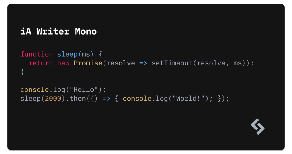
iA Writer Mono
- Ligatures: no
- Cursive italics: no
- License: free (SIL)
- Legibility:
high/ very high - Designer/foundry: iA Inc.
- Features: variable styles
I’m writing this very article right now using iA Writer. iA Writer Mono is the default monospace font that comes with the app, hbut the font is available to all from their GitHub account. If nothing else, it looks beautiful with Markdown.
A few more …
Overrated Monospace Fonts
“Popular” sums up these next eight monospace fonts, but are they really some of the best? I’ll let you decide for yourself. Personally, I think they’re legacy choices that certainly deserve spots in the Hall of Fame, but don’t really compare to the majority of the fresher talents that are available today.
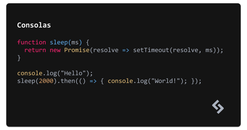
Consolas
- Ligatures: no
- Cursive italics: no
- License: free (on Windows)
- Legibility: high /
very high - Designer/foundry: Microsoft Corp.
Consolas ships with Windows (versions Vista and above) by default. It’s basically the Microsoft Edge of Windows fonts. Popular, but most likely(?) because it’s already installed.
Inconsolata
- Ligatures: no
- Cursive italics: no
- License: free (OFL)
- Legibility:
high/ very high - Designer/foundry: Raph Levien
- Features: variable styles
If you’d like something slightly better than Consolas or a version of Consolas for macOS or any other operating system, then try Inconsolata (which is inspired by Consolas anyway).
While there are many epic monospace fonts for developers, not many of them feature little details that make them shine in high-resolution like Inconsolata does. However, the downside is that it includes only a few ligatures, and only for JavaScript.
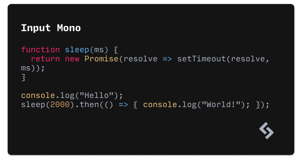
Input Mono
- Ligatures: no
- Cursive italics: no
- License: free (for private use)
- Legibility: high /
very high - Designer/foundry: DJR
Input Mono can look rather jarring when using the bolder weights, but it does look somewhat decent at its thin or regular weights. If you have a Creative Cloud subscription then you already have access to Input Mono, but otherwise there are better monospace fonts to choose from that are more accessible.
A few more …
A Font Farewell
Well, that’s my take on the best monospace fonts for developers. Was there something missing here, or a font you think wasn’t in the right category? Tell me on Twitter.
Frequently Asked Questions (FAQs) about Monospace Fonts for Developers
What Makes a Font Monospaced?
A monospaced font, also known as a fixed-width font, is a type of font where each character occupies the same amount of horizontal space. This is in contrast to proportional fonts, where different characters take up different amounts of space. Monospaced fonts are commonly used in coding due to their clarity and readability, as they align neatly into columns, making the code easier to read and debug.
Why Should Developers Use Monospaced Fonts?
Monospaced fonts are a popular choice among developers for several reasons. Firstly, they improve readability as each character occupies the same width, making it easier to spot errors in the code. Secondly, they help in aligning text in tabular format, which is crucial when writing or reading code. Lastly, they provide a clean and consistent look, which can reduce eye strain during long coding sessions.
Are All Monospaced Fonts Suitable for Coding?
While all monospaced fonts have the same character width, not all are suitable for coding. A good coding font should be clear and easy to read, even at small sizes. It should also have distinguishable characters to avoid confusion between similar-looking characters such as ‘1’, ‘l’, and ‘I’ or ‘0’ and ‘O’. Some monospaced fonts are specifically designed for coding, offering features like ligatures that combine certain character sequences into a single glyph for improved readability.
How Can I Install a New Monospaced Font on My System?
Installing a new font on your system is relatively straightforward. After downloading the font file (usually in .ttf or .otf format), you can install it by opening the file and clicking the ‘Install’ button. Once installed, the new font should be available in your code editor’s font settings. Remember to restart your code editor after installing a new font to ensure it’s properly loaded.
Can I Use Multiple Monospaced Fonts in My Code Editor?
Yes, most code editors allow you to use multiple fonts. You can specify a list of fonts in your editor’s settings, and it will use the first available font in the list. This can be useful if you work on multiple machines with different fonts installed, as you can ensure that your code looks consistent across all your devices.
Are Monospaced Fonts Free to Use?
Many monospaced fonts are free to use, but not all. Some are open-source, meaning you can use and modify them freely. Others are commercial fonts that require a license to use. Always check the license terms before using a font, especially if you plan to use it in a commercial project.
What Are Some Popular Monospaced Fonts for Developers?
There are many popular monospaced fonts among developers. Some of the most popular include Fira Code, which includes programming ligatures; Source Code Pro, a font from Adobe that’s designed for coding; and JetBrains Mono, a free and open-source font developed by JetBrains.
Can I Create My Own Monospaced Font?
Yes, creating your own monospaced font is possible, but it requires knowledge of typography and font design. There are several software tools available for font creation, such as FontForge and Glyphs. However, creating a good font is a time-consuming process that requires a lot of attention to detail.
How Can I Improve the Readability of My Code with Monospaced Fonts?
There are several ways to improve code readability with monospaced fonts. Using a font with clear, distinguishable characters can help prevent confusion. Increasing the font size or line spacing can also improve readability. Additionally, many developers find that using a font with programming ligatures makes their code easier to read.
Are There Any Disadvantages to Using Monospaced Fonts?
While monospaced fonts are generally preferred for coding, they do have some disadvantages. They take up more horizontal space than proportional fonts, which can be a problem on small screens. Some people also find them less aesthetically pleasing than proportional fonts. However, the benefits of improved readability and alignment often outweigh these drawbacks for coding purposes.
 Daniel Schwarz
Previously, design blog editor at Toptal and SitePoint. Now Daniel advocates for better UX design alongside industry leaders such as Adobe, InVision, Marvel, Wix, Net Magazine, LogRocket, CSS-Tricks, and more.