Introduction
Seaborn is one of the most widely used data visualization libraries in Python, as an extension to Matplotlib. It offers a simple, intuitive, yet highly customizable API for data visualization.
In this tutorial, we'll take a look at how to plot a Bar Plot in Seaborn.
Bar graphs display numerical quantities on one axis and categorical variables on the other, letting you see how many occurrences there are for the different categories.
Bar charts can be used for visualizing a time series, as well as just categorical data.
Plot a Bar Plot in Seaborn
Plotting a Bar Plot in Seaborn is as easy as calling the barplot() function on the sns instance, and passing in the categorical and continuous variables that we'd like to visualize:
import matplotlib.pyplot as plt
import seaborn as sns
sns.set_style('darkgrid')
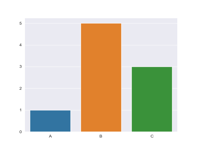
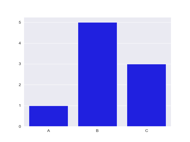
x = ['A', 'B', 'C']
y = [1, 5, 3]
sns.barplot(x, y)
plt.show()
Here, we've got a few categorical variables in a list - A, B and C. We've also got a couple of continuous variables in another list - 1, 5 and 3. The relationship between these two is then visualized in a Bar Plot by passing these two lists to sns.barplot().
This results in a clean and simple bar graph:
Though, more often than not, you'll be working with datasets that contain much more data than this. Sometimes, operations are applied to this data, such as ranging or counting certain occurrences.
Whenever you're dealing with means of data, you'll have some error padding that can arise from it. Thankfully, Seaborn has us covered, and applies error bars for us automatically, as it by default calculates the mean of the data we provide.
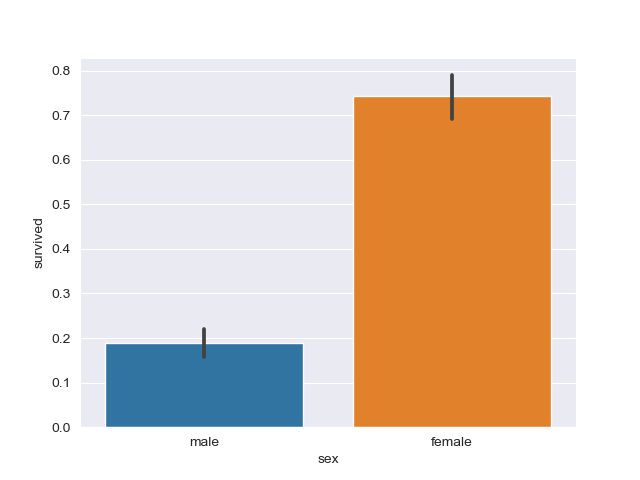
Let's import the classic Titanic Dataset and visualize a Bar Plot with data from there:
import matplotlib.pyplot as plt
import seaborn as sns

# Set Seaborn style
sns.set_style('darkgrid')
# Import Data
titanic_dataset = sns.load_dataset("titanic")

# Construct plot
sns.barplot(x = "sex", y = "survived", data = titanic_dataset)
plt.show()
This time around, we've assigned x and y to the sex and survived columns of the dataset, instead of the hard-coded lists.
If we print the head of the dataset:
print(titanic_dataset.head())
We're greeted with:
   survived  pclass     sex   age  sibsp  parch     fare  ...
0         0       3    male  22.0      1      0   7.2500  ...
1         1       1  female  38.0      1      0  71.2833  ...
2         1       3  female  26.0      0      0   7.9250  ...
3         1       1  female  35.0      1      0  53.1000  ...
4         0       3    male  35.0      0      0   8.0500  ...

[5 rows x 15 columns]
Make sure you match the names of these features when you assign x and y variables.
Finally, we use the data argument and pass in the dataset we're working with and from which the features are extracted from. This results in:
Plot a Horizontal Bar Plot in Seaborn
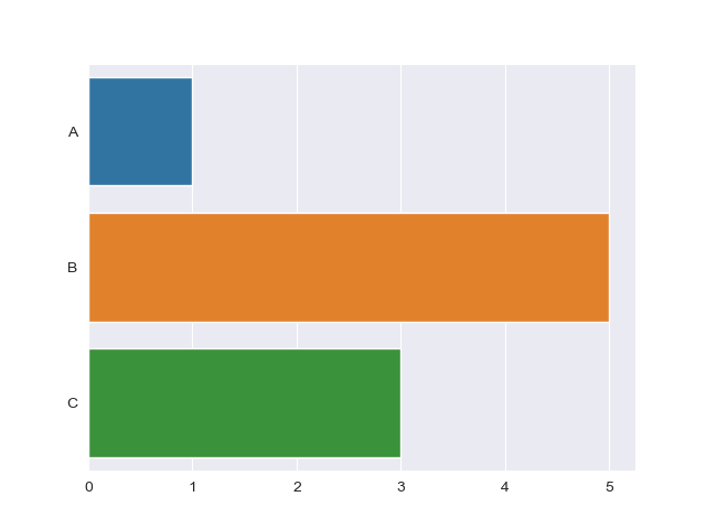
To plot a Bar Plot horizontally, instead of vertically, we can simply switch the places of the x and y variables.
This will make the categorical variable be plotted on the Y-axis, resulting in a horizontal plot:
import matplotlib.pyplot as plt
import seaborn as sns

x = ['A', 'B', 'C']
y = [1, 5, 3]

sns.barplot(y, x)
plt.show()
This results in:
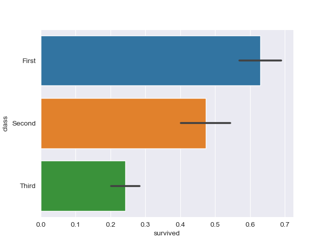
Going back to the Titanic example, this is done in much the same way:
import matplotlib.pyplot as plt
import seaborn as sns

titanic_dataset = sns.load_dataset("titanic")

sns.barplot(x = "survived", y = "class", data = titanic_dataset)
plt.show()
Which results in:
Change Bar Plot Color in Seaborn
Changing the color of the bars is fairly easy. The color argument accepts a Matplotlib color and applies it to all elements.
Let's change them to blue:
import matplotlib.pyplot as plt
import seaborn as sns

x = ['A', 'B', 'C']
y = [1, 5, 3]

sns.barplot(x, y, color='blue')
plt.show()
This results in:
Check out our hands-on, practical guide to learning Git, with best-practices, industry-accepted standards, and included cheat sheet. Stop Googling Git commands and actually learn it!
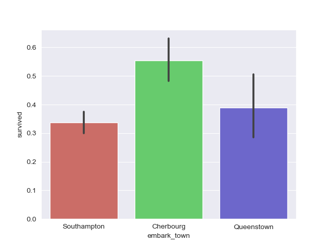
Or, better yet, you can set the palette argument, which accepts a wide variety of palettes. A pretty common one is hls:
import matplotlib.pyplot as plt
import seaborn as sns

titanic_dataset = sns.load_dataset("titanic")

sns.barplot(x = "embark_town", y = "survived", palette = 'hls', data = titanic_dataset)
plt.show()
This results in:
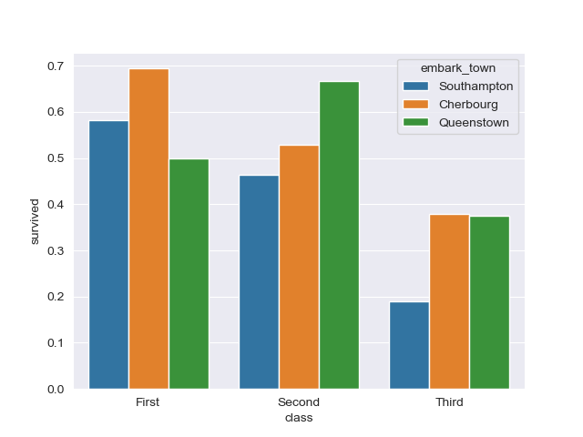
Plot Grouped Bar Plot in Seaborn
Grouping Bars in plots is a common operation. Say you wanted to compare some common data, like, the survival rate of passengers, but would like to group them with some criteria.
We might want to visualize the relationship of passengers who survived, segregated into classes (first, second and third), but also factor in which town they embarked from.
This is a fair bit of information in a plot, and it can easily all be put into a simple Bar Plot.
To group bars together, we use the hue argument. Technically, as the name implies, the hue argument tells Seaborn how to color the bars, but in the coloring process, it groups together relevant data.
Let's take a look at the example we've just discussed:
import matplotlib.pyplot as plt
import seaborn as sns

titanic_dataset = sns.load_dataset("titanic")

sns.barplot(x = "class", y = "survived", hue = "embark_town", data = titanic_dataset)
plt.show()
This results in:
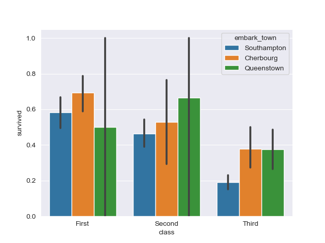
Now, the error bars for the Queenstown data are pretty large. This indicates that the data on passengers who survived, and embarked from Queenstown varies a lot for the first and second class.
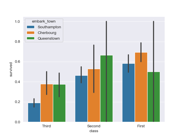
Ordering Grouped Bars in a Bar Plot with Seaborn
You can change the order of the bars from the default order (whatever Seaborn thinks makes most sense) into something you'd like to highlight or explore.
This is done via the order argument, which accepts a list of the values and the order you'd like to put them in.
For example, so far, it ordered the classes from the first to the third. What if we'd like to do it the other way around?
import matplotlib.pyplot as plt
import seaborn as sns

titanic_dataset = sns.load_dataset("titanic")

sns.barplot(x = "class", y = "survived", hue = "embark_town", order = ["Third", "Second", "First"], data = titanic_dataset)
plt.show()
Running this code results in:
Change Confidence Interval on Seaborn Bar Plot
You can also easily fiddle around with the confidence interval by setting the ci argument.
For example, you can turn it off, by setting it to None, or use standard deviation instead of the mean by setting sd, or even put a cap size on the error bars for aesthetic purposes by setting capsize.
Let's play around with the confidence interval attribute a bit:
import matplotlib.pyplot as plt
import seaborn as sns

titanic_dataset = sns.load_dataset("titanic")

sns.barplot(x = "class", y = "survived", hue = "embark_town", ci = None, data = titanic_dataset)
plt.show()
This now removes our error bars from before:
Or, we could use standard deviation for the error bars and set a cap size:
import matplotlib.pyplot as plt
import seaborn as sns

titanic_dataset = sns.load_dataset("titanic")

sns.barplot(x = "class", y = "survived", hue = "who", ci = "sd", capsize = 0.1, data = titanic_dataset)
plt.show()

Conclusion
In this tutorial, we've gone over several ways to plot a Bar Plot using Seaborn and Python. We've started with simple plots, and horizontal plots, and then continued to customize them.
We've covered how to change the colors of the bars, group them together, order them and change the confidence interval.
If you're interested in Data Visualization and don't know where to start, make sure to check out our bundle of books on Data Visualization in Python:

Data Visualization in Python with Matplotlib and Pandas is a book designed to take absolute beginners to Pandas and Matplotlib, with basic Python knowledge, and allow them to build a strong foundation for advanced work with these libraries - from simple plots to animated 3D plots with interactive buttons.
It serves as an in-depth guide that'll teach you everything you need to know about Pandas and Matplotlib, including how to construct plot types that aren't built into the library itself.
Data Visualization in Python, a book for beginner to intermediate Python developers, guides you through simple data manipulation with Pandas, covers core plotting libraries like Matplotlib and Seaborn, and shows you how to take advantage of declarative and experimental libraries like Altair. More specifically, over the span of 11 chapters this book covers 9 Python libraries: Pandas, Matplotlib, Seaborn, Bokeh, Altair, Plotly, GGPlot, GeoPandas, and VisPy.
It serves as a unique, practical guide to Data Visualization, in a plethora of tools you might use in your career.