How to Turn New Visitors into SaaS Customers with Sales Funnel Design

Prospective SaaS customers need you to show them what to pay attention to and then guide them through the rest of the sales journey. If you can do that effectively, you’ll turn more new visitors into paying customers.
It’s not always easy to turn a window-shopping visitor into a paying customer—that goes for brick and mortar stores as well as websites. You’re at an even greater disadvantage online. With the exception of live chat windows that try to be of assistance (the way in-store sales reps might offer, “How can we help you?”), there’s not a whole lot you can do to actively talk visitors into become paying customers.
Or is there?
You’re no copywriter. But that doesn’t mean you don’t have the ability to “speak” to visitors through the websites you build to promote your SaaS product.
Want to learn more about the role you play in this exchange? Then keep reading for a look at how sales funnel design can more effectively turn new visitors into SaaS customers.
What Is Sales Funnel Design?
Whenever you design a website or app, you consider more than just the aesthetics of it. Ultimately, you want to create a clear pathway from Point A to Point B.
What sales funnel design does is ask you to address the fact that there isn’t just one Point A to one Point B.
Especially when it comes to SaaS products, the buyer’s journey can take a while. So, as you design a website to promote your product, you have to consider how many of those Point-A’s-to-Point-B’s you actually need.
To better understand this, put yourself in the shoes of the SaaS customers you want to convert. We’ll use Unite UX as an example.
Let’s say you’ve been looking for software that would make it easier to hand off your designs to a developer, simplify the translation of redlines, and share feedback. You come across a link to Unite UX while researching the subject online (perhaps in search results, from a link on social, or a recommendation in a blog post). So, you enter the website.
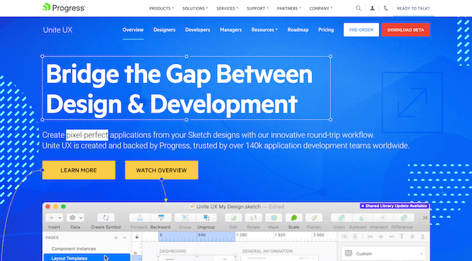
What is your main goal at this moment? You’re not looking to buy. You’re on a fact-finding mission, correct?
That’s what we refer to as top-of-the-funnel (TOF) sales, and it’s very common with SaaS products.
These are the visitors who have arrived at your site with the goal of exploring the product and learning more. As a designer, it’s your mission to build an introduction that speaks directly to these prospective customers just starting their journey.
Bottom-of-the-funnel (BOF) sales don’t usually take place during this first venture into a SaaS website.
These are the customers who are well-informed and have almost certainly made up their mind to buy. So, with this example of Unite UX, you’d be in the BOF stage after doing a bunch of window-shopping, price comparisons, and general research on competitive products. Only when your mind’s made up would you return to the site. And at that point, you wouldn’t want to mess around. You’d want to get right to it and make your purchase.
As you might imagine, this later stage would need to be designed much differently than the first-time entry. So, let’s take a look at some tips for turning those new TOF visitors into paying BOF customers.
How to Design for Top-of-Funnel Customers
It doesn’t matter how well-known the product or company is that you’re designing for. You have to assume that some visitors are going to arrive on the site in the basic awareness/research phase. So, while it might be tempting to make your first call-to-action be “Buy Now”, don’t do it. (Not on the home page, anyway.)
I’m going to use the Harvest time-tracking software to demonstrate some ways you can effectively turn strangers into interested leads:
Address the Pain Before Anything Else
Typically, visitors’ eyes go to the top-left of a page first thing. Assuming they’re not immediately scanning your navigation for information, your home page hero image is what’s going to catch their attention.
This is what Harvest has above the fold on its home page:
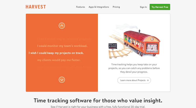
It’s a brilliant design. On the left part of this graphic, you have a vertical scroller. But it doesn’t move on its own, which gives visitors a chance to really digest what they’re seeing. In other words:
I bet you’re feeling (some of) this pain, huh?
Then, on the right, Harvest quickly provides relief for that pain. There’s no mention of the Harvest brand name either. It’s purely about providing a solution and giving the visitor the room to explore. And if that’s not the specific pain they’re experiencing, they can scroll through the other statements to find the one that fits.
This gives your top-of-the-funnel visitors room to breathe. There’s no pressure to buy or even to try out the product (though there’s a button for it in the top-right for anyone who’s immediately sold). It’s all about prioritizing education.
Get Them on the Mailing List
It’s not common to convert SaaS customers on a first visit, especially if a product is pricey or is going to cause a major upheaval once implemented. Because this decision can’t be entered into lightly, your website should continue to give them room… but not before you get some basic information from them.
While it would be great if TOF visitors always remembered which product they fell in love with and need to return to at a later date, you can’t expect that to happen. Not with how many distractions there are or how many people are multitasking while researching your product.
So, you’re going to have to ask for their email.
Rather than position it as, “Can we stay in touch?”, get their email while trading them for something valuable. When it comes to SaaS, there’s nothing better than a free trial (though there’s nothing wrong with giving them a free ebook, worksheet, or other valuable giveaway).
On the Harvest website, that’s the next thing to appear on the home page:
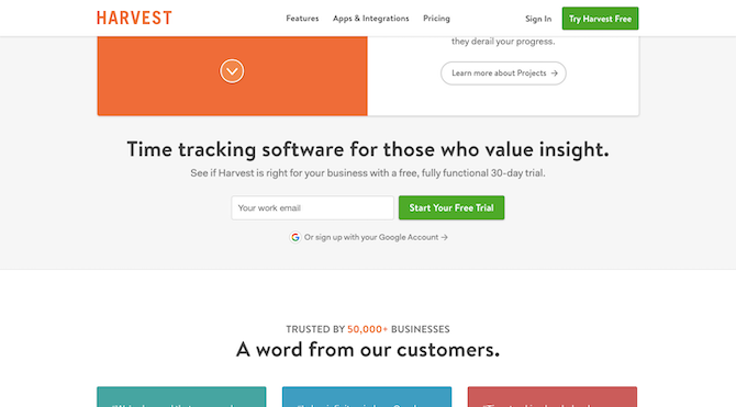
There’s also a link to this in the top-right corner of the home page in case they miss this one (like if they had clicked on one of the “Learn More” links in the hero image).
But notice here how it’s not at all about pushing them to buy. Harvest gives interested users a chance to try the product in full for 30 days.
Signup is easy. After entering their email address, users are asked for the bare minimum:
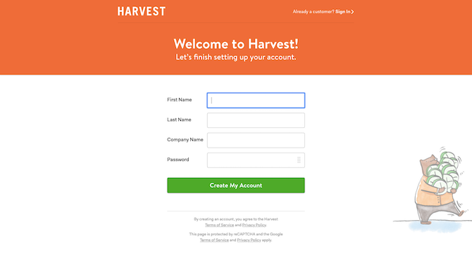
And onboarding them into the trial product is just as pleasant and simple of an experience. Harvest asks users for a few pieces of information before they can step inside.
But what I want to call your attention to is this:
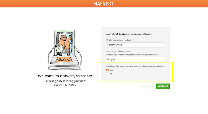
What’s nice about this—beyond the simplicity and brevity of it—is this final question:
“Would you like us to email you about product updates and tips?”
There’s no throwaway checkbox here that says, “Check here if you want to receive marketing communications.”
This instead sounds very well-thought-out and considerate. I’d be shocked if most free trial users don’t click “Yes.” If you’re going to get 30 days to try this product out, why not make the most of it?
Small touches like this that will help expedite users through the TOF part of the sales funnel.
Be Ready with Answers
At this stage, visitors have an idea of what they’re looking for as well as what their top concerns are.
Don’t overload your home page with all of this information. Instead, use the header and footer to provide them with the answers they’re looking for in those locations.
As interfaces have become more minimally designed, we’ve seen headers grow simpler by nature. Harvest does this well:

This helps new visitors really focus on what’s important: the product and what it’s going to do for them.
And because more and more websites are moving away from intimidating mega menus (even if you have a ton of information to share), your TOF visitors will know the footer is where they’ll get everything else:

Notice how there’s an entire section dedicated to “Community”? That’s really what I want you to focus on here. Because while all this stuff about the product’s features and company is great… the community resources are going to be a huge differentiator. Every angle has been covered.
The first two (Blog and Customer Stories) are informational resources. But the other parts of the Community section are meant to enhance Harvest users’ experience. It’s just more proof of how worthwhile the product is—and how it’s not just something they buy and then have to sort out on their own. Users are getting a partner that wants to help them get the most of it.
That in and of itself will put a lot of your visitors’ minds at ease.
How to Design for Bottom-of-Funnel Customers
Once you’ve established a connection with visitors and you’ve qualified them as likely customers (whether now or somewhere in the future), you have to spend some time getting in front of them. That might not be your job. That responsibility may fall on the copywriter or marketer who creates the follow-up campaigns. However, what you are responsible for is streamlining the signup process once they’re back on the site.
For this example, I’m going to use UserTesting.com.
Make One Last Strong Push
It’s not just email you can use to stay in touch with TOF visitors. You can use retargeting pixels to follow them around online. Or you can encourage them to connect on social or to download a free resource through Messenger.
There are plenty of channels where your visitors can be reached. The point is: don’t let the first step on the website be the last.
Once you’ve captured their attention and identified them as a high-quality lead (which lead generation and CRM software can help with), you need to make one final push. And it needs to be big.
Let’s take this UserTesting ad on LinkedIn, for example:
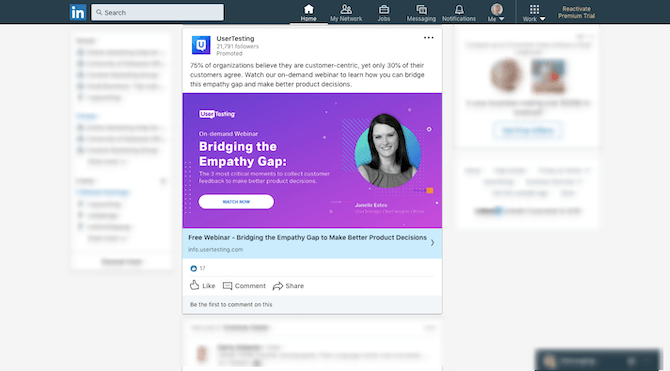
This website could easily have run an ad that asked the lead to come back to the site to buy. But, instead, the call-to-action is a free webinar—one that promises to help fix the empathy gap that exists between organizations and their customers.
Is this a wasted opportunity?
Absolutely not. This ad and free webinar is going to open the door for the sale. Why? Because people who are willing to sit through an entire webinar and on this specific subject need help now.
When you design this reengagement element, though, make sure not to mention anything about sales. This is about giving your prospects so much value and easing any remaining concerns so that conversion is the logical (but subconscious) next step.
Remove Distractions from the Landing Page
However you’re driving visitors back to the site, keep in mind that this is not the time to reintroduce them to the same website they visited before. They’ve already been through that, they’ve already made up their mind. So, don’t waste their time.
In the case of UserTesting, prospects are taken to this distraction-free landing page. This is the top-half of that page:
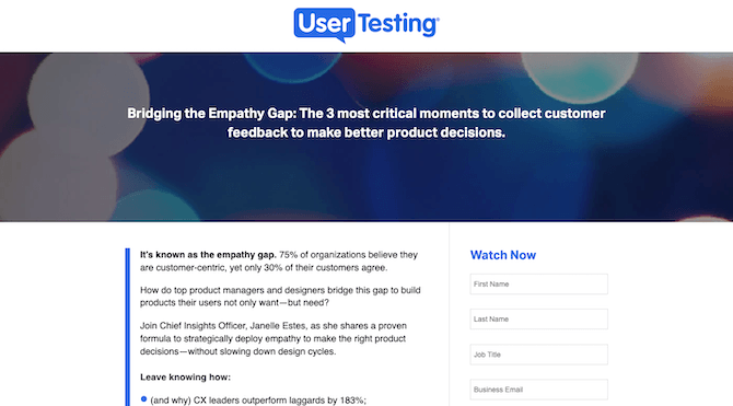
Notice how easy it is to read. Sentences and paragraphs are short. It sounds just as conversational as a webinar would be. And the remainder of the very short page sums up what they’ll get by the end of the webinar:
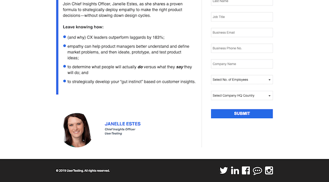
That’s it. The page is straight to the point and keeps qualified prospects from second-guessing themselves (e.g. “Should I look at the features again?”).
The sole focus is on getting them one step closer to easing their pain.
Now, you don’t need to use a webinar to close the sale. You could invite them to a one-on-one demo with a specialist. You could highlight a new feature or product and encourage them to learn more. It all just depends on what the biggest hurdle is to closing the sale.
Make the Sale Impossible to Turn Down
With an ecommerce site, it’s much easier to close the sale. You list out the specifications, answer questions in your FAQ, and provide user reviews to back up everything you’ve said about the product. Unless it’s a high-ticket item, it’s a fairly straightforward decision-making process.
That’s not always so for SaaS users. They’re going to go through various stages before they’re ready to commit. And it’s at this last stage where straggling concerns are going to creep in and it’s a good idea to have someone there to remove any remaining doubts.
That may mean you have:
- A sales rep scheduled to follow up after the webinar/download/landing page visit
- Someone manning the live chat on the site
- A phone number and email address you encourage BOF users to reach out to
What’s nice about the webinar (or demo) option is that you have a real-life person there to alleviate those concerns. For instance, the UserTesting Webinar is pre-recorded:
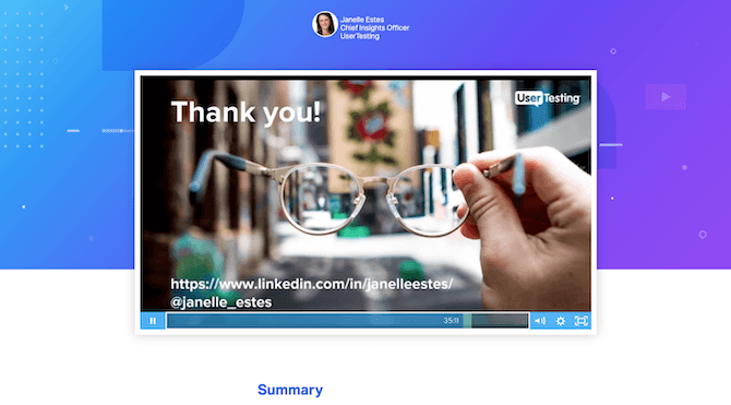
However, this webinar was recorded live at one point and the last 10 minutes are spent answering questions and concerns from attendees. Like this one:
“I love all of these ideas, but I don’t believe my team can handle it all.”
Or this one:
“How do you feel about testing non-target users? Does it depend on the nature of the product being tested?”
Anyone who’s thinking about doing user testing for their products is going to express these kinds of concerns. While a Frequently Asked Questions section might touch on this somewhat, the responses aren’t going to be as robust or even feel as honest.
Assuming this last step has removed any remaining doubts, it’s time to ask for the sale.
In the case of UserTesting, they don’t do it right away. The bottom of the webinar page invites users to a free trial:
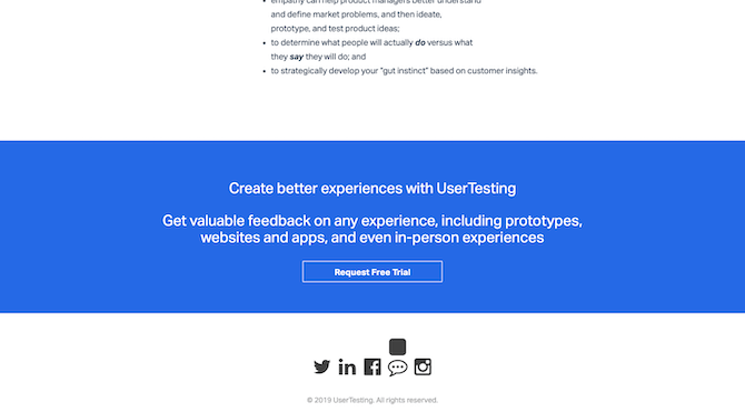
Regardless of whether attendees explore the free trial or not, UserTesting is ready to go after the sale. These prospects are primed and ready for it.
If the attendee requests a free trial, the terms of the trial are explained via email along with an invitation to contact sales if they’re ready to use the product in full:
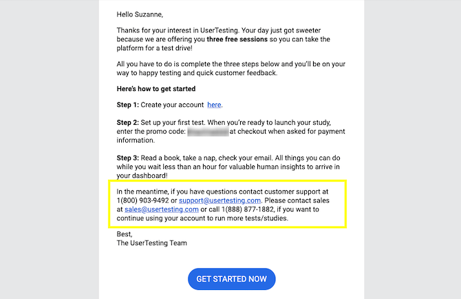
Even if they don’t start the free trial, they’re going to receive an email after the webinar with a copy of the recording. The email will also invite them to contact sales when they’re ready.
While you’re not going to be responsible for this final step, it’s important to know where you’re sending these BOF prospects to. If you can visualize their pathway, you can more effectively build a concise and effective landing page that gets them there quickly.
Wrap-Up
The key to nailing sales funnel design is to really get inside the minds of your customers. And while the words your writer uses to describe the pain and the SaaS as a solution will help close the sale, your design has to get them to take notice.
So, really pay attention to how these small details along the sales journey can encourage prospective customers to take the baby steps toward conversion.

Suzanne Scacca
A former project manager and web design agency manager, Suzanne Scacca now writes about the changing landscape of design, development and software.
